
Abstract
Geographic information system tools analyze the environmental hazards and injustice throughout the United States. This article highlights the updated Maryland Environmental Justice Screening Tool (MD EJSCREEN v2.0), a state-specific resource for visualizing local environmental justice and health disparities in Maryland. Four new functions for screening and visualizing environmental justice indicators are described and demonstrated: the Select Feature and EJScreenChart, Side-by-Side Mapper, Report Tool, and Base Map Selector. The article identifies and compares census tracts in Maryland with highest and lowest Maryland Environmental Justice Scores (MD EJScores): Johnston Square, Baltimore, Maryland, and Churchville, Maryland, respectively. This article also characterizes the spread of MD EJScores across Maryland's 1384 census tracts. The case study results indicate that, while the median MD EJScore across the state is 0.30, several of Maryland's communities of color and low-wealth communities are disproportionately and highly impacted by high exposure to air pollution, close proximity to hazardous facilities, and high rates poor health outcomes—especially in the 90th percentile of MD EJScores, which can be as much as three times the statewide median. The tool can be used by local policymakers, regulators, and community leaders in a decision-support capacity to inform strategies for reducing environmental injustice.
PURPOSE OF THE TOOL
Background on environmental justice mapping
Given the inherent spatial context of all environmental justice issues, geographic information system (GIS) applications are invaluable for visualizing and analyzing physical distribution trends relevant to environmental hazards and health disparities. 1 These “EJ mappers” allow users to overlay environmental justice indicators of interest, such as locations of emission sources and vulnerable populations, to determine potential drivers of poor health outcomes and resultant impacts. This layering or “screening” is particularly advantageous for tracking cumulative impacts as virtually all environmental justice communities are burdened by more than one environmental hazard source. 2
For community members, mapping and screening tools provide access to spatial data in an easily digestible format, allowing users to become better informed on environmental risks specific to their region, state, county, zip code, census tract, or even census block group. 3 Public participation GIS (PPGIS) further enhances this goal by building community context directly into mapping tools, melding quantitative geospatial data with qualitative lived experiences. 4 , 5 , 6 , 7 PPGIS approaches can be top-down, where software architects gather sociodemographic data to develop tools that are tailored to the needs and concerns of local residents, or bottom-up, where community members are directly engaged and trained in the development and testing of these tools to ensure that their needs (including ease of use and understanding) are satisfied. 8 , 9 Story mapping and community asset mapping are classic examples of bottom-up PPGIS. 10 , 11 , 12
Importance of state-level environmental justice mapping tools
The United States Environmental Protection Agency's Environmental Justice Screening Tool (U.S. EPA EJSCREEN) serves as the national archetype for environmental justice PPGIS tools. Publicly released in 2015 and updated annually, the EJSCREEN tool is a direct answer to Executive Order 12898, which mandates that federal agencies “collect, maintain, and analyze information assessing and comparing environmental and human health risks borne by populations identified by race, national origin, or income.” 13 The tool informs the EPA outreach and engagement initiatives as well as its implementation of permitting, enforcement, and compliance monitoring. 14
Despite the breadth of data and subsequent use cases afforded by the U.S. EPA EJSCREEN, it is not an adequate replacement for a contextualized and nuanced tool that highlights environmental hazards and sociodemographics at the state level. 15 This is due, in large part, to the fact that the EPA only includes environmental and demographic indicator data from nationally standardized data sets (e.g., U.S. Census Bureau, EPA National Air Toxics Assessment, EPA Comprehensive Environmental Response, Compensation, and Liability Information System, EPA Resource Conservation and Recovery Act, and other federally managed databases). 16 This is sensible on the part of the Agency because there are countless environmental justice issues existing in unique locations and including all of them could require immense server capacity and negatively impact the tool's ease of use and function.
However, this means that, for example, agricultural feeding operation and park location data from a state's department of natural resources or neighborhood asthma rates from a local county health department, while quality assured and validated at these local government-managed scales, cannot be natively included in EPA EJSCREEN. Given the inherently small scale at which environmental injustice and overburdening occurs, state-level mapping and screening tools are necessary and better-suited for identifying areas of environmental justice concern.
The Maryland Environmental Justice Screening Tool
The Maryland Environmental Justice Screening Tool (MD EJSCREEN) is a state-level mapping tool attuned to Maryland's environmental justice context and concerns (Fig. 1). MD EJSCREEN was built based on feedback from community members and stakeholders to create a resource for identifying social, economic, health, and environmental disparities; particularly between racial/ethnic groups. Indicators included in MD EJSCREEN v1.0 were decided upon through public community-engaged discussions, community member surveys, in-person focus groups, and other community-based participatory research practices. 17 The tool enables users to interact with map layers that display an array of pollution burden indicators and population characteristics. Environmental Justice Indicators are divided into two categories (Pollution Burden and Population Characteristics) and four domains: (1) Exposure, (2) Environmental Effects, (3) Sensitive Populations, and (4) Socioeconomic Factors. 18 Data sources and descriptions for these indicators have been published previously. 19
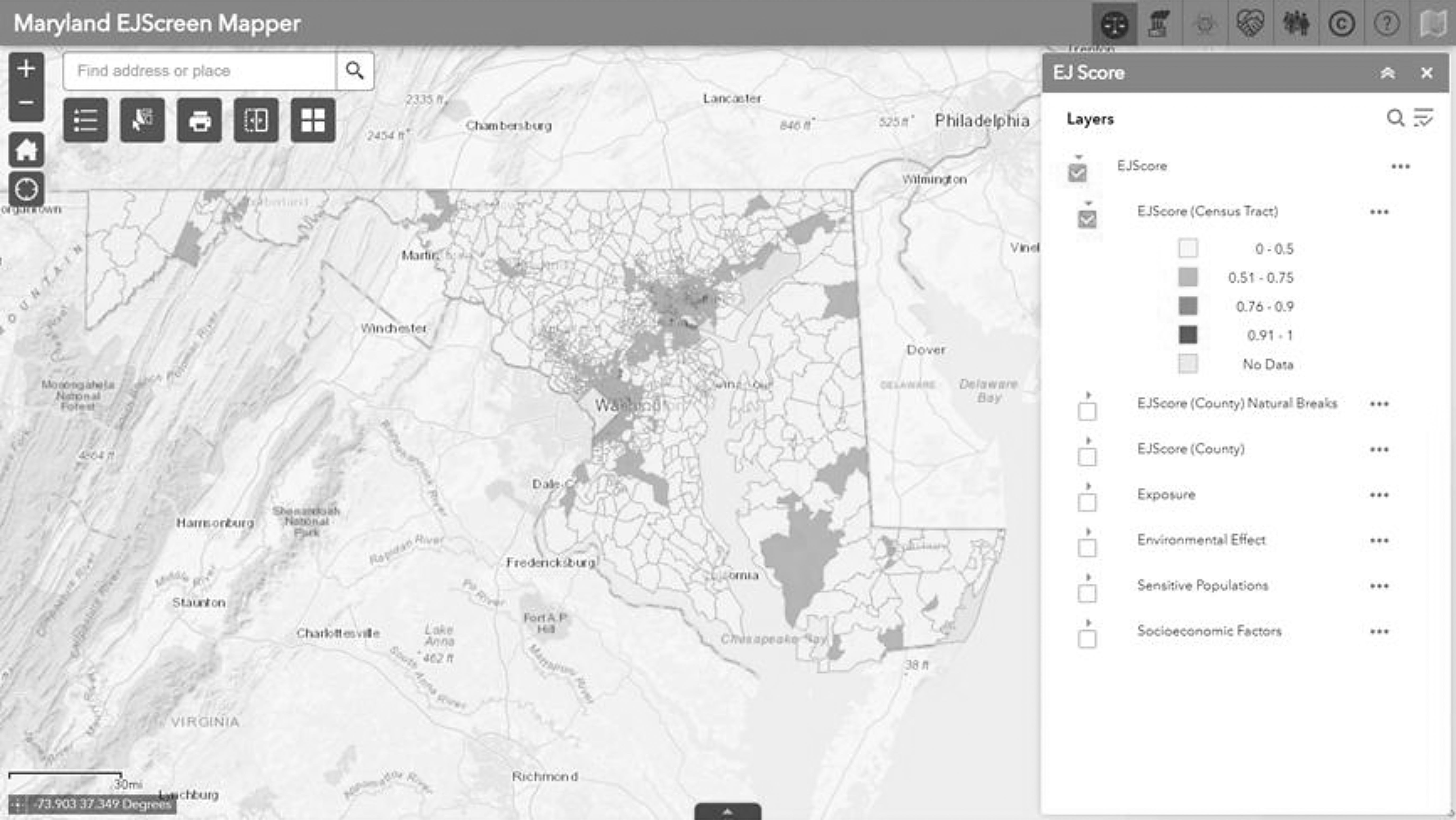
MD EJSCREEN v2.0 Home View. The Home View of the tool displays all 1394 census tracts in the state of Maryland. The tool's default layer is the MD EJScore—a composite of the scores from each of the following domain scores: Exposure, Environmental Effects, Sensitive Populations, and Socioeconomic Factors. MD EJScore, Maryland Environmental Justice Score; MD EJSCREEN, Maryland Environmental Justice Screening Tool.
A composite Maryland Environmental Justice Score (MD EJScore) allows for a ranking of census tracts based on their relative level of environmental justice concern (Fig. 2). Higher MD EJScores represent more overburdening of exposure, environmental effect, health outcome, and structural socioeconomic disadvantages—that is, less overall environmental justice and higher priority for corrective policy or regulatory action. The national-scale EPA EJSCREEN tool, by contrast, does not have a scoring component. Additionally, MD EJSCREEN includes Maryland-specific “Context Layers,” providing visualization of railroads, infrastructure, food access, housing value estimates, and more. This marks an improvement when comparing MD EJSCREEN with EPA EJSCREEN as many of these locally focused data sets are not available at the national scale and, therefore, are not included in the national tool. 20
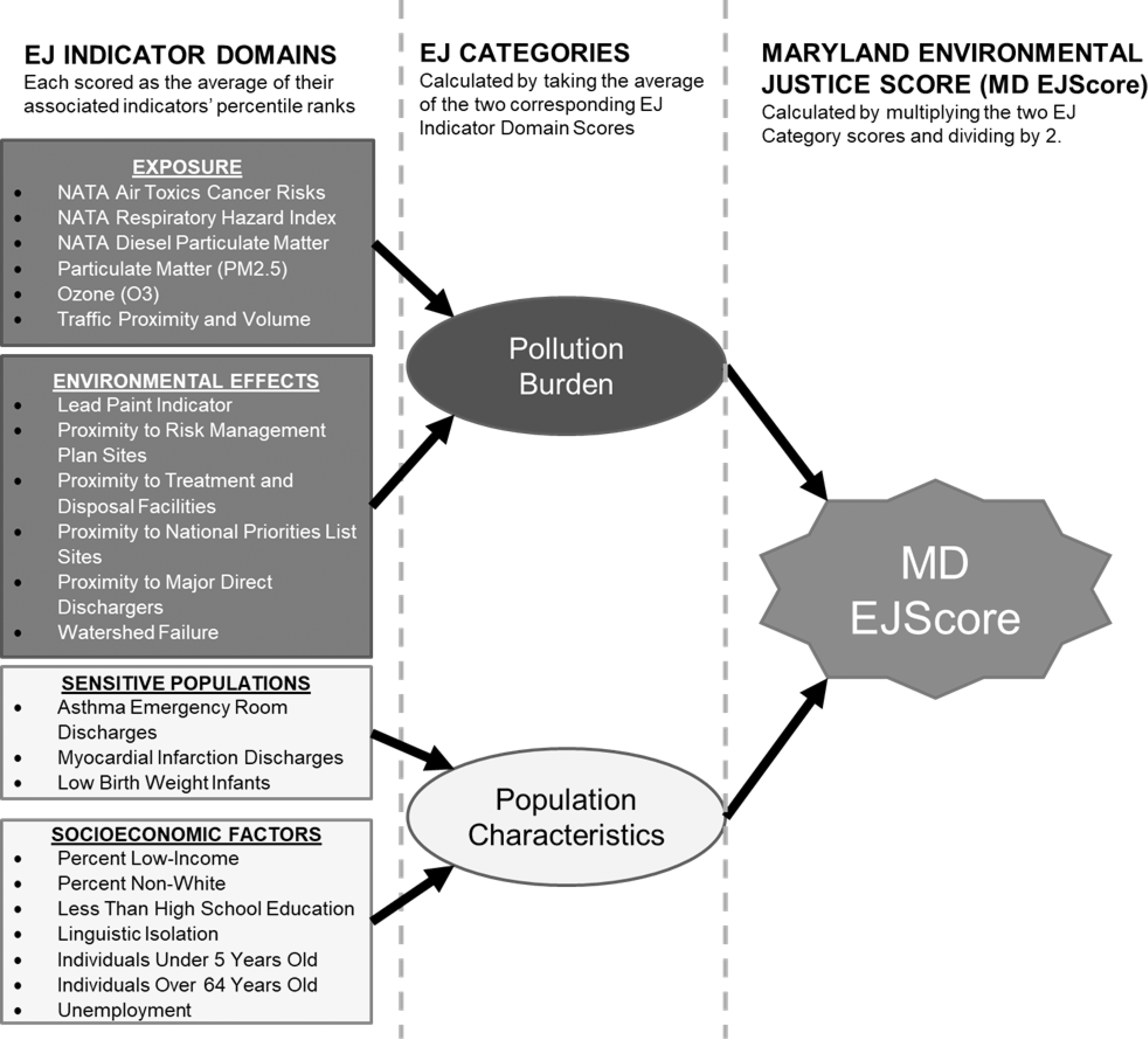
Scoring Methodology for MD EJSCREEN. Each census tract in Maryland is assigned a percentile rank across 22 environmental justice indicators, each belonging to one of four Environmental Justice Indicator Domains. The score for the domain is calculated as the average of their representative indicators. Domains are sorted into either of two categories. The Exposure and Environmental Effects domains are then assigned to the Pollution Burden Category, whereas the Sensitive Populations and Socioeconomic Factors domains are assigned to the Population Characteristics Category. Category scores are calculated as the average of their two representative domain scores. Finally, the overall MD EJScore is calculated by multiplying the Pollution Burden and Population Characteristics scores and dividing the product by 2.
This article discusses the latest improvements included in the tool's newest version—MD EJSCREEN v2.0. Four new features for visualizing and screening environmental justice (the Select and EJSCREEN Chart tool, Side-by-Side Map Viewer, Report Generator, and Base Map Gallery) are showcased and demonstrated. Furthermore, a case study analyzing the overall extent of environmental justice throughout Maryland (given by the MD EJScore) in addition to a specific highlight on highest and lowest scoring census tracts in Maryland illustrates the tools functionality to users across fields—from community members to policymakers to government officials. Archived versions of MD EJSCREEN v1.0 are available online for comparison to the newest version. 21 , 22
RATIONALE FOR DEVELOPING MD EJSCREEN v 2.0
MD EJSCREEN v1.0 was presented publicly before various stakeholder groups including the Prince George's County Planning Board as part of the 2018 Speaker Series 23 and a mixed audience of community members, researchers, and policymakers at the fourth and fifth University of Maryland Symposia on Environmental Justice and Health Disparities in 2018 and 2019, respectively. Feedback from these public demonstrations identified priority improvements to MD EJSCREEN v1.0 (Box 1).
PROCESSES USED TO UPDATE MD EJSCREEN
New data layers in v2.0
The data sources of each environmental justice indicator and scoring methodology for MD EJSCREEN v1.0 have been published previously and remain unchanged in MD EJSCREEN v2.0.
24
To address user feedback on the tool's loading speed and performance, the tool was migrated from the ESRI, Inc. ArcGIS® Online cloud server to a local on-site server at the University of Maryland Center for Geospatial Information Science. This greatly improved the responsiveness of MD EJSCREEN v2.0 with load-times reduced from >10 to <3 seconds. To expand the tool's spatial extent to encompass all of Maryland, shapefiles for each census tract in the state were downloaded from the U.S. EPA EJSCREEN resource page (
Additional context layers were gathered from various national- and state-level agency and institutional data sources including the Maryland Health Department, Maryland Department of Planning, Johns Hopkins University, and more (Table 1). All shapefile and database data underlying MD EJSCREEN v2.0 is open source and publicly available via our GitHub© repository. 25 Additionally, a tutorial for using the tool is now available at the MD EJSCREEN v2.0 website. 26
Additional Context Layers Available in MD EJSCREEN Versions 1.0 and 2.0
EPA, Environmental Protection Agency; HPSA, Health Professional Shortage Areas; MD EJSCREEN, Maryland Environmental Justice Screening Tool; MDOT, Maryland Department of Transportation; TRI, Toxic Release Inventory; USDA, U.S. Department of Agriculture.
Community Stakeholder Suggestions for Improving Maryland Environmental Justice Screening Tool Version 1.0
USES FOR MD EJSCREEN
The latest version of MD EJSCREEN includes four new function tools: the Selection and MD EJSCREEN Chart, Side-by-Side Map Viewer, Report Generator, and Base Map Gallery. These four functions represent a marked improvement in how MD EJSCREEN data can be visualized and translated into useful and meaningful formats for users. The following sections and figures illustrate how these tools can be used to identify an array of environmental justice concerns in Johnston Square, Baltimore, Maryland, and Churchville, Maryland—the highest scoring (least environmentally just) and lowest scoring (most environmentally just) census tracts in the state, respectively (Fig. 3).
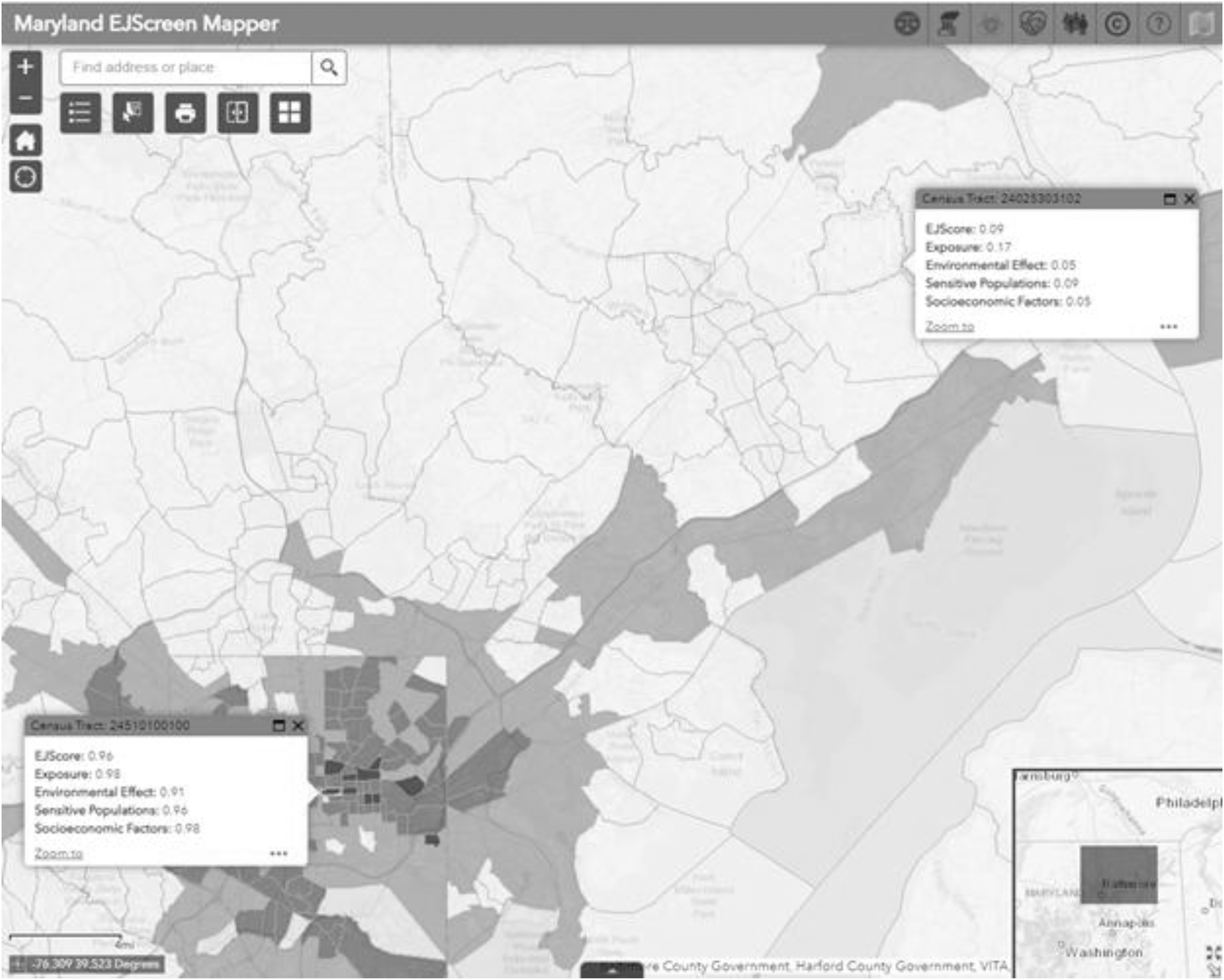
Highest and Lowest Environmental Justice Scoring Census Tracts in Maryland. This screen capture of the MD EJSCREEN highlights Johnston Square (bottom left) and Churchville (top right)—the highest and lowest scoring census tracts in Maryland, respectively. These two census tracts at opposite ends of the scoring distribution are ∼30 miles away from each other.
Select Function and MD EJSCREEN Chart
Selecting census tracts of interest is not a new feature in MD EJSCREEN v2.0, however, while selecting a census tract in the previous version of the tool only revealed a text box with the associated data, MD EJSCREEN v2.0 shows a series of bar charts that compare the selected tract's indicator domain score data to the median scores for the corresponding county and the rest of the state (Fig. 4). There is also a newly added function that allows users to select multiple census tracts at a time. This update adds to the tool's utility in identifying environmental justice concerns at scales relevant to communities and larger organizations because, while census tracts are more spatially specific than counties or zip codes, their population-based determination can limit their size to be smaller than a full neighborhood.
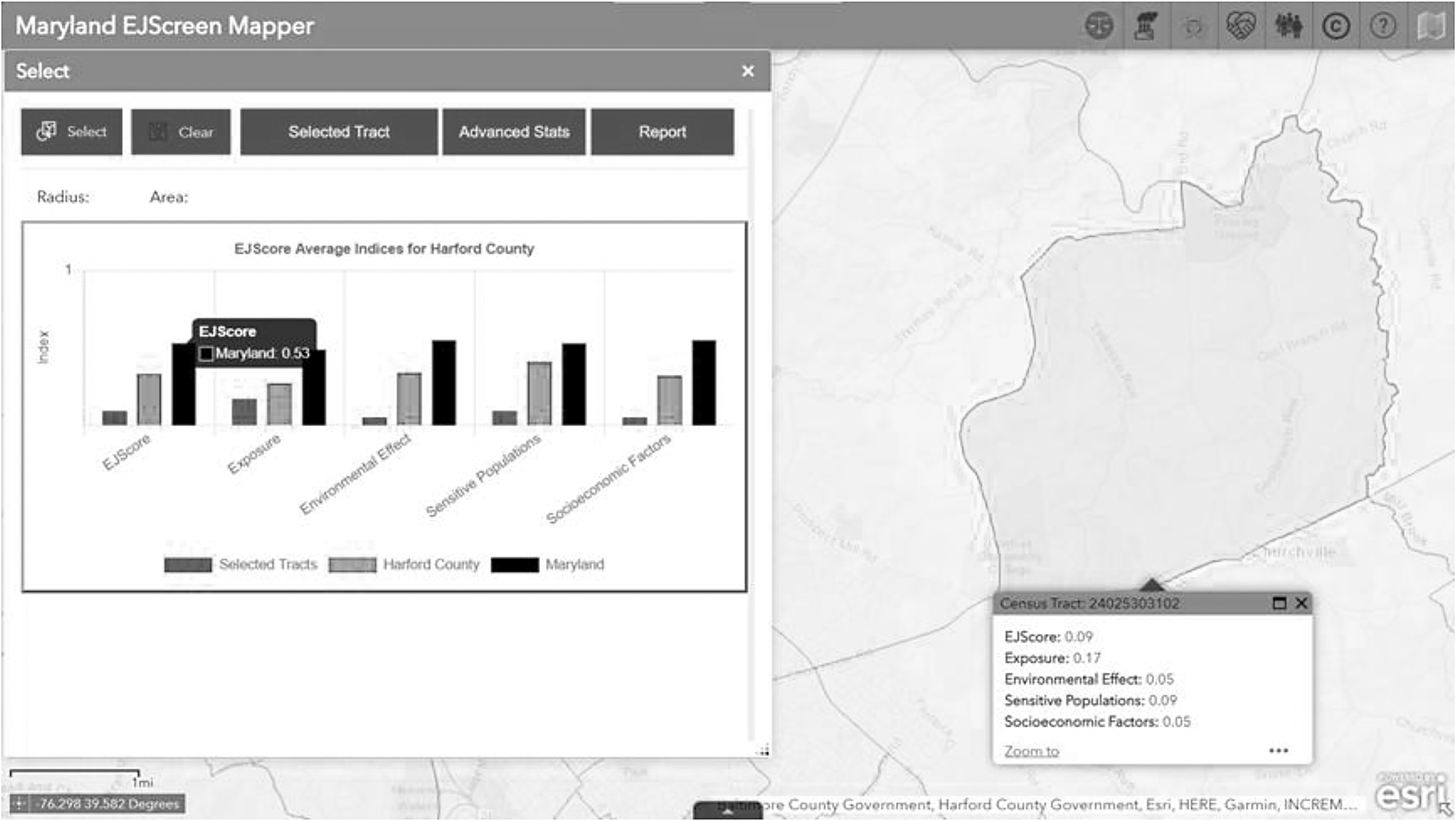
Select Function and MD EJSCREEN Chart. As in previous versions of the tool, users can click on any single census tract on the map to display a pop-up window (right) that provides scores for each of the four MD EJSCREEN indicator domains (Pollution Burden, Environmental Effects, Sensitive Populations, and Socioeconomic Factors). In the latest version, users can view this information as an automatically generated bar chart, comparing the selected tract to average scores for the tract's county as well as the state. Here, we see that Churchville, Maryland's MD EJScore (0.09) is far lower than the Harford County and Maryland medians. In fact, Churchville has low scores for each of the four environmental justice indicator domains, indication low pollution burden; low proximity to hazardous facilities; low prevalence of asthma, heart attacks, and low birth weight infants; and low proportions of socioeconomic disadvantage.
For example, Census Tract 24025303102, which represents northern Churchville and has a population of 2814, encompasses an area of 8.07 square miles. However, Census Tract 24510100100, representing central Johnston Square's population of 2233 people, has a square area of only 0.18 miles. In Baltimore's densely populated urban core, an 8 square mile circle with Johnston Square at its center would include 58 census tracts (Fig. 5).
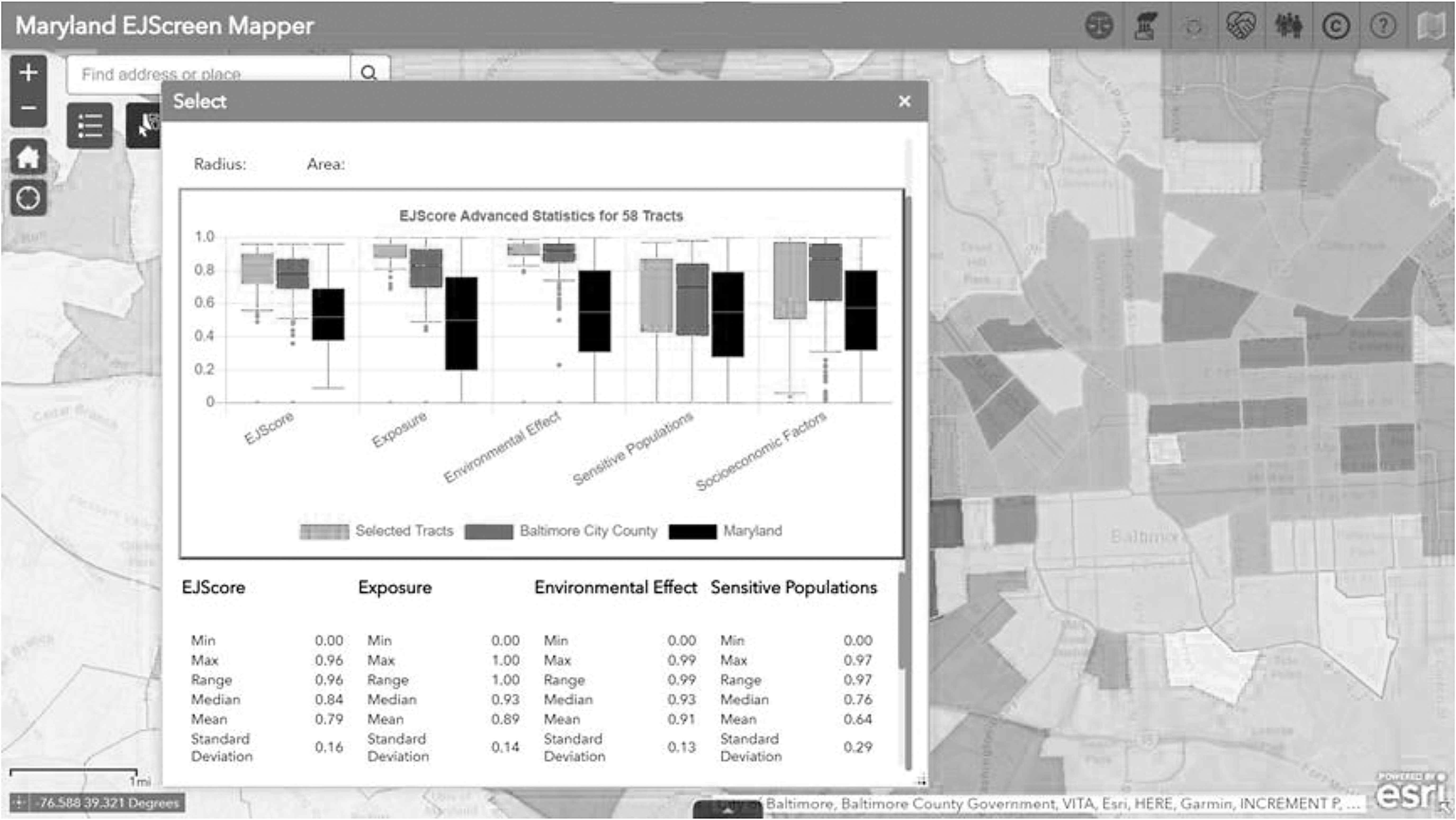
Selecting Multiple Tracts and Box Plot Data Visualization. Unlike the previous version, MD EJSCREEN allows users to select multiple tracts. When users draw a circle around the area of interest, the selection snaps to the census tract boundaries of the selected area (highlighted in purple above). The 58 census tracts selected here in Baltimore, Maryland, encompass approximately the same eight square mile area as the single census tract for Churchville, Maryland. Users can choose to view the data for the selected tracts as a box and whisker plot. By doing so, users can compare the spread of the data for the selected area to the spread of the same indicator data in the county and state. Note that the median for the 58 selected census tracts in Baltimore is higher than the medians for Baltimore City County and the state of Maryland.
Report Generator
The Report Generator function outputs a downloadable PDF with data on the selected census tract(s). In addition to providing a map and scale bar, the report also includes the bar chart or box plot shown in the main tool, as well as descriptive statistics values for the selected census tracts. These reports can be used as supplemental documentation to accompany grant submissions, legal and policy reports, white papers, and more. A sample report generated from the Johnston Square area selection in Figure 5 is included as a supplemental attachment to this article (Supplementary Appendix SA1).
Side-by-Side Mapping
See Figure 6.
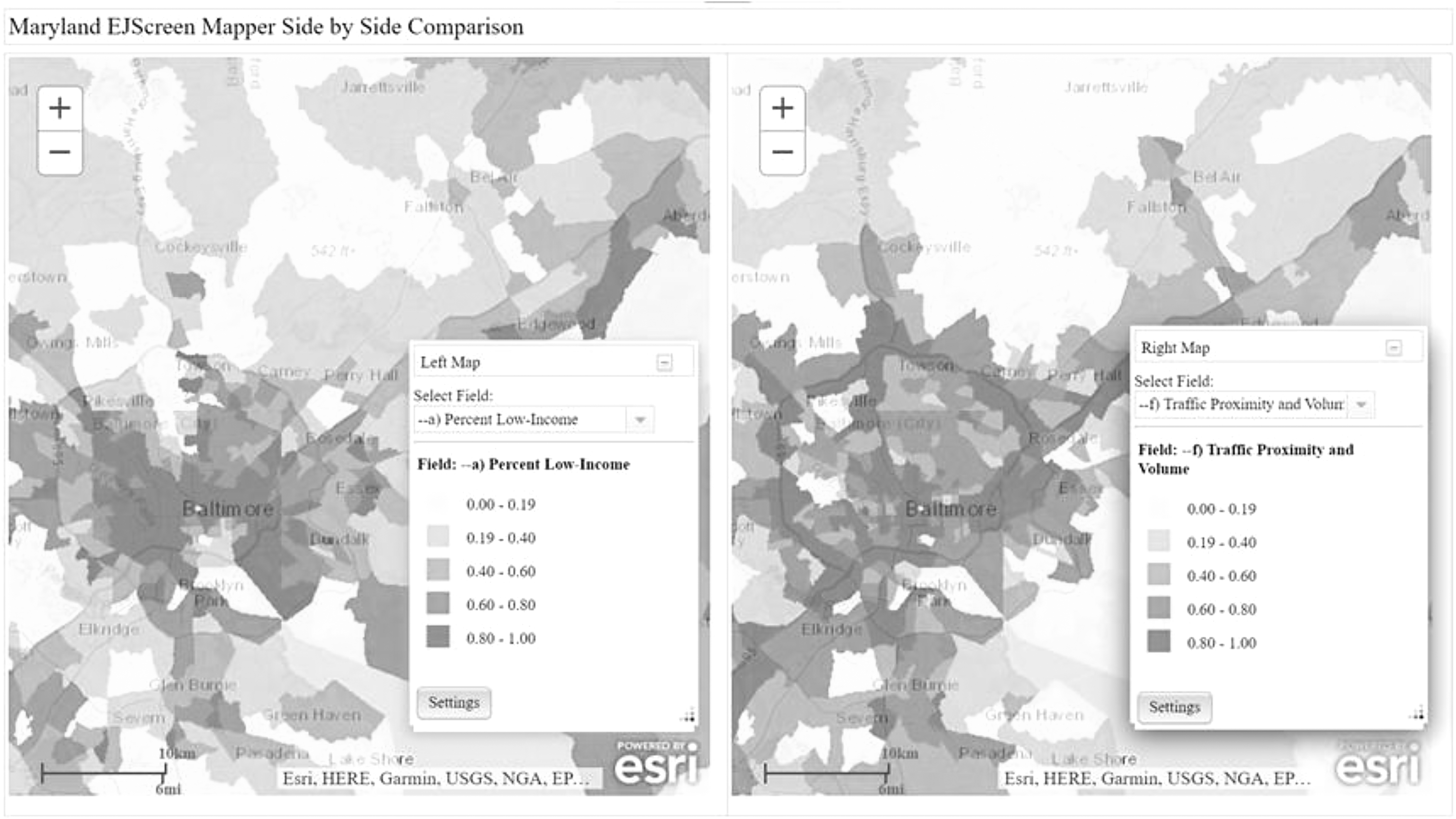
Side-by-Side Map Viewer. This function tool provides users with another way of visualizing overlapping features in MD EJSCREEN v2.0. Users can compare any of the indicators from the four scored domains to each other. This tool is useful in identifying overlapping burdens and disparities in Maryland communities. Above, Percent Low-Income (Socioeconomic Factors domain) and Traffic Proximity and Volume (Pollution Exposure domain) are shown side-by-side, revealing that the central census tract in Johnston Square, Baltimore, Maryland (bottom-left), is in the highest scoring class (80th—100th percentile) for each of the two indicators—indicating a double burden—while Churchville is in the lowest scoring class (0th–19th percentile) for both.
Base Map Gallery
See Figure 7.
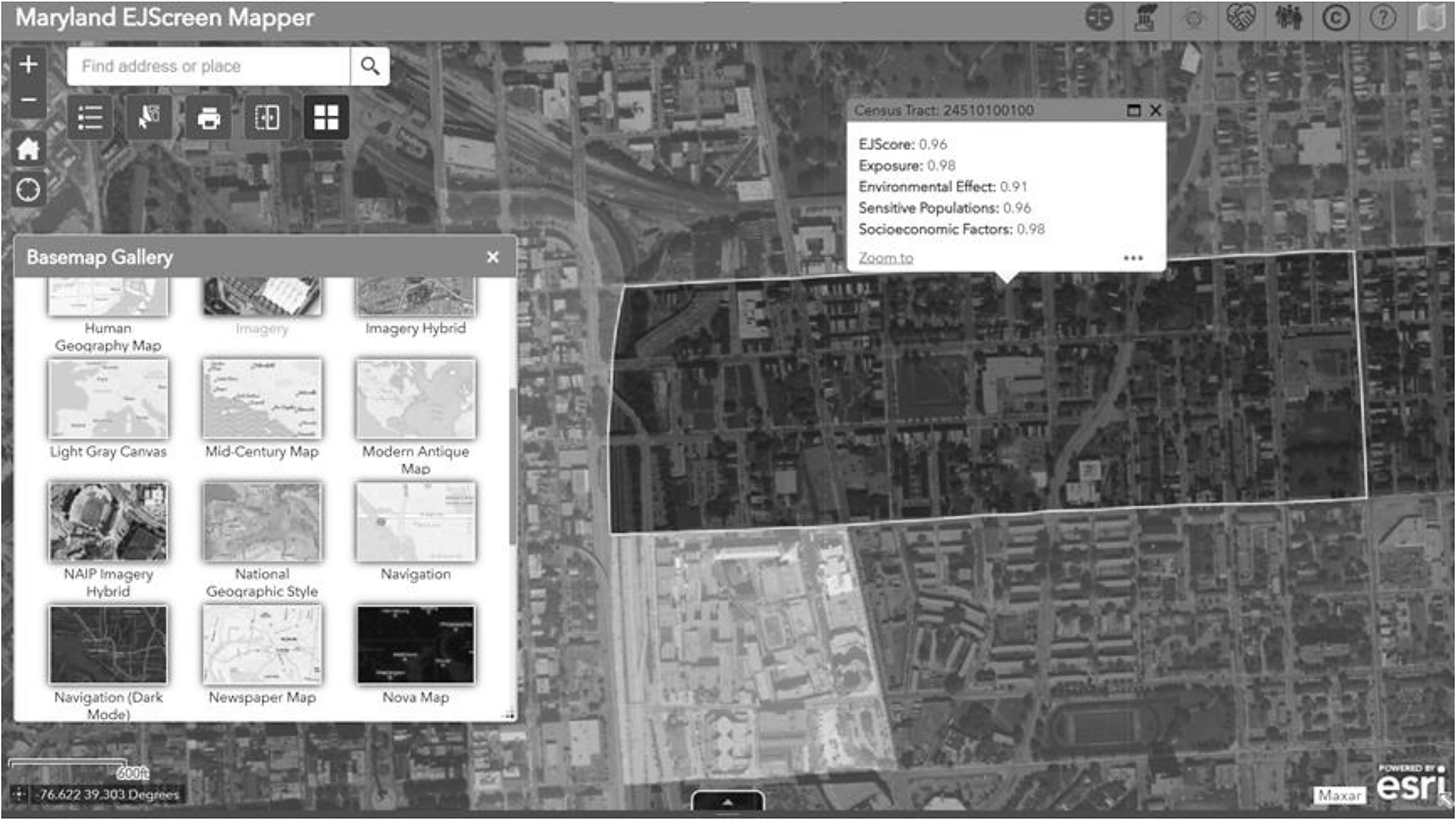
Base Map Gallery. This feature allows users to change the tool's underlying base map to any of the available selections in the ESRI© base map library. For example, the satellite imagery base map shown above allows for quick identification of residential neighborhoods (e.g., selected area), industrial or commercial areas (gray tract below selected area), green space, and roadways, in Johnston Square, Baltimore, Maryland. This is especially useful for locating potential industrial sites not marked by an existing layer. Adjusting the transparency slider (not shown) allows users to control the extent to which the active layer is displayed. ESRI, Environmental Systems Research Institute, Inc.
RELEVANT RESEARCH FINDINGS: MARYLAND'S CENSUS TRACTS WITH THE FEWEST AND MOST ENVIRONMENTAL ISSUES
As noted in the introduction, a higher MD EJScore indicates more environmental justice issues or concerns in a given census tract (i.e., census tracts with the highest scores can be considered to be the least environmentally just). Across Maryland's 1384 census tracts, MD EJScores range from 0.09 (most environmentally just) to 0.96 (least environmentally just) (Table 2). The mean and median MD EJScores for the state are relatively low—0.34 and 0.30, respectively. Examining the spread of the data, with particular attention paid to the 90th percentile and higher, reveals an exponential growth trend where the highest scores are nearly three times the median value (Fig. 8). On the opposite end of the spectrum, the lowest MD EJScore (0.09) is nearly three times less than the median for the state.
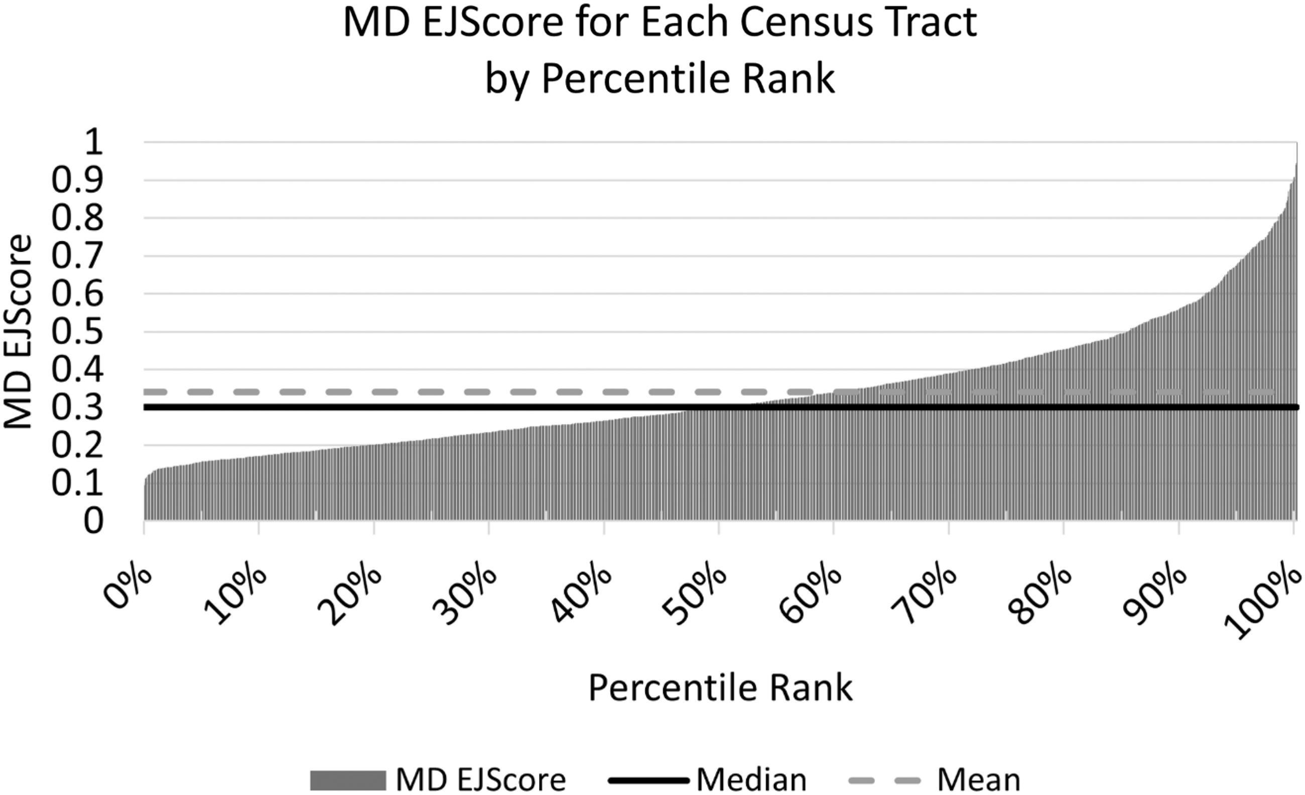
Distribution of Census Tracts' MD EJScores with Reference to the Median. The above chart shows that the distribution of MD EJScores is heavily skewed to the left, with 85% of Maryland census tracts scoring below 0.50. However, note the steep increase in scores above the median (0.30) and especially above 0.50. At the extreme, the census tracts scoring in the 95th percentile have MD EJScores that are at least 0.7, 2.3 times the median.
Summary Table for Maryland Environmental Justice Score (n = 1384 Maryland Census Tracts)
LIMITATIONS, LESSONS LEARNED, AND BEST PRACTICES
Even with the improvements implemented in MD EJSCREEN v2.0, limitations remain. In public health research, census tracts are used as proxies for neighborhoods, an approach that respects residents' rights to anonymity when investigating environmental concerns and health impacts. However, for some environmental justice issues such as green space, stormwater infrastructure, and pedestrian-friendliness (e.g., quality and availability of sidewalks, biking trails, walking trails), it is better to assess disparities at a lower unit of analysis. Therefore, future iterations of this tool will seek to include data at the census block group unit of analysis. Note that transforming data to model more spatial granularity can have its own challenges for data reliability and accuracy. 27
Currently, MD EJSCREEN shows bias toward environmental justice issues in urban counties rather than rural counties. This mainly due to the Pollution Burden: Exposure domain environmental indicators relying heavily on federally managed air pollution data. In fulfilling its mandate under the Clean Air Act, the U.S. EPA (and state agency proxies) monitors concentrations of criteria air pollutants in densely populated high traffic areas. 28 This approach can create regulatory gaps and misclassified air pollution exposure—especially in rural areas. 29 Secondarily, there are a number of environmental hazards located in Western Maryland, Southern Maryland, and the Eastern Shore that are not included in the tool as environmental indicators.
For instance, in Western Maryland, an area with traditional oil and gas extraction, oil and gas wells 30 are not included in the tool. Oil and gas extraction have been associated with air and water quality problems and public health impacts for local populations. Additionally, there are several communities differentially burdened by power plants, 31 pipelines, 32 and a natural gas liquefaction facility 33 in Southern Maryland. In the Eastern Shore region, more than 200,000,000 chickens are raised on industrial animal operations 34 producing 400,000 tons of manure each year. 35
These concentrated animal feeding operations can cause Campylobacter contamination 36 and release harmful chemicals including volatile organic compounds, endotoxins, PM2.5, among others. 37 , 38 While the MD EJSCREEN v2.0 Additional Context Layers (Table 1) do include location data for these industrial farming operations, they are not currently scored. Future iterations of the tool will seek to create new Environmental Effect data layers that reflect scoring based on proximity to these and other hazardous facilities in rural areas.
POLICYMAKING IMPACTS OF MD EJSCREEN v 2.0
MD EJSCREEN is one of many mapping tools that use GIS and PPGIS for environmental justice screening at the state level. Similar tools include the California Communities Environmental Health Screening Tool 3.0 (CalEnviroScreen), the Houston–Galveston–Brazoria region Environmental Justice screening tool (HGBEnviroScreen), and the Washington Health Disparities Map. CalEnviroScreen, which MD EJSCREEN is modeled after, utilizes the same four domains as the Maryland tool, but the specific indicators vary (e.g., the former includes indicators for Pesticide Use and Drinking Water Contaminants while the latter does not). Notably, the variables within the Socioeconomic Factors domain are very different between MD EJSCREEN and CalEnviroScreen.
While both include Unemployment, Linguistic Isolation, Low-Income Households, and Education Level, only MD EJSCREEN provides a race/ethnicity indicator (percent non-White) as well as indicators for education status, and age. The Washington Health Disparities Map was developed using the same four indicator domains and 19 variables included in the CalEnviroScreen. 39 As such, the Washington Health Disparities Map differs from the MD EJSCREEN domains and variables in the same way that CalEnviroScreen does. HGBEnviroScreen and MD EJSCREEN have similar domains, but HGBEnviroScreen includes flooding and environmental sources as well. Flooding is a feature not seen in other screening tools but is included due to the frequency of flood events in Texas's Gulf Coast communities. 40
As MD EJSCREEN provides data at different levels of spatial granularity (region, county, legislative district, and census tract), the tool has a wide array of applications for various stakeholders and decision makers. For example, county officials can utilize the tool to inform planning and zoning policy by (a) investigating and regulating pollution sources vis-à-vis the rules on setback ordinances, chemical storage restrictions, and chain-of-custody and emissions reporting mandates, and (b) implementing health-promoting infrastructure in areas of need (e.g., green spaces to mitigate air pollution and heat in highly urbanized communities).
The State legislature can use the tool to identify specific environmental justice threats at regional, county, and census tract levels—providing opportunities to design legislation that targets both broad action as well as the specific local needs of overburdened and underserved communities. Comparing EJScores across the state can also inform levels of climate change impact in both coastal and landlocked areas, an increasingly important measure for environmental policymakers and regulators.
There are also opportunities to use MD EJSCREEN in greenhouse gas tracking and reduction and the tracking of energy justice. For example, Washington uses its Environmental Health Disparities Map for the implementation of the Clean Energy Transformation Act, which acknowledges the clean energy needs of vulnerable populations. 41 In California, the government is required to “identify disadvantaged communities” and use this information in decision making (Senate Bill 619). 42 Data collected by CalEnviroScreen can be used to establish green zones, which provide a foundation for turning overburdened communities into healthy neighborhoods. 43 According to the Prince George's County Environmental Justice Plan 2025, 44 zoning officials have failed to recognize the importance of environmental justice issues in decision-making processes. The tool can be used to help modify zoning to improve access to green infrastructure and equitable development in overburdened and underresourced communities. 45
CONCLUSIONS
The updates to MD EJSCREEN allow for more in-depth analysis and visualization of environmental hazards, exposures, and population characteristics in and across different communities in the state of Maryland. Through the use of the updated Select and EJChart tools, an analysis comparing and contrasting all 24 counties showed disparities among different communities. Baltimore City showed the highest environmental justice with an EJScore at 0.86, with Prince Georges County following closely behind with a score of 0.6.
Based on these data, county officials and stakeholders should take into consideration the environmental justice issues in Prince George's County and Baltimore City when deciding where to allocate county funds and implement zoning initiatives that reduce hazards, improve health, and enhance quality of life in overburdened communities. Although environmental justice issues were shown in rural counties, MD EJSCREEN is biased toward urban areas. Future revisions to the tool should cover environmental justice issues in rural counties as well as urban counties.
Footnotes
ACKNOWLEDGMENTS
We thank the following graduate and undergraduate interns for data processing and literature review contributions: Coline Bodenreider, Menna Kassa, Alex Wang, Summer Khan, Noah Buchsbaum, Rami Homsi, Haley Mullen, Laura Schmidt, Jewel Aleshire, Jameela Rogers, Anna Brinley, Miranda Mlilo, and Juanita Richards. We also thank Sandra Olek and Kevin Coyne at the Maryland Department of Natural Resource for guidance and preliminary work on the original Park Equity Mapper tool. Finally, we thank Daniel Engelberg, original architect of MD EJSCREEN, for continued support and advising.
AUTHORs' CONTRIBUTIONS
All authors have read and approved this work.
AUTHOR DISCLOSURE STATEMENT
The authors have no conflicts of interest to disclose.
FUNDING INFORMATION
This work was supported by funding from the Maryland Department of Natural Resources and National Oceanic and Atmospheric Administration, Grant number 306-10B 14-19-2531 CZM 153. J.-M.J.A. was supported by NRT-INFEWS: UMD Global STEWARDS (STEM Training at the Nexus of Energy, WAter Reuse and FooD Systems) that was awarded to the University of Maryland School of Public Health by the National Science Foundation National Research Traineeship Program, Grant number 1828910.
SUPPLEMENTARY MATERIAL
Supplementary Appendix SA1