
Abstract

Designing a map is not a trivial task.
Kraak et al., 2020
Introduction
In recent years, many institutions of higher education have posted sustainability maps on the Internet. These maps typically highlight campus features and some even provide tours. One way to locate campus sustainability maps is through a resource-sharing platform such as the Campus Sustainability Hub provided by the Association for The Advancement of Sustainability in Higher Education (AASHE) (AASHE, n.d.). The resources in this hub include both maps posted by institutions and conference presentations about those maps. Maps may also be accessible via an Internet search.
To help with the process of designing our map, we conducted a two-part Internet search for campus sustainability maps. Our first search targeted institutions with similar enrollments, endowments, building space, and laboratory space—our peer institutions for the University of Wisconsin–Madison. Using data submitted in the Sustainability Tracking, Assessment and Rating System (STARS) reports (STARS, n.d.), we identified about two dozen peers, many of them state universities such as ours. Our second search was broader and by necessity, non-exhaustive. We browsed through the maps of another few dozen institutions with the intention of expanding our knowledge of what was out there.
From our searches, the maps of three institutions caught our attention: University of Washington (UW), George Mason University (GMU), and Cornell University (Cornell). The UW map was designed with layers organized by color and with sub-layer icons that depict the features (University of Washington, n.d.). The GMU map includes a social sustainability layer with campus features relating to well-being, food security, and gender identity (George Mason University, n.d.). The Cornell map includes ways for the public to appreciate nature, for example, a sustainable landscape trail (Cornell University, n.d.).
More generally in our review, we observed that the content of all the maps was largely environmental or economic, such as features related to buildings, infrastructure, energy, green spaces, public transportation, or recycling. These features were highly visible because these maps include organizational categories, labeled as layers. In contrast, less visible were features relating to social sustainability. Admittedly, social features are difficult to map in that they may be programs, events, or campus initiatives. Even so, we did find several examples connecting to social justice, diversity, and equity, including campus centers such as the Black Student Union and the Rainbow Room at St. Mary's College of Maryland (St. Mary's College of Maryland, n.d.) and community amenities such as public WiFi and public libraries around The University of Illinois Urbana-Champaign (Open Green Map, n.d.).
Sustainability Applying
Sustainability is defined in many ways, one of which is to name its three dimensions: economic, environmental, and social. For example, sustainability aims to “create and maintain conditions, under which humans and nature can exist in productive harmony, that permit fulfilling the social, economic, and other requirements of present and future generations” (U.S. Department of Energy, 1970). Given the deep human history of the land on which UW–Madison is situated, as well as the current campus activities of diversity, inclusion, and equity, we worked to make social sustainability features highly visible on our map.
Our research also pointed us toward the United Nations Sustainable Development Goals (SDGs). (See Figure 1.) The SDGs build upon the issues addressed in the Millennium Development Goals and approach sustainability from social, economic, and environmental dimensions (United Nations, 2015). Thus, the SDGs appeared an ideal starting point from which to organize our map. Others point out that the SDGs offer a “well-rounded angle from which to approach sustainability within learning and teaching” (Willats et al., 2018, p. 64).
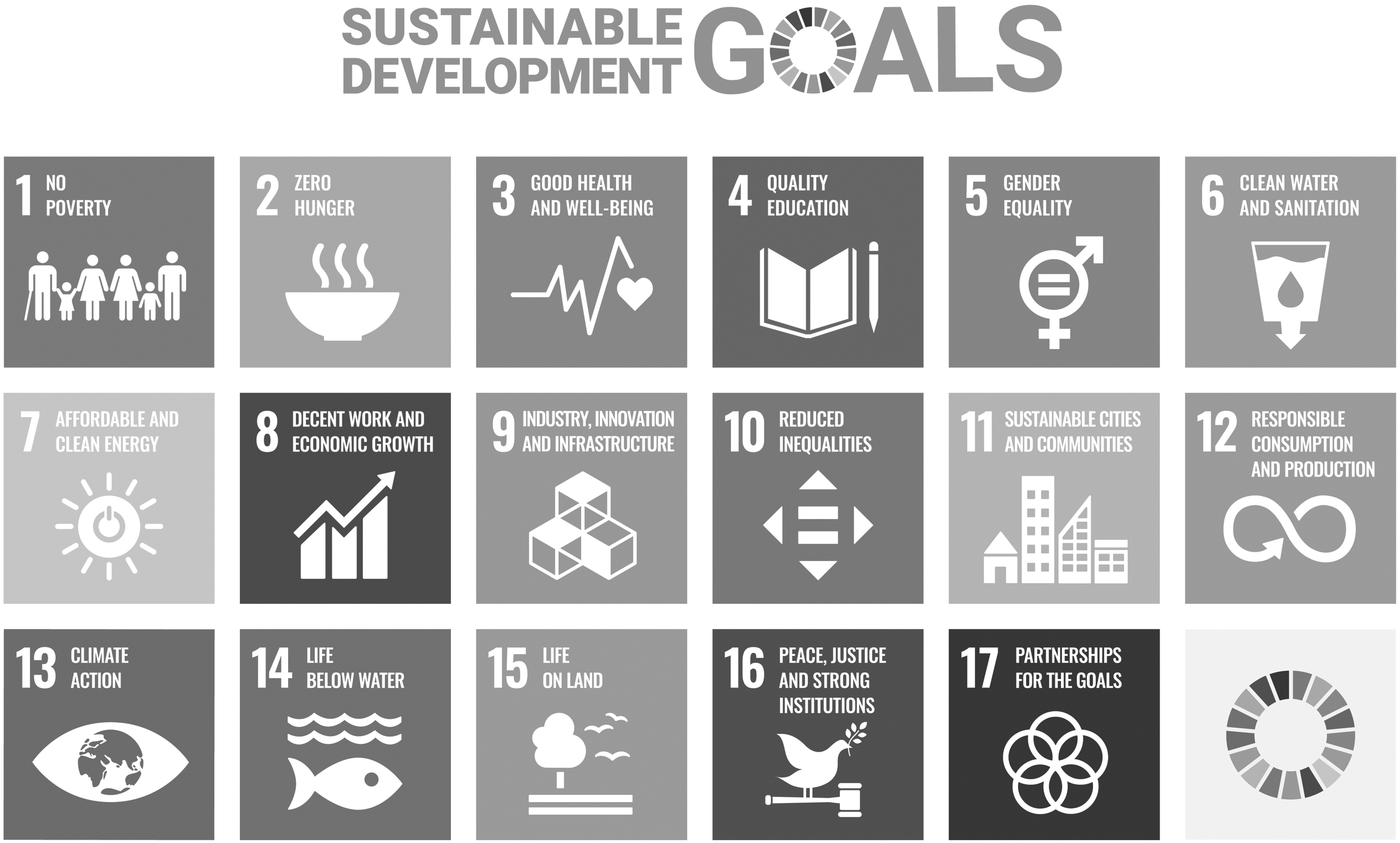
United Nations Sustainable Development Goals (United Nations, n.d.)
Our research turned up no campus sustainability maps with the SDGs as an organizing principle. However, we found several institutions that had connected the SDGs to teaching, learning, and research. A two-part project at Yale University's Office of Sustainability demonstrated the alignment of teaching and research with the SDGs and connected them to the work of higher education institutions (Goodall & Moore, 2019). Furman University offers an undergraduate course in which students develop a story map that they draw from “global models of sustainability,” such as the SDGs. Students analyze how sustainability principles impact a chosen location, thus encouraging them to connect the SDGs to local policies (Quinn et al., 2019). Instructors at the University of British Columbia are using the SDGs as a thematic framework for their introductory chemistry courses, reporting that the “SDG framework has been effective in promoting affective learning with regard to the relevance and societal importance of chemistry and in helping maintain student interest and engagement” (Petillion et al., 2019).
In addition, we found that professional organizations and disciplinary societies are using the SDGs. AASHE now features the SDGs in the most recent version of the STARS Technical Manual (ver. 2.2) in which the SDGs are “integrated and mapped to STARS subcategories and credits” (STARS, 2019). The American Chemical Society and the German Chemical Society partnered in 2020 to advance the SDGs, noting that “chemistry plays an essential role in helping society achieve the Sustainable Development Goals (SDGs)” (American Chemical Society, n.d.).
At this point, with a strong desire to include social sustainability and with a credible basis on which to organize the map, we were ready to begin the design process.
Design of the Map
The design process entailed multiple decisions including choosing the interface, selecting and organizing the features, and the choosing the artwork. Each decision was complicated, so we relied on the advice of experts: a guide from the University of Michigan (Shriberg, 2011) and Mapping for a Sustainable World (Kraak et al., 2020).
Choice of interface
Map interfaces offered both advantages and disadvantages. We chose Google My Maps (Google.com, n.d.) because of its straightforward editing capabilities, its familiar interface to the general public, and its availability at no cost. This interface allows up to 10,000 features that can be sorted in 10 layers, with a maximum of 2,000 features in a layer. However, My Maps predetermines many of the map elements, limiting the options of the designer.
Selection of features
Features are the heart of a map and its smallest unit. Our greatest challenge was deciding which features to include, and, of course, which to exclude. To be placed on the map, we decided that a feature must:
Connect to economic, environmental, or social sustainability Involve our students, staff, and/or faculty Maintain an uncluttered map Include a website where viewers could be directed Connect to one or more of the SDGs
In addition, we allowed features to be either physical (e.g., a building) or nonphysical (e.g., a program or event). Our decision to include nonphysical features necessitated compromise. For example, in considering how to place sustainability-related courses on our map, we recognized that we could not create a feature for each of the 60-plus academic departments that offered a sustainability course. Instead, we created a feature in the Quality and Accessible Education layer for the sustainability course attribute that our campus instituted in 2019. This feature links to a webpage that identifies all courses that carry the sustainability attribute (University of Wisconsin–Madison, 2019).
Although we strived for completeness, we recognized that a map is never finished. As a result, we included information on how viewers could suggest the addition of new features.
Organization of features
We needed to name the 10 layers in a way that would be helpful to our viewers. Our first attempt was informed by our research of existing maps, and we proposed Energy, Transportation, Buildings and Infrastructure, Academics, Student Engagement, Housing and Dining, Social Sustainability, Green Spaces, Wellness, and Waste Reduction. Although a useful first step, this organizational scheme appeared to us both arbitrary and unsystematic, so we then turned to the SDGs.
Number of features
Some features are located in more than one place. For example, our campus has dozens of sustainability-related student organizations. Similarly, we located dozens of stormwater best management practices. Clearly, the map would become crowded if we were to include all instances of a given feature. So whenever possible, we chose a single location of a feature and included a link to a website that listed additional locations.
Choice of artwork
The design and color of each icon required our attention. Ideally, an icon needed to be 1.) easily associated with its sub-layer, and 2.) readily distinguished from icons of other sub-layers. Although we had hoped to draw upon pre-existing logos from our campus Office of Sustainability, these were too detailed to serve as icons. So we utilized a collection that offered many graphics (Noun Project, n.d.). For color definitions, we used those from the SDG Guidelines (United Nations, 2020).
Choice of photographs
We sought a photograph to accompany each feature. Helpfully, Google Maps automatically provides publicly available photographs for each location that it recognizes. Also conveniently, these photographs are paired with a street address or other location data. However, not every location has an accompanying photograph, so we had to find and add ones wherever possible. Furthermore, some of the accompanying photographs did not match our features. For example, the automatic photograph for the feature Low Flow Toilet Retrofits (Bradley Residence Hall) showed the building itself, not the toilets. In this case and in others like it, we added a photograph (with photograph credit) taken during the project.
Choice of Layers
The maximum allowable number of layers in My Maps is 10, but there are 17 SDGs that we wanted to employ as layers. Because of the layer limit, only some SDGs could stand alone while others needed to be combined. We placed six SDGs in their own layer, sometimes modifying the name of the SDG to better match our campus features. If changed, the layer name is shown in parentheses.
Goal 4: Quality Education (Quality and Accessible Education)
Goal 7: Affordable and Clean Energy
Goal 9: Industry, Innovation, and Infrastructure (Innovative Design and Infrastructure)
Goal 12: Responsible Consumption and Production (Waste and Responsible Consumption)
Goal 13: Climate Action
Goal 15: Life on Land (Habitats, Gardens, and Preserves)
We assigned some SDGs their own layer either because the SDG had sufficient representative features or because we wanted to give prominence to a specific SDG. For example, we chose to place Goal 13: Climate Action in its own layer to emphasize the importance of climate action and to make visible that it was an area for potential development for our institution.
By necessity, some SDGs were paired with other SDGs. For example, three SDGs were combined to fit within the Equity and Justice layer: Goal 10: Reduced Inequalities; Goal 16: Peace, Justice, and Strong Institutions; and Goal 5: Gender Equality. Another example is the Healthy Lives layer, which combines Goal 3: Good Health and Well-Being, Goal 2: Zero Hunger, Goal 1: No Poverty, and Goal 8: Decent Work and Economic Growth.
Although it was easy for us to find campus features related to mental and physical health targets of Goal 3, it was difficult to find more than a handful of features related to Goal 2, Goal 1, and Goal 8. These represent additional areas of potential growth for our institution.
Case Study: The Map in the Classroom
After publishing the campus sustainability map on our Office of Sustainability website (University of Wisconsin–Madison, 2021), we were eager to see the map used as an educational tool. Accordingly, and for proof of concept, the map was integrated into an introductory environmental science course, Environmental Studies/Integrated Liberal Studies 126, Principles of Environmental Science. This course engages students in learning environmental science through site visits (e.g., tours on campus and in the wider community) and laboratory activities about campus sustainability initiatives.
With the COVID-19 public health crisis, the teaching team for the course needed an alternative for an existing hands-on assignment. Since the map provides a virtual resource for students to investigate campus sustainability, an assignment was created that put its features to use. This assignment had multiple parts, some of which involved exploring the map itself and others that had students visiting features shown on the map (as social distancing permitted). In part of the assignment, students identified and reflected upon map features that connected to social sustainability. The map proved to be an ideal fit with existing course content, and the teaching team is working to more fully integrate social sustainability into the curriculum.
Discussion
As might be expected, the campus sustainability map raised more questions than it answered. The following questions concern our mapping process.
How useful was Google My Maps?
We found Google My Maps to be a great mapping tool, as it is well-known, easy to edit, and easy to use. However, it had a few attributes that we could not modify, for example, the 10-layer limitation. Additionally, the icons for features in My Maps do not change size when the user zooms the map in or out. Finally, in places where multiple features were located at the same physical address, My Maps overlapped these features, making them hard to see.
How useful were the SDGs as an organizing principle?
For several reasons, we found the SDGs to be highly useful. First, they are a recognized set of categories with international standing. Second, they provided us with a rationale for which features to include. Third, they are extraordinarily well vetted and articulated in great detail.
Although the sustainability practices and projects on our campus were not designed with the SDGs in mind, we readily found connections. However, the SDGs were not a perfect fit. The SDGs have an international focus, and we chose a local focus that would include only features on our campus. For example, Goal 14: Life Below Water focuses on the oceans, seas, and marine resources. As our university is located in a state with a Great Lakes coastline, we paired Goal 14 with Goal 6: Clean Water and Sanitation, in a layer focused broadly on water resources.
What comes next?
A map is likely to be out-of-date the moment it is published. Thus, we will need to monitor the map, adding features, editing text, and updating website links. We anticipate that new map features will include tours currently in the planning stage, such as those of green infrastructure and cultural landmarks.
Ideally, we would want to obtain data about the map users, both who they are and which features most interest them. It is possible to collect data about users' viewing habits from the Office of Sustainability. My Maps tracks and displays the total number of times the map has been viewed. It is also possible to collect data about users' viewing habits from the Office of Sustainability. For example, the Office of Sustainability could add an optional survey on its webpage to gather data about users. If the data reveals users who are new to campus or to sustainability, we could tailor a future map for these audiences. Such a map could contain additional background information on campus features to convey the introductory principles of sustainability.
We also want to promote the campus sustainability map as an instructional tool, both in and out of the classroom. For example, we could contact instructors who are teaching courses that are designated as sustainability-related (University of Wisconsin–Madison, 2019) and suggest activities for including the map. We also could introduce the map to new student interns at the Office of Sustainability, providing a walking tour to accompany the map. Finally, the map could be used each summer during new student orientation to introduce both students and their parents to sustainability-related features, again providing a walking tour on campus.
“Mapping the SDGs is one of the many ways to share our insights and perspectives—to help us talk to one another as global citizens—and such conversation has no end date or finish line” (Kraak et al., 2020, p. 121). Our map will continue to grow, as will our campus commitment to sustainability. We provide this roadmap of our journey to those currently designing or updating their own sustainability maps, and we invite collaboration.
Footnotes
Acknowledgments
We thank our colleagues at the UW–Madison Office of Sustainability for their support in developing a campus sustainability map. We especially appreciated the suggestions from Professor Andrea Hicks, Dr. Nathan Jandl, Ian Aley, and Jason Gallup. We also thank our colleagues at the UW–Madison Nelson Institute for Environmental Studies for their support of student sustainability projects over the years.
Funding Information
No outside funding was received.
Author Disclosure Statement
All authors of this article assert that no competing financial interests exist.