
Abstract
An extensive literature has described U.S. food insecurity and its determinants, but there has been little work on the geographic distribution of food insecurity and no work on the distribution of private food assistance by geography. To study the former, we use data from the Map the Meal Gap (MMG) project, which is broken down by Rural-Urban Continuum Codes. For the latter, we combine MMG data with data from the Hunger in America 2014 (HIA 2014) survey to determine the geographic distribution of charitable food assistance. At the national level, we find few differences across the rural-urban interface, but we do find differences within and across regions. We also find that regardless of how it is measured, the distribution of charitable food assistance is directed more toward counties with smaller populations—a finding that holds even after controlling for factors that influence the distribution of charitable assistance.
Food insecurity has become a leading health and nutrition issue in the United States. The magnitude of the problem is staggering: in 2014, more than 48 million Americans (15.4 percent) were food insecure (Coleman-Jensen et al. 2015). About one-third of these individuals experienced a more serious level of food insecurity: very low food security. A vast literature has also demonstrated that numerous negative health consequences are associated with food insecurity (see Gundersen and Ziliak [2015] for a review). As might be expected, these negative health consequences are also associated with higher health care costs (Tarasuk et al. 2015).
The probability of being food insecure is not evenly distributed across the U.S. population, but research in this field has not shown that the uneven distribution correlates to whether one lives in a metropolitan or nonmetropolitan area. Since 2009, for example, the food insecurity rates in nonmetro areas have been only 1.1 percentage points higher, on average, than in metro areas. This is perhaps surprising given other work that has shown worse conditions in rural areas over dimensions such as poverty (see, e.g., Lichter et al. 2008; Peters 2012) and health (see, e.g., Auchincloss and Hadden 2002; Burton et al. 2013; Simmons et al. 2008; Vargas, Ronzio, and Hayes 2003). One reason why research has shown such small differences in food insecurity across the rural-urban divide is that studies have generally relied on the coarse, standard nonmetro/metro designations found in datasets such as the Current Population Survey (CPS).
To address food insecurity, the federal government uses multiple food assistance programs. Particularly important is the Supplemental Nutrition Assistance Program (SNAP; formerly known as the Food Stamp Program). The program is large both in terms of number of people reached (about 47 million people in 2014) and the maximum benefit levels (almost $650 for a family of four); it has proven to be an enormously successful program across numerous dimensions. In particular, research has demonstrated that SNAP recipients are upwards of 20 percent less likely to be food insecure than eligible nonrecipients (Kreider et al. 2012; for more on SNAP, see Bartfeld et al. 2015). The majority of food banks engage in SNAP application outreach and assistance, and food banks that serve rural counties may prioritize these efforts since the benefits allow low-income residents to access food through existing retail outlets that they are likely to visit.
While SNAP is the largest component of the social safety net against food insecurity, charitable food assistance programs also play a critical role in helping to relieve food insecurity. However, whether these charitable food assistance programs are truly directed toward areas in need remains an open question. There is evidence that rural areas are less well-served with respect to some services such as health care (see Aday, Quill, and Reyes-Gibby 2001; Fields, Bigbee, and Bell 2016; Kaufman et al. 2016) and banking (see Tolbert et al. 2014). The most common charitable feeding programs operating in rural areas are traditional food pantries and mobile food pantries. The latter model often involves delivering grocery products to temporary, but central, locations for direct distribution to clients and can be particularly suitable in rural areas. Nevertheless, many food banks report that serving rural counties involves operational and logistical challenges and can require substantial resources.
In this article, we use results from Map the Meal Gap (MMG)—a project of the nonprofit organization Feeding America—to address the following unanswered question: How do food insecurity rates differ by Rural-Urban Continuum Codes 1 across the United States? We also use data from MMG combined with data from the Agency and Program Surveys of the Hunger in America 2014 (HIA 2014) study to analyze the distribution of charitable food by Rural-Urban Continuum Codes across the United States.
Methods and Data
To address our first question of how food insecurity differs across the rural-urban continuum, we use data from Feeding America’s MMG project (described below). First, we analyze the data using the nine Rural-Urban Continuum Codes, and because there may be differences by region of the country, we further break things down into the four standard regions—South, West, Midwest, and Northeast. 2 We then move on to our second question: How does charitable food distribution differ across the rural urban continuum? First we provide descriptive information at the county level, using three measures of food bank coverage (described below). We then use a multivariate framework to consider the relative roles of population, food insecurity, Rural-Urban Continuum Codes, region, and size in determining food bank coverage by county. The distribution of the rural-urban continuum, along with food bank locations, is found in Figure 1.
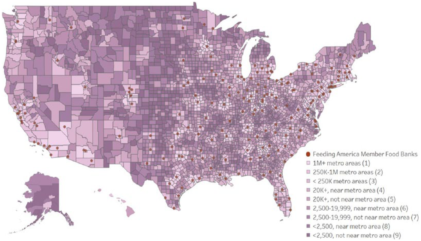
Counties by Rural Urban Continuum Code
Background: Measuring food insecurity
The Core Food Security Module (CFSM) was established in 1996 as a means of establishing the food insecurity status of a household. The measure is based on a set of eighteen questions for households with children and ten questions for households without children. Examples of questions include: “I worried whether our food would run out before we got money to buy more” (the least severe item); “Did you or the other adults in your household ever cut the size of your meals or skip meals because there wasn’t enough money for food?” “Were you ever hungry but did not eat because you couldn’t afford enough food?” and “Did a child in the household ever not eat for a full day because you couldn’t afford enough food?” (the most severe item for households with children). (A complete list of questions can be found in Coleman-Jensen et al. 2015.) Each question is qualified by the stipulation that the outcomes are due to financial issues.
Based on criteria established by the U.S. Department of Agriculture (USDA), households are then delineated into official food insecurity categories based on responses from the CFSM. This is under the assumption that the number of affirmative responses reflects the level of food hardship experienced by the family. 3 The following thresholds are established: (1) food security (all household members had access at all times to enough food for an active, healthy life); (2) low food security (at least some household members were uncertain of having enough food, because they had insufficient money and other resources for food); and (3) very low food security (one or more household members were hungry, at least some time during the year, because they could not afford enough food). A household is said to be food insecure if they fall into the second or third category.
Map the Meal Gap
While the food insecurity rates for some counties can be calculated directly using information from the Current Population Survey (CPS), in most cases, either a county is not identified in the CPS or the sample size is too small to provide meaningful food insecurity rates. To obtain estimates of food insecurity rates for all counties in the United States, then, Feeding America conducts an analysis as part of its annual MMG study. This is done through a two-step process, which is described in the appendix.
A map of MMG results can be found in Figure 2. As seen, there is enormous geographic variation in food insecurity rates across the United States. For example, rates range from relatively low in the upper Midwest to quite high in the Mississippi Delta, Appalachia, and on American Indian reservations.
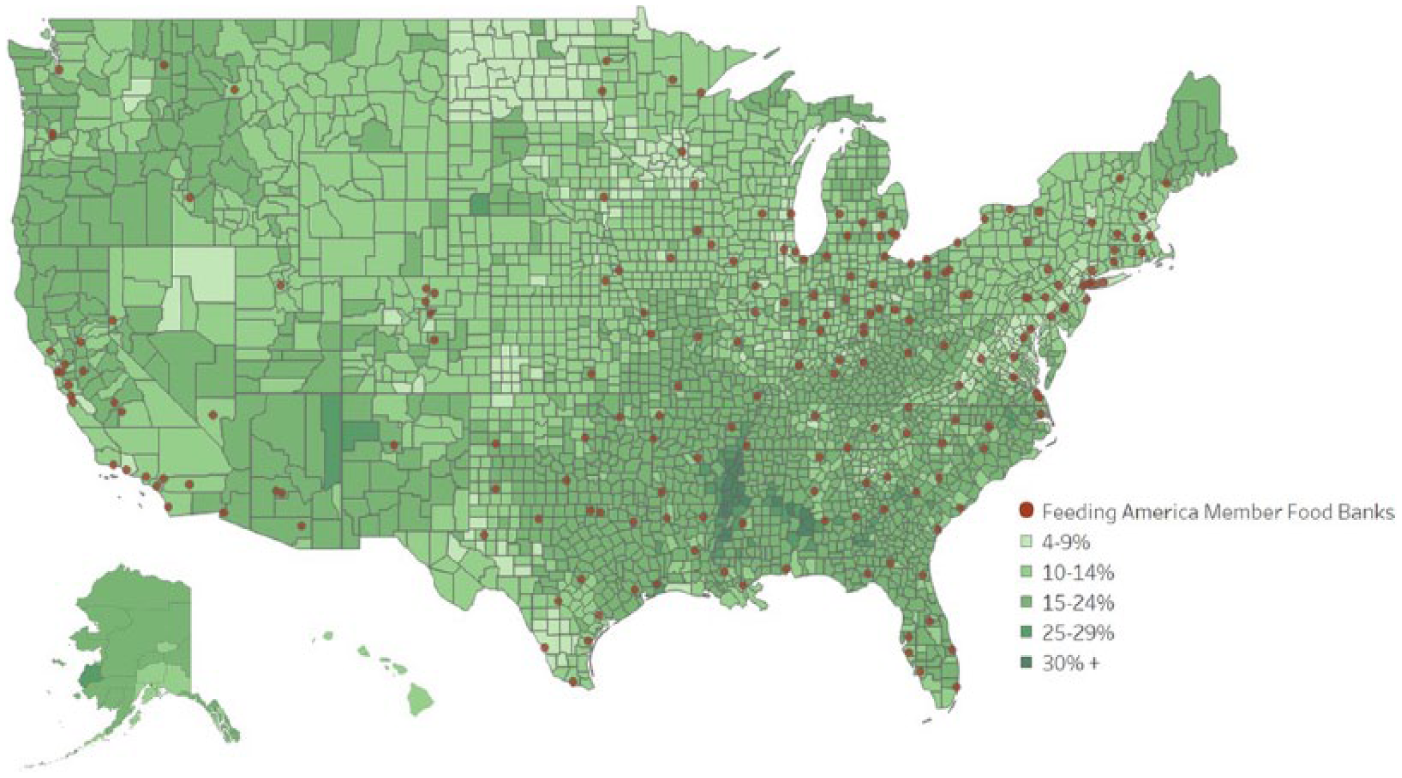
Percentage of People per County Who Are Food Insecure, 2014
Hunger in America
HIA 2014 is the latest in a series of quadrennial studies that provides comprehensive, nationally representative demographic profiles of people seeking food assistance through the charitable sector and in-depth analyses of partner agencies in the Feeding America network. 4 There are three components to HIA 2014. There is a client survey, which is based on a nationally representative sample of clients who use Feeding America food banks. There is also an agency survey and a program survey. The former is a census of all the partner agencies of all participating food banks, and the latter is a census of all programs in all participating food banks. More than 32,000 partner agencies completed the agency survey, which asked detailed questions about partner agencies’ services, capacity, and food distribution, including a specific set of additional questions about each meal, grocery, and food-related benefit program operated by the partner agency. The program-specific questions that were asked covered topics including schedule of operations, volunteer utilization, sources of food, intake procedures, and program facilities, among others. These additional questions are what are used to establish the information in the program survey.
Based on information from HIA 2014, we define three measures of service by food banks and their partner agencies. The first is the number of food-providing locations per person in the county. 5 Under this definition, a location providing food for, say, one day per month is treated the same as a location providing food five days per week, every week. To address this differential access, which may influence the ability to procure food, our second measure is the number of days that food programs are open. Responding agencies are asked about the number of days they are open and, in some instances, this yields a specific number that can be aggregated to the annual level (e.g., open once a week). In other cases, the responses are in categories and, in those instances, we assign the number of days per year as roughly the midpoint of these categories (e.g., open certain days each month). 6 Our third measure considers the number of pounds available in food bank agencies. 7 Unlike the previous two measures, which are defined by programs, this one is defined at the agency level. Because agencies do not get all of their food from food banks, this is adjusted by the proportion of food supplied from other sources by agency. For example, if an agency reports that they get 50 percent of their food from the food bank, the total number of pounds said to be supplied from that agency is doubled. In an effort to compare across counties of different sizes, we normalize these three measures by the population and by the food insecure population in those counties.
Results
Our central findings are threefold. First, at the national level, food insecurity rates are relatively similar across rural and urban areas. While this is true at the national level, when we break things down by region, there are differences across the rural-urban divide. Third, and perhaps contrary to expectations, the distribution of charitable food assistance is, on average, actually more directed toward counties with smaller populations. This holds even after controlling for other factors that influence the distribution of charitable assistance.
Distribution of food insecurity by Rural-Urban Continuum Codes
In Table 1, we display average food insecurity rates by Rural-Urban Continuum Codes. To give some context for the distribution of counties, the number of counties within each category is found in the first column. Nonmetro counties containing between 2,500 and 20,000 people, adjacent to a metro area, have the largest number of counties (593), while nonmetro counties containing 20,000 or more people, not adjacent to a metro area, have the smallest (92). In the second column, the average population for each category is displayed. These decrease monotonically in size. In counties in metro areas containing 1 million or more people, the average population is almost 400,000, while completely rural counties or those with an urban population of less than 2,500 and not adjacent to a metro area have an average population of 6,125. In the next column, the average size of the counties is displayed in square miles. Here, there is no clear relationship across the rural-urban divide. Instead, the largest counties are those with an urban population of 2,500 to 19,999 people, not adjacent to a metro area (1,777 square miles) and the smallest are those in metro areas with at least 1 million residents (653 square miles).
Descriptive Statistics and Food Insecurity Rates by Rural-Urban Continuum Codes
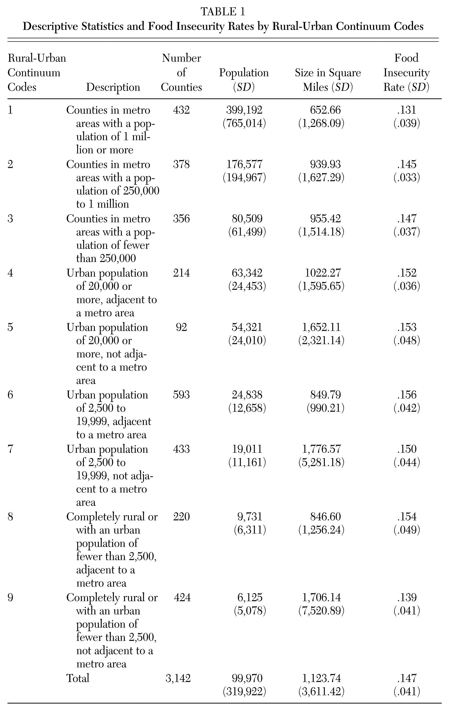
In the final column we consider the food insecurity rates. The highest are found in counties with an urban population of 2,500 to 19,999, adjacent to a metro area. However, the rate there (15.6 percent) is not that much higher than the lowest—counties in metro areas with a population of 1 million or more (13.1 percent). 8
In Table 2, we break things down by region. As seen in the first four columns, there is substantial variation in the average population of counties. For example, in counties in metro areas of 250,000 to 1 million people, that are in the South, the average population is 133,685; while for those in the West it is 326,620. In looking at the overall averages, the final row, the Northeast has by far the highest (257,171), while the South has the smallest (82,504).
Food Insecurity Rates by Rural-Urban Continuum Codes and Region of Country
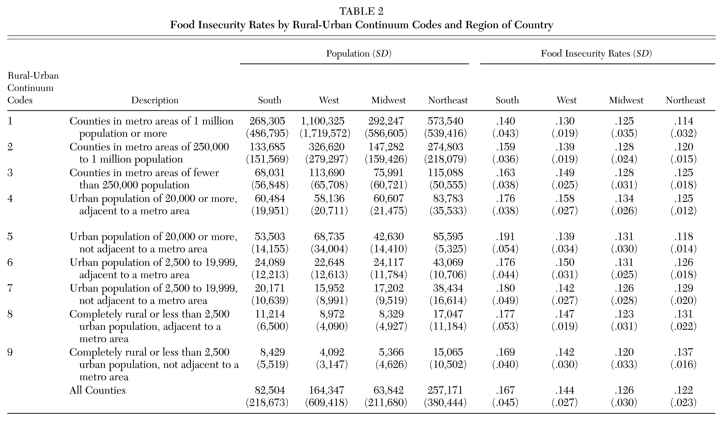
Turning to the final four columns where the food insecurity rates are displayed, the overall rates are higher in the South and West (16.7 percent and 14.4 percent) versus the Midwest and Northeast (12.6 percent and 12.2 percent). Within these areas, the highest average rate (19.1 percent) is found in the South in counties in nonmetro areas with an urban population of 20,000 or more, not adjacent to a metro area. This is substantially higher than the lowest (11.4 percent), in Northeast counties in metro areas with a population of at least 1 million. Within regions, the highest average food insecurity rates in the South are in counties in metro areas with an urban population of 20,000 or more, not adjacent to a metro area (19.1 percent); the highest are found in counties in nonmetro areas with urban populations of 20,000 or more, adjacent to a metro area in both the West (15.8 percent) and Midwest (13.4 percent); and in the Northeast, the highest rate is found in counties in nonmetro areas that are completely rural or have an urban population of fewer than 2,500, not adjacent to a metro area (13.7 percent). Consistent with what we find at the national level, the lowest food insecurity rates are found in counties in metro areas with populations of at least 1 million in the South (14.0 percent), West (13.0 percent), and Northeast (11.4 percent). In the Midwest, in contrast to the Northeast, counties in nonmetro areas that are completely rural or have an urban population of fewer than 2,500 and not adjacent to a metro area have the lowest rate (12.0 percent).
Locations of food pantries
A central goal of the Feeding America network is to provide services that reach all Americans in need, irrespective of where they reside. This often entails trade-offs between having enough resources in areas of high population density while also being able to reach less densely populated areas. In Table 3, we consider this issue based on our first two measures—the number of food service providers per capita and the number of days that food providers are open per capita. Before turning to the results, three caveats are in order. First, food banks had the option of participating or not participating in HIA 2014. As a consequence, not all counties are represented in the data, and the number of counties is fewer than found in MMG. However, more than 90 percent of Feeding America member food banks did participate. The number of counties included in each Rural-Urban Continuum Code is found in column (1). Second, there are some counties where, despite their inclusion in HIA 2014, no food was provided under the definitions discussed above. There are several possible reasons for this. Among them, some counties may not be home to a food-providing program but residents of those counties may visit programs in neighboring counties or be served by mobile distributions that originate in other counties. Alternatively, some counties may be unrepresented due to agency/program nonresponse. Third, our measures at the county level are aggregate measures. As such, they cannot account for factors such as distance to services, disproportionate distribution of food within a county, transportation barriers, and whether participants’ schedules allow them to visit the program(s) during the hours that they are open. While the simple existence of food programs is important, the extent to which people can and do access those programs is an important aspect that needs to be considered as well.
Coverage of Feeding America Food Provision Services by Rural-Urban Continuum Codes: Information at the Program Level
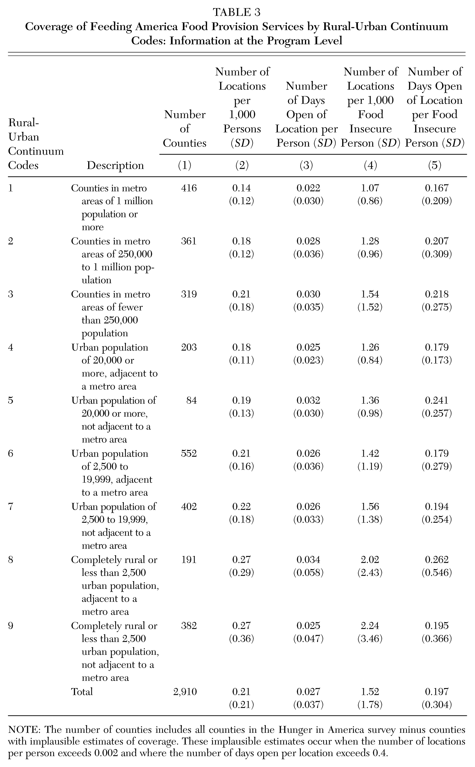
NOTE: The number of counties includes all counties in the Hunger in America survey minus counties with implausible estimates of coverage. These implausible estimates occur when the number of locations per person exceeds 0.002 and where the number of days open per location exceeds 0.4.
In columns (2) and (3), we portray the measures for which the denominator is the population of the county. Perhaps contrary to expectations, we find that more rural counties have higher coverage rates than more urban counties. For example, consider a comparison of counties in metro areas with a population of 1 million or more (the lowest) with counties in rural areas with a population of fewer than 2,500 that are not adjacent to a metro area (the highest). There are 1.4 locations for every 10,000 people in the former versus 2.7 locations in the latter. When we consider this comparison for number of days open per county, things change slightly. Metro areas with a population of 1 million or more still have the lowest degree of coverage—22 days for every 10,000 people; but this is only slightly different than counties in rural areas with an urban population of fewer than 2,500 and that are not adjacent to a metro area—25 days for every 10,000 people (p-value of .057). Under this measure, counties in completely rural areas or less than 2,500 urban population, adjacent to a metro area, have the highest—34 days for every 10,000 people.
In columns (5) and (6), we consider a different denominator, the number of food insecure persons. When looking at either metric of service, the ordering is roughly the same as when the denominator is the number of persons.
In Table 4, we consider the distribution of pounds of food per county. The results largely mimic Table 3 in terms of the distribution found there by number of days of service albeit the relative difference between the counties with the least coverage and the counties with the most coverage is smaller. Namely, counties in metro areas with a population of 1 million or more have the lowest number of pounds distributed per person (10.33), and counties in rural areas with an urban population of fewer than 2,500 that are not adjacent to a metro area have the highest (13.27).
Coverage of Feeding America Food Provision Services by Rural-Urban Continuum Codes: Information at the Agency Level
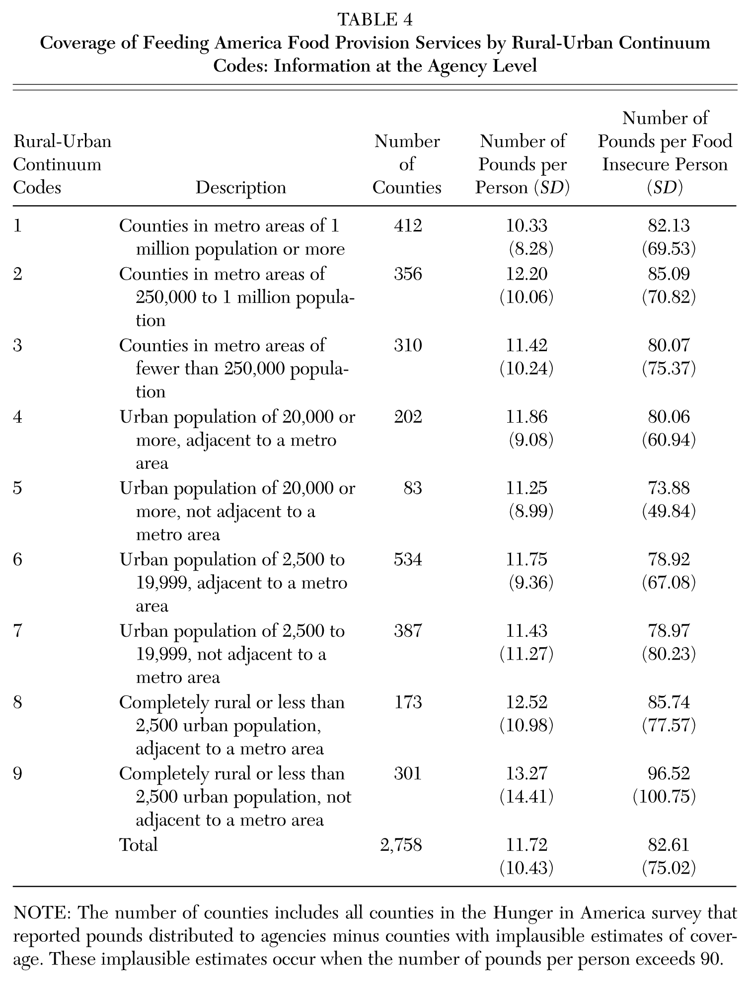
NOTE: The number of counties includes all counties in the Hunger in America survey that reported pounds distributed to agencies minus counties with implausible estimates of coverage. These implausible estimates occur when the number of pounds per person exceeds 90.
We now turn to our multivariate results in Tables 5 through 7. In each table we consider in the first column the impact of total population and the number of food insecure persons, both in logs. In the second column, we add in category variables for each of the Rural-Urban Continuum Codes, with counties in metro areas with a population of 1 million or more as the omitted group. In the third column we add in two other factors that may influence the outcome—the region of the country (South is the omitted category) and the size of the county in logs.
Determinants of Number of Feeding America Food-Providing Locations
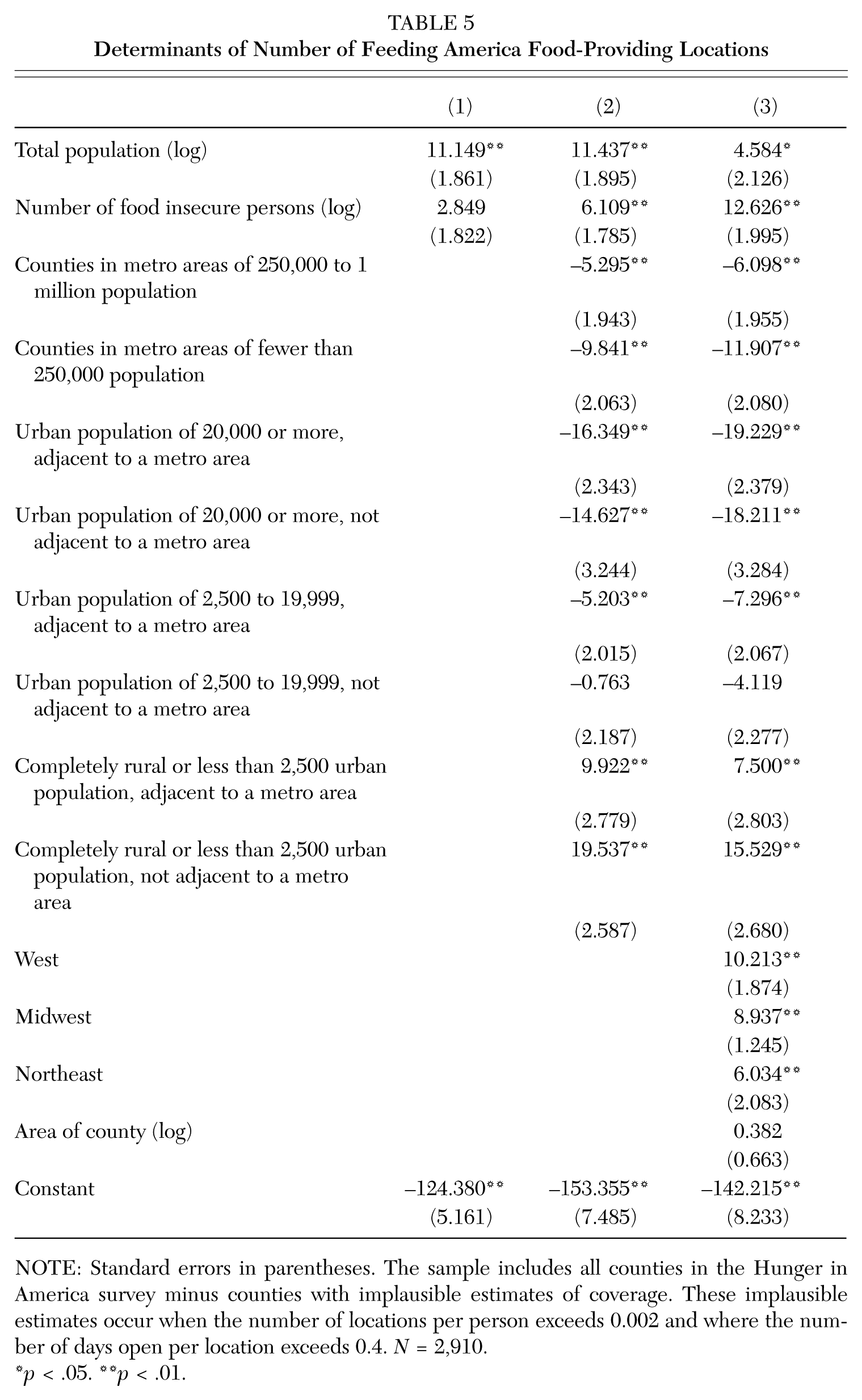
NOTE: Standard errors in parentheses. The sample includes all counties in the Hunger in America survey minus counties with implausible estimates of coverage. These implausible estimates occur when the number of locations per person exceeds 0.002 and where the number of days open per location exceeds 0.4. N = 2,910.
p < .05. **p < .01.
Determinants of Number of Days Open for Feeding America Food Providing Locations
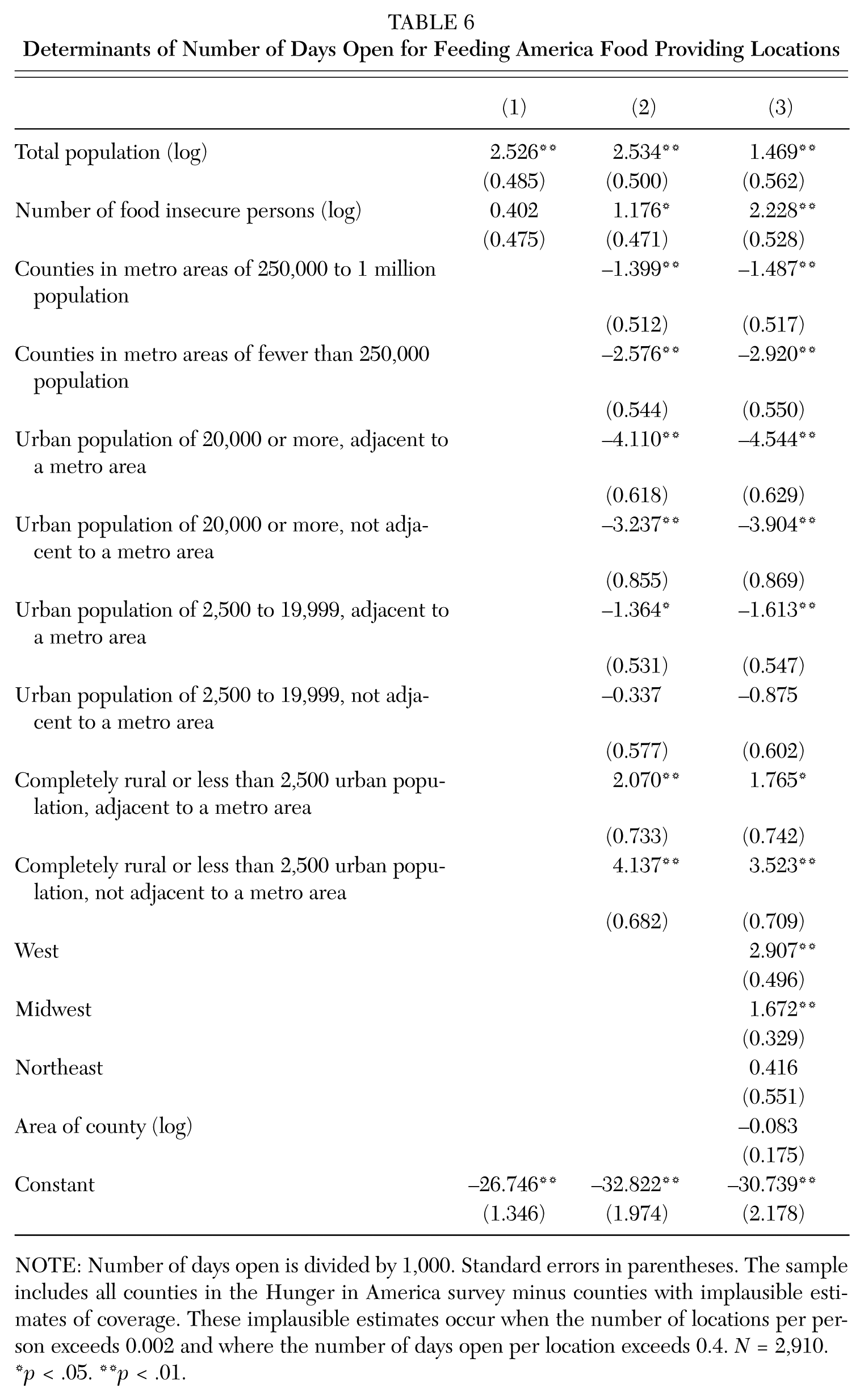
NOTE: Number of days open is divided by 1,000. Standard errors in parentheses. The sample includes all counties in the Hunger in America survey minus counties with implausible estimates of coverage. These implausible estimates occur when the number of locations per person exceeds 0.002 and where the number of days open per location exceeds 0.4. N = 2,910.
p < .05. **p < .01.
Determinants of Number of Pounds Distributed for Feeding America Food Providing Locations
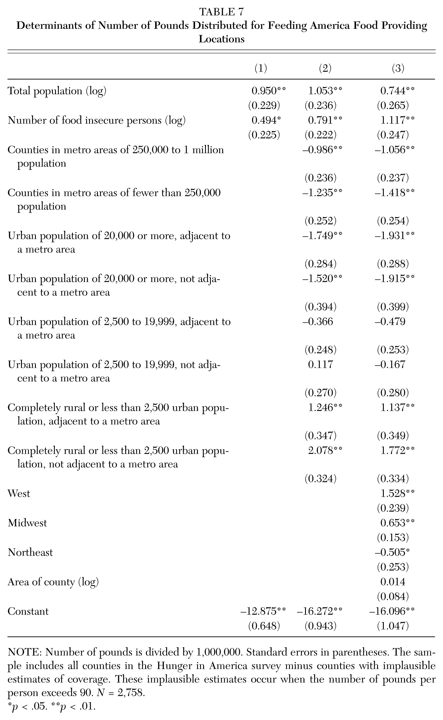
NOTE: Number of pounds is divided by 1,000,000. Standard errors in parentheses. The sample includes all counties in the Hunger in America survey minus counties with implausible estimates of coverage. These implausible estimates occur when the number of pounds per person exceeds 90. N = 2,758.
p < .05. **p < .01.
In Table 5, the outcome is the number of Feeding America food-providing locations. As expected, population size is positively related to the number of locations, as is, in two of the three specifications, the number of food insecure persons. 9 The latter is evidence that resources, at least over this dimension, are effectively directed. All else equal, counties that are completely rural or have an urban population of fewer than 2,500, adjacent to a metro area and counties that are completely rural or have an urban population of fewer than 2,500, not adjacent to a metro area have more locations than other counties. While these two most rural types of counties have more food-providing locations, the other counties have fewer locations, all else equal, than counties in metro areas with populations of 1 million or more. 10 The South has fewer locations, all else equal, than the other three regions. The size of the county has no statistically significant influence on the number of food-providing locations.
In Table 6, we turn to the number of days that a provider is open as our metric of food bank coverage. With respect to sign and statistical significance, the results are similar to those found in Table 5. The only exception is that the Northeast, all else equal, does not have more days open than the South.
Table 7 considers the impacts of the same set of factors on the number of pounds of food distributed. Results are similar to those found with the other metrics of distribution. The exceptions are that the number of food insecure persons is positive and statistically significant across all three columns; the association of counties with urban populations of 2,500 to 19,999, adjacent to a metro area; and urban population of 2,500 to 19,999, not adjacent to a metro area with number of pounds is both statistically insignificantly different from counties in metro areas with a population of 1 million or more. The Northeast distributes fewer pounds, all else equal, than the South.
A unifying theme of this volume is the blurring of boundaries between urban and rural areas. In the context of our article, this issue may be framed with respect to the distribution of food. We do so in Table 8, where we examine whether a county being adjacent to a metro area, controlling for other factors, influences the provision of food. This is enabled by the structure of the Rural-Urban Continuum Codes, whereby the groupings 4 and 5, 6 and 7, and 8 and 9 all have the same population cutoffs but differ by whether they are adjacent to a metro area. For example, categories 6 and 7 both include counties with an urban population of between 2,500 to 19,999, while the former is adjacent to a metro area and the latter is not. In Table 8 the regressions are the same as found in Tables 5 through 7; only now we consider, with a sample comprising categories 4 through 9, whether the county is adjacent to a metro area. 11 In contrast to the previous multivariate results, where we did see differences by the rural-urban divide, the coefficient on whether a county is adjacent to a metro area is statistically insignificant and small. There are three other departures from the previous tables, perhaps due to the dropping of categories 1 through 3—the region of the country is generally statistically insignificant, the size of the county is positively associated with the distribution of food, and the number of food insecure persons is now statistically insignificant in two of the three models.
Determinants of Distribution for Feeding America Food Providing Locations for Rural-Urban Continuum Codes 4 through 9
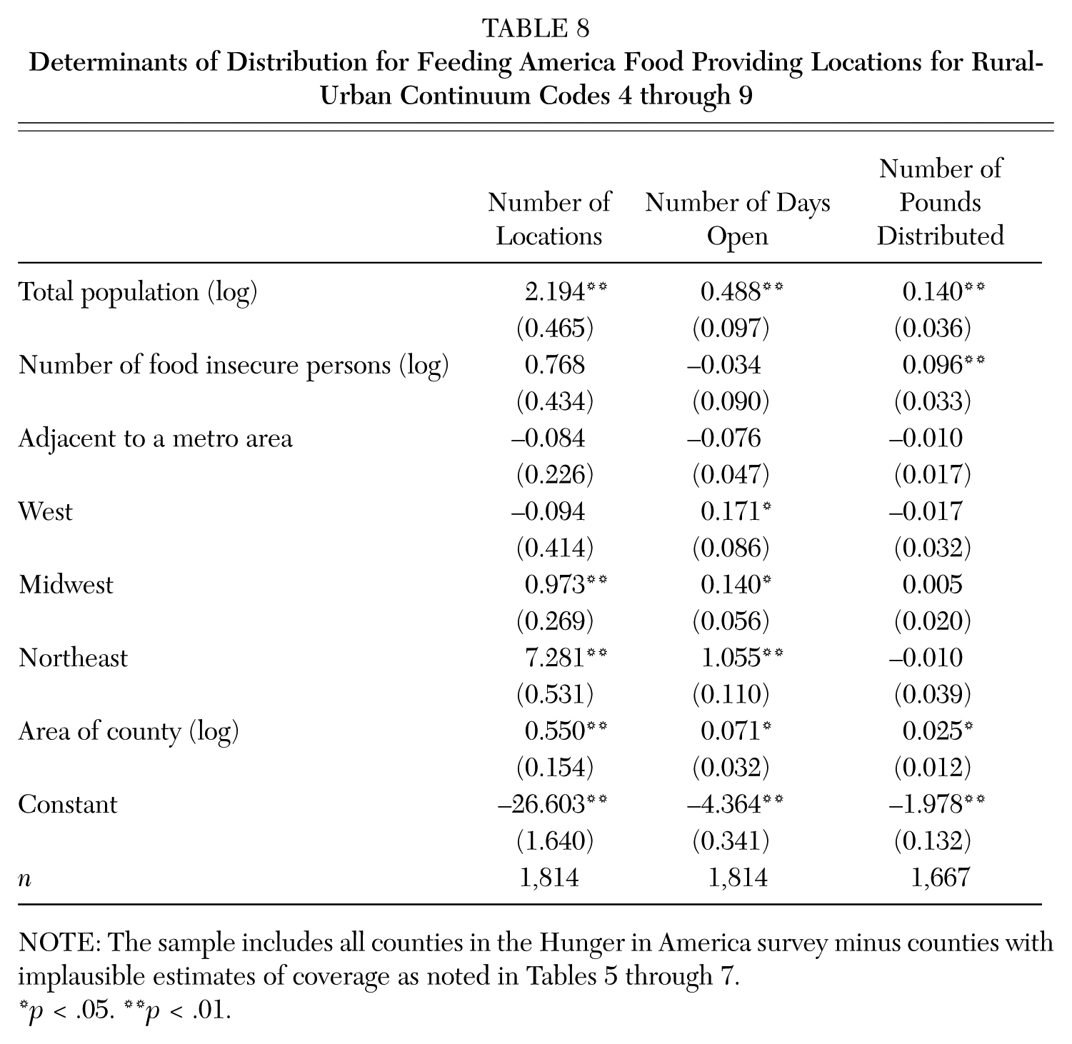
NOTE: The sample includes all counties in the Hunger in America survey minus counties with implausible estimates of coverage as noted in Tables 5 through 7.
p < .05. **p < .01.
Conclusion
Food insecurity is not evenly distributed geographically across the United States. Instead, we see distinct differences by the rural-urban divide, especially once we break things down by region. In aggregate terms, we do see that areas with greater need are receiving more food from food banks. When we use the number of food providers as our metric, there is twice as much coverage in remote rural counties compared to the largest metropolitan counties. While not as stark, we also see much better coverage in remote rural areas when we use our two other measures—the number of days open per person and the number of pounds of food distributed per person.
This high degree of coverage in rural areas is directly related to the member food bank programs provided by Feeding America. The most common program model in operation, including in rural areas, is a traditional food pantry—a physical location where grocery products are distributed for off-site use, usually for preparation in the recipient’s residence. A variation of this model that can be particularly appropriate in rural areas is a mobile food pantry, a program in which a food bank makes a same-day distribution without involving a receiving agency; this model can often involve distribution from a Feeding America truck directly to clients in need.
While the presence of charitable food assistance in rural areas is an important component of efforts to reduce food insecurity in these communities, no comprehensive plan to reduce food insecurity can overlook the importance of SNAP. As is the case with the distribution of charitable food, the proportion of the population receiving SNAP in rural areas is higher than in either metropolitan or micropolitan areas (14.6 percent versus 10.9 percent and 13.8 percent, respectively) (Bailey 2014). These higher rates may reflect food banks’ efforts to promote SNAP participation and provide application assistance in rural communities. Considering the successes of Feeding America food banks and the USDA in promoting food assistance in rural areas, perhaps other nongovernment and government groups that are charged with directing resources toward geographic areas that are underserved should emulate these programs
Footnotes
Appendix
Notes
Craig Gundersen is the Soybean Industry Endowed Professor in Agricultural Strategy in the Department of Agricultural and Consumer Economics at the University of Illinois. He is on the Feeding America Technical Advisory Group. His research concentrates on the causes and consequences of food insecurity and the evaluation of food assistance programs.
Adam Dewey is a research analyst at Feeding America, where he manages the Map the Meal Gap project, including the most recent Map the Meal Gap 2016 study.
Monica Hake is a manager of social policy research and analysis at Feeding America, where she has contributed to numerous studies about food insecurity and the charitable feeding sector, including Hunger in America 2014.
Emily Engelhard is managing director of research and evaluation at Feeding America, where she leads the organization’s research and evaluation work related to food insecurity and charitable feeding, including Hunger in America and Map the Meal Gap.
Amy S. Crumbaugh is the director of social policy research and analysis at Feeding America, where she oversees a number of research initiatives, including Hunger in America and Map the Meal Gap.