
Abstract
The visual design of municipal websites contributes to their usability and user experience and shapes citizens’ first impressions of local governments. Visual complexity and colorfulness are two central dimensions of visual design. This study compares these dimensions across the homepages of 100 Chinese and 100 Western municipal websites. The findings show that Chinese websites are more visually complex and more colorful than Western websites. Regarding visual complexity, Chinese websites displayed more diversity and density of visual elements, less structured text organization, and more content blocks. Regarding colorfulness, they had more colors, higher saturation and brightness, and a stronger preference for red as a dominant color. Overall, the results suggest that visual design conventions in municipal websites are closely tied to linguistic, artistic, and pragmatic factors, highlighting the value of cross-cultural analysis in website design.
Keywords
Introduction
In the field of technical and professional communication, scholars have consistently highlighted the importance of culturally sensitive design strategies that adapt websites to the preferences and expectations of particular cultural audiences (St.Amant, 2019; Sun, 2012; Sun & Getto, 2017; Xu & Shi, 2024; Zhang et al., 2025). Among the different design dimensions, visual design is often the most immediately apparent and culturally distinctive aspect. This study, therefore, examines cultural differences in the visual design of municipal websites in China and Western countries.
Prior content-analytical studies have identified differences between Chinese and Western websites in visual categories such as layout, multimedia, and color (e.g., Alexander et al., 2017; Doi & Murata, 2020; Goyal et al., 2012). However, this body of research has largely focused on isolated visual elements and therefore lacks a holistic perspective on how broader visual characteristics are expressed through multiple design features. Moreover, existing studies have primarily examined commercial or popular websites (Moura et al., 2016), leaving other important website genres relatively underexplored. Informative websites in particular—where entertainment, persuasion, and emotion play less central roles—have received limited scholarly attention. Because these websites are often large and complex, their visual design should primarily support users in locating and using information effectively. Municipal websites are a common example of such informative websites, and their content development has evolved in broadly similar ways in China and Western countries (Li et al., 2026). However, their visual charateristics are still unknow.
This study addresses the gap by examining the visual design of municipal websites and relating individual visual elements to two overarching dimensions of website design: visual complexity and colorfulness. Previous research has shown that Chinese websites tend to score highest on colorfulness and second highest on visual complexity, whereas Western websites rank in the middle or lower ranges on both dimensions (Nordhoff et al., 2018). However, it remains unclear how these differences are shaped by specific visual elements. Building on earlier studies, we developed an analytical framework that systematically identifies visual features contributing to these two broader dimensions. We applied this framework to a sample of 100 Chinese and 100 Western municipal websites. By combining automated visual analysis with manual content assessment, this study aims to answer the following research question: To what extent and in what ways do Chinese and Western municipal websites differ in terms of visual complexity and colorfulness?
Related Works and Hypotheses
Analytical Framework of Visual Design
Most previous content-analytical research has used bottom-up coding, resulting in a wide range of analytical frameworks for comparing design elements across cultures. Visual elements typically play a central role in these frameworks, yet their selection and measurement are often inconsistent. For example, although color is considered to be a key visual element, studies operationalize this element differently: Alexander et al. (2017) measured the ratio of specific hues, Lo and Gong (2005) counted the number of distinct colors in design elements, and Doi and Murata (2020) analyzed the subjective vividness of color tones. This variability highlights the lack of standardization in how visual design is conceptualized and measured.
We therefore developed an integrative visual design framework that builds on insights from previous studies. The framework examines how specific visual elements shape two overarching dimensions: visual complexity and colorfulness (see Table 1 for an overview and the underlying sources). Visual complexity is associated with diversity, density, text organization, and content blocks. Colorfulness is related to color quantity, color choice, saturation, and brightness. This framework enables us to identify specific visual differences between Chinese and Western municipal websites and examine how these differences contribute to the broader dimensions of visual complexity and colorfulness. Below, we review prior findings on visual differences between Chinese and Western websites, using this framework as an organizing structure.
Analytical Framework of Visual Design.
Visual Complexity
The visual complexity of interfaces is shaped by the diversity and density of its elements, text organization, and content arrangement (Michailidou et al., 2021). Visually simple webpages typically feature low diversity and density, clear text structure, and straightforward content organization. Visually complex webpages are characterized by more diversity, higher density, less coherent text organization, and more intricate or cluttered layouts (Michailidou et al., 2008; Rosenholtz et al., 2007).
Diversity. Diversity refers to the variety and heterogeneity of visual elements on webpages. Previous research has mainly examined the presence and types of images, videos, and autoplay effects. For example, Alexander et al. (2017) compared government and news/media websites from China, Australia, and Saudi Arabia and found that autoplay effects were commonly used in Chinese and Saudi Arabian websites, but significantly less often in Australian websites. Similarly, Hsieh et al. (2013) and Hsieh and Hong (2013) reported that Taiwanese municipal websites more frequently featured videos and “cute-style” illustrations—a term not explicitly defined but apparently referring to playful or cartoon-like images—than municipal websites in the United Kingdom and Australia. Together, such findings suggest that Chinese websites exhibit greater visual diversity than their Western counterparts.
Density. Density refers to the concentration of elements on webpages, typically measured by the number of elements relative to page length or display space. High-density designs may overwhelm users with information but can also convey a compact and information-rich layout. Michailidou et al. (2008) found a positive correlation between perceived visual complexity and the number of images, words, and content blocks on a webpage, identifying density as a key contributor to users’ perceptions of complexity.
Across multiple studies, Chinese websites have been found to exhibit higher visual density than Western websites. For example, Alexander et al. (2017) reported that Chinese websites contained significantly more headings, hyperlinks, and images per page than Australian and Saudi Arabian websites. Fraternali and Tisi (2008) analyzed Western and Chinese e-commerce homepages by calculating display density as the total number of elements—including links, images, videos, titles, paragraphs, and captions—relative to page length. Their findings showed that Chinese websites displayed nearly twice as many elements, resulting in substantially higher display density.
Text organization. Text organization refers to the structural and visual design of webpage text that helps users gain an overview of the content. Effective organization integrates semantic structure and visual styling so users can follow the information hierarchy with minimal effort.
Prior research has documented notable cross-cultural differences in visual text organization. Alexander et al. (2017) found that Chinese websites more frequently employ visual emphasis tags (e.g., <strong>) to indicate importance, whereas Australian websites tend to rely on semantic heading tags (<h1>–<h6>) to establish hierarchical structure. This suggests that Chinese web design places greater emphasis on visual styling, while Western design prioritizes semantic organization and structural clarity. Supporting this contrast, Zhu and St.Amant (2007) reported that traditional Chinese medicine websites often lack consistent multi-level heading structures. Such inconsistency may increase visual complexity and hinder navigation, reflecting less emphasis on textual structure.
Content blocks. Visual complexity may also be influenced by the spatial arrangement of content on a webpage. A content block is a distinct section of information—for example, a news area, a navigation section, or a grouped set of related text—typically separated by layout features such as spacing, borders, color, or alignment. Webpages contain two types of content blocks based on their location. Main content blocks are the primary structural units of a page and contain its core information. Peripheral content blocks appear around or alongside the main content and provide supplementary or promotional information, such as banners, pop-ups, or sidebars.
Relatively few studies have examined how these main blocks are structured and arranged. Using automated detection across 44 countries, Nordhoff et al. (2018) found that Chinese websites had the highest average number of text areas, a feature associated with increased visual complexity. In contrast, Wang et al. (2015) conducted a manual analysis of 320 Chinese and American manufacturing websites, comparing the number of distinct text areas and found no significant differences between the two cultural groups.
Peripheral content blocks have received more scholarly attention. For example, banners are peripheral visual components that extend beyond or float around the main content area and are commonly used to attract user attention. Several studies have found that Chinese websites employ a wider variety of banner types—including floating, animated, and clickable formats—than Western websites (Alexander et al., 2017; Hsieh et al., 2013; Wang et al., 2015; Zhao et al., 2003).
Colorfulness
Colorfulness refers to the selection and variation of colors on webpages, which shapes how vibrant or visually rich they appear. Research has shown that colorfulness plays a key role in users’ perceptions of visual appeal, user experience (UX), and usability (Reinecke & Gajos, 2014; Tuch et al., 2012). It is primarily determined by the number and types of colors used (Ivory et al., 2001; Kondratova & Goldfarb, 2006; Reinecke et al., 2013), as well as their chromatic attributes, including saturation (intensity) and brightness (luminance) (Camgöz et al., 2002, 2004; Reinecke et al., 2013; Seckler et al., 2015; Skulmowski et al., 2016).
Color quantity. Color quantity refers to the number of distinct colors on a webpage. Two cross-cultural studies have examined this by manually counting colors across webpage elements. Lo and Gong (2005) compared Chinese and U.S. e-commerce websites by coding the presence of ten basic colors across six types of interface elements. Their findings showed that Chinese websites consistently used a greater variety of colors across nearly all types than their U.S. counterparts. In contrast, Wang et al. (2015) reported no significant difference in the number of text colors used in Chinese and U.S. manufacturing websites. However, they treated different shades of the same base color (e.g., light and dark blue) as separate colors, which might explain the divergence in findings between the two studies.
Color choice. Color choice refers to the predominant hues used on webpages. These choices may reflect not only aesthetic preferences but also broader cultural, psychological, and branding considerations (Cyr et al., 2010). Prior studies have typically assessed dominant colors by examining their frequency and spatial coverage. For instance, Kondratova and Goldfarb (2006) utilized HTML/CSS code parsing and screenshot-based image analysis to examine websites from 15 countries, including China and Western countries (e.g., Australia, the U.S., and the U.K.). Their analysis identified a broadly shared international color palette consisting of white, black, multiple shades of gray, blue, and light yellow. The study did not explicitly compare or differentiate color choices between Chinese and Western websites.
Alexander et al. (2017) conducted a manual content analysis to assess color distribution by calculating the ratio of each color's occurrence on webpages (the number of instances of a color divided by the total number of colors on a page). They showed that blue and red were more prevalent on Chinese websites than on Australian websites, whereas white was more common on Australian websites. Several other studies have found that red appears more frequently on Chinese websites and is often viewed positively in China due to its cultural associations with luck, celebration, and prosperity (Barber & Badre, 1998; Cheng et al., 2019; Jiang et al., 2014).
Saturation and brightness. Saturation and brightness are key chromatic attributes that may influence the perceived colorfulness of a webpage. Saturation refers to the intensity or purity of a color, while brightness denotes how light or dark a color appears. Higher levels of both attributes typically contribute to greater perceived colorfulness (Reinecke et al., 2013).
Nordhoff et al. (2018) found that East Asian websites, including Chinese, generally exhibit lower saturation than those from Western countries. Similarly, Cermak (2020) reported lower perceived saturation scores for Chinese websites than for U.S. websites. However, a different pattern emerges when focusing on dominant colors and specific interface elements. Doi and Murata (2020) showed that although overall saturation may be lower on Chinese websites, their dominant colors are perceived as more vivid than those on U.S. websites. Likewise, Schaefer (2015) found that Chinese app icons are brighter than Western ones.
Taken together, these findings suggest that while Chinese interfaces may appear less saturated and dim at the overall page level, their key visual elements tend to use more vivid and saturated colors.
Method
To test the proposed hypotheses, we carried out a quantitative content analysis grounded in the analytical framework. This section outlines the corpus selection, the coding scheme, and the procedures of data collection and analysis.
Corpus of Municipal Websites
We collected a sample of 100 Chinese and 100 Western municipal websites, drawn from a broader corpus of 297 Chinese and 241 Western municipal sites. The Chinese dataset included all 293 prefecture-level cities as well as the four provincial-level municipalities directly administered by the central government. The Western population comprised unitary or third-tier municipalities from three English-speaking countries—Australia (n = 29), the U.K. (n = 93), and the U.S. (n = 119)—each with a minimum population of 200,000 residents.
From each group, 100 websites were randomly selected using a Python-based random sampling script. Owing to access issues, three Chinese and four Western websites were replaced through additional random sampling. The homepage HTML data of all websites were collected, and full-page screenshots were captured using a 14-inch Lenovo laptop set to a screen resolution of 1920 × 1080 pixels.
Coding Scheme
Table 2 provides an overview of the coding scheme and details all measurement parameters.
Coding Scheme.
Visual Complexity
To test H1, visual complexity was assessed using 10 design elements grouped into four categories: diversity, density, text organization, and content blocks.
Diversity (H1a). This category comprised three indicators: image diversity, autoplay effects, and video content. First, image diversity was measured by counting the presence or absence of seven distinct image types: drawings (e.g., illustrations or sketches), pictures, posters/infographics (combinations of text, visuals, and data), QR codes, logos, icons, and an “other” category for images that did not fit these classifications, such as plain or simple patterned images used for separation or background decoration. Second, the presence or absence of automatically triggered animations or slideshows (autoplay effects) was coded. Finally, the presence or absence of video content on the homepage was also recorded.
Density (H1b). Density was measured by calculating the number of visual features—images, videos (combined into a single category due to the low frequency of videos on webpages), as well as autoplay effects—relative to the vertical length of the homepage in pixels. Text quantity was excluded from this measure because Chinese characters and English words are not directly comparable in either count or visual load.
Text organization (H1c). Text organization was analyzed by examining the use of structural HTML tags on each webpage. Titles were measured by counting the number of <title> tags, which indicate the main topics of the page. Headings were measured by counting the number of <h1> to <h5> tags, which represent different hierarchical levels of section headings. Paragraphs were measured by counting the number of paragraph marker <p> tags. Because the absolute number of tags on a webpage is influenced by overall text volume, the frequency of each variable was normalized by text size to allow meaningful comparison across samples. The frequency of each variable was calculated as the number of tags per 1,000 English words or per 1,000 Chinese characters (although this is not an optimal solution, considering the incomparability of words and characters).
Content blocks (H1d). Content blocks were measured by manually counting the number of main and peripheral content blocks on each homepage. Main content blocks were defined as visually separated sections within the central layout of the page. These blocks were identified through layout cues such as borders, changes in background color, consistent spacing, or other clear separators. Peripheral content blocks referred to elements that extended beyond or floated outside the main content area, including banners, top bars, pop-ups, sidebar chatbots, and large hero images.
Colorfulness
To test H2, colorfulness was operationalized using eight design elements grouped into four categories: color quantity, color choice, saturation, and brightness.
Color quantity (H2a). The number of distinct HEX color codes was quantified across three visual domains: backgrounds, text, and borders. The data were extracted using Google Chrome's CSS Overview tool, which captures the rendered styles of all visual elements, including those generated through pseudo-elements.
Color choice (H2b). The three dominant colors on each homepage were identified using a K-means clustering method applied to the webpage screenshots. The algorithm treats each pixel as a point in a three-dimensional RGB space and groups all pixels into three clusters, each representing a set of similar colors on the page (Giovanni Code, 2022; Miniukovich & De Angeli, 2014). The centroid of each cluster—calculated as the average RGB value of all pixels within that cluster—was taken to represent a dominant homepage color. These centroids were then converted into standard color names (e.g., “dark blue” or “bright red”) using the automatic color labeling tool ColorHexa (Alexander et al., 2017). To facilitate comparison, modifiers such as “dark,” “bright,” and “soft” were removed from the color labels, whereas grayish prefixes (e.g., “grayish blue” or “grayish red”) were retained because of their perceptual distinction from base hues.
Saturation (H2c). Saturation was calculated separately for the three dominant colors mentioned above and for the overall composite color of each homepage. RGB values were first converted into the HSV (Hue–Saturation–Value) color space, in which saturation is expressed as a percentage ranging from 0% to 100%. For the dominant colors, mean saturation was obtained from the HSV saturation values of the three K-means cluster centroids. Overall page-level saturation was computed as the mean saturation across all pixels in the full-page screenshot (Ali, 2024).
Brightness (H2d). Brightness was computed using the same procedure. After converting RGB values into the HSV color space, brightness (the Value component in HSV) was represented as a percentage ranging from 0% to 100%. Mean brightness for the dominant colors was derived from the three cluster centroids, whereas overall page-level brightness was calculated as the average brightness across all pixels in the full-page screenshot (Ali, 2024).
Automated and Manual Coding
To ensure comprehensive and accurate data collection, we employed a hybrid approach that combined automated and manual coding methods, depending on the nature and measurability of each design element.
Automated data extraction was used for design elements that could be consistently and objectively captured from webpage source code and screenshots. Specifically, the number of images and structural tags was extracted from HTML files using Python libraries such as Requests and BeautifulSoup. For color-related metrics, the OpenCV library was employed to analyze full-page screenshots and calculate dominant colors, saturation, and brightness. In addition, Google Chrome's CSS Overview tool was used to determine the number of colors for backgrounds, text, and borders.
Manual coding was applied to image diversity, autoplay effects, video content, and content blocks, as these elements are difficult to standardize through automated scripts. These variables were assessed manually by the first author following a standardized coding protocol to ensure consistency across websites.
Data Analysis
We employed statistical analyses appropriate to the measurement level of each design element. For continuous variables (e.g., saturation, brightness), independent samples t-tests were conducted to compare means between Chinese and Western websites. When the assumption of equal variances was violated, as indicated by Levene's test, Welch's t-test was applied to ensure statistical robustness. For categorical variables—including binary indicators (e.g., autoplay effect) and nominal data (e.g., image types)—Chi-square tests were used. When expected cell frequencies fell below the recommended threshold, Fisher's exact tests were conducted instead.
Results
Visual Complexity
Diversity
An independent-samples t-test revealed a significant difference in image diversity between Chinese and Western municipal websites. Chinese websites exhibited greater image diversity (M = 6.32, SD = 0.65) than Western websites (M = 4.34, SD = 0.87), t(183.49) = 18.28, p < .001, with a very large effect size (Cohen's d = 2.58). This finding suggests that Chinese homepages incorporate a wider range of image types.
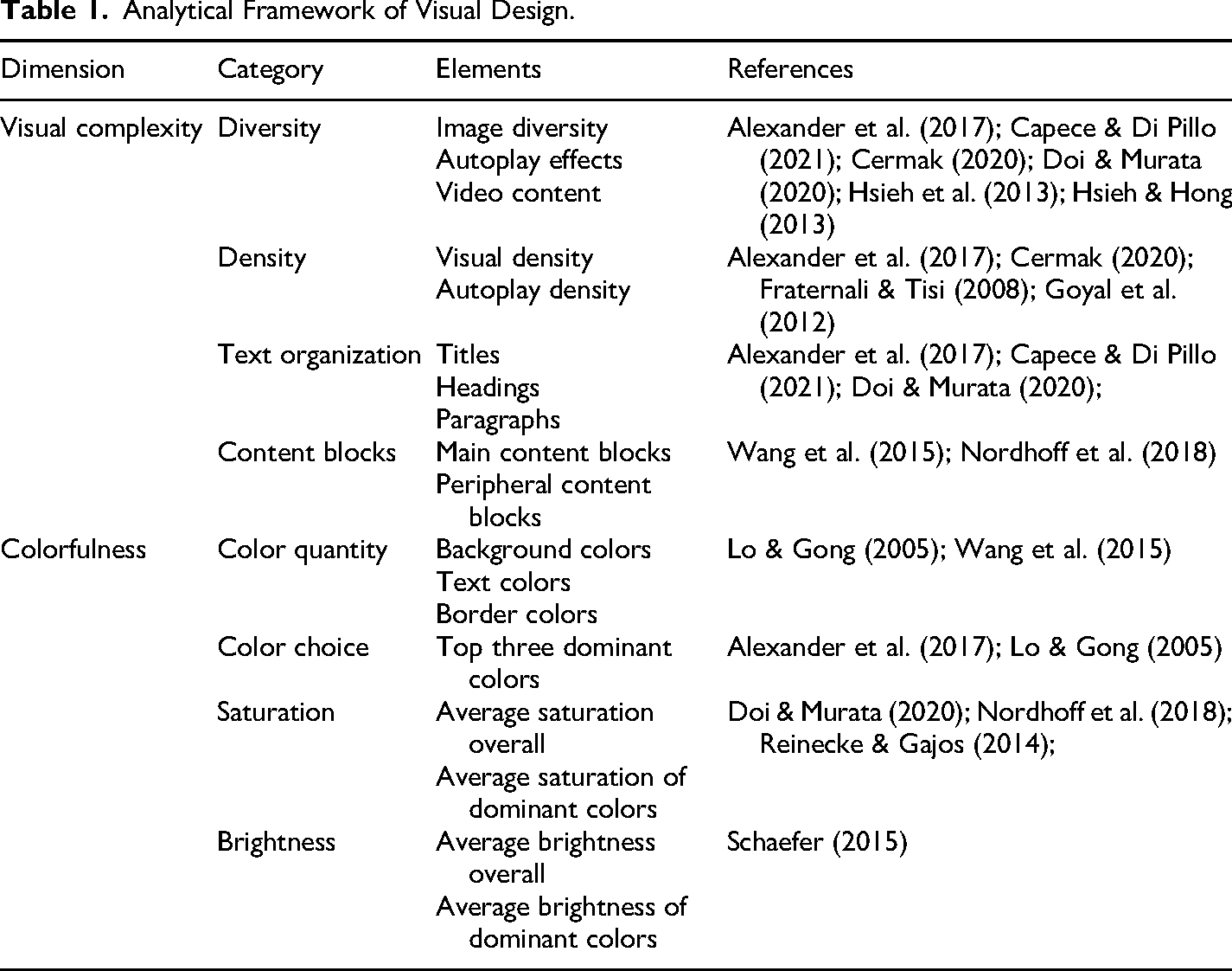
Follow-up Chi-square tests confirmed significant differences across several image formats (see Table 3). Posters/infographics appeared on nearly all Chinese websites (99 out of 100), while QR codes were also highly prevalent (94 out of 100) (see Figure 1). These image types were much less common on Western websites, where posters/infographics appeared on 66 out of 100 homepages and QR codes on only 2 out of 100. Chinese websites were also more likely to feature drawings (64 out of 100) and other images used for separation or decoration (76 out of 100).
Example of diverse image types (including posters and QR codes highlighted in boxes) on the homepage of Changsha (China).
Differences in the Diversity of Visual Elements Between Chinese and Western Municipal Websites.
Note: Interpretation of effect size Cramer's V values: 0.10 = small, 0.30 = medium, 0.50 = large (Cohen, 1988).
Fisher's exact tests revealed significant differences in the presence of autoplay effects and video content (see Table 3). Autoplay effects were present on 99 Chinese websites, compared with 39 Western websites, indicating a substantially greater use of automatically triggered visual elements. In contrast, Western websites were more likely to include embedded video content (16 vs. 1). Although this difference was significant, the relatively small effect size suggests that video content remained infrequent across both groups.
In summary, the findings support H1a, indicating that Chinese municipal websites exhibit greater visual diversity, particularly with regard to image types and autoplay effects.
Density
Independent-samples t-tests revealed significant differences in both visual density and autoplay density (see Table 4). Chinese websites exhibited substantially higher visual density, containing more images and videos per 1,000-pixel segment (see Figures 2 and 3). Autoplay density was likewise significantly higher on Chinese websites, with a large effect size indicating more frequent use of automatically triggered visual elements per 1,000-pixel segment.
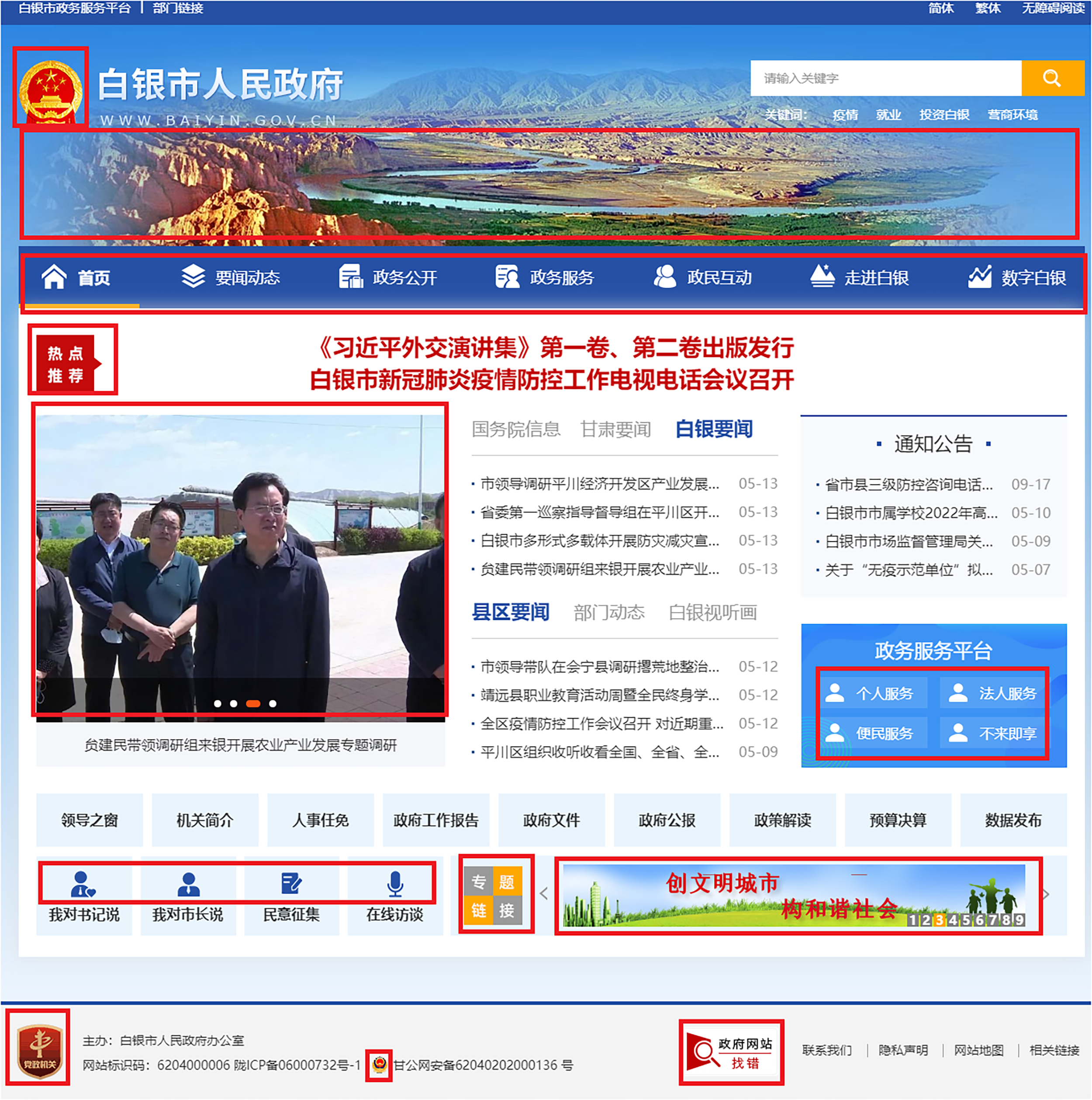
Example of high visual density (images highlighted in boxes) on the homepage of Baiyin (China).
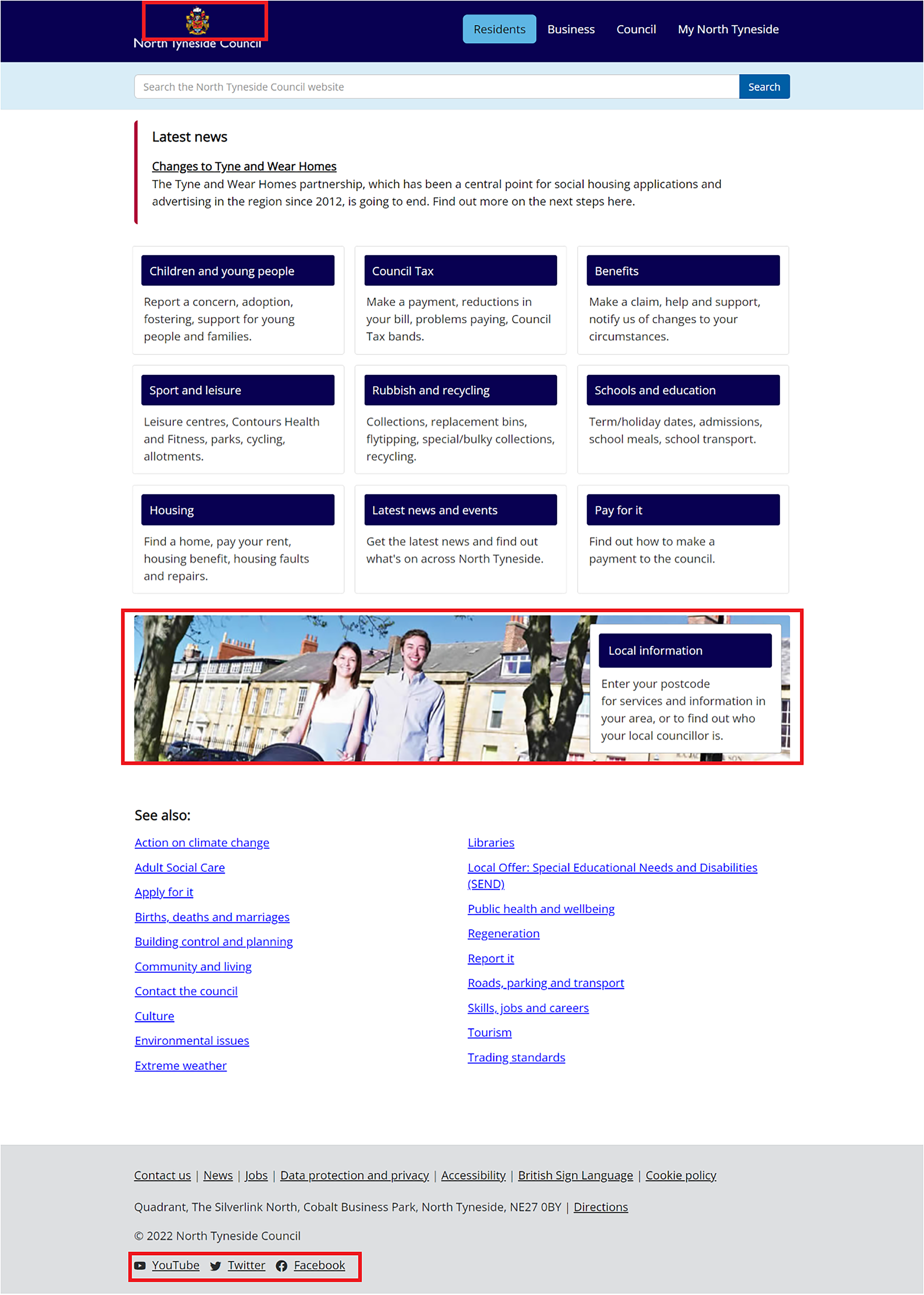
Example of low visual density (images highlighted in boxes) on the homepage of the North Tyneside (U.K.).
Differences in the Density of Visual Elements Between Chinese and Western Municipal Websites.
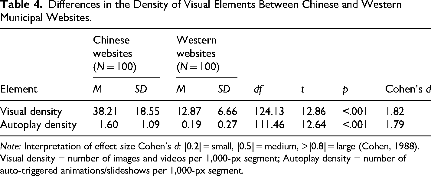
Note: Interpretation of effect size Cohen's d: |0.2| = small, |0.5| = medium, ≥|0.8| = large (Cohen, 1988).
Visual density = number of images and videos per 1,000-px segment; Autoplay density = number of auto-triggered animations/slideshows per 1,000-px segment.
Together, these findings support H1b, suggesting that Chinese municipal websites demonstrate greater visual density in both visual and autoplay elements than Western municipal websites.
Text Organization
Independent-samples t-tests revealed significant differences in the use of text organization markers between Chinese and Western municipal websites (see Table 5). Western municipal websites used structural HTML tags more frequently than Chinese websites. These tags contribute to a clearer textual hierarchy and a more standardized organization of textual content. In contrast, Chinese websites relied less on formal semantic HTML organization.
Differences in Text Organization Between Chinese and Western Municipal Websites.
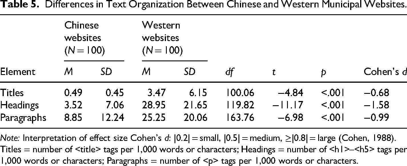
Note: Interpretation of effect size Cohen's d: |0.2| = small, |0.5| = medium, ≥|0.8| = large (Cohen, 1988).
Titles = number of <title> tags per 1,000 words or characters; Headings = number of <h1>–<h5> tags per 1,000 words or characters; Paragraphs = number of <p> tags per 1,000 words or characters.
These findings support H1c, suggesting that Western websites generally employ more standard semantic HTML organization, whereas Chinese websites place less emphasis on structural text organization.
Content Blocks
Independent-samples t-tests revealed significant differences in the number of both main and peripheral content blocks between Chinese and Western municipal websites (see Table 6). Chinese websites contained substantially more main content blocks, indicating a more segmented homepage structure. Their layouts frequently employed varied block shapes and hover-over tabs to divide information into a larger number of sections.
Differences in the Content Blocks Between Chinese and Western Municipal Websites.
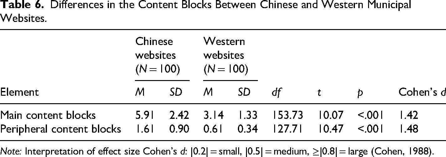
Note: Interpretation of effect size Cohen's d: |0.2| = small, |0.5| = medium, ≥|0.8| = large (Cohen, 1988).
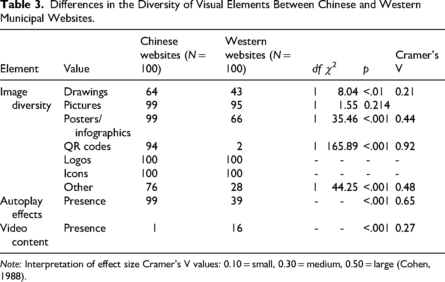
Peripheral content blocks were also more prevalent on Chinese websites. Common examples included top bars, floating windows, and sidebar banners used for public campaigns or links to social media platforms (see Figure 4). In contrast, Western websites used peripheral elements more selectively, primarily for functional or compliance purposes such as cookie consent notices or emergency alerts, which were often presented as temporary pop-ups (Figure 5).
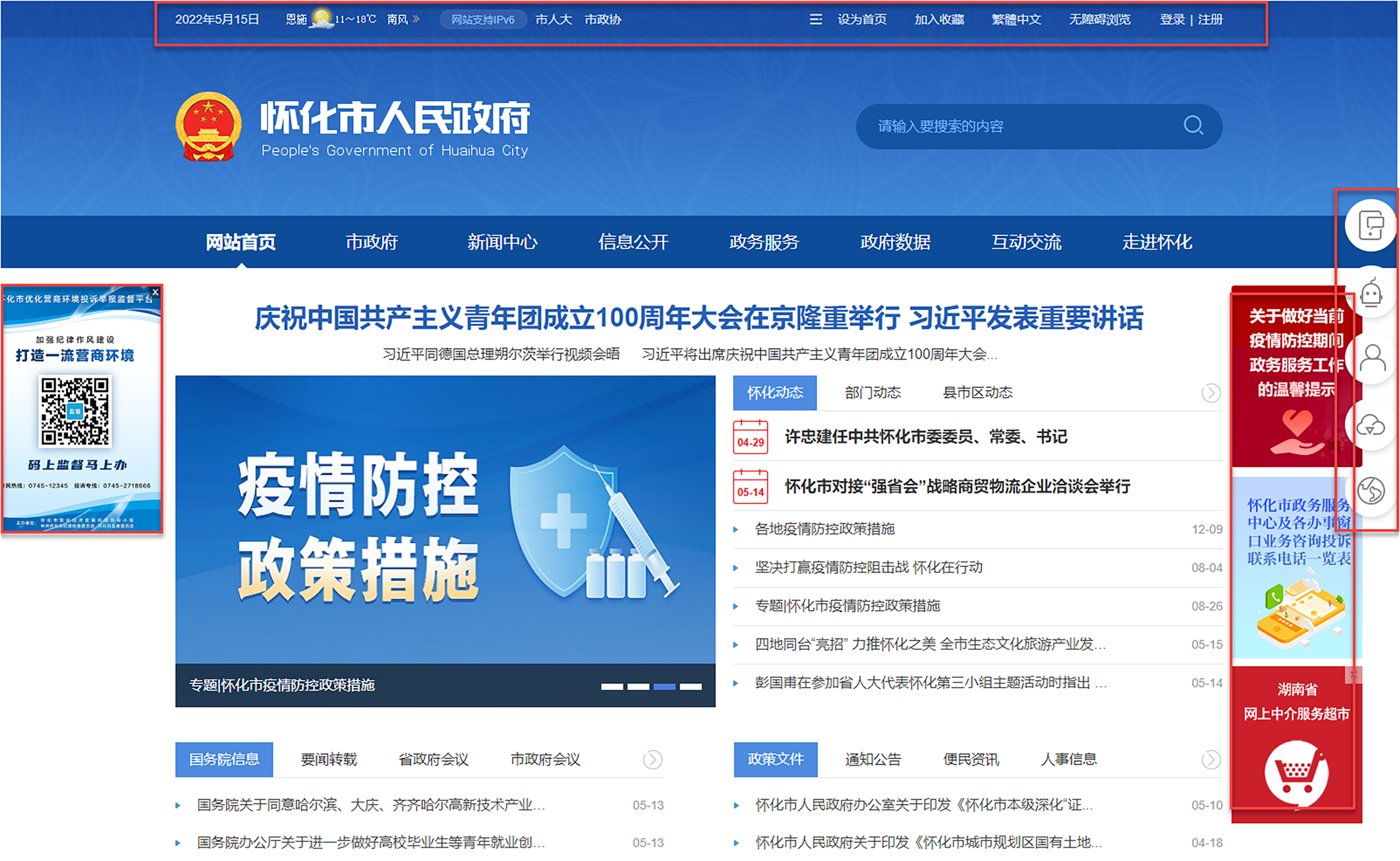
Example of prevalent peripheral content blocks (including a top bar and three sidebar banners highlighted in boxes) on the homepage of Huaihua (China).
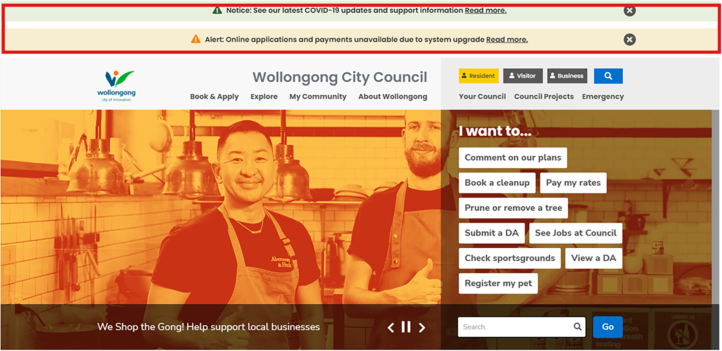
Example of limited use of peripheral content blocks (including two pop-ups highlighted in boxes) on the homepage of Wollongong (Australia).
Overall, these findings support H1d, confirming that Chinese municipal websites not only employ a greater number of peripheral content blocks but also feature more segmented main content structures.
Colorfulness
Color Quantity
Independent-samples t-tests revealed significant differences in the number of background and text colors between Chinese and Western municipal websites (see Table 7). Chinese websites employed a greater number of background colors than Western websites; however, the small effect size indicates that this difference was relatively modest. Chinese websites also displayed significantly greater variation in text colors, with a medium effect size indicating a more diverse use of color in textual elements. No significant differences were found in the number of border colors, suggesting a comparable use of colors for boundary delineation across both groups.
Differences in the Color Quantity Between Chinese and Western Municipal Websites.
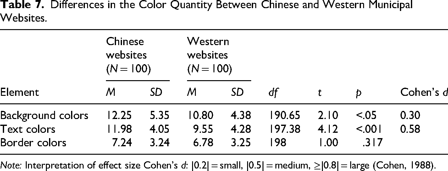
Note: Interpretation of effect size Cohen's d: |0.2| = small, |0.5| = medium, ≥|0.8| = large (Cohen, 1988).
Overall, these findings partially support H2a, indicating that Chinese municipal websites use a greater number of colors in key visual domains—particularly backgrounds and texts—than their Western counterparts.
Color Choice
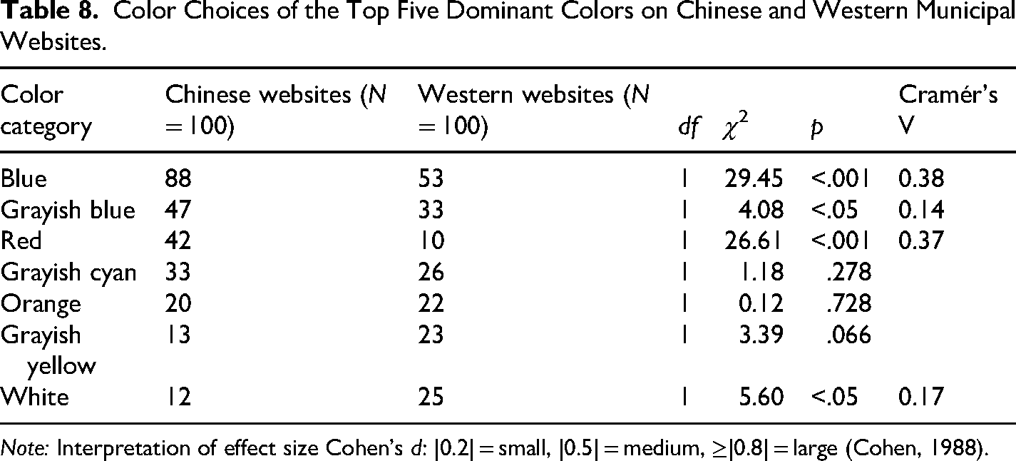
A total of 21 distinct dominant colors were identified and analyzed. The five most frequently used dominant colors in each group are presented in Figures 6 and 7. Although H2b specifically concerns the use of red, the remaining four dominant colors were also compared across the two groups (see Table 8). Blue and grayish blue emerged as the two most commonly used dominant colors in both groups. Specifically, blue was used on 88 Chinese and 53 Western websites, while grayish blue was present on 47 Chinese and 33 Western websites. The significant differences in these two colors indicate that Chinese websites rely more heavily on a centralized palette dominated by blue and grayish blue, whereas Western websites exhibit greater variation in color selection.
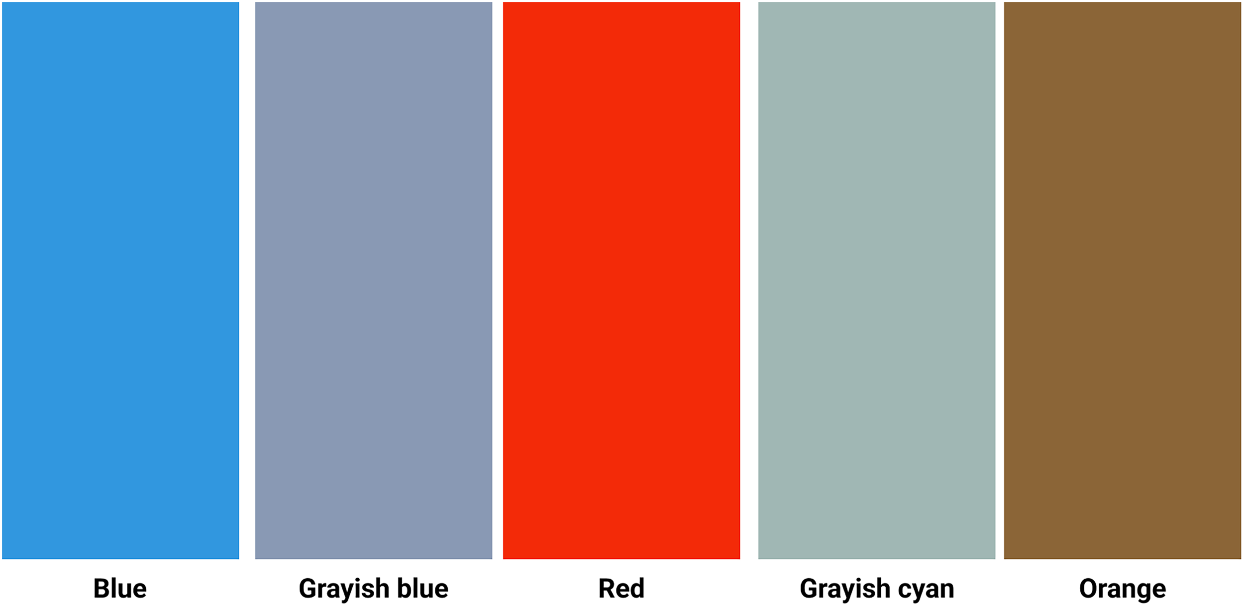
Color palette of the top five dominant colors on Chinese municipal websites (color online).
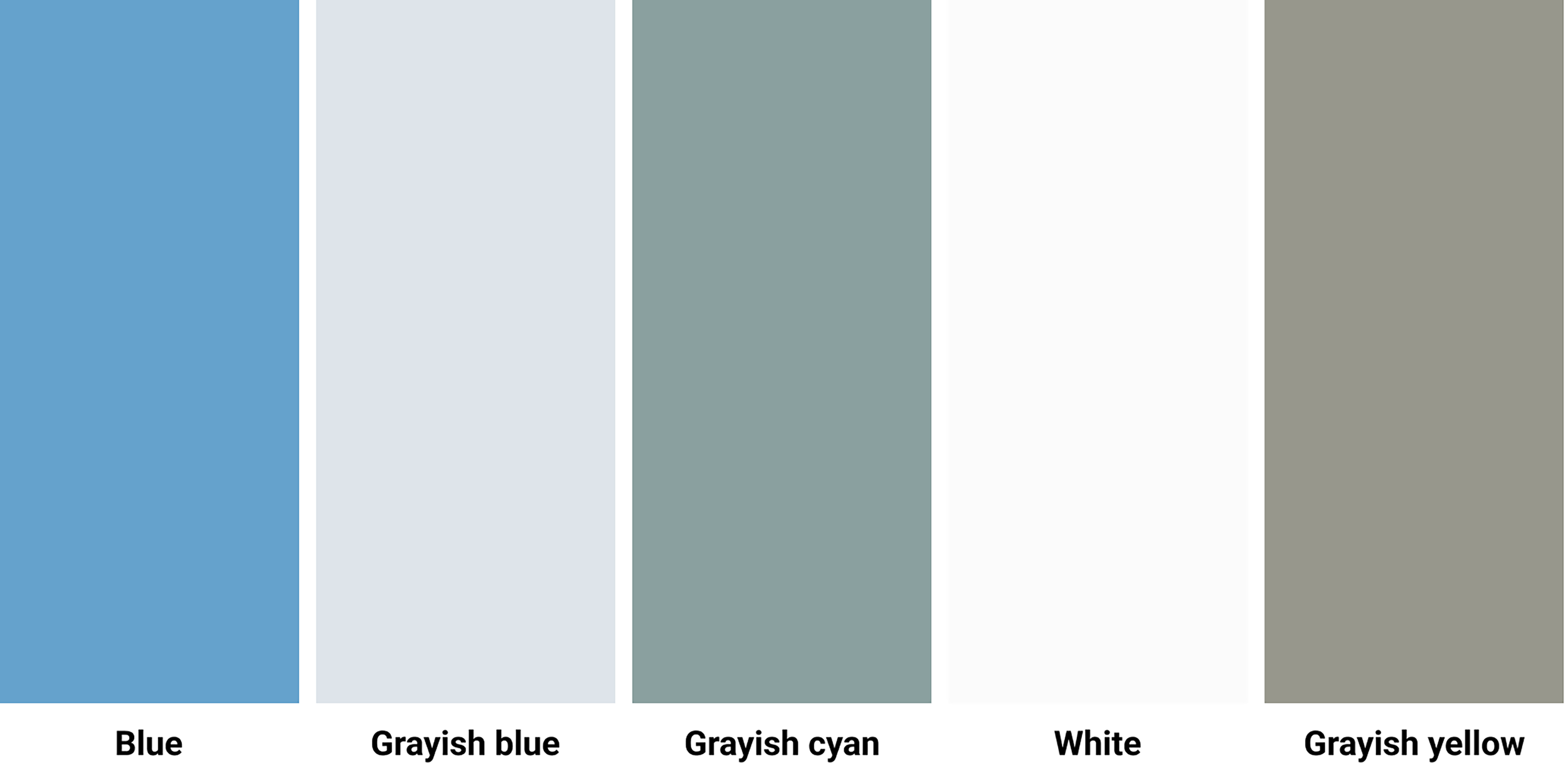
Color palette of the top five dominant colors on western municipal websites (color online).
Color Choices of the Top Five Dominant Colors on Chinese and Western Municipal Websites.
Note: Interpretation of effect size Cohen's d: |0.2| = small, |0.5| = medium, ≥|0.8| = large (Cohen, 1988).
Red was also substantially more prevalent on Chinese websites (42) than on Western ones (10), whereas white appeared more frequently on Western websites (25) than on Chinese websites (12). This pattern supports H2b, indicating that Chinese municipal websites are more likely to employ red as a dominant color.
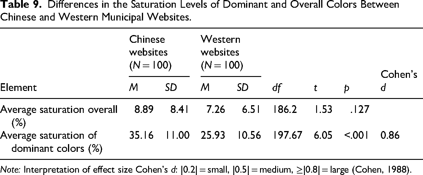
Saturation
Independent-samples t-tests revealed a significant difference in the average saturation of dominant colors, with Chinese websites displaying higher saturation levels than Western websites (see Table 9). The large effect suggests that Chinese municipal websites tend to use more vivid and intense hues to emphasize key visual elements. In contrast, no significant difference was found in overall average saturation, indicating that while Chinese websites employ more vibrant dominant colors, much of the remaining page content remains comparatively muted.
Differences in the Saturation Levels of Dominant and Overall Colors Between Chinese and Western Municipal Websites.
Note: Interpretation of effect size Cohen's d: |0.2| = small, |0.5| = medium, ≥|0.8| = large (Cohen, 1988).
These findings support H2c, suggesting that Chinese municipal websites apply higher saturation levels than Western websites in dominant visual areas to attract user attention and enhance contrast.
Brightness
Independent-samples t-tests revealed significant differences in brightness levels between Chinese and Western municipal websites (see Table 10). Chinese websites exhibited higher brightness levels in both dominant colors and overall page color compared to Western websites, with both differences associated with large effect sizes.
Differences in the Brightness Levels of Dominant and Overall Colors Between Chinese and Western Municipal Websites.
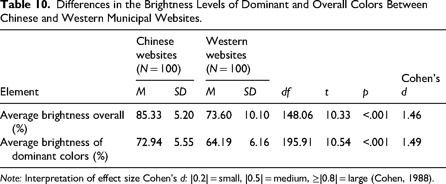
Note: Interpretation of effect size Cohen's d: |0.2| = small, |0.5| = medium, ≥|0.8| = large (Cohen, 1988).
These results suggest that Chinese municipal websites employ generally brighter color schemes, resulting in a more luminous and visually striking interface. In contrast, Western websites appear comparatively darker and less visually intense, favoring lower brightness levels that contribute to a more subdued presentation.
Collectively, these findings support H2d, indicating that Chinese municipal websites utilize higher brightness levels in both dominant and overall color design.
Discussion
Evidence for Cross-Cultural Visual Differences
This study provides clear evidence of cross-cultural differences in visual design of Chinese and Western municipal websites. All hypotheses received full or partial support.
The findings demonstrate that visual design differences between China and Western countries can meaningfully be understood in terms of visual complexity and colorfulness. Moreover, the specific design variables identified in our analytical framework proved to be useful indicators of these broader design dimensions. As such, this study contributes both a conceptual framework for understanding cross-cultural web design differences and a set of concrete design elements that can be used to visually localize municipal websites or other complex, information-rich websites.
Chinese municipal websites exhibited higher levels of visual complexity (H1) than Western websites, characterized by greater diversity and density, less structured text organization, and a larger number of content blocks. Our findings on the higher diversity and density of visual elements align with previous research characterizing Chinese websites as dense, dynamic, and visually intensive, often incorporating large numbers of images, banners, and animations (Alexander et al., 2017; Fraternali & Tisi, 2008; Hsieh & Hong, 2013). Our findings concerning less structured text organization, including the lower use of HTML structural tags, align with earlier studies on other types of websites (Alexander et al., 2017; Zhu & St. Amant, 2007) as well as user manuals (Li et al., 2020). The greater number of main and peripheral blocks further supports the findings of Nordhoff et al. (2018), who reported that Chinese websites contained the highest number of text areas among 44 countries.
Chinese municipal websites also exhibited higher levels of colorfulness (H2) than Western websites, characterized by a larger number of colors, a stronger preference for red as a dominant color, and higher saturation and brightness levels. These findings corroborate earlier studies showing that Chinese websites employ a wider range of colors and frequently use red as a primary hue (Alexander et al., 2017; Lo & Gong, 2005). At the same time, the analysis revealed a notable similarity across both groups: blue and grayish blue emerged as the most common dominant colors. In contrast to Nordhoff et al. (2018), who reported lower saturation levels in East Asian websites, our findings indicate that Chinese municipal websites use more saturated and brighter dominant colors than Western counterparts. This pattern reflects a cultural preference for vivid and visually engaging color schemes.
Influence of Linguistic, Artistic, and Pragmatic Factors
This study represents the first systematic comparison of key visual features across Chinese and Western municipal websites with respect to visual complexity and colorfulness. As such, the findings demonstrate that informative government websites are not merely technical or aesthetic artifacts but culturally mediated forms of public communication (Chen et al., 2025).
A persistent challenge in cross-cultural web research is connecting specific design choices to wider cultural explanations. Many studies rely on value-based frameworks, particularly Hofstede's (2010) cultural dimensions and Hall's (1976) distinction between high- and low-context cultures. While such frameworks provide useful points of departure, applying them directly to visual features may obscure the situated nature of aesthetic practices and oversimplify the dynamic character of online visual communication (Pauwels, 2012). Our findings suggest that linguistic, artistic, and pragmatic factors may offer a more direct, perceptually grounded account for the visual differences observed in this study.
First, linguistic affordances may shape how information can be organized on screen. Chinese, as a logographic writing system, encodes meaning at the level of the character. Each character is visually compact and semantically dense, and the writing system does not depend on spacing or capitalization to structure text (Alexander et al., 2017). These properties allow designers to compress substantial information into relatively small spatial units without reducing readability, thereby supporting more information-dense layouts (Fraternali & Tisi, 2008). In contrast, alphabetic Western languages require more horizontal space, as meaning is constructed from letter sequences that depend on spacing for segmentation and often involve longer word forms. This structure encourages the use of wider text fields, more whitespace, and clearer separation between elements. The spatial demands of alphabetic writing thus tend to reinforce a preference for more open, spacious, and linear text organization.
Second, artistic traditions may also shape interface design conventions. Chinese visual culture has long emphasized multi-perspective representation, layered composition, and simultaneous viewpoints. Western aesthetics, particularly since the Renaissance, have privileged linear perspective, realism, and a single focal point (Qi et al., 2023). Studies have also identified corresponding differences in visual cognition (Yang et al., 2019) as well as webpage scanning patterns (Alsaffar et al., 2018; Dong & Lee, 2008). Flexible text structures and segmented content blocks may better accommodate Chinese users’ tendency to explore and scan pages more freely and bidirectionally. In contrast, the flatter, more hierarchical, and streamlined organization commonly found on Western websites guides users along a more focused path, often resulting in a “5-shaped” scanning pattern (Dong & Lee, 2008; Schmid-Isler, 2000).
Third, pragmatic considerations may also influence visual design choices. The use of more diverse visual elements and saturated, brighter colors on Chinese municipal websites may help create a light, lively, and welcoming atmosphere, which aligns with documented aesthetic preferences among Chinese users (Li et al., 2021a). The prominence of red may be related not only to cultural symbolism but also to its potential political significance as an emblem of state authority and close intergovernmental alignment within China's top-down administrative system (Li et al., 2026). In contrast, Western municipal websites often employ more static visual elements and more subdued color palettes, which may serve as forms of visual restraint intended to convey professionalism, neutrality, and institutional legitimacy.
Recommendations for Technical and Professional Communicators
This study identified clear cross-cultural differences in the visual characteristics of municipal websites. Chinese municipal websites tend to be more visually complex and colorful, whereas Western municipal websites are characterized by visual simplicity and color restraint. These differences are reflected in the use of distinct visual elements. Our findings also offer several practical implications for culturally sensitive design.
First, the findings of this study can support the localization of visual design. Technical and professional communicators, as well as web designers, may use these insights to better adapt websites to specific cultural contexts, particularly by adjusting levels of visual complexity and colorfulness to align with cultural expectations (Xu & Shi, 2024). In this regard, the proposed framework provides a structured approach to visual localization that has now been validated for distinguishing between Chinese and Western cultures.
Second, the findings can serve as a mirror to reflect on existing design practices. Rather than assuming that one design approach is universally optimal, technical and professional communicators, along with web designers, can critically assess how different visual strategies might influence usability and UX (Lanius et al., 2021; Pennell, 2023). Prior research in technical and cross-cultural communication has shown that localized strategies do not always generate positive effects on user perceptions or performance (Chen et al., 2025; Li et al., 2021b; Richards & Stephens, 2022). For municipal websites in particular, comparing visual characteristics across cultures can inform strategies aimed at optimizing visual design, strengthening public image, enhancing usability, and supporting citizen engagement and participation (Spinuzzi et al., 2025).
Limitations and Future Research
This study has several limitations that should be acknowledged. First, visual design is a multidimensional construct that extends beyond visual complexity and colorfulness alone. Elements such as typography, spatial composition, iconography, motion effects, visual hierarchy, and the integration of multimodal elements (e.g., images, videos, interactive widgets) also play critical roles in shaping aesthetic expression. Future research should incorporate a broader set of visual features to develop a more comprehensive model of how visual design mediates technical and professional communication across cultural contexts.
Second, the sample was limited to a specific selection of Chinese and Western municipal websites and may therefore not fully capture the diversity of design practices within each cultural context. Municipal websites differ considerably in terms of size, administrative structure, and level of design maturity, and such contextual factors may shape design choices. Future research could broaden the dataset by including a wider range of cities across different regions.
Third, this study focused exclusively on the visual characteristics of municipal websites and did not examine users’ perceptual or affective responses. Users from different cultural backgrounds may interpret and experience visual features in different ways. Future research could therefore incorporate user-centered methods—such as usability testing, eye-tracking, or qualitative interviews—to validate and deepen the interpretation of visual cues.
Conclusion
This study examined cross-cultural differences in the visual design of Chinese and Western municipal websites, focusing on two central dimensions of visual aesthetics: visual complexity and colorfulness. By analyzing the homepages of 100 Chinese and 100 Western municipalities, we identified significant cross-cultural differences in key visual features between the two groups. Chinese municipal websites exhibited higher levels of visual complexity, characterized by greater diversity and density of visual elements, less structured text organization, and a larger number of content blocks. They also demonstrated higher levels of colorfulness, including broader color palettes, a stronger preference for red as a dominant color, and higher saturation and brightness levels. In contrast, Western municipal websites were generally more visually minimalistic, structurally organized, and restrained in their use of color.
These findings deepen our understanding of public visual rhetoric by demonstrating that visual norms are culturally constructed rather than universal. For technical and professional communication practitioners, as well as web designers, the results underscore the importance of culturally sensitive design. Practitioners cannot assume that a single visual style will align with the expectations and preferences of all audiences.
The findings further suggest that linguistic affordances, artistic traditions, and pragmatic expectations work together in shaping how municipalities present themselves online. As municipal websites continue to evolve, recognizing how design choices function across cultural contexts becomes increasingly essential for effective government–citizen communication in a global digital environment.
Footnotes
Ethical Approval
There are no human participants in this article, and informed consent is not required.
Funding
The authors disclosed receipt of the following financial support for the research, authorship, and/or publication of this article: This work was supported by the China Scholarship Council and Dienst Uitvoering Onderwijs (DUO) (grant number No. 202001650011 and CPI.20/00062).
Declaration of Conflicting Interests
The authors declared no potential conflicts of interest with respect to the research, authorship, and/or publication of this article.