
Abstract
The perception of political messages may not only be shaped by textual information, but also by its visual appearance. An online experiment investigated how newspaper articles’ layout style and text slant affect the perception of a newspapers’ political orientation on the left-right axis. The layout versions were based on a prior analysis of correlations between design and political direction of quality newspapers. Results suggest the existence of political layout effects: a conservative layout style led to the source of a left-wing slanted text being estimated more right-wing, especially for left-wing-oriented participants. However, it had no effect when it was combined congruently with a right-wing slanted text. A progressive layout style had only an effect for participants with more knowledge on quality newspapers, leading them to locate the source more left-wing.
An increasing number of studies connect the fields of political and visual communication. They point to the effectiveness and importance of visual cues for the processing of political information (e.g. Barnhurst and Steele, 1997; Grabe and Bucy, 2009; Prior, 2014). However, until now, very few studies have investigated whether graphic design or layout (i.e. the composition of style and arrangement of textual, graphical and image elements) affect the perception of political media content. But prior research indicates that certain layout styles coincide with different political positions of the respective media outlets (Barnhurst, 1994; Hutt, 1946: 12–13; Schindler and Müller, in press). As media content cannot be not designed, its layout could contribute to political opinion formation. The look of newspapers, news magazines, online news, political weblogs, political advertising or even TV content is shaped by typography, coloration and other design characteristics in similar ways. Political layout patterns could be learned by media users and affect their perception and judgment of political information from familiar and especially from unknown sources. Hence, political layout effects could also be important for experimental political communication research from a methodological point of view. Stimulus layout might unintentionally bear some political meaning and interfere with the perception of experimental manipulations.
In light of these consequences, the present study explores the political effects of quality newspaper layout in Germany. An experiment tests how newspaper layout influences peoples’ judgments of the newspaper’s political position and how it interacts with the political slant of article content. The decision to use quality newspapers in this study was made for several reasons. First, print newspapers are still the second most important source of political information in Germany, after television (Bernhard et al., 2014). They are regarded as important ‘orientation marks’ (Eilders, 2002: 28) in the process of opinion formation, as they cover the political spectrum quite well. Second, a previous analysis of German quality newspapers’ layouts has demonstrated considerable differences in layout style that correlate with the newspapers’ political orientation (Schindler and Müller, in press).
Before presenting the empirical study, this article will discuss how layout could convey political connotations. In order to explore whether graphic design is a relevant factor in the transmission of political messages, it will continue with a review of theoretical approaches and empirical findings referring to the perception and processing of political and visual information. Then the paper discusses possible influences on political layout effects, namely readers’ political convictions and their familiarity with layout patterns.
Political connotations of layout patterns
Various studies indicate that elements of graphic design can be ideologically or politically charged. This has been demonstrated for single design elements like fonts (Campbell, 2013; Hutt, 1946: 12–13) and colors (Gross, 2013; Koller, 2008), but also for layout style as a whole (Barnhurst, 1994; Chan, 2011; Peled-Elhanan, 2009). Research on election posters shows that graphic design is used as a symbol for party identities (Holtz-Bacha and Lessinger, 2006) and that the election posters of major and niche parties are designed differently (Dumitrescu, 2010; Vliegenthart, 2012).
The connection between politics and newspaper layout has also been demonstrated by a quantitative and qualitative analysis of nationwide quality newspapers’ layouts in Germany (Schindler and Müller, in press). The study shows that the layout styles of newspapers differ systematically depending on the newspapers’ position on the left-right axis, which is clearly identifiable in the German press landscape (Eilders, 2002). The primary difference lies in the use of a rather progressive layout style by left-wing newspapers and the use of a rather conservative layout style by right-wing newspapers. The progressive design of left-wing newspapers is basically characterized by the employment of more modern fonts (i.e. sans serifs), a higher number of colored elements per page and smaller page and article formats. The conservative layout applies mainly serif fonts, uses fewer colors and comes with a larger page size.
The connection between the two political directions and conservatism/modernism is quite plausible: Political direction overlaps with modernist and conservative views (Thorisdottir et al., 2007). Moreover, leftist parties have younger supporters than rightist ones (Jung et al., 2013).
Beyond the mere progressive-conservative contrast, there are also layout differences directly relating to political directions. German left-wing newspapers do not only apply more colored elements in general, but also more frequently make use of the colors red and green. These colors are linked to left-wing politics and the environmental movement (Schüler, 2006: 36–37). Furthermore, the most left-wing newspaper die tageszeitung writes its logo in lower case, referring to an ideologically charged spelling discourse in Germany. Rightist newspapers apply more and larger initials which are associated with clerical publications and, therefore, with political conservatism (Mohseni and Wilcox, 2009). Frankfurter Allgemeine Zeitung even features a logo written in blackletter. Due to its historical background, blackletter has traditionalist (and slightly nationalist) connotations in Germany (Beck, 2006). Taken together, these results indicate that newspaper design does work as a political symbol system in the German media landscape. Similar patterns might be observable in other countries.
Different cognitive mechanisms suggest that media users will notice these political layout patterns when they are confronted with a political media message from a known or even an unknown source. Layout elements might (1) remind recipients of familiar media and thus suggest a similar political orientation or (2) be generally associated with certain political views (e.g. the color red with left-wing political views). In each case, single layout elements could operate as simple peripheral cues (Petty and Cacioppo, 1986) for political camps. Sufficiently typical combinations of layout elements, however, might form politically connoted schemata. Schemata are experience-based ‘organised setting[s]’ (Bartlett, 1932: 201), which people use to interpret and remember information. The left-right schema is regarded as a universal, efficient and effective aid for communicating and processing political information (see also Jou, 2010). Thus, if being ‘left’ is associated with progressivism or aesthetic modernism and being ‘right’ with conservatism or traditionalism (see Jung et al., 2013; Thorisdottir et al., 2007), a political message could be perceived as more left-wing or right-wing depending on the style of its respective presentation.
Layout effects on the perception of political messages
By providing visual cues or schemata, layout style could have priming and/or framing effects on the perception of political messages. Priming is generally defined as the short-term activation of cognitive concepts by a stimulus. Being more accessible, these concepts may subsequently influence recipients’ perception and evaluation of further information (Roskos-Ewoldsen et al., 2007). In a similar vein, framing basically refers to the selection and salience of certain aspects of reality in media messages. Frames might also affect the perception and evaluation of mediated information (Entman, 1993). Several studies in the field of political communication have found visual priming and framing effects with regard to images so far (e.g., Coleman, 2010; Domke et al., 2002). This suggests that layout style might as well be capable of visually priming or framing the perception of political news.
In other fields than political communication, studies have already provided ample evidence for various design effects. It has been shown that layout affects, for example, reading processes (Holsanova et al., 2006; Knapper and Warr, 1965), newspaper circulation (Schoenbach and Lauf, 2002) or survey responses (Tourangeau et al., 2004). The present study focuses on layout effects on the perception of textual content. In this domain, it has already been demonstrated that scientific abstracts are evaluated more positively when written in serif fonts (Kaspar et al., 2015). Moreover, Fichter and Jonas (2008) found that newspaper articles are evaluated more positively if they were presented in their original layout (as compared to plain text). Similarly, Grabe et al. (2000) have shown that viewers evaluated television news stories as less informative and trustworthy when they were presented in tabloid style. These findings can be regarded as empirical support for effects of graphic design on the perception of media content.
The main objective of this study is to explore the effects of political connotations of (progressive and conservative) newspaper layout. But to determine the actual significance of layout for the processing of political messages, the interaction of layout effects with effects of textual slant is considered as well. In real-life settings, recipients are usually confronted with a combination of both.
Based on the mechanisms of priming and framing described above, politically charged design patterns could indicate a newspapers’ political position. Layout style is a feature of a newspaper as a whole and not only of a single article. Thus, it probably results in holistic effects on the evaluation of newspapers which exceed the mere perception of a single article. Therefore, we analyze layout effects on the overall perception of a newspaper. In order to prevent interactions with previous knowledge, participants’ perception of an unknown, that is, fictitious, newspaper is examined.
H1a. An unknown newspaper is perceived as more left-wing if the layout style of an article from that newspaper is progressive.
H1b. An unknown newspaper is perceived as more right-wing if the layout style of an article from that newspaper is conservative.
Regarding text, it seems quite obvious that an article’s slant affects the perception of political coverage. Various studies have shown that certain perspectives, arguments and language patterns mark different ideological positions (e.g. Eilders, 2002; Lowry, 2008) and that readers are able to assign views on issues to the corresponding political positions (e.g., Huber, 2010). Accordingly, it is hypothesized,
H2. An unknown newspaper’s political direction is perceived in line with the slant of an article from the same newspaper.
As mentioned above, layout and text are usually combined in real-life settings. At the same time, graphic design can be regarded as an independent level of meaning, which is typically, but not necessarily, congruent with a message’s textual meaning. Researchers have argued that there are a complex interdependencies between visual and textual framing of media content which have yet to be more closely examined (Coleman, 2010; Geise and Baden, 2015). For our context, there is not enough evidence to determine whether layout and text work as separate cues or schemata for political orientation and are added up to an overall assessment or whether there are more complex interactions. In general, visual cues and schemata are regarded as particularly powerful, because they are less explicit, more salient and can often be understood intuitively. They may also be processed with reduced awareness and, therefore, more effectively (Messaris and Abraham, 2001). With regard to possible interactions between layout and text there could be a priming effect of layout, since it is more readily accessible. The layout style of a media message could set certain expectations at the beginning of the reception process so that any further information is interpreted consistent to this first impression. Conversely, layout style might not leave any lasting impression because its effects could be outshone by the impact of text slant. These contradictory possibilities lead to the following research question:
RQ1: How do different combinations of textual slant and layout style influence the perception of an unknown newspaper’s political direction?
Influences on layout effects
Political attitudes
Research on political information processing has shown that existing political convictions influence the way political messages are processed and interpreted (Bartels, 2002; Jerit and Barabas, 2012; Strickland et al., 2011). This could also be true for perceptions of media outlets’ political direction, especially in a setting in which readers do not have any prior information about this political orientation. Readers’ political position could influence text and layout effects in two different ways: (1) They could affect the obtrusiveness of political layout patterns and (2) they could compete with political layout patterns and text slant as a heuristic anchor for newspapers’ political direction.
Regarding the obtrusiveness of political layout patterns, it can be argued that readers’ political positions could diminish layout effects. Research has demonstrated that partisans tend to select media content congruent to their political convictions (e.g., Garrett, 2009; Stroud, 2008, 2010). That way, partisans could become accustomed to the typical layout patterns of partisan media outlets. Layouts that resemble those of typically used media outlets could then be less obtrusive to partisan readers. Unfamiliar layout styles, on the contrary, should stand out. This could diminish the effects of layout patterns which are consistent with the reader’s political position and increase the effects of inconsistent layout patterns. On the other hand, it could also be easier for readers to detect well-known layout patterns. This would suggest stronger layout effects when layout patterns are consistent with readers’ political position.
Readers’ political positions could also serve as starting point for a heuristic assessment of newspapers’ political direction that is independent of layout and text slant. Studies have shown that people tend to project their own attitudes and opinions on other people (e.g. Gunther and Christen, 2002; Ross et al., 1977). This might be due to motivated reasoning (Kunda, 1990) or merely due to a lack of more sufficient information about these ‘others’. The same projection mechanism could also apply for the assessment of media outlet’s political orientation (Goldman and Mutz, 2011). On the other hand, research has also demonstrated that – independent of any actual media slant – partisans tend to regard media as biased against their position (Vallone et al., 1985). Strong partisanship and perceived in-group threat seem to trigger this effect (Hartmann and Tanis, 2013). Seen in this light, strong political convictions could also lead to an assessment of media outlets as having the opposite political orientation. Against the backdrop of these diverse possible effects of readers’ political position on both layout obtrusiveness and judgments of newspapers’ political orientation, the following research question is posed:
RQ2. How do pre-existing political attitudes influence the text and layout effects suggested in Hypotheses 1a/b and 2?
Familiarity with newspapers and attention to design
Political layout effects might also depend on readers’ familiarity with political layout patterns and with design in general: If readers have not learned to associate layout patterns with specific sources, they will not be able to draw inferences about a newspaper’s ideological position from the layout. Such knowledge about media design and content is acquired by exposure. Therefore, exposure to quality newspapers could foster the development of layout schemata and their political associations. However, basic experiences with different types of printed material may already be sufficient to allow readers to classify layout patterns as conservative or progressive even without being familiar with quality newspapers.
Moreover, attention to layout patterns could be enhanced by a general interest in layout and design which could then increase political layout effects. However, since there is no existing research in this field, the following research question is posed:
RQ3. Do familiarity with quality newspapers and attention to design influence the layout effects suggested in Hypotheses 1a/b?
Method
Participants
To test our hypotheses and answer the research questions, a 2x3-factorial (text slant x layout style) between-subjects online experiment was conducted in Germany in April and May 2014. Participants were recruited through different channels in order to provide a diverse sample regarding newspaper usage, political orientation, education, age, and gender. The survey link was spread via e-mail and Facebook, and participants were incentivized with the lottery of three €20 gift cards. In all, 546 participants completed the questionnaire. Thirteen cases were excluded from analysis because the stimulus was not viewed for more than 20 seconds. The final sample comprised n = 533 (age: M = 35.2; standard deviation (SD) = 16.3; 54% female). In all, 53% of the participants used one or more quality newspapers on a regular basis (values between 3 and 5 on a scale from 1 to 5). The political orientation of the sample was relatively balanced (M = 3.75; SD = 1.4; scale from 1 = left-wing/progressive to 7 = right-wing/conservative). The sample was rather highly educated, with 46% of the participants having an academic degree and an additional 31% having a high-school diploma as highest degree.
Procedure
In an online questionnaire, respondents were presented with one of six versions of a newspaper article. Before the stimulus was shown, they were asked to assess how often they used the most important German quality newspapers. Then, one of six newspaper article versions (Factor 1: left-wing or right-wing text; Factor 2: progressive newspaper layout, conservative newspaper layout or neutral/no newspaper layout as controls) was randomly assigned to the respondents. As mentioned above, this study tested political layout effects on the perception of an unknown newspaper. That means participants were merely instructed that the article they read had ‘recently been published by a daily newspaper’. Neither the instruction nor the stimulus itself contained any information as to which newspaper exactly the article came from. Following stimulus exposure, participants were asked to fill out a questionnaire with the central dependent variable being the evaluation of the newspapers’ political position. Furthermore, they were asked for their general perception of the article (e.g. its quality and authenticity). Attention to design was also measured after the article was presented in order to avoid drawing particular attention to layout. Finally, respondents were asked to identify their own political position and social demographics.
Experimental stimuli
For the six experimental conditions, the political slant of a newspaper and the political connotation of its layout style were manipulated. Each of the two text versions (left-wing and right-wing) was combined with each of the three layout versions (progressive, conservative and neutral/no newspaper layout). No newspaper name or other identifying information was given. To provide the highest possible external validity, the text and layout of the article versions were generated thoroughly in the style of quality newspapers. A pretest showed that the stimulus articles were perceived as realistic. The validity of the applied layout versions is also confirmed by a manipulation check (see the results section for details).
Text slant
Both text versions (left-wing and right-wing) deal with a national summit on the integration of immigrants. Both article versions begin with an introduction that explains the event and the political measures under discussion. The articles’ framing of these measures were systematically varied by emphasizing different aspects and by quoting different statements of government representatives, experts and interest groups. For this purpose, fundamental lines of conflict between left-wing and right-wing politics in Germany (Eilders, 2002; Voltmer, 1997) were addressed: preserving cultural identity (left) versus forced integration (right), state responsibility (left) versus individual responsibility (right), and preventing integration problems (left) versus sanctioning refusal to integrate (right). The left-wing version’s headline stated that ‘experts call for more support for immigrants’, in contrast to the right-wing headline, which stated that ‘experts call for more willingness to integrate’. Typical writing styles and keywords used by quality newspapers in the German migration discourse were adopted.
Layout style
Three layout style versions (progressive, conservative and neutral/no newspaper layout, see Figures 1 to 3) were created. The progressive and conservative layout versions were based on findings of the prior analysis of German quality newspapers’ layout (Schindler and Müller, in press). Both layout versions contained a heading line and page number so that they appeared like they had been cut out of a newspaper page. They differed in (1) typography (non-serif headings and some lower case (progressive) vs. serif headings and initials (conservative)), (2) color usage (red and green accents (p) vs. little muted blue (c)), and (3) format/arrangement (horizontal article format, which is typical for smaller, more modern page formats (p) vs. vertical article format (c)). They also contained (4) differently designed logos (red and green elements and a modern font (p) vs. no color and blackletter (c)) with the first part of the newspapers’ name blackened (like ‘xxx Times’). The two resulting layout styles resemble the layouts of existing left-wing and right-wing newspapers in Germany. At the same time, it was ensured that the layout did not look too similar to any particular existing paper in order to avoid the confounding effect of prior knowledge and attitudes toward existing newspapers. The control group received a treatment version which did not look like a newspaper article but was a plain text document written in Arial.
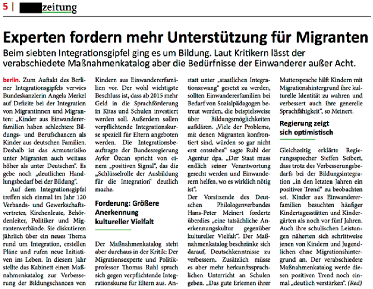
Progressive layout style.
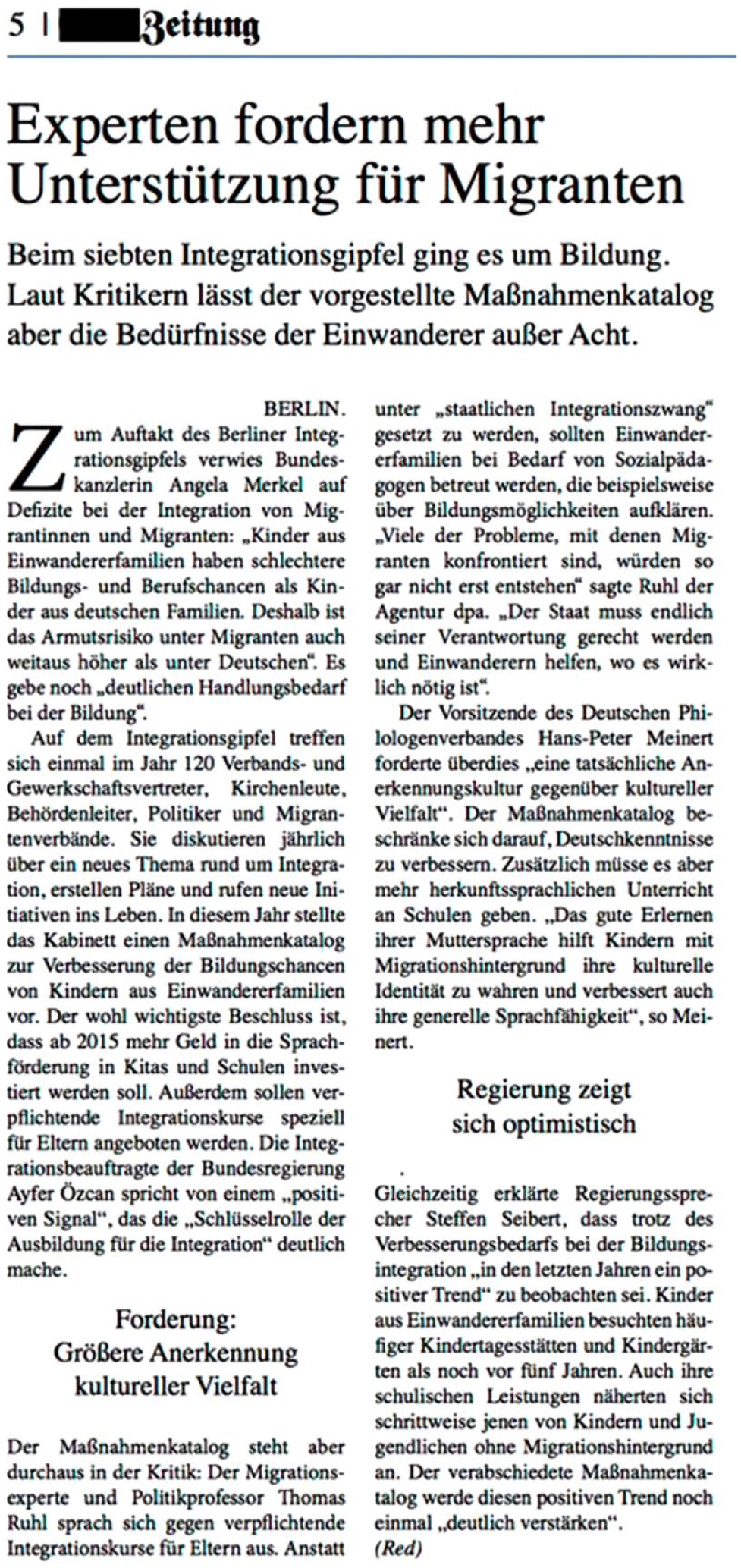
Conservative layout style.
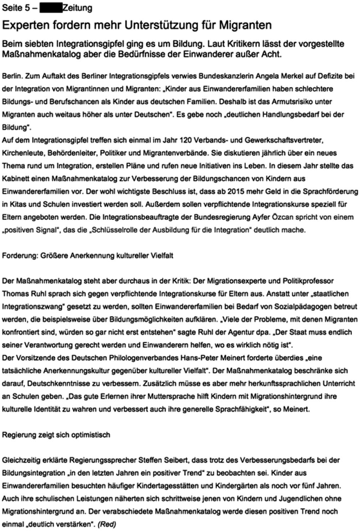
Neutral/no newspaper layout.
Measures
Perception of the newspaper’s political position
The perceived political position of the stimulus article’s source was measured on a 7-point scale from 1 = left-wing/progressive to 7 = right-wing/conservative (M = 4.31; SD = 1.31). The alternative terms ‘progressive’ and ‘conservative’ were added to the political directions because, in particular, the term ‘right-wing’ has a rather negative (and extremist) connotation in Germany, which could have led to response bias if used solely.
Respondents’ political attitude
Respondents’ political attitude was measured using the same 7-point scale from 1 = left-wing/progressive to 7 = right-wing/conservative (M = 3.76; SD = 1.44).
Familiarity with newspapers and attention to design
To capture familiarity with political layout patterns and with design in general, we measured several constructs. First, participants were asked to estimate their quality newspaper exposure on a 5-point scale from 1 = almost never to 5 = very frequently for each of the five most important, German quality newspapers. For further analyses, we calculated an index that indicates to what extent participants used one or more quality newspapers at least on a regular basis (M = 1.39; SD = 1.75).
Second, participants’ knowledge about quality newspapers’ political positions was assessed. For each of the five existing German quality newspapers, respondents’ were asked whether they think the paper’s slant is ‘rather left-wing’, ‘rather right-wing’ or whether they were not sure. Then, all correct answers were added to a sum index (M = 1.87; SD = 1.71).
Third, self-reported attention to design was measured asking participants to assess how much they generally pay attention to the design of print and online newspapers and magazines. This was estimated on a 5-point scale reaching from 1 = very little to 5 = very much (M = 3.57; SD = 1.11).
Sociodemographic factors
Participants were also asked for their age, gender and level of education.
Results
Manipulation check
In order to test for the successful creation of realistic and convincing layout and text versions, participants were asked to evaluate the article they read on a bipolar 5-point scale with 10 pairs of items regarding quality, balance, authenticity and reading experience (e.g. not professional vs. professional; not comprehensible vs. comprehensible; not reliable vs. reliable; not appealing vs. appealing). Analyses of variance showed no significant differences for these items between the different layout versions. However, t-tests indicated that the right-wing text version was rated somewhat worse in 3 of the 10 dimensions, namely in balance (right-wing text: M = 2.78, SD = 0.97; left-wing text: M = 3.18, SD = 1.04; t(485, 47) = 4.356, p ≤ .001), in seriousness (right-wing text: M = 3.60, SD = 0.95; left-wing text: M = 3.85, SD = 0.88; t(485, 95) = 3.023, p = .003), and in professionalism (right-wing text: M = 3.40, SD = 0.90; left-wing text: M = 3.56; SD = 0.94; t(488) = 2.020, p = .044). This might be explicable through the slightly left-wing oriented sample. However, it can be concluded that the layout manipulation has not resulted in any differences in the article’s general perception which could have interfered with the experimental manipulation. Differences concerning the manipulation of article slant are also not as substantial as to doubt the validity of manipulation.
Political layout effects and text effects
In order to test for the effects of the experimental manipulation on the perception of the newspaper’s political direction, an analysis of variance was conducted. Results show a significant main effect of text slant across all layout versions (F(1) = 157.61; p = .000). Reading a right-wing slanted text lead participants to rate the newspaper as more right-wing than the left-wing slanted text (see Table 1). This supports H2. In H1a and b, it was hypothesized that a newspaper with a progressive layout style is perceived as more left-wing and that a newspaper with conservative layout style is perceived as more right-wing. This is confirmed by a significant main effect of the layout versions across the different text groups (F(2) = 5.24; p = .006). Although the interaction effect between the layout and the text slant fails to reach significance (F(2) = 2.71; p = .067), there seem to be no layout effects for the right-wing slanted version on the one hand (as a separate analysis of variance indicates, F(2) = 1.25; p = .287), and layout effects for the-left-wing slanted text on the other hand (F(2) = 7.32; p = .001). According to Duncan’s post hoc test, this version is rated as significantly more right-wing if the layout style is conservative (H1b). The conservative layout appears to neutralize the effect of text slant. However, there is no difference between the progressive and the neutral layout style of the left-wing slanted text (H1a). With regard to RQ1, layout effects could thus be only found for an incongruent combination of text slant (left-wing) and layout style (conservative).
Perception of the newspaper’s ideological position by text slant and layout style.
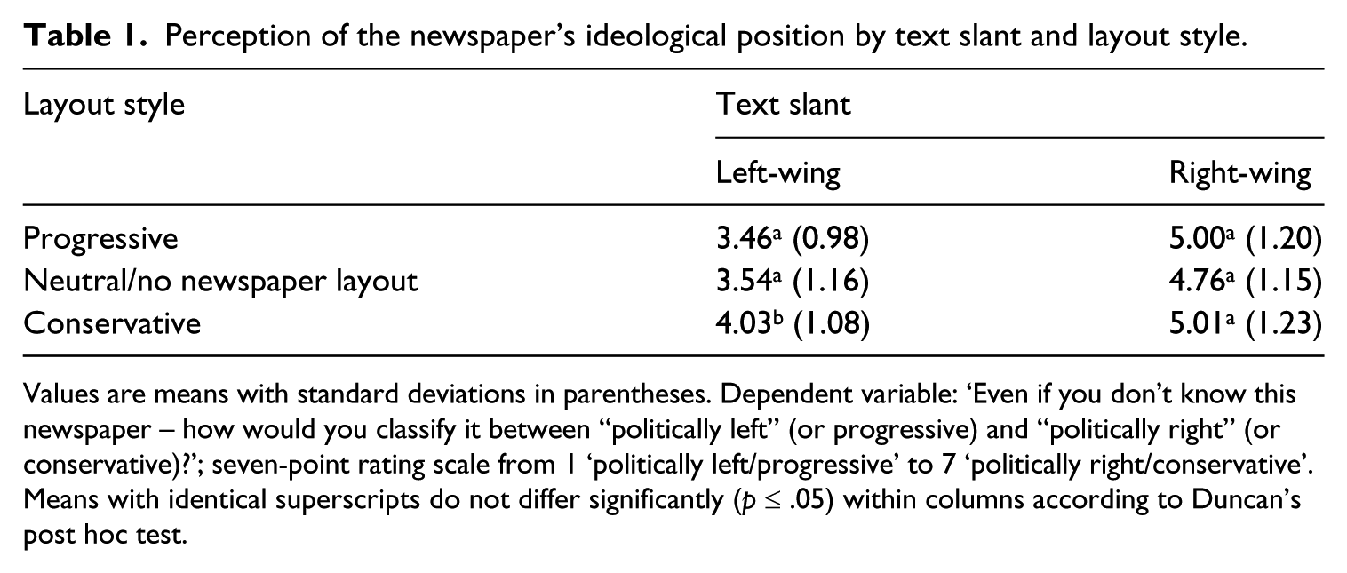
Values are means with standard deviations in parentheses. Dependent variable: ‘Even if you don’t know this newspaper – how would you classify it between “politically left” (or progressive) and “politically right” (or conservative)?’; seven-point rating scale from 1 ‘politically left/progressive’ to 7 ‘politically right/conservative’.
Means with identical superscripts do not differ significantly (p ≤ .05) within columns according to Duncan’s post hoc test.
Moderating factors
With RQ2 and RQ3, we asked for the moderating influence of respondents’ political attitudes and their familiarity with newspapers and attention to design on layout effects. In order to test for these effects, we estimated a series of linear models in which we included these variables and their interaction with the layout groups (see Table 2). Regarding the participants’ political attitude, no interaction with text slant was found. However, political attitude interacts with layout style. The more right-wing the own political attitude, the less respondents perceived the article with a conservative layout as right-wing. The effect of conservative layout style is thus reinforced by a left-wing political attitude. As to the influence of familiarity with newspapers and design (RQ3), exposure to quality newspapers and attention to design do not moderate the layout effects. Quality newspaper knowledge, however, moderates the effect of the progressive layout version: the better participants knew the political positions of important German newspapers, the more left-wing they located the article with the progressive layout style.
Effects of an article’s layout and ideological slant on readers’ perception of the newspaper’s ideological position (linear model, standardized coefficients).
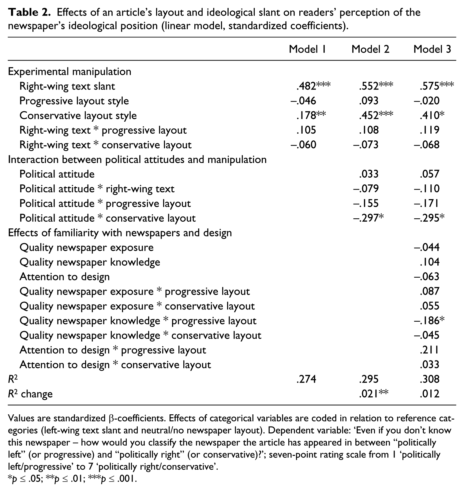
Values are standardized β-coefficients. Effects of categorical variables are coded in relation to reference categories (left-wing text slant and neutral/no newspaper layout). Dependent variable: ‘Even if you don’t know this newspaper – how would you classify the newspaper the article has appeared in between “politically left” (or progressive) and “politically right” (or conservative)?’; seven-point rating scale from 1 ‘politically left/progressive’ to 7 ‘politically right/conservative’.
p ≤ .05; **p ≤ .01; ***p ≤ .001.
Discussion
As expected, the results show a strong influence of text slant on recipients’ political impression of the stimulus. But layout style can also have an impact on how recipients locate newspapers politically. The observed findings show that variations in typography, coloration and arrangement can trigger political layout effects. However, in this experiment, direct layout effects could only be found for a conservative layout style and a left-wing slanted text version. In this case, the conservative style yielded in a more conservative evaluation of the newspaper’s political orientation than the progressive and neutral styles. The fact that neither the combination of left-wing slanted text and progressive layout nor of right-wing slanted text and conservative layout lead to significant differences in comparison to the control group suggests that a congruency of layout associations and textual content does not result in the same attention to layout as an incongruency. This means that layout does not reinforce the effects of a political text slant when it points in the same direction. However, when the layout style contradicts the text slant, it might make the difference between the perception of the same newspaper as being either left-wing slanted or centered. The left-wing text slant was, in other words, neutralized by the conservative layout style.
Regarding the relationship of text slant and layout style during message processing, these findings suggest that text and layout information are not processed separately and simply added up afterwards. If that was true, congruency of layout style and text slant should have strengthened layout effects. Instead, results indicate a holistic processing of text and layout, so that layout becomes salient only when it is incongruent with the bigger picture that is suggested by the text. It can also be concluded that text effects are stronger than layout effects but can apparently be moderated by the former in some cases. Furthermore, the fact that layout style was only effective when it was incongruent to text slant could indicate the existence of layout priming effects. The first impression of a message caused by layout style may set readers’ expectations as to the political orientation, but this priming effect may be canceled out by a strong political message in the text. These assumptions should be treated with caution though, as the underlying cognitive processes of political layout effects are yet to be examined more thoroughly.
Readers’ political position turned out to interact with layout effects but not with the textual manipulation (RQ2). Political orientation influences the stimulus perception in such a way that more left-wing oriented recipients perceive an article with a conservative layout style as more strongly right-wing slanted than more right-wing oriented recipients. This indicates that partisans can become accustomed to the layout patterns of the media outlets they are usually exposed to. Conversely, an unfamiliar layout style might appear more striking to them. Thus, political position seems capable of affecting the obtrusiveness of political layout patterns and can, accordingly, strengthen their effects. However, political position caused no different perception of the textual manipulation. Apparently, the frames used in the article versions were a quite reliable indicator for political slant, which worked independently of recipients’ political orientation.
Regarding familiarity with quality newspapers and with design, neither exposure to quality newspapers nor attention to design turned out to interact with layout effects. However, knowledge on the political positions of German quality newspapers was shown to be a moderator of the effect of the progressive layout style. While the conservative layout style was found to be effective regardless of individual factors and to be additionally moderated by political orientation, only participants with more knowledge on newspapers perceived an article with progressive layout style as more left-wing slanted. This points to the existence of different types of layout effects of whom some have more specific preconditions than others.
On the one hand, this may indicate that some political layout patterns, like the conservative style used in this experiment, fit in general schemata, which do not have to be learned specifically from regularly reading quality newspapers. Instead, their layout effects seem to be based on common knowledge about styles, symbols, and their political connotations. Such knowledge could also be transferred to other media contexts beyond the newspaper as well, so that similar political layout effects may also be observable for other political media.
On the other hand, there also seem to be political layout patterns, like the progressive layout style used in this experiment, which require specific contextual knowledge to be effective. Only participants who knew the political positions of other newspapers from the same genre located the article with the progressive layout style as more left-wing slanted. This could be explained as follows: the layout characteristics typically used by German right-wing quality newspapers (like classic initials and blackletter) differ quite clearly from the most common designs used by different media today. They might therefore be easily recognizable and commonly perceived as traditional and associated with a right-wing slant. In contrast, the design features typically characterizing left-wing newspapers (like more reds, greens and non-serif headings) are only specific for left-wing newspapers within the genre of quality newspapers. Within other genres like tabloids or news magazines, they seem to be common among right-wing oriented media as well. Hence, only participants who were familiar with the political positions of quality newspapers and therefore also with the specific design characteristics of left-wing quality newspapers perceived the progressive layout version as a sign of left-wing orientation.
Conclusion
Our study reveals two main findings: first, a large part of recipients are able to identify a relatively implicit left-wing or right-wing framing of a newspaper article. Second and most importantly, this evaluation can be influenced by layout style. Thus, this study’s findings provide first tentative evidence of political layout effects. They demonstrate that, beyond text and images, graphic design should be considered as a further dimension that may affect the perception of political media messages.
Political layout effects might be of importance in several areas: (1) Media companies and political communicators should be aware of how the perception of their political position can be influenced by design. (2) Political layout effects could unconsciously bias recipients’ perception of political messages and communicators and thus affect political opinion formation. Layout style could, for instance, cause extreme political communicators to appear more moderate. (3) Finally, political layout effects are relevant for political communication research. They could contribute to the further examination and understanding of recipients’ conceptions and evaluations of media. Moreover, political layout effects might be of importance for experimental research as effects of stimulus layout might interfere with message variations. They also point to the importance of thoroughly created stimulus layout in order to increase internal and external validity.
Limitations and future research
This study has several limitations future research should address. In this study, a single newspaper article was presented in an online setting. This setting might be regarded as a somewhat artificial reading situation. However, it seems appropriate to determine possible interferences of layout effects in experimental political communication research since many other studies in this field work with print stimuli, which are presented in an online survey as well. Future studies should, nevertheless, try to replicate the observed findings in a lab setting in which participants can be confronted with an actual print newspaper.
Moreover, political layout effects should be integrated into other fields of political communication research. They especially offer implications for priming and framing research. But also beyond the field of political communication, it should be more broadly examined how graphic design shapes the perception of media content and sources with regard to meaning. Specifically, the cognitive processes underlying layout effects and their interactions with text effects are understudied. One difficulty of this field of research lies in the complexity and multidimensionality of layout. It could not be determined whether the layout effects were actually caused by whole layout styles or just by single cues such as a particular typeface. This should be tested in more detail by future studies. Layout styles, which are connoted with some kind of political orientation, might simultaneously bear meaning in other dimensions as well. Therefore, it is not easy to systematically create specific layout styles. However, given the relevance of political layout effects, this should not prevent further investigation.
In this first step, the focus was necessarily limited to one issue, country, type of medium, and political dimension. Future analyses should particularly consider different countries and media (e.g. political advertising, political online and TV news) as well as further ideological dimensions (e.g. religion, liberalism, and intellectualism). The present study was also confined to political layout effects on the perception of a medium’s political position. It is highly plausible that this is associated with effects on the perception of media content. Future studies should confirm this assumption and investigate further possible types of political layout effects, for example, on message persuasiveness and recall.
Despite these limitations, this study points to the role of not only textual information and images, but also graphic design as a factor influencing the perception of political news. Our findings also offer insights into the complex interplay of textual and visual information in the context of political communication.
Footnotes
Funding
The author(s) received no financial support for the research, authorship, and/or publication of this article.