
Abstract
What makes one dataset powerful for civic advocacy, and another fall flat? Drawing from a citizen science project on environmental health, I argue that there is an underacknowledged quality of datasets—their topology—that shapes the social, cultural, and political possibilities they can sustain or subvert. Data topologies are formal qualities of a dataset that connect data collectors’ intentions with the types of calculations that can and cannot be performed. This configures how numerical arguments are made, and the sociotechnical imaginaries those arguments sustain or subvert. The citizen science project’s data topology made any easy notion of shared exposure to pollutants, or singular health effects, unravel. The data appeared to tell a story of atypicality at scale, where each person suffers differently from different exposure. Lacking a central tendency, or pockets of tendency disproportionately carried by different subgroups, it became it harder, not easier, for citizen scientists to use data in regulatory contexts, where dominant sociotechnical imaginaries conceive of difference in epidemiological and toxicological terms.
Data has played a longstanding role in political mobilization in environmental justice and other social movements, with data collection tools from surveys to sensors becoming resources for contestation. This contestation raises well-explored questions of local versus credentialed expertise in making knowledge (Brown, 1992; Corburn, 2005; Gabrys, 2016; Ottinger & Cohen, 2011; Wylie et al., 2017). Less explored are the qualities that make one dataset more powerful for advocacy purposes over another. Drawing from a community-based participatory environmental health project, I argue that there is an underacknowledged aspect of datasets, which I call their topologies, that shapes the social, cultural, and political possibilities that can and cannot be created with any given dataset. Data topologies create a link between the practices of collecting data and the types of calculations that can and cannot be performed. This in turn configures, but does not determine, the forms that a numerical argument can take, and therefore the sociotechnical imaginaries (Jasanoff & Kim, 2015) that a particular dataset can sustain or subvert. Through topologies, we can see how data formations entangle people and numbers into unexpected alliances and subversions. An examination of topologies can reveal where and how competing imaginaries merge or clash, and why some datasets are better tools for political advocacy than others.
I make this argument by reflecting on a project to collect air quality and health data in a U.S. community concerned about air toxin exposure. The project found that the presence of a richer dataset made it harder, not easier, for the group to take action. We collected a dense set of minute-by-minute sensor readings that created a topology that challenged pre-existing beliefs about how individuals, population, and place relate to one another. This dataset was ill-suited for advocacy not because there was a contest between ‘anecdotes’ versus ‘measurement’, and not because the dataset was too complex to understand, but because any easy notion of shared exposure, or singular health effects, did not plausibly hold together. Project collaborators did not see any reason why multi-sensor data was inherently inadequate for detecting low-level, chronic pollution. However, the sociotechnical imaginaries at work in regulatory, epidemiological, and even environmental justice circles require narratives of a single population with (preferably) a single exposure. Our data’s topology worked against this type of narrative. Without the ability to paint a picture of singular, shared exposure in the expected way, activists were hindered in their goal to establish ‘just good enough data’ (Gabrys et al., 2016), that is, community-generated data not legitimated through credentialed science but nevertheless sufficient for generating policy discussion. While the experiment was unable to fulfill the hopes of the collaborators, it did show that topologies are no mere technical detail, but deeply matter for how social relations unfold.
In the next section, I describe the research context. I then define my use of ‘topologies’, and show the connection between imaginaries and topologies. I then turn to three domains that came together the course of this experiment: (a) epidemiology and toxicology as they have informed environmental regulation, (b) environmental justice organizing, and (c) computational approaches to health. I describe the relevant imaginaries at work in each, and outline the topological forms that underpin them. I then show what happened when these became entangled with one another through our experiment. In that entanglement, an unexpected imaginary became a real prospect because of the topology we composed. I conclude by speculating on the clashes that are likely if this new topology, and its potential imaginaries, were to find its way into regulatory arenas.
Collecting data in Springfield
This work is situated in a large-scale industrial corridor in the United States that I pseudonymously call Springfield. To imagine what Springfield is like, picture taking a long road trip, heading for a major city. You crest a hill, and begin to see a 30-mile stretch of large-scale industrial installations, each site a mile or two long. It is impossible to tell where one ends and the other begins. Long trains snake through the landscape carrying hazardous materials, at times making a road crossing a 10-minute project. Your road passes directly through the middle of one site. A labyrinth of metal pipes, scaffolds, buildings, smokestacks, and storage facilities towers above you. You pull over to the side to take in the alien landscape. Upon exiting your car, your chest constricts, as mine did on numerous visits. It is as if an elephant is sitting on you. You start to get a bit of a headache, as I often did, and get back in the car.
Scattered throughout are a series of smaller communities. Some of the inhabitants work at those sites, but many do not. Some communities are middle class and primarily white, while others are communities of color bearing the brunt of environmental injustice. My collaborators, who I pseudonymously call Neighbors for Breathing, were a coalition of community groups from towns across the corridor. The coalition was also supported by two academic researchers and their labs, and focused on using new, real-time sensing technologies to collect evidence about the air and its health effects for public hearings and other legal procedures. Some members also participated in public protests that centered on broader moral claims about injustice and the connection with global climate change.
Springfield residents hold a range of views about the air pollution they face, from denial, to anger, to every permutation in between (see also Hochschild, 2018; Ottinger, 2013). In my time there, I heard a wide range of health complaints locals attributed to air toxins. Asthma, cardiovascular trouble, thyroid cancers, unexplained nausea, extended coughing fits, and chest tightness were the most common aliments they cited. There were other signs, too, that something was not right, from a neighborhood’s cars suddenly developing splotches of paint erosion, to pet illnesses that seemed to have no discernable cause. While any one of these things could have multiple causes, it is hard to hear so many stories and leave thinking all is okay. It is harder still, it turns out, to document what is going on numerically.
The hope shared by members of the coalition, including myself, was that if we combined local air sensors with off-the-shelf digital health technologies like activity trackers, blood oxygen monitors, and real-time symptom reporting, we could paint a richer, more robust picture of local environmental health that Neighbors for Breathing could use as evidence in policymaking arenas. Do community members all respond to the pollutants in the air in the same way? Which pollutants seem to affect people more? What resources would be needed to make sense of it all?
Before I became involved, coalition members had already been conducting community-based participatory research to explore how to make real-time air monitoring useful for advocacy purposes. While air quality data is in theory publicly available, it is often not available in ways that matter to advocacy groups, and it was not clear what ways of representing data would make a difference. In parallel, I had been asking similar questions through my work prototyping a (since discontinued) data exploration software tool for people seeking to resolve health issues (Nafus, 2021). This tool was not a commercial product with a business model, but an early-stage exploration of what could have eventually become a product. I became involved with this group in part because I wanted to see if that software was useful in this new context, and change it if it was not. In turn, the coalition wanted to know if my tool, and the other health sensing technologies that I had some expertise with, could help tell stories about health impacts in ways that policymakers could hear, and whether other non-technological resources were needed. Because everyone involved shared that research goal, I primarily refer to the people I worked with as collaborators and not research participants.
My role was to get community members access to technologies and analyses, to suggest technologies that could be appropriate and to guide or conduct calculations where off-the-shelf programs proved insufficient. In turn, community members worked out what gadgets, data, and calculations they did find meaningful or useful, and whether any learning required to use them was worth their while. We collectively worked towards cultivating ‘no’ as a possible outcome (no, we do not trust this company with our data; no, that gadget is overkill; etc.). We worked in two research cycles, a pilot and a ‘scaled up’ study. Each involved translating health concerns into a data collection protocol, a 2-month data collection period, and collectively examining the results. The pilot phase additionally involved community members alerting me to the limitations of the air data.
Together, we were co-designing a data collection and analysis process that we imagined would fill the gaps left by undone science (Frickel et al., 2010). Many collaborators were hoping to produce the kinds of scientific evidence they thought could establish a geographically distinct pocket of elevated rates of disease, like a ‘Cancer Alley’. We expected to see symptoms that precede a long-term more serious issue, like a rise in average heart rates, or more coughing fits, on days of high pollution. There was also an element of mechanical objectivity (Daston & Galison, 2007) that fueled the prospect that the sensors could provide additional testimony beyond collaborators’ own words and pictures, which was important for people who had been repeatedly told their experiences were mere anecdotes. Even if our efforts could not conclusively prove health effects, there was hope that we could show enough preliminary patterns either to attract a skilled public health researcher to take it further, making it ‘good enough data’ (Gabrys et al., 2016). There were others who hoped that seeing the health data directly by wearing a fitness monitor could mobilize action as an agonistic data practice to create awareness and solidarity within the community (Crooks & Currie, 2021).
What we found was no simple case of filling a scientific gap. We confirmed many of Mah’s (2017) concerns about applying big data techniques to environmental justice, and found a new one. Specifically, we confirmed that the digital divide remains a formidable barrier to using sensor data despite the ubiquity of digital devices, and that off-the-shelf technologies needed to be supplemented with computational experts to transform the data from a set of readings into a coherent story. We also confirmed that securing this expertise constitutes a serious burden on already burdened communities and raises problems of whose voice is heard. Our experiment is also consistent with Mah’s observation that real-time air monitoring is more suited for detecting severe, one-off accidents than for low-grade persistent pollution, the latter of which was community members’ concern. She explains this inadequacy by contrasting the real-time quality of air monitors, which can indicate the need for an immediate response, with the slow violence (Nixon, 2011) of persistent, low-level pollution. Our experiment indicates that this is just the beginning of the issue, which led to further questions about the sociotechnical imaginaries that our dataset challenged.
Topologies and sociotechnical imaginaries
Jasanoff and Kim (2015) define sociotechnical imaginaries as any ‘collectively held, institutionally stabilized, and publicly performed visions of desirable futures, animated by shared understandings of forms of social life and social order attainable through, and supportive of, advances in science and technology’ (p. 5). While the concept originates in megaprojects like nuclear power, mathematical forms are equally capable of sustaining sociotechnical imaginaries. Frequentist statistics—the style of statistics commonly used in positivist fields like epidemiology—inflect and underwrite longstanding sociotechnical imaginaries that remain salient today. Hacking (1990) described frequentist statistics as the ‘taming of chance’, and as a way of knowing the world through regularities and probabilities. Yet that way of knowing also proposes a vision of a more manageable world: a promise of a tamed world as much as a way of taming it. It sustains a perennial promise of improvements in control, if only more data could be collected to realize the full potential. In a messy world full of contingencies and confounding factors, where it can seem that no data is ever enough, manageability and control is remarkably hard to come by, perpetually just around the corner.
Big data is an extension of frequentist imaginaries and their impulses for more manageability. It also has partially challenged that imaginary, posing professional consternation among committed frequentists (Grommé et al., 2018). Ruppert (2018) observes that early attempts to define what makes data ‘big’—volume, variety, and velocity—are less about definitional precision and more about broader desires for speed and flexibility among proponents. Ruppert argues that imaginaries do not come to matter through the force of proclamation, but through the ways that collectivities create something new through them. Often, imaginaries are less about a broad, glimmering (or dystopic) modernity, and more about the immediate semantics of the data (see Verran, 2010), such as the way city planners imagine cities through a traffic modulation algorithm as a kind of ‘heartbeat’ (Coletta & Kitchin, 2017).
Formal qualities matter as much as semantic qualities. Kitchin (2014) describes ‘essential characteristics’ that make big data distinct: including that it is exhaustive, fine grained, and linked. Less attention has gone to what I call topological qualities. Strictly speaking, topology is concerned with geometry, making my own use somewhat metaphorical. In geometry, a topology has to do with the arrangement of surfaces. Imagine someone stretching, twisting, and bunching up a rubber band. Its topology remains a circle, unless someone snips it, flips over one end, and reattaches it to form a Mobius strip. Again, the strip could be morphed in any number of ways, but the surfaces would be arranged in relation to one another in exactly the same way. Here we are not dealing with surfaces, but with data. Nevertheless, the concept is helpful for thinking about the underlying formal characteristics or structures of a dataset that remain stable even when myriad derivative calculations and visualizations are created. A topology reflects how the dataset’s designer intended for one data element to relate to another, or the terms on which any individual observation counts as a part of the whole. It gives the whole a conceptual and mathematical coherence, such that it is possible to point to other data that does not fit, or can only be made to fit with great difficulty. For example, social media data is typically collected as a kind of network or ‘social graph’—who is linked to whom. Data in the set relate through social ties between individuals. Mathematically, it invites analysts to count up connections between them, conceptually saying much about what someone building a social graph imagines social relations to be. That ‘counting’ can take myriad forms of calculation, including machine learning models that could be trained, but there are not infinite calculations or models possible, and some are more likely than others. The ready-to-hand calculations are ones that elaborate sociality in terms of individual ‘nodes’ and connections, like shared topics of discussion or frequency of communication. This logic remains regardless of how many individuals or connections there are, or how densely or loosely individuals are connected, or whether the connections are constituted by topics discussed or frequency of contact. It also holds regardless of how the file is formatted, structured, and stored on a server. In a social graph, something that is neither evidence of a ‘node’ (individuals) nor an ‘edge’ (the connections between them) is at best secondary.
Topologies have power as a kind of epistemological starting point. Their design suggests (but does not determine) some imaginaries over others. To stick with the social graph example, a temporal or spatial analysis might be possible with access to associated time or location stamps, but these do not organize the data. Indeed, a data scientist’s job is made harder by having to work against the topology, not with it. Contrast this with the topology of the dataset I will discuss, which is a time series dataset compiled at minute-by-minute intervals. Here, a temporal analysis is all but unavoidable because the data is structured around time. It falls apart entirely without its time stamps. It asks us to imagine a world full of with pulses and rhythms, which might in turn speak to all sorts of pre-existing sociotechnical imaginaries as it moves through social life, or begin to shape a novel imaginary entirely. If the data scientist were determined, and one of the sensors generated location data, it might be possible to infer a type of social network from that data, but the dataset certainly does not invite us to do so. In fact, it creates extra work for us if that is our intention. That extra work is the friction that tells us we have stepped outside the logic of the dataset. While topologies are independent of storage and formatting, we can see a similar friction there. It is conceivable to store a social graph as a .csv file, but most people would not want to. It might be theoretically conceivable to represent a time series as a hub and spoke, but it would hardly help. The differences between these two examples are not because of what the data points refer to semantically—social media data can contain information about health and air quality as much as sensors can—but because the different in topologies potentiate different calculations, and in turn different imaginaries about what is important to know.
Topologies provide a way of thinking about how formal characteristics can vary, and how those characteristics gain social salience in specific domains, beyond Kitchin’s ‘essential characteristics’. We could potentially refer to these differences as data structures, types, or formats, but these terms are often used in data science for a wide and imprecise range of differences, like how a computer program knows what data is located where, which do not have the same salience. Here I am expanding the way the term is used among machine learning professionals, who use it to describe the ‘shape’ of certain machine learning models. By extension, a topology in data is a formal quality of how the data is collected that is difficult to change or overcome. A data set’s topology suggests something about its intent and meaning by making some statistical procedures easier, or more likely to conduct, than others. This shapes the kinds of questions that are likely to arise, and thus feeds the sociotechnical imaginaries of which they become a part.
Three imaginaries
Our experiment combined environmental sensing with digital health sensing in a citizen science context. That combination situates our work in three areas: environmental health research, environmental justice organizing, and computational medicine. These already have their own powerful imaginaries at work, sometimes deeply linked to a preferred set of topologies, sometimes less so.
The dominant imaginary in environmental health research comes from epidemiology and toxicology, and strongly influences regulatory practices. These fields largely rely on longstanding practices of frequentist statistics that privilege regularities and predictabilities tied to specific pollutants—this pollutant at that level across this period of time causes that health effect (Liboiron, 2021; Murphy, 2006). The realities do not always play out exactly in this way, but imaginaries are the stuff of the ideal type, here encoded in regulation. U.S. regulatory air pollution standards are designed around the averaged levels above which an individual pollutant should not rise for a given period of time. For example, the federal standard for nitrogen dioxide states that the yearly average should not rise above 53 parts per billion (ppb), and in any given hour, 100 ppb. 1
Underlying the epidemiological imaginary of a world made up of discrete, separable substances and effects is a key, paradigmatic topology: the distribution. Often expressed as a histogram, or an average, a distributional topology distributes a single phenomenon along a single axis, usually a population, time, or space. In an experimental setting, single pollutants are exposed to a single (usually animal) population to yield a discrete distribution of effects unconfounded by other pollutants. The effects often distribute ‘normally’, meaning there are some high effects and some low, but generally converge around an average, which can be shown as a bell-shaped curve. Governance then becomes a question of how the distribution should be morphed within the bounds of the topology. Cancers should ‘normally’ distribute geographically; but the average rate might be higher here and lower there. If the difference is not close enough to be chance, that could be evidence of an environmental health issue requiring policy intervention. The higher areas might need ‘nudging’ to resemble the middle of the curve (averages elsewhere).
Averages are at the core of air regulations, keeping the distributional topology intact. A policy goal might be to flatten the middle of the curve across an hour or a year, say, for a given population. This means it does not care for the outlier ‘spikes’ in emissions that could cause harm, and does not address anything that would require more than one X-axis at a time if plotted on a histogram. As Liboiron (2021) has pointed out, this preoccupation with averages and levels has everything to do with a colonial imaginary that understands the environment and people’s bodies as available for pollution in the first place. The topology encourages distributional game-playing within the limitations of that availability: a polluter can titrate their pollution slowly over the year, or spike wildly but rarely enough to keep it under the short-term average as if there were little difference to health. When each pollutant is assigned a distribution across time or a population, the other pollutants go out of frame, as if they no longer add up. This renders any complex interactions between multiple pollutants a kind of distant possibility, easily chalked up to uncertainty (Murphy, 2006). The acceptability of low-level pollution is thus never threatened. On the other hand, averages of single pollutants do have the power to hail policymaking subjects to respond somehow, even if meekly or sheepishly, in much the same way as Althusser’s (1970) police officer shouting ‘hey you!’ is impossible to ignore. In this imaginary, average, single-pollutant levels imply a need for management, or at least acknowledgement.
Measuring the effects of long-term exposure to low levels of multiple chemicals has been a longstanding scientific lacuna. Exposure to chemicals outside of controlled experiments introduces a range of complications, from dispersion patterns, to chemical transformations in the air, to individual health variation. This was epidemiologically inconvenient air to be breathing. The science has gone undone (Frickel et al., 2010) in part because the high number of possible chemical combinations means the preferred topologies are no longer sufficient. Distributions, like any topology, produce their own ignorance, because ‘a way of seeing is also a way of not seeing’ (Burke (1935), quoted in Proctor & Schiebinger, 2008, p. 13). The good lab experimentalist trained to remove confounding factors is also trained to be paralyzed by a relentless entanglement of bodies, chemicals, and space, and to see it as noise to her signal. Indeed, when we consulted with a public health researcher about our planned project, she advised us to avoid collecting heart rate data to correlate with air toxin exposure as it was ‘hopelessly confounded’. For her, we were stepping into sheer heartache. In this way, the scientific lacuna is not just a gap, but a way of not seeing. In policy terms, regulators see the ‘trees’ of individual pollutants, but have no way of publicly acknowledging the possibility of a forest.
Ways of imagining data within environmental justice and citizen science circles are related to epidemiological and toxicological imaginaries, but also diverge from them. Activists turn to data from health surveys (Cohen et al., 2012; Murphy, 2006) to air sampling bags (Ottinger, 2010) to sensors (Jalbert & Kinchy, 2016) to show that there is in fact pollution, and effects on health, in terms that regulators can acknowledge. Within the coalition, some collaborators put more stock in the imaginary of frequentist ‘proof’ of harm than others. There was also some apprehension (Shapiro et al., 2017) about numerical data as the privileged best way to know. My collaborators also knew that ‘proof’ sets up a dynamic of evidence and polluter counter-evidence, escalating to where ‘no evidence was good enough, no experiment close enough to the human condition’ (Proctor & Schiebinger, 2008) for regulatory action to be justifiable. Our experiment took place in country that largely rejects the precautionary principle. This places a burden on communities to seek ‘proof’ of harm regardless of one’s faith in numbers, reinforcing long-term patterns of damage-centered research (Tuck, 2009).
Where the environmental justice imaginary more sharply diverges from the toxicological/regulatory one is in the ‘single pollutant at a time’ approach, which community members say paints an unrealistic picture of the air they are actually breathing. Polluters regularly emit many chemicals simultaneously, and at low levels they are not subject to regulatory action no matter how many chemicals there are. The data from air monitors in multiple sites in the corridor showed that breathing at least three or four pollutants at a time was commonplace. Residents were concerned about the combinatory effects of what they called a low grade, persistent ‘toxic soup’. For them, this is the signal, not the noise. On this count, they are not the only ones concerned. Fortun and Fortun (2005) note that toxicology, particularly before the turn to informatics, has been criticized from within and outside the field for being ‘too slow, too methodologically conservative’ to account for low-dose and combinatory effects on bodies, or biomarkers before they result in disease.
There remains no readily available data topology that community groups could use for enumerating the ‘toxic soup’ problem in the same way that ‘one pollutant at a time’ is ready-to-hand. Informatics systems designed by and for citizen groups, such as I-Witness Pollution Map (Louisiana Bucket Brigade, n.d.) and Air Watch Bay Area (Fair Tech Collective, n.d.) began experimenting with offering stacked line graphs, or GIS layers, of various pollutants, keeping chemicals separate but in the same visual field. These only rarely ventured calculative forms that more deeply combined pollutant data mathematically. 2 Indeed, this was an area ripe for innovation (Ottinger, forthcoming).
Lastly, because our experiment used tools of digital health, imaginaries from computational medicine were also at work. These approaches make a point of departing from the frequentists’ preoccupation with distribution across a population. They re-imagine the relationship between individuals and populations by privileging particularization and personalization as a kind of social relation. The most well-known instantiation of this, precision medicine, coheres data as kind of ‘N of a billion ones’ (Greenfield, 2016), where the ability to pinpoint individuals’ ailments relies on aggregating data at large scales imagined as a totalizing picture of the sources of individual variation. In contrast, Rabeharisoa et al. (2014) argue that rare disease patient organizations have shifted away from attempts to aggregate a population, as in establishing that ‘rare diseases are rare, but rare diseases patients are many’, towards a ‘politics of singularization’, which advocates for patient registries that specify the particularities and commonalities of diseases without claims about population at all. These particularities attract medical researchers precisely because they expose poorly understood biological pathways. Similarly, the group most enthusiastic about off-the-shelf health devices, the Quantified Self community, developed expertise in digital health technology because of concerns about clinical practices not taking individual variation and patient’s stories seriously enough (Nafus & Sherman, 2014).
These sub-communities of computational medicine share sociotechnical imaginaries that hinge on individuation, but they do so in different ways. In precision medicine, the population is merely a much larger, more richly defined grouping that pinpoints individual anomalies. In rare disease politics, the connections are partial. To paraphrase Lury and Day (2019), patients are partially ordered in ways that make them similar to, but not quite the same as, others in the registry, such that the group is never able to be consolidated as an ‘us’. The Quantified Self imaginary coheres around the self, which participants do take to be a social self, but without the need for further numerical connection with others.
The topologies in computational health that sustain these individualized imaginaries are less established than those in longstanding epidemiology and toxicology traditions. Lury and Day’s (2019) analysis of a sparse matrix (originally concerning music recommendations, but which they argue also applies to health data) can help us imagine one topology that sustains imaginaries of the particular. Imagine a matrix as a large but sparsely populated spreadsheet, with products like songs or videos as the rows and consumers as the columns. An algorithm predicts which empty box in the matrix will be filled next—which next song or video will be consumed by whom. The system constantly revises the grouping to which the individual might be similar, which means that sociological constructs like ‘women in their mid-40s like these songs’ no longer apply. They call this process ‘a-typical individuation’. Roberts et al. (2019) similarly describe the dizzying a chain of non-aggregable associations in direct-to-consumer genomics data, which appear to also involve a kind of atypicality at scale. While the sparse matrix might not be the cornerstone topology in every case of computational medicine, it suggests a way of cohering phenomena through atypicality both conceptually and mathematically—the precise opposite of a distribution that delineates what is typical and what is not.
In rare disease patient communities and in precision medicine, an imaginary of personalization is no obstacle to researchers conducting research and pharmaceutical companies making money from individual patients. The social nature of that individuation is a mere subtlety. However, for communities embroiled in heated environmental contestation, that ‘mere subtlety’ is a major problem. Communities very much do require a ‘we’ at a shared site of exposure to successfully argue for stopping the pollution. This is where the problem began.
Combining air and health data
Both health devices and air sensors generate time series data at roughly continuous rates, which creates a topological compatibility that makes mathematical correlation between them possible. Other tools of citizen science, like intermittent community health surveys, or hospital records that reflect industrial accidents, cannot be as easily correlated with the moment-by-moment fluctuations of air monitor data. The software my engineering team was building could automatically make multiple time series correlations at once, which meant we stood a chance of computationally bringing together the worlds of environmental justice and digital health.
The coalition co-designed a process for collecting both health and air data, which used an academic collaborator’s software to collate the air data in machine-readable ways, and then used my software to store, aggregate, and explore the whole dataset. The community group representatives defined the health indicators to collect based on their daily experiences (see Table 1), I suggested appropriate tools to measure each, and we jointly agreed on a setup. Many of these were pulmonary and cardiovascular, as tight chests and coughing fits were a regular occurrence among my collaborators. Collaborators also requested that we invite participants to use the ‘free text’ field to report anything they wanted to express, and people did report pet ailments, barriers to using the gadgets, and even apologies when they were unable to self-report a symptom on time. We were not primarily concerned with any one variable, but with whether any sensing was plausible and feasible at all. We first conducted a nine-person feasibility test to examine the functioning of the technology, and whether it would generate plausible data. We then conducted a 30-person experiment to test whether a refined version of the setup at a somewhat larger scale gave us any further purchase on the problem. For each round, we collected data for 2 months, focusing on community members that lived either side of one of the enormous industrial installations described above, where industrial grade, though older, air monitors were already in place and their data was publicly available.
Data collected. Peak flow was abandoned in the second round. Some air variables did not have detections during the periods of study.
In the first round, I sat down with all nine collaborators individually to explore the data and identify what was salient about it from their points of view, similar to an ‘N of one’ Quantified Self study. I then did a small amount of data wrangling behind the scenes to see if any correlations held across the group, and facilitated a group discussion about these correlations. At this discussion, community members debated whether a second phase was in order, and if so, what to do differently. In the second phase, we did not host a similar group discussion for reasons that will soon become apparent.
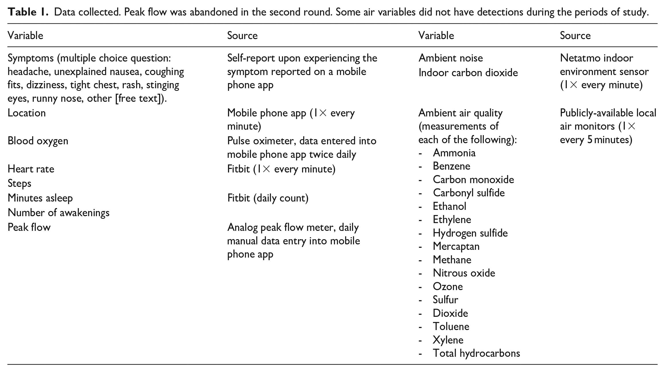
Community members had no trouble critically reflecting on their own individual data, providing context, and suggesting new and different ways of parsing it (see Figure 1). For example, one collaborator immediately spotted her out of state travel when looking at a rise in her blood oxygen. She told me, ‘I always feel better when I go [there]. It takes a few days, but I always do’. This insight taught us to not expect blood oxygen to correlate instantaneously to changes in air quality. Another collaborator saw that her heart rate seemed to be elevated at a certain time of day every day, and she asked me to bring up patterns in the air pollution to see if it corresponded with worker shift changes, which she suspected caused pollution spikes. Together we saw peaks of benzene and xylene emissions recurring during that same time slot, at which point she brought up a possible alternative explanation that she also tended to watch a particularly infuriating television show at that time, which could also raise the heart rate.
Collaborator telling me to click to a new screen to test whether the messy time series graph reflected time of day patterns in her heart rate. She was a better explorer of the data than any data scientist could be, because she was there when it was collected.
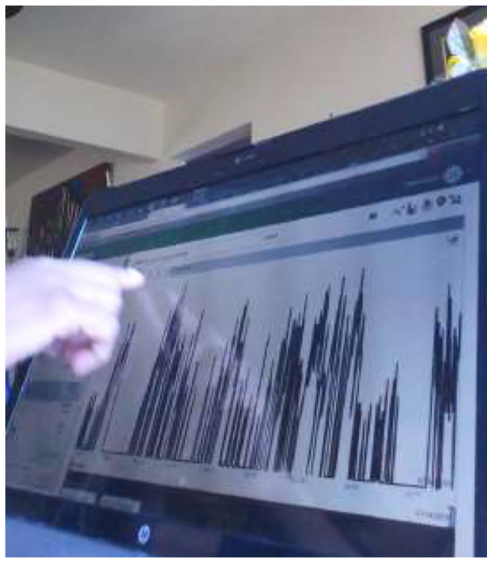
What my collaborators really wanted to know was the ‘we’ part: ‘are we getting gassed?’ as one person put it. My software had not yet built many features to aggregate data across groups, but a ‘hack’ made this possible via the correlation grid feature (Figure 2). This was originally designed to help a single user disentangle what correlates with what in a situation where they had many time-based variables that would be laborious to correlate individually. By putting in one health variable—say, heart rate—from each participant in the grid, and one pollutant as the tenth variable, I was able to create matrices that showed how each collaborator’s heart rate was responding to the pollutant in question. In the first round, it became apparent almost all participants were responding in a similar way for some pollutants, albeit with differing strength of response, and sometimes requiring us to resort to technologies outside this software to see it. This gave us reason to believe it was worth continuing into a second round even if the strength of the correlation is not terribly strong. As we were warned, hearts respond to many things beyond air quality, so the correlation should not be numerically strong. For us, the question was, are hearts responding at all.
Matrix of all possible correlations between nine people’s heart rates and one pollutant. Correlations were taken at 5-minute intervals. The intensity of the color in indicates the strength of correlation; orange or blue indicates a positive or negative correlation. For the pollutant tested, most people’s heart rate went down while it was in the air. The heart rates between people positively correlate because sleep lowers the heart rate, and people tend to sleep at the same time of day.
This was not the sparse matrix of Lury and Day (2019), but a denser one being used in a frequentist way to arrive at an average air/heart correlation across a group. This repurposed software did not calculate a group average automatically (I had to do manually), betraying its computational medicine origins. This had an unanticipated effect: collaborators could see themselves individually in the data. They also knew each other well—who lived where, each other’s health ailments, and more. This prompted questions about how or whether I had ordered the data by various characteristics (or instance older versus younger, or proximity to the pollution source) and which of these were important clusterings for the next round. It is possible these questions could have arisen if I had only reported, say, an average correlation of sulfur dioxide with heart rate, but watching people in the meeting point and gesture at the visualization, and tell interpersonal stories, the visualization seemed to have a framing effect. These were glimmers of the particular that were apparent because of the software’s computational medicine origin. These particulars created other problems. In that session, another collaborator rightly pointed out that this still replicates the ‘one chemical at a time’ approach that he and many in the group found insufficient, and asked whether there was some way to combine the pollutants together in a kind of overall index. While we eventually were able to create an index suitable for showing the presence of multiple chemicals at once, we were unable to work out a way of capturing their combined fluctuating levels such that it could be correlated with the health data.
The second round of data collection turned out to be far more vexing. The second round confirmed again that conducting a study of this type is indeed feasible, if laborious. However, in terms of what the data had to say, there were no patterns to see—no discernable tendencies overall or between subgroups defined by age, health status, or place of residences, and no consistencies between the first and second round results. We even had the good fortune that the activity tracking firm had updated their data output to include daily resting heart rate, which removed heart rate changes created by exercising (a confounding factor). Yet, there were no patterns at all to see, despite the larger numbers of participants and the arguably less confounded heart rate data. Given the contrast with people’s experiences, it was a nearly infuriating result.
What happened? It is possible that there simply was not enough pollution for that particular period of study to have an effect; in the first round there were more obviously concentrated ‘good periods’ and bad, making any possible correlation more pronounced than in the second round. The monitors at the site of our study were of an older vintage with higher detection limits, meaning that undetected pollution could be creating variance in the health data that would not correlate numerically with the artificially flattened pollutant data. The wind speed and direction data showed that the winds were especially variable during the second time period, meaning that the levels of pollution at the monitor would not translate into a consistent exposure for people down the road versus over a hill, muddying any possible relationship. It is also possible that within individual bodies, the physical response to the pollutants were too varied to produce a numerical pattern. Finally, and perhaps most importantly, it is also possible that there was nothing to see in this manner at all: either because there were no detectable effects for the health measurements we were taking; or because our expanded sample of thirty was still too small; or because we never solved the ‘one pollutant at a time’ problem, and thus any correlation was numerically diffused across several pollutants.
While any these explanations are entirely plausible, there is one final possibility. It is conceivable that what these matrices of individual correlations with individual pollutants are really indicating is not a frequentist story of a central tendency, or pockets of tendency disproportionately carried by different subgroups, but a story of atypicality at scale, one where residents are indeed suffering, but they are each suffering in their own way, like some toxic homage to Tolstoy. One clue to this possibility lies in comparing the air data collected by the two monitors in both rounds. In both rounds, the two monitors told inconsistent stories about the air. In the first round, we interpreted this as an anomaly, and based our correlations on the more plausible appearing monitor. For the second round, we used the monitor nearest to each participant’s home to be able to generate correlations of some kind. Needing to divide the people into two groups based on proximity to a monitor made it clear that there were real problems in establishing who was breathing what. If we are seeing at least two airsheds because we have two monitors, how many ‘airsheds’ are going undetected?
For me, the assumption that air is something that is shared began to unravel. For the 2 months of the second round, some pollutants, such as methane and sulfur dioxide, were detected at both sites, but others like ammonia and ethanol were seen only at one site or the other. Similarly, the pollutants that had been detected in the first round were only sometimes seen in the second round, and vice versa, showing that the composition of the air had changed significantly through the months between. An engineer who maintains air monitors told us that it is possible there were inaccuracies in pollutant levels detected due to winds and detection limits, but generally if a pollutant was detected, there is indeed some amount of it present. Are these partially overlapping pollutants drifting from yet another industrial site down the road? Similarly, in the second round, the chemicals that were detected at both monitors sometimes had differing levels, sometimes rising and falling in sync, but sometimes having no apparent relationship, or they appeared related for a time, and then suddenly appeared unrelated (see Figure 3). While some of this is likely due to monitors malfunctioning, the sheer relentlessness of the heterogeneity is reason to believe that for any particular place, at any particular time, the composition of the ‘toxic soup’ can vary quite seriously. Now add into the variation the movement of people within this area, and occasionally beyond it. The lack of correlation among the air quality variables combined with people’s movement suggests that people’s exposures are not going to be sufficiently shared such that we can say ‘people here breathe X levels of sulfur dioxide’.
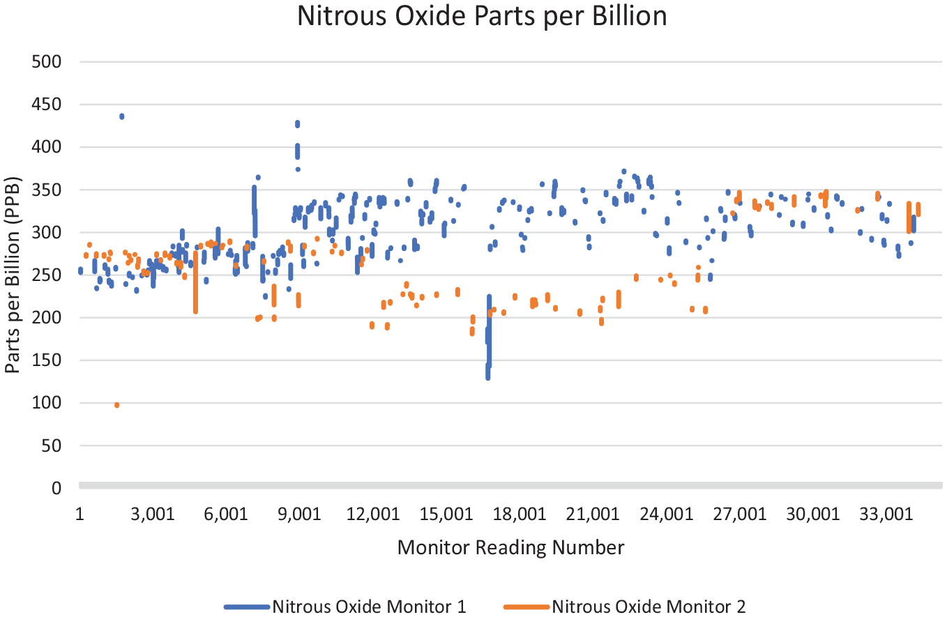
Nitrous oxide in parts per billion across two air monitors. The monitors are within 2 miles of each other. The X-axis represents the running count of data from the first reading to the 34,391st reading.
This experiment created a topology that takes the shape of a matrix of correlations between time series datasets. That matrix disaggregates individual bodies and individual pockets of air in into different slices of place and time. The data topology zoomed us in to specific temporalities and geographies that glue bodies and air together, and in that zooming, differences emerge not just between different kinds of bodies in a population, but also the different substances that they breathe. The topology drew our attention away from ‘air quality’ as a whole, and whether people on average responded to it, and towards the specificities: what could be happening socially, spatially, and biochemically to create one correlation but not another? Like Lury and Day’s a-typical individuation, and Rabeharisoa and colleagues’ patterns of similarities and difference, these correlations appeared to show a partial ordering of people who are somewhat similar to one another, but not similar enough to populate a single, simple x-axis. To speak of a standard deviation, as if everyone were on the same curve constituted by the same exposure, would imply a level of commensurability that the air data suggests might not exist.
This put any commonsense notion of ‘us’ out of reach. One would have to step out of the logic of the dataset itself to remember that in some wider sense, all air is necessarily shared. It circulates around the globe, defying tidy division. Outside the logic of the dataset, there obviously is an ‘us’: a geographic community with shared concerns, experiences, and projects, of which this was one. Yet the ‘matrixed’ time series correlation topology made difference and variation an unavoidable part of the story. This suggested, to me at least, that in our fusing of epidemiology, environmental justice, and computational medicine, we had created a possibility of a hybrid imaginary that, for shorthand, I call ‘N of many ones’—a situation where harms are particular to individual bodies, not commensurate enough to call ‘the same,’ and yet still interconnected. I am not claiming that the data conclusively showed this diffuse form of harm, only that the topological form made this potential more conceivable.
A problematic topology
While the results were unexpected, an argument could be made that what was really required here was a significantly better dataset. With resources, it is feasible to overcome many of the possible reasons for the research flop: limited temporal coverage, spatial coverage, population coverage, skills gaps, data quality, and more. A multidimensional matrix that also includes topography, air chemistry, and wind alongside the health and pollutant variables is perfectly feasible for a well-resourced project. Colleagues in data science would rightly note that this is simply called modelling, or, as the data scientist who we consulted noted, ‘at that point it’s just math’. That math, though, has major implications for communities’ capacity for advocacy.
Ultimately, this was not data that my community collaborators chose to use, and their response to the outcome was essentially a shrug. Nevertheless, I would like to conclude by reflecting on what would have made the political road rocky even if the stars had aligned empirically. The prospect of an ‘N of many ones’ situation did not slot into known regulatory tropes, and therefore did not meet community members’ aspirations for regulatory engagement. The new-found visibility of the relentless atypicality of the air does articulate advocates’ concerns that the regulatory framework is insufficient, but makes it harder to make a claim about a ‘we’ who share the same problem. When zoomed in close enough, the problem does not seem to be same for everyone. Showing each person is suffering from something slightly different, and each in their own way, does not make for a story that can be easily told in a public hearing. The dataset size might not overcome the politics of uncertainty (Murphy, 2006) that dismiss ‘nonspecific’ diffuse harms as imperceptible and therefore not in need of action. That also would require much more extensive and expensive resources including access to modelers and other specialists. These are costs that community groups are unlikely to be able to bear on their own.
If the notion of a shared airshed falls apart empirically, then a new way of imagining pollution as a nevertheless shared experience would have to be created. Yet this is already being undermined. Prototypes like London’s Clean Air Route Finder (Cross River Partnership, n.d.) use data to identify pockets of ‘bad’ air and ask people route around them. Technologies like these do not represent a new sensibility about interdependence amid specificity, but a neoliberal tactic of dividing shared interests, dissuading communities from asking inconvenient questions about why pollution is there in the first place. They are also unlikely to work. Our data showed pollutants are too scattered and constant for people to be able to realistically plan their days around pockets of air to avoid. The problem might instead be everywhere, just differently everywhere, making opting out in individuated ways an ineffective solution in most circumstances. It might be that a future project could radically rework these types of apps to show the inescapability of multiple pollutants everywhere, and collectively assert new kinds of demands beyond lowered levels. Newer approaches from the digital arts, rooted in less dominant topologies, might need to be developed to open up the visual, sculptural, and auditory storytelling strategies to do so.
Finally, there are the brute political facts of working from a non-dominant position. If regulators are hailed to manage the air via average levels, a matrixed topology does no such hailing of regulatory attention. A different composition of credentialed and non-credentialed experts might succeed in nevertheless commanding it, especially if they had a dataset so large that it tapped into the additional sociotechnical imaginary of the supposed power of large numbers, which, ironically, stems from frequentist preoccupations with representativeness. This route, however, risks not just muting community voices and experiences as Mah (2017) predicted, but leaves communities vulnerable to ‘merchants of doubt’ type techniques (Oreskes & Conway, 2011). If one way to make the science appear perpetually unsettled is to make human suffering appear scattered and unconnected, N of many ones imaginaries could inadvertently fuel that dynamic. Polluters could easily trivialize matters as a case of communities trying to pin all possible woes on a single source.
However, a hard road is not an impossible one. Cultures do change. A-typical individuation and similar social forms are becoming the stuff of the everyday, not just the stuff of computer science. Now that material conditions make many types of toxic soups harder to ignore as a shared problem, from the plastics crisis to pesticides to climate change itself, the possibility of an ‘N of many ones’ situation might be less hard to imagine.
In some ways, we could re-read my troubles with topologies as a story of coming to terms with an element of infrastructure that did not declare itself in those terms. My naïve understanding of data was that it was something that sits on top of computational infrastructure, but itself was infinitely mutable. What I encountered was instead some infrastructure-like qualities within a dataset itself, at least if we apply Star’s (1999) classic definition: relations here were embedded in structures that cannot easily escape the pre-existing components from which they come, and that delineate learned conventions and social worlds. Topologies get us purchase on the social frictions and breakdowns that are not glossed over by more and more data. In that sense, stories told with data are not just stories that sit on top of a dataset. Exploring a dataset’s topology links those stories with longer-standing lineages of computation and knowledge production, as my own assemblage across three domains rather painfully made evident. Topologies are useful to think with because they show us where a dataset’s logic needs to be broken entirely in order to tell the story worth telling.
The stories that my collaborators tell about their own experiences of pollution are a far more significant accounts of what is happening in Springfield than anything the sensor data indicated. However, the specific way the experiment ‘failed’ is useful for thinking about how topologies figure in cultural transformations. Our experiment opened a glimpse into the radically different social circumstances that would be required if we were to take differences seriously as evidence of an otherwise shared impacts. Our experience also suggests there are real problems in how data should figure in environmental contestation at all when the resources to mobilize it are not equitably distributed, when personalization provides no easy way out of a shared yet multiply different problem, and when the epistemic apparatus of frequentist statistics are only slowly softening their grip over other ways of knowing.
Footnotes
Acknowledgements
I would like to thank Gwen Ottinger and Karly Burch for their ongoing collaboration and support, and input into early drafts, and the Centre for Sustainability at the University of Otago for the intellectual home where the bulk of this manuscript was written. Special thanks go to the two anonymous reviewers for their incredibly thoughtful insights, and to the ‘Neighbors for Breathing’, for their willingness to experiment and creativity in working with new data forms.
Funding
The author received no financial support for the research, authorship, and/or publication of this article.