
Abstract
Venn and Euler diagrams can provide researchers and practitioners with a quick visual summary of information that is relevant for evaluating policy, but given that the potential number of intersections grows exponentially relative to sets of information (2 n – 1), diagrams featuring more than three sets of information are typically difficult to interpret from a two-dimensional medium (i.e. reports or articles). In contrast, upset diagrams arrange sets and intersections on a matrix. Thus, the potential number of intersections grows linearly, and further information (e.g. histograms and boxplots) can be aligned vertically or horizontally to this matrix. To demonstrate this application, seven commuter modal choices, two car-parking policies, car holdings and country of birth will be visualised using an upset diagram to evaluate whether a parking-maximums policy reform in Brisbane, Australia, is reducing car ownership and dependence.
Keywords
Parking-minimums policies are informed by the predict-and-provide planning paradigm that has dominated land-use and transport-planning policies for more than 50 years. To calibrate parking minimums, researchers and policymakers predict the peak demand for parking at a given land-use type. Developers in turn ensure that their development applications will provide enough parking so that all predicted cars may park onsite to avoid both parking overspill and the resultant social conflict (Goulden et al., 2014). For example, a parking minimum featured in Schedule 6 of the 2014 Brisbane City ePlan (BCC, 2014) requires at least 1.25 off-street parking bays per two-bedroom multi-unit dwelling. Notably, not every household will require all their parking bays, which could explain why bay-sharing applications for renting surplus parking are emerging, such as KERB and Parkhound. In addition, critics argue that parking minimums generate expanses of artificial surfaces that are poorly utilized outside of peak-demand periods that also increase the appeal of driving (i.e. the induced demand problem; see Vanderbilt, 2009) and therefore undermine the alternatives, such as public and active transport (Shoup, 2005).
In contrast, parking-maximums policies are informed by the demand-management planning paradigm that attempts to discourage demand for parking by restricting parking supply and therefore the utility of driving when alternatives exist. These policies are typically implemented within the inner city or what is deemed a walkable range of major public-transport interchanges. For example, a parking maximum featured within Schedule 6 of the 2014 Brisbane City ePlan (BCC, 2014) restricts two-bedroom multi-unit dwellings to no more than one bay if located within the ‘city core’ or ‘within 400m walking distance of a major public transport interchange’ (BCC, 2014).
To create a Venn diagram that includes all seven policy-relevant modal choices (i.e. car driver, car passenger, bus rider, ferry rider, train rider, walker and cyclist) and the policy in place where BCC commuters reside (i.e. parking minimums or parking maximums), this would require displaying eight sets and up to 255 intersections (28 – 1; Conway et al., 2017; Lex and Gehlenborg, 2014). Interpreting this potential number of intersections from a two-dimensional medium would be impractical. Thus, an upset diagram will be used. Further, this upset diagram will provide the opportunity to examine these intersections against other policy-relevant information to determine whether the parking-maximums policy reform is having its intended impact in Brisbane, Australia. For examining modal choices, the Australian Bureau of Statistics’ TableBuilder (ABS, 2019c) can tabulate their 2016 Census of Population and Housing into 239 Methods of Travel to WorkPlace (MTWP) by their Statistical Area One (SA1) neighbourhood units (ABS, 2019c). The corresponding SA1 digital boundaries (ABS, 2019b) and SA1 DataPack that comprises simple suburb characteristics (i.e. average car ownership per household and proportion born overseas are also available for download from the ABS website (ABS, 2019a). Next, to determine whether parking maximums apply where the commuters reside, the ‘city frame’ digital boundary is available upon request from the BCC, and the location of major public transport interchanges from the Queensland Government’s Department of Natural Resources, Mines, and Energy (NRME, 2019). Last, the UpSetR R library for generating upset diagrams is available for open-access from CRAN (https://cran.r-project.org/web/packages/UpSetR/index.html), while the data cleaning, coding, geo-processing and visualisation script from this article is available from rPubs (http://rpubs.com/AnthonyKimpton).
Among the 467,683 commuters located throughout the BCC, 7% reside within the city frame, and a further 7% reside within 400 metres of a major public-transport interchange. Thus, 14% of commuters reside where parking maximums apply, and the remaining 86% live where parking minimums apply. Given that 52% of commuters drove directly to work from where parking maximums apply and 72% from where parking minimums apply, these findings already suggest that the parking-maximums policy reform is successfully discouraging driving. Thus, the following upset diagram focuses on the remaining intersections (Figure 1).
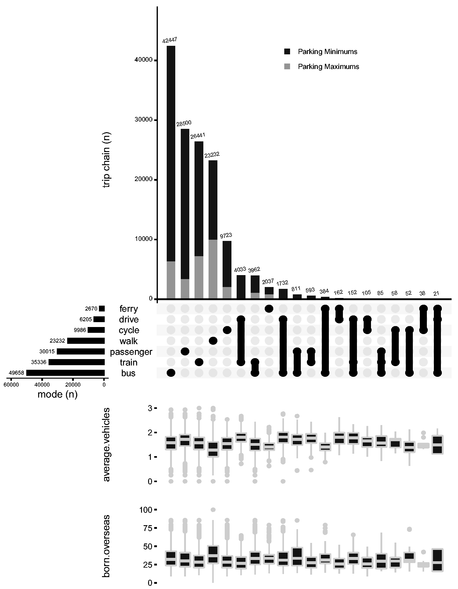
Brisbane commuters who did not drive directly to their workplaces.
Figure 1 reveals the 20 most common modal choices, and reading up the intersects axis of the matrix reveals that commuters typically avoid modal choices that entail changing modes. Notably, the ferry-only modal choice is less common that multimodal train riders. However, reading across the sets axis of the matrix reveals that that the ferry is a relatively uncommon choice (n = 2670). Further information revealed along this sets axis is that only 6205 of drivers are converting to other modes during their journey, thus suggesting a tendency to continue driving once within the comfort of their own car. Next, reading up the stacked bars reveals almost half the commuters that walked directly to work reside where parking maximums apply, which is substantial, given that just 14% of all commuters reside where parking maximums apply, and suggests that this policy is creating the opportunity to reside and work within the same neighbourhood. Last, by appending box plots in line with the intersects, it is possible to examine neighbourhood characteristics by reading down the plot. For instance, walking-only and ferry commuters are typically leaving neighbourhoods with fewer cars per household, thus suggesting that cars are less appealing when walking will suffice or an opposite side of the river must be reached. Further, walking-only commuters are typically leaving neighbourhoods with more residents born overseas, thus suggesting immigrants place a higher premium on walkability than their Australian-born counterparts. In sum, this article demonstrates the application and utility of upset diagrams for practitioners, researchers and policymakers evaluating policy outcomes, and while only parking maximums were examined, these diagrams are well suited for examining a range of policy outcomes such as green-space features or school facilities.
Footnotes
Declaration of conflicting interests
The author(s) declared no potential conflicts of interest with respect to the research, authorship and/or publication of this article.
Funding
The author(s) disclosed receipt of the following financial support for the research, authorship and/or publication of this article: This research is funded by the Australian Research Council Linkage Project grant LP160100031 with additional support from the industry partner, the Queensland Department of Transport and Main Roads.