
Abstract
Extreme weather events such as heavy snow can severely disrupt urban transportation systems. When this occurs, travelers often seek information about the status of transportation services. This study aims to assess information utilization during an extreme weather event by analyzing data from a smartphone application (“app”) called Transit, which provides real-time transit and shared mobility information in many cities. This research focuses on a snowstorm that hit the northeastern United States in January 2016 and severely disrupted transit and shared mobility services. An analysis of Transit app data is conducted in four parts for New York City, Philadelphia, and Washington, D.C. First, hourly app utilization during the snowstorm was compared with mean hourly app utilization prior to the storm. Second, the rate of app usage was calculated by dividing hourly utilization during the storm by the mean hourly volume before the storm. Third, an ordinary least squares regression model of hourly app usage was estimated for each city. Last, a feature within the app used to request Uber vehicles was examined. The results of the first three analyses reveal that overall app usage decreased during the snowstorm in all three cities; after the storm, New York experienced a significant increase in overall app use during the first Monday commuting period. The analysis of Uber data reveals that app users continued to search for ridehailing services during the snowstorm, despite travel bans. These findings are important for transportation operators and app developers to understand how travelers use information during extreme weather events.
Extreme weather events such as heavy snow can severely disrupt urban transportation systems. One recent example occurred in January 2016, when Winter Storm Jonas dumped historic amounts of snow throughout the northeastern region of the United States. Jonas was the single largest snowstorm on record for numerous locations in the northeast, including New York City’s LaGuardia Airport and Baltimore–Washington International Airport ( 1 ). This historic snowfall deeply affected the transportation systems in New York City, Philadelphia, and Washington, D.C. The local governments declared travel bans, public transit systems were shut down, and the period of recovery in some areas lasted for nearly a week after the snowstorm.
When extreme weather events such as Winter Storm Jonas occur, travelers often seek information about the status of transportation services to determine whether they are shut down and to stay informed as they reopen. However, understanding how travelers seek information during extreme events can be challenging due to a lack of readily available data. For example, surveys are difficult to administer during unplanned events, and they can be expensive to collect retroactively. Therefore, this research aims to use a new data source to understand how travelers seek information during an extreme weather event. Specifically, the records from an urban transportation information smartphone application (or “app”) are examined to provide insight into how travelers utilize new information and communication technologies during severe storms.
Prior Research and Objectives
There is a growing body of literature that examines the transportation system impacts of extreme weather events ( 2 – 4 ) and large special events such as sports games ( 5 , 6 ). This brief review of prior research focuses specifically on studies that use new data sources to understand the impacts of extreme weather on the transportation system in the New York City region.
One noteworthy study measured the resilience of the New York City transportation system after Hurricane Sandy using data from taxi GPS traces ( 7 ). The findings suggest that Hurricane Sandy affected roadway traffic conditions for more than 5 days, and that significant traffic delays were encountered during the post-disaster response period. A second noteworthy study used two “big data” sources to assess the consequences of Hurricane Sandy and Hurricane Irene in New York City ( 8 ). Post-hurricane recovery patterns for the roadway and subway systems were analyzed using taxi trip data and subway turnstile data, respectively. The method involved calculating the rate of recovery, which was found to be lower for Hurricane Sandy compared with Hurricane Irene. A third study developed a method to detect demand fluctuations and correlate them with disruptive events (such as extreme weather conditions) using New York City taxi trip data ( 9 ).
In summary, there are several emerging data sources that can help to quantify the impacts of extreme events on transportation system performance. However, to the best of the authors’ knowledge, prior research has not considered the relationship between extreme events and transportation app utilization. Therefore, the objective of this study is to explore the use of transportation information provided via smartphone applications during an extreme weather event. The specific dataset used in this analysis is from a smartphone application called Transit, which is available in numerous cities ( 10 – 12 ). Because of the multi-city nature of the Transit app, the dataset allows for a comparison between three cities that were affected by the snowstorm of January 2016: New York City, Philadelphia, and Washington, D.C.
Background on the Winter Storm
Winter Storm Jonas paralyzed the eastern United States from Friday, January 22, 2016 to Sunday, January 24, 2016. Between 20 in. and 30 in. of snow accumulated in New York City, Philadelphia, and Washington, D.C. ( 13 ). On Friday, January 22, government officials in Washington, D.C. declared a snow emergency ( 14 ), and the local government in Philadelphia did the same. The following day (January 23), officials in New York City declared a travel ban. In each of these three cities, transit services were gradually shut down, beginning before the storm in some areas and resulting in a complete shutdown during the worst periods of the snowstorm. Additionally, Uber service was officially shutdown in New York City ( 15 ).
The hour-by-hour status of public transit and shared mobility services (specifically, Uber) before, during, and after the snowstorm are shown in Figure 1. This information was compiled from transportation authority websites, local media sources, and social media (16–29).
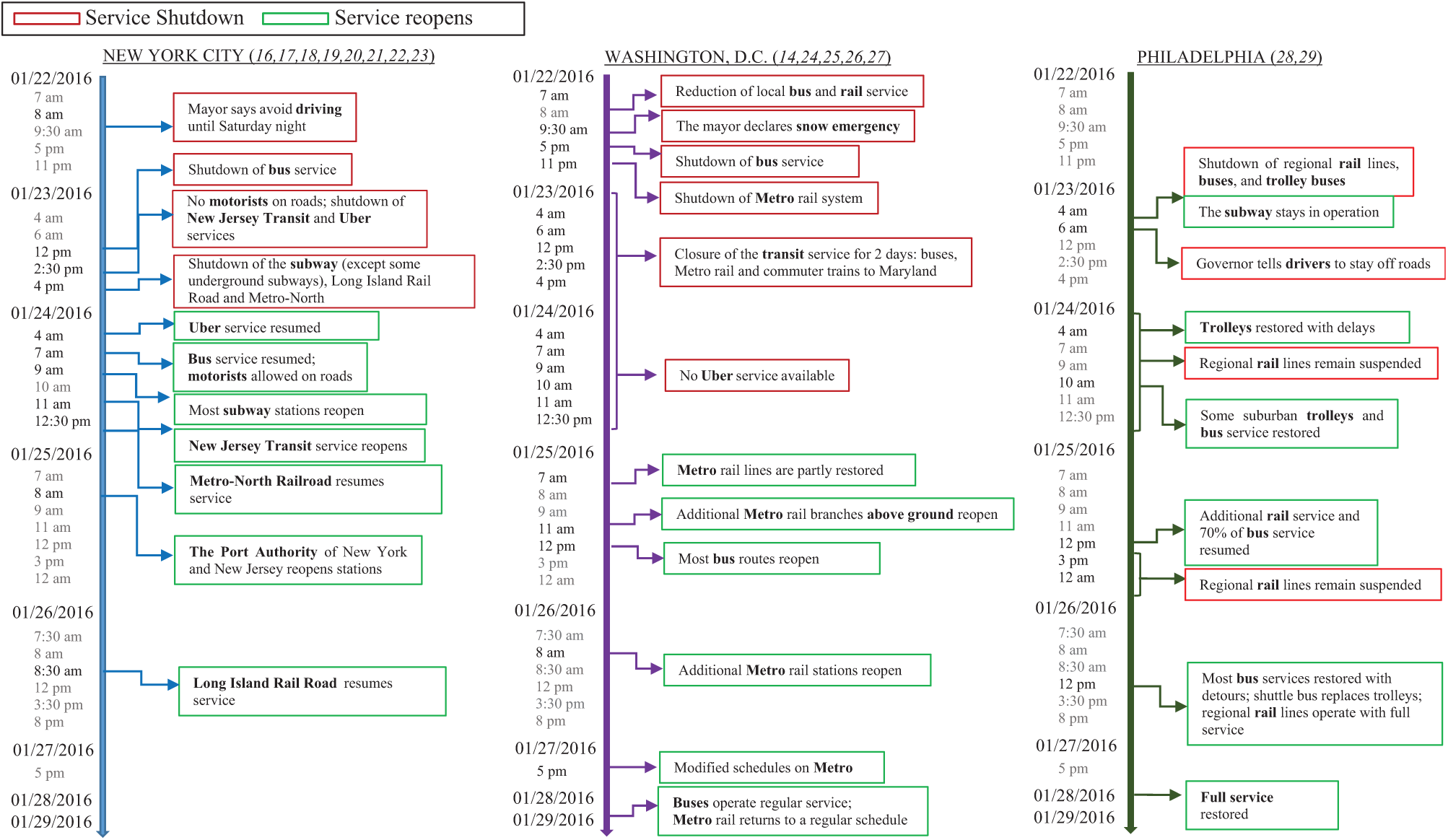
Timeline of the snowstorm.
Dataset
This section contains a general description of the smartphone app data used in this analysis. The first part gives a brief overview of the smartphone app, the second part defines the geographic area of analysis, and the last section includes a brief description of the data files.
Overview of the Smartphone Application
Transit is a smartphone application available on Android and iPhone that provides information about public transportation and shared mobility services such as bikeshare, carshare, and ridehailing ( 10 ). Transit covers New York City, Philadelphia, Washington, D.C., and approximately 125 other cities. The app includes many features, such as real-time transit vehicle location information (see left screenshot in Figure 2), trip planning (see right screenshot in Figure 2), transit service alerts, and multimodal support including Uber. To request an Uber during the period of analysis, a user would click “request an Uber” in the Transit app, and s/he would then be directed to Uber’s app to complete the order. More recently, this Uber feature has been changed so that booking and payment can be completed directly within the Transit app.
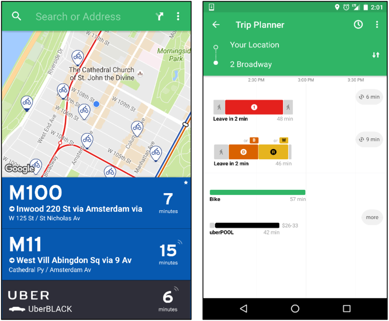
Transit app screenshots.
Time Period and Geographic Area of Analysis
The time period for this study is Friday, January 8, 2016 to Friday, January 29, 2016: two weeks before the snowstorm and one week after. The geographic areas are the regions of New York City, Philadelphia, and Washington, D.C. The boundaries of the three regions were selected based on the Metropolitan Planning Organization areas ( 30 – 34 ). Specifically, three bounding boxes were drawn to define the maximum and minimum latitude and longitude for each area. The New York City area includes the region served by the New York Metropolitan Transportation Council (NYMTC) ( 30 ) and the North Jersey Transportation Planning Authority (NJTPA) ( 31 ), which is shown in Figure 3 in yellow. The Philadelphia area includes the regions served by the Delaware Valley Regional Planning Commission (DVRPC) ( 33 ) and the South Jersey Transportation Planning Organization (SJTPO) ( 34 ), which is shown in green in Figure 3. Last, the Washington, D.C. area was selected using the region served by the Capital Region Transportation Planning Board (TPB) ( 32 ) shown in blue in Figure 3.
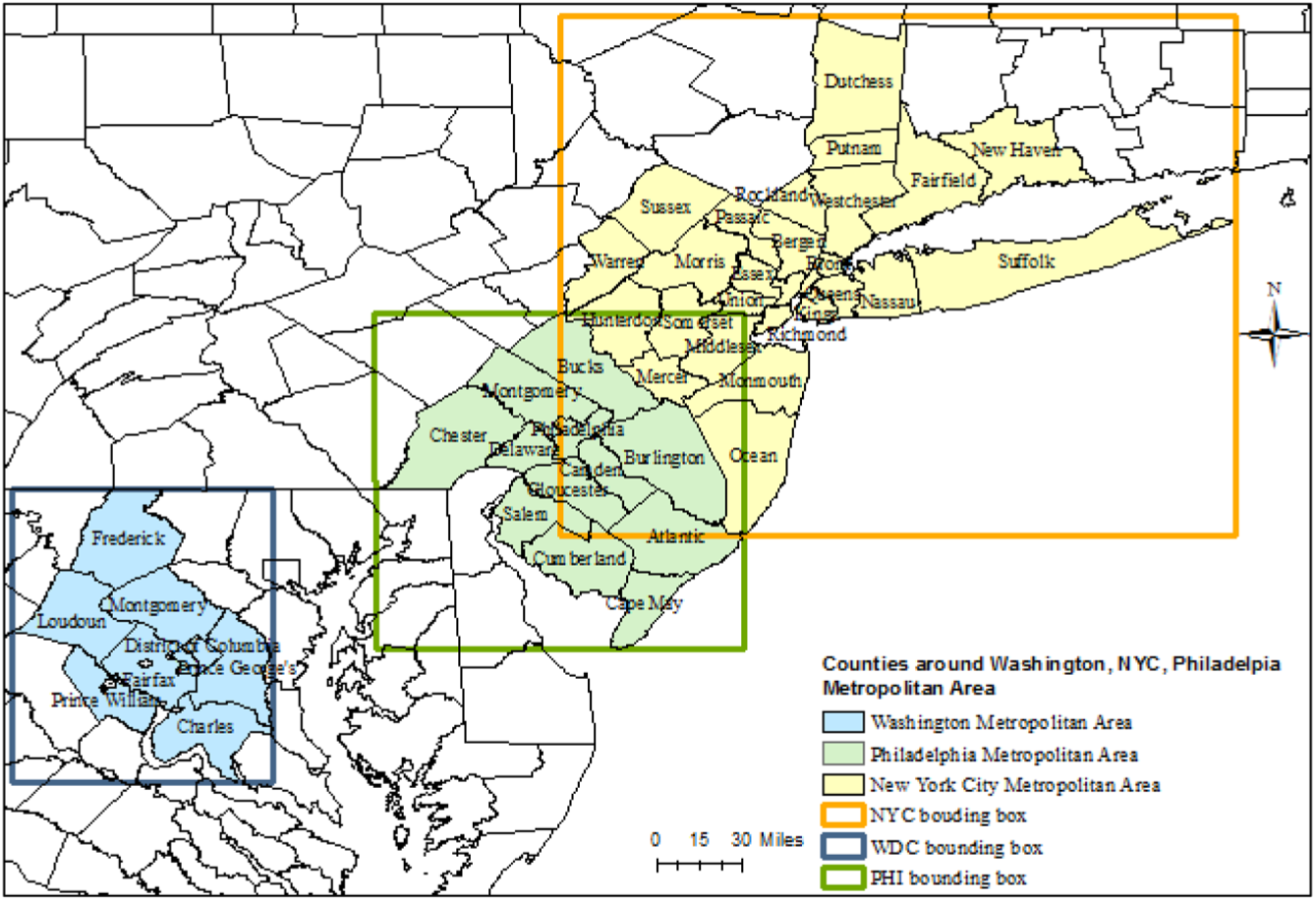
Bounding boxes around the New York City, Philadelphia, and Washington, D.C. Metropolitan areas.
Data Description
The data used in this analysis was provided by Transit to the research team. The dataset contains user interactions with the app. Each time a user opens the app, a unique session identifier (ID) is created, the time is recorded, and the location of the user (latitude/longitude) is stored. Between January 8 and January 29, 2016, there were millions of Transit app sessions in the areas of analysis.
The following analysis also uses a subset of the data that includes all Uber requests made through the Transit app. Each time a user clicks to request an Uber in Transit, the user’s location (latitude/longitude) and the time of the request are recorded. Between January 8 and January 29, 2016, there were thousands of Uber requests in the areas of analysis.
Analysis
An analysis of Transit app utilization during the January 2016 snowstorm was conducted in four parts. First, overall Transit app usage patterns were visually explored, and then the rate of use was calculated by comparing app use during the snowstorm with a regular period. Next, a regression model of total hourly app use was created. Last, the use of the Uber feature in the Transit app was investigated in a visual analysis. The results of this analysis are described in the following sections.
Part 1: Visualization of Transit App Usage
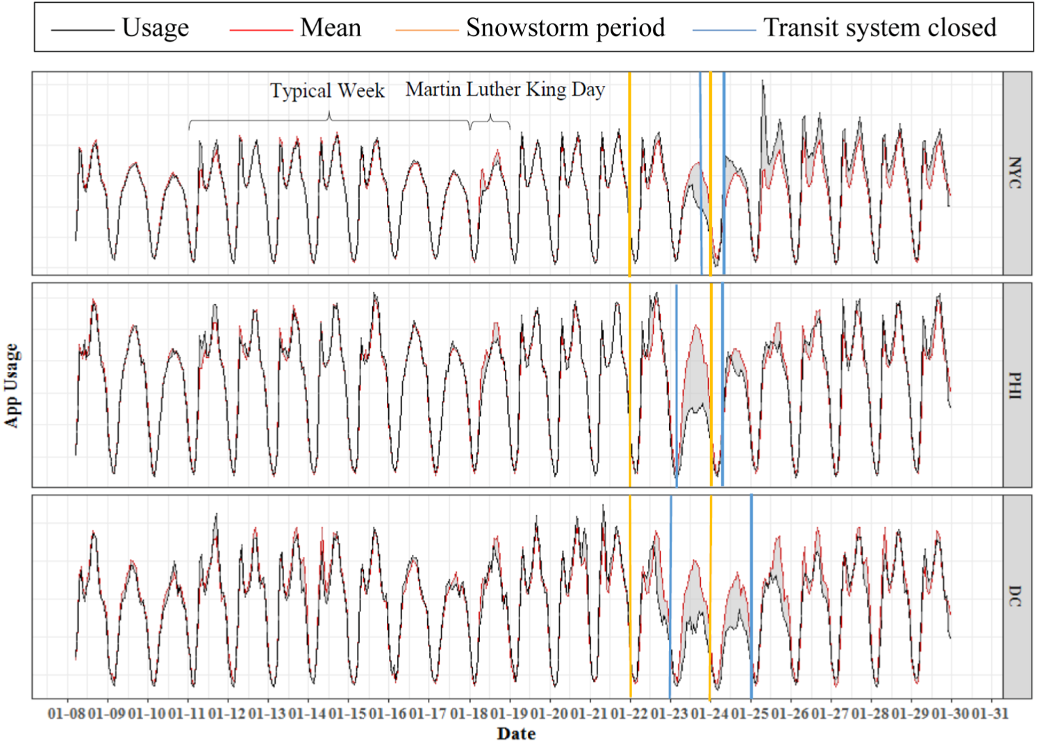
First, overall Transit app usage patterns were visually explored. During the 3-week period of analysis, the total Transit app usage per hour in each region was calculated. This was then compared with the mean app usage per hour during the two first weeks before the snowstorm when there were normal weather conditions (January 8 to January 15).
Figure 4 shows hourly Transit app usage (the black line) compared with the mean hourly usage (the red line) for each of the three regions. Utilization of the app has a strong periodic weekly pattern. There is a peak during the morning rush hour and another during the evening rush hour for weekdays, and app usage decreases during the weekend. However, this typical pattern was interrupted during the snowstorm period, as can be seen in Figure 4. The vertical line in yellow shows the period when the snowstorm hit each of the three cities, and the vertical line in blue displays when the transit systems were closed. During this period, the amount of overall app usage per hour in each city was less than the mean. In the New York City area and in the Philadelphia area, this decrease is more pronounced on Saturday, January 23 during the afternoon. For the Washington, D.C. area, the decrease in app usage began earlier (on Friday, January 22) and stayed below the mean for longer than the two other areas.
Transit app usage and mean usage in New York City Philadelphia, and Washington, D.C.
Part 2: Rate of Transit App Use
Next, the rate of Transit app use was calculated in a similar manner to a previous paper on extreme events ( 8 ) by comparing mean hourly usage prior to the snowstorm with hourly app usage during the snowstorm for each city. For every hour t, the rate of use R(t) was calculated by dividing the hourly app usage U(t) by the mean hourly usage Q(t) during the reference period, which was the two weeks before the snowstorm. Equation 1 shows the rate of use formula:

where
R(t) = rate of use
U(t) = hourly app use
Q(t) = mean hourly app use
Figure 5 displays the results of the rate of use calculation for each of the three cities as a black line. The red line in Figure 5 shows 100%, which is the typical usage during the reference period. As can be seen in Figure 5, the three cities generally exhibit similar patterns. The rate of use is fairly consistent during the 2 weeks prior to the storm, and all three cities have a dip in use on the Martin Luther King, Jr. holiday, which was Monday, January 18, 2016. During the snowstorm, all three cities initially exhibited an increase in the rate of use, but this quickly decreased below the 100% level as the snowstorm continued.
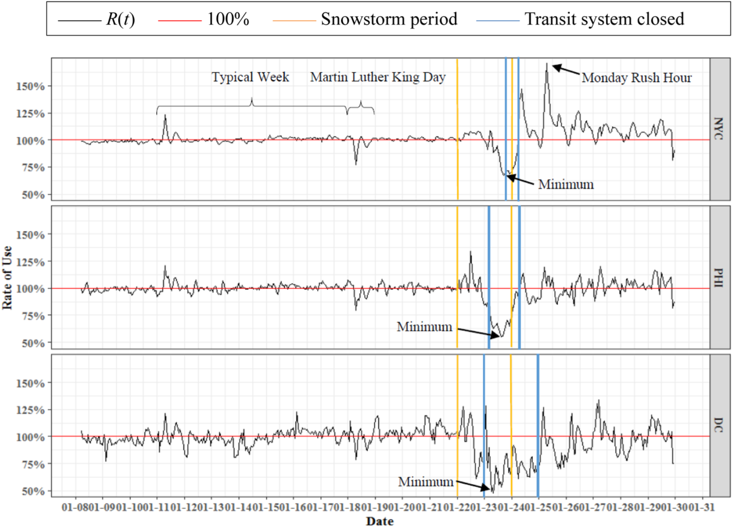
Rate of transit app use in New York City, Philadelphia, and Washington, D.C.
In New York City, the rate of app usage dropped below 100% on Saturday, January 23 before noon and remained low until the following day (Sunday, January 24). On Saturday, most transit service in New York City was shut down during the snowstorm (with the exception of some underground areas of the subway), and it was during this time that the rate of use reached its lowest point (approximately 65% of mean usage). After the snowstorm finished and transit service was largely restored on Monday, January 25, a peak appeared during the morning rush hour, and the rate of use reached about 165%. This may be because Transit app users wanted more information as they went back to work to assure them that transit service was fully restored.
In the Philadelphia area, the rate of Transit app use initially increased on Friday, January 22 until noon; at this time, a snow emergency had been declared ( 35 ) but the transit system had not yet shut down. This spike in use is likely to be because Transit app users were searching for information to get home before the snowstorm. Shortly thereafter, during the nighttime on Friday, January 22, the rate of use dropped substantially below 100% and stayed low until the morning of January 24, 2016. On Saturday 23, when Philadelphia transit authorities suspended all their services (Figure 1), the rate of use reached about 65% of the mean usage, which was the lowest point. After the snowstorm finished and transit service was largely restored on Monday, January 25, a small increase in the rate of use appeared during the morning rush hour.
In the Washington, D.C. area, the rate of Transit app use dropped below 100% for most hours from January 22 at noon until January 25 at midnight. After the storm, the rate of use took longer to stabilize compared with the other metropolitan areas, which may have been because the recovery time of the transit systems in this region was longer than the other areas (Figure 1). For example, it was not until Tuesday, January 26 that most of the Washington, D.C. metro system was reopened (with 86 of 91 Metrorail stations opened by Tuesday, January 26). Consequently, app users in Washington, D.C. seemed to be more affected by the snowstorm than those in New York City or Philadelphia.
Finally, it should be noted that some peaks in Figure 5 are not meaningful due to data limitations. For example, a peak in the rate of use appeared in each of the three cities on Monday, January 11. This is because the other Monday used to calculate the mean (reference) hourly usage was Martin Luther King Day. Future analyses should expand the period of analysis to accommodate this.
Part 3: Regression Model of Transit App Use
Next, three ordinary least squares (OLS) regression models were estimated: one for New York City, one for Philadelphia, and one for Washington, D.C. In each regression model, the dependent variable is the number of Transit app records per hour in the corresponding city. For independent variables, eight binary variables were defined to account for the effects of Martin Luther King Day (on Monday, January 18), 3 days of the snowstorm (Friday, January 22 to Sunday, January 24), and 4 days after the snowstorm (from Monday, January 25 to Thursday, January 28). Also, to control for the typical weekly app usage pattern, 167 binary variables were included in each model to account for the 168 hr in a week. Equation 2 below shows the regression model formulation, which is the same for each city:
where
Yt = number of Transit app records per hour t
h 1 to h167 = binary variables representing each hour of the week (i.e., h1 represents Friday at 12:00 a.m., h25 represents Saturday at 12:00 a.m., and h167 represents Thursday at 11:00 p.m.)
MLKD = binary variable representing Martin Luther King Day
SD1 to SD3 = binary variables representing the first, second, and third day of the snowstorm from Friday, January 22 to Sunday, January 24, respectively
RD1 to RD4 = binary variables representing the first to fourth days after the snowstorm from Monday, January 25 to Thursday, January 28
The results of the regression models for each city are presented in Table 1. All three models have high R-squared values, and more than 90% of variation in the data can be explained by the model for each city. The F statistic is significant for each model, which confirms the high joint significance of the variables.
Regression Results for New York City, Philadelphia, and Washington, D.C.
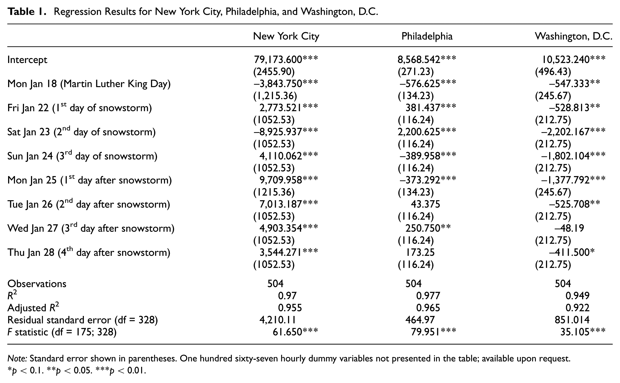
Note: Standard error shown in parentheses. One hundred sixty-seven hourly dummy variables not presented in the table; available upon request.
p < 0.1. **p < 0.05. ***p < 0.01.
For the New York City regression model, all eight binary variables representing Martin Luther King Day, the snowstorm days, and recovery days were significant (p-value < 0.01); this means that holidays and extreme weather strongly affect Transit app utilization. The coefficient for Martin Luther King Day was negative (–3,843.750), suggesting that app usage decreases on holidays. On Friday, January 22, when the snowstorm first hit New York City, the number of Transit app records increased (coefficient of 2,773.521); this increase may be due to a perceived disruption in the transit system. However, on the second day of the storm when the transit system was shut down and a travel ban for motorists was imposed, Transit app usage decreased significantly (coefficient of −8,925.937). On the last day of the snowstorm, when motorists were allowed on the roads and the transit system began to reopen, the number of Transit app records increased (coefficient of 4,110.062). The greatest change in Transit app usage was observed on the first day after the snowstorm on Monday, January 25, which had a large positive coefficient (9,709.958). On this day, users were most likely searching for transit information for their commute trip. On the subsequent days after the snowstorm, Transit app usage was larger than usage on normal days, which is indicated by the positive significant coefficients on the second, third, and fourth recovery days (7,013.187, 4,903.354, and 3,544.271, respectively).
In Philadelphia, the binary variables representing Martin Luther King Day, the 3 days of the snowstorm, and the first day after the snowstorm were strongly significant (p-value < 0.01). The effect on Martin Luther King Day is similar to that observed in New York City; Transit app usage was less than normal days (coefficient of −576.625) on the holiday. On the first and second days of the snowstorm, app usage was higher than usual (coefficient of 381.437 and 2,200.625, respectively). On the last day of the snowstorm (Sunday, January 24), the number of Transit app records decreased, which is expected due to the transit system shutdown over the weekend (coefficient of −389.958). The decrease in Transit app usage continued on the first day after the snowstorm (coefficient of −373.292) even though the transit system resumed service and it was a weekday (Monday, January 25). Two days after the snowstorm, the number of Transit app records increased, and this increase continued during the third day and fourth days of recovery after the storm.
In Washington, D.C., the coefficients were significant (p-value < 0.05) for the binary variables representing Martin Luther King Day, the 3 days of the snowstorm, and 1 day after the snowstorm. All of the coefficients for the storm days and the recovery days in this model were negative, which means that Transit app records decreased during the storm and continued to be lower than normal after the snowstorm. The transit system in Washington, D.C. resumed service on the first day after the snowstorm (Monday, January 25) but took longer to get back to normal. This model suggests that Washington, D.C. had the slowest recovery in Transit app usage of the three cities.
Part 4: Visualization of Uber Requests
In addition to overall Transit app usage, Uber requests made through the app were also considered. The dataset contains all sessions in which a user opened the app and clicked on “Request an Uber.” Notably, during the period of analysis, users could not book an Uber directly within the Transit app; instead, they would be directed to Uber’s app for fulfillment. Consequently, the Transit app dataset only highlights the users’ intention of taking an Uber and does not reflect actual Uber trips.
Figure 6 shows daily Uber requests through the Transit app and a comparison with the mean of the previous 2 weeks. The amount of data was very small compared with overall Transit app use; thus, the analysis was conducted on a daily basis instead of hourly. As can be seen in Figure 6, the yellow line shows when the snowstorm hit the three cities, the line in blue is when the transit systems were closed, and the line in green represents the travel ban or snow emergency period. It should be noted that in New York City, Uber service was officially suspended from Saturday, January 23 at 2:30 p.m. until Sunday, January 24 at 4:00 a.m. (Figure 1). In Philadelphia and in Washington, D.C., a reference stating that Uber service was suspended could not be found; however, the authorities asked citizens to stay off of the roads in both cities ( 34 , 36, 37), so it was assumed that Uber was not operating during this time.
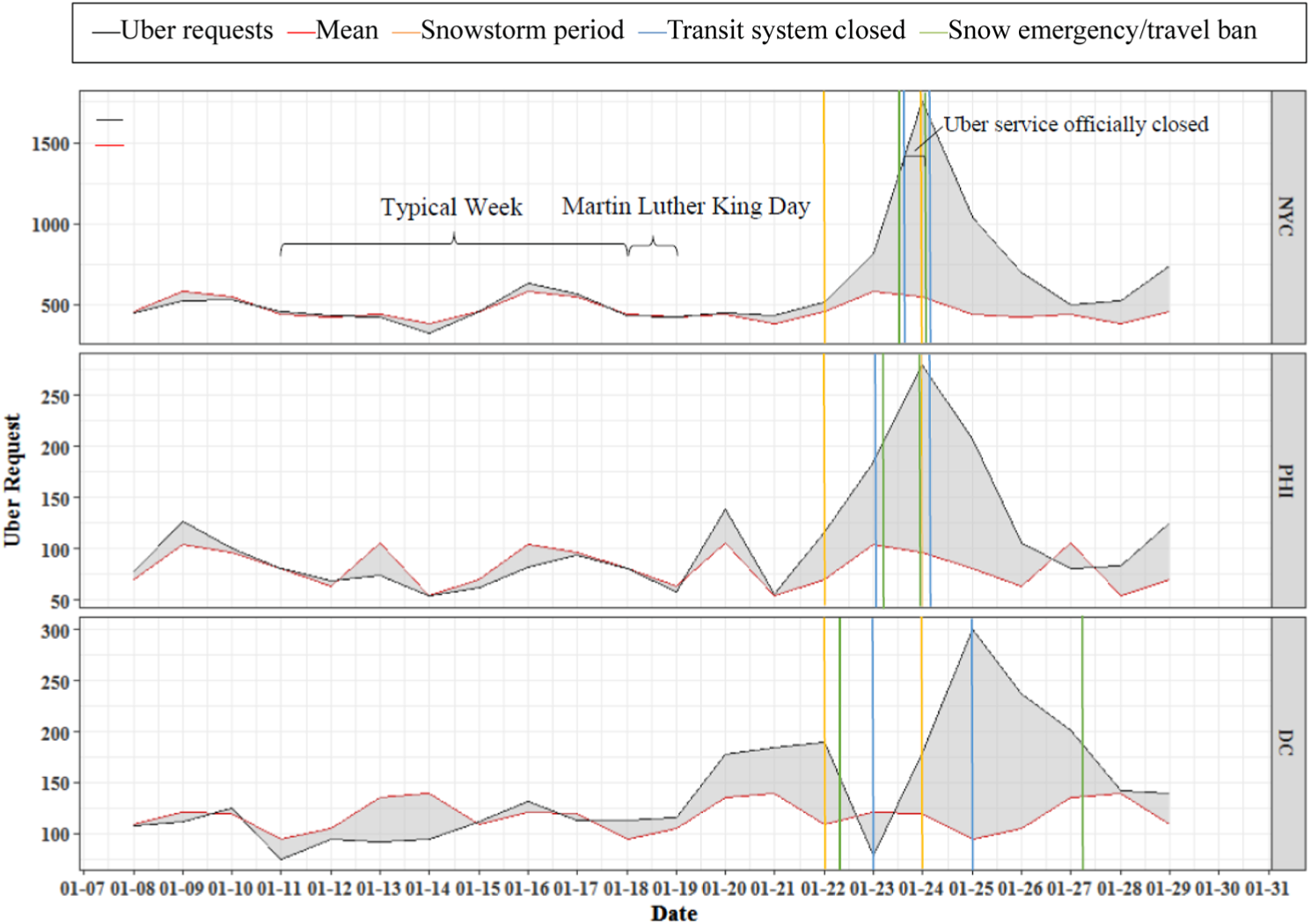
Daily Uber requests and mean Uber requests in New York City, Philadelphia, and Washington, D.C.
In New York City, the total number of Uber requests via the Transit app was between 300 and 600 per day during the reference period prior to the storm. Interestingly, the number of Uber requests was higher during the snowstorm period. On Sunday, January 24, the number of Uber requests reached a peak of 1,750 in New York City. In Philadelphia, the number was between 50 and 150 per day prior to the storm and reached 280 requests during the storm. For Washington, D.C., the number of Uber requests was between 75 and 180 per day prior to the storm, and the highest peak represented more than 300 requests on Monday, January 25. Unlike the two others cities, the lowest point in Washington, D.C. occurred on Saturday, January 23 when no vehicles were allowed on roads and the transit system was shut down.
The results imply that despite travel bans, the number of Uber requests was greater than usual. During the snowstorm, Transit app users were probably looking for other modes of travel when the transit systems were shut down. When the transit systems began to reopen service (on Sunday in New York City and in Philadelphia and on Monday in Washington, D.C.), the number of Uber requests via the Transit app reached the highest point. Last, it is important to emphasize that these are requests for Uber, which do not necessarily involve fulfilled trips; at the time of analysis, Transit app users were directed to Uber’s app for fulfillment.
Conclusions and Future Research
This study assessed information utilization during an extreme weather event by analyzing data from a smartphone app called Transit, which provides real-time transit and shared mobility information in many North American cities. The analysis focused on a snowstorm that hit the northeastern United States in January 2016 and severely disrupted transit and shared mobility services. A four-part analysis was conducted for three cities: New York City, Philadelphia, and Washington, D.C. First, hourly Transit app utilization during the snowstorm was compared to the mean hourly app utilization prior to the storm. Second, the rate of app usage was calculated by dividing hourly utilization during the storm by the mean hourly volume before the storm. Third, an OLS regression model of hourly app usage was estimated for each city. Last, a feature within the app used to request Uber vehicles was examined.
The results of the first three analyses revealed that overall app usage decreased during the snowstorm in all three cities. After the storm, New York City experienced a significant increase in overall app use during the first Monday commuting period, and Washington, D.C. had the slowest recovery in app usage. The analysis of Uber data revealed that Transit app users continued to search for ridehailing services during the snowstorm, despite travel bans. Although some of the findings of this study are to be expected – such as the decrease in overall Transit app usage during the storm and an increase immediately afterward – the number of Transit app searches during the snowstorm was surprisingly large, particularly during the period when the transit systems were completely shut down (i.e., a decrease to only about 65% of mean use).
These findings are important for transportation operators and app developers to understand how travelers use information from smartphone apps during extreme weather events, which would be difficult to do using traditional data sources such as surveys. This new type of technology – smartphone apps – largely did not exist a decade ago and has rapidly changed how transit agencies communicate with travelers. However, traveler utilization of this new technology during unusual or extreme events has not been well documented. If usage patterns are better understood, it could help transit agencies to improve communication with travelers during extreme events, potentially helping transit systems to recover faster. This analysis shows that travelers want to be informed of changes in transportation service, as evidenced by large spikes in Transit app usage after the snowstorm, and therefore, transportation providers should anticipate increased communication levels immediately after extreme weather events. Transportation operators should also consider multiple means of communication (beyond just apps) to ensure that they reach all of the traveling public.
Finally, many interesting areas for future research emerged from this analysis. First, the analysis of Winter Storm Jonas could be expanded to other regions, including areas that were not as heavily affected by the snow as New York City, Philadelphia, and Washington, D.C. Another interesting area for future research would be to examine Transit app usage patterns at the individual level, instead of at the metropolitan level. Additionally, the continuous nature of this dataset enables other anomalous events to be studied, including both planned events, such as concerts or sporting events, and unplanned events, such as hurricanes. Finally, it would be interesting to compare utilization of the Transit app to use of other transportation-related smartphone applications; however, in order for comparative analyses to be possible, the developers of other applications (which are often private companies) must be willing to share usage data. Hopefully there will be increased willingness to share data in the future as utilization of smartphone apps continues to grow.
Footnotes
Acknowledgements
The authors acknowledge the Transit app for sharing data, particularly Jake Sion. This research was supported in part by a 2015 City University of New York Collaborative Incentive Research grant (CIRG Project #2218) and a 2016 University Transportation Research Center faculty-initiated grant (UTRC Grant #49198-44-28).
Author Contributions
The authors confirm contribution to the paper as follows: study conception and design: CR, CB, NG, EJK, and JP; data collection and cleaning: CR, NG, and EJK; analysis and interpretation of results: CR, CB, NG, and JP; draft manuscript preparation: CR, CB, NG, EJK, and JP. All authors reviewed the results and approved the final version of the manuscript.
The Standing Committee on the Logistics of Disaster Response and Business Continuity (ABR20) peer-reviewed this paper (18-00302).