
Abstract
Dedicated bus lanes and other transit priority treatments are a cost-effective way to improve transit speed and reliability. However, creating a bus lane can be a contentious process; it requires justification to the public and frequently entails competition for federal grants. In addition, more complex bus networks are likely to have unknown locations where transit priority infrastructure would provide high value to riders.
This analysis presents a methodology for estimating the value of bus preferential treatments for all segments of a given bus network. It calculates the passenger-weighted travel time savings potential for each inter-stop segment based on schedule padding. The input data, ridership data, and General Transit Feed Specification (GTFS) trip-stop data are universally accessible to transit agencies.
This study examines the 2018 Metropolitan Atlanta Rapid Transit Authority (MARTA) bus network and identifies a portion of route 39 on Buford Highway as an example candidate for a bus lane corridor. The results are used to evaluate the value of time savings to passengers, operating cost savings to the agency, and other benefits that would result from implementing bus lanes on Buford Highway.
This study does not extend to estimating the cost of transit priority infrastructure or recommending locations based on traffic flow characteristics. However, it does provide a reproducible methodology to estimate the value of transit priority treatments, and it identifies locations with high value, all using data that are readily available to transit agencies. Conducting this analysis provides a foundation for beginning the planning process for transit priority infrastructure.
Congestion throughout metropolitan areas is a well-known problem that will only be exacerbated as the urban populations continue to grow. Frequent travel delays have resulted in an overall lack of system reliability, prompting transportation planners and engineers to rethink traditional and oftentimes costly infrastructure solutions. Without dedicated right-of-way or signal priority, buses are forced to travel in heavily congested general-purpose lanes, causing frequent delays for existing customers. Traveling in mixed traffic means there is no travel time advantage to taking the bus, reducing the appeal of the bus compared with driving and increasing operational costs to transit agencies ( 1 ). Dedicated bus lanes and other priority treatments have gained popularity in many cities across the United States, serving as multifaceted solutions that manage demand across busy corridors, incentivize transit use by reducing travel time, and ultimately provide a more reliable transportation system for all users.
However, the decision to implement bus preferential treatments, especially those that use existing right-of-way, is often highly contentious, so cities and transit agencies must carefully target locations for these improvements and justify their value ( 2 ). Quantifying the benefits that these treatments would provide, not only for transit agencies and their existing customers, but for all users of the transportation system, is important in making the case for their implementation. Furthermore, while some high-volume corridors are clearly suited for such treatments, it is likely that more complex transit systems contain unknown areas where simple treatments could pay large dividends. Because transit agencies and cities have limited budgets for these improvements, better understanding the impact that bus treatments could have throughout their network can help prioritize investments that would yield the most benefit.
There is an extensive amount of literature which focuses on the emerging use of automated vehicle location (AVL) technology to determine performance measures and identify locations for infrastructure improvements ( 3 – 5 ). While AVL provides comprehensive, real-time data to tech-savvy transit agencies, it currently lacks universal appeal because polling frequency needs to be high enough that arrival and departure events (to and from stops) can be recorded precisely. Transit agencies often lack data of this granularity. Moreover, performing a detailed analysis with AVL would require additional investments. Because agencies are increasingly called on to improve system performance under severe budget constraints, a methodology that uses readily available data is likely to be broadly appealing to transit agencies of all sizes.
This study proposes a methodology to identify which corridors and segments in a transit system are best suited for bus preferential treatments by combining General Transit Feed Specification (GTFS) and ridership data to estimate total passenger-weighted travel time savings along each segment of a bus network. GTFS was created in 2005 through a collaboration between Google and TriMet, the transit agency of Portland, Oregon, to facilitate the sharing of data and provide information to users ( 6 ). One of the main draws of GTFS is its simplicity, in that it provides a straightforward publishing standard which allows agencies, both large and small, to publish data at low cost ( 6 , 7 ). It is also open source, which allows collaborations to form between private developers and public agencies. Catalá ( 7 ), published a study, commissioned by the Florida Department of Transportation, claiming that GTFS data could be leveraged to support operational and planning activities, especially when supplemented with additional ridership data.
In this study, the proposed methodology is demonstrated on the Metropolitan Atlanta Rapid Transit Authority (MARTA) bus network. In the Atlanta region, many roadways are operating at, or over, capacity, especially during peak periods. Identifying areas of congestion and managing traffic demand is becoming increasingly important for a metropolitan region that is projected to swell to over 8 million people by 2040 ( 8 ). Compared with the expansion of rail transit or additional private vehicle right-of-way, dedicated bus lanes and other preferential treatments offer a low-cost alternative that can manage Atlanta’s transportation demand effectively and increase transit reliability without necessitating major infrastructure investments. While the Atlanta Regional Commission, the Metropolitan Planning Organization for Atlanta, the City of Atlanta, and MARTA have planned bus rapid transit for several corridors in the region ( 9 ), specific preferential treatments for these corridors have not yet been determined.
The intention of this analysis is to provide transportation planners and engineers with a framework and methodology to assess the value of bus preferential treatments such as dedicated lanes, queue jumps, and transit signal priority at the city level and beyond. These treatments are analyzed on the basis of travel time reductions, rather than increases in reliability. While reliability is an important factor for the utility of transit service, variance in travel time requires greater data granularity and is beyond the scope of this study. Such treatments would reduce delay and provide a more reliable service that would retain existing transit users, increase customer satisfaction, and capture additional riders. Moreover, these treatments could reduce operating costs for transit agencies and have environmental justice impacts by reducing the amount of time buses idle in traffic.
Literature Review
Improving speed and reliability within bus networks is a primary focus of transit agencies, as they have the potential to retain, and even increase, ridership. Over the past two decades, transit agencies and researchers have increasingly made use of inexpensive and widely available data to make data-driven decisions that aim to improve system performance. For example, Stewart and El-Geneidy ( 10 ) developed a framework to prioritize the routes that should transition to all-door boarding in Montreal. Tétrault and El-Geneidy ( 4 ) built a model to identify where stop-skipping could lead to the greatest travel time reductions. Furth and Wilson ( 11 ) developed a method to allocate service frequency across routes to maximize ridership. With a clearer understanding of where a system is experiencing breakdowns, such as excessive delays, transit planners can better identify appropriate infrastructure interventions that alleviate speed and reliability issues.
Speed and Reliability
Much of the literature on improved transit operations focuses on improved speed and reliability because it has a two-pronged effect of reducing operating costs while simultaneously boosting rider satisfaction ( 12 , 13 ). Speed is how quickly a bus can travel from place to place, whereas reliability refers to how well the schedule can be maintained ( 13 ). King County Metro, a leader in transit system efficiency, published speed and reliability guidelines in 2017, which plainly state that “moving more people and less time getting delayed, save(s) operating dollars that can be used for new service” ( 13 ). Moreover, when travel times and time spent waiting for a bus are minimized, transit users generally consider a service to be reliable ( 14 ). Unsurprisingly, high levels of perceived reliability and overall rider satisfaction can attract and maintain bus riders. Using three-stage least square regression on cross-sectional data, Chakrabarti and Giuliano ( 15 ) found a correlation between on-time performance and bus ridership in the Los Angeles Metro system. On high-frequency routes, service reliability is perceived in headway-stability rather than schedule-adherence. Fan and Machemehl ( 16 ) found that on routes with headways shorter than 12 min, passengers tend to arrive randomly even if a schedule is available. On these routes, the mean passenger waiting time is proportional to the mean headway divided by the headway variance ( 17 ). Therefore, both the speed and reliability jointly participate in reducing passenger waiting time and thus improving rider satisfaction.
In his 2011 book, Human Transit ( 18 ), Jarrett Walker suggests that urban transit should not focus on travel speed per se, but rather a reduction in delay to increase the speed of bus operations. Walker states that while reliability and speed are different metrics, both are undermined by delay, and a reduction in delay provides a faster and more reliable service. In urban areas, speed is not only a function of the speed limit, but also of random delay encountered along a route as well as projected delay that planners account for when creating schedules ( 19 ). Two main sources of random delay are traffic (i.e., interference from other vehicles) and signals ( 18 ). Therefore, a reduction in delay is commonly achieved by providing preferential treatments for buses along congested travel ways or at crowded intersections.
A reduction in delay translates to travel time savings for existing riders. While small amounts of travel time savings typically only benefit the passengers, larger magnitudes of travel time savings reduce transit fleet requirements and operating requirements, decreasing the overall cost of operations ( 20 ). Paulley et al. ( 21 ) performed a study which evaluated demand for public transport in the UK and found that elasticity of bus trips with respect to travel time can range from −0.4 to −0.6, meaning a 10% reduction in travel time increases ridership by 4% to 6%. It is often held that dedicated bus lanes will reduce capacity for other roadway users, mainly those in personal vehicles, but Litman ( 22 ) argued that reduced travel time for bus users can potentially outweigh the increase in travel time for automobile users. For example, if 1,000 bus passengers can save 5 min (1,000 × 5 = 5,000), this still outweighs 2,000 automobile passengers who might be delayed an additional 2 min (2,000 × 2 = 4,000). Thus, it is important to consider the movement of people—not vehicles—when maximizing overall travel time savings ( 18 ).
Bus Preferential Treatments
Bus preferential treatments have long been discussed in academic literature, but the advent of highly accessible data allows planners and engineers to make informed decisions on the location and type of infrastructure improvements that maximize the efficiency of transit operations ( 23 ). This research focuses on three types of preferential treatments: dedicated bus lanes, transit signal priority, and queue jumps. Treatments within each category vary widely, and ultimately the solution that is implemented depends on several factors, including budget constraints, roadway geometry, and general support from policymakers and the public.
Dedicated bus lanes are typically considered on urban streets with relatively high bus and general traffic volumes, which are also the segments most prone to excessive delay and poor reliability ( 13 ). Creating a dedicated lane may not require purchasing additional right-of-way but instead can use converted general-purpose lanes or parking lanes to create exclusive or semi-exclusive bus lanes ( 13 , 20 ). King County Metro estimates the capital cost of a bus lane to be anywhere from $2,000 to $30,000 per 100 ft of bus lane, with higher costs attributed to projects that require roadway widening or median reconstruction ( 13 ). Although bus lanes can reduce the flow of vehicular traffic, multiple studies based on simulation have shown that they can still increase person-throughout because buses have greater occupancy than private cars ( 24 , 25 ).
King County Metro also recommends the implementation of shorter bus lane segments, or queue jumps, placed at strategic locations which experience routine bottlenecks. The Transit Capacity and Quality of Service Manual defines a queue jump as “a relatively short lane that is available for buses to bypass queues of general traffic at or before a signalized intersection” ( 20 ). Queue jumps thus require less right-of-way than longer distance bus lanes while still reducing the delay that bus riders would experience while traveling in entirely mixed traffic.
Another common intersection control is transit signal priority (TSP), which involves modifying the existing signal timing to give priority to transit, reducing both delay at traffic signals and travel time variability ( 13 ). TSP is typically categorized as passive, active, or real-time ( 20 ), all of which require varying degrees of signal technology. Passive TSP involves making manual adjustments to a signal to better align with transit schedules, while active TSP strategies only adjust signal timing when a bus is approaching an intersection. Real-time TSP continually adjusts to current traffic conditions and bus locations ( 20 ). Because of the specialized equipment required to optimize signal timings, applications of real-time TSP are limited ( 20 ). King County Metro reports a capital cost ranging from $30,000 to $100,000 per intersection depending on the type of TSP and the existing signal infrastructure.
The effectiveness of TSP at improving speed and reliability is conditional on its synchronicity with the schedule or headway control mechanism. Kimpel et al. ( 26 ) showed that TSP can only improve travel times if properly calibrated. Likewise, Currie and Shalaby ( 27 ) observed different levels of service reliability by comparing the TSP system in Toronto, where priority is applied regardless of schedule, and in Melbourne, where priority is only awarded to buses running late. Finally, Berrebi et al. ( 28 ) found that TSP could interfere with real-time vehicle dispatching if the two systems are not integrated. Therefore, as with other aspects of public space, TSP requires a high level of inter-governmental coordination to be successful.
Methodology
The methodology used in the analysis is depicted in Figure 1. For descriptive purposes, a “trip segment” is defined as a bus traveling between two consecutive stops on a particular trip, and a “network segment” is the road segment between two consecutive stops, along with all of the bus network activity that takes place on that segment. The following subsections describe the data sources and process in greater detail.
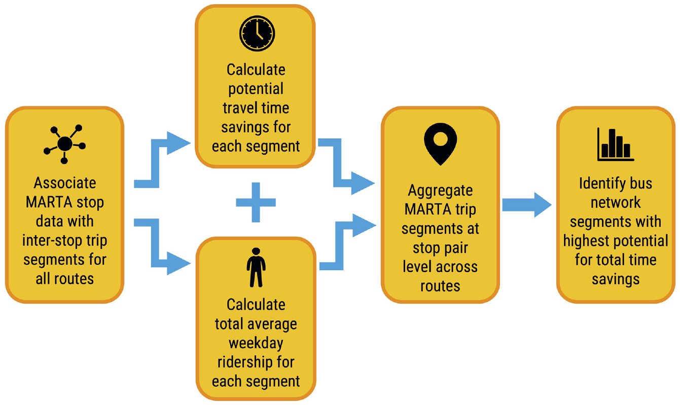
Overview of methodology.
Data Sources
Data was obtained from MARTA and GTFS. MARTA ridership data were obtained directly from the agency in comma-separated values (.csv) format for the first quarter of 2018. The data contained average weekday ridership (boardings and alightings) at the stop level, stop name, stop ID, route number, direction (e.g., NB, EB), and latitude/longitude of each stop.
To correctly match the ridership data, historical GTFS data from May of 2018 were also used. GTFS has 13 fields, six mandatory and seven optional, that can be downloaded to comma-separated values (.csv) file format. The fields represent stops, routes, and schedules, all with unique IDs, which together make up the entirety of a transit agency’s scheduled operations throughout all days of the week ( 6 ). Importantly, the GTFS schedule data can be examined to determine schedule padding.
Process
Step 1: Join MARTA Ridership Data to GTFS Trips and Scheduled Arrivals
Since MARTA ridership and GTFS data were obtained from separate sources, the two data sets first needed to be joined. Ridership data contained a stop ID for each stop and the trip ID associated with each individual trip, so these data were joined based on trip ID and stop ID.
Step 2: Create Trip Segments and Calculate Travel Time
Next, the data was sorted by route, trip, and stop sequence to group the data into inter-stop segments. For every route and trip number within that route, a row was created to represent each stop pair (i.e., start stop = n; end stop = n + 1).
The elapsed time between each stop pair was calculated by subtracting the GTFS scheduled arrival at the end stop from the arrival time at the starting stop. To more accurately depict the travel time between stop pairs, dwell time was subtracted from the total elapsed time. Dwell time, chiefly a function of boardings and alightings, was calculated from the number of ons and offs for each stop pair using the methods outlined in Exhibit 6.4 of the Transit Capacity and Quality of Service Manual (TCQSM) (20).
Step 3: Compute Travel Time Savings Potential (Delay)
Because several routes share similar network segments and each route has multiple trips throughout the day, Step 2 resulted in many trip segments with many travel time values for each stop pair. Since travel times were based on the schedule, variation in travel times for the same segment is a result of schedule padding. Schedule padding is defined by Wessel and Widener ( 19 ) as the “difference between how fast you could reach a destination in the best case and how fast you expect to be able to get there in the average case.” The minimum travel time across all trips allotted to each stop pair represents the best-case scenario for each segment under the current infrastructure conditions. In most cases, this minimum time represented a trip made during an off-peak period, when schedule padding was not needed to accommodate delays from traffic congestion. Thus, the travel time savings potential can be calculated by subtracting the minimum travel time from the actual travel time for each trip:

Equation 1 was computed for all trip segments. Time savings potential can also be considered an estimate of the travel delay incurred on that trip segment. If the proposed preferential treatments include infrastructure improvements that could further reduce the minimum travel time for that segment, the time savings used in this analysis would be a conservative estimate of the true potential time savings.
Step 4: Calculate Passenger Load and Passenger-Weighted Travel Time Savings for Each Trip Segment
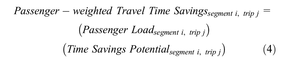
Focusing on segments with significant delay and high ridership provides the basis for locating bus preferential treatments that will improve speed and reliability for the greatest number of passengers. Rather than using only time savings potential, ridership numbers were incorporated to find the total passenger-weighted travel time savings for each segment. If passenger load data is directly available from the transit agency, it may be used. In the absence of passenger load data, Equations 2 and 3 were used to estimate passenger loads on each trip segment based on the number of boardings and alightings at each stop. This method restricts passenger load at the start of the trip to zero, so passenger load data direct from the agency is preferred.
First, the change in passenger load was calculated for each trip segment:
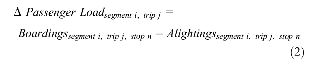
It was reasoned that the boardings and alightings for the first stop in the trip segment would determine the change in passenger load as the bus travels from the first stop in the trip segment to the second. From this point, the passenger load for any trip segment is the sum of the change in passenger load of all segments leading up to and including that segment on the trip:
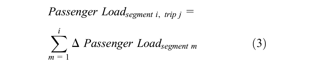
Calculations 2 and 3 were completed for each trip segment along every MARTA bus route. Then, the passenger-weighted travel time savings for each segment were calculated by multiplying the passenger load along that trip segment by the corresponding time savings potential:
Step 5: Aggregate Trip Segment Data up to Bus Network Segments
The results of Equation 4 for all trips using each unique inter-stop segment (regardless of the trip) were summed to give a total passenger-time savings potential for all bus trips on each segment of the bus network. The resulting data set has one row for each segment of the MARTA bus network, with an estimate of the passenger delay incurred in a typical weekday for that segment.
Step 5.1: Data Validation
Once the travel time and potential savings were calculated using GTFS data, the results were validated using Google Maps Distance Matrix API ( 29 ). While the analysis could have been carried out solely with Google Maps API, GTFS provides multiple benefits in that it is easy to use and is universally accessible to transit agencies, academics, and the general public. Peak hour travel times given by Google Maps were considered the source of truth, and the maximum travel times allotted in the GTFS schedule were proofed against Google Maps data. It was hypothesized that GTFS would be a conservative estimate, meaning the maximum travel time from stop to stop in GTFS was less than the Google Maps “best guess” travel time estimate for the p.m. peak hour along the same segment.
Google requires a future date to perform this analysis, so all estimates were run for a randomly chosen Wednesday in September 2020 at 5:00 p.m. In general, GTFS underestimated the travel time on 53.52% of the segments and overestimated on 45.85% of the segments. Roughly 3% of segments did not produce Google Maps estimates at all, possibly because of inconsistencies in the data or because segments were too short. Figure 2 shows the difference between travel times calculated by Google Maps at 5:00 p.m. which was assumed to be at or near the peak hour, versus the maximum travel time allotted in the GTFS data, with most differences hovering around 0 to 100 s. Thus, we can assume that GTFS gives a reasonable approximation of peak travel time along each segment. The slight skew reveals that, if anything, the travel times given by GTFS are conservative, meaning buses would likely see even greater time savings on most of the segments according to Google Maps.
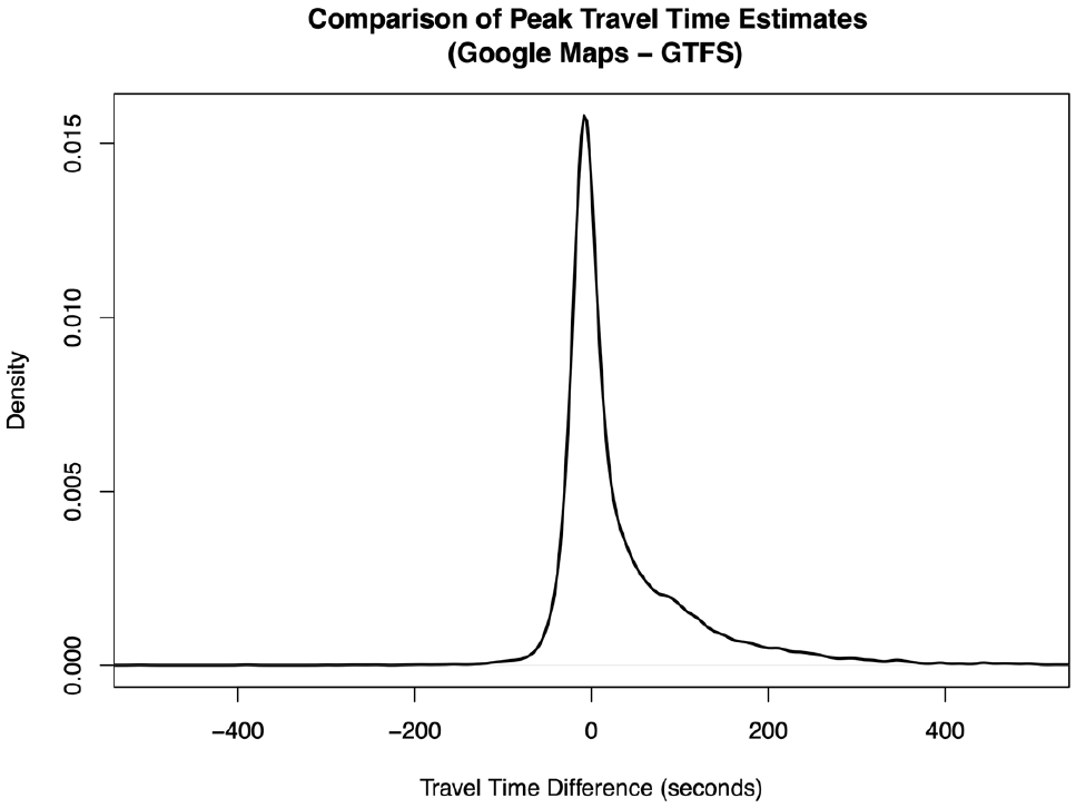
Comparison of Google Map peak hour travel time estimate versus maximum GTFS travel time (travel time difference = Google Maps - GTFS).
Results
This analysis included all routes within MARTA’s existing bus network. Figure 3 below shows the extent of the network as of 2018.
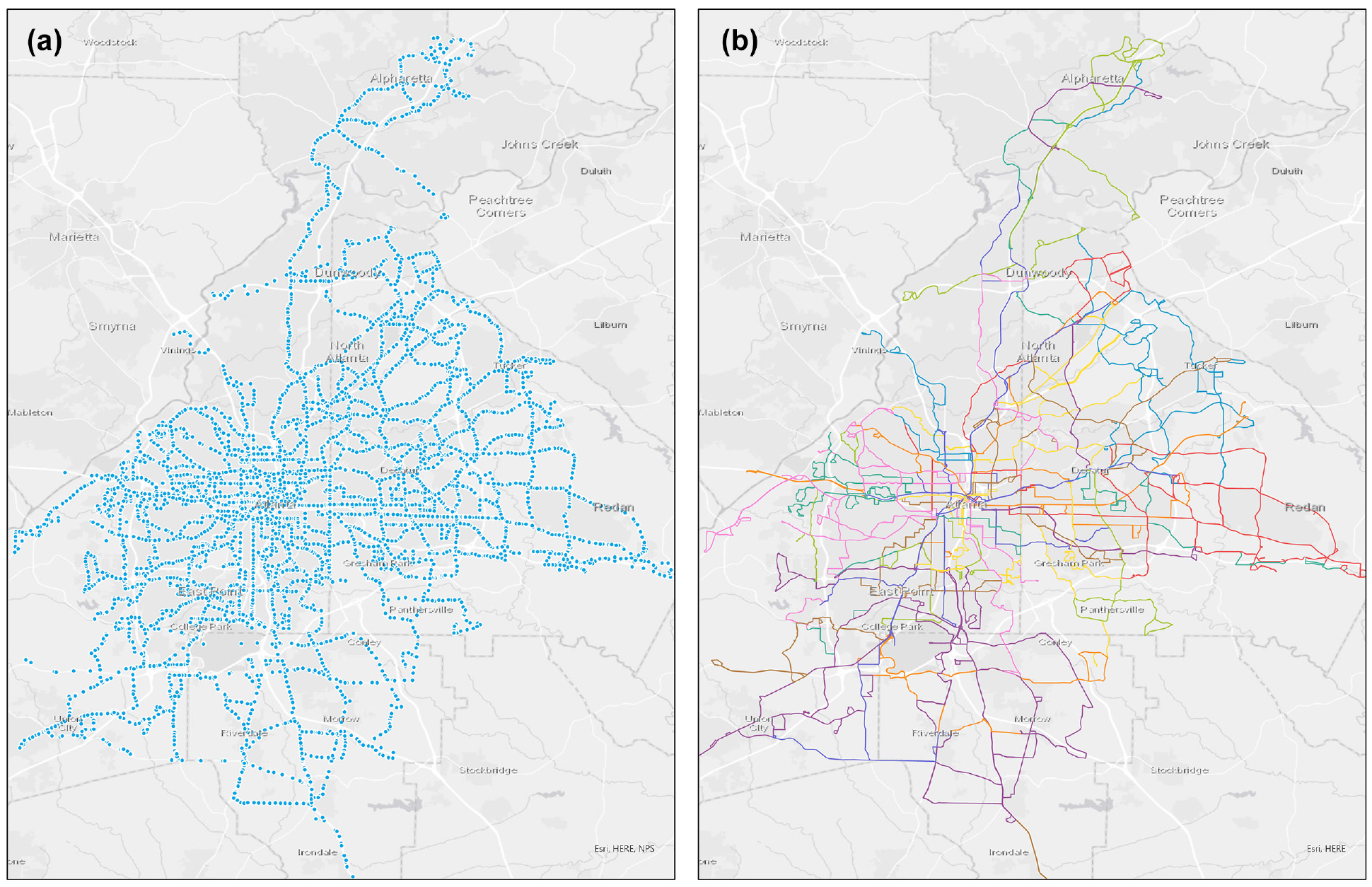
2018 MARTA bus network: (a) individual stops, depicted by blue dots; (b) individual routes, with each color representing a different route.
MARTA’s 2018 bus network consists of 108 routes that cover more than 1,400 route-miles. Results were ranked by passenger-weighted travel time savings, and only the top 10% of segments were retained for the remainder of the analysis and discussion. The top 10% of segments resulted in a total daily travel time saving of 179,018 min. In other words, passengers experience about 124 days’ worth of delays across the selected segments on an average weekday. All segments in the 2018 MARTA bus system experienced a total of 325,910 min of delay, so the top 10% of segments account for 55% of the system’s delay.
Figure 4 shows the results of the analysis. The segments shown are in the top 10th percentile of travel time savings, with all of these segments included (Figure 4a) and only segments shorter than one mile included (Figure 4b). The segments are of variable length, but a large portion of travel time savings exists along express routes that operate over longer segment lengths. Both sets are shown because the longer segments may visually obscure shorter route segments which may benefit from low-cost, high-impact infrastructure interventions.
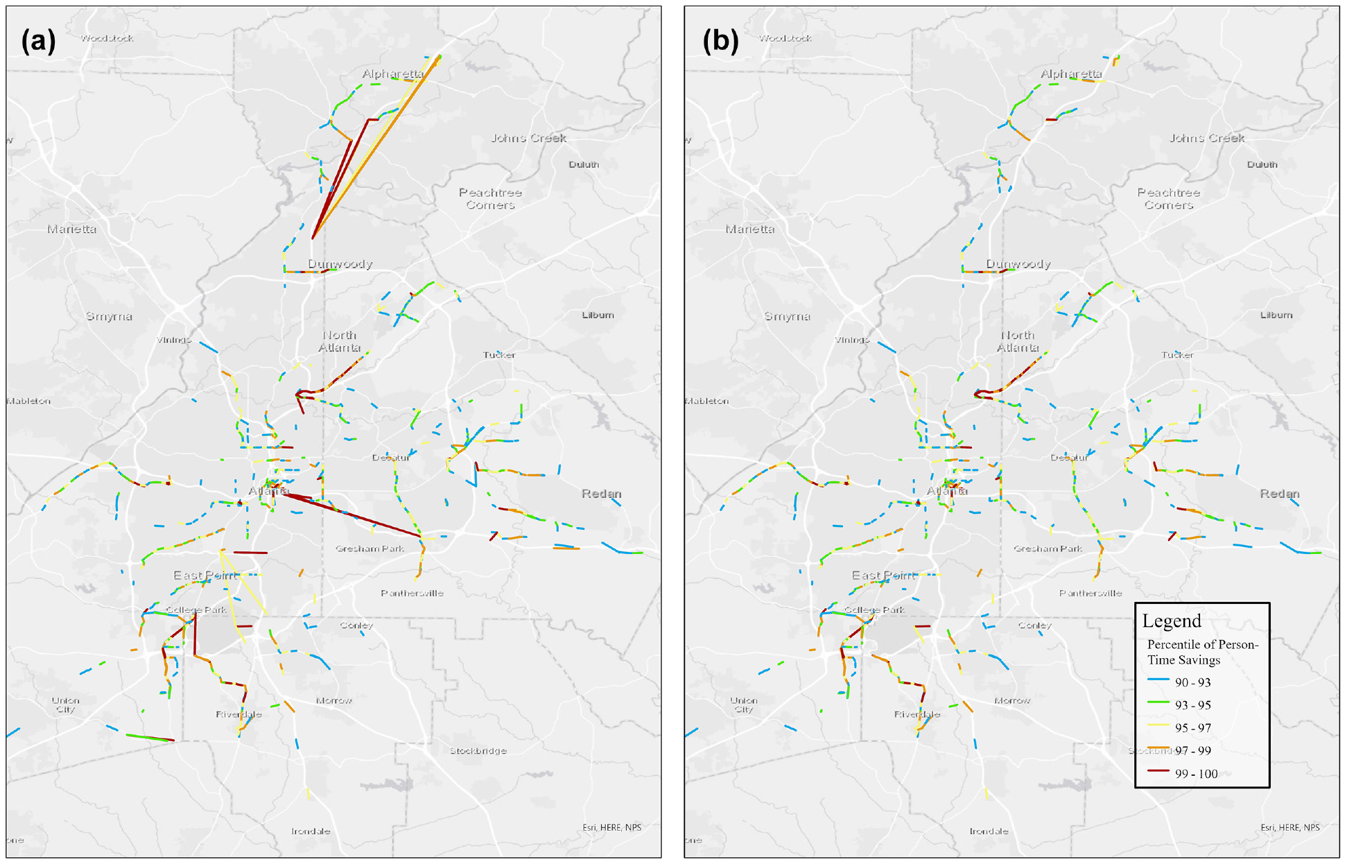
(a) All segments that fall into the 90th percentile or higher of passenger-weighted travel time savings; and (b) the refined results; segments that fall into the 90th percentile or higher of passenger-weighted travel time savings that are less than 1 mile in length.
Figure 4 highlights more than 900 segments in the MARTA bus network. The team did not review each segment individually; rather, the results were reviewed qualitatively for noticeable trends. Future work could build on these results by aggregating series of high-value segments to corridors and programmatically evaluating them. However, these results provide a foundation for a planning process which ought to be informed by more than just a data-based analysis. Below, highlights from the results are discussed based on what they reveal about the current state of the MARTA bus system.
Figure 5 shows a subset of the results, focusing on the southern portion of downtown Atlanta. Five Points station is located near the top left of the image, where many highlighted segments converge. Five Points can be considered the epicenter of the MARTA network; it is the connection point between north/south and east/west rail lines as well as a terminus for many bus lines. This figure reveals that one of the busiest and most critical components of the transit network is also where some of the greatest passenger delay is taking place.
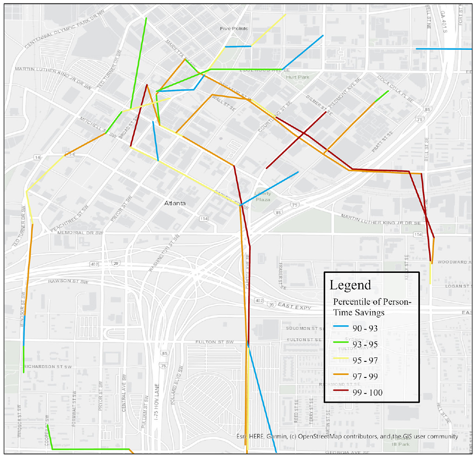
Passenger-time savings in downtown Atlanta.
This analysis supports the claim that prioritizing transit near Five Points station would have a significant impact on passenger-time savings. While it is beyond the scope of this study to recommend specific treatments, Figure 5 shows that bus routes are spread across many downtown streets, all in mixed traffic. Consolidating routes onto a few transit-oriented corridors may result in improved service.
Importantly, the results of this analysis corroborate real-world efforts to improve the MARTA transit system. Planned improvements to Five Points station target improved wayfinding, streetscape improvements, easier movements of pedestrians and buses, and ridership increases ( 30 ). Figure 5 also highlights Capitol Avenue (bottom center, running north/south) as a high-value corridor. This corridor is part of the planned Summerhill Bus Rapid Transit (BRT) service ( 9 ). In another example, Figure 6 shows the southern portion of route 39 which runs on Buford Highway and Sidney Marcus Boulevard to Lindbergh station. This corridor has long been discussed as a candidate for BRT because of its high bus ridership and large right-of-way ( 31 ). These examples help to demonstrate that, while directional in nature, this analysis highlights portions of the bus network that are currently under consideration for bus preferential treatments.
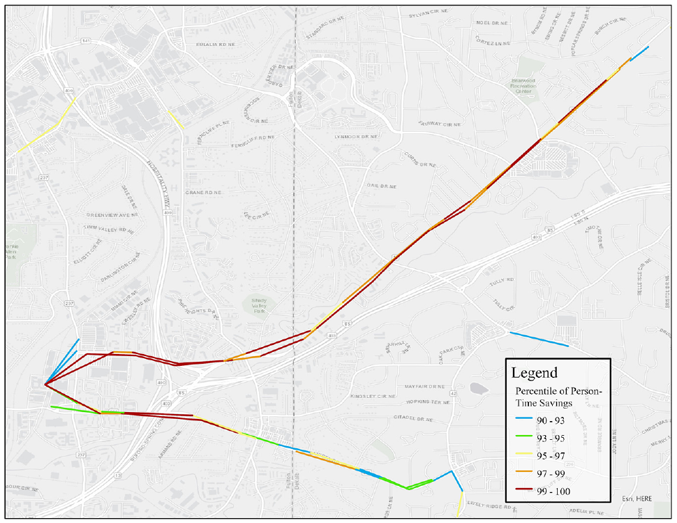
Passenger-time savings on Buford Highway.
Outside of Five Points station, network segments that start or end at rail stations consistently appeared with high-value potential. With MARTA’s spoke and hub network, connections to rail stations are critical to transit services. Figure 7 shows a selection of the transit stations with many high-value segments. These stations are key destinations for bus passengers and serve several different routes which progress in different directions. For example, the West End station, shown on the left side of Figure 7, has six route patterns with high potential passenger-time savings on the segments between the station itself and the next stops on these routes. At these stations, buses may be delayed when entering the traffic flow from the bus loop, or vice versa. Providing buses with free flow movement to and from the transit station could result in significant time savings and strengthen these connections.
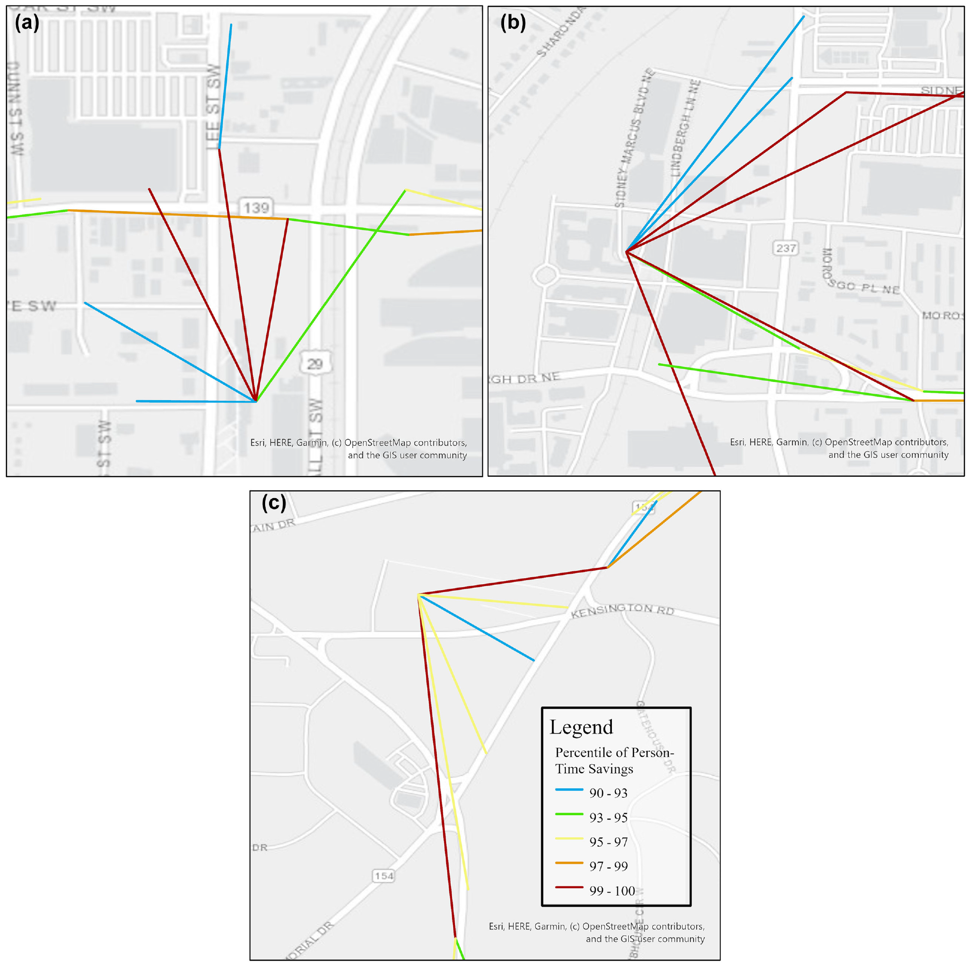
(a) Passenger-time savings near West End; (b) Lindbergh; and (c) Kensington stations.
The analysis presented here has highlighted known areas where transit prioritization is under consideration or in progress and illuminates sensible places for transit improvements that may not have been previously considered. Transit agencies may benefit from conducting this analysis, both by supporting existing claims to space for transit improvements, as well as by screening their networks for areas of opportunity.
Value of Time Savings for Passengers and Transit Agencies
Once potential locations for improvement have been identified, this analysis can help begin the process of quantifying the value of those improvements. The example of the inner portion of route 39 is used here to illustrate the supporting information provided by these results. This portion of route 39 runs on Sidney Marcus Blvd and Buford Highway from Lindbergh Station to just south of Clairmont Rd (Figure 6). A few assumptions were made to estimate the monetary value of time saved. First, according to the U.S. DOT, the hourly time value of money to a transit passenger is $16.35 in 2020 dollars ( 32 ). Second, the MARTA-estimated bus cost per vehicle revenue hour is $110.44 in 2020 dollars ( 33 ).
Table 1 shows the estimated time saved by passengers and vehicles on a typical weekday, as well as the monetary savings for a typical weekday and all weekdays in a year, if transit priority were included throughout this corridor. These annual estimates do not include savings on weekends and holidays, and they assume that ridership and frequency remain constant.
Savings Potential for Route 39
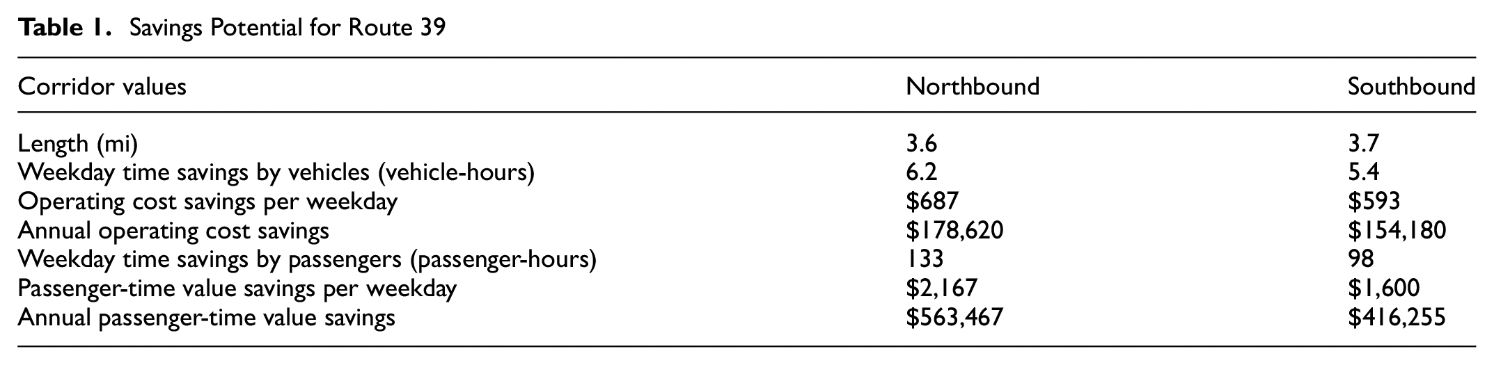
The results shown in Table 1 indicate the potential for 10 to 12 hours of savings per weekday for buses running on this route, which results in roughly $300,000 in annual operating cost savings direct to the transit agency. In addition, passengers would save 200 to 250 hours collectively on a typical weekday and roughly $1,000,000 in time savings annually. The reduction in vehicle operating time would also provide environmental benefits by reducing emissions, not calculated here. Furthermore, it is possible that improved service would attract greater ridership to route 39.
Overall, these time-value savings provide a rough estimate for the value that MARTA and its riders could save if bus preferential treatments were implemented. A complete cost–benefit analysis would include all road users and the cost of implementing the infrastructure. Travel time elasticities could also be used to estimate increases in ridership caused by decreases in bus travel time and improvements in reliability. These additional riders and the value of their travel time savings should also be included for a more thorough cost–benefit analysis. These figures support federal applications to capital improvement programs by addressing operating cost savings, passenger value through mobility improvements, environmental benefits, and even ridership increases brought about by transit priority infrastructure.
Conclusion
This project demonstrates the ability to analyze transit networks to prioritize locations of bus-only lanes and other bus preferential treatments using only readily available data. GTFS and MARTA ridership data were the only data inputs needed to complete the analysis. Although this analysis focuses on MARTA’s bus network, the methodology is easily transferable to other transit agencies if ridership data can be obtained at the stop (or route) level. This analysis could be further generalized with the integration of a standardized ridership source such as GTFS-ride ( 34 ). The results of this analysis agreed with transit planning efforts in the Atlanta area, as they highlighted areas currently discussed or planned for transit improvements, like the Summerhill BRT line, Five Points station, and route 39 on Buford Highway. These results could provide quantitative justification to move forward with projects such as these.
In addition, the results uncovered locations with high passenger-time savings potential to be explored further. While this analysis does not recommend any specific treatment, it serves as a starting point to evaluate where transit preferential treatments may be appropriate. The route 39 corridor on Buford Highway and Sidney Marcus Boulevard showed an example of the steps that can be taken as a result of this analysis. Planners should review these results and begin a process of evaluation in which they identify areas of opportunity.
Further studies could enhance this analysis in several ways. For example, integration with roadway data such as functional class, annual average daily traffic (AADT), and lane numbers could help determine the viability of bus preferential treatments along with their potential value to passengers. As mentioned above, travel time elasticities could be used to estimate ridership increases that may result from reduced travel time and improved reliability thanks to preferential treatments. In addition, multiple transit agencies offer bus services that overlap MARTA segments, and the inclusion of ridership data from these services would result in increased projected passenger-weighted travel time savings, bolstering the justification for infrastructure improvements in some locations. Taking the results one step further and combining contiguous high-value segments to create high-value corridors could be conducted programmatically. Finally, it is important to note that the methods presented here are deterministic and intended to provide a high-level overview of the potential for travel time savings from bus preferential treatments. Before beginning to implement any of these infrastructure improvements, agencies should conduct a more in-depth stochastic analysis that accounts for variations in traffic congestion and travel demand to more accurately estimate potential travel time savings and reliability improvements.
Using existing data to locate areas with high potential for bus preferential treatments is a critical first step in improving speed and reliability within a transit network, as it provides a justification for targeted infrastructure improvements. The resulting metric, passenger-weighted travel time savings, is easily understood across all disciplines, and lays the foundation to carry out cost–benefit analyses and inform policy initiatives related to improved transit services. Ultimately, all roadway users benefit from increased speed and reliability, and now, more than ever, the data and tools are available to uncover low-cost, high-impact solutions.
Footnotes
Acknowledgements
The authors would like to thank Robert Goodwin at MARTA for providing ridership data.
Author Contributions
The authors confirm contribution to the paper as follows: study conception and design: D. Arias, K. Todd, J. Krieger, S. Maddox, P. Haley; data collection: D. Arias, K. Todd, S. Berrebi, S. Maddox, P. Haley; analysis and interpretation of results: D. Arias, K. Todd, S. Maddox, S. Berrebi, K. Watkins; draft manuscript preparation: D. Arias, K. Todd, J. Krieger, S. Berrebi, K. Watkins, S. Maddox. All authors reviewed the results and approved the final version of the manuscript.
Declaration of Conflicting Interests
The author(s) declared no potential conflicts of interest with respect to the research, authorship, and/or publication of this article.
Funding
The author(s) received no financial support for the research, authorship, and/or publication of this article.
Data Accessibility Statement
The Metropolitan Atlanta Rapid Transit Authority (MARTA) provided the ridership data used in this research. Current GTFS data for MARTA can be found on their App Developer Resource page (https://www.itsmarta.com/app-developer-resources.aspx); an archive of GTFS data is provided by OpenMobilityData (![]() )
)