
Abstract
Transit ridership has been seriously affected around the world by the COVID-19 pandemic. This study investigates the impacts of the COVID-19 pandemic on bus service ridership patterns in King County, Washington, using clustering and multinomial logit (MNL) models. Ridership patterns of King County Metro buses during different study periods are detected using clustering. The characteristics of ridership patterns and cluster assignment spatial distributions are further examined. The MNL models were developed using explanatory factors, including socio-demographic, transit service, and land use characteristics at each stop, that are correlated with the ridership pattern cluster assignments. Results of the developed models demonstrate disparities across socio-economic groups and unevenness throughout different neighborhoods in ridership reduction and peaking patterns during COVID-19.
Keywords
Since late 2019, the pandemic of the coronavirus (COVID-19, or COVID) disease has exploded across the world. King County in the State of Washington detected the first COVID-19 case in the U.S. in late February 2020. After the outbreak, the government closed schools and businesses as well as issued a stay-at-home order to prevent the spread of the virus. These sudden shutdowns constrained people’s movements for both work and leisure, leading to a decline in travel demand. Based on cell phone tracking data, a 57% decline in the average number of Census block groups (CBGs) people visited each day was detected across all urban mobilities in King County between February and April 2020, in which transit services suffered the most with the sharpest decline of 74% ( 1 ). Not only in King County but also from across the world, data and surveys showed that transit had suffered particularly badly compared with other modes ( 1 – 3 ). The drastic decline in transit ridership was likely because of transit services being recognized as having a higher risk of infection compared with other urban mobilities, since the limited space in transit stations and vehicles made it difficult for transit riders to follow social distancing rules ( 2 , 3 ).
Although a reduction in transit ridership was detected all over King County during the pandemic, declining magnitudes differed across the region spatially ( 1 ). Uneven ridership reduction across neighborhoods was also found in other cities around the world, such as Chicago, New York City, and Stockholm, associated with socio-economic inequalities in different neighborhoods ( 3 – 6 ). Many of the remaining transit riders were less-educated and lower-income individuals who had limited access to alternative transportation modes and had jobs that did not permit them to work remotely ( 3 – 5 ). A survey performed by Transit ( 5 ) in 2020 found that many of the people who kept riding buses were mostly female, members of minority groups, and poorly paid essential workers working in food preparation and healthcare jobs. Therefore, ridership experienced a sharper drop in neighborhoods of more-educated, higher-income individuals who switched to working from home or using other transportation modes during the pandemic. On the other hand, neighborhoods with the lowest ridership drop hold higher percentages of essential workers, lower-income residents, and people of color who depend on transit for work or essential trips ( 7 ).
While the total transit ridership declined, the hourly ridership throughout a day was also disrupted, reconfiguring the ridership peak patterns over the course of the day. In Nashville and Chattanooga, Tennessee, the largest declines in ridership were detected on weekdays during morning and evening peak hours, which created flatter ridership peaks during peak hours ( 8 ). Survey data from Pakistan (9) and the State of Ohio ( 10 ) both reported uneven ridership reductions for different trip purposes. Thus, the effect of the COVID-19 pandemic on the peaking patterns at each stop is expected to be different across a region, as each stop would serve different groups of travelers with different trip purposes.
This study focused on finding the answers to two questions: (i) What are the impacts of the COVID-19 pandemic on the King County Metro’s fixed-route bus service ridership? (ii) How do factors such as socio-demographics, transit service, and land use characteristics explain the uneven changes in ridership? This study evaluated how ridership reduction and peaking patterns varied across the region and quantified the difference of peaking ridership patterns from before to during COVID. A research framework incorporating clustering and multinomial logit (MNL) models was developed in this study to answer the above questions.
The rest of the paper is organized as follows: “Research Design and Methodology” describes the data and the methodology used in this study, the “Results” section presents the analysis and results, and then the “Conclusion” concludes the study.
Research Design and Methodology
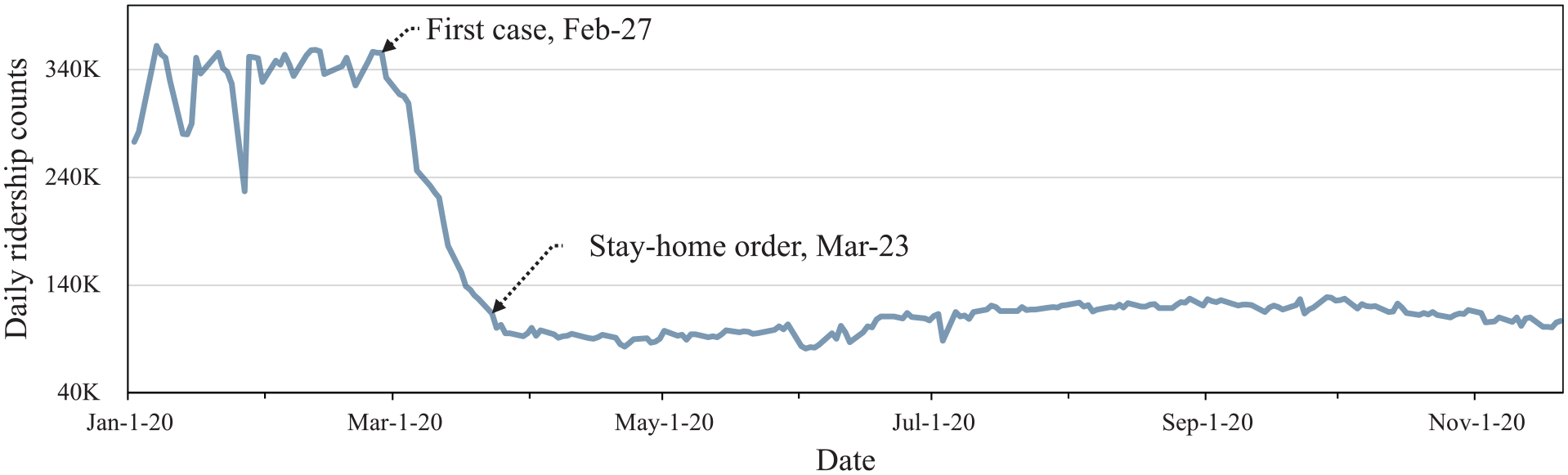
King County, home to the city of Seattle, is the most populous county in the State of Washington with an estimated population of 2.26 million as of 2020 ( 11 ). King County Metro (KCM) is the largest public transportation agency in King County, mainly providing fixed-route bus services in the region. As shown in Figure 1, the daily ridership in KCM services during the weekdays experienced an unprecedented reduction in ridership during the COVID-19 pandemic. Ridership reduction was first detected after the county reported the nation’s first COVID-19 case on February 27, 2020. From then, daily ridership dropped about 75% in a month as case numbers increased, schools closed, and the stay-at-home order was announced. On the other hand, ridership on weekends also decreased, but with a lower degree than the weekdays, by about 50%.
In response to COVID-19, service adjustments were made by KCM to better fit the reduced demand as well as to keep both riders and transit employees safe. KCM discontinued fare collection from March 21 to October 1, 2020 ( 14 , 15 ), and made service modifications across its fixed-route service three times between March and April 2020. The changes included services with lower frequencies, shorter operation times, and canceled routes ( 7 ). During weekdays, KCM operated with 42% fewer buses, 36% fewer transit operators, and 27% fewer service trips ( 16 ). However, specific routes with relatively lower ridership reduction were adjusted from time to time to maintain the social distance capacities of 12 passengers on 40 ft vehicles and 18 passengers on 60 ft vehicles.
Research Framework
As presented in Figure 2, a research framework incorporating clustering and MNL models was developed for both parts of analysis: (i) ridership reduction and (ii) peaking pattern. Analysis of the reduction in ridership aimed to identify the distribution of ridership loss across King County and to understand the relationship of socio-demographic, transit service, and land use characteristics between areas with different magnitudes of ridership decline. On the other hand, analysis of peaking pattern observed and compared the distribution of ridership throughout a weekday during both the pre-COVID period and the COVID-19 pandemic. Additionally, socio-demographic, transit service, and land use characteristics were used to help explain the differences of the patterns. For both parts of the analysis, clustering models were applied to group stops with similar ridership patterns. We used k-means clustering method as this clustering method is widely used for analyzing transit ridership patterns across socio-economic groups ( 17 – 20 ). The clusters were then put into MNL models to find significant factors correlated with the ridership patterns.
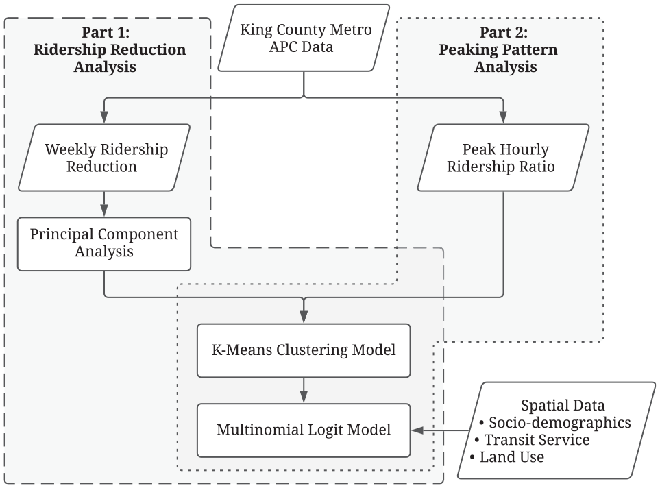
Flowchart for research framework.
Datasets and Data Preparation
Automated Passenger Counter (APC) Data
For this study, detailed ridership information of the bus system operated by KCM in 2019 and 2020 was provided by the APC data. The APC data were collected by the active sensors installed on 70% of KCM buses, which provided information about buses arriving at each bus stop, including their route numbers and arrival times, as well as the number of passenger boardings and alightings. Another possible data source providing similar information needed in this study was smart card data, which also had the boarding information of all transit trips made by each cardholder. However, since KCM discontinued fare collection from March 21 to October 1, 2020 ( 14 , 15 ) and had all passengers board buses from the rear door without tapping their cards, half a year of smart card data was missing from the start of the pandemic. Moreover, the APC data counted all passengers boarding a vehicle no matter their payment method, making APC data more inclusive than smart card data, which only collects information on passengers paying with their smart cards. Therefore, the APC data is more reliable and inclusive during our study period and for our analysis.
Since the KCM bus system reached a new stable state on April 6 2020, shown in Figure 1, the study period during COVID in 2020 was set to the period from April 6 to November 20, 2020. The pre-COVID study period was set to the period from April 6 to November 20, 2019 to match the study period in 2020. In Figure 3, each line plots the half-hourly ridership of a bus stop throughout the 24 h in a day. The ridership was averaged across all weekdays within the study periods in 2019 and 2020, respectively. The figures not only show that the half-hourly ridership in the COVID period was significantly lower than that in pre-COVID period, but also show that ridership patterns during COVID had less visible peaks for the morning and evening peak hours than before COVID.
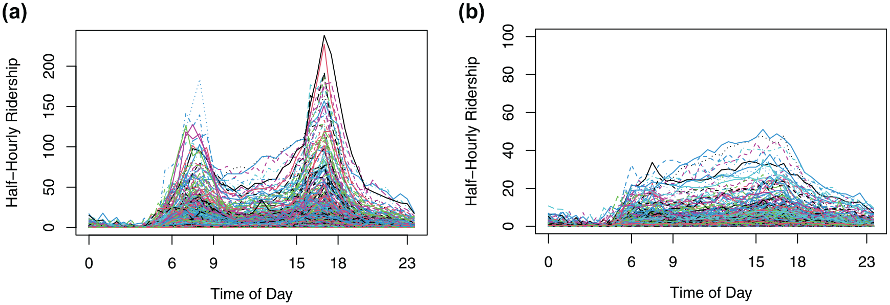
Half-hourly time of day ridership distribution (each line represents a bus stop): (a) 2019 pre-COVID ridership distribution and (b) 2020 COVID ridership distribution.
As shown in Figure 2, the APC data were used for clustering variables in both analyses, but aggregated into different levels. For the ridership reduction analysis, 32 weeks, from week 15 to week 46 in 2020 (April 6 to November 13, 2020), of stop-level weekly ridership change rates were calculated with Equation 1 to observe the ridership pattern after the system arrived at a new equilibrium since the outbreak.

where
The peaking pattern analysis, on the other hand, needs information on how the ridership changes throughout a weekday at each stop to identify the stop’s peaking pattern. The stop-level hourly ridership was averaged across all weekdays in each study period, including pre-COVID in 2019 and during COVID in 2020. The stop-level ratios of average hourly boardings in time periods, including early morning, morning peak, midday, and evening, were then calculated by dividing average hourly boardings in those time periods to that in the evening peak period. The time distribution of each time period is as follows:
• Early morning = 00:00 to 06:00 (6 h)
• Morning peak = 06:00 to 09:00 (3 h)
• Midday = 09:00 to 15:00 (6 h)
• Evening peak = 15:00 to 18:00 (3 h)
• Evening = 18:00 to 24:00 (6 h)
Moreover, filters for stop-level daily ridership higher than a threshold are placed in both the pre-COVID and COVID MNL models to remove stops with very low ridership. Although the threshold removed stops from the analysis, a large portion of the boardings are retained. The daily ridership threshold for the pre-COVID analysis is set to 48, which accounts for 30% of all stops and 87% of all boardings, while the threshold for COVID is set to 12, accounting for 36% of all stops and 90% of all boardings.
Socio-Demographic, Transit Service, and Land Use Data
In addition to APC data, datasets providing factors of socio-demographic, transit service, and land use information at each bus stop were also needed for the MNL models. A detailed description of the complete dataset is shown in Table 1.
Description of Socio-Demographic, Transit Service, and Land Use Factors
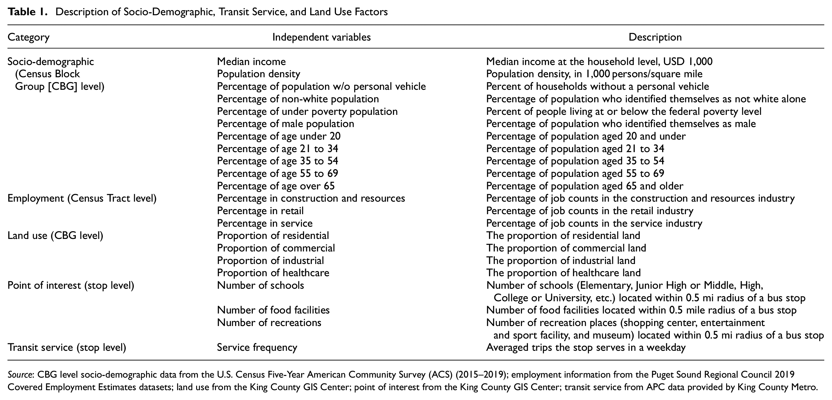
Source: CBG level socio-demographic data from the U.S. Census Five-Year American Community Survey (ACS) (2015–2019); employment information from the Puget Sound Regional Council 2019 Covered Employment Estimates datasets; land use from the King County GIS Center; point of interest from the King County GIS Center; transit service from APC data provided by King County Metro.
The factors mentioned in Table 1 could have some limitations. Since the factors describe the characteristics of either the bus stops or the CBGs and Census Tracts in which the stops are located, we can only know the information of where the trips happened, instead of information about the people actually making the trips. The origins of trips that people make in a day can be their home, their workplace, or other places that they have visited. As a result, mismatches are highly possible if the socio-demographic information of the boarding stops are directly assigned to the riders. In addition, from the notes in Table 1, the datasets are collected by different agencies at different times. Socio-demographic data, derived from the U.S. Census Five-Year American Community Survey of 2015 to 2019, may not perfectly represent the demographic characteristics of the population in 2020. The same applies to other datasets.
Methodology
Methods of clustering, PCA, and MNL models presented in Figure 2 are introduced in this section.
Clustering Model
Clustering is an unsupervised learning method that identifies groups of objects similar to each other and puts them into clusters. This method has been implemented in several studies to classify transit stops into clusters each with a ridership pattern distinctive from other clusters ( 21 , 22 ).
This study applied a k-means clustering model to assign

where
Principal Component Analysis (PCA)
PCA is a statistical technique widely used for dimension reduction. Studies have shown that when dealing with a high-dimensional set of variables, the clustering results will systematically and significantly improve if the variables are dimensionally reduced by PCA ( 23 ). In this study, PCA acts as a complementary approach in the ridership reduction analysis to help reduce the dimensions of 32 weeks of ridership change rates before using them as clustering variables.
Multinomial Logit (MNL) Model
Each of the MNL models applied in this study was used to model log-odds of category membership as a linear combination of the predictor variables. The applied models illustrated how factors such as socio-demographics, transit service, and land use characteristics explain the differences in ridership patterns.
An MNL model was developed under a random utility framework (
21
). This study followed the formulation published by Shankar and Mannering (
24
) to develop MNL models for ridership analysis. In the following analysis, the probability of stop

where

where the average utility
Derived from Equations 2 and 3, the probability of stop

Finally, Equation 6 shows the model modeling the log-odds of each corresponding alternative compared with the base alternative as a linear function of relevant independent variables to explain how the explanatory factors potentially affect alternative membership ( 28 ). In Equation 6, the coefficients of the independent variables indicate the rate of change in the log-odds ratio as the corresponding independent variables change.

where
Results
Results for Ridership Reduction Analysis
Breaking down the total reduction of KCM ridership during the COVID-19 pandemic into the CBG level, an uneven distribution of declining magnitude across the region is shown in Figure 4. Figure 4 also shows areas with higher percentage of population in poverty, that is, below the federal poverty level. Areas in darker blues, located mostly in areas closer to Downtown Seattle as well as West and East Seattle, containing residential areas with higher median income, experienced a greater reduction, while areas in lighter blues, located mostly in South Seattle and the upper half of North Seattle with a lower median income and a more diverse population, had lower reduction. In this section, we look into the uneven changes of ridership reduction in King County during the COVID-19 pandemic.
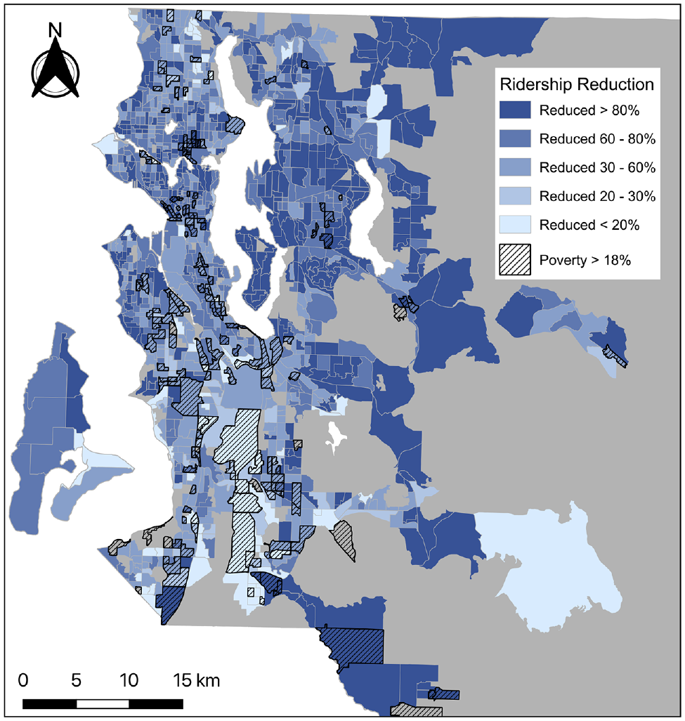
King County Metro ridership reduction distribution map.
Ridership Reduction Clustering Results
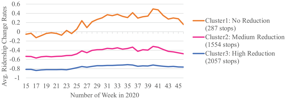
The k-means clustering generated three clusters. Figure 5 shows the pattern of average weekly ridership change rates for each of the three identified clusters from week 15 to week 46. The stops in Cluster3, holding the most negative values of ridership change rates with an average of −0.77, experienced the highest ridership loss. The stops in Cluster2 also experienced ridership loss, but the magnitude of their decline, with an average rate of −0.44, was smaller compared with the stops in Cluster3. The stops in Cluster1, on the other hand, either remained about the same ridership or experienced a slight increase in ridership during the pandemic. Names are given to the clusters as: Cluster1 = no reduction, Cluster2 = medium reduction, and Cluster3 = high reduction. We also find that the stops in Cluster1 with no ridership reduction all have lower daily ridership with an average of less than 300 counts, even before the pandemic. Thus, bus stops with higher ridership, which have an average daily ridership greater than 300, are all assigned to either Cluster2 or Cluster3 with ridership reduction detected during the pandemic. Despite the reduction caused by COVID-19, the ridership in all three clusters increased during summer, from week 23 to week 40 (June 1–September 30, 2020). Ridership then decreased slightly from around week 40 when KCM resumed fare collection on October 1, 2020.
Ridership reduction clustering results.
Figure 6 illustrates the distribution map of ridership reduction clusters. Stops in Cluster3 with higher ridership reduction are mostly located in Downtown Seattle and Downtown Bellevue, which are areas where major employers are located; and in East Seattle, West Seattle, Magnolia, and Ballard, which are residential areas with relatively higher median income among their residents. Stops in Cluster2 with medium reduction are mostly located in North and South Seattle, which tend to be areas with lower income and larger percentage of non-white population. Unlike the previous two clusters, stops in Cluster1 are scattered all over the region without visible gatherings.
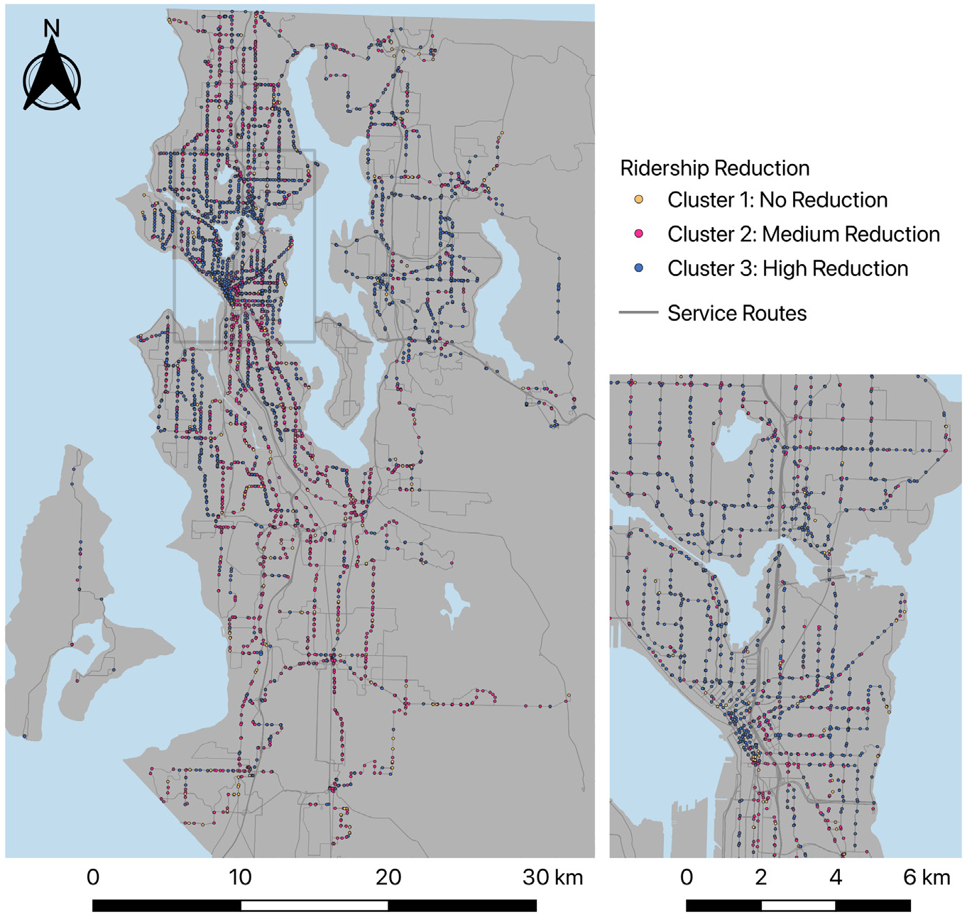
Spatial distribution of clusters for ridership reduction analysis.
Ridership Reduction MNL Models Results
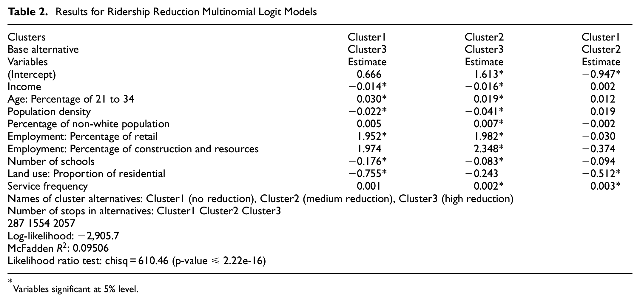
In the MNL models for ridership reduction analysis, each observation represents a bus stop. The dependent variable of the model is the cluster assignment identified in the clustering analysis described above with three alternative clusters: Cluster1 (no reduction), Cluster2 (medium reduction), and Cluster3 (high reduction), whereas the independent variable candidates were the socio-economic, transit service, and land use factors at the bus stop. The estimates are interpreted by comparing between the corresponding alternative and the base alternative. If the estimated coefficient of a variable has a positive value, then a positive unit change in that variable will increase the probability of a stop being in that cluster other than in the base alternative. On the other hand, a negative coefficient will decrease the probability of a stop being in that cluster.
The results of the MNL model are provided in Table 2. The table includes two identical models with the same independent variables but having different base alternatives, Cluster3 and Cluster2 respectively. The second model with Cluster2 as the base alternative is shown to provide an easy comparison between Cluster1 and Cluster2.
Results for Ridership Reduction Multinomial Logit Models
Variables significant at 5% level.
Looking closely at the results in Table 2, stops in Cluster1 with no reduction are more likely to be located in CBGs with lower proportions of residential land use. The stops located in CBGs with higher median income, higher population density, higher percentage of young people aged 21 to 34, lower percentage of employment in retail, and more schools, are more likely to be in Cluster3 with higher ridership reduction. Comparing Cluster3 with Cluster2, between all stops with ridership reduction, the stops in Cluster3 with the greater reduction are more likely to be located in CBGs with lower percentage of non-white population, lower percentage of employment in construction and resources, and lower service frequency.
Results for Peaking Pattern Analysis
Peaking Pattern Clustering Results
For the peaking pattern analysis, the k-means model generated a total of three clusters for the pre-COVID study period and a total of four clusters for the COVID study period. Figure 7 shows the peaking patterns throughout a weekday with the average half-hourly ridership of all stops in each cluster for both pre-COVID and during COVID.
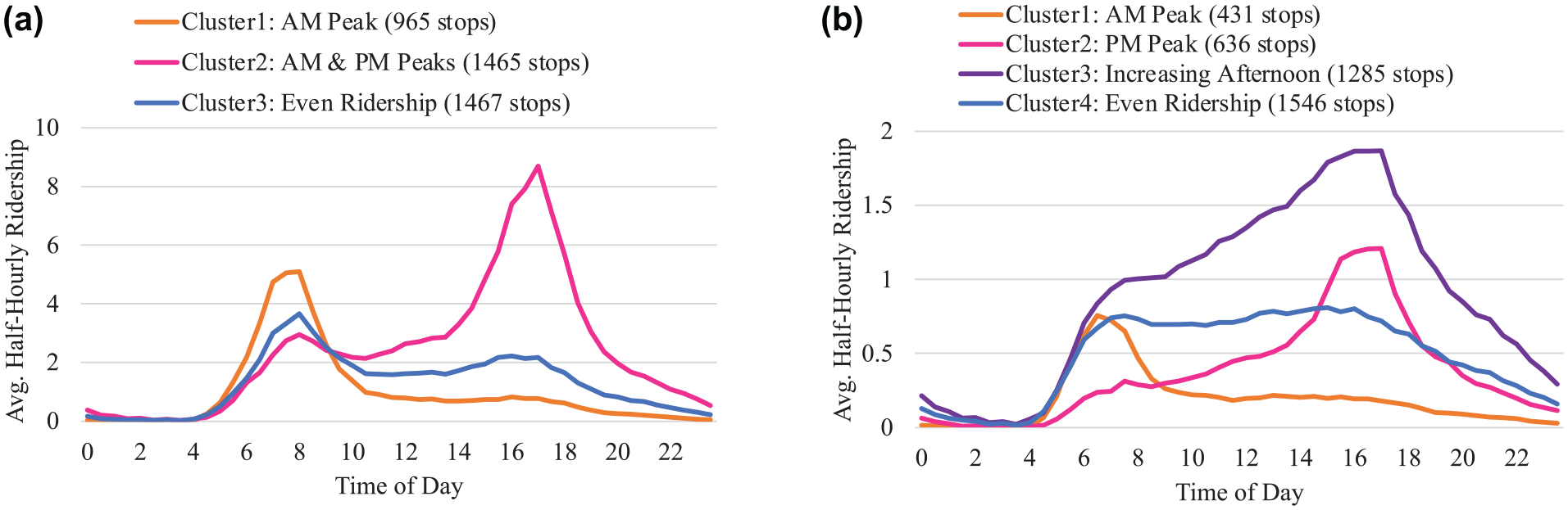
Peaking pattern clustering results: (a) before COVID-19 and (b) during COVID-19.
Among the three clusters of peaking patterns pre-COVID, stops in Cluster1 have most of their daily ridership during the morning peak. Stops in Cluster2 have both morning and evening peaks, in which the evening peak is higher than the morning peak. Cluster3 has stops with a more even ridership throughout the day. These clusters are characterized as: Cluster1, “morning peak”; Cluster2, “morning and evening peaks”; and Cluster3, “even ridership.” On the other hand, the clustering assignments during COVID have four clusters. Stops in Cluster1 have a higher share of ridership during the morning peak. In both Cluster2 and Cluster3, stops have more ridership in the afternoon, but those in Cluster2 have most of their ridership in evening peak hours, whereas ridership in Cluster3 is also high during the day. Last but not least, stops in Cluster4 have an even ridership throughout the day. These clusters are therefore characterized as: Cluster1, “morning peak”; Cluster2, “evening peak”; Cluster3, “increasing afternoon”; and Cluster4, “even ridership.”Figures 8 and 9 illustrate the peaking pattern cluster distributions for before and during COVID.
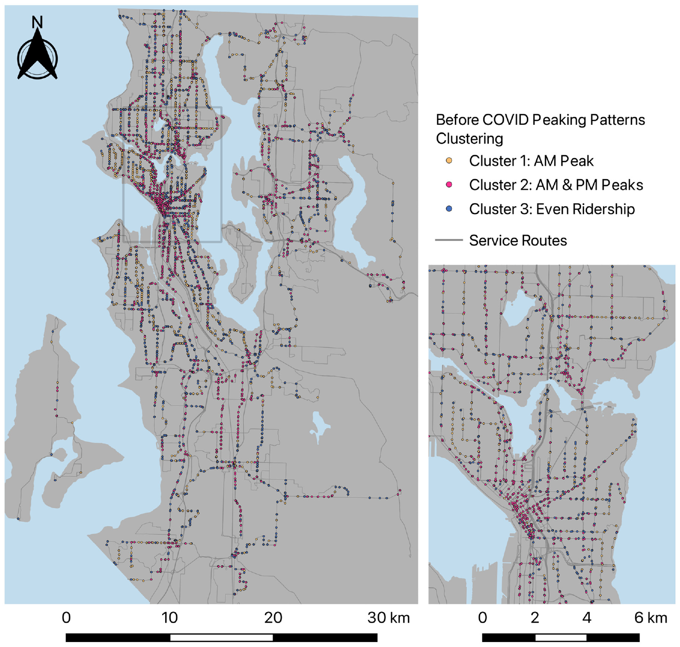
Spatial distribution of clusters for before COVID-19 peaking pattern analysis.
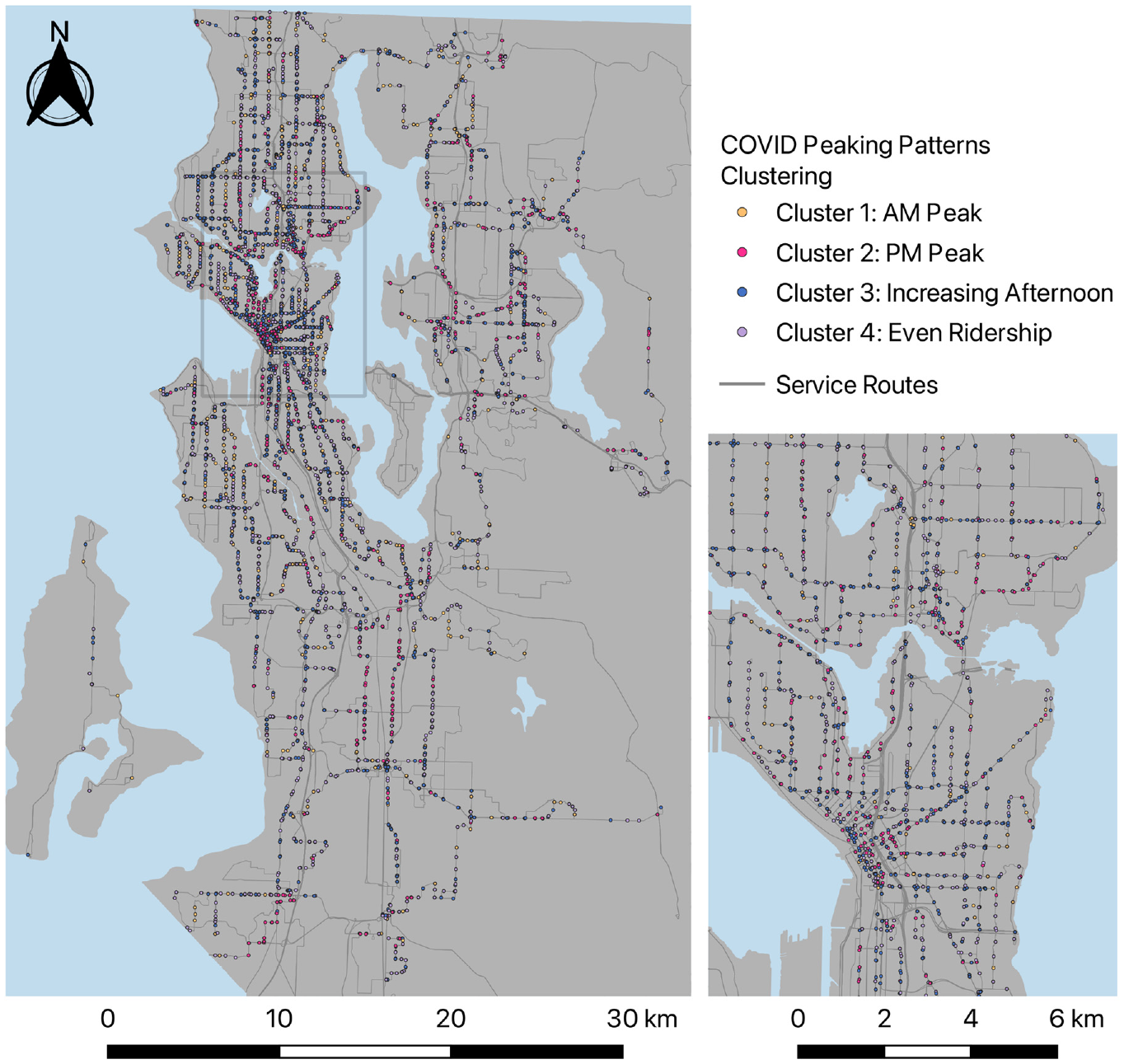
Spatial distribution of clusters for during COVID-19 peaking pattern analysis.
The maps for both pre-COVID and during-COVID periods in Figures 8 and 9 show that Cluster1 stops with morning peaks are mostly located in North Seattle, Magnolia, and West Seattle, which are all residential areas. Those stops in Cluster1 mostly belong in residential areas because they serve commuting trips from home to work during morning peak hours. However, the number of stops with morning peak in Cluster1 reduced by more than half, from 965 stops to 431 stops, during COVID as a large proportion of workers either started working from home or began using other transportation modes after the outbreak. In Cluster1, 499 stops out of the 965 stops lost their pre-COVID morning peak hours ridership and shifted to Cluster4, with even ridership during the day during COVID. On the other hand, the business areas that are home to major employers, such as Downtown Seattle and Downtown Bellevue, were mostly covered with stops in pre-COVID Cluster2 with morning and evening peaks as well as the stops in Cluster2 and Cluster3 during COVID both with higher ridership in the afternoon. The stops in Downtown areas serve trips of workers traveling back to their homes after work, which explains their higher afternoon peak hour ridership. The stops with even ridership, Cluster3 pre-COVID and Cluster4 during COVID, were scattered evenly across King County.
Referring to the previous ridership reduction analysis, from the reduction cluster map in Figure 6 and the pre-COVID cluster map in Figure 8, an overlap of the stops with greater reduction and stops with morning peak before COVID-19 is found in the residential areas with higher income. This finding, complemented with the drop of the number of stops with morning peaks during COVID, implies that work-related trips among those areas were significantly reduced.
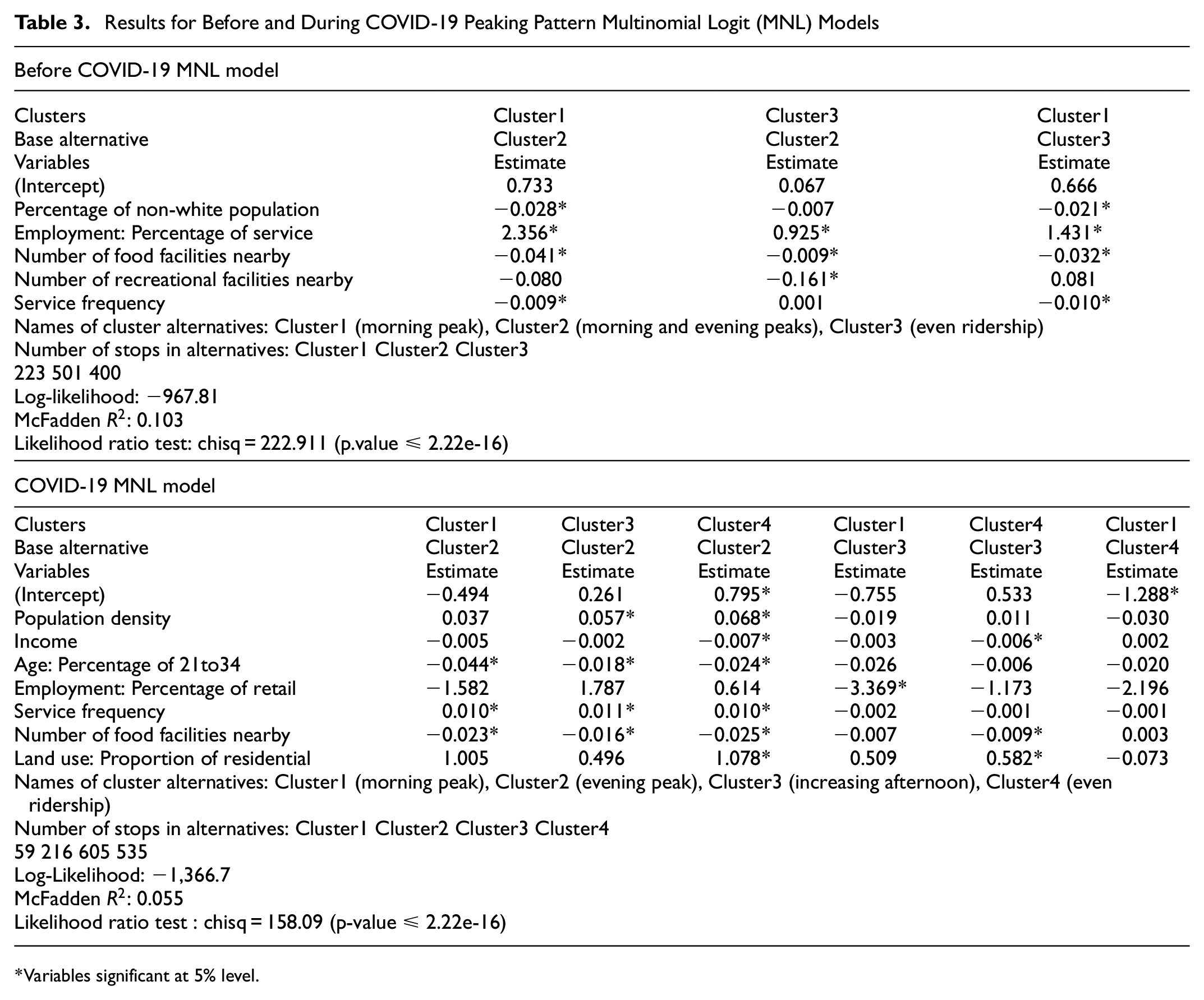
Peaking Pattern MNL Models Results
The clustering assignments described above were used as the dependent variables in both MNL models for before and during COVID. Three cluster alternatives are included in the pre-COVID MNL models: Cluster1 (morning peak), Cluster2 (morning and evening peaks), Cluster3 (even ridership). The results for the pre-COVID peaking pattern MNL models are presented in Table 3. The table shows two models with identical independent variables, but with different base alternatives. From the results, stops having lower service frequency or located in CBGs with a lower percentage of non-white population, and a higher percentage of people working in service industries are more likely to fall into Cluster1 with a morning peak. A stop located in a CBG with more food facilities nearby is more likely to belong to Cluster2 with morning and evening peaks. Looking into Cluster2 and Cluster3, stops located in CBGs that hold more recreation facilities are more likely to have more distinct morning and evening peaks (Cluster2) instead of an even ridership throughout the day (Cluster3).
Results for Before and During COVID-19 Peaking Pattern Multinomial Logit (MNL) Models
Variables significant at 5% level.
On the other hand, four cluster alternatives are included in the during-COVID MNL models: Cluster1 (morning peak), Cluster2 (evening peak), Cluster3 (increasing afternoon), Cluster4 (even ridership). The results for the during-COVID peaking pattern MNL models are presented in Table 3. This table holds three identical models, but with different base alternatives for easier interpretation. From the results, stops in Cluster2 with an evening peak are more likely to have lower service frequency and to be located in CBGs with more food facilities and higher percentage of people aged 21 to 34. Stops in Cluster2 are also more likely to be in CBGs with lower population density, compared with the stops with ridership throughout the day in Cluster3 and Cluster4. Stops situated in CBGs with higher income or lower proportion of residential land use are more likely to belong to Cluster2 and Cluster3, rather than to Cluster4. Stops located in CBGs with a higher percentage of people working in the retail industry are more likely to fall into Cluster3 instead of Cluster1.
Referring to both MNL models for pre-COVID and COVID, areas with more food facilities are more likely to hold stops that demonstrate higher ridership during afternoon peak hours in both pre-COVID and COVID periods. In areas with more recreation facilities, on the other hand, all the stops demonstrate higher ridership during afternoon peak hours during pre-COVID times than during COVID. This finding implies that people stopped visiting recreation facilities after working hours, but people were still likely to visit food facilities after working hours even during the pandemic.
Conclusion
This study quantified the impact of COVID-19 on stop-level bus ridership patterns with clustering. The impact was further evaluated using MNL models incorporating factors of socio-demographics, transit service, and land use. Findings from this study confirm that socio-economic disparity and spatial unevenness are detected in ridership reductions and pattern changes during the pandemic.
In the ridership reduction analysis, ridership decline during COVID-19 is observed all across King County. However, the magnitude of the reduction is not spread out evenly. The stops that experienced a greater reduction are more likely to be found in areas with more schools as well as a relatively higher median income, higher population density, higher percentage of young people aged 21 to 34, and lower percentage of employment in retail. These stops are mostly located in Downtown areas, East Seattle, West Seattle, Magnolia, and Ballard. On the other hand, the stops with lower reduction are more likely to have higher service frequency and to be in areas with a higher percentage of non-white population and higher percentage of employment in construction and resources. These stops are mostly located in North and South Seattle.
The peaking pattern analysis groups stops with the same ridership distribution pattern throughout a weekday into clusters for both pre-COVID and COVID time periods, respectively. The results show differences in peaking patterns for the same stops during the two time periods. Many stops that had both morning and evening peaks before COVID had their peaks flattened during COVID as the peak hours work trips reduced significantly during COVID. Additionally, more than half of the stops serving work trips with a morning peak during the pre-COVID time lost their riders during morning peak hours and changed to having even ridership throughout the day during COVID. Findings from pre-COVID MNL models suggest that the stops with a morning peak tend to have lower service frequency, a lower percentage of non-white population, and a higher percentage of people working in service industries. Stops with more food facilities nearby are more likely to have morning and evening peaks. Moreover, stops with more recreation facilities nearby are more likely to have distinct morning and evening peaks (Cluster2) instead of an even ridership throughout the day (Cluster3). During the COVID period, the stops with an evening peak are more likely to have lower service frequency, more food facilities nearby, and a higher percentage of people aged 21 to 34. Stops within CBGs with a higher income or lower proportion of residential land use are more likely to show a higher ridership during evening peak hours.
Several limitations are recognized in this study. First, nearby stops can be in the same CBG or Census Tract levels, thus having the same socio-demographic values. This causes the model to be unable to distinguish their respective impacts on ridership. Furthermore, this study only analyzed ridership patterns in the first nine months of the COVID pandemic period. However, phases of the pandemic can vary over time, along with changes of government policies and reopened businesses. Thus, travel patterns could be different after the nine-month period analyzed.
For future studies, together with APC data, smart card data or smart phone location data with information on the origin and destination of each trip as well as the demographic information of the riders can also be analyzed to better determine the changes in travel patterns and in travel behavior across different socio-economic groups. Additionally, data from more transit agencies, such as Sound Transit, which operates the Link Light Rail and express buses in King County, can also be included to ensure all transit options are considered.
Footnotes
Acknowledgements
The authors are grateful to many individuals who have helped us tremendously during the course of completing this study. Dr. Erik Jenelius and Dr. Shuai Huang reviewed and commented on the study as final presentation committee members. Especially, Rich Lee and Brian Van Abbema from King County Metro who kindly provided the APC data and constructive comments on this study.
Author Contributions
The authors confirm contribution to the paper as follows: study conception and design: J. Lin, C. Chen; data collection: J. Lin; analysis and interpretation of results: J. Lin, C. Chen, O. Angah; draft manuscript preparation: J. Lin, C. Chen, O. Angah. All authors reviewed the results and approved the final version of the manuscript.
Declaration of Conflicting Interests
The author(s) declared no potential conflicts of interest with respect to the research, authorship, and/or publication of this article.
Funding
The author(s) received no financial support for the research, authorship, and/or publication of this article.