
Abstract
For more than a half century, federal policy has required metropolitan planning organizations (MPOs) to communicate regional priorities through long-range transportation plans (LRTPs). Despite the length of that requirement and the high cost of the associated investments, there are virtually no resources to guide MPOs in graphically communicating these plans to the public. This research reviews 1,502 graphics from a stratified random sample of LRTPs from 20 MPOs across the United States with populations less than 200,000. Quantitative and qualitative analyses were conducted to assess current graphic practices and generate suggestions to guide MPOs in enhancing graphic communication. This review categorizes LRTP graphics into three types (spatial, numeric, and concept), identifies the frequency, components, and uses of each type, and then proposes a set of 26 “core” graphics as a common baseline for all LRTPs.
Keywords
For over 50 years the U.S. government has required urbanized areas to develop long-range transportation plans (LRTPs). These documents represent a regionally shared vision for transportation investments ( 1 ) and consume a significant portion of metropolitan planning organization (MPO) expenditures. Surprisingly, given the long-standing requirement to make these plans, their significant value to the community, and the high cost for plan development, there is relatively little guidance on crafting the official plan documentation—particularly its graphics.
LRTPs, by their very nature, involve quantitative analyses and considerations of space—both of which lend themselves to graphic presentation. Graphics enhance reader interest and content retention and are, consequently, critical to plan communication ( 2 ). The absence of graphic guidance affects all 403 MPOs in the United States, but it is most problematic for the 198 smaller MPOs that do not qualify to be transportation management areas (TMAs) and have limited resources for LRTP development.
This research seeks to offer succinct graphic guidance for any MPO practitioner to apply when developing an LRTP. After presenting the literature on graphic communication, this work reviews 1,502 images from a stratified random sample of 20 LRTPs to offer metrics on graphic frequency and to identify three categories of graphics: spatial, numeric, and concept. This tripartite taxonomy structures a quantitative and qualitative analysis of LRTP graphics to propose a set of 26 “core” graphics to help MPOs communicate plans to stakeholders.
Graphic Communication Literature
Graphic communication transcends many industries, emphasizing effective messaging ( 3 ). It is “the art and science of integrating writing and design” to best convey ideas ( 4 ). Graphic communication is an intentional process of engaging and informing targeted audiences ( 4 – 6 ) through imagery (including diagrams, maps, timelines, photographs, charts, and icons) that complements written text ( 7 ). Although graphics can be distracting ( 8 ), they should ideally be “indispensable partners of words” ( 9 ).
Transportation planning documentation has been criticized as being excessively long, technical, complex, and utilizing “distant and unfriendly” language ( 10 , 11 ). Good graphics can improve the appeal of a plan by increasing stakeholder interest, information retention, and policy engagement ( 12 , 13 ). Graphics can make documents more transparent, participatory, credible, and “trust-inspiring” ( 7 , 11 ). These benefits can counter the alienation of bureaucratic prose ( 14 ).
Data Sample
This research chronicles existing practices within LRTPs to guide small MPOs in their use of graphics. A sample set of 20 LRTPs constitutes the basis of this analysis. These plans were chosen from a stratified random sample of MPOs with a population of less than 200,000 residents. Population thresholds exceeding this range trigger additional legal requirements associated with being classified as a TMA, from which smaller, non-TMA MPOs are exempt. For this research, it was assumed that TMA MPOs more often incorporate graphics in their LRTPs owing to their greater budgets and staff capacity. With smaller populations and fewer responsibilities, non-TMA MPOs generally have smaller budgets and staff capacity—despite their plans affecting nearly 23.3 million people across the United States ( 15 ).
The sample, mapped in Figure 1, was collected by randomly selecting five non-TMA MPOs from each of the four geographic regions defined by the U.S. Census Bureau: West, Midwest, Northeast, and South. This stratification ensures the sample is geographically distributed and ideally reflects any regional variation extant among MPOs. The total sample size represents a tenth of all non-TMA MPOs.
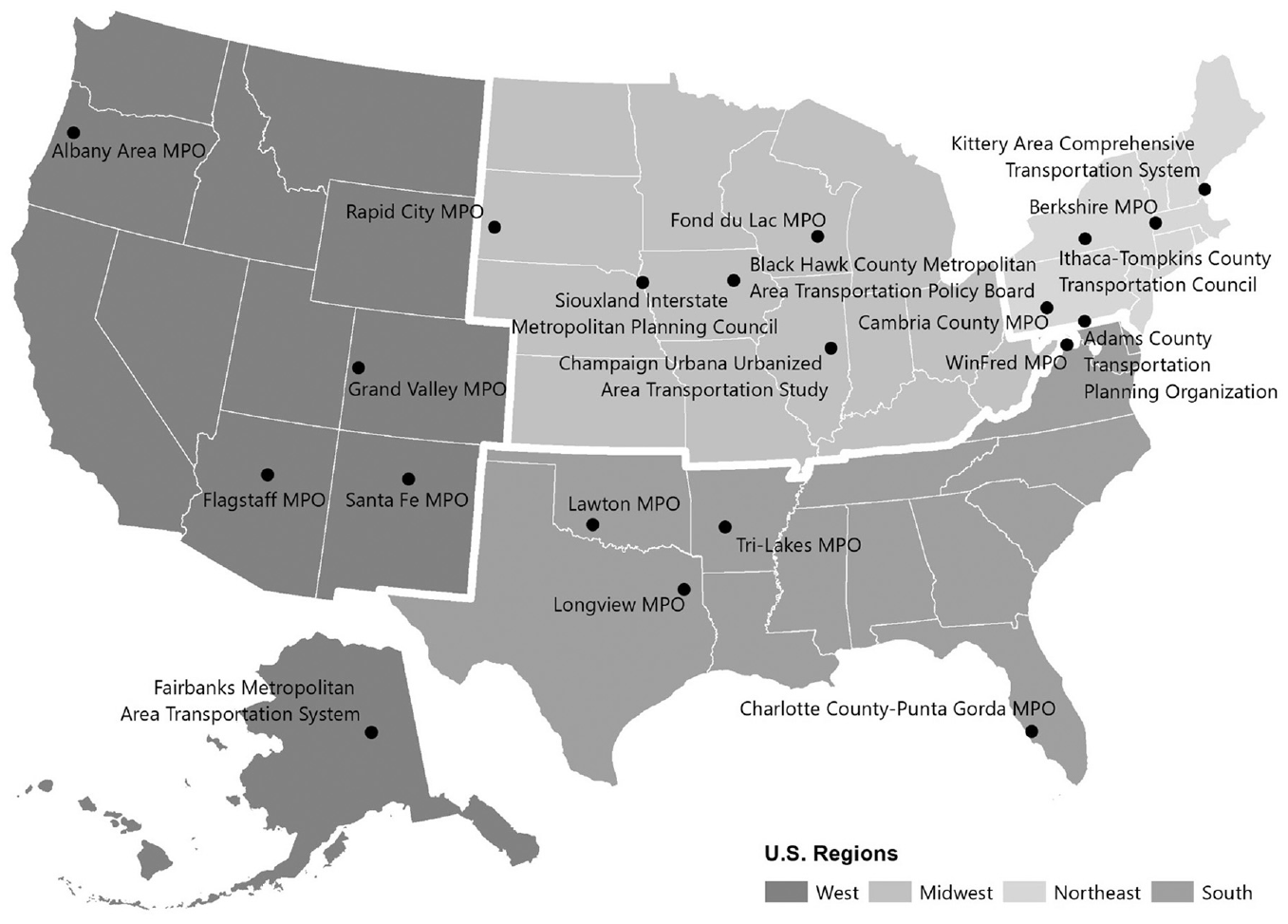
Sampled metropolitan planning organizations (MPOs) by region.
Table 1 provides information on the study sample of MPOs, their 2010 populations, and the years and length of their latest LRTP ( 16 – 35 ). Table 1 also indicates whether the MPO is situated within a council of government (COG) as well as whether the LRTP was completed with consultant assistance, as both conditions might support more graphical inclusion. Although, by definition, these non-TMA MPOs covered areas with fewer than 200,000 residents, the actual population ranged from just under 49,000 in Springvale, ME to just over 161,000 in both Urbana, IL and Punta Gorda, FL. The mean MPO population was 104,806 residents with a standard deviation of 33,070. All of the sampled MPOs completed their reviewed LRTP between 2014 and 2018.
Study Sample of Metropolitan Planning Organizations
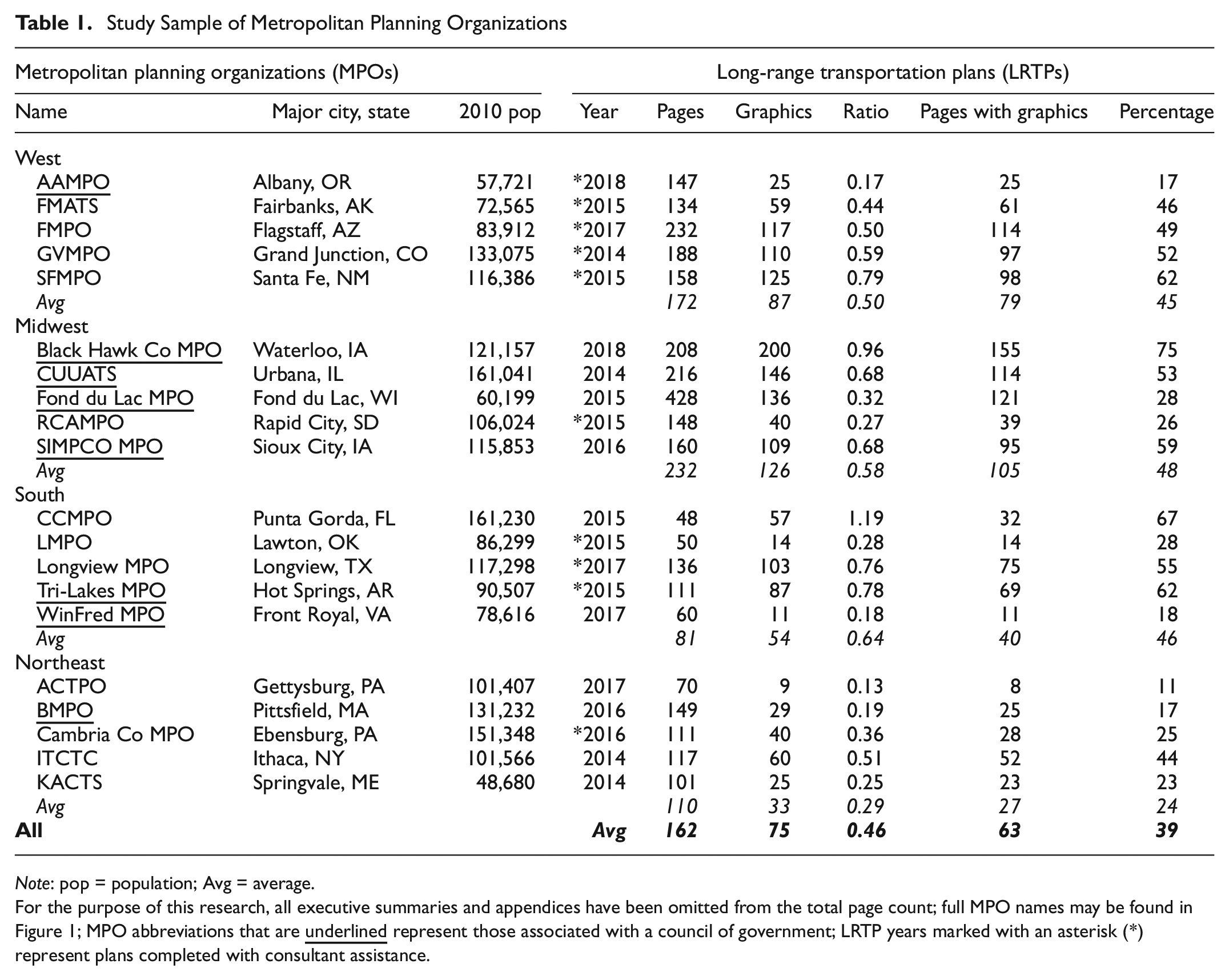
Note: pop = population; Avg = average.
For the purpose of this research, all executive summaries and appendices have been omitted from the total page count; full MPO names may be found in Figure 1; MPO abbreviations that are
Graphic Frequency
The first analysis quantified the frequency of graphics found within LRTPs to provide expectations for an appropriate number of plan graphics. Two different measures of graphic frequency were calculated: the total number of graphics in each LRTP and the number of plan pages that had at least one graphic. These frequencies were scaled to the total number of plan pages (excluding executive summary and appendix) to enable fair comparison across LRTPs. This scaling was necessary as metropolitan areas face different development issues that require differing lengths of plan documentation. For example, Table 1 shows sample plans that range in length from 48 to 428 pages with a mean of 162. Similarly, sample plans ranged from 9 to 200 graphics with a mean of 75. Dividing the graphic frequencies by the plan length created comparable ratios, as well as helpful metrics for MPOs assessing their own plans. Only these scaled numbers are discussed below.
Graphics-to-Page Ratio
The first frequency metric is the ratio of total graphics to total plan pages. This simple ratio provides an indication of the number of graphics to be developed for a given length of a plan.
The sample mean was 0.46 graphics-to-page—just under one graphic for every two pages—with a relatively large standard deviation of 0.30. The individual LRTPs comprised graphics-to-page ratios ranging from a low of 0.13 to a high of 1.19 in Charlotte County-Punta Gorda MPO (CCMPO) where there were more graphics than pages.
The CCMPO example illustrates a limitation of this first frequency metric, namely it does not directly account for multiple graphics on a single page.
Percentage of Pages with Graphics
The second frequency metric is the percentage of all pages that have at least one graphic. This measure was calculated as the number of plan pages with one or more graphics divided by the total number of pages multiplied by one hundred (to be expressed as a percentage). This measure attempts to remedy the limitation noted above with the graphics-to-page ratio, since it is designed not to exceed 100%. More importantly, this metric attempts to reflect the experience of the reader, specifically, to ascertain the share of pages where text is broken up or replaced by graphics. An MPO can calculate this metric by flipping through their LRTP to establish the proportion of pages with at least one graphic.
The sample mean share of pages with graphics was 39% with a standard deviation of 20. The individual LRTPs reported shares ranging from a low of 11% to a high of 75%, meaning three-quarters of a plan’s pages had graphics on them. Interestingly, this highest share was found in Black Hawk County MPO in Iowa, not in the CCMPO plan, which, although having more graphics than pages, allocated those images to only two-thirds of the total pages.
Drivers of Graphic Frequency
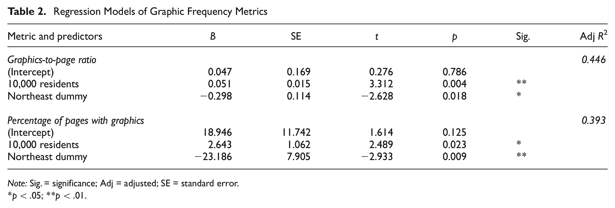
Additional analysis was undertaken to determine whether LRTP graphic frequency varied with MPO population, census region, organization of the MPO as a COG, or if completed by a consultant rather than in-house (all variables are presented in Table 1). These relationships were explored statistically to better understand how context, size, organizational structure, or out-sourcing might affect graphic frequency. Given the small sample size, these relationships should be seen as suggestive of larger trends rather than definitive.
MPO area population had a statistically significant positive association with the graphics-to-page ratio. Estimating a simple linear regression model yielded parameters that suggest for every 10,000 residents in an MPO region, the graphics-to-page ratio increased by 0.049. The model was statistically significant and accounted for 26% of the variation in the graphics-to-page ratio. This finding suggests that MPOs with larger populations incorporated relatively more graphics into their LRTPs. MPO population was also positively associated with the percentage of pages with graphics metric, but not at a level of statistical significance.
When comparing regional averages, the Northeast region had lower LRTP graphic frequencies than the other regions; however, analysis of variance revealed that none of these regional differences were statistically significant on their own. When both MPO population and a dummy variable for the Northeast region were incorporated as predictors in a multiple linear regression model of the graphs-to-page ratio, the resulting parameters were statistically significant, as shown in Table 2. The coefficient for 10,000 residents was virtually unchanged from the simple population model at 0.051, whereas the coefficient for the Northeast region dummy was −0.298. The model explained 45% of the variation in graphic frequency. The same two predictors yielded statistically significant models for the percentage of pages with graphics metric. In other words, while accounting for population size, non-TMA MPOs in the Northeast tended to have fewer graphics-per-page and fewer pages with graphics.
Regression Models of Graphic Frequency Metrics
Note: Sig. = significance; Adj = adjusted; SE = standard error.
p < .05; **p < .01.
Contrary to the researchers’ hypothesis, neither organization of a non-TMA MPO within a COG nor use of consultants to prepare the LRTP demonstrated any statistically significant relationship with graphic frequency in the plan. Simple two-sample t-tests revealed no differences in means and more complicated incorporation of these variables in multiple regression models revealed no statistical significance when controlling for confounding variables.
This discussion of graphic frequency summarizes existing LRTP experience, not whether any particular rate of graphic inclusion is best for the consumers of LRTPs. MPOs might use these frequency metrics to compare their efforts with those of the peer agencies presented in Table 1. Alternatively, an aspirational goal might be for MPOs to aim for at least half the pages of LRTPs to contain graphic imagery. This rate exceeds the study sample average by about half a standard deviation, to encourage a gentle increase in typical graphic frequency.
Although frequency is easy to quantify, graphic content is more central to good communication and discussed in the subsequent sections.
Three Categories of Graphics
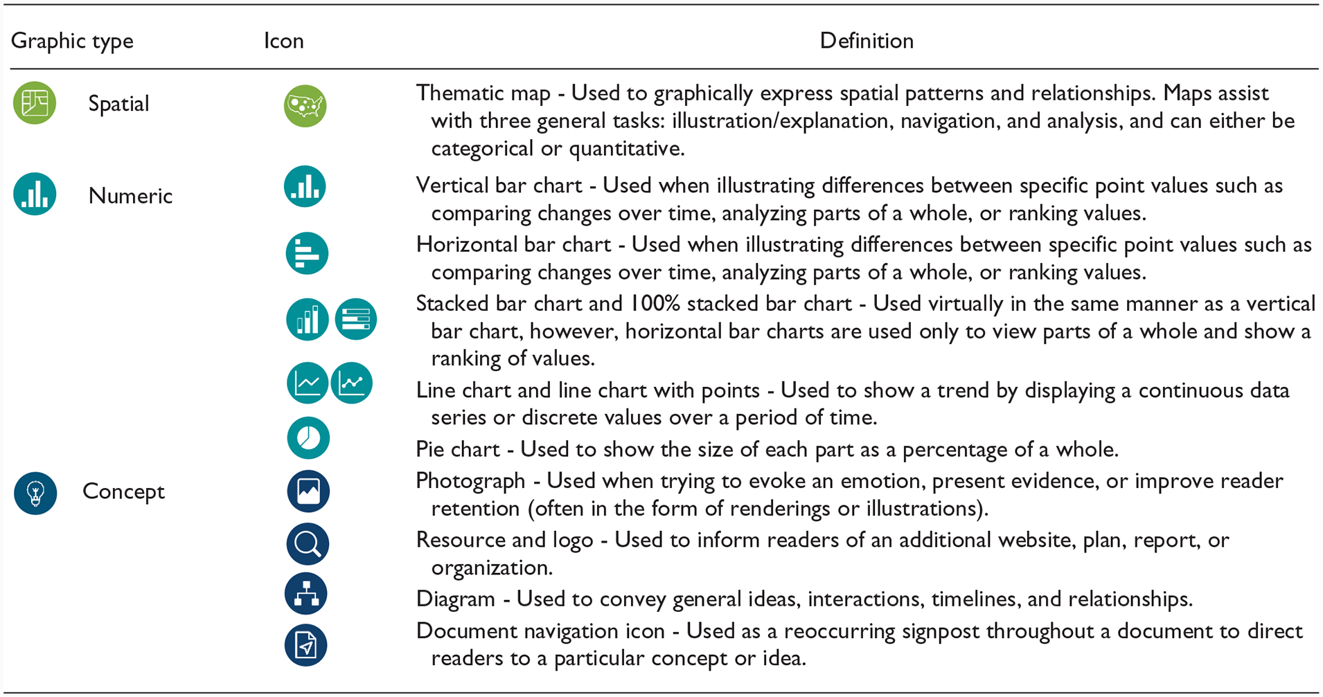
While the previous section provides metrics for considering graphic frequency, this section offers a framework for considering graphic content. This content analysis induced three categories for transportation planning graphics: spatial, numeric, and concept.
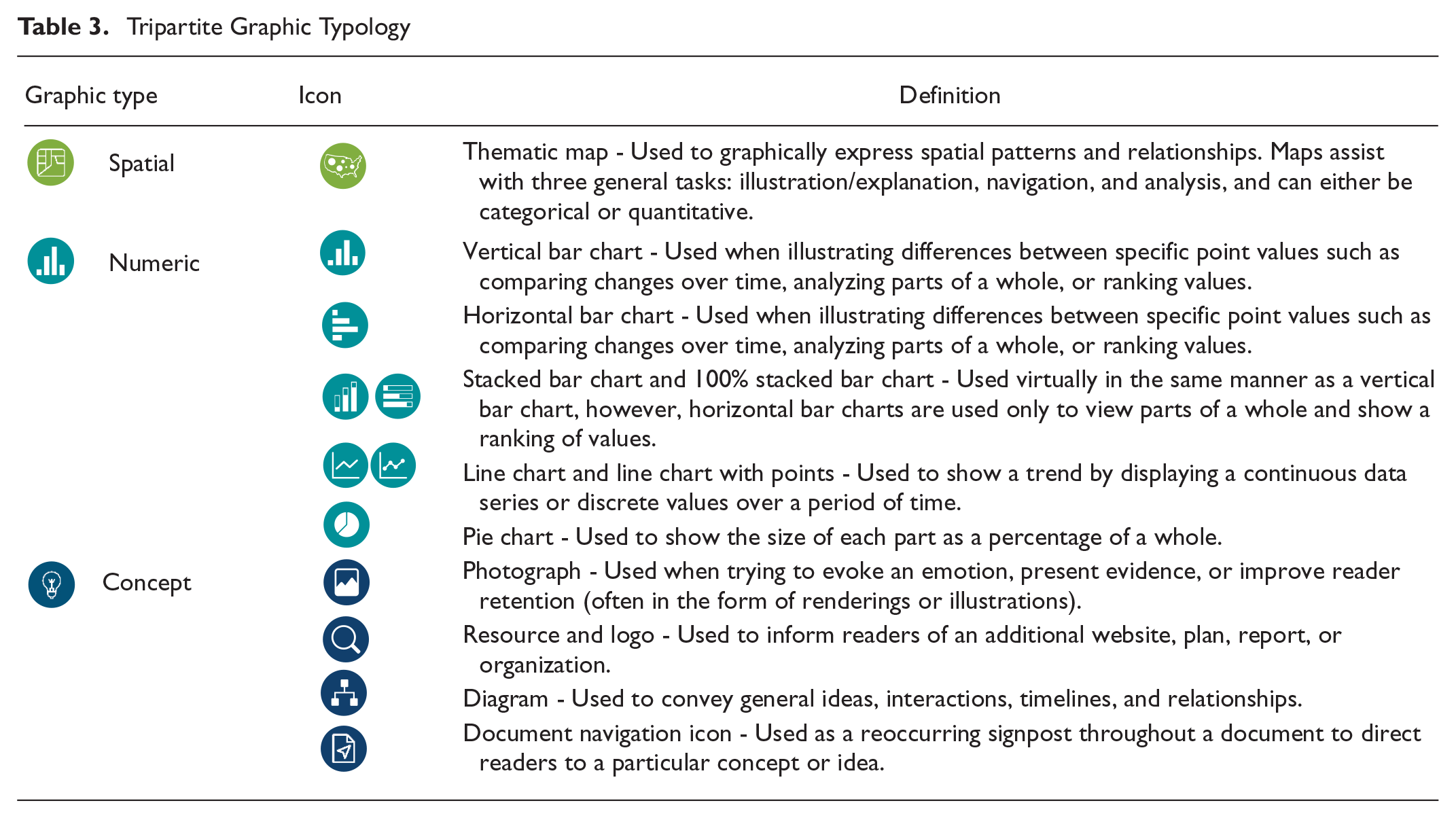
Spatial graphics present relationships and patterns across an area ( 36 ). These thematic maps come in two varieties: categorical and quantitative. Categorical maps communicate discrete nonnumeric information, such as street names or proposed infrastructure; quantitative maps communicate the relative values of variables, such as a choropleth map of population density or flow map of traffic volumes.
Numeric graphics are graphs, charts, and other related figures that present quantitative data aspatially, such as a bar chart of mode shares or a line chart of regional population growth. Numeric graphics convey relationships among numbers more quickly and clearly than data in a table ( 37 ).
Concept graphics are visualizations that are neither spatial nor numeric. These graphics clarify an idea through imagery. Concept graphics are the most diverse graphic type. Examples include photographs of existing infrastructure conditions, renderings of proposed treatments, and illustrations of planning ideas, such as zoning by transect. One type of concept graphic is the icon used to guide readers through a transportation plan. These document navigation icons are often quite small and repeated throughout a plan (and for these reasons are excluded from the count of concept graphics in this section).
Table 3 lays out these graphic categories along with their common LRTP forms as a reference. Figure 2 presents the frequency of each graphic category within the study sample. (Both the table and the figure showcase the use of the document navigation icons discussed above.) The data in Figure 2 demonstrate that spatial graphics accounted for the plurality of LRTP graphics (45%) followed by concept (34%) and numeric graphics (21%).
Tripartite Graphic Typology
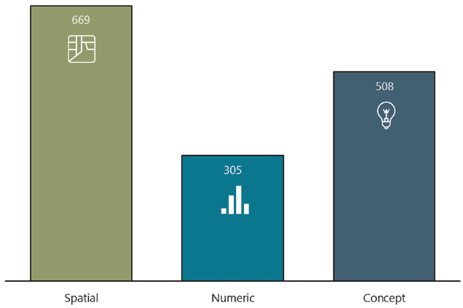
Number of graphics in sample by type.
Each graphic type has its characteristic size in LRTPs. Figure 3 presents these distributions by size to show that most small graphics (i.e., less than a quarter page in size) were concept, most medium-sized graphics (i.e., between a quarter and a half page in size) were numeric, and most large graphics (i.e., more than half a page in size) were spatial. This relationship is logical, as maps tend to consume more space because they display a high volume of information in contrast to other formats. More detailed graphics need to be larger.
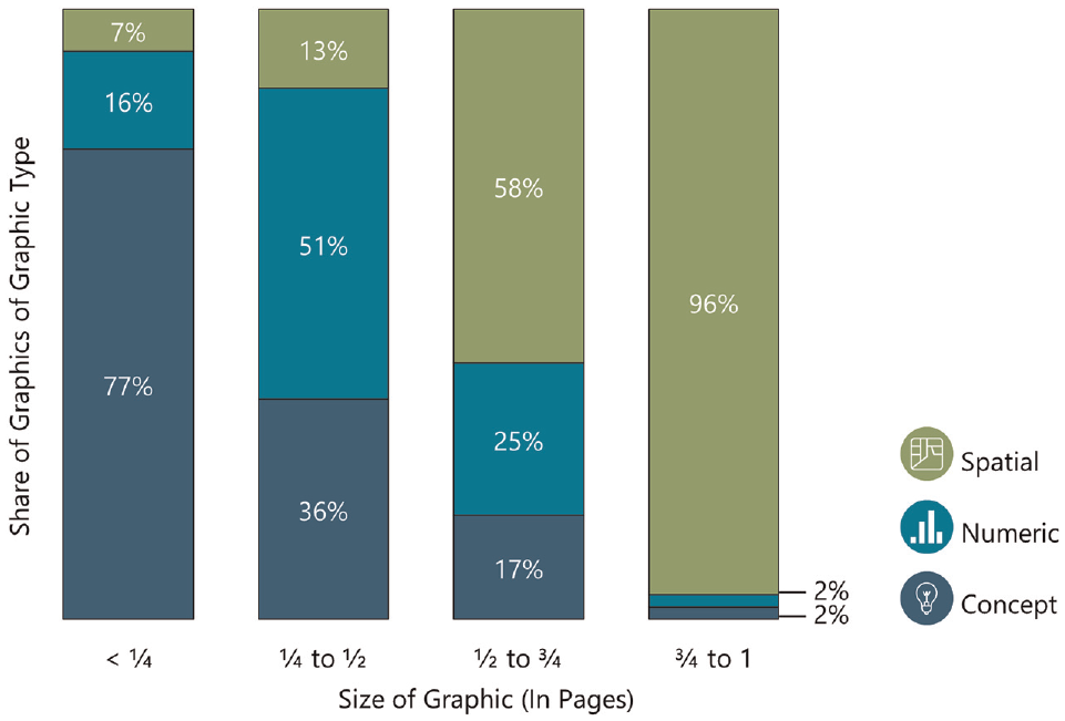
Graphic size distribution by type.
Spatial Graphics
Among each of the LRTPs in this study, spatial graphics varied in relation to their scale, type, and theme.
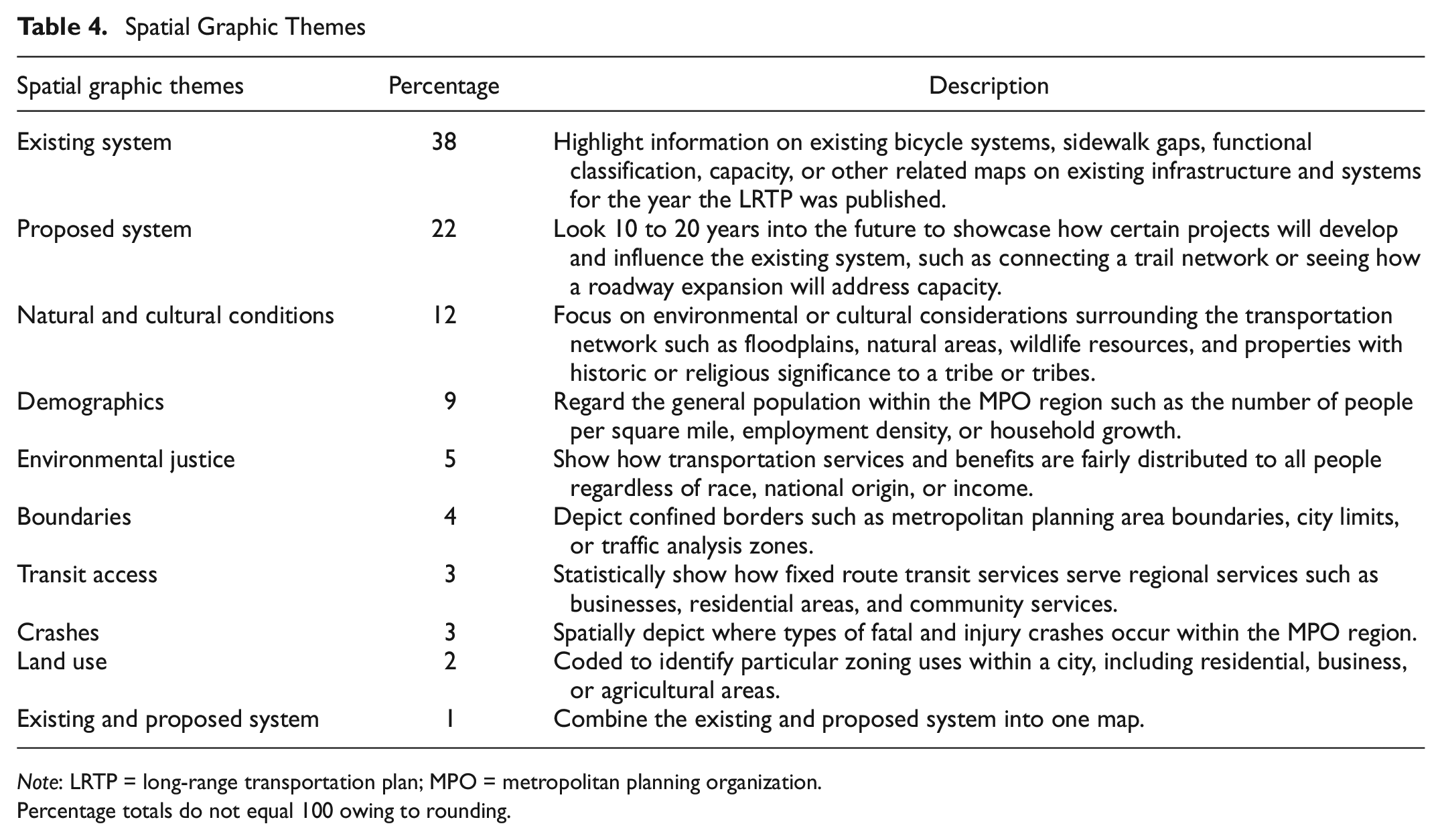
These graphics were found at all geographic scales from a neighborhood to the entire country. Three-fifths of spatial graphics were scaled to show the geography of an entire MPO region. Most LRTPs had a common template for this scale. A consistent map background or template helps facilitate reader comprehension as it can be easy for readers to recognize a change of topic while still having easily identifiable reference points. Only a small minority of spatial graphics extended beyond the MPO region. Maps beyond the MPO region typically orient readers to where the MPO is located within a state or depict a national trend. Roughly a third of spatial graphics were at the sub-MPO scale, such as at the city, neighborhood, or corridor level. These maps demonstrated a greater level of detail on current or proposed infrastructure.
As noted earlier, spatial graphics were of two types: categorical or quantitative. Almost three-quarters (73%) of the spatial graphics were categorical and communicated nonnumeric information, such as a fixed route transit system or sidewalk inventory. The remaining 27% of spatial graphics communicated quantitative information, such as the distribution of a population or traffic volumes. Three-fifths of these quantitative maps were choropleth maps that depict the geographic distribution of the data at different magnitudes, most commonly demographic, environmental justice, and transit access information.
The spatial graphics represented 10 distinct themes among the sample of transportation plans. Table 4 presents these themes along with their respective shares of total spatial graphics, to provide MPOs with guidance on typical spatial graphic options and their prevalence in LRTPs.
Spatial Graphic Themes
Note: LRTP = long-range transportation plan; MPO = metropolitan planning organization.
Percentage totals do not equal 100 owing to rounding.
Numeric Graphics
As stated, numeric graphics represent quantitative data aspatially. Although these graphics are easily generated by data analysis software, care must be taken as default settings can result in graphics that abrogate good design principles ( 38 , 39 ). A common example is the automatic generation of grid lines for bar charts, when simply adding a value label (as in Figure 2) would be sufficient.
Table 5 presents the six numeric themes identified among the sample transportation plans along with their percentage breakdowns.
Numeric Graphic Themes
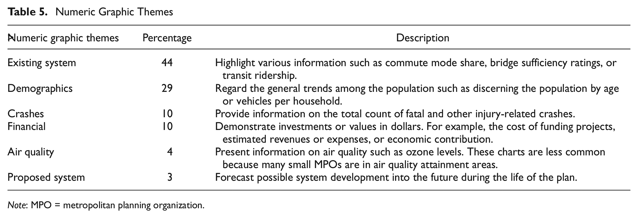
Note: MPO = metropolitan planning organization.
Two findings stood out from this review. First, there were relatively few projections of conditions despite the future focus of LRTPs. Second, numeric graphics varied in quality. Some plans excelled at producing clear charts whereas other plans had charts that were blurry, unnecessarily three-dimensional, or composed of colors that were difficult to read or lacking in contrast when printed in black and white.
Concept Graphics
Concept graphics are visualizations that are aspatial and nonnumeric, such as photographs of innovative infrastructure implementations from other communities or diagrams of intelligent transport system architectures. These graphics ideally communicate new or complex ideas.
One concern about concept graphics is the high use of photographs. Graphic communication theory considers photographs to be the most “insidious types of illustrations” as they can distract the audience to the detriment of the intended message ( 40 ). Two-thirds of all concept graphics (and therefore 22% of all surveyed LRTP graphics) were photographs. These images often serve a “filler” role, that is, filling odd spaces to add visual appeal without offering any content communication. Such filler graphics, which are not limited to photographs, unnecessarily lengthen transportation plans, potentially deterring or distracting readers.
A related concern is the reuse of an identical graphic in multiple places within a single LRTP. This image recycling can be reasonable when plan chapters are made available separately, such as on an MPO website; however, this research found that these “repeated” graphics are rarely referenced within the text, once again suggesting a filler rather than communicative role.
There is one type of concept graphic that gains value through repetition, namely the document navigation icons mentioned earlier (these are not included in the proportions listed in Table 6). These are symbols that are interspersed frequently as signposts throughout plans to alert readers to key ideas or topics. Ideally, document navigation graphics are defined at the beginning of a plan so their use is clear to the reader.
Concept Graphic Themes (Nonphotograph)
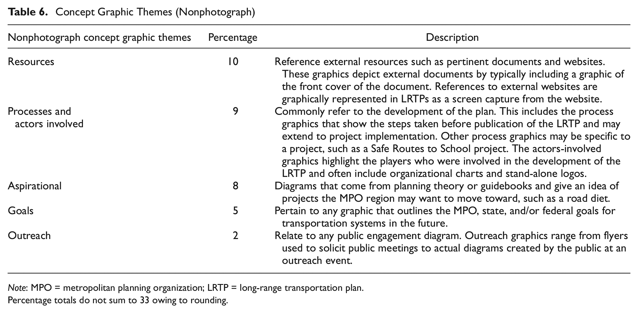
Note: MPO = metropolitan planning organization; LRTP = long-range transportation plan.
Percentage totals do not sum to 33 owing to rounding.
Table 6 presents the five themes found in nonphotograph concept graphics along with their share of all concept graphics. These accounted for a third of the concept graphics.
As noted above, the vast majority of concept graphics were photographs. These images, and the renderings that are often built on them, can appear almost entirely distinct from other concept graphics, as they provide greater dimension in capturing the physical environment. Consequently, these images offer a high audience impact and can powerfully communicate existing or proposed infrastructure to readers ( 39 ).
Table 7 identifies 10 themes among the photographic concept graphics in LRTPs. These accounted for two-thirds of concept graphics.
Concept Graphic Themes (Photograph)
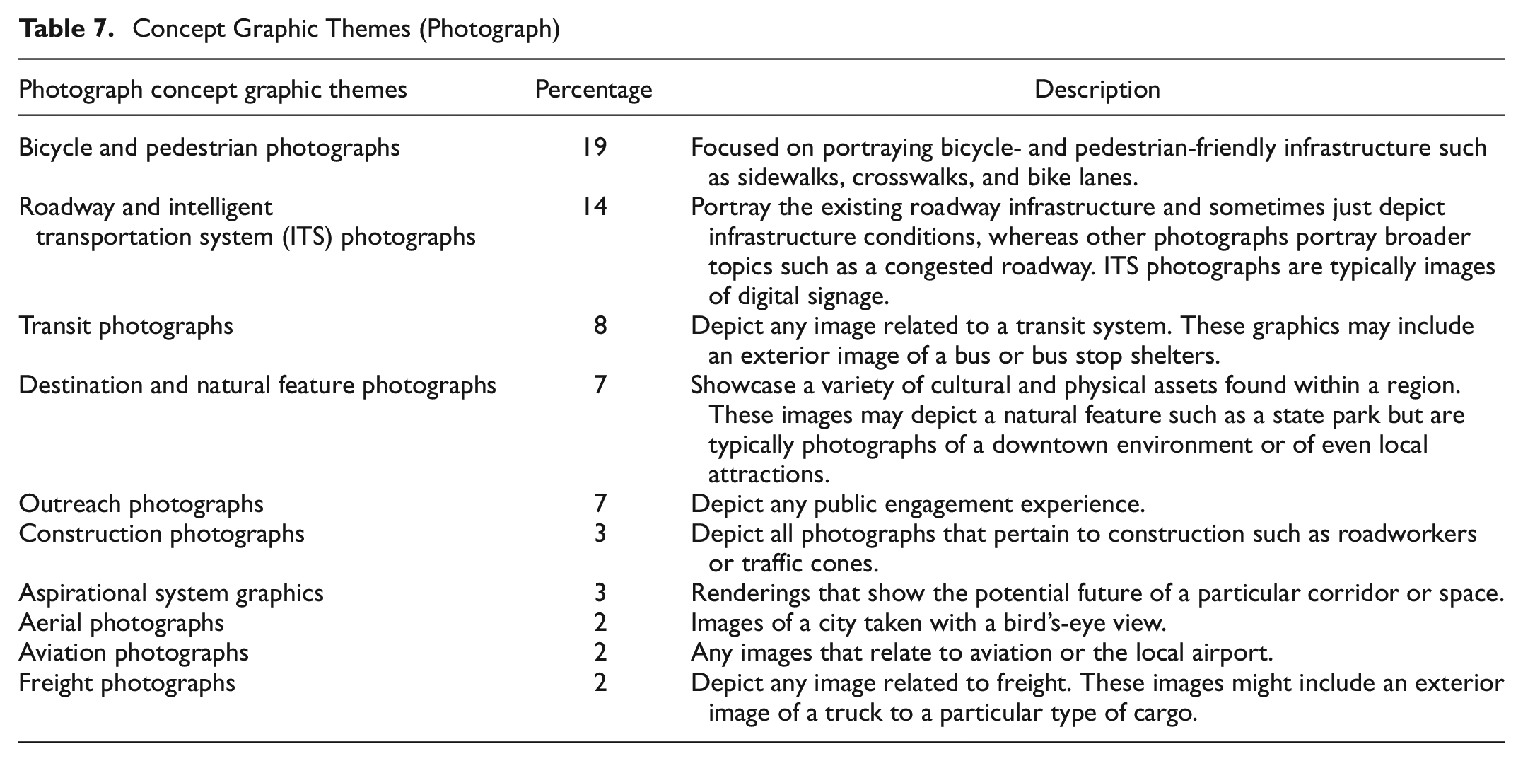
The most salient finding from the photographic concept graphics was the surprising inconsistency of public outreach evidence. Plans would either include several photographs of their outreach process or none at all. The inclusion of public outreach photographs signals that in-person public engagement shaped the plan—an important value to showcase in the report.
“Core” Graphics
To help guide transportation plan development, this last section presents a set of 26 “core” graphics for LRTPs. (Use of quotation marks around the word “core” is to reflect the authors’ recognition that the content of this list is subjective and its embrace by MPOs arbitrary.) This proposed set of graphics reflects the authors’ review of sample plans and their own considerations for best graphic (and planning) practices. These recommendations are offered to provide a helpful baseline checklist for small MPOs.
Table 8 organizes the core graphics by type (spatial, numeric, and concept), recommended format, and frequency found in the sample LRTPs. Half of the 26 recommended core graphics are spatial whereas the other half is split between 7 numeric and 6 concept graphics. The suggested format for each graphic is based on either the commonly used format in the study sample or the graphic communication principles identified from literature ( 37 , 39 , 41 , 42 ).
List of “Core” Graphics
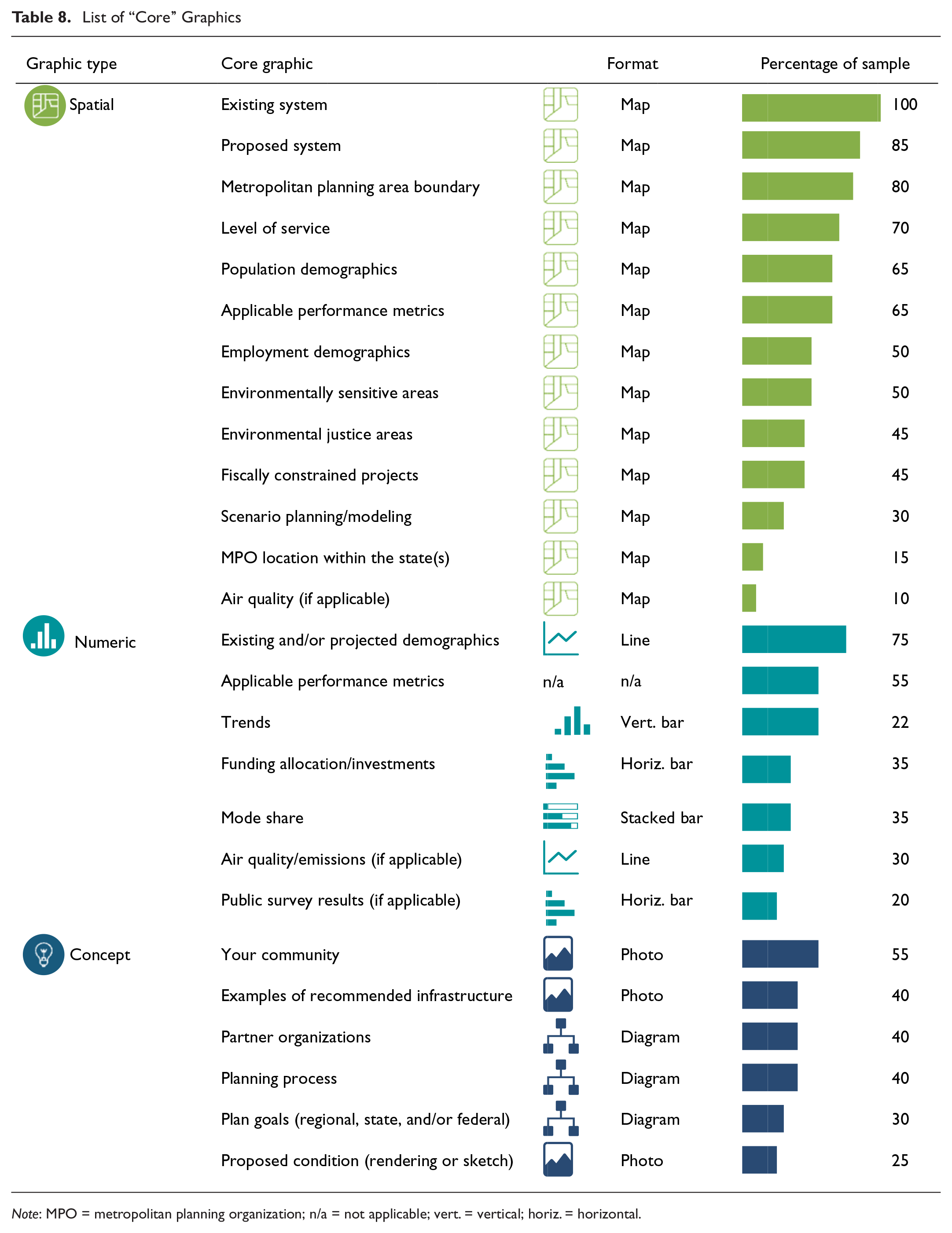
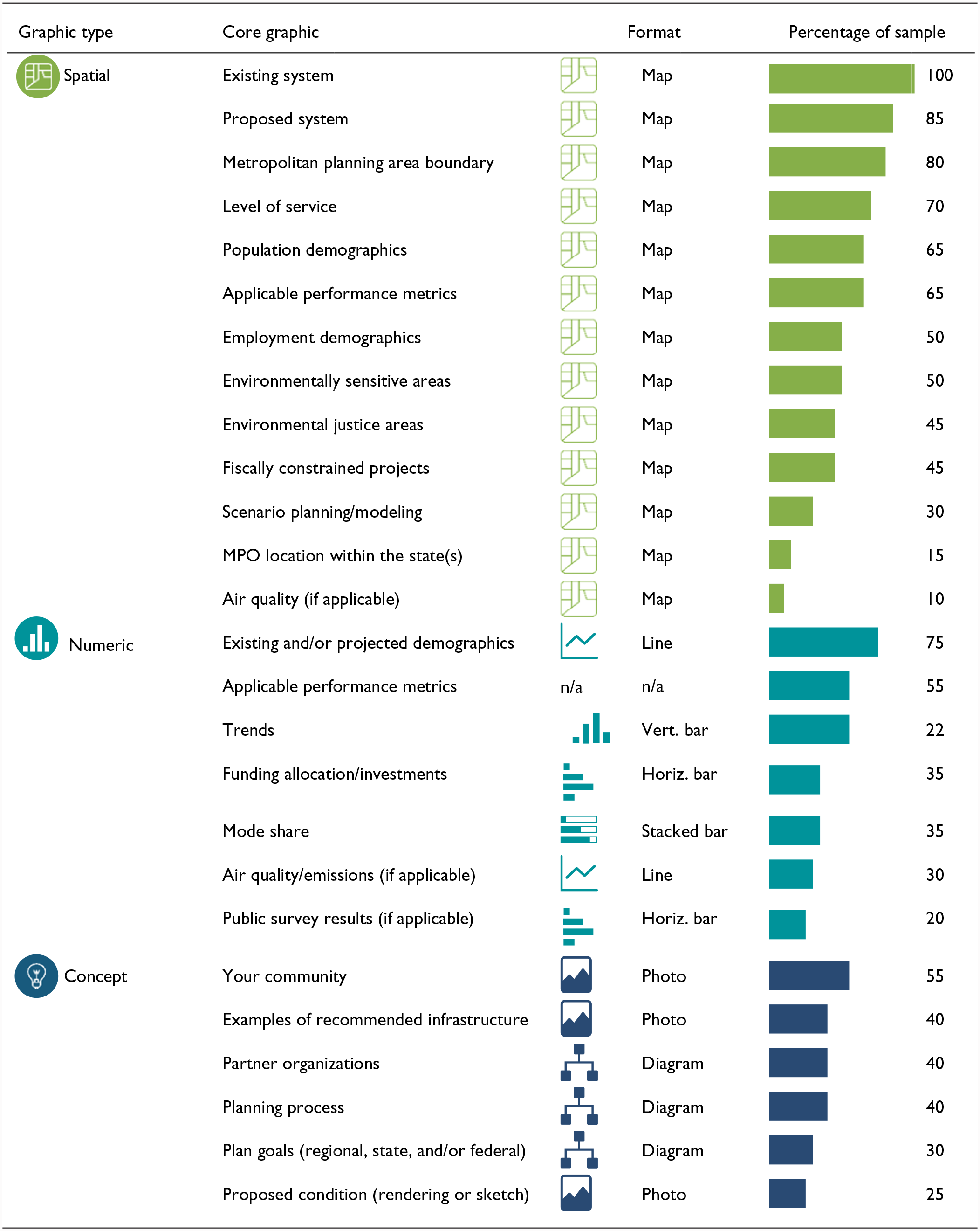
Note: MPO = metropolitan planning organization; n/a = not applicable; vert. = vertical; horiz. = horizontal.
The frequency information demonstrates that the recommended core graphics are not currently widely incorporated into LRTPs with only 11 of the 26 core graphics included among even half of the studied plans. Some of this low uptake reflects objective factors. For example, recommended graphics on air quality are unlikely to be relevant among MPOs in attainment with federal criteria pollutant standards as is often the case with low-population non-TMA MPOs. However, some of this low uptake reflects differing planning priorities. For example, regions with limited transit infrastructure may not see the value in presenting mode split information. The authors’ decision to elevate mode share to a core graphic reflects an underlying normative priority on multimodal planning.
This example illustrates that the recommended core graphics reveal the authors’ own priorities about regional planning in addition to their concern for graphic communication. MPOs using this list should view these as suggestive rather than prescriptive. It is hoped these recommendations will help MPOs in the development of documents that work for their unique situations, not bind MPOs to a static set of graphics. Furthermore, it is expected that as planning practice evolves (as evidenced by the MAP-21 requirements to report performance metrics), the list of what might be considered core imagery in the future will look different from that presented here. The authors would encourage federal government or an appropriate nonprofit agency, such as the Association of Metropolitan Planning Organizations, to develop and maintain a more industry-accepted set of such graphics.
Plans with Core Graphics
Whereas Table 8 shows the rate of inclusion of each core graphic individually, Figure 4 shows the inclusion of core graphics collectively in each LRTP. These data demonstrate that the studied plans included between 4 and 21 of the recommended graphics—no plans included all 26. Figure 4 also compares this collective core graphic inclusion to the number of total graphics per plan. This comparison showed a very high and positive Pearson correlation (r = 0.90) between the number of total graphics and the number of core graphics. For example, the two plans with the highest number of graphics, Black Hawk County MPO (200 graphics) and the Champaign Urbana Urbanized Area Transportation Study (146 graphics), also had the highest number of core graphics (21 graphics each).
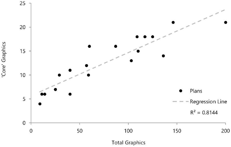
Comparison of “core” graphics to total graphics.
Although correlation cannot explain causation, it appears that, currently, the MPOs that invest more in graphics are more likely to include core graphics. This scattergram is not presented to promote a scattershot approach to hitting these core graphics (i.e., that more graphics necessarily to lead to more core graphics); rather, the authors offer the list to enable MPOs to target their limited resources more effectively. The intention is that MPOs focus first on this core set of graphics as a baseline before adding additional imagery. It is hoped that this approach will lead to future research finding no correlation between the number of plan graphics and the number of core graphics—since most plans will include most core graphics.
Conclusions
This research examined graphic communication in over 1,500 images from a sample of 20 randomly selected MPOs in non-TMAs to inform LRTP design. This research quantified data on graphic frequency, induced a typology of graphic images, and proposed a checklist of core graphics to be included in an LRTP.
This work fills a vacuum in government guidance and available literature to structure graphical expectations for LRTPs; however, this research is based entirely on a review of recent LRTPs without any experimentation as to what types of graphics resonate best with the intended audience of these documents. The suggestions provided reflect the professional judgment of the authors not any industry-wide consensus.
Future work might pursue such consensus on the core graphics to be included in an LRTP. This effort might include a larger sample of all MPOs. Once a set of core graphics is agreed on, additional research might field test different presentations of these images to identify those most effective for conveying information to the reader—thus achieving the goal of good graphic communication.
Footnotes
Acknowledgements
The authors thank Stephanie Peterson of the City of Manhattan and Jared Tremblay of the Flint Hills Metropolitan Planning Organization for providing feedback and support on this project.
Author Contributions
The authors confirm contribution to the paper as follows: study conception and design: R. F. Peterson, G. L. Newmark; data collection: R. F. Peterson; analysis and interpretation of results: R. F. Peterson, G. L. Newmark; draft manuscript preparation: R. F. Peterson, G. L. Newmark. All authors reviewed the results and approved the final version of the manuscript.
Declaration of Conflicting Interests
The authors declared no potential conflicts of interest with respect to the research, authorship, and/or publication of this article.
Funding
The authors disclosed receipt of the following financial support for the research, authorship, and/or publication of this article: This research was funded by the Dwight David Eisenhower Transportation Fellowship Program 2018 and 2019 Graduate Fellowships (Federal Grants #693JJ31945077and #693JJ31845034).