
Abstract
The Housing Choice Voucher (HCV) program represents the largest subsidized housing program in the United States. While families with vouchers can, in theory, lease any housing of reasonable quality renting below a rent ceiling, the empirical evidence suggests that they rarely use their vouchers to move to lower poverty neighborhoods. This paper examines the question of how spatial boundaries impact the residential possibilities of HCV subsidized families, both the visible boundaries of Public Housing Authority (PHA) catchment areas and the invisible boundaries of racial and economic segregation. I use administrative data supplied by the Department of Housing and Urban Development, which includes all moves by HCV families between 2005 and 2015 in the Baltimore, MD, Cleveland, OH, and Dallas, TX, metropolitan areas. Using a Louvain method of network cluster detection, I subdivide each metro into distinct mobility clusters—sets of census tracts within which voucher holders move but between which they rarely do. I find that the empirical mobility clusters at the metropolitan level are highly defined by PHA’s catchment areas. Even though families are technically allowed to “port” their voucher from one PHA catchment area to another, such behavior is rare. Within the PHA catchment areas, HCV mobility clusters are defined by patterns of race, income, and history. These findings suggest that patterns of racial and economic segregation seem to partially define the mobility clusters within PHA catchment areas, but not across them.
Introduction
The Housing Choice Voucher (HCV) program (formerly Section 8) represents the largest subsidized housing program in the United States, serving over 2.4 million families (Schwartz 2014). While families with vouchers can, in theory, lease any housing of reasonable quality renting below a rent ceiling, the empirical evidence suggests that they rarely use their vouchers in low-poverty communities, performing little better than equivalently poor renters (Basolo and Nguyen 2005; Devine et al. 2003; Turner 1998). While the program significantly improves upon public housing in terms of neighborhood poverty (Newman and Schnare 1997), it falls short of its potential to help families access the types of neighborhoods which could improve educational and economic outcomes (Chetty, Hendren, and Katz 2016; DeLuca, Garboden, and Rosenblatt 2013; McClure 2008; McClure, Schwartz, and Taghavi 2015; Metzger 2014; Sharkey 2013; Varady 2010).
A large number of studies have described the myriad limitations faced by voucher holders seeking housing including a limited supply of affordable rental housing, landlord discrimination, and information gaps (for summary, see DeLuca, Garboden, and Rosenblatt 2013). Looking at three metropolitan areas, this paper adds to this literature by empirically describing the portions of each metropolitan area within which voucher households move and, by extension, the barriers across which they rarely do. These “mobility clusters” differ from traditional cluster detection techniques insofar as they consider how tracts are linked by networks of mobility, rather than identifying areas with a high number of voucher households at a particular point in time. By considering how these mobility clusters align with (1) municipal boundaries, (2) Public Housing Authority (PHA) catchment areas, and (3) divisions of race and ethnicity, the goal of the paper is to determine under what conditions certain boundaries are salient. While the present analysis is not designed to test hypotheses on the reasons certain boundaries exist, I nevertheless hope that the descriptive findings suggest potential mechanisms and potential policy interventions.
I use administrative data supplied by the Department of Housing and Urban Development, which includes all moves by HCV families between 2005 and 2015 in the Baltimore, MD, Cleveland, OH, and Dallas, TX, metropolitan areas. The three metros provide several important vectors for comparison: in the Baltimore metro, the high-poverty center city is served by its own PHA (Baltimore City and Baltimore County are separate, non-nested counties), presenting challenges for voucher holders looking to move to more affluent neighborhoods. By contrast, high-poverty Cleveland city is nested within Cuyahoga County (with a single PHA serving both) allowing me to consider differences between jurisdictional and administrative boundaries. Finally, the plurality of vouchers in the Dallas site is administered by the Housing Authority of the City of Dallas, the catchment area of which includes Dallas County and five surrounding counties, covering most of the metro area.
Using a Louvain method of network cluster detection described in detail below, I empirically subdivide each metro into a set of mobility clusters—groups of census tracts within which voucher holders move frequently but between which they are unlikely to. I find that the empirical mobility clusters are highly aligned with PHAs’ catchment areas. Even though families are technically allowed to “port” their voucher from one PHA catchment area to another, they rarely do. Municipal boundaries do not appear to be salient boundaries except in cases where they align with PHA catchment areas. Within the PHA catchment areas, HCV mobility clusters are defined by patterns of race, income, and traditional neighborhood definitions (“East” and “West” Baltimore for example). These findings suggest that the boundaries to mobility are potentially a result of both existing patterns of racial and economic segregation, as well as externally defined administrative boundaries.
Background
More than half of all HUD subsidized households (2.4 million in total) are now housed by private landlords through the HCV Program (A. F. Schwartz 2014). Poor families can use vouchers to subsidize any rental housing unit costing below a Fair Market Rent (FMR, roughly the fortieth percentile metropolitan or zip code rent, adjusted by the payment standard) if the landlord is willing to accept voucher holders. HCV families pay 30 percent of their income (adjusted for utilities) directly to the landlord, while the rest is paid by HUD. The program is administered by thousands of PHAs, generally at the county or municipality level.
In theory, any voucher can be used anywhere in the country through a process known as portability—the transference of a voucher from one PHA’s jurisdiction to another. The voucher is designed to allow poor families to align their housing consumption with their particular set of preferences and needs, choosing from a wide range of neighborhoods, including low poverty, areas with higher performing schools, and lower crime rates. Though the deconcentration of poverty has never been an explicit goal of housing vouchers (Galster 2013; Khadduri 2005; Varady 2010), the fact that the program was designed to provide families with increased residential choice means it is increasingly seen as a tool to facilitate low-income renters’ access to geographic opportunity (Basolo and Nguyen 2005; Greenlee 2014; Pendall 2000).
The HCV program has been moderately successful compared to hard unit public housing at helping families move to less poor neighborhoods (Newman and Schnare 1997), but has fallen short of expectations with regard to poverty deconcentration and racial desegregation (McClure 2008; McClure, Schwartz, and Taghavi 2015; Metzger 2014; Sharkey 2013). A vast literature at both the national and local level has highlighted the program’s limitations. Voucher holders are overrepresented in neighborhoods with moderate to high poverty rates (DeFilippis and Wyly 2008; Deng 2007; Devine et al. 2003; Galster 2005; Galster 2013; Hartung and Henig 1997; McClure, Schwartz, and Taghavi 2015; Owens 2017; Schwartz 2014), they are distributed across metropolitan areas in ways similar to unassisted low-income renters (Basolo and Nguyen 2005; Devine 2003; Metzger 2014; Schwartz 2014; Turner 1998), and their residential patterns exhibit explicit spatial clustering (Park 2013; Patterson and Yoo 2012; Walter, Li, and Atherwood 2015; R. Wang and Walter 2018; Wang, Varady, and Wang 2008; Wilson 2013). In general, each of these phenomena is worse for Black and Latino households (Galvez 2010; A. F. Schwartz, McClure, and Taghavi 2016). Moreover, these patterns appear to be quite durable; voucher households move to slightly lower poverty tracks over time (Feins and Patterson 2005) and there has been a larger trend in some metros towards suburbanization (R. Wang and Walter 2018), but despite these gains, vouchers have retained their tendency to cluster in particular neighborhoods (Covington, Freeman, and Stoll 2011; Wilson 2013).
These findings have led researchers to look more closely at the preferences and structural constraints that shape the residential decisions of poor families generally (DeLuca and Jang–Trettien 2020) and of voucher households specifically (DeLuca, Garboden, and Rosenblatt 2013; Graves 2016). Several factors have been proposed. First, even when provided with a subsidy, mobility decisions are affected by the limited supply of affordable rental housing in low-poverty neighborhoods (McClure 2005, 2008, 2010 but see Devine et al. 2003). This issue is particularly acute in metropolitan areas where the voucher rent ceiling (the FMR) is set at the metropolitan level, meaning that there could be no eligible rental housing in affluent zip codes (Kahn and Newton 2013; McClure 2010; Pendall 2000). Over the last decade, a number of PHAs have switched to Small Area Fair Market Rents (SAFMRs), ensuring that roughly 40 percent of rental housing in each zip code is eligible for the program (Kahn and Newton 2013). The impact of this change has been statistically significant in some areas, but fairly modest (Reina, Acolin, and Bostic 2019); SAFMRs cannot address areas with a limited number of rental units, and evidence suggests that landlords are more likely to reject voucher holders when they can attract higher income market tenants (Galvez 2010; Garboden et al. 2018a; Garboden et al. 2018b; Greenlee 2014; Hanson and Hawley 2011; Popkin 2000; Rosen 2020).
Second, research has shown that poor families, especially poor Black and immigrant families, face complex tradeoffs when choosing neighborhoods. While nearly all families desire safe communities with high-performing schools (Darrah and DeLuca 2014), moving away from family and friends can present issues related to a loss of support systems, particularly those necessary for transportation and childcare (Boyd et al. 2010; Hogan, Hao, and Parish 1990; Shelby 2017; Stack 1975).
Third, work from Krysan and Crowder (2017) argues that voucher holders restrict housing searches to a set of neighborhoods about which they have information and in which they believe they will be able to find housing that fits their needs. Because this pool of plausible neighborhoods is defined by past experience, the segregation of families is in part explained by the self-reinforcing nature of neighborhood attainment. While the research is not yet conclusive, poor families likely rely on social networks more, and online sources less, than affluent households (Boeing 2020; Ellen, Suher, and Torrats-Espinosa 2019; Teater 2009), a factor that is likely exacerbated when they are attempting to identify landlords who are amenable to the voucher program.
Fourth, Black and Latino families still face housing market discrimination in their housing search, including the illegal steering of minority home seekers into areas with a high concentration of minority households (Ross and Turner 2005; Yinger 1997). This illegal racial discrimination is exacerbated for voucher holders by the fact that landlords in low-poverty communities can legally refuse to rent to voucher families, while those in high-poverty neighborhoods actively recruit them (Cunningham et al. 2018; Garboden et al. 2018; Rosen 2014). While an increasing number of municipalities have passed laws prohibiting such source of income discrimination, the ability of such laws to change landlord behavior has been modest (Tighe, Hatch, and Mead 2017).
Each of these literatures explains some portion of the residential outcomes of the HCV program, but they largely overlook the administrative factors that promote or inhibit housing mobility (DeLuca, Garboden, and Rosenblatt 2013). Indeed, the success of HUD’s housing voucher program depends on the interconnected but semi-autonomous actions of three groups: policymakers and administrators, low-income voucher recipients, and landlords. For example, a growing literature suggests that mobility counseling can have a significant effect on the degree to which voucher holders lease up in lower poverty communities (Bergman et al. 2019; Marr 2005). While the current standard among PHAs nationwide is a fairly low level of search assistance, those that do provide more robust services are better able to achieve the basic objective of high success rates, as well as goals related to poverty deconcentration and racial integration (Bergman et al. 2019; Marr 2005).
Particularly relevant to this study is the issue of “portability”—the process by which voucher households can move out of the catchment area of one PHA and into another. PHA catchments areas have been described as “highly fragmented and insular” (Katz and Turner 2008, 338; 2013), and the research consistently suggests that only a small number of families take advantage of portability (Climaco et al. 2008). For example, between 1998 and 2005, the percentage of HCV moves that required portability fell from 5.1 to 1.6 percent (Climaco et al. 2008). Some of this is certainly driven by the preferences and constraints described above, but research has also suggested that PHAs view the portability process as administratively burdensome (Climaco et al. 2008; Greenlee 2011). Although HUD has reduced the financial disincentive for portability, Greenlee (2011) finds that agency staff resist the additional paper work and staff time associated with ports and noted challenges in communicating with other PHAs. More portability can also lead to unpredictable funding and workloads between fiscal years, particularly where PHAs observe a pattern of “back-and-forth” portability moves (Greenlee 2011). This means that PHAs can sometimes be hesitant to promote portability as an option to poor families (Climaco et al. 2008; DeLuca, Garboden, and Rosenblatt 2013; Greenlee 2011). Importantly, research focused on Alameda County in California suggests when PHAs do proactively cooperate across catchment boundaries, the potential of portability can be quite high both in terms of neighborhood attainment and household satisfaction (Varady and Walker 2003, 2007).
Data and Method
Data used in this analysis come from the Department of Housing and Urban Development’s 50058 administrative dataset, which contains address-level data on all HCV subsidized households between 1994 and 2015 in the Baltimore, MD, Dallas, TX, and Cleveland, OH, metropolitan areas. A tenant unique identifier, provided by HUD, allows for the identification of mobility trajectories for each subsidized household. When combined, these mobility trajectories (reduced to the census tract level) form a complex network of moves across each metropolitan area. Using the Louvain Modularity cluster detection algorithm in Gephi 0.9.2, I am able to simplify this network into distinct mobility clusters—sets of tracts which subsidized families are more likely to move within than between.
I then employ a variety of descriptive and visualization techniques to describe the characteristics of these mobility clusters in each metropolitan area with a particular focus on their correspondence with other jurisdictional boundaries as well as segregation by race and income. As reflected in the findings, this analysis is purely descriptive in nature; my approach is designed to empirically identify spatial areas of clustered mobility (and the boundaries between them). Building off the extant literature, I hypothesize some plausible explanations for these spatial patterns, but I do not employ an identification strategy that would allow me to confirm these hypotheses.
Site Selection
The three research sites were selected to provide a range of housing market contexts in which to observe the residential trajectories of subsidized families. Dallas represents an understudied urban form, the rapidly growing sunbelt city with a robust economy, nearly unlimited developable land, and pockets of Black and Latino poverty. Baltimore and Cleveland are both shrinking rust-belt cities; both showed strong growth up until the 1960s, catalyzed by the Great Migration and robust manufacturing economies, followed by decades of population decline and property abandonment. Baltimore, however, is a poor city within a wealthy metropolitan area, while Cleveland’s economy suffers at the regional level. In all three cases, the central cities have substantially higher poverty rates than their surrounding counties. Baltimore City’s poverty rate is 24 percent, while the neighboring Baltimore County and Anne Arundel County have individual poverty rates of 10 and 6 percent, respectively (ACS 2014). Cleveland city has a poverty rate of 39, while Cuyahoga County’s poverty rate is 19 percent (falling to 11% in just the areas of Cuyahoga County not in Cleveland) (ACS 2014). Dallas has less of the traditional central city—the city and county overlap in peculiar ways, but Dallas city nonetheless has a poverty rate of 25 percent, while Dallas County’s poverty rate is 20 percent. Tarrant County, which contains Fort Worth, has a poverty rate of 15 percent (ACS 2014).
The three metropolitan areas also provide significant heterogeneity with respect to the intersection of administrative and jurisdictional boundaries. In the Baltimore metro, each county has its own PHA. This includes Baltimore City which is not part of Baltimore County, but its own independent jurisdiction with its own Housing Authority. The Cleveland metro is similarly divided except that Cleveland falls within Cuyahoga County and the Cuyahoga Metropolitan Housing Authority administers vouchers in the central city and the small municipalities to the east and south. Finally, the Housing Authority of the City of Dallas manages 35.5 percent of vouchers and has a broad reach throughout the metropolitan area administering vouchers in Collin, Dallas, Denton, Ellis, Kaufman, Rockwall, and Tarrant counties. The Dallas County Housing Authority (8.5% of vouchers) defines its catchment area as any zip code at least partially contained in Dallas County, meaning that it administers many vouchers just outside the county line. Each of the others counties (and several municipalities) maintain their own PHAs, the largest of which is the Housing Authority of Fort Worth (12.3% of vouchers), which administers vouchers throughout Tarrant County with the exception of the City of Arlington. Details are provided in Table 1.
PHA Catchment Areas.
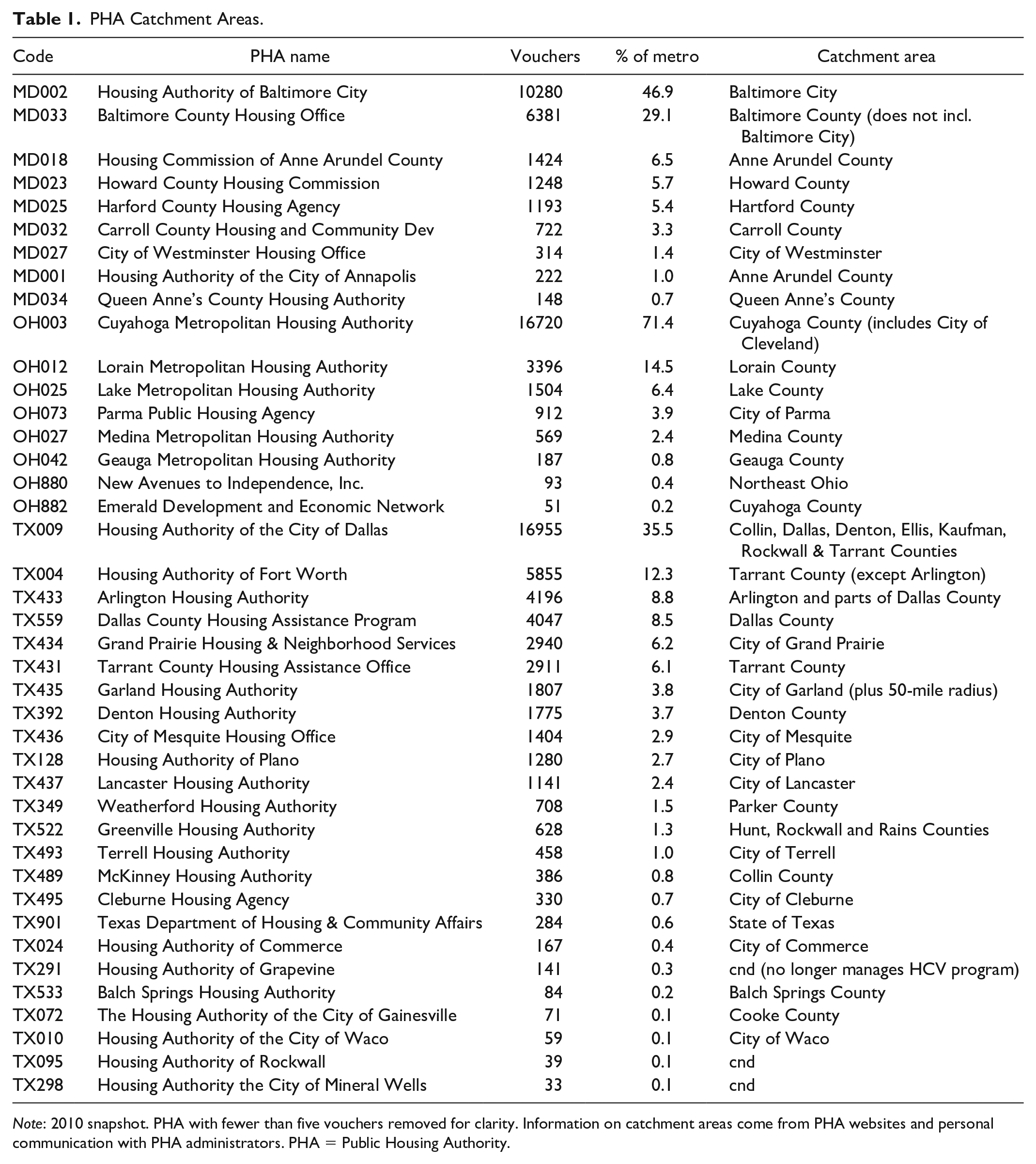
Note: 2010 snapshot. PHA with fewer than five vouchers removed for clarity. Information on catchment areas come from PHA websites and personal communication with PHA administrators. PHA = Public Housing Authority.
For reference, the most relevant jurisdictional boundaries are shown in Figure 1. As explored below, Dallas’ overlapping jurisdictions create a series of interpretive complexities, but the primary story of the Dallas region is that the plurality of voucher holders lacks meaningful jurisdictional limitations to mobility. For those that do, the enormous counties of the Dallas metropolitan region mean that PHA catchment areas generally contain a substantial diversity of neighborhoods.
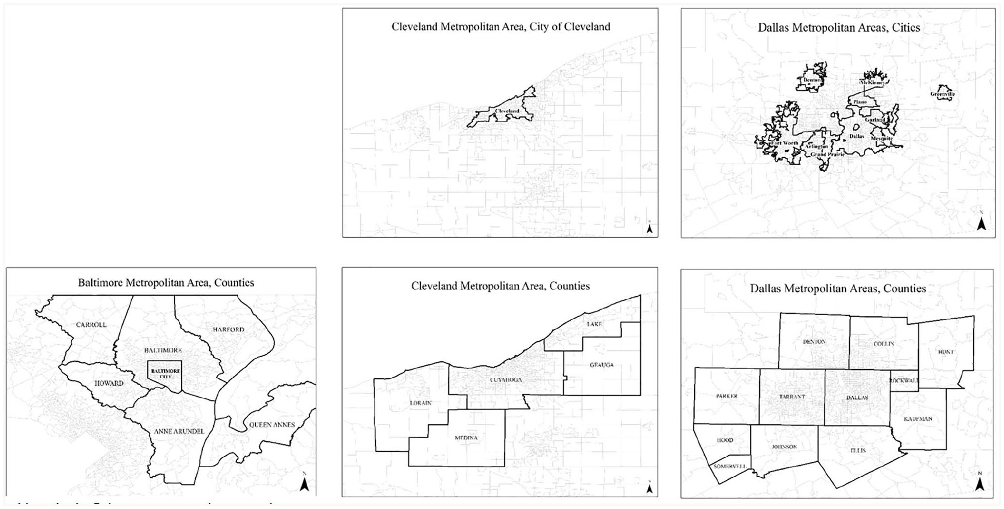
Relevant jurisdictional boundaries in the Baltimore, Dallas, and Cleveland metropolitan areas.
Beyond administrative boundaries, the major programmatic difference between the three sites is that after 2011, the Dallas Metropolitan area implemented the SAFMR demonstration (the program has now been expanded to other jurisdictions, although not Cleveland or Baltimore). In most metropolitan areas, voucher holders are required to rent properties below a rent ceiling, known as the FMR, which is set at the 40th percentile rent for the metropolitan area. Up until recently, the FMR was uniform throughout a metropolitan area, and was generally considered to be generous in high-poverty neighborhoods while limiting supply in low-poverty neighborhoods. The SAFMR program recalculates this rent ceiling at the zip code level, allowing it to vary across neighborhood conditions. The effectiveness of this change in facilitating moves to low-poverty neighborhoods in Dallas has been examined and shown to have a modest yet significant impact on residential outcomes (Finkel et al. 2017). However, as shown in the Appendix, an analysis of the Dallas metropolitan region excluding moves after the implementation of SAFMR shows no meaningful differences in the primary pattern.
The Baltimore site is the location of the Baltimore Regional Housing Partnership (BRHP), a housing mobility program administered at the metropolitan level that serves families affected by the discriminatory siting of public housing in Baltimore City. These families are required to live in a low-poverty “opportunity area” for one year (now two). These families are excluded from the analysis, which focuses on the standard HCV program.
Data
HUD’s 50058 data are collected by local PHAs and maintained by the Office of Policy Development and Research (PD&R). Data were provided to the research team in annual snapshots between 1995 and 2015 and contain address-level information on each HCV subsidized family as well as their demographic and income characteristics. The data extraction was based on the address of the voucher holder meaning that it includes all families living in each metropolitan area regardless of the PHA administrating their particular voucher. As shown in Figure 2 and confirmed in communications with HUD, data in the earlier years are less reliable and have multiple missing records. Because no information exists to determine whether the missing records were random, the analysis used in this paper is limited to the most recent ten years of data (2005–2015), when total counts of subsidized families roughly align with those presented in other sources, such as annual reports produced by the PHAs. It is important to note that this data window includes the Great Recession and subsequent recovery, thus potentially limiting its generalizability to some degree. In the Baltimore metro, the analysis is further limited to 2007 to 2015 due to data quality limitations resulting from Moving to Work (MTW) 1 reporting requirements. Limiting the data to this window also avoids interpretive complexities associated with the large-scale transition from public housing to vouchers via HOPE VI and related programs which slowed substantially after 2005.
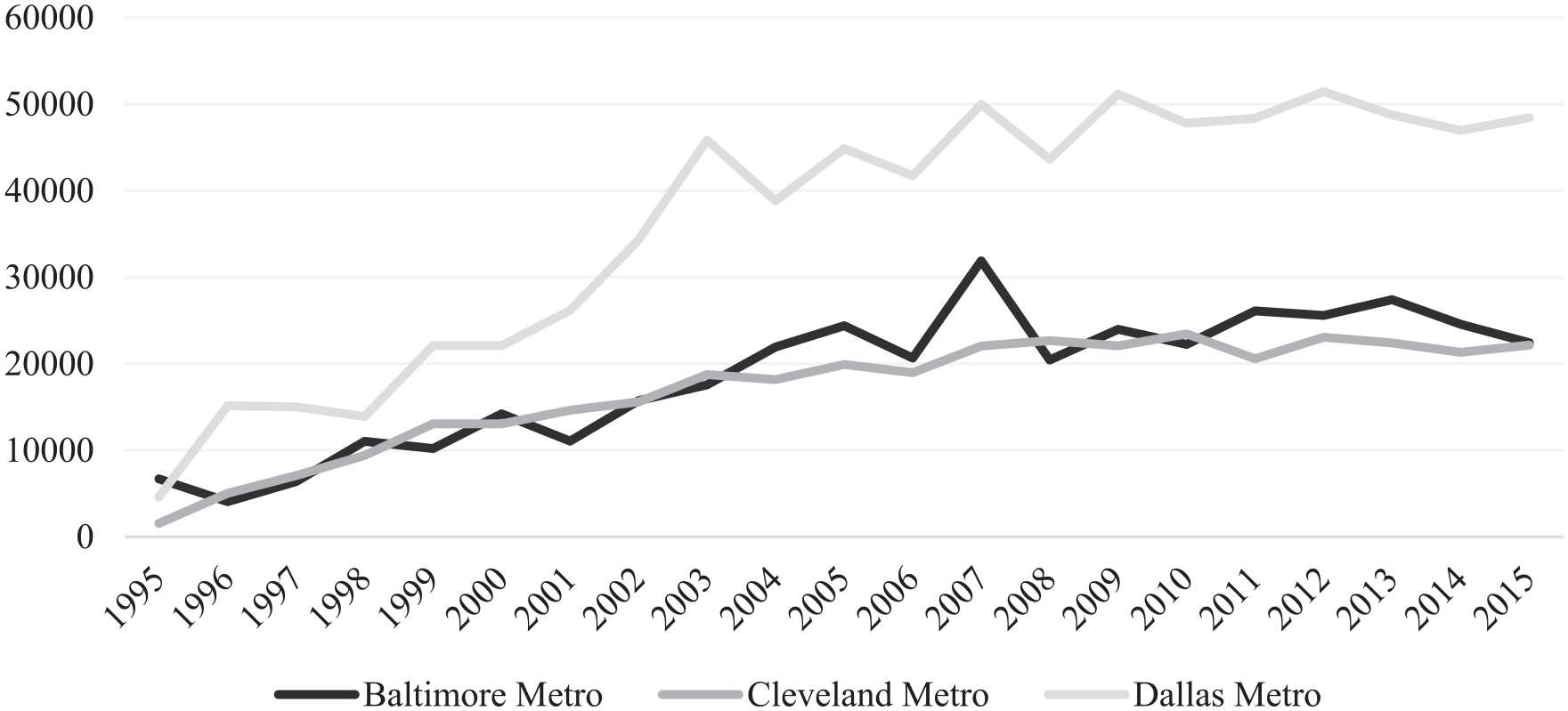
Number of 50058 records per year by metro.
Extensive data cleaning was conducted to ensure that the data accurately captured the distribution of mobility in each metropolitan area. Longitude and latitude information provided by HUD was checked for accuracy and regeocoded when necessary based on the street address provided, manually checking for obvious typographical errors. After cleaning was complete, 99 percent of the records were accurately geocoded and placed into tracts.
The final data consists of 986,370 person-year records, averaging 25,000 per year in the Baltimore metropolitan region, 21,700 in the Cleveland metro, and 47,600 per year in the Dallas metro. Moves were identified by changes in household street addresses between two consecutive years. Because the data were collected for administrative purposes, it represents the universe of moves for subsidized families during the time period with the following caveats. First, I do not observe moves outside of the three metropolitan areas. Such moves are rare and it is unlikely that any intermetro mobility patterns would be sufficiently robust to shift the cluster analysis. Second, because the data were provided in annual snapshots, I do not observe addresses that families entered and exited between the data periods. Given the standard year-long lease, this situation could only arise in cases of unit failure, foreclosure, or emergency relocation. While such moves almost certainly occur, their omission would only impact observed mobility patterns if these temporary units were distributed differently from those in which families lived for a year or longer.
Each geocoded household was placed within its 2010 census tract and merged with statistics from the American Community Survey and Decennial Census to provide tract-level information, a standard proxy for neighborhood attributes.
Analytical Technique
As HCV families move within and between census tracts, they generate a dense network of moves. Each tract centroid (node) is connected to dozens of other centroids. These connections between tracts (edges) can be weighted based on the number of families relocating between the two tracts over the ten years of the analytic sample. While the overall characteristics of this network are interesting, the sheer number of relocations each year results in a level of complexity with little analytic value. To better understand the residential patterns of HCV recipients, it is necessary to simplify the overall network by identifying specific mobility clusters—sets of tracts within which voucher holders frequently relocate, which can then be meaningfully categorized. 2
A common approach to network simplification entails subsetting network nodes in such a way as to maximize network modularity (Q) defined as (Blondel et al. 2008; De Meo et al. 2011):
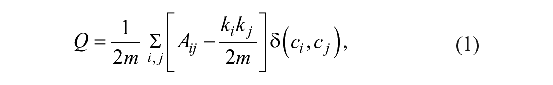
where m is equal to half the sum of all edge weights in the matrix, Aij is the edge weight between nodes i and j, ki is the sum of edge weights connected to node i, and δ(ci, cj) takes the value of 1 if i and j are in the same subset and 0 otherwise (Blondel et al. 2008). As the equation suggests, Q increases as within-cluster density increases with a penalty for between-cluster edges. Subsetting a network in such a way as to maximize modularity lacks a closed form solution and thus must be approached algorithmically. In this paper, I employ the Louvain method for community detection which has been shown to be not only computationally efficient but also equivalently precise as more intensive approaches (see Blondel et al. 2008 for details).
Figure 3 serves as a stylized visual representation of the Louvain cluster detection process. As indicated by the thickness of the edges, the figure shows frequent mobility between nodes 1, 2, and 3 as well as between nodes 5, 6, and 7. Few households move into or out of node 4, but those that do come from node 3. A small number of households move between nodes 3 and 6. For this example, a Louvain cluster detection process would divide all seven nodes into two clusters: (1, 2, 3, 4) and (5, 6, 7). While this example was set up to have an intuitive solution, it highlights several key interpretive points. First, the process attempts to balance the density of moves within an identified cluster and the number of clusters. Indeed, a theoretically valid solution to any clustering problem is to define the entire network as a single cluster or, at the other extreme, to define each node as a cluster unto itself. In the former case, the within-cluster density is low, but the penalty for between-cluster edges is necessarily zero. In the latter, the within-cluster density of maximized, but the between-cluster edge penalty is enormous.
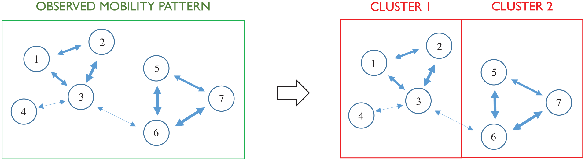
Louvain cluster detection, stylized example.
It is also important to note the inclusion of node 4 in cluster 1, despite very low mobility into and out of that tract. This is a key distinction between my approach and previous studies of voucher mobility that address the frequency of moves into particular types of neighborhoods. The inclusion of a particular tract within a cluster does not suggest that voucher holders frequently relocate into and out of that tract only that those that do are from tracts within the same cluster (rather than elsewhere in a metropolitan area). For example, it is entirely plausible that low-poverty tracts with few units available to voucher holders will be in the same cluster as high-poverty tracts with many options; the meaning of these heterogeneous tracts sharing a cluster is that whatever units are available (and desired) by voucher holders tend to be filled from the same pool of HCV households. The value of Louvain clustering is not to once again elucidate the challenges faced by voucher holders in accessing certain types of neighborhoods, but instead to reveal the spatial submarkets in which voucher holders move, and thus the often-invisible barriers across which voucher holders are unlikely to relocate.
For this analysis, I conceive of all residential moves as a dense network between census tract centroids with edge weights representing the number of households that moved between those tracts within the ten-year data window (this analysis assumes an undirected network graph). The choice of census tracts as my unit of analysis is fairly arbitrary as far as the algorithm is concerned (any spatial polygons will work, including a rectangular grid). I have selected census tracts for three reasons: (1) they are designed to be demographically relevant areas of roughly consistent population; (2) they are accompanied by a rich set of publically available descriptive data; and (3) their boundaries align with the majority of relevant political boundaries.
For the sake of interpretation, I remove all edges with fewer than two moves, and nodes without any moves into or out of them (results without these simplifying assumptions are substantively similar and available upon request). The Gephi 0.9.2 tool proved robust to the 50058 data, maximizing the modularity scores (Q) to .430, .549, and .591 in the Baltimore, Cleveland, and Dallas metropolitan areas, respectively. The modularity score ranges between −1 and 1, with a score of zero expected if the edges are distributed at random between nodes. A score above zero suggests some type of clustering mechanism (as we would expect for this case). On average, each cluster contains 62 tracts in Baltimore (11 min, 101 max), 95 tracts in Cleveland (30 min, 166 max), and 132 tracts in Dallas (20 min, 242 max).
These mobility clusters represent portions of each metropolitan area in which particular subsets of HCV families churn but are unlikely to exit. One benefit of this technique is that it allows for the identification of mobility clusters while preserving information on intercluster moves, essentially producing a highly simplified network in each metropolitan area, as described below.
Results
As shown in Table 2, 12.3, 17.2, and 16.2 percent of HCV families moved with a voucher each year in the Baltimore, Cleveland, and Dallas metropolitan regions, respectively. 3 Of these moves, families remained within the same census tract 28.8 (Baltimore), 13.9 (Cleveland), and 17.0 percent (Dallas) of the time and over 90 percent were in the same county.
Aggregate Moves of HCV Recipients by Metro.
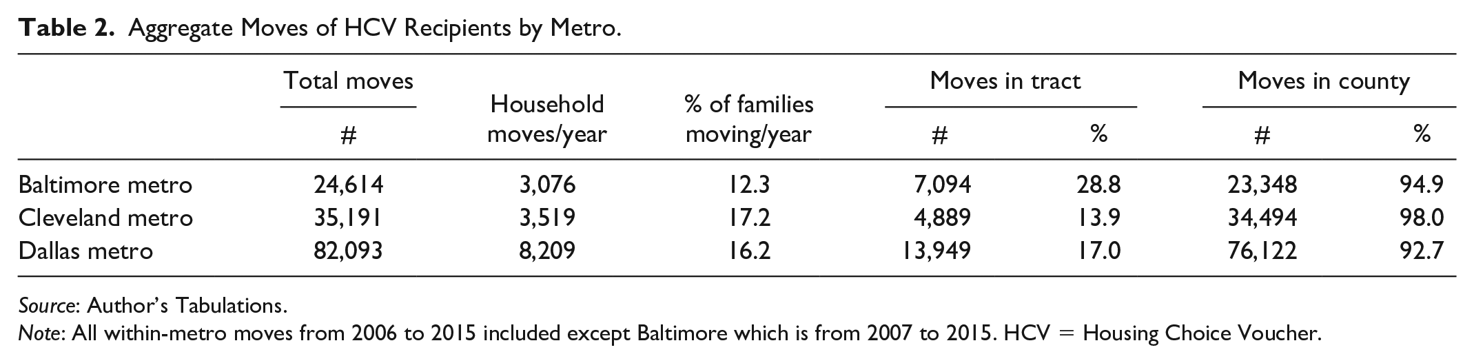
Source: Author’s Tabulations.
Note: All within-metro moves from 2006 to 2015 included except Baltimore which is from 2007 to 2015. HCV = Housing Choice Voucher.
As shown in Figure 4, these moves form a dense network of relocations between census tract centroids. The community detection algorithm identified nine clusters in both Baltimore and Dallas, and six in Cleveland. These mobility clusters are illustrated in Figures 5 to 7. As shown the Tables 3 to 5, the majority of moves occurred within these clusters (83.2% in the Baltimore metro, 82.8% in Cleveland, and 81.1% in Dallas).
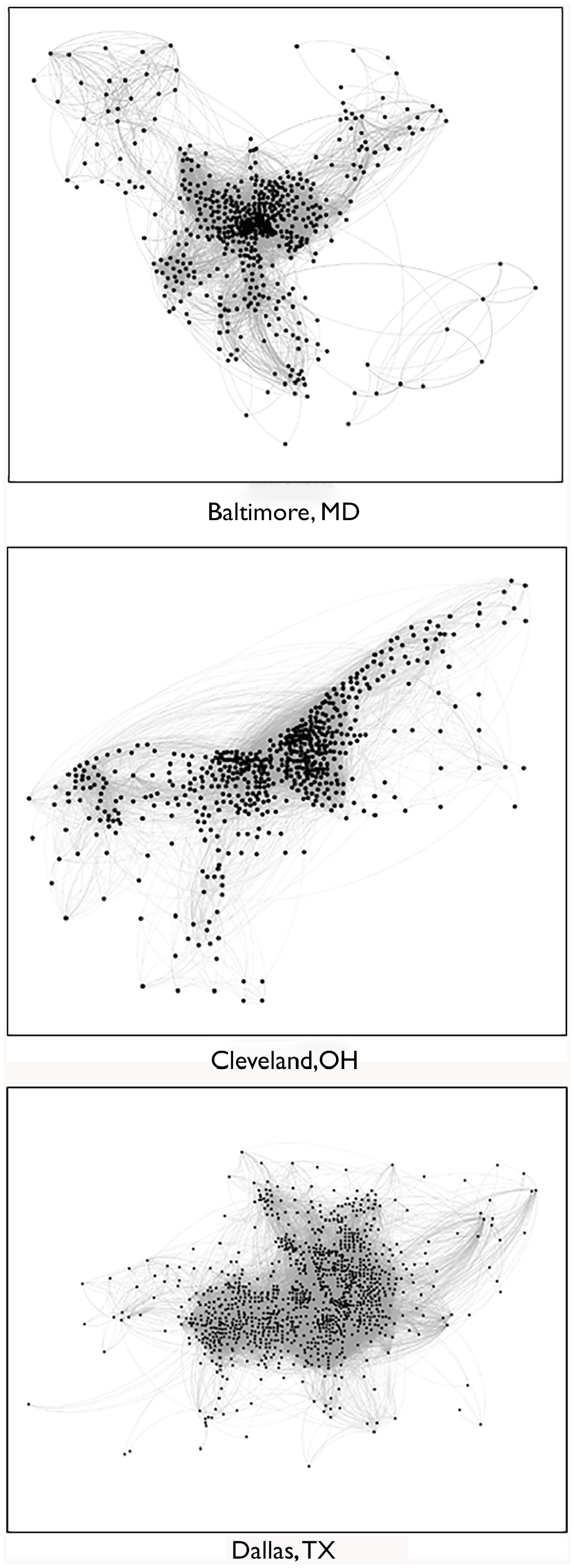
Mobility patterns in the Baltimore, Dallas, and Cleveland metropolitan areas.
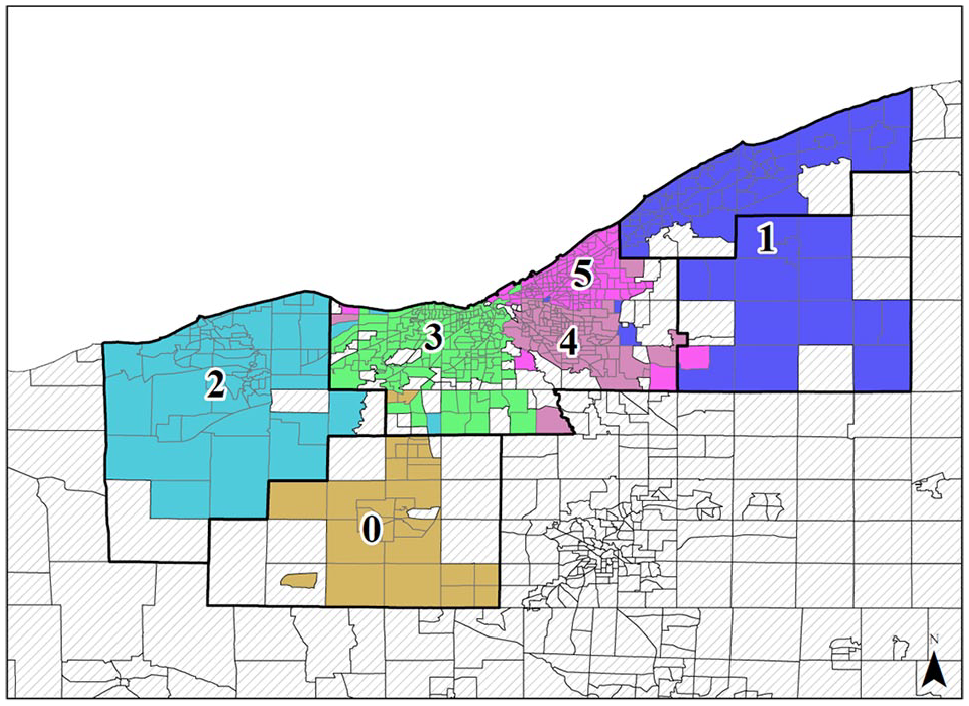
Baltimore metropolitan area, mobility clusters.
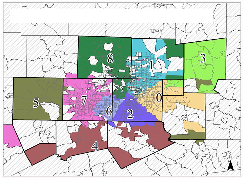
Cleveland metropolitan area, mobility clusters.
Dallas metropolitan area, mobility clusters.
Percent of Moves with and between Mobility Clusters, Baltimore Metropolitan Area.
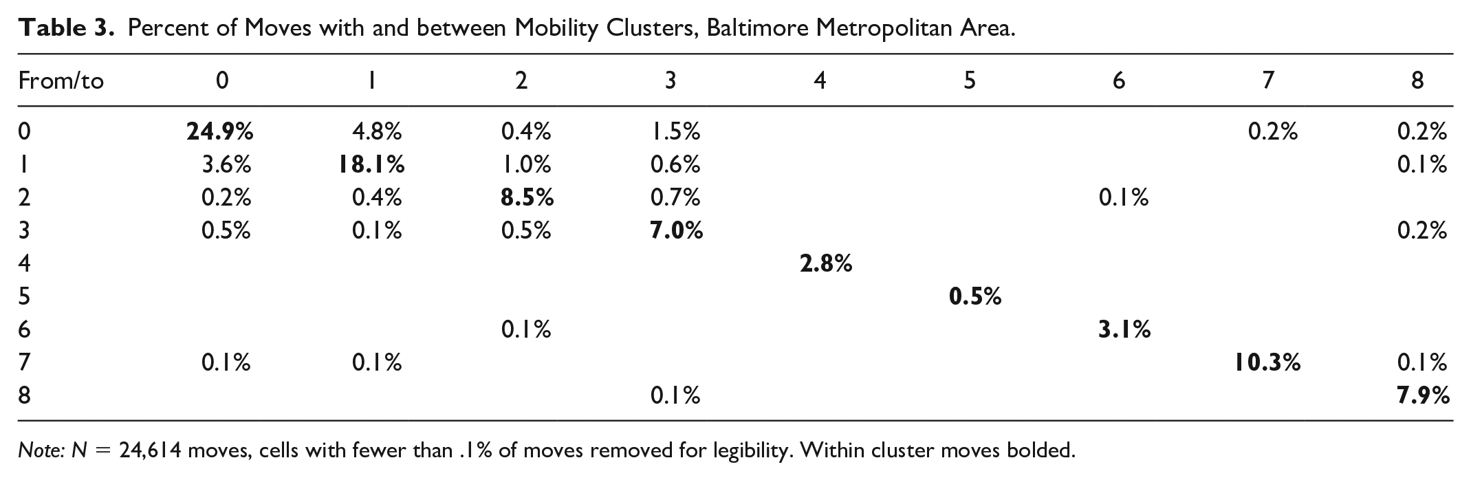
Note: N = 24,614 moves, cells with fewer than .1% of moves removed for legibility. Within cluster moves bolded.
Percent of Moves with and between Mobility Clusters, Cleveland Metropolitan Area.
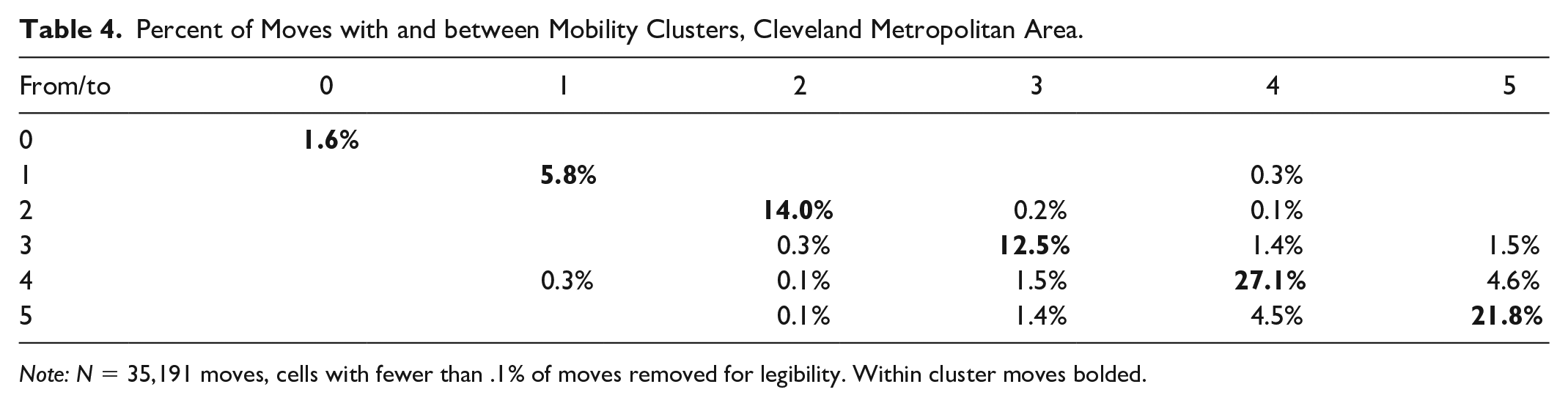
Note: N = 35,191 moves, cells with fewer than .1% of moves removed for legibility. Within cluster moves bolded.
Percent of Moves with and between Mobility Clusters, Dallas Metropolitan Area.
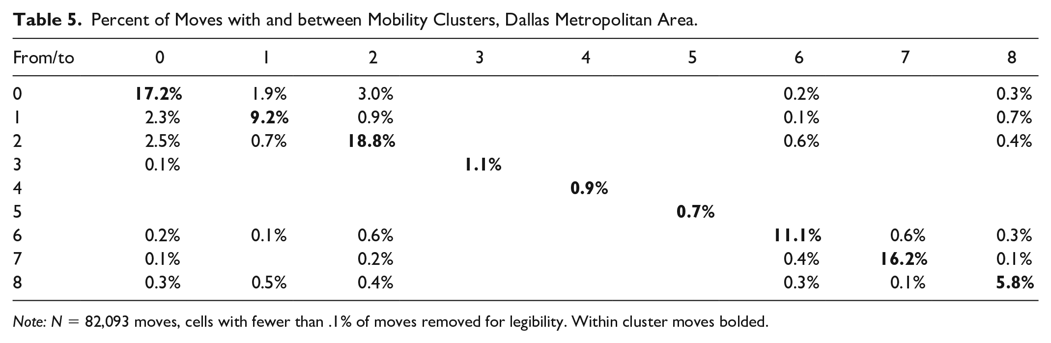
Note: N = 82,093 moves, cells with fewer than .1% of moves removed for legibility. Within cluster moves bolded.
In Baltimore, the mobility clusters follow county lines nearly perfectly, with the singular difference that there is a strong east/west division in both Baltimore City and Baltimore County (Baltimore County’s urban-rural demarcation line means that almost no rental housing exist in the northern portion of the County). Intercluster mobility is limited outside of the two Baltimore City clusters between which 8.4 percent of the total moves occurred. The three most rural clusters (4, 5, 6; Carol, Queen Anne, and Harford Counties) are detached from the rest of the metropolitan area with no substantial mobility between them. Clusters 7 and 8 (Howard and Anne Arundel Counties) are nearly as isolated, with fewer than 1 percent of moves between them and elsewhere. Taken together, the clusters suggest that the HCV program catalyzes only modest amounts of intercounty or inter-PHA mobility in the Baltimore region. In the Baltimore metropolitan region, PHA catchment areas are nearly perfectly aligned with the counties. In the Baltimore metro, 94 percent of all moves occurred within the PHA catchment areas.
The Cleveland metropolitan region mirrors Baltimore insofar as each cluster breaks at the county line. Unlike Baltimore, however, the City of Cleveland is contained wholly within Cuyahoga County and the city/county boundary is not a boundary between PHA catchment areas, nor does it appear as a mobility cluster boundary. Instead, Cuyahoga County is divided into three clusters (3, 4, 5) which reflect the city’s historical demographic divide and include portions of both Cleveland City and Cuyahoga County. As with Baltimore, these three central clusters have a far higher rate of intercluster mobility than the surrounding areas, with nearly 15 percent of moves occurring between them, with 10 percent occurring just between clusters 4 and 5. The counties of Lorain and Medina form clusters all their own (0 and 2), with another cluster (1) including both Lake and Geauga counties. Importantly, this case is an example of a time when two distinct PHA catchment areas are nonetheless clustered together, different from much of the analysis so far. However, because Geauga County contained only 187 vouchers, this finding is likely driven by a very small number of moves. In the Cleveland metro, 97 percent of all moves occurred within the PHA catchment areas.
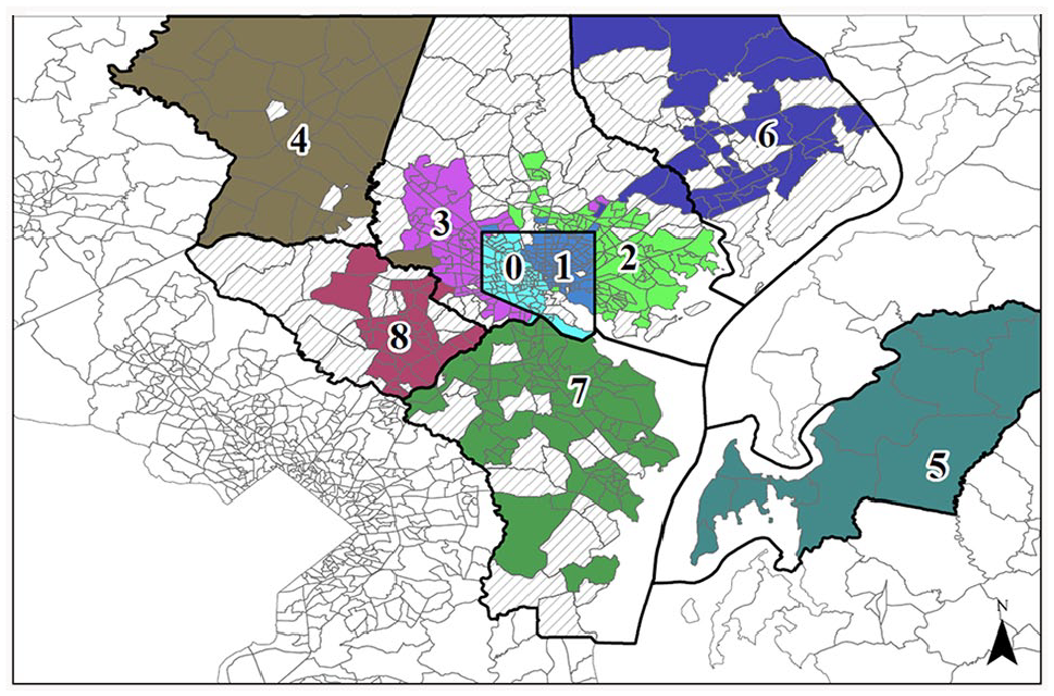
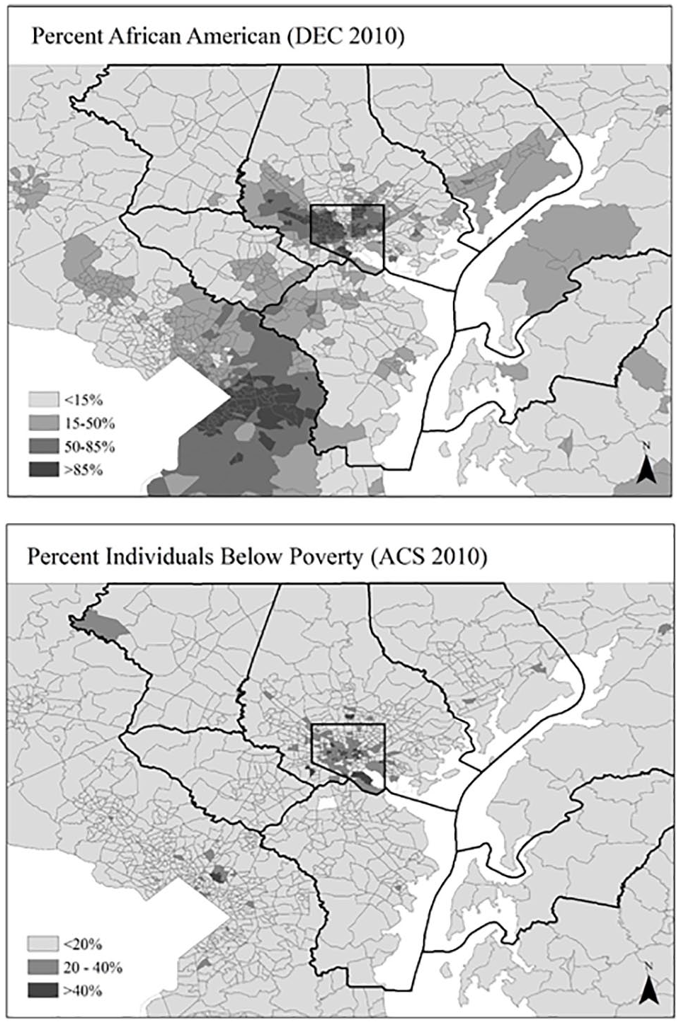
The patterns in Dallas are more complicated to interpret. While intercounty moves represent less than 10 percent of the total moves, the mobility clusters are much more likely to cross county boundaries. This suggests that while long-distance mobility is rare across the board, the county lines do not represent strong barriers to mobility as they do in Baltimore and Cleveland. As described above, the most likely explanation for this substantial difference is that the plurality of vouchers in the metro is unlikely to encounter sharp PHA boundaries and those that do often live in areas with overlapping catchments areas. The exception here being clusters 3 and 5 (Hunt and Parker Counties), rural areas with few voucher holders. Cluster 4, which includes the totality of Somervell, Johnson, and Ellis Counties, is similarly isolated from the rest of the metro. Cluster 7 includes most of Tarrant County, except that which falls within the city of Arlington—a pattern that suggests the impact of the non-nested Tarrant and Arlington PHAs. Dallas County is divided into five wedges (clusters 0, 1, 2, 6, and 8) each spreading from the downtown area into a nearby county.
We can quantify the degree to which county boundaries divide clusters by considering the probability that any two adjacent tracts will be in the same cluster, and how that probability changes when the two tracts are separated by the county line. In Baltimore, 89.2 percent of the 1,531 pairs of adjacent tracts fall in the same cluster. For the 116 pairs divided by a county (and thus PHA) boundary, only 12.9 percent fall in the same cluster. Cleveland presents a similar story: 92.9 percent of adjacent tracts share a cluster, also dropping to 12.9 percent of those divided by a county (and thus PHA) boundary. In contrast, 90.6 percent of Dallas pairs fall in the same cluster, but so do 68.5 percent of those divided by a county line, likely because the county lines do not represent PHA boundaries for most voucher holders.
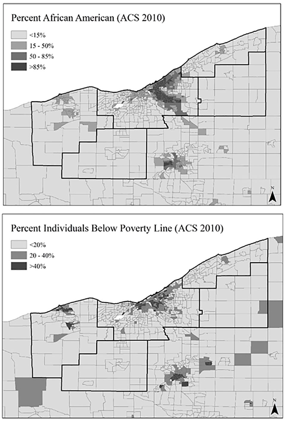
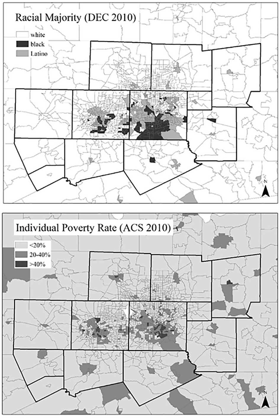
As shown in Figures 8 to 10, the clusters either within or across county boundaries appear correlated with patterns of racial and economic segregation in each of the three metropolitan areas. In Baltimore, the pattern aligns with what locals term the “Black butterfly” with high levels of Black poverty in both east and west Baltimore expanding northeast and northwest along arterial transportation corridors. In Cleveland, the racial divide between a white western half of the city and a Black eastern half is also reflected in the mobility clusters. Dallas’ clustering reflects the triangle of Black residents to the south of downtown and west of the Trinity River, with Latino dominated wedges to the east and west and white households in the north.
Baltimore metropolitan area, demographics.
Cleveland metropolitan area, demographics.
Dallas metropolitan area, demographics.
These patterns of racial and economic segregation interact with jurisdictional lines in complex ways. In Baltimore, there appears to be no significant demographic discontinuity at the county/PHA boundary (particularly in the northwest portion of the city). In the Cleveland metro, there is no discontinuity at the Cleveland City boundary, but much at the Cuyahoga County/PHA boundary. In Dallas, there appears to be a sharp discontinuity between Dallas and Ellis counties, but not between Dallas and Tarrant (Fort Worth and Arlington). In all cases, the presence of a distinct PHA boundary appears to take precedence. In other words, patterns of racial and economic segregation seem to partially define the mobility clusters within PHA catchment areas, but not across them.
Table 6 quantifies these patterns by examining the demographic characteristics of each mobility cluster and comparing it to the demographic characteristics of the HCV families moving within the cluster. Because HCV families are not representative of the general population, the story told by these statistics is somewhat complex and requires an examination of each location in turn.
Tract and HCV Household Demographic by Mobility Cluster.
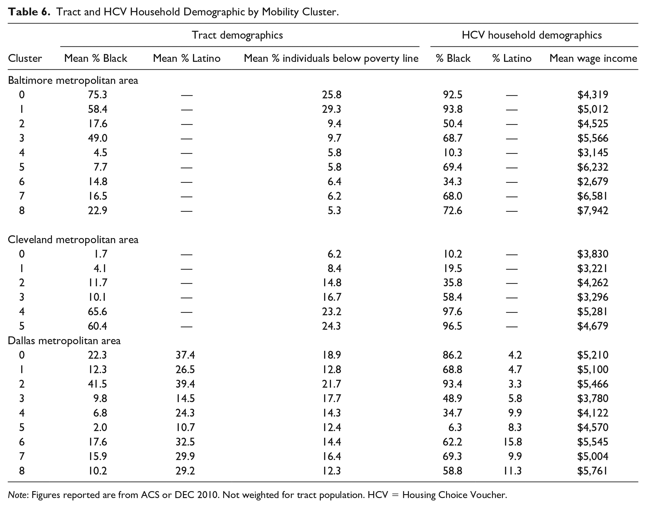
Note: Figures reported are from ACS or DEC 2010. Not weighted for tract population. HCV = Housing Choice Voucher.
Baltimore City contains two clusters with a high number of Black residents (cluster 0 with 75% Black residents and cluster 1 with 58% Black residents) and extreme levels of poverty and disadvantage (poverty rates of 26% and 29%, respectively). Because these two clusters represent the entirety of Baltimore City’s HCV population, the families who live in them reflect the demographic profile of Baltimore City’s HCV families as a whole (both are over 90% Black). The large interquartile range of neighborhood characteristics in cluster 1 suggests that it is more heterogeneous than its west-side counterpart. Baltimore County similarly contains two clusters, but with the west-side cluster now representing a more heterogeneous set of neighborhoods. Only half of voucher household heads in the east-side cluster (2) are Black and the cluster itself contains just 18 percent Black residents. The other clusters, all counties in and of themselves, are low poverty (on average) with primarily white residents. The HCV population, in contrast, is significantly more Black, ranging from 34 percent in Harford County to 72 percent in Howard County.
The Cleveland metro represents a different case. The three clusters outside of Cuyahoga county (0, 1, and 2) are similar to some of the more rural/suburban clusters in the other two metropolitan areas insofar as they are low poverty, mostly white, and contain mostly white HCV families. Cuyahoga County itself, by contrast, is remarkably segregated. The two clusters on the east-side (4 and 5) are both highly segregated (66% and 60% Black, respectively), very poor (23% and 24% poor, respectively), and contain almost all Black HCV household heads (98% and 97%). The west-side cluster (3) is far more mixed. Only 58 percent of the HCV household heads were Black, and the neighborhoods within the cluster are only 10 percent Black and 17 percent poor on average.
Dallas again is strikingly different. Only one cluster (2) contains a high percentage of Black residents (42%) and HCV heads of household (93%). Likely due to eligibility issues, the Latino population is vastly underrepresented compared to neighborhood residents but the mobility clusters nonetheless reflect the Latino-majority areas of the metro. The clusters with the highest percentage of Latino residents (0, 2, and 6) all contain high levels of Black HCV households (86%, 93%, and 62%). Unlike Baltimore, there is limited variation in average poverty rates between clusters, which range from 12 (cluster 5) to 22 percent (cluster 2). The two most rural clusters (4 and 5) are both majority white, low poverty, and contain mostly white voucher holders.
Discussion
Taken together, the mobility clusters identified in the preceding analysis suggest several things about how voucher households navigate the housing options available to them. In particular, it shows how administrative boundaries interact with historical patterns of segregation to shape the residential mobility patterns of voucher families.
First and foremost, the findings suggest that the administrative boundaries of PHAs have enormous influence over where families relocate; in both Baltimore and Cleveland, the mobility clusters fall almost entirely within PHA catchment areas. This is particularly consequential for program outcomes in the Baltimore case, as the majority of low-poverty neighborhoods with well-funded public schools are located outside of the central city and thus outside the catchment area of the largest PHA. In Cleveland, the administration of the program throughout Cuyahoga County means that voucher holders do not experience mobility boundaries between themselves and the more affluent portions of Cuyahoga County. This should not be misinterpreted as suggesting that voucher holders are not concentrated in low-income neighborhoods in Cleveland—they assuredly are—only that diffusion to suburban communities does not encounter a specific boundary until the county line is reached.
While Dallas differs from the other two cities on a number of dimensions including its density, housing stock, and public transportation, it is most plausible that the more complex pattern of its mobility clusters is shaped due to the Housing Authority of the City of Dallas administering vouchers throughout the metropolitan area. Because HACD administers over a third of all vouchers in the metropolitan region, the relative flexibility its clients have in selecting their housing likely explains higher levels of cross-county mobility and a lack of manifest barriers to mobility within the administrative structure.
It is important to distinguish between a mobility cluster—sets of tracts between which HCV families typically move—and the overall trajectories of families within those clusters. As noted, only about 7 percent of moves in Dallas were between counties. While this is higher than either Baltimore or Cleveland, it nonetheless confirms the canonical finding that voucher holders tend not to leverage their vouchers to make significant gains in neighborhood quality. The key addition of this analysis is the finding that there does not appear to be significant boundaries to mobility within the clusters as evidenced by the density of moves within them. The culprit is more likely at the intersection of a lack of available rental housing in the more suburban counties combined with the bundle of preferences and constraints discussed above. I argue here that there is a meaningful policy difference between mobility impediments represented by an administrative boundary and those presented by a shift in context; both require intervention, but they require intervention at different levels.
The second key finding regards how mobility clusters are distributed in the absence of hard constraints such as PHA catchment areas. In all three cities, there exists at least one hypersegregated cluster with a high percentage of Black residents and high levels of poverty. In these clusters, nearly all voucher holders are Black. Even when not divided by an administrative line, moves from one of these clusters to another are rare. In Cleveland, for example, moves within and between the two most segregated clusters represent 58 percent of the moves in the metropolitan area. But only 3 percent of moves were from these two clusters into the third city cluster, which is both lower poverty and more diverse (and almost none outside of Cuyahoga County). And, indeed, 3 percent of moves were in the other direction. In Dallas, 19 percent of moves were within the highest poverty segregated cluster, with a similar 3 to 4 percent entrance and exit rate to other central clusters.
My data cannot reveal the mechanism by which these nonadministrative cluster boundaries are maintained. The most likely explanation sits at the intersection of personal preference and limited information; families who relocate with a voucher are likely looking for a suitable unit close to home in an area with which they are familiar, rather than searching broadly across the metropolitan area (Edin, DeLuca, and Owens 2012; Krysan and Crowder 2017). Regardless of the mechanism, the durability of these clusters serves to reinforce patterns of racial segregation and neighborhood disadvantage. While voucher holders do indeed live in nearly every tract within each area, a focus on their mobility patterns reveals the limiting structure of this pattern.
Implications for Policy
This analysis suggests that the HCV Program in both Baltimore and Cleveland could do more to promote intercounty mobility for the subset of subsidized families who would desire to make such moves. A great deal of recent policy energy has been focused on two reforms to the HCV program. The first is to open up new neighborhoods to the program by increasing rent thresholds (via SAFMR and related policies). The second is to reduce landlord discrimination against voucher holders (via source of income discrimination legislation). The results in this paper suggest those reforms are necessary but may not be sufficient. Fortunately, the challenges with mobility across PHA catchment areas can be addressed in multiple ways, ranging from fairly radical restructuring to more modest interventions.
At the more extreme end, Katz and Turner (2008; 2013) have suggested that the balkanization of PHA jurisdictions is a vestige of their former focus on brick-and-mortar subsidies and ill-suited to manage the HCV program. Indeed, the majority of housing mobility programs are administered regionally specifically to avoid their clients encountering jurisdictional barriers (Bergman et al. 2019; Briggs, Popkin, and Goering 2010; Rosenblatt and DeLuca 2012). While an intriguing proposal, others have argued that the local expertise of PHAs represents one of their greatest strengths and that previous attempts at regional administration of HCV (as opposed to special mobility programs) have a disappointing track record (Basgal and Villarreal 2001).
Moreover, research in Alameda County suggests that the dissolution of local PHAs may not be necessary (or desirable) to achieve trans-catchment area mobility (Varady and Walker 2003, 2007). In cases where leadership is enthusiastic, there are proven models for cooperation and coordination between PHAs that can allow voucher households to realize their housing choices at the metropolitan level, particularly when combined with counseling and search support. Indeed, the evidence from Dallas detailed above suggests just such a possibility; its PHAs remain local but administer the HCV program over a larger set of neighborhoods. HUD has already implemented reforms to reduce some of the administrative burdens and it is plausible that a more robust set of incentives for cooperation could help other metro regions reproduce Alameda County’s success.
A third option is the creation of explicit housing mobility programs that provide counseling and support to families looking to move to lower poverty neighborhoods. While these have typically existed outside of the normal PHA infrastructure, recent legislation suggests that HUD may be looking to incorporate the lessons learned from special mobility programs into their more standard operating procedures (U.S. Department of Housing and Urban Development 2020). In some areas, this will certainly require interjurisdictional cooperation as found in the Alameda case, but will also require high levels of housing counseling and search support (Marr 2005). When mobility programs have proven disappointing—as was the case for MTO, Gautreaux II, and other light-touch approaches (Boyd et al. 2010; Clark 2005; Edin, DeLuca, and Owens 2012; Pashup et al. 2005; H. L. Schwartz, Mihaly, and Gala 2017)—there has generally been a lack of robust search assistance. When they meet expectations—as in the Baltimore Housing Mobility Program, Creating Moves to Opportunity, and Gautreaux I (Bergman et al. 2019; Darrah and DeLuca 2014)—the opposite has been the case. Even without an explicit poverty deconcentration goal, there is now an abundance of evidence supporting the value of metropolitan cooperation and search support.
None of these proposals are simple and none should be expected to have more than modest effects. If there is one thing to be learned from three decades of research on HCV households’ mobility patterns, it is that patterns of racial and economic segregation are incredibly durable (Owens 2015). It is important not to ask too much of the HCV program, but it is also appropriate to consider how to maximize the effectiveness of any intervention. As the Biden administration considers allocating significantly more funds to the HCV program, it will continue to be necessary to consider how the program can help poor families realize the full potential of the program, wherever they wish to live.
Footnotes
Appendix
Acknowledgements
I would first and foremost like to thank Peter Durham for his help with data cleaning and analysis (particularly given the fact that the encrypted data computer was, for the sake of security, stored in a not at all large coat closet at the Poverty and Inequality Research Lab). Of course, my thanks go to the project PIs Kathryn Edin and Stefanie DeLuca for their inspiration and mentorship, along with Meredith Greif for her wisdom and work in Cleveland. Eva Rosen knows what she did. Anna Rhodes, Melody Boyd, Christine Jang, Anne Owens, Kiara Nerenberg, Julia Burdick-Will, and Barbara Kiviat all provided insight into study design and working drafts. Finally, I greatly appreciate the team at the Department of Housing and Urban Development, specifically Carol Leming for data wrangling and Elizabeth Rudd for her guidance on the project.
Declaration of Conflicting Interests
The author(s) declared no potential conflicts of interest with respect to the research, authorship, and/or publication of this article.
Funding
The author(s) disclosed receipt of the following financial support for the research, authorship, and/or publication of this article: Department of Housing and Urban Development, the Institute for Research on Poverty at the University of Wisconsin–Madison, the Massive Data Institute at Georgetown University, and the Furman Center at New York University.
Disclaimer
The work that provided the basis for this publication was supported by funding under a grant with the U.S. Department of Housing and Urban Development. The substance and findings of the work are dedicated to the public. The author and publisher are solely responsible for the accuracy of the statements and interpretations contained in this publication. Such interpretations do not necessarily reflect the views of the Government.