
Abstract
Grid or matrix questions are associated with a number of problems in web surveys. In this article, we present results from two experiments testing the design of grid questions to reduce breakoffs, missing data, and satisficing. The first examines dynamic elements to help guide respondent through the grid, and on splitting a larger grid into component pieces. The second manipulates the visual complexity of the grid and on simplifying the grid. We find that using dynamic feedback to guide respondents through a multiquestion grid helps reduce missing data. Splitting the grids into component questions further reduces missing data and motivated underreporting. The visual complexity of the grid appeared to have little effect on performance.
Introduction
Grid or matrix questions are common in web surveys, as they are in other types of surveys. In grid questions, a series of items is presented (usually in rows), sharing a common set of response options (usually in columns), asking one or more questions about each item. Despite their popularity, grids are associated with several undesirable outcomes, including higher breakoff rates, higher missing data rates, and higher levels of straightlining or nondifferentiation, than their single-item-per-page counterparts. It is not clear whether the use of grids per se or specific features of the design of grid questions that produces these negative consequences. This article assesses the effect of alternative designs of grid questions on breakoffs, missing data, and other indicators of measurement error.
Background and Literature
One of the first papers to use paradata to explore web survey design (Jeavons, 1998) implicated grid questions as a source of breakoffs in surveys. Since then, several studies have experimentally contrasted grid questions with two item-by-item alternatives—one in which several items are presented on the same page but each item is followed by its response options, and the other in which each item is presented on a separate webpage. Studies have also examined the number of items in the grid (i.e., the size of the grid) as a factor in nonresponse and measurement error.
In one of the first experiments on grids, Couper, Traugott, and Lamias (2001) examined a 5-item knowledge measure (with the items on one page in a grid or on 5 separate pages) and an 11-item attitude measure (with the items in three grids on separate pages, including 4, 4, and 3 items respectively, vs. on 11 separate pages). The grid version took significantly less time to complete (168 s on average for the 16 items) than the item-by-item version (194 s). The interitem correlations (as measured by Cronbach’s α) were slightly but not significantly higher for the grid versions of the scales. They also found significantly lower rates of item missing data (“don’t know” or “not applicable” responses) in the grid version.
In another early experiment, Bell, Mangione, and Kahn (2001) contrasted a grid version of the SF-36 health questionnaire (Ware & Sherbourne, 1992) with an item-by-item version (with all items on the same page). Completion time for the item-by-item version was slightly longer than for the grid version (5.22 vs. 5.07 min), but the difference did not reach statistical significance. They found no differences in interitem correlations (also using Cronbach’s α).
In a comparison of grid versus item-by-item formats in a paper questionnaire, Iglesias, Birk, and Torgerson (2001) administered two versions of the SF-12 quality of life questions (see Ware, Kosinski, & Keller, 1996) to a group of older (70+) women. Item missing data rates were significantly different, with 26.6% of respondents in the grid version missing one or more of the 12 items, compared to 8.5% in the item-by-item version.
Tourangeau, Couper, and Conrad (2004) compared 8 agree–disagree items presented in three formats: (1) all items on a single page in a grid, (2) 4 items on one page and 4 on the next, also in grids, and (3) each item on a separate page. Respondents took significantly less time to answer in the grid format (60 s on average) than when each item was on a separate page (99 s). They also found a significant linear trend in the α coefficients across the three conditions, with interitem correlations increasing as the grouping of items increased. However, they found that respondents who got the items in a grid showed less differentiation (i.e., were more likely to choose the same response option for all items). Further, the part-whole correlations for two reverse-worded items were weaker in the grid version, suggesting that respondents were less likely to notice the reverse wording in a grid. A reanalysis of these data by Peytchev (2005) using structural equation modeling suggested that the increased correlations may mean higher measurement error rather than improved reliability of measurement. These results suggest that the faster completion times may come at the cost of suboptimal responding.
Toepoel, Das, and van Soest (2009a) compared four versions of a 40-item arousal scale, with 1, 4, 10, or 40 items per page, the latter three versions using grids. They found no effect of format on the arousal index scores, and only modest effects on interitem correlations. However, item missing data increased monotonically with the number of items on a page. Using grids significantly reduced the time to complete the set of items, but also significantly lowered scores on respondents’ subjective evaluations of the questionnaire. They also tested versions where the headers (response options) were repeated for each item, but these did not differ significantly from the corresponding common-header versions.
Callegaro, Shand-Lubbers, and Dennis (2009) tested the 4-item vitality subscale and 5-item mental health subscale of the SF-36 health questionnaire in grid versus single-item per-page versions, also varying the shading of rows. They report median response times of 45 s for the grid groups and about 70 s for the single item per screen groups, but do not report on the statistical significance of this difference. The interitem correlations (Cronbach’s α) did not differ significantly by version, nor did the reverse-worded items show weaker correlations. Further, they found no significant differences in the perceived difficulty or self-reported enjoyment of respondents between the versions. The shaded versus unshaded grid versions similarly did not yield any significant differences in performance or preference.
Thorndike and colleagues (2009) had subjects complete both an item-by-item version (with all items on one page) and a single-item-per-page version of a series of depression and anxiety measures in a cross-over design with the order of completion randomized. Subjects completed the two versions between 1 and 4 hr apart. They report that the factor structures of the measures in the two versions were equivalent. The majority of participants preferred the single-item-per-page version, although it took significantly longer to complete this version (an average of 20.1 min for the single-item versus 18.4 for the multiple-item version in the first measurement, and 14.0 vs. 12.6, respectively, in the second measurement). However, they note that this preference was particularly pronounced for those seeking treatment for depression, suggesting that subjects with psychiatric symptoms “might benefit from the more straightforward task of answering one item per Web page, willingly trading time for this approach” (Thorndike et al., 2009, p. 399).
Finally, Yan (2005) explicitly tested the relatedness heuristic (see Tourangeau, Couper, & Conrad, 2004) encouraged by grids. She assigned respondents to one of three versions of a set of six loosely related items: (1) 1 item per page, (2) all 6 items on the same page, in an item-by-item approach, and (3) the 6 items in a single grid. She also manipulated the introduction to the 6 items, one suggesting they came from the same source, another suggesting different sources, and the third a neutral introduction. The effect of the layout on the interitem correlations (Cronbach’s α) was not statistically significant. In a follow-up question asking respondents how related they thought the items were, she again found no significant effect of layout.
Taken together, these studies suggest that grids have a clear effect on completion times. At least two studies find significantly faster times with grids (Couper, Traugott, & Lamias, 2001; Tourangeau et al., 2004) and several other studies find trends in the same direction (Bell, Mangione, & Kahn, 2001; Callegaro, Shand-Lubbers, & Dennis, 2009; Thorndike et al., 2009; and Toepoel et al., 2009a). Grids may also increase item missing data (Iglesias, Birk, & Torgerson, 2001, and Toepoel et al., 2009a, find this, but Couper et al., 2001, find the opposite) and reduce subjective satisfaction relative to the item-by-item alternatives (Thorndike et al., 2009, Toepoel et al., 2009a). Further, interitem correlations appear to be slightly higher in the grid versions (Tourangeau et al., 2004, find a significant difference, but Bell et al., 2001, Callegaro et al., 2009, and Yan, 2005, do not), although this may be an indication of correlated measurement error or nondifferentiation (Peytchev, 2005). That is, higher item-total correlations (Cronbach’s α) may be produced by straightlining, especially if the items share the same valence (direction).
Although the research findings on grids versus item-by-item approaches are mixed, a number of practitioners have cautioned against the use of grids in web surveys. For example, both Poynter (2001) and Wojtowicz (2001) recommended that grids should be avoided, and Gräf (2002) similarly argued that matrix questions in tabular forms should be avoided. More recently, Dillman, Smyth, and Christian (2009) recommended minimizing the use of matrixes (of which grids are one type), arguing that they “represent one of the most difficult question formats to answer” (p. 179). Despite these proscriptions, grids remain popular in web surveys (see Couper, 2008). Given this, the question becomes one of whether the negative effects of grids can be mitigated by improved design.
Our article goes beyond these comparison studies, by focusing on how the design of grid questions may affect the outcomes of interest. Only a few studies have explored the design of grids (as opposed to the use of grids). Kaczmirek (2009) contrasted a grid with shading of alternative rows (which he calls preselection feedback) versus a grid with no shading to explore whether such shading helped respondents with orientation in a grid. He found a slightly lower missing data rate (13.9% with any of the 16 items missing) for the shaded version than the nonshaded one (17.0% with any missing), but the difference was not significant. Completion times did also not differ significantly between versions.
Galesic, Tourangeau, Couper, and Conrad (2007) tested dynamic shading where each row of the grid was grayed out after an answer had been selected. They found that dynamic shading (whether by graying out items in the row or changing the background to gray) significantly reduced item missing data relative to the standard version, for each of the three grids tested. For example, for an 18-item grid, 8.3% of respondents missed one or more items in the standard version, compared to 1.6% for when the item was grayed out and 3.4% when the background was changed to gray. Breakoff rates were not significantly affected by the shading.
Kaczmirek (2009) also tested feedback designs in grids. Graying out the row (in similar fashion to the Galesic et al. design) significantly reduced item missing data relative to the control. However, a mouseover effect that highlighted the row and column before selection increased item missing data relative to the control, suggesting that this feature distracted respondents and interfered with completing the task. In a follow-up experiment, he found that highlighting the row both before and after selection reduces missing data, but that highlighting both rows and columns (cells in the table or grid) does not (Kaczmirek, 2011).
We extend this prior work, exploring a variety of factors—conditional shading, conditional grids, and visual complexity—as contributors to various desirable or undesirable outcomes in grids.
Conceptual Framework and Expectations
One of the reasons grids may produce problems for respondents is that they are more complex than single-item screens. There is more information on the screen, and the effort required for respondents to complete the task (e.g., answering row by row) may be higher. Navigation also becomes more complex than with single-items screens; respondents have to locate a response option for an item in two dimensions (row and column) rather than just one. This task gets harder as the size of the grid—the number of items (rows) and response options (columns)—increases. Larger grids may also require scrolling, whether vertical (as the number of items increases) or horizontal (as the number of response options increases), further compounding navigational difficulties. While the research reviewed earlier has focused (indirectly) on the number of items in the grid, we know of no research focusing on the effect of the number of response options on the task.
Regardless of their actual complexity, grids may simply appear more complex or the sheer number of items in a grid may be daunting to respondents, discouraging them from investing cognitive or sensorimotor effort in answering the questions—that is, satisficing (Krosnick, 1991). At the extreme, this would lead to breakoffs, but milder forms of reduced effort include missing data and straightlining. This would suggest that the larger the grid—the more rows (items) and the more columns (response options)—the bigger these effects would be, particularly if scrolling were necessary. If this hypothesis were true, then making the grid look more complex—without changing the underlying task—should also produce more problems for respondents. That is, the harder the task appears, the greater is the likelihood of satisficing.
Apart from the actual complexity of the task, other variables can affect perceived complexity, including the organization of information on the screen, and the use of color, font, lines, and other visual elements. Cognitive load theory (see Sweller, van Merriënboer, & Paas, 1998; Paas, Renkl, & Sweller, 2003) argues that learning is inhibited when cognitive load is high enough to exceed working memory capacity. Two types of cognitive load are distinguished in this literature: Intrinsic cognitive load relates to the inherent difficulty of the subject matter, whereas extrinsic cognitive load refers to the design of the materials themselves. With regard to the latter, Garner, Gillingham, and White (1989) coined the term seductive details to refer to the addition of interesting but irrelevant material. Examples of such seductive details in the survey context may include images (e.g., Couper, Tourangeau, & Kenyon, 2004), progress indicators (e.g., Conrad, Couper, Tourangeau, & Peytchev, 2010; Callegaro, Villar, & Yang, 2011), color (e.g., Tourangeau, Couper, & Conrad, 2007), and other design details that may distract respondents from or interfere with the task of answering the survey questions.
Mahon-Haft and Dillman (2010) tested a related notion of “emotional design,” based on Norman’s (2004) concepts, by manipulating the visual aesthetics of a web survey among college students. They contrasted a “viscerally-displeasing design” (in which color, font, grouping, and organization of elements on the page were manipulated to elicit a viscerally negative reaction) to a neutral control design. Breakoffs rates were not significantly different between the two groups, but the item missing data rate was significantly higher for the visually displeasing version. They also found larger primacy effects in the displeasing design. However, their general conclusion was that “the impact of the aesthetically-displeasing screen design was not as widespread as expected” (Mahon-Haft & Dillman, 2010).
Applying these notions to the design of grids, we hypothesize that reducing cognitive load may decrease satisficing by increasing attention to the task. Intrinsic cognitive load could be reduced by making the task less complex, for instance, by breaking it into component parts. Extrinsic cognitive load could be reduced by providing visual cues to help the respondent navigate the grid, or by reducing the amount of extraneous visual “clutter” (see Rosenholz, Li, Mansfield, & Jin, 2005).
Finally, grids with multipart items (such as we test here) may encourage motivated underreporting (Kreuter, McCulloch, Presser, & Tourangeau, 2011). If the follow-up questions associated with a “yes” response are apparent to the respondent, he or she may be tempted to select the “no” response to avoid answering the conditional items. Avoiding “yes” to filter questions has been found when the filter and follow-up questions are interleafed (see, e.g., Kreuter et al., 2011); it is not clear whether a similar tendency will be found in grid questions such as we are using. Thus, we expect that splitting the grids—in which the follow-up questions are only revealed after the yes/no questions have been answered—will increase the number of “yes” responses over the condition where the follow-up questions are visible to the respondent at the outset.
In summary, we expect that providing visual guidance through a complex grid using dynamic shading will reduce problems for respondents, leading to fewer breakoffs, less missing data, less nondifferentiation, and faster completion times. Splitting the grid into component questions will reduce such problems even further and will also reduce motivated underreporting. Conversely, adding visual complexity to a grid will increase problem behaviors, such as breakoffs, missing data, and straightlining, and will increase completion times.
Design of Experiments and Methods
The experiments described below were embedded in two different web surveys completed by members of opt-in panels. The grid experiments in both studies used the same set of items. We describe the respondents and the instruments in turn.
Subjects
The first survey (Experiment 1) was fielded from September 2 to 28, 2008. Respondents were drawn from two different online panels. The first was the Survey Sampling International (SSI) Survey Spot Panel, an opt-in web panel of volunteers who have signed up online to receive survey invitations. The standard SSI incentive (sweepstakes drawings for cash prizes totaling $10,000) was used. Panel members were invited to participate by e-mail and nonresponders received one reminder. A total of 61,884 panelists were invited to the survey, of whom 1,703 started the survey and 1,200 completed it, for a participation rate of 1.9% (see Callegaro & DiSogra, 2008). The second panel was from Authentic Response, which maintains a similar opt-in panel and uses sweepstakes entries as incentives. Again, panelists were invited to participate by e-mail and nonresponders received one reminder. A total of 7,316 panelists were invited, with 1,510 starting the survey and 1,210 completing it, for a 16.5% participation rate. We combine the data from the 2,410 completed surveys for analysis, as the results for the two samples were very similar.
The second survey (Experiment 2) was conducted from June 23 to July 21, 2010. The sample came from the same two sources. A total of 138,323 SSI panelists were invited to the survey, with 1,582 starting it and 1,201 completing it before the survey was closed, for a participation rate of 0.9%. A total of 15,435 Authentic Response panel members were invited to the survey, with 1,392 starting it and 1,206 completing it, for a participation rate of 7.8%. Again, the data from the 2,407 respondents from the two sample sources who completed the survey were combined for analysis.
These are not probability samples permitting representation to the broader population. Nonetheless, they are large and relatively diverse groups of volunteers, especially relative to the college students used in many experiments. Further, our focus is on the effects of the experimental manipulations on differences in responses. In terms of demographics, 52% of Experiment 1 respondents are male, 89% White, 44% college graduates, and 44% are under age 50. For Experiment 2, 56% are male, 84% White, 38% college graduates, and 57% under 50 years of age.
While demographically varied, the samples for both experiments are experienced Internet users and online survey takers. For example, 58% of Experiment 1 respondents report being members of four or more online panels and 58% reported completing more than 30 previous Internet surveys, while 48% describe themselves as advanced or expert Internet users and 95% reporting using the Internet at least daily. Similar levels of experience are found for Experiment 2, with 47% reporting membership in four or more panels, 49% reporting completing more than 30 Internet surveys, 56% describing themselves and advanced or expert users, and 92% reporting daily Internet use. We should thus be cautious about generalizing from these groups to less-experienced Internet users or less-experienced online survey takers.
It may be that veteran web survey takers are less affected by the kinds of design manipulations we undertake here than those with less online survey experience. On the other hand, they may be less tolerant of poor design than less experienced respondents and show their displeasure by satisficing or even terminating the survey. Replications of other web survey design experiments on probability-based panels (e.g., Conrad et al., 2006; Toepoel, Vis, Das, & van Soest, 2008; Toepoel, Das, & van Soest, 2009b) suggest that the results are not sensitive to the composition of the sample.
Instruments
Both surveys were programmed and fielded for us by Market Strategies, Inc. (MSI). The experiments described below were included along with several other methodological experiments in these surveys. All experiments were independently randomized, that is, the assignment of a respondent to a treatment in one experiment was independent of their assignment in another experiment. We tested for, and found no evidence of, carryover effects across experiments.
Both of our experiments make use of a set of 13 items on fruit consumption from the National Cancer Institute’s Diet History Questionnaire (see http://riskfactor.cancer.gov/DHQ/). The paper form of the DHQ is a 36-page instrument covering all the major food groups. The 13 fruit items were sufficient for our purpose. The web version of the DHQ (available at the URL above) is not designed as a grid, but we modified it for our experiments. We chose the DHQ because it has a relatively large number of items (13). Each item consists of two questions, the first asking about the frequency of consumption and the second asking about amount consumed per sitting. In this respect, the DHQ items do not form a prototypical grid, with a series of items sharing a common set of response options. However, this type of grid—where two questions are asked of each of the items—is also commonly found in web surveys (e.g., for ratings of satisfaction and importance).
The DHQ thus has sufficient complexity to test a number of ideas about grid design. Note, however, that these are behavioral measures, rather than attitude measures. Much of the early research on grids (especially on straightlining) focused on attitude measures. The DHQ questions allow us to explore another form of satisficing beside straightlining—motivated underreporting. Because the follow-up questions are visible in the grid, respondents could reduce their effort by selecting “never” for the frequency questions, allowing them to skip the follow-up amount questions. We describe the design of each of the experiments, along with the results, in turn below.
Experiment 1
Experiment 1 Design
The first experiment tested the use of visual feedback (dynamic shading) to assist in navigation and the use of split grids to reduce the complexity of the task. We tested five different versions of the grid, described in Table 1. A screenshot of part of the baseline grid is shown in Figure 1; screenshots of all five conditions tested are presented in Appendix A. All respondents had to have JavaScript enabled to answer the surveys, and those who did not were redirected at the welcome page.

Portion of the baseline grid, Experiment 1.
Versions of Fruit DHQ Tested in Experiment 1.
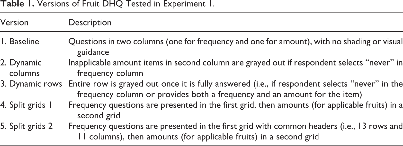
Our goal was to see if two types of design modifications—dynamic shading and split grids—improved outcomes over the baseline grid. We expected that all four treatment conditions (Versions 2–5) would reduce breakoffs, missing data, straightlining, and underreporting relative to the control (Version 1). The dynamic versions have the same visual complexity as the baseline version, so we expected similar levels of breakoff. The follow-up amount questions are also visible, so we expected similar levels of reported consumption (i.e., the percentage reporting “ever” consuming each fruit and the reported mean frequency of consumption). We expected the dynamic versions to reduce inadvertent item missing data. Version 2 only grayed out the second column of responses, whereas Version 3 grayed out both columns, so we expected the latter to be the more effective navigational aid, giving respondents a better sense of completion. We expected the two split-grid versions to reduce breakoffs relative to the control and also to reduce item missing data (given reduced task complexity). Further, we expected these versions to increase the overall reported frequency of fruit consumption (fewer “never” responses), since the follow-up amount questions are only shown for the applicable items. The second split grid (Version 5) more closely resembles a traditional grid, with 11 response columns. We expected this design to increase straightlining relative to Version 4 and to yield lower reported frequencies of consumption because the low response options are closer to the labels on the left and choosing them would minimize eye and sensorimotor (cursor) movements. We note that this version likely required horizontal scrolling for some respondents, but 11 response options are not unusual for grids seen in web surveys.
Experiment 1 Results
The grid experiment appeared about mid-way through the survey, and most breakoffs tend to occur early. The overall breakoff rate on this series of questions was low (1.7%) and did not differ significantly by version. The sunk costs of completing the survey to this point may have discouraged further breakoffs. The remaining analyses focus on the 2,410 respondents who completed the survey. Table 2 shows some key outcomes of interest across the five conditions.
Key Outcome Measures: Experiment 1.
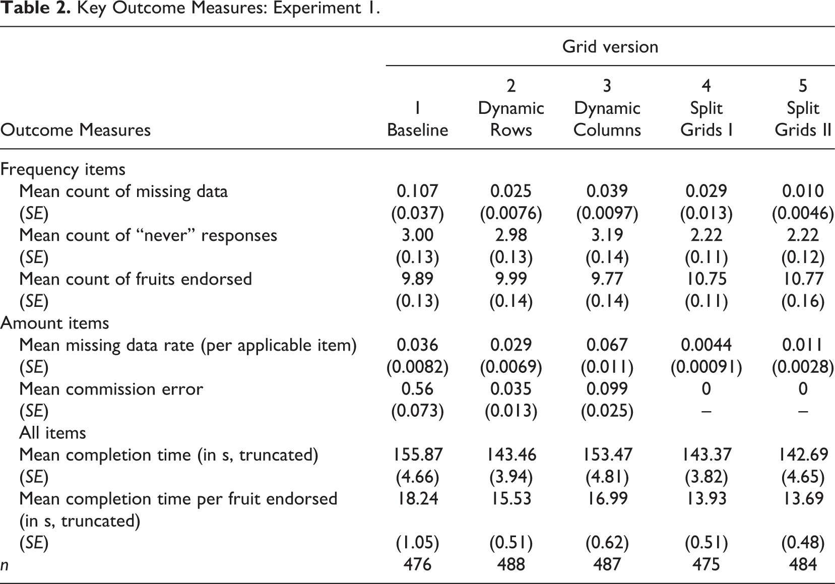
Across the five conditions, we find significant differences in the rates of missing data to the frequency items, F(4, 2405) = 4.3, p = .0018. Overall, the missing data rates are low (about 1/10th of an item per respondent was missed for the 13 items). 1 The standard grid has the highest missing data rate (a mean rate of 0.107 across the 13 items), and all of the experimental conditions significantly reduce missing data relative to the control. Among the experimental conditions, the two dynamic versions (Versions 2 and 3) do not differ from each other (p = .98), and the two split versions do not differ from each other (p = .94). When collapsing these versions into two types (dynamic and split), the dynamic (p = .0021) and split versions (p = .0003) are both significantly different from the control, but not from each other (p = .79).
We expected the proportion of “never” responses to be higher for the versions where the follow-up items are in the same grid as the frequency items (Versions 1–3) than in the split grid versions (4 and 5) where the follow-up items are not apparent until after the first grid is completed. The data in Table 2 support these expectations. In an ANOVA, the collapsed (three-category) experimental variable (baseline vs. dynamic vs. split) is significant, F(2, 2407) = 26.9, p < .0001, with the split grid versions being significantly lower than either the baseline (p < .0001) or the dynamic versions (p < .0001), but the latter two do not differ from each other (p = .60). Table 2 also shows the mean number of fruits endorsed. As we expected, respondents select significantly more fruits in the split grid versions than the baseline or dynamic versions, F(2, 2407) = 28.9, p < .0001—on average about one more fruit per respondent. This difference persists even if we exclude the catch-all “other kinds of fruit” category. Of course, this finding is a consequence of the lower rates of missing data and “never” responses.
For the follow-up amount items, we looked at missing data rates (errors of omission) and errors of commission (i.e., answering an amount after selecting “never” or not answering the frequency item). By design, the split grid versions only present the applicable items to respondents, so there are no errors of commission. Across the three types of grids, the missing data rate differs significantly, F(2, 2407) = 16.8, p < .0001, with the split grids having significantly lower rates of missing data than either the baseline (p = .0027) or the dynamic versions (p < .0001). Errors of commission are significantly (p < .0001) reduced in the dynamic versions relative to the baseline grid (where such errors occur on average about half a fruit per respondent), with the split grids eliminating commission errors completely, by design.
The dynamic row shading produced higher missing data rates to the frequency items and higher rates of errors of commission to the amount items than the dynamic column version, and, contrary to expectation, higher rates of “never” responses and higher missing data rates to the amount items than the baseline grid. It is clear that a small number of cases are responsible for the higher missing data rates. We have examined the detailed paradata available to us (including browser and operating system characteristics, screen dimensions, and mouse click data) on this series of items, but see nothing untoward about these cases. This remains a puzzle.
We also examined a variety of indicators of satisficing (not shown in Table 2), focusing on the frequency of consumption items. These included the variance of responses to the 13 items (Krosnick & Alwin, 1988, p. 531–532), a measure of nondifferentiation (Mulligan, Krosnick, Smith, Green, & Bizer, 2001, cited in Chang & Krosnick, 2010), and full- or near-straightlining (the same answers to all or all but one of the 13 items). We find no significant differences between the five versions in these indicators of satisficing. Only 1.1% of respondents (across all versions) gave the same response to all 13 items, and only 2.3% gave the same response to 12 or more items.
Finally, we examined completion times across the five grid versions. The time measure is positively skewed, so we truncated the distributions at 600 s (10 min). These truncated estimates of mean time are shown in Table 2. We also looked at a log-transformed measure of time and conducted a Poisson regression, with similar results. Across the three types of grids, the differences in time in seconds is not statistically significant, F(2, 2409) = 2.86, p = .058, but the log times are, F(2, 2409) = 3.73, p = .024. However, when we take into account the number of fruits endorsed and examine mean time per fruit endorsed (see Table 2), the results are even clearer. There is a significant difference in response times across the three types of grid, F(2, 2389) = 15.91, p < .0001, with the dynamic versions being slightly faster (p = .041) than the baseline, and the split grids being faster still compared to the baseline (p < .0001). In other words, respondents reported eating more fruits in the split grid version and answered more follow-up questions about the amounts they ate with no additional time penalty.
In summary, the version with dynamic rows improved performance over the baseline grid, as we expected, but the dynamic column version did not. Both split grid versions performed better than the baseline grid, as expected. Overall, the simplified split grids seemed to outperform the other three versions, reducing missing data, increasing the number of fruits reported, and decreasing the time spent per item endorsed.
Experiment 2
Experiment 2 Design
The second experiment again examined two elements of grid design. First, we explored the effect of visual complexity on task completion. We did this by varying visual features of the grids without changing the underlying task. In one version (high visual complexity), we alternated colors of both rows and columns in the grid, and varied the typeface used. In the other version (low visual complexity), we did not use any background color or shading and kept the standard typeface (Arial) throughout. 2
We also explored the split-grid idea further. First, we added an explicit yes/no question to the series (e.g., “Over the past 12 months, did you eat . . . apples?”) to increase the complexity of the grid. We then created a single-grid version (containing the yes/no question, the frequency question, and the amount question for each of the 13 fruits), a two-grid version (with the yes/no items on one grid, and the frequency and amount items on the second), and a three-grid version (with separate grids for each of the items).
Crossing these two factors yields a 2 (high vs. low visual clutter) × 3 (1, 2, or 3 grids) design. We added one other cell to the design, in which we replicated the baseline grid from Experiment 1, to test the effect of an explicit yes/no question versus an implicit one (choosing “never” for the frequency item). 3 The resulting seven versions are summarized in Table 3, and screenshots are presented in Appendix B. No shading (dynamic or otherwise) was employed in the low-clutter versions, and the fruits included in the follow-up questions in the split-grid versions were conditional on a positive (“yes”) response.
Versions of Fruit DHQ Tested in Experiment 2.
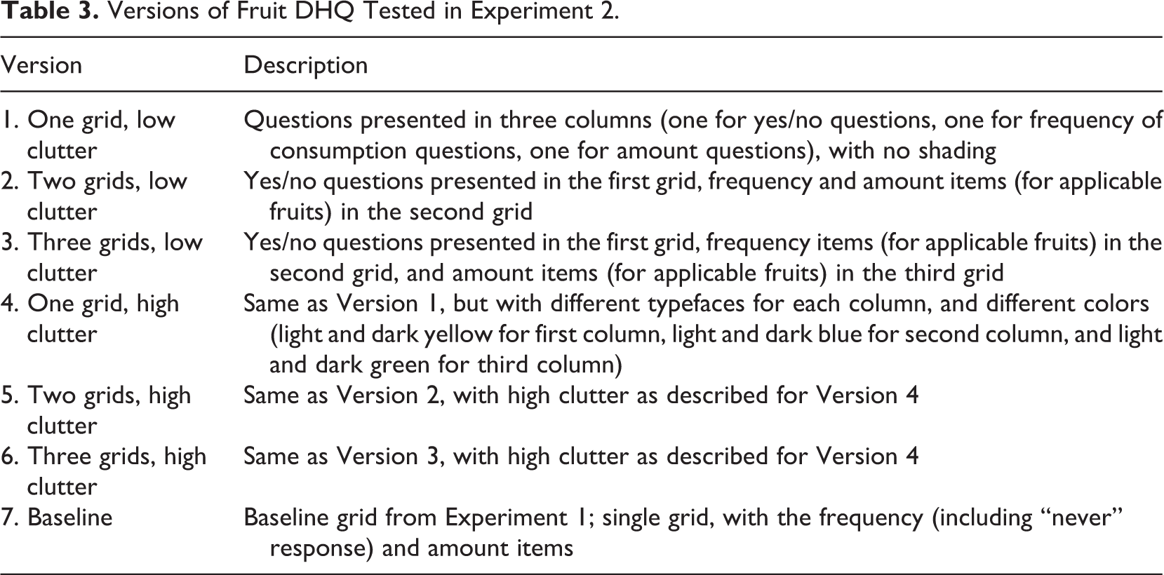
The analysis focuses on the first six versions, allowing us to examine the effects of visual complexity and number of grids. Our expectation is that making the grids appear more complex will reduce effort on the grids, increasing breakoffs, missing data, and satisficing. Based on the results of Experiment 1 and earlier findings, we expect that increasing the number of grids will improve performance on the grids. We also expect an interaction effect between the level of visual clutter and the number of grids, with the worst performance on Version 4 (single grid, high clutter).
We also examine the effect of the implicit (a frequency item with a “never” option) versus an explicit (yes/no) question (Versions 1 and 7). We expect longer completion times for Version 1, as it adds one more question. We also expect lower reported fruit consumption (i.e., more “no” responses) in Version 1, given the explicit question. These two versions do not differ much in complexity, but we also examine whether Version 1 (with three questions rather than two) reduces performance relative to Version 2.
Experiment 2 Results
We begin with an examination of the 2 × 3 experiment, varying visual complexity and the number of grids. As with Experiment 1, breakoff rates on this series of items are low overall (1.5%) and do not differ by version. Remaining analyses are focused on those who completed the survey. Selected outcomes across the six conditions are presented in Table 4.
Key Outcome Measures: Experiment 2.
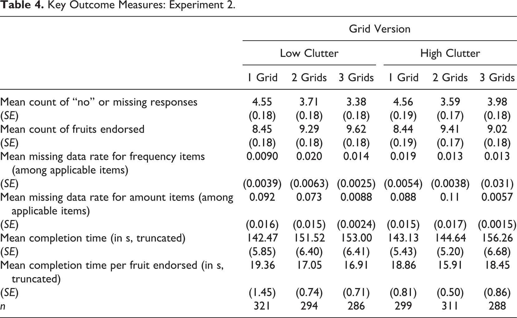
In ANOVA models with main effects for visual clutter and the number of grids, visual clutter (high vs. low) has no effect on the number of fruits endorsed, F(1, 1795) = 1.0, p = .32, on missing data rates for either the frequency, F(1, 1761) = 0.03, p = .87, or amount, F(1, 1766) = 0.68, p = .41, questions, or on the time to complete the set of items, F(1, 1782) = 0.05, p = .83.
On the other hand, the number of grids has a significant effect on the number of fruits selected, F(2, 1795) = 16.8, p < .0001. As expected, when the yes/no question is separated from the follow-up items (i.e., in the versions with two or three grids), significantly more fruits are mentioned (mean = 8.44 for one grid, 9.35 for two grids, and 9.32 for three grids; the difference between two and three grids is not significant, p = .9775, but both are different from the one grid version, p < .0001).
We find no significant effects of the number of grids on missing data rates (among the applicable items) for the frequency of consumption, F(2, 1761) = 0.28, p = .75, with the overall rate being about 0.014 (i.e., on average about 1.4% of applicable items are not answered) and with 8.3% of respondents having missing data on at least one of these items. However, the missing data rate is higher overall for the amount items (0.064) than for the frequency items, and differs significantly by version, F(2, 1766) = 26.43, p < .0001. 4 The one- and two-grid versions have similar rates of missing data (both rates were 0.090), while the three-grid version is significantly lower (0.007). If we combine the missing data rates for the frequency and amount items, we find rates of 0.052 for the one-grid, 0.053 for the two-grid, and 0.010 for the three-grid condition, with the latter significantly lower (p < .0001) than the other two conditions. We thus find only partial support for our expectation that splitting the grids would reduce item missing data—three separate grids reduced overall missing data, but two grids does not.
In terms of “errors” of commission, a total of 94 respondents in the single-grid versions (50 in the high clutter condition and 44 in the low clutter condition) answered one or more frequency items without responding to the yes/no question. In counting the number of fruits endorsed (see above), we treated these cases as an implicit “yes.” In other words, even taking such implicit responses into account, significantly more fruits are endorsed in the split-grid versions, where respondents who did not explicitly answer “yes” would not get the follow-up questions.
Turning to completion time, we find no differences in mean completion time by number of grids, F(2, 1782) = 1.95, p = .14, with average time increasing as the number of grids increases (mean = 142.77 for one grid, 147.97 for two grids, and 154.62 for three grids). However, if we allow for the fact that more fruits were endorsed in the separate grids versions and examine completion time per fruit endorsed, the overall effect of number of grids on completion time reaches statistical significance, F(2, 1768) = 4.38, p = .013, with means of 19.1 s for one grid, 16.4 s for two grids, and 17.7 s for three grids. We also examined the effect of the two factors on the same indicators of satisficing (variance of the frequency and amount responses, full- or near-straightlining, and nondifferentiation) as used in Experiment 1. Consistent with Experiment 1, we generally find little evidence of such satisficing behavior. None of the indicators vary significantly by clutter. Neither variance or straightlining differ significantly by number of grids, although differentiation scores (indicating less nondifferentiation or straightlining; using the Mulligan et al. measure) did increase significantly, F(2, 1975) = 6.10, p = .002, with increasing number of grids, suggesting that splitting grids reduces the incidence of nondifferentiation.
Krosnick (1991; see also Holbrook, Green, & Krosnick, 2003; Narayan & Krosnick, 1996) has suggested that those with lower cognitive ability may be more likely to satisfice. We tested several indicators of cognitive ability (including education, age, and Internet experience) both as main effects on satisficing indicators and as interactions with the experimental manipulations. In general, the main effects of these background variables are modest and vary across different outcomes. For example, neither education nor age is associated with significant differences in item missing data. There are significant effects of age on variance of the responses and the differentiation score, with both increasing with increasing age (consistent with the literature). Education shows no significant main effect on either of these indicators. Further, we find no significant interactions of either education or age, and the number of grids, on indicators of satisficing.
We also compared the two single-grid versions, one with an explicit yes/no question on consumption (Version 1 in Table 3) with the version from Experiment 1 with an implicit question (Version 7 in Table 3). We expected that the additional question would increase the visual complexity of the grid and increase the amount of effort required to respond, since three questions are asked instead of two for each item. For this reason, we expected the explicit yes/no version to increased motivated underreporting, that is, to decrease the number of fruits endorsed to avoid answering the follow-up questions. Further, we expected the explicit yes/no version to take longer to complete.
The explicit yes/no version did result in significantly, F(1,616) = 33.14, p < .0001, fewer fruits consumed than the implicit version (mean = 8.45 vs. 9.89, respectively). This difference (of about 1.4 fruits per person on average) counts as a “yes” those respondents in the explicit version who did not provide a “yes” response but nonetheless answered the frequency question. Treating these cases as “no” responses would increase the size of this difference slightly. The explicit yes/no version also took nonsignificantly longer to answer (142.5 vs. 135.3 s; F(1, 616) = 0.83, p = .36. However, taking into account the number of fruits endorsed in each version, the time per fruit endorsed was significantly longer for the explicit version (19.4 vs. 14.8 s; F(1, 603) = 7.82, p = .005. In summary, then, adding an extra question seemed to increase motivated underreporting in the single grid versions, in which the follow-up questions are visible to the respondents when they answer the filter item.
Summary and Discussion
In general, we did not find as much evidence of poor responding on these grids as we might have expected, despite our efforts to make them even more difficult than normal grids. Breakoff rates and missing data rates were generally low across all of the versions we tested. The incidence of nondifferentiation or straightlining was similarly low. It is possible that straightlining is relatively rare with behavioral items like the ones we used, where it is implausible the answers would be the same for every item. It may be easier to give the same answer to a series of similar-looking attitudinal items. It could also be that the grids we tested were not large enough (only 13 items) or complex enough to produce the expected effects. But negative effects of grids (relative to item-by-item approaches) have been found with as few as 4 items (e.g., Toepoel et al., 2009a; Tourangeau et al., 2004).
Still, we did find that the design of grids affected the quality of responses and the speed with which respondents answered the questions. In Experiment 1, we found that using dynamic feedback reduced missing data relative to the control condition. This is consistent with the findings of Galesic et al. (2007) and Kaczmirek (2009, 2011). Providing such feedback helps respondents identify the items they have not yet answered in a large grid and serves to communicate progress through the task. Dynamic feedback also appears to permit respondents to answer in less time per applicable item.
We also found that splitting the grids into component questions and showing only those follow-up questions for which respondents were eligible reduced missing data and time needed to complete the items (with the split grids being significantly faster than both the control condition and the dynamic feedback versions). Splitting the items in more than one grid also eliminated errors of commission. In addition, we found evidence of motivated underreporting, with fewer fruits reportedly consumed when the follow-up questions were visible to respondents from the outset in the single-grid version.
Turning to Experiment 2, we found that increasing the visual complexity of the grid, without changing the underlying task, had no effect on the outcome measures we examined. This is contrary to our expectation, but is in line with Mahon-Haft and Dillman’s (2010) finding of relatively small effects of an aesthetically displeasing screen design. One explanation may be that the veteran survey takers we studied have become inured to such design variations. Many opt-in panel vendors (including the two we used for these studies) host studies from multiple sources with large variation in design. This may mitigate the effect of added visual complexity.
Does this suggest that we can ignore aesthetics in the design of web surveys in general, and grids in particular? Given the several studies that have found effects on data quality or response distributions of small changes in design, such a conclusion may be premature. Our findings suggest further research using different samples of respondents might be warranted.
The findings on the number of grids in Experiment 2 parallel those from Experiment 1. Reducing the complexity of the grids, by spreading the questions across several screens and making the display of follow-up questions contingent on answers to the first question, improves respondent performance in completing the grid items. In particular, the three-grid version of the fruit consumption items significantly reduced missing data and the completion time per fruit endorsed relative to the control condition.
Finally, the choice of grid design affects the reported consumption of fruits. Specifically, when an explicit yes/no question is asked on a separate page from the follow-up questions, we obtain higher average numbers of fruits reported. This provides further evidence of motivated underreporting when the follow-up questions are apparent to the respondent (Kreuter et al., 2011). Thus, the choice of grid design may affect not only performance indicators like missing data rates and completion times but also substantive response distributions.
These results, along with the earlier research on the design of grid questions, suggest that many of the negative effects of grids can be mitigated by careful design. One factor, which we did not manipulate in our studies, is the number of different items in the grid. Another is the number of questions per item and the number of response options. For example, it is not uncommon in market research surveys to ask respondents to rate items on two metrics (e.g., satisfaction and importance) at the same time in a grid. Our research suggests that splitting these grids will improve data quality. Similarly, asking the stem or filter question separately from follow-up questions will also improve performance. Well-designed grids should not be harder for respondents than item-by-item versions of the same items.
More than 20 years ago, Norman (1988) proposed seven principles for making the design of a variety of everyday objects more user-friendly. Our findings on grid design are consistent with two of Norman’s design principles. The first is to simplify the task. Splitting large or complex grids—especially those involving multiple response sets for each item, as our study tested—into simpler component pieces is one way of achieving this goal. The other principle proposed by Norman that is reaffirmed by our findings is to make actions visible. Providing feedback about what the user has done and what remains to be done—in this case, through the use of dynamic shading—is one way to implement this principle. Similarly, graying out completed items in a grid makes it clear to the respondent that they have dealt with those items (Galesic et al., 2007). Both methods of making their actions visible help respondents to fill out grid questions quickly and completely.
Footnotes
Appendix A
Appendix B
Acknowledgements
We are grateful to Reg Baker for his contributions to the design and implementation of these experiments.
Declaration of Conflicting Interests
The authors declared no potential conflicts of interest with respect to the research, authorship, and/or publication of this article.
Funding
The authors disclosed receipt of the following financial support for the research, authorship, and/or publication of this article: The work reported here was supported by a grant from the National Institute for Child Health and Human Development (R01 HD041386-01A1).