






Abstract
As citizens increasingly rely on data to navigate complex scientific issues, effective visualization has become essential. This study proposes a multidimensional framework to assess visualization complexity. We collected 6,641 COVID-19 visualizations from 29 media outlets over 18 months and recruited U.S. participants (N = 905) to evaluate a subset (N = 640). Results indicate that traditional measures of visual complexity had limited effects on audience perceptions, whereas data encodings, particularly advanced chart types and higher variable count, significantly shaped audience evaluations. These findings offer practical insights for enhancing the clarity and effectiveness of data visualizations in science communication.
Introduction
Contemporary society is saturated with data and requires citizens to engage with numerical information across various domains, such as health and science (Kong et al., 2025; Schloss, 2025; Y. Zhang et al., 2021). By converting complex data into accessible visual forms, data visualizations serve as an important tool for helping citizens understand difficult issues (Cairo, 2016; Greussing et al., 2020). One prominent example of this is the COVID-19 pandemic, where visualizations played a central role in disseminating a wide range of critical information, including case trends, vaccine efficacy, and virus transmission rates (Bisiani et al., 2025; Kong et al., 2025; Y. Zhang et al., 2021). These numerical patterns pose challenges for both government agencies and media outlets striving to present data clearly, as well as for the public attempting to interpret and act on it.
The complexity of COVID-19 charts likely influences audience evaluation and comprehension (Cairo, 2016; Lin et al., 2025; Tufte, 1983). Visual complexity affects various outcomes ranging from processing fluency and aesthetic appeal to social media engagement and information retrieval (Baughan et al., 2020; Sharma & Peng, 2024; Tuch et al., 2009). However, previous frameworks on visual complexity have often focused on visual materials such as advertisements, photographs, and webpages (Miniukovich & De Angeli, 2016; Peng & Jemmott, 2018; Pieters et al., 2010), and whether these frameworks translate to data visualizations remains underexplored. One contribution of this study is to propose an integrated, multidimensional framework of visualization complexity that captures a broad range of design choices in data visualizations.
As data visualizations have become increasingly central to journalistic storytelling, there is a growing need for empirical research on how audiences perceive and evaluate these visual forms, particularly in science and health communication where complex data must be conveyed to the public (Kong et al., 2025). Existing research on health communication infographics suggests that relatively few studies have examined how design choices and visualization techniques shape audience comprehension and interpretation of health-related information (Kong et al., 2025). The COVID-19 pandemic provides a useful context for examining these questions, as it accelerated the use of innovative visualization techniques to communicate complex public health data in news coverage (Bisiani et al., 2025; García-Avilés et al., 2024; Y. Zhang et al., 2021). This study empirically examines audience responses to COVID-19 visualizations in news media, with a focus on affective and cognitive evaluations such as processing fluency, aesthetic appeal, credibility, and perceived informativeness.
This research collected a large dataset of COVID-19 visualizations from 29 media outlets widely consumed in the United States spanning 18 months (N = 6,641) and curated audience reactions to a diverse sample of visualizations (N = 640) of varied chart types. Combining computer vision analysis and manual coding, we identified a set of visualization variables that may influence complexity and fluency. Through crowdsourcing, this study collected over 7,000 chart evaluations from participants (N = 905) and revealed how various design factors shaped a chart’s complexity and evaluations. These findings provide practical insights for improving pandemic media coverage by highlighting strategies for making visualizations more understandable and accessible to the public.
Data Visualizations in COVID-19 Media Coverage and Audience Reception
Visualizations became a central component of science and health communication during the COVID-19 pandemic (Kong et al., 2025). The crisis heightened public demand for data journalism and accelerated both its adoption and innovation in news coverage (Bisiani et al., 2025; García-Avilés et al., 2024). Content analyses show that COVID-19 visualizations cover diverse themes and employ both conventional and novel techniques to communicate public health information (Y. Zhang et al., 2021).
Scholars have begun to examine how these visualizations shape public attitudes, interpretations, and behaviors. Some studies demonstrate their influence on public responses to the pandemic. For example, Li and Molder (2021) found that public awareness of the “flatten the curve” charts was high, and this awareness moderated the role of institutional trust in shaping pandemic risk perceptions. Other research highlights how visualizations circulate and are interpreted in online discourse. C. Lee et al. (2021) showed that individuals who distrusted the scientific community often adopted data-driven language in discussions of COVID-19 visualizations while promoting anti-science views.
A growing body of research also examines how visualization design influences audience comprehension and perception. Sánchez-Holgado et al. (2023) found that exposure to news with data visualizations improved readers’ comprehension and attitudes toward news stories. Different visualization formats can produce distinct emotional and cognitive responses. In one study, tables led to more accurate forecasts than line graphs, although line graphs increased users’ confidence (Fansher et al., 2022). Luo et al. (2022) found that area charts showing COVID-19 trends generated greater anxiety than line charts due to heavier color shading. Padilla et al. (2022) showed that while simpler COVID-19 forecast visualizations were perceived as more trustworthy, they often led to poorer trend predictions, highlighting trade-offs between trust and task performance.
Together, these studies reflect growing recognition of the importance of visualizations in pandemic communication, yet important gaps remain. Existing research has begun to examine how design choices shape pandemic communication, but these studies often focus on a limited set of chart features or primarily analyze trend and forecast charts used in COVID-19 coverage (Fansher et al., 2022; Kong et al., 2025; Luo et al., 2022; Padilla et al., 2022). Given the diversity of visualization formats in pandemic reporting, this study broadens existing inquiry by examining how audiences interpret and evaluate a wider range of chart designs.
Visualization Complexity: Three Sources of Difficulty
Understanding a visualization involves a series of tasks and requires viewers to manage both perceptual and cognitive demands, including visually parsing the graphic, extracting data from visual representations, and interpreting the intended message, often moving back and forth among these processes (Correll & Gleicher, 2014; Dimara et al., 2020; Heer & Bostock, 2010; Schloss, 2025). Building on prior research, we identify three major sources of difficulty in chart understanding: visual complexity, data encoding, and textual elements. Specifically, visual complexity primarily affects how viewers parse and perceptually process visual elements, data encoding influences the effort required to decode how visual elements represent data, and textual elements shape how viewers interpret and integrate textual information (Correll & Gleicher, 2014; Heer & Bostock, 2010; Lin et al., 2025; Schloss, 2025).
Therefore, visualization complexity is best reflected as a combination of dense visual elements, intricate design, data encoding choices, and accompanying textual elements that increase the effort required to process and interpret a visualization (Figure 1). These three components should not be viewed as independent but as interacting factors that jointly shape how viewers process visualizations. For example, visualizations with multiple data encodings may increase visual density, requiring viewers to manage both perceptual processing and the cognitive effort of mapping visual features to the concepts they represent (Schloss, 2025). Clear textual guidance may direct viewers’ attention and interpretation, potentially mitigating the difficulty posed by visually complex graphics (Segel & Heer, 2010). The present study uses these interacting sources of difficulty as an organizing framework to examine visualization features.
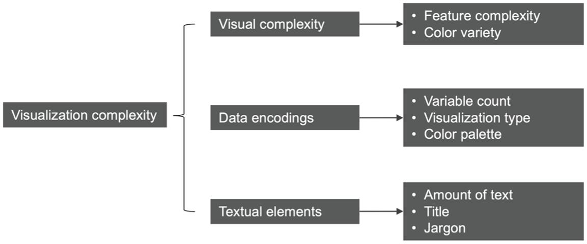
Three sources of visualization complexity.
Visual Complexity
Visual complexity is a key source of difficulty in processing visual material (King et al., 2020; Lazard & Mackert, 2014; Nadal et al., 2010). Visual complexity represents the degree of variation and intricacy in a visual stimulus and captures the mental effort required of users to process and retrieve information from that stimulus (Lazard & Mackert, 2014; Peng & Jemmott, 2018; Pieters et al., 2010). High visual complexity increases processing effort and reduces performance in visual tasks such as search (Baughan et al., 2020; Tuch et al., 2009). Visual complexity is understood as a multidimensional concept, with two core dimensions frequently discussed. The first refers to the quantity and variety of visual information and details that need to be processed. The second concerns how this complex information is organized and presented, which can influence how easily viewers can retrieve and process it (Deng & Poole, 2010; Lazard & Mackert, 2014; Nadal et al., 2010; Pieters et al., 2010).
In data visualization, some scholars and practitioners argue that graphics should remain visually simple to improve effectiveness (Harold et al., 2016; Tufte, 1983). Difficulty in understanding a chart often stems from the effort required to recover structure from its visual representation, and excessive elements may obscure patterns and hinder interpretation. A key principle is Tufte’s (1983) “data–ink ratio,” which recommends eliminating decorative or redundant elements—such as unnecessary gridlines or visual embellishments—that do not directly represent the data. Some empirical studies support this principle. Park and Tang (2019), for example, found that low-complexity skin cancer infographics were perceived as easier to understand than complex ones. Similarly, Elhamdadi et al. (2024) found that COVID-19 visualizations with lower visual complexity were perceived as more trustworthy than those with more complex designs.
Others challenge the assumption that simpler visualizations are always more effective. Dick (2020) critiques Tufte’s data–ink ratio, arguing that minimalist design principles largely reflect the norms of expert-oriented scientific communication rather than universal standards. In journalistic contexts, elements often labeled as “chartjunk” may serve communicative purposes because visualizations must align with audiences’ familiarity with common visual formats and their interpretive abilities. Cairo (2016) argues that visualization design should balance visual simplicity with informational depth. Although complex graphics require greater cognitive effort, they also provide informational depth and insight. An experimental study comparing minimalist and visually embellished charts found no differences in comprehension, but embellished charts were remembered better weeks later (Bateman et al., 2010). Overall, visual complexity likely influences visualization effectiveness and comprehension; however, the direction and conditions of this relationship remain contested. To operationalize visual complexity, this study includes two indicators: feature complexity and color variety.
Feature Complexity
Feature complexity refers to the amount of perceptual visual detail present in a visualization, such as edges and fine visual elements (Miniukovich & De Angeli, 2016; Pieters et al., 2010). Visual design inherently involves the deployment of many visual elements, such as lines, shapes, and textures (O’Connor, 2014), and a complexly designed visual would naturally add to the perceptual detail of a visualization. High feature complexity increases the effort required to parse the graphic and perceive its various elements, thereby increasing perceived complexity.
Color Variety
Because feature complexity does not fully capture color variations, we also include color variety, defined as the range and diversity of colors used in a visualization (Miniukovich & De Angeli, 2016). A larger number of colors increases the perceptual demands of parsing a visualization, as viewers must process a greater variety of color information. Lin et al. (2025) showed that the number of colors weakly correlated with perceived visualization complexity.
Data Encoding
The second source of difficulty comes from data encoding, as visualization complexity depends on how easily viewers can infer the meaning of visual elements (Schloss, 2025). Data visualizations convey information by mapping data to visual elements such as position, length, color, size, and shape (Wilke, 2019). These encodings are processed through different perceptual channels, meaning some allow viewers to detect and extract quantitative values more efficiently or accurately than others (Heer & Bostock, 2010; Schloss, 2025). Beyond value extraction, interpreting visualizations often involves higher-level reasoning, as viewers must draw conclusions about patterns and relationships, a process vulnerable to cognitive biases and reasoning limitations (Dimara et al., 2020). These reasoning processes can shape how viewers perceive relationships in the data and ultimately influence decision outcomes (Dimara et al., 2018). Effective visualization design should therefore support decoding and reasoning processes, rather than simply maximizing the amount of displayed data (Correll & Gleicher, 2014; Schloss, 2025).
Therefore, the difficulty of interpreting a visualization depends on how systematically and logically visual elements represent the underlying data, as well as how familiar and intuitive the mapping between data and visual attributes is. When these mappings are unclear or complex, viewers must expend greater cognitive effort to decode the information conveyed by the visualization (Schloss, 2025). Accordingly, this study examines several visualization features that may influence the effort required to decode data.
Variable Count
Variable count refers to the number of variables represented in a visualization and reflects the amount of data information viewers need to decode from visual elements. As more variables are encoded, viewers must interpret additional visual mappings, which increases the cognitive effort required to decode the information (Harold et al., 2016; Lin et al., 2025; Wilke, 2019). For example, a simple scatterplot may visualize the relationship between two variables, but designers can also vary the size, color, and patterns of dots to encode additional variables. Decoding each extra variable requires more cognitive effort, increasing the visualization’s complexity. Supporting this idea, a study found that the number of quantitative and categorical variables represented in visualizations was positively associated with crowdworkers’ perceptions of chart complexity (Lin et al., 2025).
Visualization Type
Data can be encoded into a variety of formats, and visualization type likely influences its complexity. Researchers and practitioners often distinguish between basic charts (e.g., bar charts, line charts) and more advanced, alternative charts (e.g., heat maps, spider charts) (Goo, 2015; S. Lee et al., 2016). Basic charts are widely included in data visualization tools and tutorials and frequently appear in media coverage and everyday contexts. In contrast, advanced charts are typically encountered in advanced education and are less prevalent in both daily life and news media (Borkin et al., 2013; C. Lee et al., 2021; S. Lee et al., 2016). While individuals are generally comfortable with basic charts, they often struggle with interpreting advanced charts (Borkin et al., 2013; Goo, 2015; S. Lee et al., 2016). For instance, a survey found that only 63% of Americans could correctly interpret the relationship shown in a scatterplot, possibly because scatterplots are rarely featured in news media, which may contribute to difficulties in interpretation (Goo, 2015; S. Lee et al., 2016).
Color Palette
Visualizations can encode data with different color palettes. A qualitative palette uses distinct colors to represent categories or groups, a sequential palette uses gradients of a single color or adjacent colors to encode ordered data, and a diverging palette uses contrasting color schemes to represent values centered around a critical midpoint (Wilke, 2019). Unlike color variety, which captures the raw perceptual diversity of colors in an image, color palettes are a data encoding tool. Viewers must learn and use the mapping between colors and the data values they represent to extract meaning (Schloss, 2025). Color can facilitate interpretation by enabling viewers to quickly distinguish categories or detect patterns (Borkin et al., 2013; Schloss, 2025); however, the extent to which different palettes facilitate or hinder comprehension remains unclear.
Text Elements
Finally, data visualizations often incorporate textual elements such as titles, captions, labels, and annotations, which can also influence the difficulty of interpretation (Kong et al., 2018). These elements work together with visual representations to guide how viewers interpret the data. Visualization research highlights that design decisions operate across multiple editorial layers, including the data, visual representation, textual annotations, and interactivity (Hullman & Diakopoulos, 2011). Within these layers, annotations can direct viewers’ attention to specific parts of a graphic and emphasize particular interpretations. Similarly, narrative visualization emphasizes messaging devices such as headlines, captions, and annotations as means of communicating observations, orienting viewers, and highlighting relevant patterns in the data (Segel & Heer, 2010). Because textual elements frame the interpretation of data, explain visual encodings, and shape the accessibility of information, they can either reduce or increase the cognitive effort required to understand a visualization. Accordingly, we examine three textual features that may influence processing difficulty.
Amount of Text
Text is often necessary to guide viewers in interpreting the subject matter, scales, and labels of a visualization. However, excessive text can become counterproductive. Large amounts of textual information may overwhelm viewers, clutter the design, and divert attention away from visual patterns.
Title
Titles play a central role in framing how viewers approach a visualization (Kong et al., 2018; Wanzer et al., 2021). They provide an initial reference point that helps readers situate themselves within the data and anticipate the insights presented in the graphic. Furthermore, scholars distinguish between generic titles, which simply describe the topic of the graph, and informative titles, which highlight the visualization’s main message (Wanzer et al., 2021). Informative titles can direct viewers’ attention toward key patterns, trends, comparisons, or causal relationships (Wanzer et al., 2021). By guiding interpretation early in the viewing process, such titles can reduce the cognitive effort required to identify the intended message (Wanzer et al., 2021). Finally, subtitles—text placed adjacent to main titles—can provide additional context. By clarifying scope, definitions, or limitations, subtitles may further reduce cognitive load and improve interpretability.
Jargon
Given the context of pandemic visualizations, the use of jargon may be particularly relevant to understanding. Jargon refers to specialized terms or technical language used within a specific community (e.g., science), which may be unfamiliar to a general audience (Bullock et al., 2019; Shulman et al., 2020). Jargon often impedes effective science communication by disrupting the flow of understanding. When viewers encounter unfamiliar terms, they may need to pause to mentally translate or look them up (Bullock et al., 2019). Jargon can also create a sense of alienation among the audience from the scientific community, potentially leading to a loss of interest and reduced engagement with the message (Shulman et al., 2020). In the context of COVID-19, scientific, medical, or financial jargon, such as “R0” and “consumer price index,” may significantly increase the cognitive load.
Downstream Effects of Visualization Complexity
Prior research distinguishes between objective message complexity, an intrinsic and objectively defined message feature, and perceived complexity, which reflects the subjective evaluation of complexity and processing difficulty (O’Keefe, 2003; Tolochko et al., 2019). As summarized above, complexity in data visualizations may arise from multiple sources, including visual complexity, data encoding, and textual elements. However, it remains unclear which of these sources or specific features exert the strongest influence on viewers’ judgments. Our first step is therefore to examine which attributes most strongly predict perceived complexity. Following prior research, we conceptualize perceived complexity in terms of processing fluency, defined as the subjective experience of ease and effortlessness resulting from information processing (Kostyk et al., 2021; Shulman et al., 2020; Tolochko et al., 2019). This study proposes the following research question.
This research includes three additional subjective evaluations: aesthetic appeal, perceived informativeness, and credibility. Aesthetic appeal refers to the visual attractiveness of charts and the overall appeal of the visual content (Lazard & King, 2020; Wanzer et al., 2021). Perceived informativeness captures the extent to which visualizations provide valuable information to viewers, helping them make informed decisions (Lazard & Mackert, 2014). Finally, perceived credibility reflects the perceived accuracy and trustworthiness of the information, often arising from a combination of affective and cognitive evaluations (Peng et al., 2025; Wanzer et al., 2021). Together, these three outcomes represent a wide range of affective and cognitive responses to visualizations that are often desirable goals in data communication.
It remains unclear how visualization complexity influences these subjective evaluations. From an “affect-as-information” perspective, when message recipients encounter simple and easily processed information, the ease and fluency of processing can evoke positive feelings and evaluations. Relying on these positive feelings, viewers may form more favorable impressions of the message, such as higher aesthetic appeal, stronger engagement, or greater credibility (King et al., 2020; Shulman et al., 2020; Tolochko et al., 2019). On the other hand, when complexity is too low, viewers may experience reduced arousal, find the visualization uninteresting or unengaging, and thus evaluate it less positively (Madan et al., 2018; Nadal et al., 2010). Consequently, studies often find a relationship between visual complexity and subjective evaluations such as aesthetic appeal. However, the direction of this relationship is not consistent: Some studies report positive effects, others negative effects, some find no significant effects, and still others identify a curvilinear relationship in which both extremely low and extremely high levels of complexity reduce evaluations (Madan et al., 2018; Miniukovich & De Angeli, 2016; Nadal et al., 2010). These relationships may also depend on the specific dimension of complexity being considered (Deng & Poole, 2010; King et al., 2020; Pieters et al., 2010). In summary, visualization features that influence processing fluency may also affect other subjective evaluations, such as aesthetic appeal, perceived informativeness, and credibility. We focus on objectively defined visualization features rather than subjective processing fluency as predictors. This approach allows us to identify the effects of specific design features and generate clearer design implications.
Data and Methods
Collection of COVID-19 Visualizations in Media Coverage
Data Retrieval and Cleaning
Based on Pew Research Center’s November 2019 American Trends Panel Survey, this study sampled 29 English-language news outlets widely consumed in the United States. Google Image search was used to download COVID-related images over an 18-month period (January 1, 2020, to June 30, 2021). Search queries included covid, covid-19, covid19, coronavirus, corona, and pandemic. Each query was confined to one specific outlet (e.g., site: nytimes.com) and to a 1-month period (e.g., after:2020-01-01 before:2020-02-01). This was repeated for all selected sites and months. Animated GIFs and inaccessible image links were removed, resulting in 243,651 images.
Data visualizations were operationalized as images that use at least one visual element—such as shapes, lengths, positions, or colors—to represent variables (Wilke, 2019). The returned images contained a substantial number of non-visualization images, such as photographs. An image clustering technique was used to remove irrelevant images, which combines transfer learning and clustering to automatically group visually similar images (H. Zhang & Peng, 2024). This method clustered similar images—such as all photographs of medicine—allowing for the removal of non-visualizations. After the entire search results were reduced to a manageable sample, we used manual coding to further screen the dataset. Plain tables and diagrams that did not visualize data were removed. This step also removed visualizations that were templates, incomplete, cropped, or extremely blurry. A total of 6,641 visualizations were identified. As shown in Figure 2, the largest share of charts originated from The Wall Street Journal (28.7%), followed by The Washington Post (11.2%), BBC (10.2%), Business Insider (8.5%), Vox (8.2%), and The New York Times (4.6%).
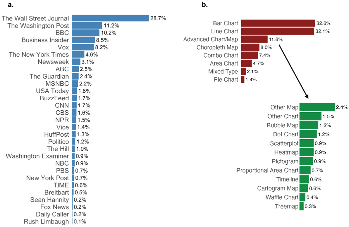
Percentages of COVID-19 data visualizations (total N = 6,641): (A) By media outlet and (B) By visualization type.
Classification of Visualization Types
Classifying chart types, particularly distinguishing basic from advanced visualizations, was important. However, prior work provides clear classifications for some charts (e.g., bar and line as basic) but leaves others more uncertain (e.g., scatterplots). To address this classification, we conducted a frequency analysis, assuming that less frequently used chart types in media coverage represent more advanced visualizations (C. Lee et al., 2021).
We adopted a two-step classification process. First, based on previous literature (S. Lee et al., 2016; C. Lee et al., 2021), this study considered bar charts, line charts, area charts, pie charts, and choropleth maps as basic chart types. We later added combo charts as basic charts, which combine bar, line, or area charts sharing the same axis, such as a bar graph visualizing COVID-19 cases with a line representing the moving average. Visualizations were categorized into these types, along with advanced charts and images containing mixed chart types. Next, we further categorized advanced charts/maps into more specific types. One author conducted the initial coding of all images. A research assistant independently coded a subsample of 200 images, showing high intercoder reliability (Cohen’s Kappa = 0.98 for visualization presence and 0.95 for visualization categories).
Basic charts were indeed the most common in the data, with bar (32.6%) and line charts (32.1%) leading, followed by choropleth maps (8.0%), combo charts (7.2%), and area charts (4.7%). The exception was pie charts, which were less commonly used by media outlets (1.4%). Still, this study treated pie charts as a basic type due to their intuitive design and widespread use in everyday life. Also, many advanced types were indeed uncommon in media coverage, such as bubble maps (1.2%), dot charts (1.2%), and scatterplots (0.9%).
Selection of Data Visualizations for Audience Evaluation
We proceeded to sample a subset of visualizations for audience evaluations. A purely random selection would have resulted in a high proportion of basic charts, limiting the diversity of stimuli. Therefore, this study adopted a maximum variation sampling strategy and selected 640 data visualizations to maximize the diversity of chart types in the sample. For advanced charts, a wide range of types, such as heatmaps, treemaps, and scatterplots, was included. Images with multiple chart types were excluded, as they often appear as dashboards without a clear message or as infographics where visualizations were only a small component of the overall content. Figure 3 presents examples illustrating the types of visualizations in the dataset (for additional details on data collection, see Supplemental Material, Section 1).
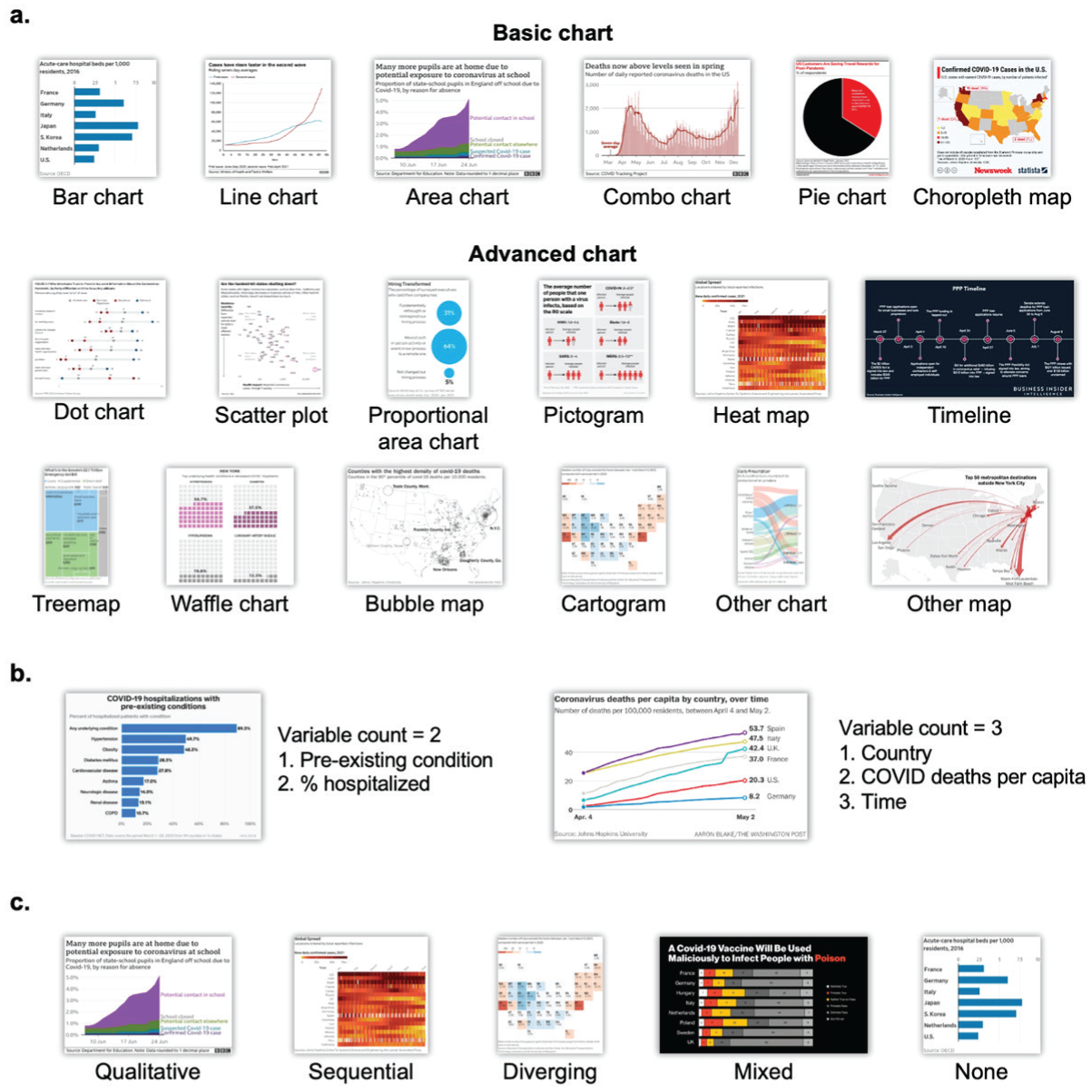
Visual examples of (A) Visualization type, (B) Variable count, and (C) Color palettes.
Computational Visual Analysis of Data Visualizations
Feature Complexity
Two metrics were used. The first was a JPEG file size normalized by image dimensions. Because JPEG compression eliminates redundant information, simpler images generally have smaller file sizes (Peng & Jemmott, 2018; Pieters et al., 2010). The second involved edge detection, an image processing technique that identifies edges, contours, or lines. Edge density, calculated as the ratio of edge pixels to total pixels, reflects the level of feature complexity (Peng & Jemmott, 2018). These two measures (r = .83) were combined after standardization (for additional detail on computational measures, see Supplemental Material, Section 1).
Color Variety
Computers can use the HSV model to represent colors: Hue refers to the actual color (such as red or blue), saturation describes how vivid or muted the color appears, and value captures the brightness. We applied the hue count formula from Ke et al. (2006), which estimates color diversity by counting the number of salient hues in an image.
Amount of Text
This study applied Google’s Optical Character Recognition to identify text in the visuals and measured the amount of text as the number of words recognized.
Manual Coding of Data Visualization Attributes
We manually coded the remaining visualization attributes, including variable count, color palettes, titles, and jargon. Two coders assessed a subsample of 200 visualizations and achieved high intercoder reliability, indicated by Cohen’s Kappa (.96 for variable count, .99 for color palette, .98 for title types, .95 for subtitle presence, and .95 for jargon).
Variable Count
Visual elements that encoded data, such as shape, color, axis position, and shape size, were first identified. These encodings might represent either categorical variables (e.g., country) or numeric variables (e.g., case counts, time). The variable count of a visualization was the total number of variables represented visually in the graph. Figure 3 shows two examples of how variable counts were computed. On average, each chart encoded 2.6 variables (SD = 0.7).
Color Palette
Color palettes were classified into five types (Figure 3): qualitative palettes (43.3% of the sample) used visually distinct hues to separate categories or groups; sequential palettes (19.7%) used shades of a single hue or gradients of two similar colors for ordinal or numeric variables; diverging palettes (3.9%) used two contrasting color gradients that diverge from a midpoint; mixed color palettes (2.7%) used combinations of the color palettes above or rainbow-style schemes; and no color palettes (30.5%).
Title and Subtitle
Title was defined as prominently placed text, typically positioned at the top or bottom of the chart. It was distinguished by a font that was generally more noticeable and prominent than other text elements within the visualization. Titles were coded into three categories: generic titles (76.4% of the sample), which simply mentioned the subject or variables in the visualization (e.g., “Daily national COVID vaccinations”); informative titles (20.2%), which provided an interpretative summary such as describing trends or highlighting comparisons (e.g., “Black Americans significantly trail in COVID vaccinations”); and no titles (3.4%). Subtitle (45.5%) was defined as any accompanying text placed immediately adjacent to the title.
Jargon
Jargon (4.5%) was defined as specialized terms typically used within professional communities but less accessible to the public. This included scientific/medical (e.g., R0, herd immunity) and economic/financial terms (e.g., CPI, IPO).
Control Variables
Visualizations’ subject matter (e.g., COVID cases/trends, public health measures), data source (e.g., U.S. government agencies), and attribution (e.g., news media) were included as control variables. A detailed codebook with examples is included in the Supplemental Material, Section 2, Table S2–S8.
Audience Evaluation of Data Visualizations
Participants and Procedure
In January 2022, this study recruited 1,071 U.S. participants from Amazon Mechanical Turk (MTurk) who met eligibility criteria of an approval rate above 95% and completion of more than 500 prior tasks. Each participant rated eight randomly selected charts. For each chart, participants wrote a brief description of what it depicted and summarized its main message, and then completed the subjective evaluations (Bateman et al., 2010). These open-ended responses ensured engagement with the visualizations and functioned as an attention check by detecting low-quality or bot-like answers, such as irrelevant statements, copied text, or short responses (fewer than two words). After quality checks, 166 participants were removed for providing low-quality responses to more than four visualizations. The final sample consisted of 905 participants (55.4% female; 46.5% Democrats, 26.2% Republicans; mean age = 43.5, SD = 13.3; 13.0% Hispanic, 70.0% non-Hispanic White, 6.9% Black, and 6.5% Asian).
Measures
For each chart, participants indicated their perceptions on seven-point scales (1 = strongly disagree, 7 = strongly agree). For processing fluency, participants indicated whether each graph was difficult to process, took a long time to process, and was difficult to understand (Kostyk et al., 2021) (reverse-coded; α = .95; M = 4.30, SD = 1.88). For aesthetic appeal, participants assessed whether the graph was attractive, was professionally designed, and was visually appealing (α = .91; M = 4.74, SD = 1.41) (A. Lazard & Mackert, 2014). For perceived informativeness, participants indicated whether the chart was informative and whether they learned something new from it (r = .71; α = .83; M = 5.01, SD = 1.35) (Lazard & Mackert, 2014). For credibility, participants assessed whether the graph was accurate, believable, and credible (α = .91; M = 5.07, SD = 1.21; Wanzer et al., 2021).
Results
Multilevel modeling estimated the effects of chart characteristics and individual differences on chart evaluations (Figure 4). Visualizations and participants were treated as random effects. Visualization and individual characteristics were included as fixed effects. The variance inflation factors (VIFs) revealed no substantial collinearity (all VIFs < 3).
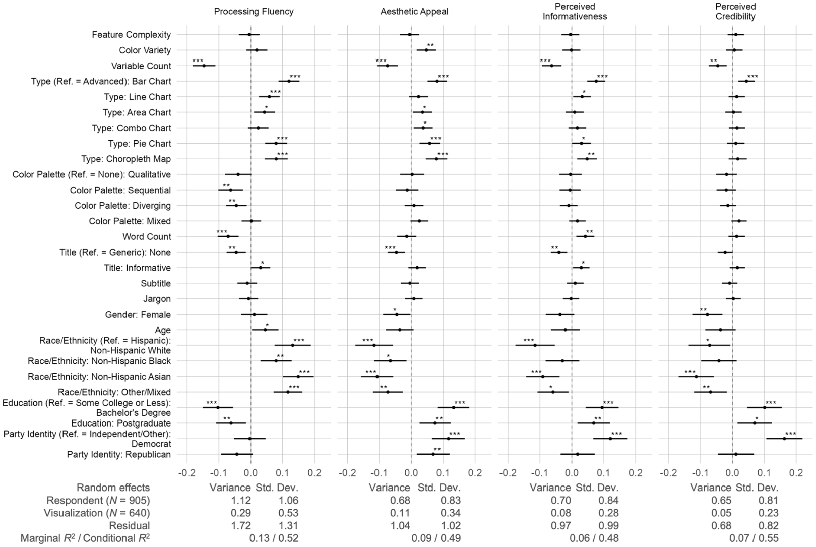
How visualization attributes and individual characteristics predict processing fluency, aesthetic appeal, perceived informativeness, and credibility.
How Visualization Attributes Predict Processing Fluency (RQ1)
Regarding visual complexity, feature complexity and color variety did not show significant effects on processing fluency. Regarding data encoding, variable count showed a negative coefficient (β = −.15, p < .001). Compared to advanced types, most basic chart types yielded higher fluency, including bar charts (β = .12, p < .001), line charts (β = .06, p < .001), area charts (β = .04, p = .011), choropleth maps (β = .08, p < .001), and pie charts (β = .08, p < .001), except combo charts. Regarding color palettes, compared to no palette, sequential (β = −.06, p = .001) and diverging (β = −.05, p = .006) palettes were associated with lower fluency, but qualitative and mixed palettes showed no significant effects.
Regarding text, word count negatively predicted fluency (β = −.07, p < .001). Compared with generic titles, the absence of a title was associated with lower fluency (β = −.05, p = .003), whereas informative titles predicted higher fluency (β = .03, p = .047). However, subtitles and jargon did not yield significant results.
How Visualization Attributes Predict Other Subjective Evaluations
Aesthetic Appeal (RQ2)
First, color variety enhanced aesthetic appeal (β = .05, p = .002), whereas feature complexity did not show effects. Regarding data encoding, variable count negatively predicted aesthetic appeal (β = −.07, p < .001). Compared to advanced charts, bar charts (β = .08, p < .001), area charts (β = .04, p = .022), combo charts (β = .03, p = .013), pie charts (β = .06, p < .001), and choropleth maps (β = .08, p < .001) predicted higher aesthetic appeal, whereas line charts did not. Regarding text, the absence of a title predicted lower aesthetic appeal (β = −.05, p < .001), but other attributes showed no significance.
Perceived Informativeness (RQ3)
The two attributes under the visual complexity dimension did not show significant results. Variable count (β = −.06, p < .001) had a negative association with perceived informativeness. Compared to advanced charts, bar charts (β = .08, p < .001), line charts (β = .03, p = .024), pie charts (β = .03, p = .046), and choropleth maps (β = .05, p = .003) showed significantly higher informativeness. In addition, word count predicted more informativeness (β = .04, p = .003). Compared to generic titles, the absence of titles predicted lower informativeness (β = −.04, p = .003) and informative titles predicted higher informativeness (β = .03, p = .026).
Perceived Credibility (RQ4)
Credibility was generally not shaped by the proposed attributes. Only variable count (β = −.04, p = .001), bar charts (β = .04, p = .001), and no titles (β = −.02, p = .031) showed significant coefficients.
Heterogeneity Among Advanced Visualization Types
Figure 5 displays the average processing fluency scores by visualization type. Overall, more advanced visualization formats, such as scatterplots, treemaps, and heatmaps, received lower processing fluency ratings. Still, several advanced types, including pictograms and waffle charts, achieved relatively higher fluency scores. We conducted follow-up regression analyses comparing advanced chart types against basic chart types as the reference group. The results indicated that three advanced formats—pictograms, waffle charts, and timelines—did not show significant detrimental effects on processing fluency, whereas other advanced formats exhibited lower fluency ratings than basic charts. Figure 5 also presents descriptive patterns for the other evaluation outcomes—aesthetic appeal, perceived informativeness, and perceived credibility—which similarly reveal notable heterogeneity across chart types. Regression analyses examining these differences are reported in the Supplemental Material, Figure S2.
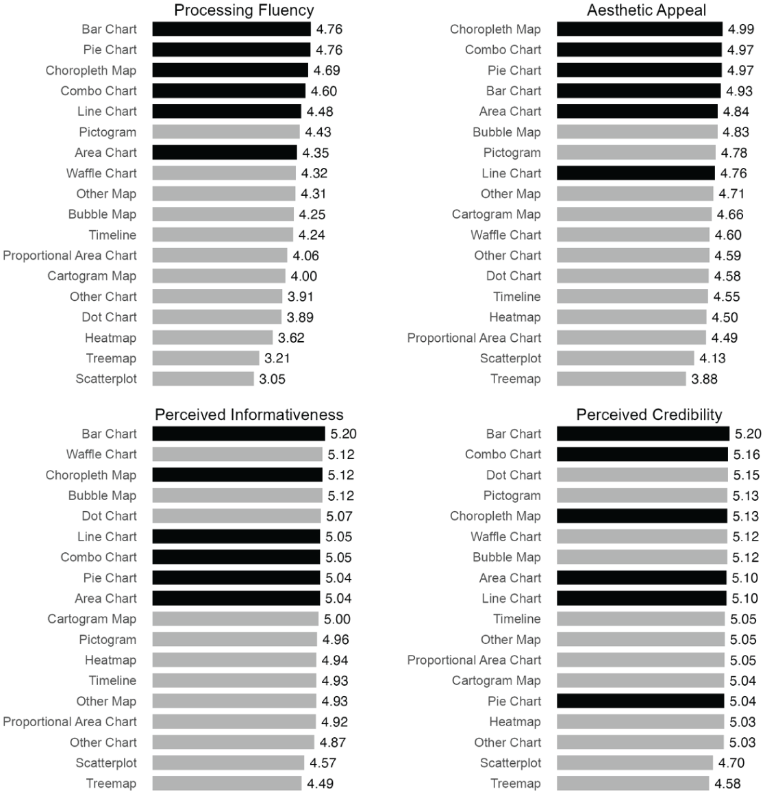
Mean ratings of processing fluency, aesthetic appeal, perceived informativeness, and perceived credibility by visualization type.
Discussion
In summary, this study underscores the importance of data visualization in pandemic communication and applies insights from prior work on visual complexity, developed largely in the context of photos, artworks, and webpages, to the domain of data visualizations (King et al., 2020; Lazard & Mackert, 2014; Nadal et al., 2010; Peng & Jemmott, 2018). It introduces a multidimensional framework that identifies three sources of visualization complexity—visual complexity, data encoding, and textual elements—and shows that factors such as chart type, amount of text, and variable count, rather than visual complexity alone, influence audience responses. Consequently, the study offers practical recommendations to enhance the comprehensibility of data visualizations.
Toward a Multidimensional Understanding of Visualization Complexity
This study emphasizes that visualization complexity should not be considered solely in terms of its visual aspects but also in relation to data encoding and textual elements. First, this study found that visual complexity measures generally had minimal effects and were not strong predictors of processing fluency or related outcomes. Metrics such as edge density and JPEG file size, which predict psychological responses in other visual domains (Peng & Jemmott, 2018; Pieters et al., 2010), proved insufficient for data visualizations. This suggests that data visualizations require more than perceptual parsing, as viewers must also decode structured visual conventions. Traditional complexity metrics, focused on low-level visual properties, fall short by overlooking these higher-order decoding demands.
In comparison, data encodings play a central role in shaping audience responses to visualizations. Factors such as variable count and visualization type are key determinants of visualization complexity, which also have downstream effects on participants’ subjective evaluations. First, as the number of encoded variables increases, participants report lower processing fluency, rate the visualizations as less aesthetically appealing, and perceive them as less credible and less informative. In addition, the visualization type also matters. Compared with basic formats such as bar charts, more advanced charts are generally associated with lower processing fluency. However, some advanced formats, such as pictograms and waffle charts, do not appear to substantially reduce fluency. Overall, visualization complexity stems not from visual elements alone but from how data are mapped to visual forms.
Finally, text contributed to visualization complexity. Informative titles summarizing key patterns improved fluency, whereas greater amounts of text reduced fluency while also predicting higher perceived informativeness. This suggests that more text likely increases processing effort but may also contain richer content, allow for more exploration, and support deeper engagement with the visualization. In this way, a visualization with more text that requires higher cognitive investment may also reward viewers with greater informational value. These findings highlight that the function of text matters: textual guidance that helps viewers interpret a visualization, such as informative titles, can reduce difficulty, while additional explanatory text may involve a trade-off between fluency and informativeness.
Interestingly, jargon did not reduce processing fluency, a surprising result that contrasts with prior research showing negative effects of jargon on comprehension and engagement (Bullock et al., 2019; Shulman et al., 2020). Further inspection of participants’ open-ended responses revealed an important pattern: because much of the jargon in COVID-19 visualizations resembled everyday language, participants often assumed they understood the terms even when they did not. For example, the term “ancestral virus” (i.e., the original form of a virus from which later variants have evolved) was misinterpreted by some participants, who believed it meant that individuals with certain ancestries were more likely to contract variants. Jargon may create a false sense of understanding and lead to misinterpretation.
Implications for Data Visualization Design in Pandemic Communication
This study’s findings offer practical guidance for improving data visualizations in pandemic coverage and crisis communication. First, communicators should carefully consider which data to present. Effective visualizations should prioritize human understanding rather than simply maximizing the amount of data displayed (Correll & Gleicher, 2014). In high-stakes situations where clarity and efficiency are crucial, designers should limit the number of variables shown and prioritize the most essential information. Emphasizing the variables that convey the most critical insights while avoiding unnecessary detail can help prevent confusion and make visualizations easier for audiences to interpret.
In addition, communicators should carefully consider how data are mapped to visual encodings and select visualization types that support clear interpretation. On the one hand, in crisis communication, where rapid and accurate comprehension is critical, simpler and more familiar chart formats should generally be prioritized over complex techniques. On the other hand, data journalists and designers often face the challenge of balancing simplicity with engagement and innovation. Although common charts are easy to interpret, they can also feel conventional and forgettable (Borkin et al., 2013; Wilke, 2019). In such cases, communicators may choose to engage audiences with less cognitively demanding alternative chart designs, such as pictograms. Still, chart types are not interchangeable. Different visualization types carry implicit assumptions about the data (e.g., a line chart implies continuous change over time), and substitutions should only be made when the alternative format is appropriate for other considerations such as data structure and the intended message.
Data communicators should pay close attention to how text is used in visualizations. Titles should clearly state the main takeaway and serve as informative summaries that guide readers’ interpretation of the chart. At the same time, unnecessary explanatory text should be minimized to avoid overwhelming the audience and distracting from the key message. Jargon should be clarified in clear and precise language, rather than assuming audiences will interpret it correctly. Some technical terms may resemble everyday language but carry specific scientific meanings, such as “ancestral virus” or “incubation period.” Without clarification, readers may rely on their intuitive understanding of these familiar-sounding terms and misinterpret the intended meaning.
Finally, although this study focuses on how visualization features influence processing fluency, fluency is not universally beneficial. Difficulty in processing information can sometimes encourage deeper cognitive engagement and more systematic processing (Alter et al., 2007). In contexts where audiences rely heavily on heuristics or hold strong prior beliefs, moderate processing difficulty may prompt individuals to scrutinize information more carefully and reconsider default assumptions. Accordingly, practitioners should consider their communication objectives and audience needs, balancing clarity with opportunities for more effortful engagement when appropriate.
Inequality in the Production of Data Visualizations
This study highlights inequalities in the journalistic production of COVID-19 visualizations. As shown in Figure 2, a small number of outlets, such as The Wall Street Journal, The New York Times, and The Washington Post, dominate production. These elite U.S. publications frequently publish innovative and alternative visualization types, providing in-depth data storytelling that captures the complexity of COVID-19. However, because many of these outlets operate behind paywalls, access is often limited to socioeconomically advantaged audiences. Producing sophisticated visualizations requires substantial skills, infrastructure, and staff (Bisiani et al., 2025), which concentrates data journalism in well-resourced newsrooms and reinforces disparities in access to high-quality data storytelling. These patterns underscore the need to broaden accessibility in data journalism.
Limitations and Future Research
First, the sample of visualizations may not be fully comprehensive. The study focuses only on static visualizations and does not consider interactive ones, which should be a future research direction. Interactivity allows users to explore data dynamically, but it also requires digital literacy, trial and error, and navigation through multiple layers of information, which may substantially influence how complexity is perceived and processed (Greussing et al., 2020; Li et al., 2018). In addition, the dataset is limited to a specific timeframe (January 2020–June 2021), the COVID-19 context, and English-language outlets popular in the United States, which constrains the generalizability of findings to other crisis contexts, time periods, and media systems. Examining visualization practices in other crises and the post-pandemic period could provide further insights into how visualization design and communication strategies have evolved. Moreover, because this study adopted a maximum variance sampling strategy to curate diverse visualization types, the audience perception study is not intended to represent the distribution of chart formats in pandemic media coverage. Instead, the chart type comparisons reflect differences among the diverse visualization formats included in the curated dataset.
In addition, our framework provides a roadmap for future research to incorporate additional visual attributes, but the proposed list is not exhaustive. For example, regarding data encoding, design choices in visualizations, such as double-axis charts or misaligned legends (Wilke, 2019), may make data encoding less intuitive and increase cognitive load. In terms of text, factors such as explanatory text, text readability, and statistical concepts may also be important directions for future research.
This research relies on crowdsourced workers from Amazon MTurk, who may not represent the general population. MTurk participants often have higher education levels and stronger digital experience (Hargittai & Shaw, 2020). Yet, even within this relatively experienced sample, participants struggled to interpret more complex or novel visualizations, suggesting that education and digital experience do not necessarily correspond to strong visualization literacy. Future research can examine how individual differences, such as visualization literacy and numeracy, shape chart comprehension and engagement (S. Lee et al., 2019). These variables may moderate the effects of visual attributes, as some individuals may be more familiar with advanced visualization types or better able to process complex graphics.
A future direction is to develop computational measures for variables that were manually coded in this study. Advances in visual language models may enable automated coding of complex features such as chart types and variable counts (Alexander et al., 2024; Liu et al., 2026; Peng et al., 2024). These tools could improve the scalability and speed of analysis for large datasets. They may also enable real-time evaluation of chart characteristics and provide practitioners with feedback to refine visualization design and improve audience perceptions.
Supplemental Material
sj-docx-1-scx-10.1177_10755470261460330 – Supplemental material for What Makes COVID-19 Charts Understandable? A Visualization Complexity Framework for Evaluating Data Visualizations in Pandemic Media Coverage
Supplemental material, sj-docx-1-scx-10.1177_10755470261460330 for What Makes COVID-19 Charts Understandable? A Visualization Complexity Framework for Evaluating Data Visualizations in Pandemic Media Coverage by Yilang Peng in Science Communication
Footnotes

Funding
The authors disclosed receipt of the following financial support for the research, authorship, and/or publication of this article: This work was supported by the National Science Foundation (CNS-2150723).
Declaration of Conflicting Interests
The authors declared no potential conflicts of interest with respect to the research, authorship, and/or publication of this article.
Author Biography
References
Supplementary Material
Please find the following supplemental material available below.
For Open Access articles published under a Creative Commons License, all supplemental material carries the same license as the article it is associated with.
For non-Open Access articles published, all supplemental material carries a non-exclusive license, and permission requests for re-use of supplemental material or any part of supplemental material shall be sent directly to the copyright owner as specified in the copyright notice associated with the article.
