






Abstract
This article examines the praise and controversy that a change in color to the façade of the Główny railway station in Wrocław, Poland, provoked during 2010–2012. Ethnographically following the definitions and makings of a “historical” color during the reconstruction process, it pinpoints two contrasting and conflicting ways of valuing and devaluing historicity: the “scientifically accurate” historicity versus the “familiar” one. Examining urban experts’ practices of valuating the historicity of this building, the valuation devices urban experts relied upon, and the versions of historicities they consequentially produced, this article shows that the “good” of historicity is not a given but is discovered and learned about by various actors during the very activities that constitute valuation.
Introduction
“Suppose I were to begin by saying that I had fallen in love with a color. . . It began slowly. An appreciation, an affinity. Then, one day, it became more serious,” writes Maggie Nelson in her novel, Bluets (2009, p. 1). Suppose I were to begin my story with a color, too. To be more accurate, I begin my story with the historicity of a color—a matter that occupied the inhabitants of the Polish city of Wrocław during the years 2010–2012.
During those years, a peculiar controversy arose among art historians, architects, city officials, and inhabitants of Wrocław. In that period, Wrocław Główny—the city’s railway station—underwent a dramatic historical reconstruction. Painted light beige for as long as the city’s inhabitants had experienced the building, that is, since the annexation of the German city of Breslau to Poland in 1945, Wrocław Główny acquired a new exterior color—bright ochre. Composed of varying proportions of oxygen, hydrogen, and iron in nature, ochre tints can vary from light yellow to red to brown (Barnett et al., 2006). Found as clay in caves around the globe, the color ochre arrived in the Prussian Empire and moved to the reconstructed Wrocław Główny in recently independent Poland as a shade of orange (Figure 1).
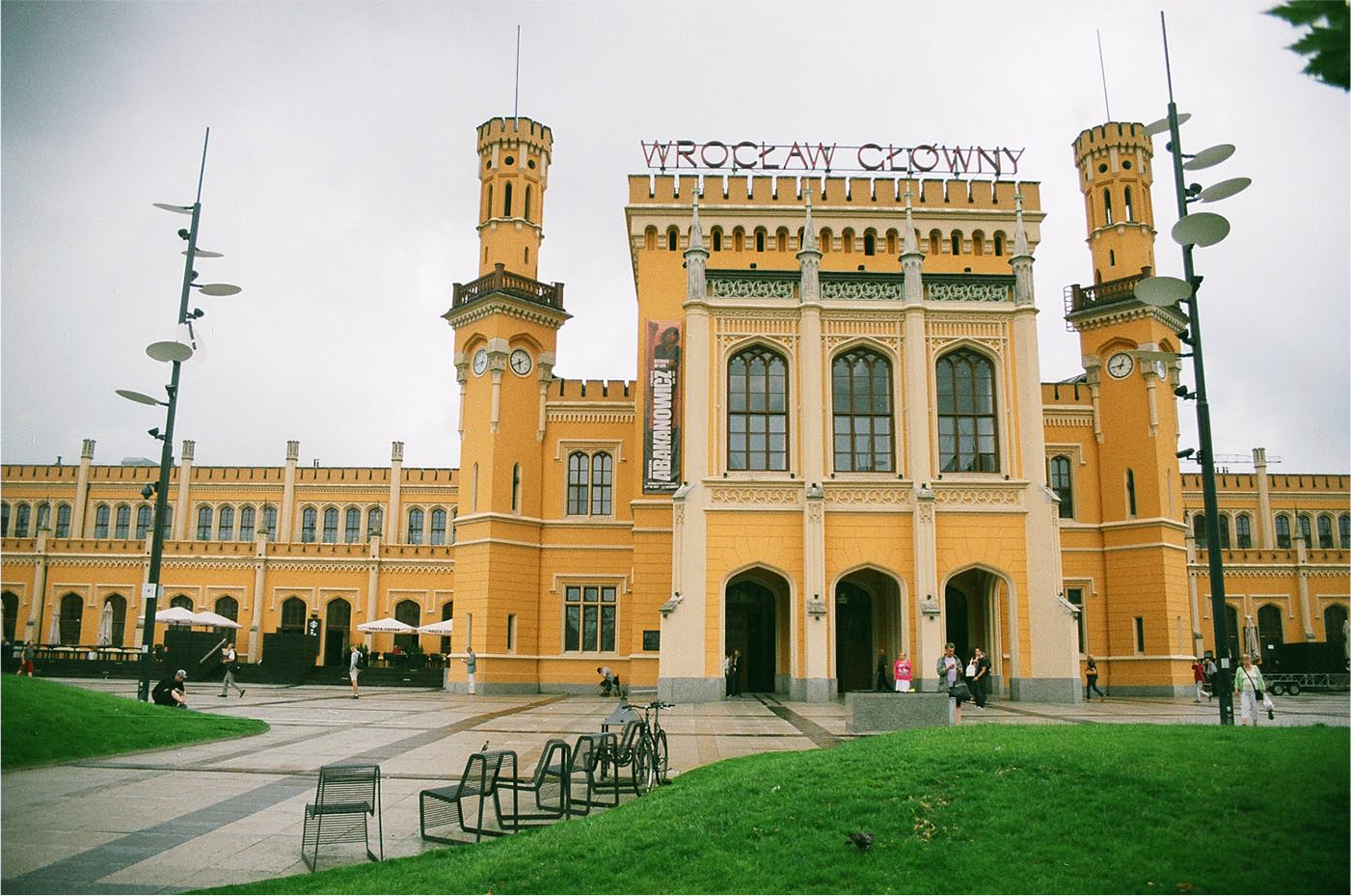
Wrocław Główny after the reconstruction, 2016, Wroclaw.
The transformation of the color of the façade was initially imbued with a rhetoric of historicity. “It is the scientifically accurate historical color,” art historians, architects, and activists emphasized, but the reactions to the change in color unsettled the “good” of scientific accuracy. What urban experts, as well as ordinary inhabitants, underlined was the too bright quality of the freshly painted ochre. Irritated by the bright coloring of the exterior, critics of the aesthetic transformation relied upon their shared experience of the building as light beige, on their memories of the building, and on their imaginary of how the urban palette of European cities looks and feels. “European cities were never so colorful,” lines from newspapers and petitions shared on Facebook stated (TuWrocław, 2011). The scientifically accurate ochre came under severe public scrutiny, but the division of public reception into supporters and critics of the ochre façade did not emerge from a division between lay and expert knowledges. Something else was feeding the controversial reactions toward the orange of the façade.
As I will show in this article, tension between different ways of valuating resulted in a lack of agreement regarding the change in color of Wrocław Główny. Two particular ways of valuating the historicity of the building coexisted. The first praised the “good” of scientific accuracy: it operated using evidence, documents, and stratigraphic examinations as major valuation devices. This method of valuating historicity is commonly accepted as conventional in the field of conservation (Muñoz-Viñas, 2005). The second way endorsed the “good” of familiarity: it relied on what was known to, convenient for, and sensorially accepted by the city’s residents. The first way of valuating required the building to be painted ochre. The second way conferred value on the familiar light beige color. The choice between two colors and two ways of valuating historicity needed to be made.
Research on issues of historicity and aesthetic transformations takes historicity as an “imported meaning” (Koshar, 2000), “sacred surplus” (Meyer & de Witte, 2013), and already possessing the necessary power to persuade various actors of its special status, but there is a problem with this line of research: scholars describe the “good” of historicity as possessing a taken-for-granted character. For example, in their study of the conservation of Glasgow Cathedral, Jones and Yarrow (2013, p. 6) state that conservation policies “contain [values that] radically underdetermine the specific interventions that may emerge in response to any given situation.” While they critically examine how people with different forms of expertise enacted the object of conservation differently and, as a consequence, justified what is a “good intervention” in divergent ways, Jones and Yarrow describe the situation of valuation as one in which all actors agree upon the highest value to which they aspire—authenticity—with authenticity meaning “something which is done ‘for the future’ or on behalf of ‘future generations’” (DeSilvey & Harrison, 2020, p. 2). In other words, the making of historicity is seen as “a complex activity [that] may involve many different professionals from many different fields working towards the same goal” (Muñoz-Viñas, 2005, p. 9 [my emphasis]).
Stories like the one I examine here reveal a striking lack of certainty among urban experts in Wrocław regarding both how to valuate historicity and the goal of doing so with reference to one of the city’s most iconic buildings. The experts asked: “What is more important, evidence from the ages or a collective habit?” A city conservator named Hanna
1
described it, thus, in a personal interview: Two things could have been done: either acknowledge somehow this public habit, the fact that the people are used to the [old] color and accept it, or follow conservation rules strictly. All the issues were considered by the conservator. That conservator did the latter, another [person] would have done something else.
This quote suggests that “familiar” historicity was taken no less seriously by urban experts involved in the decision-making process than the “scientifically accurate” one. Yet, the question remains: How did the valuation and devaluation of historicity unfold so that the ochre color ended up covering the façade of the building—against resistance from many architects, art historians, and city residents?
This question opens terrain for the study of something that remains unspecified in the body of literature concerning historicity, conservation, and valuation—the composition of both “subjectivity and objectivity as considered with respect to knowledge-making” (Shapin, 2012, p. 171). In other words, it foregrounds how scientific accuracy meets with aesthetic preferences and the situated sensorial practices accompanying the valuation of historicity. In this article, I, thus, follow Steven Shapin’s call for “ethnographies—contemporary and historical—of how taste judgments come to be formed, discussed, and sometimes shared” (p. 177). Along with other scholars who approach matters of conservation and historical reconstructions with an anthropological eye (Dimova, 2013, 2019; Dominguez Rubio, 2014; Herzfeld, 2009; Jones & Yarrow, 2013; MacDonald, 2009, 2013; Meyer & De Witte, 2013; van de Port & Meyer, 2018; Sezneva, 2013; Yarrow, 2019), I look at the activities of valuation and devaluation of historicity, how these activities unfold materially, and how “different visions of ‘the good’ are at stake in a range of dilemmas about what should be kept and why” (Yarrow, 2019, p. 5). However, I propose a different vision of historicity from the one common in this emerging field of research.
This vision is afforded to me by lens of valuation. Valuation “engages persons, in their bodily existence, in a world of things” (Boltanski & Thévenot, 2006, p. 131), in their resistances, and their surprises (Yaneva, 2008). To clarify my understanding of valuation, I turn to Heuts and Mol’s (2013) concept of valuation in practice. Valuation in practice contains a concept of “good” at its core, a “good” that is created in “adaptive, tinkering and open-ended efforts” (Heuts & Mol, 2013, p. 130). Using this concept allows me to address the historicity beyond a conceptualization of it as a value, the “good” of which is defined a priori as “a coherent givenness of [a] seemingly self-evident ‘thing’” (Jacobs, 2006, p. 3). Instead, the valuation of historicity in practice shows that, by employing different techniques of sensing, tasting, knowing, and not-knowing, urban experts explore the various “goods” of historicity, which, consequentially, allows them to “do” different versions of historicity, but before turning to the examination of such activities, however, I propose addressing the question of the relationship between historicity and the color ochre.
Historicity and Color
Historicity and color do not make an easy match. On the one hand, historicity is expected to recount the stories of changing objects. The sign of such changes—aging—is a “part of the object itself, and without [it], the object would be a different thing” (Muñoz-Viñas, 2005, p. 5), an artificially updated thing that arrests transformation (Lowenthal, 1985). Fading color is one such transformation. It “confer[s] a sense of authenticity and age” (DeSilvey & Harrison, 2020, p. 3) those of, for instance, a degrading building (Dehio & Riegl, 1988).
But fading introduces other “goods” too. Douglas-Jones et al. (2016), for example, demonstrate beautifully how, in some instances, changes in the color of a building due to weathering and material decay of its façades “create [an] aesthetically pleasing ‘character,’ ‘patina,’ and ‘ruination’” (Douglas-Jones et al., 2016, p. 831). As a result, color contributes to the ways in which a building’s form, structure, and visual appeal are experienced (Eiler, 1959). The color becomes inseparable from the other properties of the “big thing” (Jacobs, 2006).
However desirable it may be as “partial loss” and “curated decay” (DeSilvey, 2006, 2017; DeSilvey & Harrison, 2020), fading color can trouble historicity. How does this occur? A fresh color, contrary to a fading one, has one significant privilege: it supports the idea that historicity is an effect of the hard work (Lowenthal, 1992) of various professionals searching for the “truth” about the building (Muñoz-Viñas, 2005), in this case, searching for the “true” color. As an expression of the work performed by these professionals, the color covers the surface of the building evenly and is expected to express an authentic hue. Freshly painted color shows that the work required for conservation of historic objects is displayable.
Thus, historicity and color do not make an easy match, but bringing attention to the colorfulness of historicity teaches us a number of insights about the value. First, historicity possesses “thingness.” This means that valuations of historicity rely on the measurements of “attributes inherent in the material fabric” (Jones, 2010, p. 182), and it is in the interactions among different matters and valuating bodies that the making of historicity happens (Griswold et al., 2013, p. 344). Second, historicity is unstable, and it requires interventions and updates (Dominguez Rubio, 2016). The colorful qualities of historic buildings reveal that there are “stakes involved in keeping them that way” (Rose-Greenland, 2016, p. 82), and that making historical things colorful is an achievement, an act of labor (Foster & Jones, 2019; Jones & Yarrow, 2013; Lyon 2012). Third, we learn that a particular version of historicity can act as an object of shared attachment (Rose-Greenland, 2016). A change in the historical color makes it obvious: transformations that take place under the slogan of searching for “true” historicity do not always go smoothly. People can become attached to particular properties of buildings, and breaking such attachment results in discomfort and disappointment. This last aspect is something that I want to clarify and explore here.
To say that people can be attached to the color is not only to explore the meanings of the color, that is, the “personal and communal sentiments, and strong group affiliations” (Archer & Stent, 2011, p. 118) that the color expresses or contains. The color also enables particular bodily behaviors or prevents them (Slack & Hristova, 2017; Zubrzycki, 2011); it conceals some things while accentuating others (Fehérváry, 2013; Sur, 2017) and allows for the building of relationships with a wide-ranging set of objects (Krivý, 2015). Overall, the color can act as a “thing,” and, in this capacity, it assembles people and objects in a tight configuration.
The power of this tight assembly between the color of the building and the objects and bodies surrounding it can be well illustrated with a concept of familiarity developed by Thévenot (2007). As Thévenot shows, familiarity is a particular way of engaging with the environment. The “good” that such an engagement generates is “feeling at ease” (Thévenot, 2007, p. 417). To feel at ease is not a given: it involves “a tight union between bodily gestures and an environment” (Thévenot, 2001, p. 8), one which is trained and developed. Being familiar with the color of the building is just one example of engagement. To familiarize oneself with the color is to attune oneself to it bodily: to become closer to it, to allow oneself to be affected and moved by it (Hennion, 2017), and to explore it aesthetically (Strati, 2003). The colors of façades ask for multisensorial engagements (Marks, 1978), “total bodily activity” (Taussig, 2009, p. 6), from the people who act as viewers (Tait & White, 2009).
Thévenot treats familiarity as a personalized “good.” Yet, the urban experts and inhabitants of Wrocław make it obvious that being familiar constitutes a collective engagement with the color of the building, and this stance informed valuation practices in the conservation field. This is the step that I take in order to frame historicity in a new light. I treat familiarity as an activity of valuation, with its own “goods,” devices, and ways of seeing and focusing attention (Grasseni, 2004). In the following sections, I, therefore, introduce the case of the reconstruction of Wrocław Główny in order to explore discoveries and adaptations of various “goods” of its historicity that occurred during the reconstruction. But before doing so, I outline the changes that the building went through before and after the annexation of the city of Breslau from Germany to Poland and the fieldwork that I conducted in order to explore the controversy over ochre as a color.
(Non)historical Reconstruction and Fieldwork
Before the 2010–2012 reconstruction, Wrocław Główny was described as a building that was “‘rundown’, ‘dirty’, and ‘unattractive’ to city residents and tourists,” according to what art historians and architects told me during personal interviews. The impending European Football Championship of 2012 became the trigger that motivated the building’s owner, the Polish State Railway (PKP) company, to seek out resources to invest in the reconstruction project. The project was officially called “The Historical Reconstruction (odtworzenia) of Wrocław Główny Together with the Rebuilding of Railway Infrastructure,” but this did not mark the first time the building underwent a significant change.
Built between 1855 and 1857 by the Royal Prussian architect Wilhelm Grapow in neo-Gothic style, the station, called Breslau Bahnhof, experienced a number of drastic transformations in the ensuing period. During the period from 1895 to 1907, the station was extended, with construction this time in the Art Nouveau style, in preparation for the city of Breslau receiving an official visit from Prussian Emperor Wilhelm II. In the 1930s, an air raid shelter was built underneath the station, which served as a hospital during World War II. In 1945, the city, along with most of Silesia, was annexed from Germany to socialist Poland, and the station was renamed Wrocław Główny. The city’s new inhabitants—forcibly repopulated Poles—faced the need to structurally repair the damaged built environment (Thum, 2011), including the station, a process which lasted until the 1950s. In line with those repairs, in the 1960s, the interiors of the station were repainted (Figure 2); neon signs were installed all over the station and on the street opposite the main entrance (Figure 3); and the railway platforms were repaired. An example of ideologically devalued “German” architecture (Thum, 2011), the station was registered as a historical monument in the category of industrial/technical heritage (dziedzina przemyslu/techniki) in 1966. According to an assessment by the historian Stanislaw Jablonski in 1997—in independent Poland—the station is “the largest platform hall in Poland and one of the most impressive and original works of Romanticist architecture in Europe.” 2
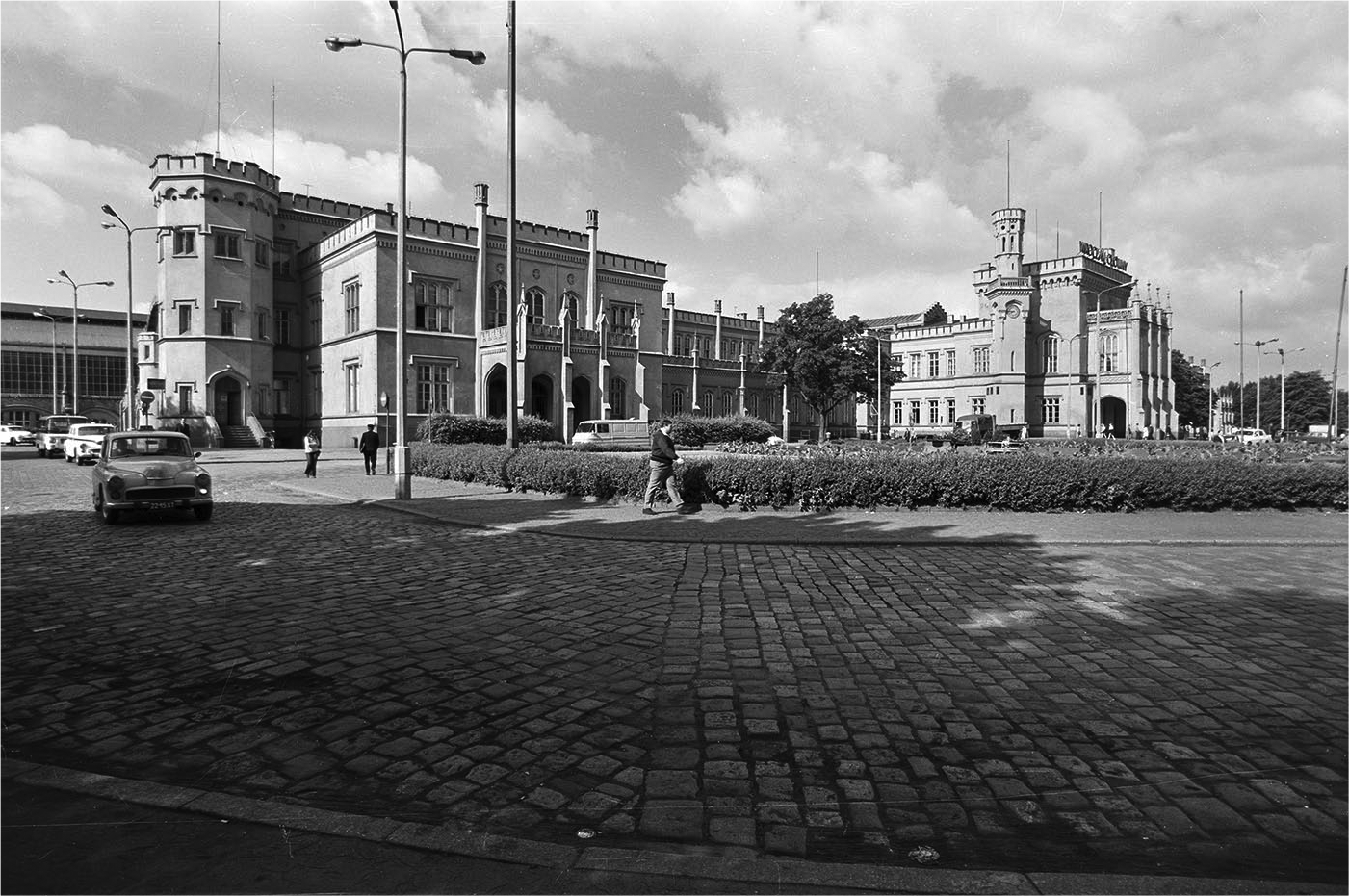
Wrocław Główny, 1970s.
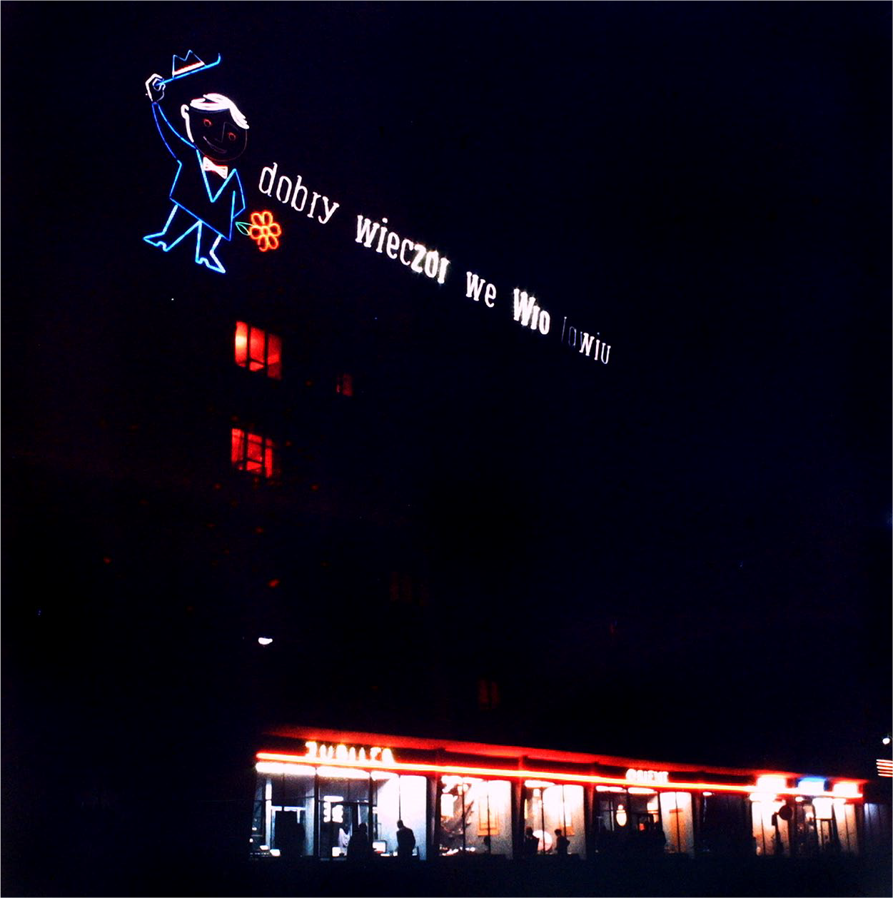
Wrocław Główny’s neon signs, 1970s.
The reconstruction that took place during 2010–2012 was funded by European Union funds dedicated to heritage protection as part of the Infrastructure and Environment Program and by the Polish State Railway itself. The cost was approximately zł380 million, nearly €88 million, and it covered the listed changes: the public square in front of the building was redesigned to accommodate pedestrians and visitors, underground parking was built, and the platforms were modernized. As a result of numerous sessions regarding the reconstruction, the period of the extension (1895–1907) in Art Nouveau style was declared a priority by the participants of the project.
Reactions to the reconstruction of Wrocław Główny varied. On the one hand, the project received several honors, such as a Eurobuild Award 2012 in the category of Regeneration Award Poland. In addition, the project was acknowledged at the annual Beautiful Wrocław competition and received recognition in a competition organized by the Heritage Conservation Office of Lower Silesian Voivodeship in 2013. On the other hand, experts on urban historical conservation and architecture and city residents held critical opinions of the reconstructed building, in particular, of its color transformation.
The reconstruction project was carried out by a number of subcontractors, the valuation activities of which contribute to my argument in this article. The first of these is Grupa5, an architectural firm from Warsaw, which did not participate in my empirical research, but the initial design proposals of which were examined for this article. The second set of subcontractors, the valuations of which influence my argument, were Castellum and Restoart, firms that served as conservation advisors on the project, represented by two art historians, Jola and Jacub. Jola and Jacub’s voices and valuation activities were crucial to the reconstruction project: they participated in assessments of evidence and documents related to conservation procedures, and they oversaw construction workers’ activities on site. The third subcontractor was Budimex, a construction company represented in the article by David, the company manager. In contradistinction to Jola and Jacub, David interacted with the building not as an object of conservation but as a technological object requiring modernization, which consequentially diversified the valuation activities he conducted at the site. He supervised the activities of construction workers and engineers, and also communicated and coordinated tasks with the project’s architects. Jola, Jacub, and David, thus, represent a broad range of actors who were involved in the reconstruction project.
I conducted in-depth interviews with all three and go-alongs with Jola and Jacub. I also conducted semi-structured interviews accompanied by photo elicitations with 30 urban experts—10 architects and planners, 10 activists, and 10 city officials—on their vision for the reconstruction and their views of the most and least attractive architecture in the city. Though their voices do not comprise the central argument of the study, I conducted the interviews to understand the place Wrocław Główny and German-period architecture in general hold in the aesthetic preferences of the city’s urban experts. I also performed document analysis of media coverage of the reconstruction and archival research concerning the valuations that the building underwent prior to 2010–2012. I conducted research during three visits to Wrocław from 2017 to 2019, comprising a total of 5 months of fieldwork.
Go-alongs (Kusenbach, 2003) were particularly significant for the study. Employing this method revealed that buildings not only “substitute or embody abstract ideas” (Zubrzycki, 2017, p. 4), such as nationhood (MacDonald, 2009) or “good urbanism” (Gastrow, 2017; Sur, 2017), but they also shape and direct gazes (Foucault, 1975) and organize practices and flows of bodies (Yaneva, 2017). My go-alongs in and around the station lasted from 2 hours to 6 hours and included audio and video recording, and photo taking. These walks functioned as multisensorial praxeological (Mol, 2002) tools, allowing me to observe how urban experts engaged with different matters and spaces: in particular, how “things” were discovered, looked at, touched, learned about, and documented, and how “the building [was] ‘brought to life’” during the reconstruction by means of the various tools, crafts, and movements upon which urban experts relied (Strebel, 2011, p. 244). In what follows, the valuation and devaluation of the building’s competing historicities are examined.
How Does a Color Become Historical?
In order to understand the color transformation—and the affection, attachment, hatred, and annoyance it brought to the surface—we need to return to the 1930s, when the railway station’s façade was light beige. At that time, two significant changes to the building took place: first, the air raid shelter was constructed; second, pieces of plaster on the exterior were filled and patched, concealing the plaster that had covered the building since the 1850s. Due to this change, up until 2010, city residents, art historians, and conservation professionals had assumed that light beige was the façade’s original color. This, in turn, affected how the color entered the architects’ reconstruction design, which aimed to bring to life a freshly painted light beige building (Figure 4).
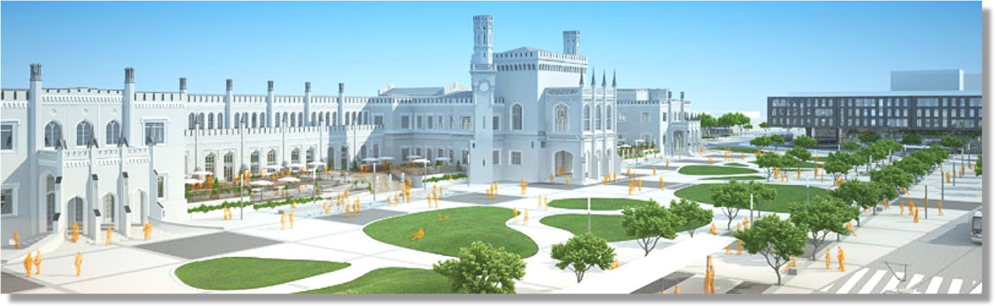
Grupa5’s design for Wrocław Główny, 2011.
Grupa5’s design designated the air raid shelter for demolition to free up space for underground parking. Budimex acquired 10 tons of ammonite: the bunker’s ceiling was 1.6 meters and its walls 3 meters thick. A group of construction workers David managed installed the explosives. When the dust settled after the explosion, the workers discovered an unfamiliar element: plaster not coated in light beige paint. Thus, the explosion’s witnesses uncovered ochre paint.
Art historians labeled the ochre’s appearance a “discovery.” They uncovered plaster with remains of orange paint, but it was not yet a historical color. What the workers saw, and what Jola later documented in the conservation diary with photographs, was only assumed-to-be-historical. To understand what an “assumed-to-be-historical” color is, we need to enter one of the railway station’s rooms, on a day in late 2011, where a group of art historians had gathered to scrape paint off wooden planks with varnish and oil paint on them. While scraping, they cut fragments out of the planks. Jacub, their supervisor, explained to me that it was important to cut evenly. “What does that mean?” I asked. He replied: “This technique shows which layer is on top of which. You cut evenly and later it is numbered. . .in the documentation and later you can study this color.” The art historians сleaned the plank, cut out fragments, and photographed the colors disclosed by scraping.
The art historians were cleaning from the wooden planks the layers of paint with which the station was covered since the building’s renovation in the 1960s. Using a spatula, tweezers, and scalpels, these art historians carefully turned fragments of touch-up paint from the socialist period repair into matters unspecified in conservation diaries. In the case of the façade of the building, the revealed color of ochre was scraped off, numbered, and photographed—documented. Still, documentation did not mean the art historians agreed upon the status of its historicity. They still were haunted by the question: “Was it the exterior’s ‘true historical color’?” My question was: “What, after all, is a historical color?”
To answer the first question, the art historians visited several archives in Wrocław. Jacub was lucky: he found some postcards, one of which he brought to our interview, proudly depicting the ochre station. My research assistant, Jolanta, asked him: “Why was this material—a colorful postcard—not enough to make a decision to paint the façades orange”? “These postcards appear to be colored. So, there is always the risk that this is,” he was silent for a few seconds, “well, that someone made up those colors and that they are not what they used to be in reality.” Jacub also found a few photographs of the railway station, though in black and white. He wrote an email to the Grupa5 architects, stating that it is possible to find out what color the building was before the 1930s, if they order a procedure that allows one to see how the photos would look in color. David recalled that the architects rejected Jacub’s idea. Coloring the black-and-white photographs was considered an unnecessary expense.
Even though Jacub had the postcard documentation that might have been used to “prove” the historical accuracy of the ochre color, the colors on the postcards were not considered persuasive enough to make a decision regarding the historical color. In the absence of “trustworthy” knowledge about the building, the art historians opted for a cultural interpretation. Their argument was that it is not enough to discover ochre as a material fact. Situating it within a broader cultural framework was essential. “What does it mean that the exterior was painted so bright? Should we tone it down a little?” Jacub recalled discussions he had with colleagues. They thought the bright color might have been a necessity for a private railway station located on the outskirts of the city in a wild, green area at the time of its construction, which needed to attract customers.
While the postcards found in archives were not convincing enough for the art historians, the discovery of surprising matter in the shade of ochre, together with retrospective speculations on its significance to the original architect, possessed persuasive power regarding repainting the façades. Together, these factors framed the final decision: the building should be painted ochre. The city conservator, Katarzyna Hawrylak-Brzezowska, gave voice to it. In an interview with the city newspaper, she stated: Our role is to restore the original shape to the station, because the renovation is financed from the monument protection fund. It is the result of a conscious reconstruction. We could not be guided by the desire to meet universal wishes, but only by scientific criteria. And although it may be shocking, it has the chance to become a model solution. (Wrocław Naszemiasto, 2011, emphasis mine)
Yet, there was more to the decision: What paint should one use?
This brings us to how art historians valuate a historical color. A color is a layer, but a layer of a peculiar kind, one that needs constant refreshing in order to be visually separated from other layers. I asked Jola why she keeps referring to ochre as the historical color. Her response was: Historical colors are the ones found as the foundation for other colors that conceal the one that is believed to be the deepest layer. Historical colors can be renovated and refreshed, so to say, with historical paints. Materials that imitate the historic ones or are similar to them historic are also in the ingredients, but they are more durable. [than the original paint]
Thus, in art historians’ practice, historical color as a layer comprises the pigments resembling or “mimicking” the ones used in paints that previously covered the exterior walls. Historical pigments are believed to be durable, saturated, but more than that, they are more expensive to produce than non-historical pigments.
Before choosing the “correct” shade for the historical color, architects and art historians tested two shades of ochre. Both shades were applied to the eastern wall of the building. Though my research participants did not remember who chose the final shade and how, it was clear from interviews that aesthetic preference ruled, and the lighter shade was chosen. To make the color historical, urban experts ordered a mineral paint, shade NCS S 2050-Y30R, made by Keim, a German company. They researched the company’s history beforehand. Jacub explained, “[Keim] has good recipes, worked out already in the 19th century, and their samples are based on the original coloring of historical buildings and their paints allow the walls to breath.” Thus, the historical color relies on the qualities of paint produced by a company “with history and good recipes.” Keim’s mineral paints possessed a quality, in which art historians were particularly interested. As Keim’s official website states, mineral paints receive their color from “fine and extremely chromophoric powders. . .and their mineral pigments are extremely color resistant and do not fade.”
The “scientifically accurate” historical color was expected to resist urban dust, rain, and sunlight. Its fading was undesirable, seen as preventing the reconstruction project from being a “model solution,” in Hawrylak-Brzezowska’s words, from being an object that constitutes evidence of the conservation professionals’ work, as well as a reminder of the change and intervention that occurred during 2010–2012.
The Mad, the Real, and the Familiar
I was walking with Małgorzata, an official employed by Wrocław’s Economic Development office, when we suddenly turned away from the station. When I asked why, Małgorzata said she sometimes prefers to avoid seeing the building. “It hurts me,” she said facing the socialist period mass housing across from the station. “And now?” I asked. She said: Not anymore. I am used to it now, but still prefer [to take] other routes if I can. You know, when something hurts, but you get used to it, then you can pay more attention to it. The color shocked me in the beginning, but I decided to get used to it, I can look at it now.
Małgorzata was not the only urban expert in the city upset by the intense shade of ochre. Martyna, an activist who works with artists and art historians, felt similarly: I think it’s too strong. It doesn’t go well with the rest of the space. I think it could be. . .that it falls under such a Polish, maybe not only Polish, just such a Euroremont vision, it is too strong. With Euroremont, houses from the eighties are painted bright green or canary. But we do not have these colors in such quantities in nature.
Both Małgorzata and Martyna pinpointed a peculiar quality of the saturated ochre: its misfit with the surrounding built environment. By calling the station’s historical color “Euroremont”—post-Soviet neologism referring to renovations that cosmetically conceal standardized designs with the help of cheap materials imported from Europe—Martyna situated the project in relation to the common practice of repainting architecture from the state socialist period in bright colors to freshen them up and differentiate it from the socialist period landscape described as ordinary and grey (Hirt, 2013). In Małgorzata’s and Martyna’s accounts, the historical color is more than a building’s feature. Its brightness penetrates people’s bodies and choices of walking routes; it either becomes familiar and not-so-painful or remains bothersome and distracting.
How did Wrocław’s urban experts deal with the “shock” of ochre? For the city conservator and art historians, it became a matter of concern. The city conservator stated in an interview, “At the time the building was being built, intense colors dominated in Europe. The cities were colorful” (Wrocław Naszemiasto, 2011). In the same article, Janusz Dobesz, an art historian and professor in Wrocław’s Polytechnic University’s architecture department, agreed with her: That’s what these buildings looked like centuries ago. We have to accept that, just as we mistakenly interpreted the appearance of ancient sculptures, our ideas of the nineteenth century are also unreal. Back then, cities were colorful, and that is how our station will be.
According to Dobesz, the familiar image of European cities coated in “mild” colors is simply “unreal,” while colorfulness offers inhabitants a realistic image of European cities. Asked what the historical color of Wrocław Główny was, the city conservator and Dobesz redirected residents’ attention to a different question: How did European cities look?
In the case of Wrocław Główny, the “good” of the “scientifically accurate” historicity of the ochre was meaningless and even disturbing for many critics of the color transformation. The city conservator summed up residents’ reactions: “scientifically legitimized colorful madness.” Aleksander, an architect who worked and lived in Wrocław, told me he was strongly against the orange color. “Why don’t you like it”? I asked. Aleksander replied: I remember this station as light-grey. I am a fan of this color. I was addicted to it. You always have two possibilities for [updating]. . . according to your feelings or according to history [my emphasis]. I think people’s memories are more important. They say that European cities used to be so colorful. Yes, but these colors matched more at the beginning of the 20th century. Everything was connected to these colors, the clothes, and the horses. Everything was close to this color palette. [But] colors should not take our memories away.
Acknowledging his personal preference for—even addiction to—the familiarity of the former color, Aleksander emphasized that this stems from his memory of the building. For him, transforming the façades’ color is more than a question of a proper conservation. It is also a question of valuation that divides color choice into two approaches: scientific accuracy (“according to history”) and aesthetic familiarity (“according to your feelings”). What was interesting in our short conversation was Alexander’s resistance to the art historians’ belief in “a colorful European city.” In his opinion as an architect, this belief does not accommodate the importance of temporality—styles change, materials change, dress changes. Contemporary urban palettes should resist the temptation to adjust to the colors of the past. In his valuation of the color, Aleksander relied upon a panoramic vision: a color can fit or not fit the surrounding built environment, and it can irritate viewers.
The disturbing quality of the “too bright” ochre also acquired significance among the participants in the reconstruction project. Jacub and several other art historians agreed with the common criticism of the newly painted façade. However, they emphasized that everyday dirt and dust and wear and tear would make it “more real” and “less irritating.” In other words, the historical ochre still needed “to get dusty.” Jacub explained: “One needs to wait a year or two, and then this ideal, perfect color will tone down, become more realistic, it will acquire the character it’s supposed to have. That’s why too bright is not a problem.” While according to the scientific accuracy approach, the “real” color is bright and saturated, for Jacub its “too perfect” historicity needed to fade. Dust and time would perform the necessary aesthetic work. This, thus, is a version of historicity different from the “scientifically accurate” one. It prioritizes familiarity over scientific evidence, such that the historical color is the familiar one. It considers the viewers’ bodies, their sensorial reactions, and aesthetic relations—fit or lack thereof—between the building in question and its surrounding objects. Even though this version of historicity was not pursued, it still informed and affected those art historians who waited for the saturated ochre color to fade and acquire “realness.”
Coherence and Patchwork
During a walk around the station, Jola described the color as capable or incapable of making the building a totality: The exterior’s coloring was chosen without attention to the platforms’ color, so, unfortunately. . .because of this. . .these actions were very incoherent and it often ended up in such. . .no one thought about this entity as a whole. [my emphasis]
That was the first time a renovator used the concept of “coherence” in conversation with me.
Valuating coherence seemed to be present everywhere in the building, and its unattainability revealed the tensions and disappointments that valuating historicity brought to the fore. Jacub pointed at stone elements on the columns, covered with paint. Apparently, given that the stone is considered a “noble material,” the common convention in conservation practice is to open the stone to tactile and visual inspection and experience. The stone he showed me and my research assistant Jolanta was painted over. “It was a mistake that was made. We didn’t influence everything.” “But who did”? Jolanta asked. Before answering, Jacub brought us into the next room, where a McDonald’s is now located and said: You see these colors? The original colors were very dark. But the architects claimed they would be too sad. They used the mold we created for the decoration. But they did the coloring their own way.
What Jacub described hinted at how asymmetries and incoherencies in decision-making shaped his perception of the interiors. He explained that the reconstruction project’s architects had the final word on the building’s aesthetic look and its interiors, even in cases in which the conventions for working on a heritage site dictated that the architects should consult the art historians. “This example shows the architects didn’t have experience with historical buildings,” Jacub said later. He pointed at an air vent on the ceiling: It was installed in an acceptable way. It does not damage, does not cut out the ceiling structure. Well, it could have been painted claret, so that it wouldn’t stand out too much. That is the only thing.
What he left unsaid was how the architects’ decisions affected the resulting appeal of the building’s interiors, their colors, in particular. By saying “it could have been painted,” Jacub alluded to an imagined, nonexistent building that manifested his vision of “good” historicity, in which various elements do not “stand out.” More importantly, “good” historicity is characterized by a “coherence” in relationships and decision-making processes among the various actors involved in a renovation.
Jola agreed with David and Jacub. For her, the quality of historicity depends upon the quality of the relationships holding the reconstruction process together. She imagined, as a necessary environment for working on a historical site, a thorough investigation and the step-by-step unfolding of the reconstruction, in which actors have the opportunity to advocate for the correct decision. Otherwise, it is possible to “harm the site,” Jola said. Its fragility requires different working conditions from the usual ones, for “coherent,” “respectful,” and “symmetrical” relationships among actors based on dialogue and transparency.
To my research participants, coherence also mattered as the promise of an intuitively understandable experience of historicity for visitors. The reconstructed design was supposed to lead visitors to the building through the interiors right to the newly added elements. Jacub explained: If someone enters, then she either finds out. . .or feel it intuitively that this color shows something, she may try to look for some explanation of why it is made like this. [my emphasis]
The art historians stated that the chosen colors may lead visitors to “feel intuitively” what is historical and what is not. The art historians assumed that visitors have the skills they had trained for years: attuning to materialities’ differences to allow themselves to be surprised and led by them. Keeping matter “coherent” was meaningful not simply out of respect for the matter itself but out of “respect for visitors.” Jacub clarified: It seems to me that whoever comes here will read it as the reconstruction of the original color, that this is what this interior used to look like. Why would anyone start wondering if it is someone’s invention?
Thus, remaking the historical was considered a pedagogical project, similar to Mukerji’s (2012) description of the design of the gardens at Versailles. In particular, the project demonstrated accountability to visitors: the building’s coherent historicity was supposed to represent the conservators’ and architects’ responsibility for the accuracy of their practices through the color in two ways: first, the color as part of the palette, as fitting or not fitting; and second, the color as a property that makes newly installed objects “stand out.”
To Conclude: Patchworked Historicities
The relationship between historicity and color is rarely harmonious. On the one hand, objects imbued with historicity are supposed to display signs of aging and fading. On the other, conservation procedures require historical objects to be updated, running the risk of troubling the very definition of those objects. As Roland Barthes wrote, “I am not fond of Color….For me, color is an artifice, a cosmetic” (1981, p. 81). Yet, color is essential: more than a secondary feature of form and shape, a building’s color can acquire thingness and even agency. No longer a “layer of something superimposed on matter” (Benjamin, 2003, p. 50), it intervenes in people’s ways of looking, moving around, and valuating buildings.
By ethnographically following the makings and the valuations of the color ochre—stratigraphic examinations, documenting and archival research, cultural interpretations, and the various ways urban experts look at and move around Wrocław Główny—I use the case of its reconstruction to examine valuations and devaluations of historicity and the relationships that do or do not hold it together. Informed by an emerging field of studies of conservation practices (Dimova, 2013, 2019; Herzfeld, 2009; Jones & Yarrow, 2013; MacDonald, 2009, 2013; Meyer & De Witte, 2013; van de Port & Meyer, 2018; Sezneva, 2013; Yarrow, 2019), I analyze how different techniques of valuation reveal various “goods” and, as a consequence, make and unmake various versions of historicity. A plurality of historicities offers a different perspective from that of the building-as-a-palimpsest (Huyssen, 2003). Instead of enabling the reconstruction of a layered and “chronological superimposition of traces” of different pasts (Bartolini, 2013, p. 519), plural historicities allow the conflicts, juxtapositions, and tensions, in ways of understanding and materializing of historicity, to emerge. In my research participants’ vocabulary, these overlapping historicities constitute patchworked historicity.
In this article, I have demonstrated how various versions of historicity are valued and devalued as either scientifically accurate or familiar. The “scientifically accurate” historicity was proven via the accumulation of evidence, cultural interpretations of the original architect’s intentions, and sharing imaginary of how “European cities looked.” The “familiar” historicity relied mostly upon visual examination: the color’s historicity was valuated based upon whether it fit the environment, irritated or pleased the viewer’s body, and was familiar or unfamiliar to the descendants of inhabitants forcibly settled in Wrocław after it was annexed from Germany. The “scientific accuracy” of the ochre color’s historicity was, thus, valuated not against “scientific inaccuracy” but against “familiarity,” “brightness,” “colorful madness,” and the “disturbance” of memories, habits, and mundane sensations.
Conservation, therefore, is not merely a field that “make[s] buildings matter as specific objects of knowledge and intervention” (Yarrow, 2019, p. 4), which is “constrained by [the] collective ideas as well as intellectual training” (Rose-Greenland, 2016, p. 98) of those participating in conservation activities, but it is also a field in which aesthetic appreciation of the qualities of a built environment is no less significant in the articulation of common good than the value of scientific accuracy. This makes conservation—and maintenance of built environments in general—a space for negotiation and exploration of pluralistic visions of common good through aesthetic interventions in urban design where the aesthetic commitments of both urban experts and city residents are at stake.
Footnotes
Acknowledgements
The present study benefited from the financial support by the Center for German and European Studies (St. Petersburg State University – University of Bielefeld), Amsterdam Institute for Social Science Research, and a Council for European Studies Herder Fellowship. I am particularly grateful for the assistance given by Jolanta Banaś on collecting and interpreting interviews conducted in Polish and Teresa Przyprawa on translating essential research materials. The article benefited from the generosity of over 30 architects, planners, art historians, city officials, and activists who expressed their interest in the research project. I am thankful to Helen Faller for her caring editing of the text. Finally, I would like to express my very great appreciation to Giselinde Kuipers, Olga Sezneva, Carolyn Birdsall, Linda van de Kamp, Virag Molnar, participants of the Culture, History, and Politics workshop organized by the University of Michigan, and four anonymous reviewers for their comments, questions, and constructive recommendations on the article.
Declaration of Conflicting Interests
The author declared no potential conflicts of interest with respect to the research, authorship, and/or publication of this article.
Funding
The author received no financial support for the research, authorship, and/or publication of this article.
