
Abstract
This article probes into the visual discourse expressed in a selection of advertising posters designed to promote the ‘Turner Prize’, a contemporary art award organized by the Tate Gallery in London. Four posters were chosen from 1994 to 2011, a 17-year period in the history of the prize that was marked by controversial candidate choices, polarizing critical reviews by art critics in the media and the seemingly deliberate fostering of an audience comprised of ardent fans and detractors. Through a semiotic deconstruction of the visual images and textual messages employed, with an emphasis placed on their multidimensional structure and its intersection with the social context of viewing, this article provides a critical analysis of the role played by visual design of the posters’ potential for boosting audience development and the effectiveness of the communication strategies put in place by the Gallery. The analysis reveals that the posters’ effectiveness on specific target groups cannot be overshadowed by more up-to-date means of communication. Nevertheless, the Tate’s persistence in focusing on media attention as an advertising practice leaves other aspects of the institution’s identity unexplored.
Introduction
Advertising as a medium of communication is one of the major tools that museums and other cultural organizations use for effectively communicating with their public, building their brand image and promoting their goals and activities. Advertising posters, in particular – one of the most common means of advertising – play a special role promoting a specific collection or exhibit, and disseminating information about a particular event to assist audience development. Given their strategic positioning, often in the heart of urban centres, posters are a valuable promotional tool signalling cultural life in the city. Whether staged in the subway, the streets, on buses, billboards, public buildings, motorways, or city entrances, their placement is catalytic for the projection of a cultural organization’s messages and identity.
In this article we discuss a selection of advertising posters designed to promote the Turner Prize, an annual award organized by Tate Britain. The Turner Prize was set up in 1984 by the Patrons of New Art (PNA), a group of Tate Gallery benefactors committed to raising the profile of contemporary art. Named after the painter JMW Turner, this annual prize is presented to a British visual artist under the age of 50. Its mission is to celebrate new developments in contemporary art in the UK and to award the prize to an artist who has had the greatest impact on art in Britain over the previous 12 months (Turner Prize, nd). 1 In its 30-year history the Turner Prize has been very active in provoking debate about visual art and promoting growing public interest in contemporary British art. It is now widely recognized as one of the most important and prestigious awards for the visual arts in Europe.
From its early years of existence there has been much debate regarding the Turner Prize’s organization and the quality of the competition and the winner. Many have questioned the merits of the artwork championed by the Turner Prizes, some going so far as to say it had been demeaning to contemporary art. However, the award has managed to survive one year of suspension (1990) and severe criticism by the art critics and the media regarding the criteria used to select the shortlisted artists and the final winner (Twenty Years of the Turner Prize, nd). Headlines in the press have often been ruthless, ranging from ‘How I Suffered for Art’s Sake’ (Barber, 2006) to ‘A mannequin on a Toilet and Dry Porridge – It’s the Turner Prize’ (Akbar, 2008). Nevertheless, this same media attention has increased public interest in the award and helped many of the promoted artists to build an international career.
An important feature which benefits the artists is that, apart from a cash benefit, the Turner Prize has an immediate impact on the cachet their work commands in the market place. This has led critics to describe the award as more art market hype rather than an indicator of artistic merit and value. Characteristic examples of the controversies over shortlisted artists, media attention and its influence in the art market are illustrated through the cases of the artists, Tracey Emin and Chris Ofili.
Tracey Emin’s My Bed (1998), is an artwork that attracted a tremendous amount of media attention when it was shortlisted for the Turner Prize and exhibited at the Tate Gallery in 1999. It consisted of a mixed media installation that included her bed and other objects from her bedroom in an abject state. Although it did not win the prize, its notoriety has persisted. The artwork provoked much debate over the public display in the gallery of bed sheets that were stained with bodily secretions and other items on the floor from the artist’s room such as condoms, a pair of knickers with menstrual blood stains, and other detritus, juxtaposed with functional everyday objects such as a pair of slippers (Su and Mallinder, 2010). The bed was presented in a state that Emin claimed was the way she had left it after not getting up for several days due to a suicidal depression brought on by relationship difficulties. My Bed was purchased by Charles Saatchi for £150,000 and displayed as part of the inaugural exhibition for the Saatchi Gallery’s new premises at County Hall, London (which it has now vacated). Saatchi later installed the bed in a dedicated room in his own home (Sooke, 2008).
The purchase in 2005 of The Upper Room, an installation of 13 paintings of rhesus macaque monkeys by Chris Ofili (Turner Prize winner in 1998) and exhibited in a specially designed room also caused media furor as Ofili was on the Board of the Tate Trustees at the time (Hastings, 2005). After a campaign initiated by the Stuckist art group, 2 controversy sparked by the negotiations with the art dealers over a conflict of interest led to a serious indictment against the Board of Trusties over the running of the Gallery (Adams, 2005). In 2006 the Charity Commission censured the Tate for the purchase but did not revoke it.
Taking these examples into consideration, it can be easily understood that advertising campaigns for the Turner Prize have played a critical role in disseminating the Tate’s communication objectives and strategies and building an appropriate image for the annual event. The Turner Prize has managed throughout the years to attract criticism using different stratagems, fostering the image of a controversial yet highly successful artistic event in the UK. In this way, it has succeeded in attracting large early attendance rates that grab headlines and, through word of mouth, generates free advertising. Since 1991, the partnership with Channel 4 3 has been invaluable in increasing the awareness and understanding of contemporary art, thus serving well the initial aim of the prize (Twenty Years of The Turner Prize: 1984–2004, nd). Prime-time television coverage is guaranteed, itself an endorsement of contemporary art in the eyes of the wider public. Media coverage has also been very effective in promoting younger and lesser-known artists. The up-grading of every aspect of the prize reconfirmed its status as a hugely significant national and international art-world event. 4
Among the numerous marketing activities 5 the organization undertakes in order to attract audiences, the poster is still considered to be an important channel of communication in terms of addressing defined target groups. According to the Turner Prize’s 2009 Marketing Campaign, its primary audience is that of adults who are interested in culture and living in London, particularly students and creative professionals, between the ages of 25 and 46, whilst its secondary audience includes regular gallery-goers and a contemporary art-world audience. On display in the London Underground, the posters address another primary target group as well, that of tourists visiting London at the time of the exhibition (Turner Prize Marketing Campaign, 2009). Deployed in the Underground stations, distributed to national and contemporary art galleries, museums, colleges, bars and even clubs in London, the posters provide potential audiences with a glimpse of the artwork and an invitation to visit the exhibition.
Given the different communication vehicles available today – particularly in the era of social media – it is important to consider the poster as a vehicle still relevant for advertising. With origins that can be traced back several centuries, posters have been used to distribute information and promote events through the eye-catching use of type and image in the creation of easily understood and memorable messages (Hollis, 1994: 10). At the end of the 19th century, posters were an expression of economic, social and cultural life, competing to attract buyers for goods and audiences for entertainments in the streets of rapidly expanding cities (p. 11). In the early 20th century, they played a critical role in the dissemination of ideological and political propaganda in the turbulent years of the First and Second World Wars. Posters also proliferated in the latter half of the century as underground communities and social movements from the student uprisings in the 60s to anti-establishment punks of the 70s and 80s, who were isolated from the mainstream media, turned to the poster as an accessible and inexpensive means to communicate and challenge the status quo.
The communicative power combined with the artistic value of the poster has long been acknowledged in art and design history. In Europe, commercial designers were joined by avant-garde artists who saw graphic design as a means of extending art into modern life (Hollis, 1994: 36). They used and abused traditional typography, and exploited photography as an objective form of illustration juxtaposing type and image to create new meanings. Utilizing visual vocabularies from the past and present, British designer Ahsley Havinden argues: Designers regard themselves as solvers of problems of communication in whatever medium is required. They felt free to draw on classical antiquity; Bauhaus functionalism, eighteenth-century symmetry; Renaissance realism; Cubist experimentalism; early Victorian quaintness; Surrealist dream images; candid camera snapshots; engineering blueprints; the space divisions of abstract art and modern architecture; the typography of the fifteenth century; X-ray photography, wood engravings; statistical diagrams; the new typography of Tschichold; fantastic decorated display letters, etc., etc. (cited in Hollis, 1994: 157)
Reflecting postmodern ideas at the end of the 20th century, designers felt free to draw from and appropriate image-making strategies from a range of traditions (Poynor, 2003: 17). Coupled with advances in digital technology, this launched an explosion of creative activity in visual communication as designers re-examined existing rules and forged new approaches, which are evident in the Turner prize posters featured in our analysis. Posters are also subjected to ideological, political and cultural mutations, represent an iconography of different time periods and can be found in many museum collections as part of the cultural iconography of their time. Posters are therefore an important and diachronic component of communication.
From our first encounter with the posters of the Turner Prize, we observe a creative and qualitative multiformity of the incorporated advertising messages. Depending on the Tate’s and the prize’s communication strategy, the messages differ down through the years as to where the emphasis is placed. Having taken into consideration 15 posters 6 from the exhibitions held from 1994 to 2011, we selected and thoroughly analysed four of them as being representative examples of three distinct time periods. The time periods we identified are based not only on the layout and the visual discourse utilized in the posters, but also on changes in their structure or communicative approach towards their audience, 7 as well as the evolution of the Tate Gallery and the prize itself.
In the first period, from 1994 to 1999, the posters are almost identical (apart from that of 1997) in expressing a continuous and steady communication strategy concerning the target audience. Each poster’s visual message consists of four photographs illustrating an exhibit that represents the work of each nominated artist, accompanied by practical information regarding the exhibition. In the second period, which covers the years from 2000 to 2006, the year 2000 was chosen as the starting point for this new era in which the Tate Britain was founded and began to undertake the organization of the prize. A shift in the organization’s outdoor marketing campaign can be observed at this point – from traditional and somewhat trite advertising practices to more creative and original ones. The third period covers the years 2007 to 2011, when the Tate adopted a new communication strategy with the main objective of attracting new audiences, by appealing to the wider public and communicating a more international image.
Theoretical And Methodological Remarks
The methodology employed in the visual discourse analysis of the posters is based on semiotics. Concepts and terminology from different semiotic schools of thought are applied in order to unravel the logonomic system that shapes the messages’ production and reception. By doing so, our ambition is to avoid the self-reflexivity of the posters’ meanings and place the emphasis on the social conditions and effects of the images, which reflect the way we envisage the stakes of visual semiotic theory in the 21st century.
While Barthes’ contribution to the field is considered fundamental, semiotics has expanded its concern beyond the structure and the system of signs. Social semiotics, a new approach to structuralist semiotics, has engaged two new aspects in the semiotic analysis of messages. First of all, the social context of the visual discourse is taken into consideration at the time of the message’s production and interpretation, 8 and secondly, the contribution of other disciplines or practices, such as visual design or cultural management, is evaluated during the analytical process. What is more, the images and language of the posters in the article are considered as a whole, a text, rather than a mere coexistence of many signs in a particular frame (Van Leeuwen, 2005: xi, xii, 1).
Another criterion for employing semiotics in our analysis is the attention drawn to the reader 9 of the sign rather than to the sign itself, focusing on how one realizes or produces meaning out of what one ‘sees’. What interests us is the positioning of the subject (O’Sullivan et al., 2006: 282), a focus which is implicitly imposed in our case by the nature of the medium (the advertising poster) and the absence of the producer of the sign at the time of its interpretation.
Nevertheless, in the case of advertising, the role of the sign’s creator certainly matters. Our interpretation is guided by the cultural, psychological and social history of the producer and the criteria that led to the choice of this particular sign; in other words, what signifies the interpretation of a sign is what was intended to be ‘said’ at the time of its production, not the sign itself (Kress and Van Leeuwen, 2006: 7).
In addition, two other parameters have been taken into account in our analysis of the posters. First, we consider visual design as a visual language, which is not universal, but culturally specific (pp. 3–4). It serves three functions: the representation of our environment; social interaction, in other words, the interaction between the producer of the image and the reader; and finally, the internal and external cohesion of the elements that make up the message as a whole (p. 15). The latter concerns the relationship between the linguistic and the visual message. When conducting a visual discourse semiotic analysis of posters that employ both language and image, it is imperative that we bear in mind that the relation between the two is neither simply one of an ‘anchorage’, where the language anchors the meaning of the image, nor one of mere visual representation of what is verbally stated. The linguistic message has new information to provide, additional to that given in the picture, and vice versa. Therefore, both parts of the message co-exist in a complementary relationship not a duplicated one (pp. 110–111).
In particular, we will examine why and how the Tate uses a traditional marketing tool like the poster alongside modern means of communication in order to serve its overall communication strategy. Furthermore, we shall determine to what extent the image the Tate wishes to create and promote to the public and the media, based on its mission statement, annual reports, marketing strategy and data collected from marketing research, is reflected in the posters and what those messages reveal about the organization’s intention and communication strategy. In addition, we will attempt to determine whether the messages embedded in the posters appeal to a wider public, a stated goal of the Tate, or if they fail to do so through use of trite advertising and ignoring market research findings in favour of sustaining the media-centric image that the Tate has created over the years.
Discourse Analysis of the Turner Prize’s Advertising Posters: 1994 to 2008
1994–1999: A consistent communicative profile with one exception
By 1994, the Turner Prize had been in existence for 10 years and was an annual cultural event considered to be of national importance and attracting worldwide interest (Twenty Years of the Turner Prize: 1984–2004, nd). The posters from this period (apart from that of 1997) are almost identical, reflecting the intention of the Tate to create and maintain a consistent image by adhering to the same communicative tactics.
The posters are informative, leaving no room for misinterpretation by the reader. The linguistic message provides practical information regarding the audience’s visit to the exhibition (dates, admission, opening times, sponsors) and introduces the nominated artists. The visual message comprises artists’ work for the current exhibits, in other words a ‘sample’ of the product being advertised.
Emphasis is placed both on the four photos of the exhibits, which constitute a visual representation of what the reader will experience, and on the name of the prize, which is rendered in bold capital letters. Nevertheless, it can be observed that the photos are more salient due to the black frame that supports them and the contrast created between the black background and the colourful shots of the exhibits (Kress and Van Leeuwen, 2006: 178). In addition, the layout of the poster makes use of the horizontal axis, which means that the name of the prize is placed on the left as an already known element, the ‘given’ information, whilst the photos are placed on the right, presented as a new element inciting the reader to pay special attention to them (pp. 180–181).
The visual message of the posters consists of four pieces of artwork, one by each candidate for the award. The use of artworks in advertising is a common practice and suggests two attributes of the message advertised: wealth and cultural value. On the one hand, works of art attract the attention of the receiver as it represents an acquisition indicative of a certain social class, upper education, economic and social status. On the other hand, every work of art has great cultural value, as a part of the national and worldwide cultural heritage (Berger, 1972: 135). In this way, the Tate manages to confer the institution with the prestige of a supreme social event and to establish an award of great cultural importance.
What is more, we can clearly remark upon the multidimensional structure of the visual message that ascribes through a number of classification and analytical processes two new opposite attributes to the prize’s identity, unity and difference. First and foremost, through a classification process called a ‘covert taxonomy’ (Kress and Van Leeuwen, 2006: 79), all the exhibits are classified as belonging to the same category. In other words, the four artworks are distributed symmetrically across the poster, in a plain and neutral background, so that no artwork stands out (p. 107). Considering the four images as representatives of four participants of equal significance, the reader acknowledges them as species of the same genre that is modern art, without paying any attention to their differences. In the second process, the analytical (p. 108), each image represents a different kind of art. In the 1998 poster (see Figure 1), for example, the visual message consists of four artworks, a painting, an installation, a sculpture and a photographic work, underlining their difference as far as genre is concerned.
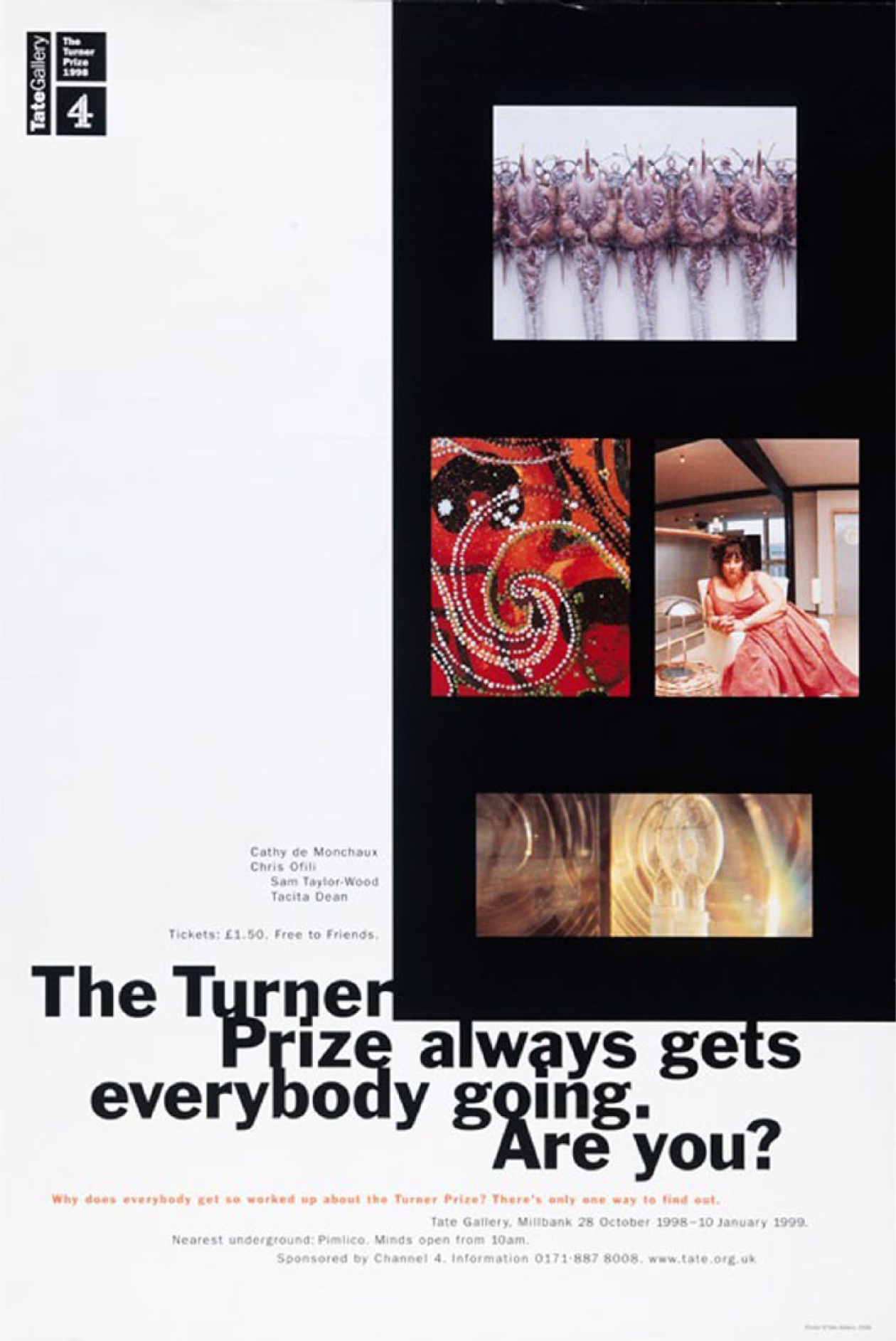
Turner Prize poster 1998. © Tate 2011. Reproduced with permission.
At this point, a question is raised regarding which process, and therefore relation, is more dominant in the visual message and which is embedded in it. Is it possible that the two contradictory messages conveyed by these two processes create confusion to the reader? The answer is simple. The message from the classification process is dominant as it is more powerfully and clearly stated. It is thus supported by the linguistic message, which confirms that this poster is about a modern art exhibition. Furthermore, the ignorance of the majority of the readers relatively to the exhibits on display (they can’t possibly be familiar with the work of the artists, unless they have already visited the exhibition or have previous knowledge of these specific artworks) confirms the dominance of the classification process over the analytical one, which comes second to revealing the variety of the exhibits on display.
The prevailing linguistic message of the 1998 poster, as a result of scale, consists of two sentences: The Turner Prize always gets everybody going. Are you?
The linguistic content is a play on words. The use of the indefinite pronoun ‘everybody’ and of the adverb ‘always’ addresses a wider audience by stating that the Turner Prize appeals to everyone and not only a limited audience, as is commonly believed for exhibitions of modern art. Moreover, this message is reinforced by the indirect invitation of the phrase ‘gets everybody going’ but it can also be linked to the public debate caused by the selection of the artists and be interpreted as ‘it gets everyone talking about it’. For example in 1997, nominee Tracey Emin (1999), sparked controversy when she walked out of a live Channel 4 discussion programme, presented as part of the coverage of the award (Longrigg, 1997). In 1998, a talking point in the media referred to Chris Ofili’s use of balls of elephant dung attached to his mixed media images on canvas, which he also used as supports on the floor to prop up the canvases (Bond, 2000).
The question at the end of the message and especially the use of the second-person personal pronoun ‘you’ suggests a certain urgency, inciting the receivers to visit the exhibition, as they may feel this message addresses them personally. Furthermore, the use of the present continuous tense helps to define the time of the exhibition as a current event and, as it is commonly used in advertising discourse, it shows the everlasting value of the product (Koutsoulelou-Mihou, 2004: 72); in our case, it emphasizes the many years of the institution’s existence. Finally, the ‘s’ of the present simple tense in the word ‘gets’ denotes that the subject is not the producer of the message, nor the reader of the poster, abstracting its modality from the authority of the message’s source. The message indicates that the source, the Tate, maintains a distance from the sentence, establishing itself as neutral, which makes the message more reliable for the reader (Hodge and Kress, 1993: 91–92).
Finally, one cannot help but observe the imposition of the linguistic message upon the visual one. In this case, language comes first, imposing in an authoritative way the meaning on the image. The photos of the work of the four nominated artists, probably most representative of the exhibits, are not likely to be recognized by the majority of the target audience since they have not yet visited the exhibition. Therefore, the four artworks can easily be replaced by others in successive years with no significant effect upon the meaning (Kress and Van Leeuwen, 2006: 24–26).
Before moving on to the second period, it is interesting to examine the 1997 poster as it is completely different from the posters preceding and following it, with no evident reason for the change in the consistent communication strategy employed by the Tate during the period in question.
Once again, the linguistic message is prevalent in the poster, but this time its deconstructive structure attracts the attention of the reader. The letter ‘S’ at the beginning of the message is prominent because of its size, and the rest of the linguistic signs seem to be randomly placed, as if they have been cut out from a magazine or a newspaper and scattered across the poster. The disassembling of the linguistic message points to another way of encouraging audience participation by ‘opening up’ the meaning of the linguistic message to interpretation. The deconstructivist composition is reminiscent of the Dadaists’ verbal collages (Chipp, 1968: 389) or Russian Constructivism that used the poster as a means of appealing to a wide public (Margolin, 1984: 28). Deconstruction as a postmodern strategy was appropriated by graphic designers in the 1990s and aimed at discovering, through the process of analysis, new ways of encouraging audience participation by ‘opening up’ meaning to audiences by engaging them in its construction and interpretation (Poynor, 2003: 66). Designers began to explore design as a cultural practice closely connected to popular culture, skilfully deconstructed by theorists such as Barthes (see Barthes, 2002) and others, rather than as a focused, professional, problem-solving tool (p. 53). In the early 1990s, deconstruction was primed for popular assimilation, especially for cultural clients who were open to visual experimentation by designers rethinking the relevance of design in the larger context of trends in the visual arts and theoretical discourse.
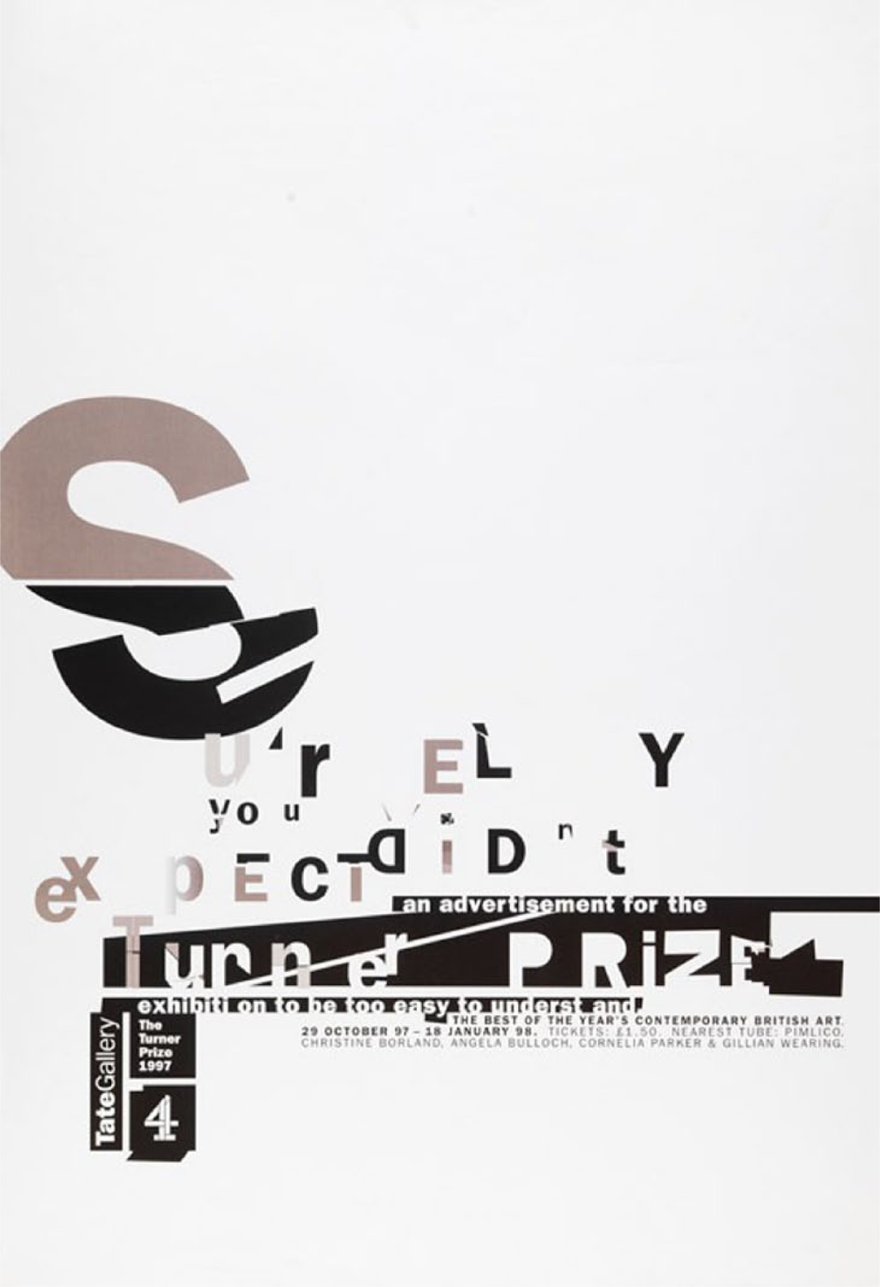
Turner Prize Poster 1997. © Tate 2011. Reproduced with permission.
This intentional disorder of the linguistic signs in the 1997 poster signals a ‘playful’ attitude to the poster that captures the interest of both high and low involvement audiences (Kroeber-Riel, 1998: 184–187). On the one hand, for the audience already interested in visiting the exhibition (high involvement audience) it is an unexpected surprise relative to the posters of the preceding years. On the other hand, attracting the attention of new target audiences is not an easy task given the current media and excessive amounts of information individuals are exposed to on a daily basis (p. 221). However, the 1997 poster manages to spark the interest of audiences that have never visited the exhibition (low involvement audiences) through its unique layout, relative to the previous posters.
As for signification in the linguistic message, a distinct effort has been made to place the emphasis on the dissension and criticism that the prize has generated throughout the years. It also echoes debates about the ability of contemporary art to provoke and encourage public debate. Thus the focal point of the verbal message is the name of the prize placed in the center in bold white letters (apart from the first letter) supported by a black background. The Tate’s intention becomes more evident in the preceding message. A distinguishable tone of irony emerges from the word ‘Surely’, imposing in an indirect way the correctness of the following message. The imperative tone at the beginning of the sentence ‘Surely, you didn’t expect …’ indicates that the producer knows what the reader thinks and establishes its effect on her or him in an authoritative way (Kress and Van Leeuwen, 2006: 142). The content of the rest of the sentence ‘… you didn’t expect an advertisement for the Turner Prize exhibition to be too easy to understand …’ underscores the structure of the message, a difficult-to-read poster for a difficult-to-understand exhibition. The breaking down of this perception aims to decode its parts in such a way that these act as ‘informers’ for the Turner Prize, and any assumptions or convictions the audience may have regarding the prize. Moreover, the use of the second-person pronoun ‘you’ makes the message more personal and compensates for the lack of reciprocity as the message’s creator is absent at the time of its interpretation. Finally, the use of the past tense instead of the present gives the sentence a notion of uncertainty, a lower degree of modality (Hodge and Kress, 1993: 91). The whole sentence is an indirect invitation to the wider public to visit the exhibition and affirm or refute for themselves the notion that the Turner Prize celebrates incomprehensible works of art that only appeal to a limited audience.
Finally, it is worth mentioning that two words of the last part of the message seem to be cut in half. The first is the word ‘exhibition’ and the second the word ‘understand’: exhibiti…on underst…and
What is the purpose behind the deliberate fragmentation of these words? A possible explanation could be that the dissension of the first word creates the preposition ‘on’, which alters the content of the following message ‘…on to be …’, revealing the forthcoming event, the exhibition. From the second word, the additive conjunction ‘and’ reveals that despite the punctuation (full stop) the message doesn’t end there. The message continues below informing the reader about the time, tickets and the names of the nominated artists.
2000–2006: Fireworks: The beginning of a new era
In 2000, the Tate expanded and launched a new identity comprising four galleries: the existing gallery on Millbank was renamed ‘Tate Britain’, in addition to ‘Tate Liverpool’, ‘Tate St Ives’ in Cornwall and ‘Tate Modern’ in London. The Tate Gallery reopened its doors as Tate Britain in an effort to rebrand itself with a primary focus on works by British artists, both contemporary and historical (Bond, 2000). The Turner Prize has been held at Tate Britain since then and the gallery set new goals for the following years. It acknowledged itself as an international organization with partnerships at home and abroad, open to all kinds of audiences, willing to spread its knowledge and offer rich and enlightening experiences by engaging some of the most stimulating and distinguished thinkers of our time (Tate Report: 2002–2004, nd).
The Turner Prize followed these guidelines and its primary concern was to create and establish the image of an international organization. That is why, in 2000, for the first time in the history of the prize, there was only one native-born artist. Furthermore, from this period onwards, the prize has focused on the richness and variety of the experiences being offered and has presented itself as being more open to the wider public and, in a way, more democratic. In 2002, it invited the audience to leave a comment on special boards in a room called the ‘Reading Room’ (Twenty Years of The Turner Prize: 1984–2004, nd) and in 2005 with the ‘Judge for Yourself Tour’ a part of the exhibition was transferred to some Underground stations and the audience had the opportunity to express their opinion through interviews and add comments on a special board. The goal of the publicity campaign was to make viewer participation a priority. Through inviting viewers to ‘judge for themselves’, the prize seeks their active involvement, encouraging them to approach the artworks and learn more about the artists, to record their impressions and give feedback: hence, to draw conclusions for themselves (Lewis, 2005).
The poster for the year 2000 has been chosen for analysis from this time period as it is emblematic of the Tate’s plan to establish itself as a self-sufficient organization, to increase its visitation figures and financial resources and create a more international and audience-friendly image.
The visual image attempts to create associations within the reader regarding certain thoughts and feelings concerning the product’s identity (Kroeber-Riel, 1998: 204–205). In other words, if the Turner Prize is linked with the feeling of the excitement that a colourful fireworks display evokes, it can heighten the interest of the reader and encourage him or her to visit the exhibition. Moreover, the object represented in the poster has the ability as a sign to signify a far more abstract concept (metonymy) (Fiske and Hartley, 2004: 32), that of a festive event, a sparkling celebration, an opening ceremony or even festivities for the turn of the century. It is quite clear that the Tate intended to seize the opportunity not only to promote through this poster the current Turner Prize’s exhibition, but also to associate the message with the inauguration of Tate Britain and to link the name of the institution with the new organization. In this poster, it is interesting to note that the illustrator questions the boundaries between high (valuable) and low (inferior) forms of culture, appropriating commercial packaging and the starburst into an advertisement for an art exhibition. Appropriation has been a crucial development of postmodern design used by many contemporary artists as is the use of vernacular images from commercial culture.
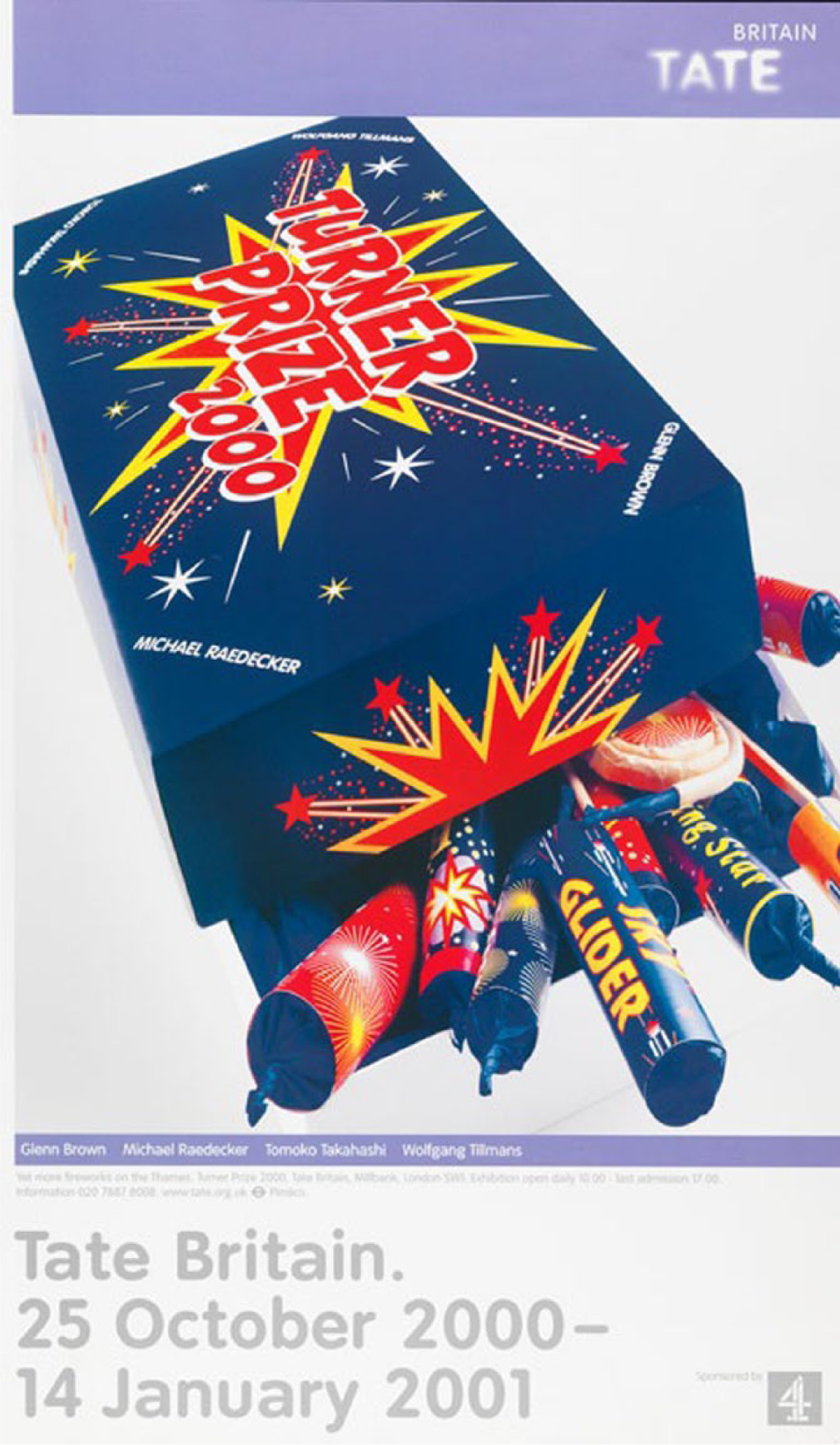
Turner Prize poster 2000. © Tate 2011. Reproduced with permission.
The angle of the shot and the size of the represented object to the frame (a middle distance from the viewer) suggests the Tate intended to create a high level of engagement between the reader and the product (Kress and Van Leeuwen, 2006: 127–128). The proximity of the object to the reader and the steep angle of the frame create a high level of involvement and encourage the audience to visit the exhibition. Furthermore, the high angle from which the photo is taken (point-of-view) implies that the product is within reach of the reader and its value is not imposed on him or her. The product on offer, the exhibition, becomes more ‘reachable’ for the audience as the relation between the ‘interactive participants’ 10 (the organization and the audience) with the ‘represented participant’ (the product) is considered to be one in which the first have power over the latter and not vice versa (p. 140).
The linguistic message is divided into two parts, the message within the image and the message below the image. In the textual message within the image we observe the name of the prize, which counterweighs potential misinterpretations that may otherwise have been caused by the polysemy of the image (‘anchorage’). What is more, the year is also placed in the centre of the box and the names of the candidates in the four corners. It is the first time that the artists are mentioned twice in the textual message, on the box and under the box, compensating for the lack of the images of their artworks that were a part of the visual message in the posters of the previous period. We also note that two of the fireworks bear noun phrases. The one in the middle is easy to read ‘Sky Glider’, whilst the other is only half discernible ‘… Star’. The reader, based on knowledge and experience, attempts to complete the message. Two possible adjectives would be ‘Rising’ and ‘Shooting’, acting as a reference to the nominated artists, ‘Rising Stars’, justifying the choice for their being nominated or even the potentials offered by the media exposure that the prize has to offer. No matter what the addition will be, both messages aim to be interpreted through their ‘connotative’ meaning, attributing to the exhibition the essence of an exciting cultural event, supporting the organization’s statement, which characterizes its exhibitions as rich and enlightening. The textual message below the box includes the names of the candidates (as mentioned before), the sponsor, the dates of the exhibition and information relative to the visit to the Tate.
Finally, one cannot help but comment upon the new logo of the organization placed on the upper right of the poster. In 2000, Wolff Olins redesigned the brand for the Tate as a part of its transformation from one to four galleries and its effort to rebrand itself focusing on the idea ‘look again, think again’. It expresses the Tate’s wish not only to invite, but also to challenge visitors and offer ‘many different ways of seeing’ (Wolff Olins, nd).
2007–2011: The Tate is ‘open’ to new audiences
In this period, the Tate Gallery set new communication goals and envisioned an organization that is entrepreneurial, open to new ideas and reflects the artistic diversity in Britain and throughout the world (Tate: Our Priorities, nd). The 2007 poster has been chosen as an example of this time period for two reasons. The first concerns the circumstances that frame the exhibition and therefore affect the creation and interpretation of the poster. In 2007, Liverpool was the European Capital of Culture, attracting tourists from all over Europe. Thus, for the first time the Tate chose to hold the Turner Prize exhibition outside London, and it proved to be the most visited exhibition at Tate Liverpool with more than 71,000 visitors (: 2007–2008, nd: 50). The second concerns the poster itself. One can’t help but remark on the convergence of the visual and linguistic messages and the way they embody the social aspect of the organization’s image.
The image on the poster acts as a visual metaphor (Hartley, 2004: 143–144) for the message that the nominated artists wish to express through their artworks. The photo of the open eye invites the audience to stop turning a ‘blind’ eye towards important humanitarian issues. For example, the spiritual and natural relationship between human beings and their environment (Nathan Coley), political engagement and social commentary (Mark Wallinger), contrasted with the open depiction of human emotions that we all experience – pain, love, and longing (Zarina Bhimji) (Turner Prize 2007: The Shortlisted Artists, nd) are some of the concerns explored by the artists chosen for the 2007 exhibition. Highlighting issues of worldwide concern supports and enhances the image of the Tate as an international cultural organization, and may contribute to attracting foreign audiences, tourists or immigrants living in the UK.
Moreover, the size of the image of the eye filling the poster reveals the intention of the Tate to foster a more intimate relationship with its audience. Working with Hall’s theory of the four basic distance zones, 11 we can link the distance between people and objects experienced in every day human interaction, with the interaction created between the producers and the reader of the poster. 12 In this particular case, the ‘extreme close-up’ (Kress and Van Leeuwen, 2006: 124) of the image, which shows only the human eye, represents the proximity of the viewer to the subject, which reveals a high level of intimacy. Therefore, in the interaction between the organization and the audience, there is a distinct effort by the Tate to minimize the ‘social distance’ between itself and its audience in order to create a more ‘friendly’ profile.
We should also consider the replacement of realistic colours in the photograph with an overall light blue colour, which attributes a low-modality to the image (Kress and Van Leeuwen, 2006: 159). The application of a monochrome colour to the photograph instantly takes the viewer away from the realm of the ‘real’ by abstracting the image. Photos are used in advertising in order ‘to create a promise of reality’, a true possibility. Nevertheless, in this case the employment of one single colour in the photo serves the organization’s purpose after all. First and foremost, light blue colour creates a neutral background by taking the emphasis away from the photograph and placing it on the linguistic message. In addition, the application of Halliday’s three metafunctions to the colour scheme demonstrates how colour fulfils its three functions simultaneously (Kress and Van Leeuwen, 2001: 347–350). First, the ideational function indicates particular objects, people or even ideas for a specific socio-cultural group. In this case, light blue can bring to the mind of the audience images or objects that they have seen in the past, such as the clear blue sky, lakes, the sea, etc. Second, the interpersonal function is used to convey certain meanings, to have a certain effect on the reader. ‘Blue is a typically heavenly colour’ (Kandinsky, 2004: 45) and it is associated with spiritual figures, and therefore, in this case attributes a sense of spirituality and serenity to the message. Finally, the textual function can either help to emphasize the differences existing in a whole, or its unity. In our case, the monochrome colour helps to make the image more coherent and hence unifies the whole layout of the poster.
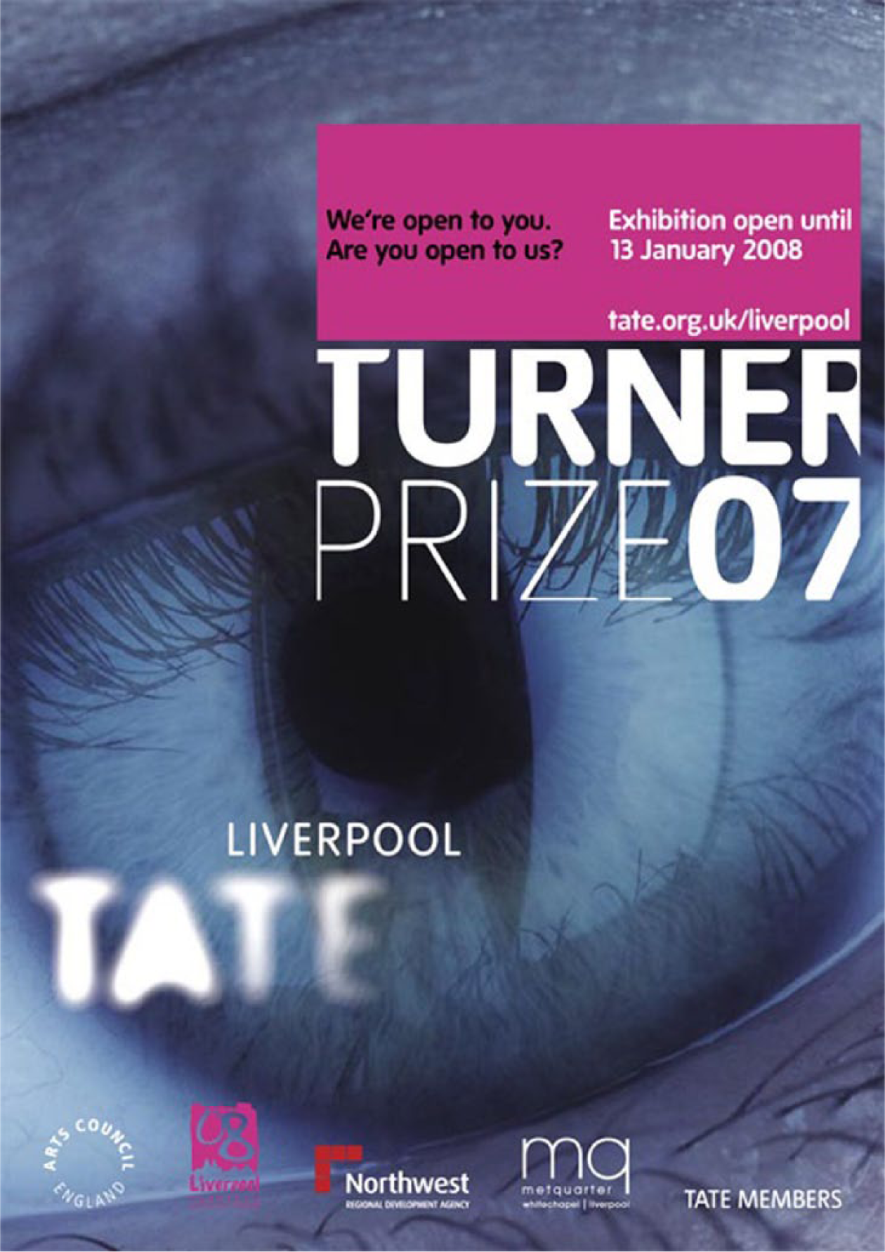
Turner Prize Poster 2007. © Tate 2011. Reproduced with permission.
From a different perspective, if we base our analysis on iconography, we can distinguish three levels of meaning regarding the visual message (Dyer, 1982: 93–94). On the first level, we initially privilege the visual, the photograph, which overshadows the linguistic message due to its size. However, as argued above, the light blue colour eases the intensity created by the image of the open eye and moves the emphasis to the linguistic message. At this point, it’s worth mentioning the directness of the gaze of the eye that seems to address each receiver individually, making the message more intimate, more personal. On the second level, we would argue for a symbolic interpretation of the open eye which can represent an open-minded individual and a progressive thinker. On the third level, we interpret the image in relation to the exhibition, which invites the audience to open their eyes to the artist’s work, to take a broadminded approach, and be willing to experience something new.
Of course, the image of an open eye is subject to multiple interpretations depending on the cultural, social and religious background of the reader. For example, symbolically one could interpret it as the so called ‘All Seeing Eye’, which can be found in numerous cultures and religions from the Babylonians and the Assyrians, for whom it was a symbol of divine protection, to Christianity, as a symbol for the ‘eye of the Lord’ (Barber, 2006: 24). Alternatively, in the case of a more invested audience, those who have knowledge of the visual arts, the image may heighten the urgent effect of the message and the need to see the exhibition, as it has appeared in the work of many early avant-garde artists such as Salvador Dali (Christie, 2007), and Francis Picabia (see Francis Picabia: The Cacodylic Eye (L’ Oeil cacodylate), 1921), as well as avant-garde art movements, such as Cubism, Dadaism, and Surrealism.
Finally, we would like to return to the directness of the gaze, which represents the producers (the Tate) that empowers the image and establishes a direct form of address to the audience. The open and direct gaze of the eye is a standard ‘attention-grabbing’ device. It captures the interest of viewers by reaching into their personal space, and derives its eye-catching effect from the iconicity of the image, coupled with the attention-getting process modelled on real-world facial cues, which involve looking directly into the eyes of our interlocutor, an element of everyday interpersonal interaction (Messaris, 1997: 21). According to Kress and Van Leeuwen (2006: 116), vectors are formed by the sightlines of the eye in the image on the poster, connecting the producers with the reader. In this way, the target audience is acknowledged with clarity and an ‘image act’ is constituted. What is meant by this term is that the represented producers have either something to ‘offer’ or ‘demand’ via the image. In our case, the reader is being asked to keep an open mind to attending the exhibition and it is up to him or her to accept or reject the invitation.
The same logic can be applied to the linguistic message. Based on Halliday’s fundamental distinction of four speech functions, Kress and Van Leeuwen (2006: 122) distinguish four kinds of ‘speech acts’: (1) those that offer goods and services; or (2) information; (3) and those that request goods and services; or (4) information. The first sentence of the message offers information: ‘We are open to you’, whilst the second one requests information: ‘Are you open to us?’ The presence of the word ‘you’ in both sentences creates a connection with the eye in the image, as it embodies the visual ‘you’ implied by the directness of the gaze. Thus, the linguistic message is in a complementary relationship with the visual message, and the two work together to achieve the Tate’s communicative purpose, which is to define and address the audience.
The first sentence reflects the intention of the Tate, declaring it is an organization ‘open’ to everyone. The latter can be characterized as a rhetorical question that challenges the audience to experience something different. Worthy of comment is the repetition of the word ‘open’ that links the image with the linguistic message and one could argue that it creates a circle resembling an open eye: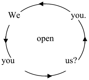
The repetition of the word ‘open’ and the image of the open eye create a high degree of redundancy in the poster, which helps the reader to interpret the message according to the intention of the sender.
Discussion
We have analysed four advertising posters used to promote and communicate information about the Turner Prize award from 1994 to 2011. The employed methodology was based primarily on semiotics with an emphasis given to the social context of the messages quoted in the posters, the active role of the readers in their interpretation and the intention of the Tate at the time of their production. Our analysis revealed a number of ideologies imbricated within the semiotic structure of each of the posters studied.
Let us begin by examining how the Tate incorporates the posters into its overall communication strategy by using them as a more traditional marketing tool relative to more contemporary electronic means of communication. In the past few years, a composite of strategies involving the use of media and social networking tools has represented an important development in communication design and the identity-construction work done by museums (Pierroux and Skjulstad, 2011: 205). The Tate has explored and used the new technologies available to build a more immediate and interpersonal relationship with its culturally invested audience through initiatives such as the Tate Channel (http://www.tate.org.uk/context-comment/audio-video), the Tate website (http://www.tate.org.uk/) and the presence of the Tate on Facebook (http://www.facebook.com/tategallery) and Twitter (http://www.twitter.com/Tate). However, new media and especially social media solutions have not overshadowed print media, in our case, the poster’s importance as a marketing and communication tool whether for the organization or for its audience.
The posters are specifically designed to communicate the organization’s desired image to new target groups. For the past five years, the marketing campaign for the Turner Prize has primarily targeted adults between the ages of 25 and 45, who are interested in culture and living in London, and as a secondary target group, regular gallery goers and the contemporary art-world audience. The posters, seen as a part of the campaign in the London Underground, have another primary target group as well, that of tourists visiting London at the time of the exhibition (Turner Prize Marketing Campaign, 2009). In contrast with more technological means of communication which are used to address secondary audiences that are already interested in visiting the exhibition and keeping up with new developments in contemporary art, the posters are destined to appeal to a wider public. They can be a catalyst for audience development as a result of their ability to penetrate the daily routines of segments of the primary and secondary target audiences, in other words, young professional adults, students, commuters and tourists. Underground stations, where the posters are displayed, among other strategic locations, 13 are ideal places for gaining maximum attention, as people have to linger (Parry, 2011: 121) waiting for trains on a daily basis. Nevertheless, it is of interest that the majority of the visitors claim to have been informed about the event by the Tate website or by another person and only a small percentage mention the posters in the Underground 14 (Turner Prize Market Research, 2007–2008). Therefore, one might question why the posters have failed to boost attendance figures for the exhibition. If the nature of the medium enables it to enter into the daily routine of the wider public, then perhaps it is the design of the posters that fails to effectively deliver the message of the Tate.
After a closer look at the visual discourse of the posters, one can observe the organization’s distinct effort to address a wider public that is interested in culture but has not yet visited the exhibition. All the posters examined encompass either through their visual images (see 2007 poster) or through their linguistic messages (see 1998 poster) an ‘open’ invitation to the wider public to visit the exhibition and ‘see what the fuss is about’. This invitation is aligned with the organization’s overall marketing strategy of branding the award as a media-centric institution. Thus the posters act as a reminder for those already interested in visiting the exhibition (secondary audiences) through the repetition of certain logos and slogans, 15 and as a challenge to primary audiences that are familiar with the institution through the media coverage, but have no personal experience of having attended an exhibition.
At this point, we should consider the Tate’s willingness to focus on negative criticism and cultivate the controversy surrounding the Turner Prize award as a strategy to spark public curiosity and lure people to visit and discover the exhibition. Over the years, media publicity alongside a distinct and continuous effort by the Tate to promote emerging artists as pioneers in a way that fosters and reinforces controversy, which in turn is debated by art critics and the public, has established a certain credibility for the Turner Prize and guaranteed the sustained attention of its audience. It is evident that the institution has made a commitment to offer its ‘culturally interested’ audience a thought-provoking experience fuelled by controversial comments, extreme reactions and surprising choices of artists and artworks. In the years examined, the institution aroused a lot of debate regarding the choices of the nominees and the final winner. A well-known example is the case of Damien Hirst, who in 1995 was bound to be in the spotlight, as he had found himself in the headlines quite often due to his personal life (alcohol and drug abuse) and his art (O’Grady, 2003). Among his most controversial artworks was the notorious exhibit Mother and Child Divided, which displayed a bisected cow with its calf in a glass case, which received contradictory reviews from the critics in the press and created mixed feelings amongst the public, but managed to attract an unprecedented number of visitors the following year (Twenty Years of the Turner Prize: 1984–2004, nd). Thus, the Tate has chosen to maximize media attention by drawing the public’s interest to events and actions that framed each year’s exhibition. The media orientation of the Tuner Prize is further reinforced by the style of the awards ceremony in which the prize is often given by pop stars and celebrities. 16 Finally, each year since 2000, there has been a demonstration against conceptual art and the prize held outside Tate Britain, with protesters calling for a return to figurative painting and modernist ideals. Now a target of demonstrations, perhaps this is a sign of how despite, or indeed as a result of its ‘bad boy image’, the Turner Prize has entered the mainstream.
Without underestimating the contribution of the media coverage in forming the brandscape around the Turner Prize award, we consider that other aspects of the institution’s identity have remained unexplored, as far as the visual design and content of the posters is concerned. For example, market research undertaken by the Tate revealed that a majority of the visitors come to visit the Turner Prize exhibition on the grounds of research or for their self-improvement (Turner Prize Market Research, 2007–2008). Hence, the messages of the posters should consider espousing concepts such as ‘ originality’ or ‘ artistic innovation’ in order to spark audience interest and increase the number of visitors, rather than take advantage of the perceived eternal dispute between the Tate, the critics, other artists and the public about whether the artworks and their creators represent the avant-garde of contemporary art or are unworthy of the prize and are being used to fuel the dispute and maximize publicity (see 1997 poster).
We would like to suggest other more positive aspects of the Tate’s identity that could be portrayed in the posters. For example, in 1996 the Turner Prize was awarded to Dougals Gordon, a video artist for the first time (Turner Prize: A Retrospective 1984–2006, nd: 96–97), embracing the introduction of technological advances in contemporary art. The Tate has also been prompt to respond to social changes through a number of substantial initiatives, which if presented in the posters could be a testimony to the organization’s commitment to acknowledging the social context in which it operates. For instance, the shortlist for the 1997 Turner Prize consisted entirely of women artists, addressing the issue of the poor representation of women artists up until then (Glaister, 1997). Thus, in the shortlisted artists for the 2000 Turner Prize there were three non-British candidates (Waters, 2000), reflecting a desire for a more international profile for the institution in a globalized world.
The contribution of the posters in establishing a more international profile for the institution should be an important component of audience development. Research findings (Turner Prize Market Research, 2007–2008) 17 have shown an overriding uniformity in audience attendance as far as ethnicity is concerned. In fact, Tate Britain by attracting only 3 per cent of visits from ethnic minorities, has a poor demographic representation of audiences in an increasingly multicultural nation (Walsh, 2008: 1). The Tate’s objective to become more international and open to all kinds of audiences (Tate Report: 2002–2004, nd; Tate Report: 2007–2008, nd) should be embedded in the posters, as in the case of the 2007 poster. For instance, a direct or indirect reference could have been made to the international identity in the 2000 poster, as for the first time in the history of the award there was only one British-born artist among the four candidates (Twenty Years of The Turner Prize: 1984–2004, nd).
In retrospect, one can conclude that the Tate has given more emphasis to the events that surround the Turner Prize rather than to the exhibition itself. Nevertheless, one cannot deny that the conglomeration of publicity, criticism, public reaction and events surrounding the exhibition has contributed to developing an audience of avid supporters and increased attendance figures for the institution. There are, however, other concepts that could have been embedded in the visual discourse of the posters, such as artistic innovation, self-improvement or internationalism, all of which have proven to be valid incentives for audiences to visit exhibitions. Given the newly renovated Tate Britain opened this year, it is time the Tate considered a new communication strategy, crafting a new image for the institution by promoting the other ways it has contributed to the celebration of the pioneering spirit of emerging artists who have made a significant contribution to contemporary art.
In recent years, advances in digital technologies and information management have provided some of the greatest challenges facing museum and cultural heritage professionals. While the biggest trend in cultural advertising and audience development is focused on social media and mobile technologies, one ought to consider and not forget the role of posters and print media in this new global advertising brandscape. The incorporation of posters for cultural events in many museums and cultural institutions archives and on their websites is a testament to the important role these posters play in their visual heritage. The posters advertising the Turner Prize are an integral part of the visual heritage of the Tate and document aspects of the ways in which the Prize has developed over the years. This study reveals the crucial role the posters play in shaping the visual representation and ‘image’ of the Prize, which makes them an extremely important and exciting site for research in visual communication.
Footnotes
Acknowledgements
We would like to express our gratitude to the Marketing Department of the Tate for kindly allowing us to use and reprint the four posters in this article and for the information provided about their marketing campaigns. Our kind and warm regards also go to the blind reviewers for their intuitive and thought-provoking comments and to Mary Cummins for her willingness to re-read, make comments and suggestions for the final version of this article.
Funding
This research received no specific grant from any funding agency in the public, commercial, or not-for-profit sectors.
Notes
Biographical Notes
Address: Ilektras 17, Heraklion 71305, Crete, Greece. [email:
Address: Anagnostara 13, Agios Dimitrios, 17341, Athens, Greece.
[email: