
Abstract
This Roundtable on Numbers/Data began life as a live, public event on the power and influence of numbers in contemporary visual, material, immaterial, and media cultures.1 To imagine such an ambitious event, and to do it justice, the event’s programme brought together academics, industry professionals, and practitioners. Taking Steven Connor’s recently published book Living by Numbers: In Defence of Quantity (2016) as a springboard, each contributor to the event was invited to deliver a 10-minute presentation, an opening statement to set the scene, and to raise fundamental questions to be considered in the ensuing discussion. The authors retain this structure here, along with some of the informality that live conversation affords.
By way of these four presentations and the conversation between the event’s speakers and audience, the Roundtable raises a series of pressing concerns around data and big data, life tracking, digital health studies, and the quantifiable self; the quantitative and the qualitative; data forms and flows; climate change data and social media; the bleed between private and public computational infrastructures; labour, productivity, and accountability; time, money, and economies; and the contemporary intensification of surveillance, audit culture, marketization, and outcomes-based performance management.
Notwithstanding data dystopia’s numerical sublime, the contributors are always looking to keep an eye out for reasons to be optimistic in their discussions around: numbers in education and numeric literacies; the materiality of numbers and numbers as artifacts; data’s flexibility and manipulability; sensors, sensor data, and everyday life; the rise of amateurism and citizen scientists; data and numbers vis-à-vis experiences, embodiment, emotions, intensities, and their affective powers; and the contributors’ absolute delight (or abject horror) at the very arbitrary nature of numbers, all of which offer hope towards more democratic, creative, imaginative, and personalized futures …
Interested in the Quantified Self community? Ever wondered what role numbers played in the UK’s Referendum to leave the EU? Intrigued by the idea of an exhibition about odd and even? Curious about what folk data might be? Read on!
I’ll talk for a few minutes about a book of mine called Living by Numbers (2016). Despite the title, it’s not really a book about our contemporary condition in relation to numbers, quantity, or calculation, although it certainly bears upon that. My starting point was that numbers are, for most human beings, most of the time, a kind of horror. There’s a moment in Lewis Carroll’s Alice’s Adventures in Wonderland (1865) when the White Queen is trying to assess how much academic knowledge Alice has. She says to her: ‘what’s 1 and 1 and 1 and 1 and 1 and 1 and 1 and 1 and 1 and 1?’ and Alice says, ‘I don’t know’, because she can’t add up all the 1s quickly enough. The answer was 10, actually. But this tells us something very important about numbers: they’re all the same. All numbers are exactly the same; they are not the same numbers, but they’re all the same in the way in which they are numbers. The difference between the number 17 and the number 13 is that one consists of 17 ‘ones’, and the other consists of 13 ‘ones’. But every number has got to be a certain number of ‘ones’. Now, all the numbers are not the same in the sense that they are the same numbers, but they’re all the same in the sense that there is no qualitative difference between them, as there is qualitative difference between other things in the world.
And there’s something deathly and horrifying about that; something also exhilarating, and a little bit mind-expanding. Take the number 17 for example. You can define the number 17 in a number of different ways: 3 plus 14, or 13 plus 4, or 30 minus 13. As a matter of fact, you can – and you must – define the number 17 in an infinite number of ways, because you’ll never get to a definition of 17 that’s any better than any other definition of 17. They are all exactly as good as each other; none of them has any kind of priority over the others. This radical and really rather disturbing flatness about numbers is the horror under the glory of numbers, the source of all the power that numbers have.
Now most people are not able to think in this way, so horrifying is the prospect that all numbers are the same. For example, most people, when they imagine or visualize numbers, have a mental picture of a line of numbers, a number line. I called it a number line, but there are some people – Francis Galton did some very interesting work on this in the late 19th century – who imagine all the numbers arranged in quite complicated circles or fans or other sorts of interior visualizations. Most people, if you ask them – and you can perform experiments that will confirm this – assume that the gap between the numbers 2 and 3 is bigger than the gap between the numbers 18 and 19. You know that that’s not the case, but somehow 2 and 3 seem closer to you. And so, following the laws of the experience of this in an imaginary perspective, there’s kind of more distance; they’re more scrunched up further away. And people make a lot of mistakes, as a result of this distortion in perspective.
Not only that, but people, of course, have favourite numbers. Mathematicians in particular have favourite numbers. This is one of the reasons why mathematicians have a very poor understanding of numbers: because they’re good at maths. The whole point about numbers is that they are all exactly the same.
There’s a story that’s told about the famous Cambridge mathematician GH Hardy. Hardy had taken up the cause of a self-taught Indian mathematician called Srinivasa Ramanujan. And he actually brought Ramanujan over to Cambridge, made him a Fellow at Trinity College, and Ramanujan was a most remarkable figure. But he died very young; and the story goes that Hardy was visiting him in a hospital in Croydon, where he was actually dying, and Hardy wasn’t the most scintillating conversationist. Hardy sat by his bedside and said: ‘the taxi cab that brought me here was number 1729, a very dull number I thought.’ To which Ramanujan replied: ‘on the contrary, Hardy: 1729 is in fact the lowest number that can be expressed as the sum of two cubes in two different ways.’ And so it can be: 1729 is 1 cubed plus 12 cubed, or 9 cubed plus 10 cubed.
For mathematicians, there are hot spots; all of us have favourite numbers. Conjurors and illusionists know what the commonest favourite is; and I do too, but I’m not going to tell you. It might not work in this present company, but in most company, most assembled groups of larger than about 13, there is one particular number that will recur, in most parts of the world. But you can’t have favourite numbers because numbers are all the same. But it’s that being exactly equivalent and therefore allowing things to be made equivalent that is the usefulness of numbers, that makes it possible to perform this thing known as calculation, named after the stones that used to be used. Calculus just names a stone, a pebble. It enables us to make things equivalent that are not otherwise equivalent. And the only point of something like money is to act out this universal equivalence. So actually whenever you have a system of equivalence, like time, you’ve actually got money. You haven’t abolished money; it’s just another kind of money. Because any form of universal equivalence whereby something can be traded in for something else or bought to seem equivalent to is a kind of money, is a kind of currency.
What I wanted to say is that we live in a world where we don’t have to do numerical transactions, calculations, any more. They are done mechanically at an extraordinarily dizzying speed; we live in a world in which we’re able to manipulate the transformations and equivalences that numbers make available. But actually before that happened, all of us have lived out intense, and complex, and highly emotional relations with numbers. So my interest is in what you might call folk or vernacular mathematics that don’t actually need any mathematics. So you can do quite complicated mathematics without knowing it. For example, if you’re a sunflower, the seeds on the head of a sunflower are packed in precisely the most efficient way to enable the greatest number of seeds that can be packed into that space. Why? Because sunflowers tried all the different ways of packing there were, at random. And the ones that didn’t pack so many seeds didn’t make it. But they didn’t do the calculation, they were the calculation.
This is true for a huge number of entities and organisms in the world. In a sense, they are performing calculations, judgements that involve equivalences and quantities, even if they are not named in countable ways, even if they are not brought to a certain consciousness.
This is true for a huge amount of what we do, how we live, how we live our relation to pleasure, for example: human beings cannot have pleasures without representing them to themselves; our relation to pleasure is never immediate and spontaneous because we’re able to represent things; which is what I’m doing whenever I think ‘I like to do that’. That means we’re always calculating our pleasures, and that means there is a pleasure in calculation itself that is always part of it: ‘Oh, it’s 8 o’clock, it’s Sunday morning and I have a whole 24 hours before I have to be back at work!’
So there is calculation in laughter, in pleasure, there is calculation in everything. And we are in fact often calculating without realizing it or making it explicit. In my view, we’re experts in these forms of calculations. So I want to suggest that actually we live by numbers whether or not we choose to, and whether or not we like it. Although, as it happens, we all do like it very much.
My association with numbers may be less direct than those of the other panellists. I’m a social historian, and my current research looks at the relationship between public policy and communities that depend on small-scale manufacturing for their livelihood. Numbers, for example in the form of economic statistics, are part of my ‘bread and butter’: I make and critique arguments by analysing numbers in various forms, from published economic data to internal company data. But I use numbers alongside objects, images, environments, oral histories and textual archival materials.
That said, I am interested in numbers as artefacts. As a historian who works with design and material culture, one of the things I do quite a lot is study designed, made things, or artefacts. This means that I’m always thinking about the impact of non-human actors, including numbers, on how history unfolds. As a result, all and any kind of artefact, including numbers, demands attention. And numbers, like any other artefact, have a particular materiality and afford particular behaviours, in the sense that we engage and relate to them in ways shaped by the nature of numbers as a category of things, and by the nature of the specific numbers in any one transaction.
Tonight I’ll argue for the importance of an open-ended, omnivorous approach to research data and methods that lines up numbers next to more familiar Humanities ones. And I’ll make a case for paying attention to the materiality and affordances of evidence, numerical and otherwise. So my first point concerns the importance of using numbers in everyday Humanities practice. The second addresses numbers as artefacts, and illustrates why we should pay more attention to what numbers do, as the result of being numbers.
An example, and a bit more positioning: on the way here, I passed a banner for a school in Hammersmith. It read: ‘We’re in the Top Three Schools for Reading, Writing & Maths’ (Figure 1). Anyone who is sceptical about statistics or is a rather ‘picky’ researcher should be immediately unnerved by this. A smaller note explains that the ranking derives from Key Stage 2 results in primary schools in Hammersmith & Fulham in 2016, so we know the source and date, and could find the sample size and so on. But is this a consistent result? How much do results differ from those of neighbouring districts? What skills, precisely, do the tests measure as ‘reading’, ‘writing’ and ‘maths’? And what relation does this number bear to children’s performance, happiness, and confidence overall?
Other than the last question, my questions could be beside the point if you’re a parent concerned to place your child in a school with strong test results. But, as a statement, the banner usefully illustrates various aspects of our relation to numbers. First, the degree to which numeracy education could be important, should be important, and is important in the UK today. Second, the draw of quantitative data for selling an argument, and the power ascribed to measurement in our world. Third, the extent to which we categorize maths as separate from reading and writing, even though in practice we use the skills and aptitudes measured by the three disciplines – analysis, abstraction, communication, poetry and so on – holistically. Together, these statements begin to indicate reasons why arts and humanities types might want to pay attention to numbers: not just to ‘have a say’ or to ‘be heard’ in a culture besotted with measurement, but because our work will be the richer for it, and because – as Steve’s thoughts on numbers make clear – the Humanities can bring something to numbers, too.
But let’s begin with the argument for omnivorous methods. I’ve spent a lot of time looking at wooden chairs like this one (see Figure 2), and considering their manufacturing techniques and context. This is a beautifully modernist chair, designed by Tange Kenzo, a major 20th-century architect. You might say that chairs as objects of study have little to do with numbers, and for some historians and curators – of art, architecture, design, technology, etc. – they wouldn’t; because the ways these objects have been described, analysed, narrated and displayed tends to foreground the ‘qualities’ of their form or the ‘status’ of their designer. The manufacturer might be mentioned, there might be an article or a caption that notes the technique. Business and economic historians pay attention to numbers made and sold, and use economic data to track the health of the furniture industry, retailers as well as manufacturers. But there is only little mention of numbers when people talk about specific artefacts like this, even though numbers tell so much about them. We might inquire about the extent to which economic conditions shaped decision-making around the chair’s commissioning and manufacture in the first place, for example: what type of wood could the manufacturer and client afford. We might consider the impact of the amount of wood, steel, steam, electricity, labour hours and pay, and so on required for its production. We might pay attention to the tax and tariff regime in place when it was made, and to the impact of changing tax systems on the manufacturer and the client, a major textile firm. And we could use big data techniques to map the economic context, supply chains and other networks of relations – human and non-human – embodied in the chair and the numbers around it, to understand more about postwar Japanese history, 20th-century furniture, and so on. For me, what matters about this beautifully modernist chair is the social organization and economic structures that shaped how chairs like that could be made, received and distributed. I couldn’t do that without considering numbers. And it’s a beautifully modernist chair in these aspects, too.
Calling for researchers whose evidence sits most comfortably within the arts and humanities to explore quantitative data and methods doesn’t mean embracing positivism: the criticality, playfulness and attention to nuance and complexity that we associate with the arts and humanities don’t disappear as soon as we look at quantity, or try other methods. And I’m late in espousing quantitative methods alongside qualitative ones – many colleagues have done this, very well, for years. But while visual and material culture proponents call for researchers who use traditional archives and quantitative data to acknowledge the agency of the visual and material in their work, we’re very good at ignoring what evidence and methods we find unfamiliar and uncomfortable bring our work.
So why is numeracy important? In June 2015, the British Academy (BA) produced a report about the social and economic importance of numeracy for individuals at all stages of life, as well as for the UK as a nation. The BA also offered funding for Humanities researchers to familiarize themselves with quantitative methods, with the specific aim of building capacity across the sector – not just because we live in a STEM-dominated hierarchy of value in which numbers carry more clout, but also because numbers could benefit from the Humanities’ ability to ask questions, convey complexity and address emotion. The BA report was produced before the notorious claim in spring 2016 that leaving the European Union would save the UK £350 million a week that could go towards the UK’s National Health Service (NHS), if voters only chose to leave the EU. Of course, the claim’s proponents disavowed it immediately after the referendum to leave the EU that June, and it was repeatedly debunked by commentators throughout the referendum campaign. But accuracy was beside the point. So much of the Brexit campaign depended on emotion and numbers were used to evoke emotion, paradoxically using numbers’ perceived status as non-emotional as a way to do so while saying ‘it’s about emotion … it should be bigger than numbers!’ Clearly we need better numeracy, but the agency of numbers in the Brexit campaign also indicates how we need better understanding of the cultural values and emotive nature of numbers: what we project onto numbers, the base qualities of numbers, and how numbers act on us.
Going back to that chair, then, even if I were interested in the chair primarily as an aesthetic object, I’d still argue that numbers are important. This extends to teaching, too; whether we’re teaching students to be critical thinkers and researchers, designers and artists, museum and gallery professionals, and so on. So that’s the first point: the importance of attending to numbers, the behaviours they afford and how they shape our lives, as part of any engaged practice around researching, thinking, representing, and living those lives.
The second point develops what I mean by numbers as artefacts with particular materiality and affordances: noticing the particular nature of quantified data that determines how we react to it, and how it shapes everyday life and experience. In 2015, I had the opportunity to join a project funded by the Arts and Humanities Research Council (AHRC), one of the British research councils. Our project was part of a larger project called ProtoPublics, and this parent project was intended as agile, playful and risky research, combining interdisciplinary groups of Humanities researchers with social and community organizations around the UK, and blending social innovation, community group methods and different academic research methods. 2 The hope was that we’d create new, transferable knowledge around social practice that also makes a direct difference at the local level, and becomes more comfortable, as Arts and Humanities researchers, doing situated, collaborative work.
Our project, Creative Temporal Costings, concerned timebanks (see Briggs et al., 2016). A timebank is a system in which you do work but, instead of receiving money for your work, you receive credit hours. Those hours are held in a central log that counts time credit rather than financial credit so that you can use the hours for different services. So rather than ‘I’ll weed your garden, you bake me a cake’, it might be: ‘I’ll weed your garden, you’ll bake a cake for someone, and that person films your performance; that person paints your house for you, and this person does copyediting for you, and that gets back to me.’ So it’s a way of distributing work; it’s a way of sharing skills without using money.
We wanted to understand how users negotiated being part of a timebank and a money economy at the same time, and to understand the value of time and collaboration created through the transactions afforded by the timebank structure. Because timebanks are fantastic, they’ve received attention as an effective structure for empowering communities. But how do the values they create – for social relationships, for fixed quantities of time, and so on – relate to those created within economies, particularly the money-based one that governs academic research and creative practice in a capitalist system? To do this, we designed the project to be funded both by a timebank, in hours, and by the research council and our respective universities, in money. The timebank gave hours of credit that we could use for members’ time and for events. The research council gave us money to spend on events, and the universities contributed toward the academics’ time. Rather than establish an artificial ‘exchange rate’, we used the two currencies, time and money, alongside each other in undertaking the research.
Creative Temporal Costings was a messy project to run, sometimes a bit of a nightmare. A major reason for this was that the values created for quantities of time and effort in time and money economies don’t always sync. Take economic value. The timebank functions because members agree that one hour of any activity is equal to that of any other, whereas in a money economy, some kinds of work are remunerated more generously than others for the same amount of time, meaning that hours aren’t equal. And some projects, such as academic research, often rely on ‘donations’ of uncosted additional hours to arrive at completion. There’s also the emotional value attached to quantified time and effort. Timebankers noted that they sometimes gave more time than the exact counted hours because the conviviality of timebank culture, as built through the transactions, prompts generosity. They valued the services gained through their timebanking, but they also valued the sense of community and generosity. This means that they experienced those hours differently to how they would experience an hour bought through money. So one of the key findings was that working within different ways of counting provides a different experience, one prompted by the different values of quantified time and labour in different systems, as afforded by the specific materiality of each system. The ways that you experience a transaction when you’re costing it through time and a transaction when you’re costing it through money are very different. Going back to numbers as artefacts, then, quantities are artificial entities – artefacts – that shape our everyday experience. And, as such, we can and need to attend to them, as part of our omnivorous inquiry into the world.
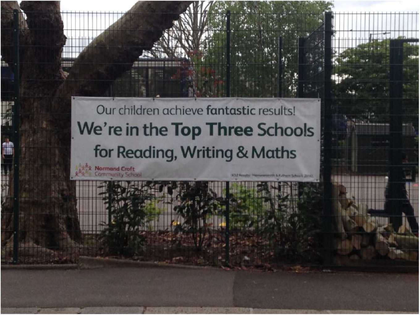
Banner at Normand Croft Community School, West Brompton, London, May 2017. © Sarah Teasley.
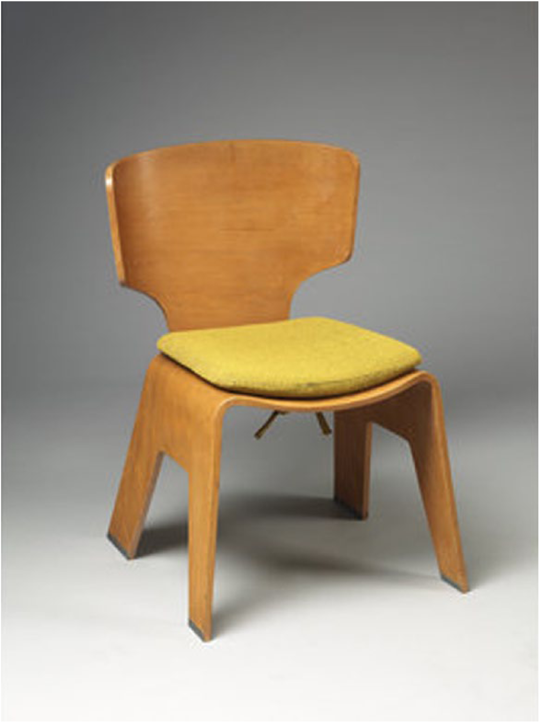
Tange Kenzo (designer) and Tendo Co Ltd (manufacturer), chair, moulded 11-ply birch plywood, metal screws, aluminium feet, seat cushion, Japan c. 1955. © Victoria and Albert Museum, London.
As someone interested in the anthropology of numeracies, recently I’ve been working with sensors and sensor data, as they relate to various technologies in our everyday lives – activity trackers, smart thermostats, breathing monitors, air quality sensors – or what I call ‘biosensing’ (Nafus, 2016). Biosensors like these are proliferating, and collecting a lot of data very quickly. One theme in my work has been about a cultural tension that emerges when we think about the specific kinds of numbers that sensor data really represents. On one hand, there is a cultural motif suggesting that data is an imagined field of infinite commensurability. This data flows, it gives off exhaust, it’s leaky, connecting to everything. It is horribly flat, as Steven Connor suggested. On the other hand, data is not any old number. Supposedly it means something, or refers to something. Most of the people I speak with who work with data find the labour to cohere it together into some kind of meaning is full of friction; it’s actually quite difficult. The difficulty does not have to do with math. (It’s not to do with a question like: can we do math in a simple form, or the more complex forms that are now emerging?) Rather, it has to do with the cultural configurations that make it possible to imagine what the data connects to. I have two examples of these configurations, one to do with heart rate and the other with electricity consumption.
Heart rate is a really common data stream that lots of people work with. You see it in fitness practices, in hospitals, and now in more advanced computation trying to measure ‘stress’, and so forth. Heart rate is interesting because it indicates a whole lot more than just a beating heart: it indicates potential stress, emotions, illness, or the presence of exercise. It is this interestingly multivalent indicator. Heart rate is a reasonable place to go looking for stress; there is some connection between the body and experience, more broadly. But then in Computer Science there is a sort of faith that somehow it might indicate in a pretty straightforwardly Peircian way; like it’s the smoke to the fire.
We in the Social Sciences and Humanities, we never call it straight! I come at this ethnographically, which acknowledges that there is more than indexicality going on. There are all sorts of debates right now in Computer Science about whether stress can in fact be computationally inferred. So if you’re a computer scientist, what you say is: ‘alright, let’s just collect more and more data to clean out all the instances of exercise and everything else, so we have this “clean” signal about stress’, which reduces the presence of all sorts of complications. Ethnographically, you might approach heart rate differently by saying: ‘the best person to really make sense of what signal the data is giving is the person the data refers to, and let them follow the traces through the unclean world!’ I spent a lot of time in a community called ‘The Quantified Self’, where people are very insistent on this idea that data is not something to be read from afar, but is actually meant to be read up close. Then we can start to come up with much more interesting and much more subtle ways of handling what the data is actually signifying.
Much of my work relies on the anthropological theorizing that argues that numbers come to mean not necessarily because we can get a ‘clean signal’ with them but we have various cultural routines, notions, and material forms that cohere them in our imagination. Helen Verran (2001), for instance, talks about numbers as a socio-material ‘clot’. She says we don’t just refer to numbers; we do them, whether that’s counting, pricing, indexing or what have you. These are done materially, in concrete times and places – never truly in the abstract. The practice and the materials bind together into a cultural formation. In a volume I edited recently (Nafus, 2016), we showed how biosensors create numbers that clot the physical, social, and cultural in ways that are sometimes very old and traditional, and sometimes quite new and emergent.
What gets complicated with biosensing technologies is that often they get made in engineering labs where there’s a sociality of a kind, but that’s not the sociality ‘out in the world’ where numbers are supposed to play a role. The engineers make guesses, and sometimes they are good guesses and sometimes they are bad guesses. Heart rate is a particularly interesting guess because it’s a very old measurement, but only more recently it has become technologically feasible to measure continuously outside of a hospital setting. There’s a very real way in which we feel like we know what it means because it’s old but really we don’t, either medically when the person is going about their daily routine or in all the other associations that could be present – the absence of illness, the knowledge that one is about to have to speak in public, or a sense of Calvinist morality if a high heart rate signifies achievement, as it does for many fitness enthusiasts. It’s all vague, but we guess that it matters. It’s presented on wrist-worn devices as if it were all self-evident when it’s really not.
What I see happening when people use gadgets like fitness trackers is a ‘making up’ of the cultural practices more or less ‘on the fly’. The numbers vaguely suggest something, and that vagueness then gets worked on – or not. The work can give a sense of clarity or action, or failure, or even indifference; many numbers don’t actually mean anything at all, and people more or less give up on them. Biosensing gadgets are advertised as devices that optimize our lives; in fact, they rarely do. What happens much more often is that their users get ‘stuck’ in a hope-for-meaning-that-never-comes. That happens much more readily than optimizing (Nafus, 2014).
The second example of how I see culture at work here is from home energy monitoring. With my colleague, Richard Beckwith, I conducted a series of interviews with Pachube users, which is an early technology that offered sensors for detecting home electricity consumption, and the users would upload the data to the Pachube website. In this particular subculture of Pachube users, there’s a notion that ‘open data is always good’, and that ‘data wants to be freed.’ These are open data activists in a way, and they are detecting their electricity in part because they want to know what their electricity consumption is, and in part because they’re participating in openness.
When we looked at the data together, we saw all these unintended traces. It struck us that the data always meant more than what you think it means, and also less than what you think it means. Both at the same time. The ‘more than …’ part is: you can see pretty readily when someone’s not home; or you can see pretty easily in some of the signatures what kinds of appliances you have. It turns out a boiling kettle has a very distinct ‘spike’ that looks nothing like the other appliances. There are all these excesses, and yet a lack of meaning concerning the very thing it was supposed to measure. Users thought they were measuring home energy, or energy efficiency. Trying to measure brought them to a rather rapid understanding that there is no such thing as efficiency ‘out there’ that you can just measure. And it invited this kind of mental reckoning: ‘Well, you know, the overall number seems high, but I have five people in my household, so is that efficient or is it not?’ or: ‘But this is just the electricity and I also have gas’, or home heating oil or whatever it is. So these questions became a new problem. Some people continued the string of mental reckoning as a kind of an intellectual project. For others, it was just evidence of the uselessness of this stuff and they stopped.
This gets at the tension between the cultural trope that says that data always flows, and the work it takes to make it flow. Even the people who were quite enthusiastic about asking the next question – ‘Is it this appliance or that?’ – almost universally seemed to get stuck when that data was brought into relation to the ‘data wants to be free’ ideology. At that point, the data started to appear very flat. People would say that they had bought this energy sensing technology precisely because earlier versions displayed a single number on a wall, almost like a thermostat; so that if you happen to be at home when your dishwasher or washing machine were going you could see the spiking energy, but then if you weren’t there to witness it, the data kind of wasn’t there. They talked about that as data that was ‘dead’, or data that was ‘trapped’, and they wanted to bring it to life, to bring it into circulation.
So Pachube provided the infrastructure to do that: users can put the data on the web and see the historical traces. But then what, right? We looked at this stuff together, and it’s just a single person’s time series. There’s no way to see a bigger picture. People hoped vaguely for a ‘white knight’ or mysterious figure in the future who would eventually want to use their data. Such a figure never appeared, and we in fact mucked around with the idea and played that role a little bit. Somehow our mucking around surprised them – they would say things like: ‘it’s great that you did that, I wouldn’t have thought to do that’. And their surprise surprised us. At some level, their data was technically open; that was the point of putting it up on the internet. But there was an imagined possibility of relatedness – that the data might connect to some other data – without actual relatedness. There’s not a cultural routine, a milieu, or configuration that would in fact load those numbers with emotional valances. There could be eventually, but there isn’t now. By contrast, the number ‘£350 million for the NHS’ is hugely loaded with cultural valence, and we could certainly go about a kind of archaeological process to try to understand how that came to be. But for both the home energy data and heart rate data, there was less to go on. It was still under construction. In both heart rate and energy, the data gets stuck in a state where it seems worthwhile to make it open (in the case of energy monitors) or to display it on a wrist (in the case of heart rate) because there’s always something ‘more’ to learn, an excess. But then that sense of excess gets cut short when the actual labour it takes to build those routines, and make it mean something, starts to become visible.
I always work collaboratively and I think it’s important to mention who you work with first, as it is a polite but also an ethical thing. So I’ve worked for a long time with Gavin Baily, who is an old friend of mine; and most of the work we’ll look at today involves collaboration with him, Jonathan McKenzie, who is a complexity scientist at Cambridge, and the British Antarctic Survey who I’ve been working with for the last five or six years on climate data.
I’m going to talk about data rather than numbers per se. I’ve been interested in data since the mid-1990s, Dawn has already raised the issue of indexicality as problematic in terms of how we think about data and I’d like to pursue this by thinking about data as a representational mode in artistic practice. We might begin by broadly conceiving data as a way of objectively accounting for the world. In this sense, data has a lens-like quality, functioning like a camera to directly capture the thing it is pointed at, measures or accounts for.
One of the things this leads to, I would argue, is that data has the potential to develop quasi-representational modes of art-making that account for phenomena in the world in ways that are ‘objective’ in a very broad sense of the term. So, we might say that data practices reintroduce art-making ‘to the real’ in the affordances it offers to index, delineate and measure things ‘in the world’ and thus deal in a very direct way with contemporary social, political and environmental concerns. This is a very seductive idea, particularly in an era where questions concerning the value of art and its role are at the forefront of contemporary discourse; however, it also represents a naïve view of how data functions by crowding out more nuanced understandings of it, particularly in the field of artistic practice.
Firstly, I want to argue that rather than being simply a technical form, in its commonly understood conception as a digital artefact, data, its production, operations and circulation have a physical presence that encompasses an enormous array of chemical, architectural and technical infrastructures. In this sense, we can consider ‘data mining’ in parallel with ‘resource mining’ of the type required to deliver the silicon crystals for computer memory and lithium for laptop and mobile phone batteries which ultimately drive the devices through which most of us access information. These activities in themselves leave legacies that impinge on environments, atmospheres and other material sites through complex interrelationships of energy transference, waste disposal and economics (for example, data centres globally currently account for 2% of global greenhouse emissions equivalent to aviation). Layered up with and criss-crossing the technical, environmental and architectonic, are the manifold activities of social, political institutional and knowledge production that describe the human labour of data generation to which we can add the semiotic and cultural. In short, and as formulated by Kitchen and Lauriault (2014), rather than conceive of data as something discrete or contained, we should rather consider it a multifaceted assemblage, relationally, politically, technologically, and materially bound. To go further, the assemblage is not merely a by-product of data operations but mutually co-constitutes it because of contingent interactions between its related material, political, social, cultural, and technological elements, so rather than being a ‘given’, data is ‘constructed’ in ways that complicate conceptions of it as ‘objective’, ‘neutral’ or ‘factual’.
As with earlier discourses around the indexical in photography, the tension between the thing pointed at/measured and the resultant representation then is less a direct or neutral imprint of the world, but a highly-mediated phenomenon, caught up in and resultant from the kinds of assemblage just described. Data always exceeds its technical base and has a complex relationship towards the claims of objectivity, commonly attributed to it. Or to paraphrase Deleuze (1992[1990]), data is always social first. However, and it’s a big however, data practices in the broad do adhere to phenomena ‘in the world’ demonstrably establishing objective relations to it, in ways for example that save lives and enable us to understand climate change. In this sense, data can have a claim on ‘truth’ but, to paraphrase the Facebook relationship status option, ‘it’s complicated’, and human subjectivity is always implicated in its production and reception. The issue here then is not a problematizing of objectivity in data but a more complex set of issues around how data (or the idea of objectivity itself) is situated as a historically specific set of social and technical activities, and precisely how an artistic practice might inhabit these.
Now I’m going to run through some works that we’ve developed using data of various types over the past few years to think through some of these issues.
‘Cyclone’ (2007) was a project we started as hurricane Katrina landed on the east coast of the US. We became aware of a phenomenon – which is very vivid now as a contemporary trope – of the use of social media, to spread fake news and hate speech. This seemed to us to be contrary to a lot of the discourse around networks back in the early to mid 2000s as spaces of rational debate or places where you could develop a utopic relationship to politics. In particular, we were interested in how online platforms were enabling the spread of climate change denial, to obscure action on climate change.
‘Cyclone’ brings together two different data sets; a live internet stream of discussions from online chat forums, and meteorological data of cyclonic storm conditions from NASA. The live discussions are taken from online forums dedicated to extreme viewpoints (e.g. climate change denial) that are then mapped to meteorological storm formations derived from the weather data. The overall effect is of churning and swirling weather fronts driven by extremist arguments and viewpoints. The project in part attempts to bring notions of the abject into data practices in contemporary art by confronting the way that hate speech and ‘alt facts’ are penetrating public discourse, technological platforms, impacting on our politics and changing our environment. (I call it the data-abject.) Through the prism of a data practice, ‘Cyclone’ seeks to articulate and problematize the distinction between social and technological worlds, by showing how ideological systems and natural systems co-exist in mutually influencing entanglements.
‘The Southern Ocean Studies’ (2011) is a follow-on project, made with the British Antarctic Survey. It uses data from climate models to explore the temporal dimensions of site and the way scientific data sets can function as representations of climate change beyond their original scientific contexts. The project runs in real-time, generating the ocean currents on the fly, to which are mapped various other ecological data sets. These geophysical couplings mesh to produce flickering constellations of tidal flow, wind direction and biotic form. Drawing upon a multiplicity of data resources, models, physical theories, and sensing technologies, it asks how these global infrastructures enable an opening up to the gaze of the hidden systems and processes at large in the wider material world, and our interactions with them. The work also addresses memory: of site, place, and environment. By layering up and integrating multiple historic and contemporary data sets within the same moving image, we formulate what we describe as ‘deep time landscapes’, or extended temporal forms that are visual gestalts of long-term environmental changes. Whilst respecting the underlying science, the work seeks to develop a sensibility to the dynamics of ecological complexity as pattern and felt experience rather than quantity and measure. In doing so, we hoped to articulate an aesthetic of system-ness – a metonym for the interconnected forces operative within the ecosphere to which lived human behaviour contributes and is a part.
And it’s also very beautiful because there’s an unusual aesthetic that emerges from the data set (see Figure 3). When you’re using data like this – it’s quite complicated technically to make this kind of work – you’re never sure what you’re going to end up with. We didn’t actually fiddle with or edit the data for ethical reasons. We used what we’d got. And we ended up with something that we couldn’t have predicted – it wasn’t designed to end up looking like this. The data sets are many things: CO2 concentration in the ocean; atmospheric, biological salinity, wind speed – all aggregated within the image and running in real time.
In 2015, we produced a follow-up project about the Arctic, ‘Northern Polar Studies’, which uses data-sets from drifting buoys and satellite measurements of the retreat of Arctic sea ice from the 1980s to the present day. In animating this data visually, the work reveals an uncanny vision of phantasmagoric shapes, figures and tendrils of environmental ruination over an extended time-period, which expresses the plasticity, vulnerability and multidimensionality of environmental sites in an era of anthropogenic forcing. As in the previous two projects, we use data as a prism through which to explore issues of site, technology, and human behaviour, to articulate how we are imbricated within complex assemblages of material, environmental and social processes.
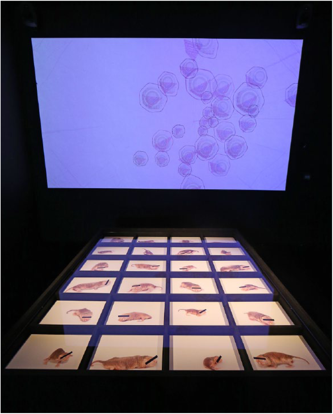
The last project I’m going to talk about is slightly different, entitled ‘Blood & Bones’ (2012–), but does share some of the ecological considerations of data discussed in the previous work but in a way that explores how data circulates, forms, and is made through social, material, and bodily processes. About six years ago I was diagnosed with a haematological condition, which is incurable, and, as an artist … artists are very entrepreneurial in this way … I said to myself: ‘I could take advantage of this, I’ll make a bit of work about it!’
Bodies in pain undergoing change, and bodies that malfunction, produce huge amounts of medical data that connect to other medical, financial, biological, and affective systems. In part following Sontag’s (1978) call ‘against metaphor’, this project seeks to map the production of this data and its interrelationships as a means to develop alternative ways of representing illness beyond normative narrative tropes, i.e. metaphors of struggle, achieved wisdom from trauma, etc. ‘Blood & Bones’ builds on foundational work on illness by artists such as Jo Spence and Helen Chadwick but uses contemporary data methods to lay bare experience ‘as it is’, and as it happens. I designed a range of indexing methods for tracking, documenting, and measuring a spectrum of experiences including details of psychological response (e.g. the ‘stoicism index’); a sartorial tracker that captured a daily change of headwear necessitated in response to chemotherapy; a running total of drugs consumed; and the financial cost of my treatment which I could ascertain from public databases (Figure 4). These indexes were published on a website that I maintained during treatment and subsequently output in several forms: simple visual graphs, grids of photographic images, texts of data tables, and physical installations using towels and other medical equipment expressing the data in physical forms for exhibition.
‘Blood & Bones’ seeks to develop different ways of accounting for illness than might normally be encountered. This involves the development of a deliberatively terse visual and informational grammar capable of rendering the complex arrangements of economics, biology, affect and matter that the experience of illness produces. The ‘terseness’ is important, the experience of illness for me, on a day-to-day level was mundane. I don’t wish to downplay the seriousness of the situation (which is ongoing), but it felt important to develop a means and ways of capturing the bureaucratic, the boring, the physical, the psychological within a framework that enabled a 360-degree appreciation of the experience.
The data indexes function to connect and make tangible these different registers and coordinates of experience, an optics if you like to project a data documentary of something that we all get to face at some point in our lives.
*
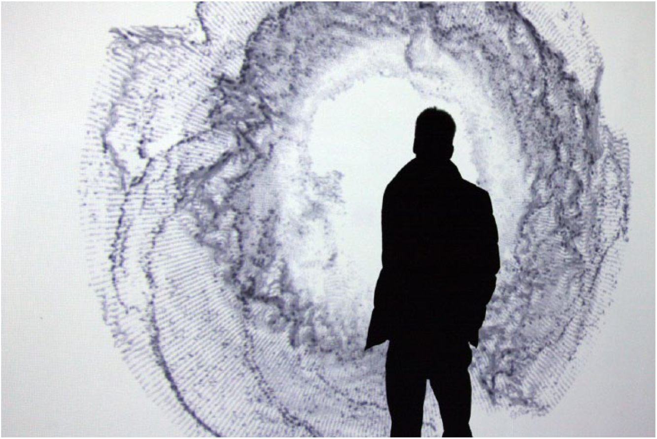
Tom Corby, Gavin Baily and Jonathan MacKenzie (2011: 3) The Southern Ocean Studies (climate data driven moving image installation). London: Ambika P3. Reproduced with permission.
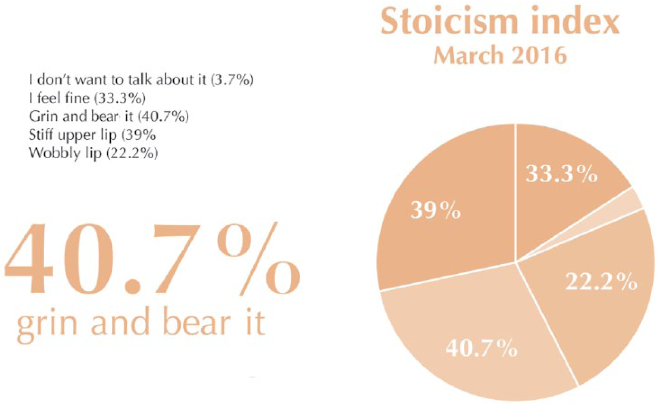
Tom Corby (2014) ‘Blood & Bones, Stoicism Index’ (data driven graph, digital print). Istanbul: Kasa Gallery. Reproduced with permission.
I was struck by the attention all four speakers gave not just to notions of numeracy and data, but also to notions of the emotional and the cultural realities of data and numbers. Rather than being wholly abstract, stable truths, numbers and data are affected by a huge spectrum of variables that are emotional, that are actual, and that are influenced by everything that happens around them. There’s an interesting story to tell here about data that struck me from the first moment I started working with it. We see it often as a flag-bearer of truth. But actually much like any other recording or representational device, data has started being used to capture reality, to evidence truth. We’re now very familiar with the ways in which data is used to construct stories, narratives and un-truths, and things that are slippery and difficult. So it’s becoming more and more complex. It will be great to touch on some of the issues that you’ve all referred to, but, before that, I’m guessing that most of you in the audience aren’t data experts or expert mathematicians. Steven, if you could say a few words about the distinctions?
Well I’m really not either, but I do speak English. Data is a Latin word that means ‘that which is given’. From datum. From do, dare, to give. But data was never given. Data is always, in fact, there to be transformed or encoded. We think of data as having numerical form, but it doesn’t have to. So for instance ice core data from Greenland is not numerical; you just drill into the ice and you get different concentrations of different kinds of chemicals. But we can numerize those, that’s one of the things that we could do. But data doesn’t have to be numerical. It’s just that we can make more things with stuff if we make it numerical – or, as we nowadays say, digital – because of this principle of absolute equivalence; because numbers are all exactly the same in what they are.
So numbers in a way are an operation that we perform upon data, and the things that we call data, I think we tend to call them data precisely because they are things that are available or maybe made available for us to transform into pictures, for example.
The first formulator of statistical theory, the Belgian Adolphe Quetelet, was astonished to find that no matter what the fluctuations of national fortunes and moods, the number of suicide attempts in Paris remained absolutely consistent from year to year. And absolutely consistent too were the proportion of letters that failed to be delivered in Paris. He speculated that there might be a correlation between these two things – probably not.
What we do is we do things with numbers.
So data is not numbers; numbers are an operation that we perform on things. Number doesn’t exist until entities that count perform numerical operations on things in the world. Mathematicians for the most part are Platonists; they think that numbers exist before everything. So they think that all the places of Pi somehow exist somewhere. Wittgenstein disagreed with this and I’m with Wittgenstein. Number is in process, it’s in the process of emergence. Wittgenstein said that even God would have to do the maths in order to know all the numbers of Pi, that’s the only way. And we haven’t got there yet; 3 billion places so far of the numbers of Pi.
So number is what we do to things and data is just stuff that is plastic enough for us to do stuff with it; which is almost the opposite of what we tend to mean by data. We tend to mean stuff that is given: ‘There it is, can’t do anything with it.’ But actually data is stuff that you can do anything you like with.
Yet we heard a different story from some of these presentations. I’m trying to look at Dawn [who’s on Skype]: would you like to pick this up?
What particularly interested me in the presentations was the categories of people that feel that they have licence to do stuff with data. I think those are interestingly more varied than we might expect.
There are those mathematicians who speak about having their favourite numbers, when perhaps one shouldn’t. And what about the licence of being an artist able to make up an index that is of interest or useful? I cite these as examples of a certain licence that one has; but these are capacities that everyone has in an everyday context, too.
And yet that licensing in certain contexts does get curtailed. Environmental activists are very concerned about the numbers that come from air quality sensors. These activists are very rigorous in many ways; there is a sense that they’re experts already. They know how certain features in data work, whether the regulatory frameworks have gone wrong, etc. The expertise there is astounding. When you take that same data, though, and transform it just a little bit – change it from an average across a 24-hour period to a rolling average, say – they are on much less steady ground because that’s not the kind of data transformation they normally work with. Something happens to the social licensing. It puts them in relation to other more privileged forms of expertise, and they have to spend time thinking about what a rolling average does instead of focusing on saying: ‘this set of readings tells us there is a problem’. I think we’re in this interesting moment where we can open up ideas about who has these privileges and these capacities; which we all have at some level, of course.
One point I wanted to convey is precisely about this licence to use numbers and to name them as important. Currently, there are a lot of conversations amongst people in our professional worlds who wouldn’t conventionally use numbers as a practice, who aren’t supposed to be involved with numbers. They’re cultural historians, artists and curators, people who did Arts and Humanities subjects at school rather than numbers, and they’re – we’re – having all sorts of arguments about why we should be using numbers.
One of those arguments is about productivity, economic gain, and social participation. This is the argument of documents like the British Academy report I referred to earlier. It says, ‘look, we need to be numerically literate, we need to be comfortable with numbers, it’s for the national good, it’s for the individual good.’
There’s another argument in the Humanities, particularly in places like the UK where the ‘impact’ of what we do is counted in particular ways. 3 This is the argument that numbers are power; that qualitative evidence on its own is insufficient, so we need to be able to quantify the results of our work. 4 This also means that quantitative language is the language that will allow you to access power. So a related argument is that those of us who work in the Arts and Humanities should become familiar with that language as it allows us access to government and industry, thus increasing our likelihood of having an impact. When I present my research to people who prefer numbers, it’s possible to adopt a different verbal and body language, to try to present the work as quantitatively valid in a context where quantitative systems are privileged over qualitative ones.
I’d suggest we’re agreed that quantitative concepts can only be an important element in critical cultural practice. At the same time there are all sorts of connections and critiques to be made with performativity, passing and power, here. And I have serious concerns about what happens when we frame one in terms of the other; in quantitative language or the language of the economist or the technocrat. It was the poet and activist Audre Lorde (1983) who wrote that ‘the master’s tools will never dismantle the master’s house’. So are we trying to do the impossible, and should we be working from the outside? Can you be heard for what you want to say if you’re parroting the language of the dominating and you’re feeling oppressed within it? There are some very real caveats around using that language. I’d also argue there are moments when we should be using it.
And finally, I’d argue that numbers and counting and calculation are always part of what we do; and that the Arts and Humanities – and for those of us who took the Arts track at school – could be more vocal in articulating this. That might go some way towards counter-balancing this qualitative–quantitative divide and the hierarchy that lies within it.
Can I make a point about Audre Lorde? I once saw that chalked up on a wall in a university in India: ‘the master’s tools will never dismantle the master’s house’. And I thought: ‘Well, has Audre Lorde ever seen a hammer!’
Numbers are always, in that sense, two-sided.
Not many of us like the idea that you can count up and measure the impact of your work and, as it were, get rewarded proportionally to it. This is all about deciding how to divvy up a budget that the government (by way of the Higher Education Funding Council for England’s evaluation, what it now calls the Research Excellence Framework) decades ago decided it wasn’t just going to divide up equally. That’s how it used to be; but for a long time now they wanted to divide it up selectively. But imagine a circumstance in which a funding agency, or your employer for that matter, says: ‘we’re going to distribute salaries at random!’ So some months you’d get £2,000, some months you get £15. That’s fine, isn’t it? Because we don’t really approve of this quantification thing! We really approve of this quantification thing when you get the same amount of money every month. Or preferably you get more every month. So you gotta use the tools.
Last week, Darren Henley, Chief Executive of Arts Council England was with us here in Art, Design & Museology at UCL Institute of Education. He was speaking with students and staff about his most recent book, The Arts Dividend: Why Investment in Culture Pays (2016). He’s interested in the ‘benefits’ that art and culture bring; which are to do of course largely with education, creativity, innovation, health and well being, and so on. And these ‘benefits’ are, perhaps inevitably, aligned with economic ‘benefits’.
Darren’s in a position where he needs to argue for both; and he knows this, and does it knowingly. (There are plenty of clues in the titles of his books, and an earlier publication entitled Virtuous Circle: Why Creativity and Cultural Education Count – see Sorrell, Roberts and Henley, 2014 – makes this rhetoric of accounting even more obvious!) So, he needs to argue for why art and culture matter in principle, and he needs – especially in this climate in which for instance Donald Trump in the US is proposing to eliminate the National Endowment for the Arts and the National Endowment for the Humanities – to be able to make the economic argument; the argument for (and show others how to make that argument for) the benefits of the creative and cultural industries to the UK economy. (The actual figure is that they contribute around £90bn net to GDP; incidentally 96% of those working in these industries voted in the 2016 Referendum to ‘remain’ in the EU.)
While he was with us, Darren spoke a great deal about ‘excellence’ – a word that for decades has been circulating in and as a rhetorical default for ‘quality’ and has been dictating the terms and conditions of both the arts/culture sector and the higher education sector. It’s a word that has of course been critiqued for as long as it’s been in circulation, and rightly so, since the ‘discourse of excellence’ is an integral part of the corporate techno-bureaucratization of both the arts/culture and higher education. (The University in Ruins by Bill Readings, published in 1997, exactly 20 years ago, after its author’s untimely death, is still, I think, the most damning account of this situation in which we now find ourselves even more firmly entrenched.)
Anyway, of course Darren has to use the word ‘excellent’ to account for the value of the arts/culture. But, listening to him last week, now he seems to have found a way of taking the conversation to its next logical step: he was speaking about the introduction of qualitative metrics! I must admit he did a good job of being enthusiastic about the introduction of qualitative metrics as a way of accounting for excellence across the board in supporting the Art Council’s efforts to fund the right kinds of projects. For him, it’s absolutely about arguing on behalf of the quality of bids/projects. So he’s after that evidence, and believes that we should at least be trying to account for the evidence of these projects’ excellence qualitatively.
(After all, they have to be accounted for somehow – we can’t just know that a project should be funded; that way lies defaulting to elusive qualities like magic or, God forbid, through a similarly alchemical process or practice, judgement! It would be like trying to determine whether Messi really is better than Ronaldo, or vice versa, once and for all.)
For Darren, then, the idea of qualitative metrics is a way for ACE to use the machinery of quantitative systems to qualitative ends – very much an effort, you might say, to use the master’s tools to dismantle the master’s house! And we know what Steve just said about that! Anyway, we’ll have to wait and see what happens …
Part of the problem is that the quantification culture that we live in, that drives a lot of policy decisions, for example, is aligned with, yet ironically wholly at odds with, a Post-Truth context in which evidence and expert opinion aren’t valued.
If you talk to a scientist about data, they’ll pull in all kinds of qualifications about the data that they were developing, using and marketing, whereas I’ve spoken in a government setting with policy makers about these kinds of quantification metrics, and they have a completely naive belief in its indexical quality; whether that’s deliberately naive or genuinely naïve, I don’t know.
If there were more nuanced understandings of the scientific method beyond the science community in relationship to what data is, then we might be in a better situation! Then policy makers, culture workers, academics in the Arts and Humanities, even artists might have understood that this quantification culture, this version of it, is only one view on the phenomena we’re looking at, and that it needs to be placed side by side with other views that might be more subjective, or more discursive, or more aesthetic, and that through the interactions between these views you might get at something that’s actually quite useful.
We talk about the qualitative as opposed to the quantitative, but quantity has certain qualities. I don’t think that the force of numbers is on anyone’s side, as it were. I don’t think it is all on the side of the people who are repressing us, or is all on the side of the people who are struggling to get out from under suffering and repression. We need to think about the fantastic civilizing power, of things like the capacity of calculating insurance premiums. This doesn’t sound like a very romantic or exciting thing, but everything that we depend upon, in the modern world, depends upon forms of insurance, and of forms of probability calculation that were entirely impossible a couple of hundred years ago. No one had the faintest notion of the mathematics of probability; it keeps us all safe.
So, there is force, there is quality and power in the quantitative, but it is not all in one place, nor all on one side, and nor can we ever be all on the other side from it, as I’m afraid many of the people in ‘my tribe’, in the Arts and Humanities, seem to think: that the enemy is quantity.
That’s exactly it: we shouldn’t be afraid of numbers; we’re already using them. And we need to ask: What are the tools of quantity that we could be using? I’ll give you an example. As a historian I wonder why historians don’t more frequently use the kind of big data analytics that some researchers, for example, biologists, take as stock-standard now. Why are we not collaborating with statisticians? We count things, but the way that we count and the way that we then process the numbers made available to us are unsophisticated compared to what we could be doing.
Why is this? I think it’s partly about fear, partly about a lack of awareness, partly about a lack of training, or a lack of encouragement, or a lack of acknowledgement that this could be a way to work. So we have to ask: what would happen if we took the way that biologists, transport engineers and others, who work regularly with algorithms and large data sets to understand complex systems, and applied those techniques as well as the techniques we already use to analyse complex systems? Because that is what we describe the Humanities as doing, right: it’s trying to explain the complex and ultimately inexplicable systems that are what it means to be human, so why are we not using those tools as well?!
We have a question from the floor …
Thank you all, that was fascinating. I was especially struck by Steven talking about the folkloric nature of how humans calculate things without even knowing it! My question, though, concerns museums getting more involved in activities around numbers – more exhibitions, more educational programming, etc. When it comes to numbers, what would you challenge museums to do more of? Or, to put that another way, what would be your number-related dream exhibition?
I’d love to see an exhibition that’s about odd and even!
If you ask someone to put in a grant application and they say they need £2,800, you know they just made up that figure. But if they say they need £2,813, you believe they’ve carefully meditated on exactly how much it’s going to cost, and you believe them. That’s a tip for the future, everybody.
Why do we think that odd numbers are more precise than even numbers?
Well, it’s partly because we have the expression ‘rounding up’. And there are a whole host of other reasons! Which can be very varied, culturally. In many Asian cultures, people’s favourite numbers tend to be even numbers, because lucky numbers in at least some Asian cultures tend to be even. Lucky numbers in European cultures tend to be odd numbers; think about the magic number three, seven in fairy tales, and so on. And this is entirely arbitrary; it’s just things that we do with numbers.
Why is it that if you wake up in the middle of the night after a rather feverish, alcohol-fuelled dream, the digital clock always says 03:17 am? It’s always odd because somehow you are out slightly to the side of existence. You could do an awful lot with odd and even as a very simple starting point.
I’d love to see an art and design museum, particularly a design museum put on an exhibition about actuarial science and the way that bureaucracy uses numbers in and as design; to take on numbers as artefacts, and to take on calculations and calculating equipment, and the labour around calculation as a design process, and as the outcomes of design.
I think a really good place to start would be an initiative that enables people to design their own data collection activities, in ways that make sense to them, that open up that possibility …
It’s interesting that we have citizen scientists in natural history museums but we don’t see that tendency so much with art and design museums …
That’s true, but what I have in mind isn’t so much a citizen science project as much as a citizen data project. Data doesn’t necessarily have to be a scientific process; it can be very personal. It becomes folk data, if you like. I think folk data could be a very interesting starting point but it may not necessarily be an exhibit, it might be more like a set of processes.
In part, my number-related dream exhibition already took place at a Quantified Self conference a few years ago (http://qs15.quantifiedself.com). This incorporated artists who were doing interesting representational work with self-tracking data, where artists were collecting data about themselves and thinking through its representational politics. I think they did a nice job of it! A lot of science happens at QS but they are totally unafraid of approaches grounded in the Humanities, and in Design. There is always a tension between the two, especially when medical directives are involved, but there was something wonderful about having fully-fledged medical researchers and biotech engineers in the same room as people exhibiting photographic collages similar to Tom’s ‘Blood & Bones’.
Other than that, I’d love to see a challenge to children’s museums or science museums to subvert the familiar tropes of STEM education. I’d like to change the narrative that currently says: ‘We learn math in order to do science and only science.’ It would be great for a museum to show that Humanities-based approaches are conceivable, and not just because you can make pretty art. You can challenge authority, too. In effect, this would make the same move as QS did for adults and medical data.
There’s been a lot of talk about how there should be more numbers in the Arts and Humanities. From an educator’s point of view, how do you think that can actually happen? Does that need to start in schools? Does it need to happen in museums? Is how numbers are talked about in the media the problem or the solution? Speaking as someone who didn’t like numbers at school, and now finds themselves working as an educator, I’d like to know how you think we can make a difference, and where you think we can make that difference?
Well, I was terrible at maths in school, which is deeply ironic, now that in my work I’m caught up in processes that involve having some kind of competence in maths!
I think an answer to your questions can be found, at least in part, in some of the discussions we’ve been having, especially around starting to involve people in using the numeric in ways that makes sense to them, that helps them to make sense of their lives in creative ways, in ways that offer insights into their relationships with people and things, and about the world. Immediately this goes beyond the silos of specialism like Maths or Humanities. So there is work, already out there, and we’ve talked about some of this work today: in the Quantified Self community, work by artists using data and the numeric in all sorts of interesting ways, and when members of ‘the public’ come across this, they’re fascinated by it in an often very direct way. That’s one or two routes towards it …
I’m speaking personally as a mum with two primary school-age children, who has herself been through an education system that very much segregated art and science. I was an art person, yet weirdly I ended up working in the Science Museum with technology, so now I do both. What I’m noticing about the way maths is taught now is quite encouraging. It’s quite philosophical and exploratory, and I think that’s really positive. The school uses a lot of visual tools to explore numbers and numeric relationships. I feel less positive about the arts; the arts have been discredited and you’re lucky if your school is supporting art, drama or music, which my children’s school does, fortunately. As you noted in your slides, Sarah, the fact that subjects, disciplines or competencies are so separated is problematic. Literacy is separated from itself, so visual literacy is treated differently to numeric literacy. I’d love to see STEAM being celebrated rather than STEM, as a modus operandi. Ireland, I’m told, this is anecdotal, from government down are making that their approach; but I don’t know if that’s true, someone told me.
Think how far we’ve come! When I was a kid, we were brought up on ‘the three Rs’ as the foundation of our educational system: Reading, Writing, and Arithmetic! Despite my sophisticated ear for phonemes, it’s no wonder there’s a generation or two of such poorly educated comprehensive school kids out there!
I also want to mention data science education. Currently data science is not a field that is particularly well defined right now, which makes it an excellent opportunity to elaborate Humanities-based approaches. Data scientists do not just seek to quantify and predict; they also explore data. When that exploration is done with rigour, and with self-awareness and reflexivity, it looks surprisingly similar to ethnography and archaeology. Data science programmes produce people who often go on to do high stakes things – these are people who might work for large companies predicting customer behaviour or might make riveting, incisive social commentary using data in art and design. I’d rather live in a world where even the people who choose the former at least understand that the latter is conceivable and important. It creates the possibility of some degree of self-awareness about one’s effects on the world.
Thank you for your presentations. Sarah and Dawn both talked about giving their students licence to look at all sorts of data. We’re about to embark on our dissertations, so I’m interested to hear to what extent you encourage your students to create their own data?
I would ask: What’s the most effective data for the project you’re undertaking? What kind of data is available? and What kind of data would you need to then create? And then the question comes: How long do I have? And here we are again, back to the point made earlier about quantifying everything: How long do I have to write, research, and finish and submit that dissertation? It’s a fantastic example of everyday calculation, as we’ve been discussing.
Thank you all. I have a question for Tom. I was at a Humanities-based high school, and studied Art History as an undergraduate, so I am not particularly into numbers! Tom, you were talking about what kinds of sense numbers make for people, and how they could have a relation to everyday experiences, to our everyday lives in some way. And I’m wondering, I can see a real difference in what I’d see as the two strands of your projects. ‘Blood & Bones’ is quite understandable and impactful because it is strictly related to data and numbers as they pertain to individuals and bodies, and for sure I can relate to the emotional affect of this accounting. Contrary to this, even though I’m interested in climate change, I had more difficulty understanding the data/numbers as they’re presented in the earlier projects you discussed. Obviously, it was an artwork with its own aesthetic and visual language, but at the same time, it’s clear that you’re making choices to not make the data and the numbers more obviously intelligible to the public, right?
With the screen-based work, they’re visual articulations; they’re abstractions of underlying data sets. So I guess the question would be: do you need to know there’s numeric data underlying what you’re looking at, or could you experience that work just by walking to it? Could you get some kind of sense of time and form and place from that work without realizing what the data sets were or the magnitude of the number underlying them? I think you do. In my experience, from ‘walk in’ situations, when people simply walk in and see the work in an exhibition context, they’re often not that interested in the specific data sets underlying the work. Some people are, of course; it depends on their backgrounds, interests, how they’re approaching the work, whether it’s being exhibited at Ars Electronica, for instance, where the audience are by default more likely to ‘do’ data. I think that work can’t exist without the data, or it becomes a very different type of work. I think the visibility of the data in ‘Blood & Bones’ is much more evident and perhaps easier to grasp in a PowerPoint presentation than seeing documentation of an installation. Works like ‘Cyclone’ and ‘The Southern Ocean Studies’ project are very large, very physical, so this installation work brings to bear other relations: bodily relations, the scale of the work, its temporal dimensions; the physical and visual expressions in the works that you don’t really see in documentation of them.
When I work with artists like Tom, who work with data, I’m often in a position of explaining that what someone is seeing isn’t ‘just’ information, and that what artists do is exploit different manifestations, different relationships, and different and perhaps less stable ways of engaging with, arranging, and utilizing or articulating what that data could mean, and then what that might suggest about wider cultural contexts. The show I’m currently co-curating with Sam Skinner for FACT, Liverpool and the Open Data Institute (ODI) is called The New Observatory (Figures 5 and 6). It brings together an international group of artists, researchers and technologists whose work explores new and alternative modes of measuring, predicting, and sensing the world today. Central to our project is an attempt to distinguish observation from narratives around surveillance, with their overriding associations of secrecy and distrust. So the exhibition offers up observation as a series of actions that include drawing, composing, film-making, expeditions and citizen sensing. The artists we’ve included utilize, analyse and critically engage with data through an enormous variety of strategies and media. We’re interested in how conversations around observation shift when we relocate the traditional purpose of an observatory from being a specialist site of scientific exploration to a more free-form site of artistic and individual exploration, exempt from the formal constraints of science, where imagination and speculation are as fundamental to research as any technological tool.
Julie Freeman, Rodent Activity Transmissions (RAT) Systems (2016 – ongoing). The New Observatory at FACT, 2017. © Photograph: Gareth Jones.
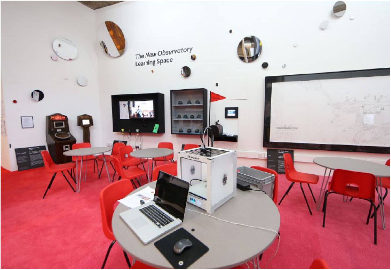
The New Observatory at FACT, 2017. Learning Space. © Photograph: Gareth Jones.
I agree with what you’ve just said, Hannah, regarding artists exploiting data in these ways and to these ends. I have my sense of what a work is and does, but as an artist I always think that when you make a piece of work you’re giving a gift to somebody. And whether they accept that gift in the form you give it to them or not is up to them. We might have completely different notions of what we’re experiencing, but that’s the kind of experiential interpretative space that artworks produce.
It seems to me that we’re in a very, very auspicious time because we have a notion that lies midway between or participates completely both in the worlds of the mathematical and in the worlds of whatever else there is. And that is pattern. And there is no final definition of pattern other than a mathematical one.
Let’s start here: What’s the definition of chaos? Chaos is any sequence or anything that cannot be economized in any way, or technically compressed. So white noise is just one thing and then some other thing randomly, and then some other thing randomly. If there is any pattern, if there is any sequence at all in the white noise, then you have a means of reducing it, you have technically something like an algorithm. You could compress it. If you can compress anything at all, you can make certain things more likely than chaotic, then you’re moving towards economy. This could be expressed mathematically.
Language is mathematical, visual form is mathematical because it’s about recognition of recurring things. There are good and bad ways of transforming the things we call data to bring out pattern.
So we could have taken your data, Tom, and said: ‘I’m not going to transform this visually. What I’m going to do is I’m going to operate the following code: every time a prime number appears in that data, a grey squirrel dies.’ It’s a very crude way of illustrating a pattern, but it would be a codification of the data. It would only be worse insofar as it would be cruder. But if you wanted it to be cruder and also, by the way, want to get the grey squirrel population down, that would be a socially useful way of encoding that data. But pattern is just about likelihood or predictability. And we are creatures – and all living creatures are designed to maximize predictability.
We don’t want our molecules flying off in random directions; we want them more or less staying in the same place for as long as possible; not indefinitely. Fortunately. So that holds us together: pattern.
I think that’s probably an appropriate image with which to end.