






Abstract
Ontologies and hierarchical clustering are both important tools in biology and medicine to study high-throughput data such as transcriptomics and metabolomics data. Enrichment of ontology terms in the data is used to identify statistically overrepresented ontology terms, giving insight into relevant biological processes or functional modules. Hierarchical clustering is a standard method to analyze and visualize data to find relatively homogeneous clusters of experimental data points. Both methods support the analysis of the same data set but are usually considered independently. However, often a combined view is desired: visualizing a large data set in the context of an ontology under consideration of a clustering of the data. This article proposes new visualization methods for this task. They allow for interactive selection and navigation to explore the data under consideration as well as visual analysis of mappings between ontology- and cluster-based space-filling representations. In this context, we discuss our approach together with specific properties of the biological input data and identify features that make our approach easily usable for domain experts.
Introduction
Ontologies play an important role in biology and medicine to structure biological knowledge. An ontology is a set of controlled, relational vocabularies of terms commonly used in particular areas of science. Ontologies are used to structure and standardize biological knowledge to support data integration and information exchange. Examples are Gene Ontology (GO—to standardize gene and gene product attributes across species), Molecular Interactions Ontology (PSI MI—to standardize molecular interaction and proteomics data), and Systems Biology Ontology (SBO—to standardize terms commonly used in computational modeling and systems biology). To access many ontologies in biology, the Ontology Lookup Service (OLS) 1 provides a web service to query multiple ontologies from a single location, providing a unified output format. Often data obtained by biological experiments (experimental data) are analyzed in the context of biological ontologies, for example, by means of enrichment of ontology terms to identify statistically overrepresented (inner) ontology terms.
In particular, the GO 2 is an online resource that provides a set of structured vocabularies (ontologies) for the annotation of genes, gene products, and sequences. These vocabularies are used to describe the roles and properties of genes or gene products in organisms and provide a consistent characterization of gene products in various databases. Currently, there are three independent vocabularies (or parts) that are considered by the GO: molecular function, biological process, and cellular component. Biologists use such a vocabulary as a guide to answer meaningful questions, for example, “if you were searching for new targets for antibiotics, you might want to find all the gene products that are involved in bacterial protein synthesis, but that have significantly different sequences or structures from those in humans.” 2 In consequence, new discoveries that change our understanding of these roles are made daily, thus making GO a dynamic data set. The GO terms are interconnected and form a directed acyclic graph (DAG).3,4
Hierarchical clustering is a standard method to analyze and visualize large-scale experimental data in the life sciences. 5 It is a statistical method for finding relatively homogeneous clusters, based on two steps:
Computing a distance matrix containing the pair-wise distances between the biological objects (such as genes);
A hierarchical clustering algorithm.
Clustering algorithms can either iteratively join the two closest clusters or iteratively partition clusters starting from the complete data set. After each clustering step, the distance matrix between the new clusters and the other clusters is recalculated.
Ontologies and hierarchical clustering are widely used to support the analysis of molecular-biological data obtained by high-throughput technologies. These technologies lead to an ever-increasing amount of data, which delivers a snapshot of the system under investigation and allows for the comparison of a biological system under different conditions or in different developmental stages or with different genetic background. However, both ontologies and hierarchical clustering result in huge data sets of DAG- and tree-like structures. To help in analyzing these data, often both views are desired: visualizing the data set (such as the expression levels of the genes in organisms) in the context of an ontology (such as the GO) and in the context of clustering of the data (such as a hierarchical clustering).
Background and related work
A typical example is transcriptomics data. The transcriptome is the set of all RNA molecules in one cell or a population of cells. It is measured by DNA microarrays or sequencing and gives a snapshot of the current gene activity within the cell. Hierarchical clustering is a typical method to identify and classify patterns of gene-expression in this data. It results in an ordering of the genes such that clusters of co-expressed genes are visualized and can be used to infer gene function. Ontologies, however, give a functional annotation of elements; in case of the GO, it gives a hierarchical annotation of gene function. The combined investigation of gene activity in both hierarchical clustering and ontologies can now help in better understanding of the roles or functions of genes. If, for example, a small cluster of genes is highlighted in the hierarchical clustering and the visual investigation of the corresponding genes in the GO shows that most of these genes belong to the same subgroup within the ontology, then this gives a strong indication that these genes are not only assigned to the same function but also that this function may be of particular importance (as the activity of these genes behaves similarly). However, if the genes of a cluster in the hierarchical clustering belong to many different ontology concepts (assigned functions), then it may be also of interest to investigate these functions in more detail. Finally, the enrichment of ontology terms in the data is used to identify statistically overrepresented ontology terms, giving insight into relevant biological processes or functional modules. If the respective genes also behave similarly (belong to the same cluster in the hierarchical clustering), then this is again of interest to a biological user as the enrichment or clustering has been obtained independently with these two different methods. Therefore, a typical user session would be browsing the data to investigate the relation between functional annotation in the ontology and behavioral grouping of gene activity in the clustering.
Related to our approach is the problem of comparing two or more trees with the same set of leaves, for example, commonly occurring during the comparison of different phylogenetic trees. A usual way to represent such structures visually is to draw the two trees side by side in opposite directions and to draw connectors between the corresponding leaves. The problem of computing good leaf orderings and tree visualizations has been studied extensively, see, for example, studies by Dwyer et al., 6 Fernau et al., 7 and Venkatachalam et al. 8 However, the problem of comparing a tree (hierarchical clustering) with a DAG (ontology) or two DAGs with the same set of final (leaf) nodes has only recently come in the focus of research. Scornavacca et al. 9 introduced the concept of tanglegrams for rooted phylogenetic networks. However, the approach still uses the concept of drawing the two trees or networks side by side in opposite directions and drawing connectors between the corresponding leaves.
This article proposes a new method for the combined visualization of an ontology (DAG) and a hierarchical clustering (tree) of one data set, and extends the work 10 by a description of additional features, future directions and more biological background. It is structured as follows: in section “Properties of the input data,” the properties of the input data are discussed; section “Visualization approach—CluMa-GO” presents our visualization approach combining GO (DAG) visualization and cluster tree visualization, and discusses interaction techniques. Section “Technical issues” deals with technical issues, such as implementation aspects and the scalability of the proposed method. Finally, section “Discussion” presents a discussion of our tool’s utility, including requirements of biologists, and section “Conclusion and future work” concludes this work with ideas for future work.
Properties of the input data
In general, any data set that can be connected to an ontology and used for a hierarchical clustering is appropriate input for our visualization approach. Here, we employ a transcriptomics data set representing different expression levels of genes. The initial data set has been reduced to genes, which are significantly up- or downregulated, resulting in 7312 genes. The resulting tree of the cluster analysis (called Cluster Tree in the following) is a binary tree with 14,623 nodes and 14,622 edges. It has 7311 (nonterminal) nodes and 7312 leaves (terminal nodes). The GO is a DAG consisting of more than 34,000 inner nodes and a substantial amount of leaf nodes depending on the organism under consideration. We consider only the nodes representing the 7312 genes and those nodes that are on paths between the GO root node and leaf nodes (genes). Therefore, the final GO data set consists of 10,042 nodes and 24,155 edges. The graph has 1 root, 2729 (nonterminal) nodes, and 7312 other nodes. Not all of these are leaves of the GO. There is also a considerable amount of unconnected nodes as not all genes are assigned to GO terms and therefore do not form part of the GO DAG.
Both of these graphs are independent from each other from a developers’ point of view as they have different node and edge identities (IDs). However, the graphs have the same label for terminal nodes (genes), indicating that they “share” a specific part of the nodes among each other. This means that the relationship between these two data sets can be mapped as indicated by Figure 1. To further investigate the relations between GO DAG and Cluster Tree, users should be able to find the cluster subtree derived from any node in the GO. The main idea here is that for each interactively selected node in the GO visualization, a corresponding subtree in the Cluster Tree should be computed. Our own implementation of this mapping (Subgraph Extraction) is briefly described in subsection “Architecture and implementation.”

The light-blue part on the left represents a part of the GO DAG. The gray part on the right represents the Cluster Tree, while the red nodes in the middle are shared between both of them. Note that this diagram shows an idealized situation because the common leaves do not need to be neighbored.
Visualization approach—CluMa-GO
Due to the complexity and size of our input data, we visualize the GO DAG and the Cluster Tree in two separated and coordinated views.11,12 The data are fed to our tool by using two individual .gml files 13 (one for the GO and one for the clustering) through a standard dialog box. Representing large data sets on their own is challenging, but our tasks became even more complicated as we have to relate two such data sets of different nature to each other: a DAG and a binary tree. We use interaction techniques, such as brushing,14,15 to show the mapping between both. If we draw the graphs by using conventional graph drawing algorithms,16,17 problems such as clutter when showing the GO DAG and long or wide cluster trees (depending on the chosen tree drawing algorithm) would appear. This would result in a lot of scrolling and panning actions 18 because zooming out would not be sufficient in case of the Cluster Tree visualization (traditional tree drawing algorithms produce much unused space). Another issue with respect to the mapping is the cluster subtree derived from a selected GO node as described in the previous section (and Figure 1). Here, the corresponding parts of the subtree are often not sequentially mapped and thus form “gaps,” as common leaves in the mapping do not need to be neighbored, see subsection “Architecture and implementation” for more details. Those parts might be too far apart from each other to be shown in a single view. As a consequence, a user might miss some information. Nevertheless, we offer the user an optional view to show the mapping by standard node-link layouts in a separate window as described in subsection “Detailed map viewing.”
We implemented specific representations for the GO DAG and Cluster Tree that address the aforementioned challenges. First, we will present the approaches to visualize both the GO DAG and Cluster Tree and describe the supported interaction techniques later in order to distinguish between visual representations and interaction concepts. A complete overview of the graphical user interface (GUI) of our prototype implementation, called CluMa-GO,10,19 is shown in Figure 2.
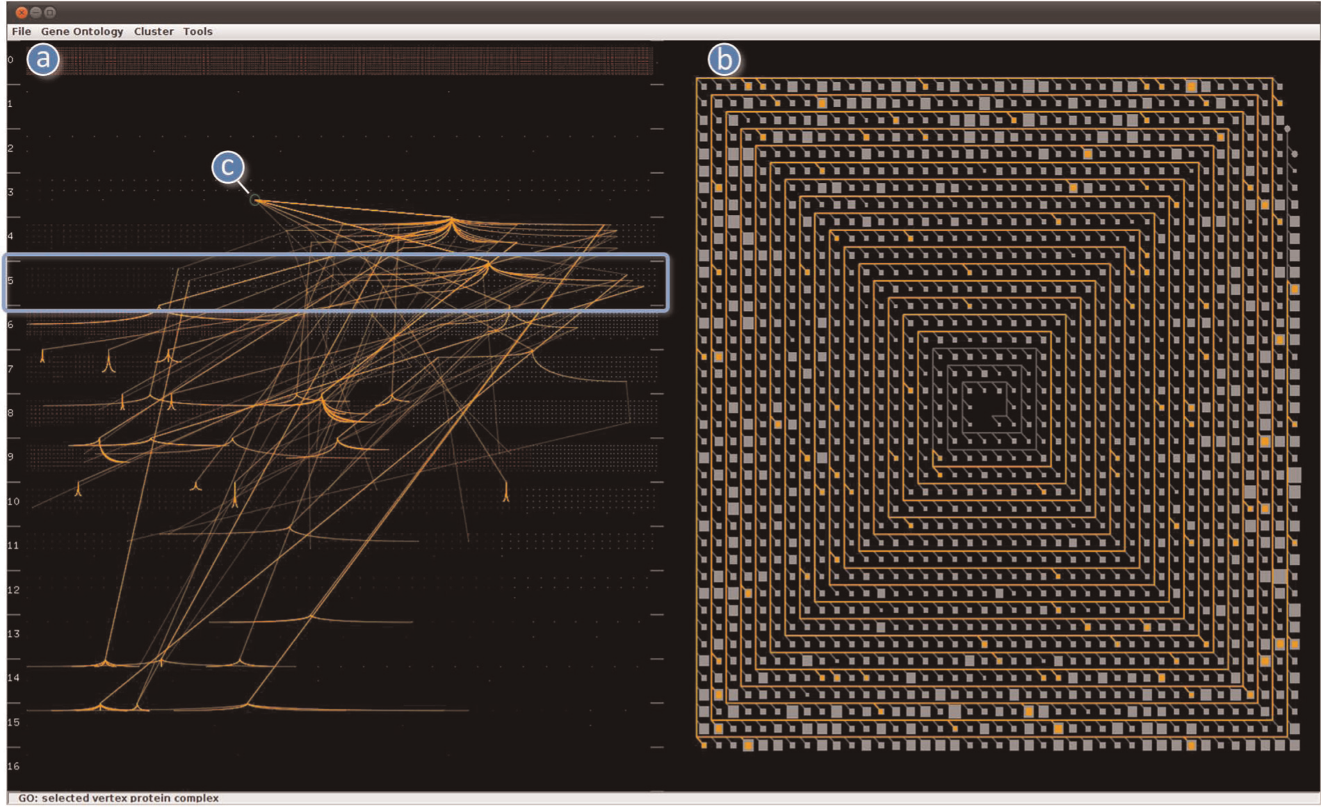
GUI of CluMa-GO. On the left-hand side, (a) the used GO is represented in the GO view (Levels Layout). The layer numbers from 0 to 16 are displayed on the left margin. Layer 5 is highlighted with a blue rectangle, and (c) marks the selected node in layer 3. On the right-hand side, (b) the Cluster Tree view is located.
GO (DAG) visualization
As already described in section “Properties of input data,” the used GO DAG consists of more than 10,000 nodes and 24,000 edges, even if we use a subset of the entire GO. The visualization of such a graph by using standard node-link approaches would not scale without some kind of filtering or aggregation. Our challenge was to show all data in one view. We got inspiration from pixel-based approaches, which usually cope with large data sets.20–23 In our case, GO nodes are represented by colored pixels, whereas edges are hidden to avoid clutter. We call those pixels node pixels in the remainder of this article. Choosing the right color theme was another challenge due to the use of pixel-based approaches. CluMa-GO supports an arbitrary color setting of the different elements of the visualization, such as color of the nonterminal and terminal node pixels, background, and so on. In the default setting, all graphical elements can be easily distinguished and identified on a computer screen. However, in order to write this article, we found a good working compromise for both the computer display and for print outs. ColorBrewer 24 turned out to be a great help for doing this.
Red node pixels represent leaf or unconnected nodes, and light-blue node pixels represent nonterminal nodes. DAGs can be hierarchically layered and have a “flow direction” as there are no cycles. This allows us to place the nodes into several layers, which provide some insight into the topology of the GO graph as shown on the left-hand side of Figure 2. This method produces results that have some similarity with the semantic substrates approach presented by Shneiderman and Aris.25,26 However, the placing of the nodes in layers in our approach is solely based on the graph topology, while in the semantic substrates approach, they are placed in regions (resembling our layers) based on specific node attributes. The layers are denoted by layer numbers and small line segments in the GO view to give a cue to the spatial area of the particular layers. Our GO data set has a quite big number of unconnected nodes. In this particular view, those unconnected nodes are placed in layer number 0 as shown in Figure 2 on the left. We can immediately notice that it is the most dense layer. We have implemented two layering approaches that mainly differ in the way how leaves and unconnected nodes are positioned. These approaches are discussed in the following two paragraphs.
The first layering approach is called Levels Layout and places the leaves (red node pixels) and nonterminal nodes (light-blue node pixels) into their corresponding layer depending on their graph-theoretic distance 27 from the source node (root). Moreover, leaf nodes are distributed in the left part of their assigned layer; all other nodes are arranged on the right. This feature gives us further insight into the topology of a specific layer by gaining information about the distribution of leaf nodes and nonterminal nodes on a particular layer. Figure 2 shows an example of this layout strategy in the GO view on the left-hand side, whereas Figure 3 displays the situation if the user zooms in the view. Although the resulting visualization looks to mimic bar charts, the number of leaves cannot be precisely compared between different layers, as the area the red node pixels (leaves) cover is not proportional to the total number of leaves in each layer. However, it is proportional to the sum of nodes in that particular layer. In other words, the covered area depends on the specific layer density. Unconnected nodes are placed in the top layer number 0. The spatial arrangement of the node pixels within a layer, except the placing of leaves and nonterminal nodes in specific regions, is random.
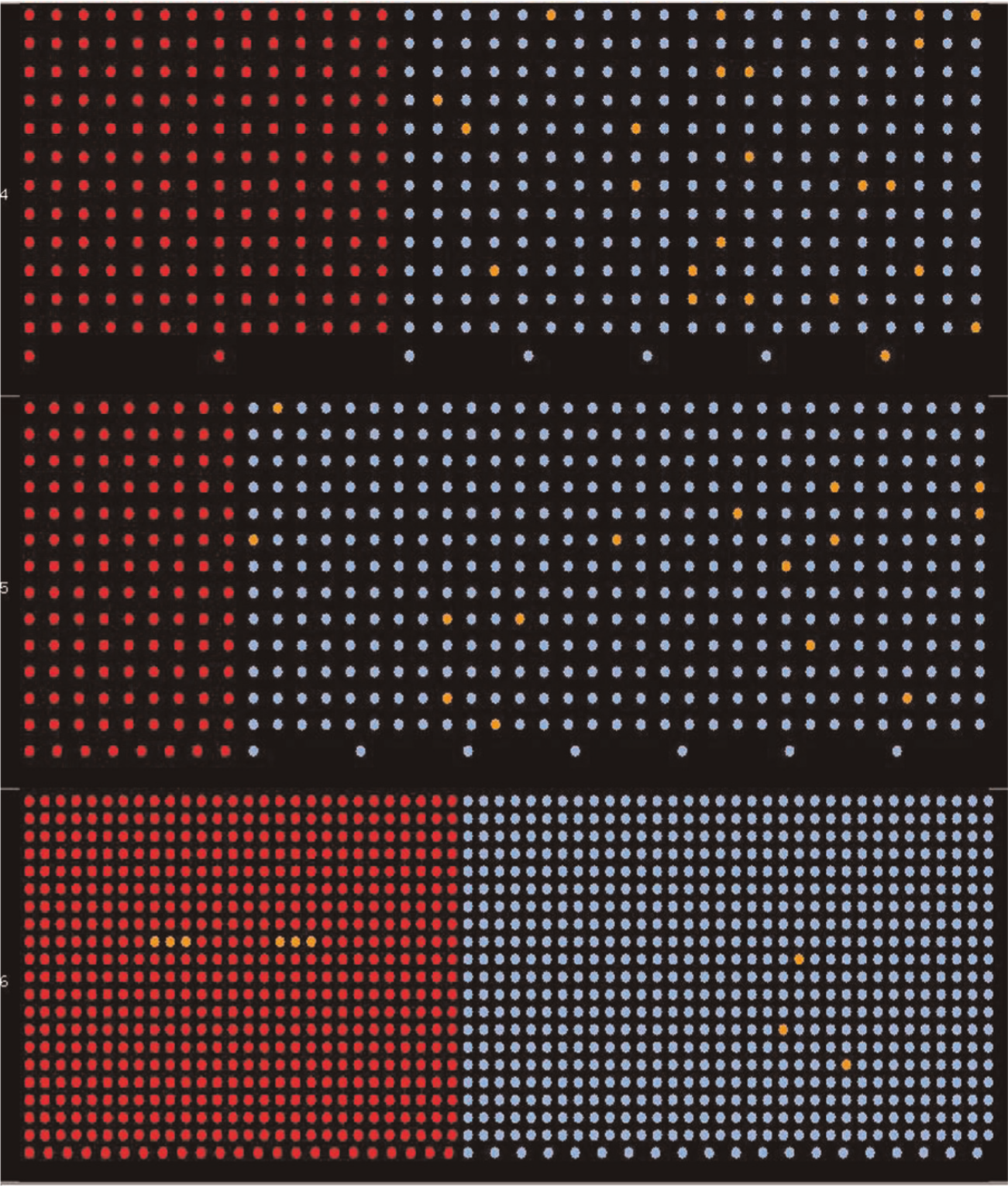
Zoomed-in view using the Levels Layout approach. Layers 4–6 are shown. The red nodes represent leaf nodes (e.g. genes), and the light-blue nodes represent nonterminal nodes (e.g. terms). This view provides insight into the distribution of leaf nodes in a specific DAG level. The orange nodes represent the calculated subgraph (mapping).
Our second layering approach Bottom Layout is similar to the first one in terms of placing the nodes into corresponding layers based on the distance from the source node and random distribution of the node pixels within each layer. However, all leaves are placed into one single layer together with unconnected nodes at the bottom of the GO view, that is, in the layer with the highest number (Figure 4). Unconnected nodes can be filtered out if necessary. This approach gives insight into the distribution of nodes among different layers without the distraction of the leaves, thus enriching the perception of the graph topology.
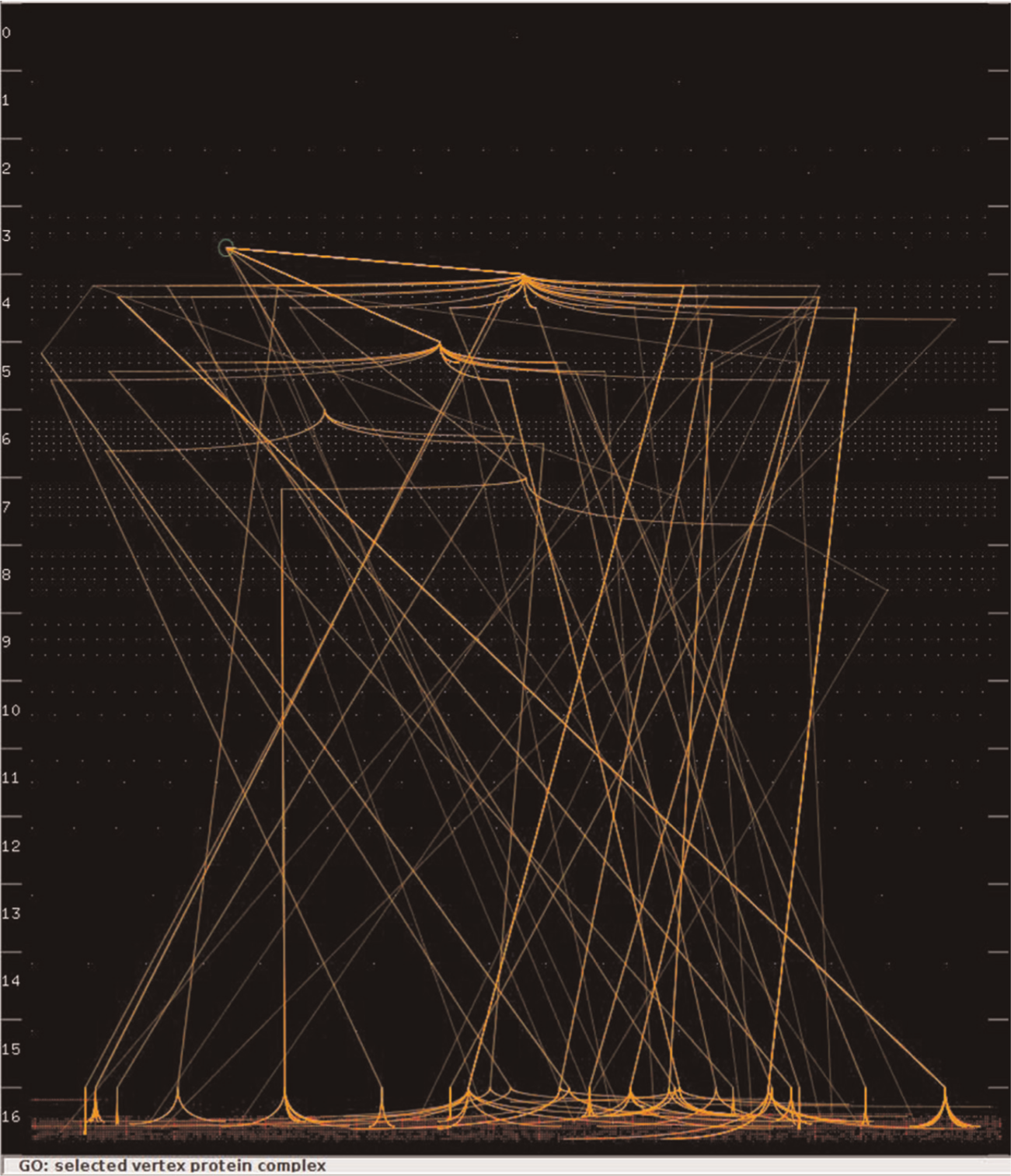
GO view with visible (bundled) edges based on the Bottom Layout. The tool highlights the selected node in layer 3 with a green circle.
Edges are not shown by default in the initial view since clutter will occur otherwise. They are shown optionally in case the user selects a particular GO term (nonterminal node) for further exploration. We also implemented a simple edge bundling algorithm to reduce clutter, that is, only paths outgoing from a selected node that end up in the same layer are bundled together. Figures 2 and 4 show the edge bundling of the calculated subgraph in the GO view based on the Levels Layout and Bottom Layout approaches. This facilitates the differentiation of layers accessed by a specific node. Furthermore, placing the nodes on layers makes the use of arrows for showing the edge direction obsolete, as the flow in longest path layered DAGs is from lower layers to higher ones, that is, from top to bottom in our case. Also, there cannot be an edge between terms in the same layer.
Cluster Tree visualization
We have to address similar problems with respect to the Cluster Tree visualization as we had to do with the GO representation. The tree is usually huge, and any traditional type of visualization would not scale. The application of conventional tree drawing algorithms would produce rather high tree drawings or wide ones, if we would choose to draw the entire binary tree as a dendrogram. Therefore, we developed a novel visual representation for the Cluster Tree. We have noticed that the trees in our data sets at hand are particularly high and unbalanced with not so deep branches (subtrees); therefore, we decided to take this disadvantage of typically space-consuming drawings and turn it into an advantage when dealing with trees of such nature.
Figure 5 displays how a part of such a tree might look like. We decided to use those nodes and edges that form the longest path that connects all branches as a “backbone” for our Spiral Tree Layout. We represent this backbone as a spiral, thus preserving space and giving us a possibility to show the complete tree in one view. We implemented this space-filling tree visualization approach, which is particularly suitable for the representation of unbalanced binary trees. This prevents us to perform repetitive scrolling to browse or navigate the elements.28,29 The direction of the flow in the spiral is counterclockwise from the center toward out, that is, the closer the subtrees (see below) are to the center of the spiral, the closer to the Cluster Tree root they are. For instance, the sample tree
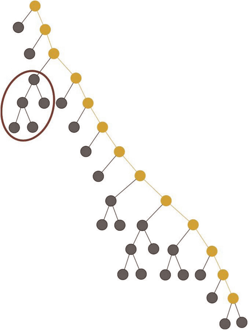
Sample Cluster Tree

The subtrees connected to the backbone are aggregated as the data set is too large. Thus, we allow a specific amount of abstraction in our visualization approach: each small box glyph in Figure 6 corresponds to one subtree branching out from the backbone with an angle of 135° from the vertical. The size of a box glyph represents the number of nodes of the corresponding subtree. For instance, the subtree marked with the brown ellipse in Figure 5 is visualized by the box glyph marked with the brown circle in Figure 6. The highlighted subtree with five nodes is one of the largest ones; therefore, the box in the spiral is proportionally enlarged by the drawing algorithm. In the current version of CluMa-GO, the space between the “spiral arms” of the backbone is constant and not influenced by the size of the subtrees. Therefore, the box representing the subtree is normalized based on the maximum number of elements a particular subtree has.
This approach helps to identify interesting patterns of distributions of subtree branches in the Cluster Tree. For example, if we look at the Cluster Tree view in Figure 2, we notice that the biggest branches appear far away from the root node of the tree. To support a deeper analysis, the user can explore the details of each subgraph visualized in the spiral. This is done by clicking on a box glyph. CluMa-GO then displays the tree visualization widget (Figures 9 and 10) as described in subsection “Interaction techniques and additional views.” Here, the user has the choice between two different dendrogram layouts. The mapping between the two parts, GO DAG and Cluster Tree, respectively, is realized by using brushing techniques. These and other interaction techniques are described in the following subsection.
Interaction techniques and additional views
Biologists browse the data set randomly to find or investigate interesting patterns, or have a specific GO term in mind. They can either select or search for that specific term in a list that is shown in a dialog box called from the menu, or they can directly click on a particular node in the GO view. A mouse-over action on a node will display the name of that node with the help of a tool-tip. This supports the users to browse the GO and to select a node for further exploration. The GO view displays the nodes as single pixels as already explained earlier in this article. It is pretty hard to perceive a single highlighted pixel by using color coding only. Therefore, we allow double-coding and draw a circle around the selected node in the GO view, as seen in the third layer of the GO view in Figure 4. This feature makes it also easier to identify the layer that the currently selected node belongs to.
After the node has been selected by clicking, the subgraph consisting of all reachable nodes will be calculated. These related nodes, as explained in subsection “Architecture and implementation,” will be highlighted in orange in the GO view. Optionally, the edges of the subgraph will be shown too. At the same time, the corresponding cluster subtree will be highlighted with the same color in the Cluster Tree view reflecting the selection made in the GO view. In this way, the user can easily identify the mapping between both views by comparing the orange-colored elements. Note that the closer the selected node is to the GO root, the larger the number of nodes that can be accessed from that particular node (the root node of the GO DAG, for instance, has access to all nodes of the DAG). This means that if the root node pixel is clicked, the complete DAG is selected, which makes no sense usually. In such cases, clutter cannot be avoided. Therefore, users can choose the option to disable the visualization of edges if needed.
The user can also zoom in on a specific layer in the GO view by left-click (Figures 3 and 7). CluMa-GO replaces the GO view by the zoomed-in view with the selected layer in the center of its neighbored layers. In case layer 0 is selected, the view displays the first three layers of the DAG; if the last layer is selected, the last three layers are shown. In addition, it is possible to scroll up or down between three layers simultaneously. The edges are not shown in the zoomed-in view because a lot of edges from other layers might go through and, in consequence, introduce clutter. However, the nodes remain highlighted, and since we deal with a fixed amount of layers and magnified node pixels, it is easier to discover connections than in zoomed-out mode. The zoom-in mode is particularly helpful for analyzing different elements of the subgraph, as it is easier to select and interact with bigger node representations. In order to leave the zoom-in mode, the user has to perform a right-click inside the view.

This screenshot shows the zoomed-in GO view (with the three layers 7–9) on the left-hand side and the Cluster Tree view with opened subtree widget on the right-hand side.
Figure 2 (right part) displays a Cluster Tree visualization with a calculated subtree highlighted in yellow, which was triggered by selection of a specific GO term. We can see that this particular GO term covers most of the backbone of the Cluster Tree. Some subtree box glyphs are not highlighted, while others are only partially highlighted. This is due to the fact that not all nodes in a subtree might be mapped to the selected GO term. The area of the highlight is proportional to the number of the nodes mapped in that particular branch. Figure 8 displays a cut-out of a Cluster Tree view in order to provide a more detailed view.

Cut-out of a mapping in the Cluster Tree view.
Users can further examine these subtrees by clicking on them. This opens a widget that shows the particular subtree in two optional layouts that users can select based on their preference. They can view the subtree in an “explorer view” (Figure 9) based on an Horizontal-Vertical (HV)-drawing algorithm 32 or as a radial dendrogram (Figure 10) similar to other dendrogram visualizations.33,34 The subtree widget appears next to the selected subtree box glyph. It is semitransparent in order to show the context of the area that it covers. In case, the area covered by the widget is important and interesting, the user can grab the widget with the mouse and move it around. Similar to the GO view, a mouse-over action shows the name of the particular node of the tree through a tool-tip. Additionally, users can select one of the nodes in the widget to create a “reverse mapping,” that is, parse and highlight the particular subtree until the genes (leafs) are reached and continue parsing and highlighting the GO DAG until a common root in the GO is reached.

Subtree (branch) view. The more detailed view of the selected branch (green box glyph) is visualized by following a so-called HV-drawing algorithm.

Subtree (branch) view. The more detailed view of the selected branch (green box glyph) is visualized as a dendrogram.
Detailed mapping view
After several discussions with domain experts and feedback from visualization experts, we decided to implement an additional view where the explicit mapping is shown on demand based on the idea presented in Figure 1. It is called Detailed Mapping view and implies the use of traditional graph drawing algorithms. As described earlier in this article, showing the complete data set is not possible. Therefore, we use this more detailed view for representing the highlighted subgraph and subtree solely. However, even if we only focus on the highlighted part of both subgraphs, their size is still considerable. This is especially noticeable in the cluster subtree as most of the selected GO terms produce subtrees with large backbones. This in return creates long strings of backbone nodes. Showing all these nodes in a detailed view using traditional tree drawing algorithms introduces a lot of clutter.
Figure 11 shows a screenshot of the mapping created by selecting amino acid catabolic process from the GO view. The genes (red nodes) are placed in the center of both graphs showing the shared nodes explicitly. The GO DAG subgraph is drawn on the left-hand side using a simple layer-based approach (the light-blue nodes). The cluster subtree is visualized by a dendrogram (light-gray nodes). The edges are shown in orange to correspond to the mapping in the main view. However, in this screenshot, we see a number of blue edges, which represent long backbones as those nodes are not shown in order to avoid clutter. The length of a blue edge corresponds to the number of nodes in that particular part of the backbone, giving insight into the number of nodes that have been hidden. This view is activated on user’s request and can enforce the perception of the topology of both subgraphs at the expense of clutter, enhanced edge lengths and many edge crossings. However, then, it gives a more direct insight into the mapping.

This screenshot shows the Detailed Mapping view. On the left-hand side, the selected subgraph of the GO DAG is represented; the Cluster Tree is shown on the right-hand side using a dendrogram layout. Both are connected with genes: the red nodes in the center. Some edges are thicker and blue. As seen in the cut-out of the screenshot, they represent a lot of backbone nodes, which are hidden in order to avoid clutter.
Technical issues
Architecture and implementation
CluMa-GO was developed using the Java programming language and Java OpenGL (JOGL) for visualization and interaction. JOGL is a wrapper library that allows OpenGL to be used in Java 35 and is the reference implementation for Java Bindings to OpenGL (JSR-231). To build the GUI, we used the Java Swing API. It provides a native look and feel that emulates the visual appearance of several computer platforms. JOGL is just a wrapper that uses corresponding native libraries depending on the platform. Thus, builds for our tool have to be made for all popular platforms, such as Windows 32 and 64 bit versions, Mac OS X 10.6, or similar platforms. Every build contains the necessary native libraries and Java libraries (jars).
An overview on the tool’s architecture is given in Figure 12. The implementation is divided into several modules specialized for various tasks. The input–output (IO) module implements data loading from .gml files. The data are stored in an extended .gml file format, which contains additional properties for nodes, such as the node label. The Graph Core module extends the JUNG graph model 36 in order to fit it to our requirements. The implementation of Swing GUI and OpenGL user interactions is realized by the User Interaction module. The Graph Visualization module and its submodules contain all codes for the whole visualization process, including our own layout implementation, primitive drawing abstraction, and program state machine.

Module architecture of CluMa-GO.
One of the most important modules of CluMa-GO is Subgraph Extraction that contains the implementation of the subgraph-tree calculation algorithm, see Algorithm 1 for its pseudo-code. The algorithm uses two separate graph data structures as input: a GO graph and a Cluster Tree as well as a user-selected vertex within the GO graph. Each vertex in both graphs has a unique label except the leaves. The algorithm should finally output a GO subgraph and a cluster subtree. Extracting the GO subgraph is done by employing a (nonrecursive) double frequency sweeps (DFS) approach starting from the user-selected vertex as root. Afterward, all leaves of the freshly computed GO subgraph are parsed so that the mapping to the Cluster Tree can be made. This is done by checking the labels on both graphs as only the leaves of both graphs have identical labels. At the same time, all connected vertices from the current leaf up to the Cluster Tree root are stored in a list. Then the edges between the vertices are added. After this process has been repeated for each leaf, a cluster subtree is produced containing a path from each leaf node in the subtree to the root of Cluster Tree. Next, we need to find the common subtree root and remove the rest of the vertices (called root chain in the pseudo-code) from the Cluster Tree root to the computed subtree root. Figure 13 shows an instantiation of the algorithm on a given small input example. Note that “gaps” in the mapping might occur; an example is the red leaf node between the two orange rectangles in the background of Figure 13. Our tool and the source code are freely available in a SourceForge repository. 37

The red nodes in the middle are shared between both the GO DAG (light-blue nodes) and the Cluster Tree (gray nodes; see Figure 1). The interactively selected node is highlighted in green, from which we traverse the graph (orange nodes) until we reach all accessible leaves (red nodes with orange background). The leaves are used to calculate a subtree of the Cluster Tree (orange nodes in the right part of the figure).
1: // extract subgraph using nonrecursive DFS starting from selected_GO_vertex as root
2: GO_subgraph = extarctSubgarph (GO_graph, selected_GO_vertex);
3: //build a list of all leaves in GO_subgraph
4: listOfLeaves = GO_subgraph.getAllLeaves();
5: //collect all paths to the cluster tree root for all GO leaves
6:
7: //leaf labels are the same for both graphs, but the vertex objects are different
8: label = GO_graph.getLabel(vertex);
9: leaf = Cluster_tree.getVertexByLabel(label);
10: //get all connected vertices from the current tree leaf up to the cluster tree root
11: connectedVertices = getVerticesFromLeaf(Cluster_tree,leaf);
12: //add connectedVertices to Cluster_subtree and create edges
13: addVertices_createEdges(Cluster_subtree, connectedVertices);
14:
15: //find lowest common subtree root and
16: //remove the vertices from the cluster tree root to the lowest common root
17: removeRootChain(Cluster_tree, Cluster_subtree);
Scalability
When dealing with data sets as presented in section “Properties of the input data,” a number of issues need to be addressed. One of the main challenges is to show the complete data set to start the analysis process or to provide an overview. As explained in the previous section, we can clearly see that our prototype is able to visualize the complete data set. Moreover, with the help of the described interaction techniques, we can gain more insight into the data and perform the mapping between the GO subset and Cluster Tree.
Another issue that arises during the work with our prototype is its responsiveness. An important question is whether the system can handle all data and provide the users with real-time interaction possibilities. CluMa-GO can open and visualize both input files in 3–5 s approximately. However, when clicking on the GO root term, the complete subgraph and subtree has to be calculated, which involves the parsing of almost all nodes from both data sets. It can take up to 10 s to be calculated on a standard personal computer (PC; Core 2 Duo Intel processor with 2.53 GHz). This is of course the worst case scenario, and most of the nodes from the lower levels respond immediately when selected. Nevertheless, we have implemented a simple caching strategy that speeds up the process significantly (around 1 s to highlight the calculated subtree if the root node is chosen). Once the user has selected a particular GO term, the calculated mapping data are cached. Therefore, the next time a user selects the same node, only the highlight occurs as the calculation is stored in memory. To reduce the memory usage for caching, we used a smart map from the open source library Google Guava. 38 This map allows to set a limit of stored elements together with a setting of their lifetimes. The parameter setting in our tool currently corresponds to a storage of up to 100 subgraphs for the GO and Cluster Tree for about 1 min. If one of these limits is reached, then the oldest map element will be removed. Frequently used elements remain in the cache for a longer time.
Discussion
Ontologies and hierarchical clustering are both important tools in biology and medicine to study high-throughput data. The presented tool supports the interaction between both analysis frameworks. An example has been presented in section “Background and related work” for the analysis of transcriptomics data. As described there, a typical user session would be browsing the data to investigate the relation between functional annotation in the ontology and behavioral grouping of gene activity in the clustering.
Additional requirements
The development of CluMa-GO followed an iterative process of discussion with domain experts and prototype development. The initial requirements were to be able to have a combined visualization of an ontology and an hierarchical clustering of one data set in a compact view and allowed to search and browse within these data. After the implementation of the initial prototype and subsequent discussions with domain experts, more specific requirements could be derived. This included, on the one hand, specific improvements of the presented method, such as different representations of subtrees (already implemented by HV-drawings and radial dendrograms), zooming within the GO DAG (already implemented by the zoomed-in view), a different representation of more balanced trees (cf. discussion in section “Balanced tress”), and ways to visualize a direct mapping between a terminal GO DAG node and a Cluster Tree leaf.
On the other hand, many requirements addressed more general aspects for making such an approach easily usable for domain experts. This included direct import of microarray data sets, representing additional information connected to parts of the clustering, more statistical analysis methods (like computation of the aforementioned enrichment of ontology terms), and employment of different clustering algorithms or other ontologies. As our focus here is to present a novel method for the visualization of mappings between ontologies and cluster trees from a conceptual side, we focused on requirements for specific improvements of the method. One way to address the second type of requirements would be to implement the visualization and interaction method as extension to existing tools for the analysis of biological data.
Balanced trees
As stated in section “Cluster Tree visualization,” our visualization of the Cluster Tree is based on the premise of visualizing highly unbalanced binary trees. Even though unbalanced trees are common, there is a considerable amount of cases where more balanced trees appear. At the current state, our approach does not work well with such trees. For instance, normalization of the sizes of the boxes representing the branches (subtrees) would be ineffective in such circumstances as the ratio of the nodes among different subtrees would be too high. Moreover, this would mean abstracting a lot of information, which is against our initial goal of showing most of the information in a single view. Therefore, we continued to design an improved version of our spiral tree metaphor to cope with more balanced binary trees. One possible solution is to create something we call “Nested Spiral Trees.” The idea is to draw smaller spirals instead of aggregating larger subtrees that pass over a certain threshold of nodes into box glyphs (see Figures 14 and 15). However, this approach will introduce more unused spaces, making the approach less space-filling. This conceptual drawback of the spiral approach demands other ways to visualize more balanced trees.

In this cut-out of the cluster tree, we assume that the subtrees highlighted in green and blue are too large to be abstracted into boxes.

Nested Spiral Tree Layout built based on the tree sample in Figure 14. The red circles show the roots of the main tree (the circle in the center) and of the branches (i.e. the nested subtrees).
Again, we sought inspiration from pixel-based approaches, especially from the recursive pattern metaphor.20,21 In the following, only the fundamental concept of a possible solution is presented, as it has not been implemented into our tool. The basic idea is similar to the original spiral tree metaphor, that is, we will reuse the backbone approach. However, instead of laying the backbone into a spiral, we will employ a snake-like shape, such as the one typically used in a recursive pattern. With this approach, called “Recursive Pattern Trees,” we can create less space-expensive nested subtrees. It is exemplified in the following.
Let us assume that the green- and blue-marked subtrees in Figure 14 are too big to be abstracted into a box. If we extract the backbones of these subtrees, we can create new spirals and embed them into a general spiral view at the expense of much unused space. However, if a recursive pattern metaphor is used, it is possible to lower the space usage. Figure 16 shows the basic idea how such a layout might look like. The tree root is placed on the top-left position of the view instead of the center. As in the original approach, subtrees are aggregated based on their size. However, the direction of the backbone resembles a snake-like metaphor, that is, when the backbone reaches the end of the screen, then it goes a step down and turns into the opposite direction and continues until reaching the end of view. The same process is repeated again until the whole tree has been parsed. Similar to the spiral metaphor, we aggregate the two initial branches (see Figure 14) into boxes. By following the backbone in Figure 16, we see that there are two subtrees connected to the backbone before a bigger green box. If a certain branch is large, that is, it has more nodes than a predefined threshold, this particular branch will not be aggregated into a box. Instead, it will be displayed inside a bigger container using the same algorithm as for the entire Cluster Tree. This means that the branches will be nested inside the tree. Therefore, the blue branch in Figure 16 corresponds to the branch highlighted in blue in Figure 14. The same principle is applied for the green branch. The next branch starts in a new line/row to avoid cases where two nested branches appear close to each other, similar to our example. In consequence, some space is lost as the backbone will get too long, but the approach makes it easier to follow and to find the location where the nested subtrees appear. After drawing the nested branches, the algorithm continues aggregating the rest of the branches that do not pass the threshold, as seen in Figure 16.

A new layout method based on recursive patterns in order to visualize more balanced cluster trees. Here, root nodes are always located in the top-left corner of each container.
Conclusion and future work
We presented a new method for the combined visualization of an ontology (represented as DAG) and a hierarchical clustering (represented as tree) of one data set. The proposed method interactively visualizes all the data without scrolling, thereby presenting an complete overview. It also allows for interactive selection and navigation to explore the data. We have showed that CluMa-GO is able to tackle the problem in our research focus, that is, the visualization and visual mapping between two huge and conceptually different data sets that have some part in common. However, there are some improvements that should be performed in the future.
The current state of the prototype does not provide a way to visualize a direct mapping between a terminal GO DAG node and a Cluster Tree leaf. A simple way to overcome this problem for one specific node is to highlight the corresponding nodes in the GO view and/or Cluster Tree view on mouse-over action. This could be easily implemented as a part of our future work. Similarly, the Detailed Mapping View does not offer a possibility to explore the nodes inside the aggregated backbone (see the blue edges in Figure 11). We will extend this view by adding simple details-on-demand interaction triggered by mouse click on a desired edge, or implement more complex “focus + context” techniques in order to explore such data, for example, by using fish-eye lenses.
Our tool is designed to specifically visualize highly unbalanced binary trees. Thus, it does not work well with more balanced cluster trees. In subsection “Balanced tress,” we presented the conceptual design for the visualization of such balanced trees. One of our next steps is to implement this concept and test it to see how it copes with such data. Further improvements of the presented concept are also possible depending on feedback from domain experts.
As explained in section “Visualization approach—CluMa-GO,” the zoomed-in GO view shows three levels while displaying the subgraph by highlighting the nodes only. The edges are omitted due to clutter problems that can occur since edges from a higher level might go through the zoomed-in view to nodes in the lower layers. It does not make sense to show them because we have no insight from which layer those edges are coming from, nor to which layer they are going to. However, an improvement is possible by showing only edges between the three layers shown in the zoomed-in GO view. At the same time, the edge bundling algorithm could also be improved.
Finally, both GO and hierarchical clustering are currently provided by the input files. This has the advantage that different algorithms could be used, for example, to compute the clustering. However, for an end-user tool, it would be helpful if the user can import the data directly into the tool without such preprocessing. One way to reach this goal would be the embedding of our visualization into existing tools for the analysis of biological data. By doing this, additional data provided by such tools—such as statistical data or centroids—could be integrated and represented in our approach.
Footnotes
Acknowledgements
The authors wish to thank Vladyslav Aleksakhin for implementing the first version of CluMa-GO, Christian Klukas for providing the data sets used in this work, and Christian Klukas and Astrid Junker for their constructive comments.
Funding
This research received no specific grant from any funding agency in the public, commercial, or not-for-profit sectors.