
Abstract
Graph visualizations increase the perception of entity relationships in a network. However, as graph size and density increases, readability rapidly diminishes. In this article, we present an end-to-end, tile-based visual analytic approach called graph mapping that utilizes cluster computing to turn large-scale graph (node–link) data into interactive visualizations in modern web browsers. Our approach is designed for end-user analysis of community structure and relationships at macro- and micro scales. We also present the results of several experiments using alternate methods for qualitatively improving comprehensibility of hierarchical community detection visualizations by proposing constraints to state-of-the-art modularity maximization algorithms.
Keywords
Introduction
As scientists, government agencies, and businesses increasingly require insight from massive relational data sets approaching “web scale” (millions to billions of entity node and link (edge) relationships), there is a growing need for tools to create extensible visual graph analytics that help users understand relationships in big data. While computational algorithms can extract relational patterns from graph (node–link) data sets, they continue to lag behind the human ability to perceive visual patterns and anomalies. 1 As such, technical and non-technical audiences alike benefit from interactive visual graph analytics to
Discover nuances or patterns not typically identified by computational algorithms;
Assess the believability or perception of truth in answers computed with computational algorithms;
Place the aforementioned answers in the proper context.
By exploring massive graph data in an interactive visual analytic system, users are able to apply their natural visual acuity to quickly identify clusters and communities of related nodes, understand how closely connected nodes suggest relationships and associations, and observe the structure of communities. 1 This spatial representation of complex data facilitated by computational processes enables users to retain mental models of data organization and detect anomalies and patterns for further investigation.
Creating visualizations for web scale graph data has prohibitive perceptual and computational costs: traditional approaches often lack the capability to render massive data. Even when they overcome these limitations, they tend to produce overcrowded “hairball” renderings (Figure 1) that obscure communities and have limited ability to support more detailed investigation.
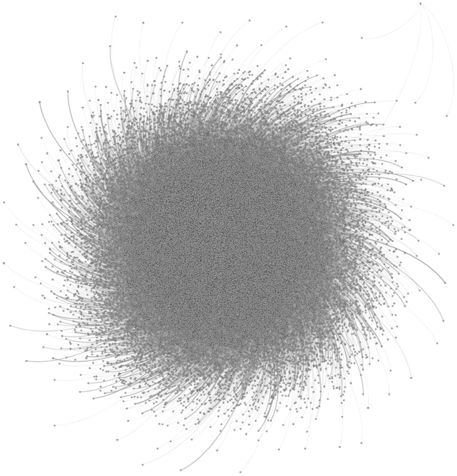
An example hairball rendering of a large graph generated by Gephi, a traditional graph visualization tool.
These rendering issues are especially detrimental to the understanding of relationships between entities. Knowledge of these structures is vital to understanding nodes grouped into highly related communities, internal and external community topology, characteristics, and relational patterns. By separately applying community detection and layout algorithms to large graph data, traditional visualization approaches tend to deteriorate the ability to perceive and understand nuanced relationships between entities.
Large-scale graph data sets pose challenges to the existing visual graph analysis approaches surveyed, requiring new techniques to overcome the following issues.
Computational performance: computations required to establish optimal graph layouts that reveal communities and relationships are prohibitively expensive;
Community clarity: separate community detection and graph layout processes can cause community attributes and relationships to be lost or obscured; 2
Memory requirements: the largest graphs are becoming too big to fit in memory on a single machine;
Rendering performance: rendering graphs that exceed millions of nodes and links is time-consuming.
Our graph mapping approach addresses these issues by applying open-source cluster computing frameworks and a tile-based visual analytic (TBVA) methodology3–5 to (1) extract hierarchical communities in the raw graph data; (2) apply a distributed, recursive layout algorithm to align nodes according to their hierarchical community membership; (3) compute tile-based analytic summaries of community properties; and (4) produce a layered two-dimensional, interactive multi-scale graph visualization with a familiar, web-based map interaction scheme that supports intuitive pan and zoom navigation.
In this article, we present details of our technical approach. We also gauge the speed and effectiveness of these processes by performing experimental analyses on both synthetically generated and real-world data sets. We discuss the findings of these experiments and propose several alternative modifications to our community detection algorithm to increase visual comprehensibility of the resulting community structure. Finally, we present the qualitative results of our visualization pipeline by illustrating a pair of example applications that we created using real-world data.
Related work
Various aspects of the problem of large-scale community analysis have been explored in previously published work. In this section, we review related work on community detection, layout, and interaction methods for graphs.
Community detection research
Detecting communities (clustering) of highly related nodes is important to revealing the structure of a graph. It highlights the relationships and commonalities among nodes. In this article, we only consider non-overlapping communities. Non-overlapping communities comprise a group of nodes with many internal links but few external links, forming well-connected subgraphs. 6
To minimize the computational expense of detecting communities within large graphs of more than a few million nodes, previous research has investigated numerous optimization techniques, including heuristics and distributed algorithms.7,8 Our approach has its basis in the “Louvain” modularity algorithm designed by Blondel et al. 9 The Louvain algorithm is a greedy optimization method that first assigns each node to its own community and then runs through each node, determining how the neighboring communities would improve were it added to them. This improvement is measured with modularity, which quantifies how well divided a graph is (i.e. into clusters). It does this by measuring the relative strength of intra-community links as compared to a random graph with the same connectivity. While this approach scales to large graphs (millions of nodes and billions of links), it tends to produce oversized clusters of nodes that obscure the true underlying communities. Compared to previous approaches,7,8 the Louvain algorithm produces communities with higher modularity in less time. 10 However, its initial stages take the majority of the computation time, a problem that is pronounced as it is applied to larger data sets. 9
Recent research has attempted to create parallelized implementations of the Louvain algorithm to increase its scalability and improve the processing time of its first phase. Wickramaarachchi et al. 11 implemented a message passing interface to parallelize the first phase of the Louvain algorithm and reported a reduction in execution times (up to five times faster) with little to no change in overall modularity.
The goals of our community detection approach are to achieve a similar level of computational scalability, with improvements to the utility of resulting clusters for the user. For greater utility, we apply several constraints to the baseline Louvain algorithm by Blondel et al. with the goal of preventing oversized communities from forming. We also examine how these modifications affect processing time in the baseline algorithm.
Graph layout research
Our investigation of the canon of existing graph layout methods included several different approaches, including treemap, adjacency matrix, and force-directed layouts. In general, the goals of graph layouts are to produce aesthetically pleasing and informative presentation of nodes and links for increased sensemaking of a data set’s topological properties. To increase sensemaking, the investigated approaches attempt to minimize edge crossings among nodes. However, we concluded that few, if any, of the existing methods are scalable to large-scale graphs.
Treemap layouts have been applied to graph structures many times since the visualization technique was introduced by Schneiderman. 12 In the Group-in-a-Box layout implemented by Rodrigues et al., 2 a treemap meta-layout with a non-hierarchical approach semantically groups nodes either along categorical attributes or community structure. Each cluster is drawn in its own box, while the nodes that comprise its subgraph can be plotted using any graph layout technique. The Fitted Rectangle Layout presented by Chaturvedi et al. 13 extends the Group-in-a-Box approach to minimize inter-cluster link crossings. It applies a donut- or U-shaped meta-layout to clustered graphs and aggregates inter-cluster links to minimize overlap and occlusion. The most connected cluster is plotted at the center of the graph, with all other clusters placed around it in decreasing order of connectivity. While these treemap approaches help expose community structure, the resulting visualizations do not address scalability or visualizing community hierarchies and can hinder the ability to perceive and interact with smaller communities.
Other layout methods for large graphs include adjacency matrices. With NodeTrix, Henry et al. 14 employ a hybrid technique that combines a global graph layout with a set of adjacency matrices that summarize local connections within communities. NodeTrix uses a single level of aggregation that can be dynamically rearranged for both layouts. The ZAME visualization tool designed by Elmqvist et al. 15 employs a tile-based approach to provide a multi-scale graph adjacency matrix. The bottom level in the adjacency matrix pyramid represents connections between all the nodes, while each successively higher level aggregates its child into half as many nodes and links. Intersection squares contain glyphs that summarize the attributes of the links between the corresponding nodes, including extrema and central tendency. While adjacency matrices can effectively illustrate graph communities, they can be difficult to interpret due to their complexity and unfamiliarity, making it challenging to find patterns and paths between multiple nodes.
Force-directed layouts of node–link graph representations are prevalent in graph visualizations due to their intuitiveness, as they create spatial maps where proximity communicates relatedness. Our approach most closely aligns with the Fruchterman–Reingold model, 16 which uses attractive forces on both links and neighboring nodes and repulsive forces between all nodes. While force-directed layouts are designed to apply visual separation of unrelated nodes and minimize link crossings, they do not scale well with big data or ensure that nodes are aligned by community structure, as the position of each node is affected by the force of every other node in the graph, leading to expensive quadratic computational costs. Recently, numerous researchers have attempted to improve the performance times of force-directed algorithms. With their FADE algorithm, Quigley and Eades 17 introduce a method of approximating node repulsion calculations using quadtree decomposition to speed up the process of generating graph layouts. Hu 18 proposes an adaptive cooling scheme to prevent local minima and stop calculations once an optimal layout is achieved to prevent unnecessary iterations. Jacomy et al. 19 refine layout results by instituting an anti-collision function to inhibit community overlap by accounting for community radii during force calculations.
Didimo and Montecchiani 20 employ a parallelizable algorithm that combines force-directed and space-filling methods to align nodes according to community membership. They evenly distribute clusters across a rectangular area and optimize the layout by partitioning clusters into successively smaller rectangles whose size reflects the number or weight of nodes they contain. This approach aligns with our goals of enabling interactive analysis of networks at multiple scales, from the global level down to any given subnetwork where nodes are laid out according to their hierarchical community membership. Our approach differs by using an interactive multi-scale visualization methodology with a stable layout.
Our graph layout approach extends several visualization techniques from the cited works above to recursively layout hierarchical communities with a force-directed and space-filling method. We use cluster computing to parallelize the layout task and apply several algorithmic techniques (quadtree decomposition, adaptive cooling, and anti-collision) to ensure that the force-directed algorithm, which has scalability issues with large graphs, effectively scales to data sets in the terabytes and produces meaningful and appealing visualizations. With our approach, we aim to generate spatial layouts that visualize the hierarchical community structure within the data and maintain a stable visual mapping at each zoom level. Such stable visualizations should scale with the level of detail but retain the same layout, thus preserving the user’s mental map of the network.
Tile-based Visual Analytics (TBVA)
For many years, web-based map services (e.g. MapQuest and Google Maps) have been using pyramids of image tile caches to serve interactive multi-resolution world maps over the Internet. 21 They allow users to view the world at a global level and zoom down into street-level views. These views are served as pre-rendered image tiles sent to the client on-demand based on the user’s current viewport. While the basic tile-based approach is sufficient for geographic map services, pre-rendered graphic tiles are not ideal for visual analytic workflows using big data, where users need to be able to overview, zoom, filter, and expand details on demand during sensemaking. 22
A generalized tile-based approach facilitates the ability to perform exploratory analysis on any large data set.3–5 Like web-based map systems, a TBVA approach aggregates data across multiple levels of resolution from a high-level “global” picture down to the individual data points and also supports layering of information. However, instead of serving pre-rendered graphics, localized analytic summaries (i.e. for the current viewport) are computed per tile and served on request to the client. This approach is highly parallelizable, as each tile region can be processed independently, producing aggregate views of the data contained within each tile boundary as an offline batch process. Unlike static graphic tiles, data tiles support interactive analysis, such as filtering or applying new visual metaphors to the data. By utilizing web-based map interaction methods, a TBVA approach allows interactive exploration and drill down through familiar pan and zoom operations. Creating a global map of all data ensures consistency of location across levels of aggregation while progressively revealing more detail, enabling the user to learn about areas of the data and maintain contextual perspective at all times.
The TBVA approach is generalizable to massive graph data sets. In the next section, we discuss our TBVA approach to process hierarchical, force-directed layouts of communities and translate them to sets of data tiles that summarize the community graph at multiple resolutions and provide interactive graph analysis.
Technical approach
Graph mapping, our interactive visualization approach for massive graph data, employs TBVA to enable hierarchical community analysis in common web browsers. The resulting visualization structure allows multi-scale exploration of all the data across a hierarchical community-based layout of nodes with layered in-context analytic summaries. To scale with massive data, this multi-stage methodology 23 (Figure 2) builds on the cluster computing platforms Apache Spark, 24 GraphX, 25 and Hadoop, 26 which enable efficient parallelization when computing hierarchical layouts and generating multi-scale tile-based views of the resulting graph layout. An HDFS-based key-value store (e.g. Apache HBase) is used to enable distributed file storage and scalability to billions of tiles.
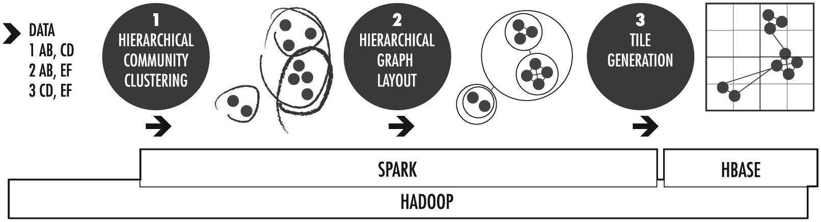
Graph mapping uses a pipeline of community clustering, graph layout, and data tiling techniques.
The graph mapping pipeline uses Apache Spark to convert character-delimited or GraphML source data into a set of serialized data tiles that summarize the graph at multiple resolutions. A tile service delivers the tiled data to the web client as either a set of rasters or a JSON payload for client-side rendering based on the zoom level and current viewport. This “tile pyramid” representation of the graph (Figure 3) spans global to local scales, much like Google Maps offers both aggregate views of the entire world and street-level depictions. The tile-based approach ensures that a constant amount of data is transmitted to the client, linear in the number of pixels in the client display.
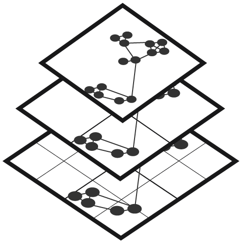
Tile pyramids represent massive graph data at successive levels of detail for rapid interactive analysis.
Tiles are served and rendered on demand as images in an interactive web-based map client, where users can pan and zoom through increasingly detailed views of the source data. Users can filter tile views by attributes such as node degree or overlay analytics and aggregate summaries for each tile. The following sections detail how the stages in the graph mapping pipeline interoperate to generate an interactive, hierarchical visualization of massive graph data.
Hierarchical community detection and clustering
Our hierarchical community detection algorithm (Figure 4) is based on the “baseline” Louvain modularity algorithm described in section “Community detection research” of section “Related work.” We modified the baseline algorithm to store metadata for each of the resulting communities. At a minimum, the metadata contain a descriptive label representing the most central community member. Centrality may, for instance, be computed from the sum of the weights of incident links for a given node. The metadata can be expanded to include various custom analytics applied to and aggregated across the nodes of the community.
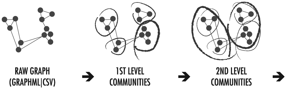
Community clustering iteratively groups related nodes across numerous hierarchical levels by applying modularity maximization techniques.
In an attempt to increase the visual comprehensibility of results produced by the original Louvain algorithm, we also experimented with several constraints in our approach that limit the size of the resulting communities. For more information on these modifications, see section “Alternate methods” in section “Experimental analysis.”
The community detection stage is theoretically the only limiting factor in the scalability of our approach. If a graph can be hierarchically divided into an appropriate number of subcommunities within each parent community, the result will be both cognitively efficient for the user and computationally efficient for the remaining pipeline stages. Ultimately, we found this method to perform adequately (<20 min on a single machine with eight cores and 16 GB RAM) and produce high modularity for all but the largest data sets (>10M nodes and 50M links) in our experimentation. Further optimization of this method is a matter of ongoing research. 11
Hierarchical graph layout
Informed by the network and community structure, the hierarchical graph layout stage positions nodes to convey relatedness through spatial proximity. Our force-directed algorithm applies a modified Fruchterman–Reingold model 16 to independently position graph elements across every level in the hierarchy from the top level down, laying out the larger global communities independently of the lower-level structure. Each community is treated as a virtual node with a radius relative to the number of nodes it contains and arranged in proximity to other communities with which it is connected. By utilizing the Apache Spark GraphX library, we are able to lay out the communities on each hierarchy level in parallel.
As shown in Figure 5, our algorithm first lays out the most aggregated communities at the top level of the hierarchy. Once this is complete, we lay out the next lowest level of communities in the hierarchy within the spatial constraints of the parent level, and so on. On each level, we parallelize the layouts of subcommunities and nodes within each parent community from the previous level to compute the overall global layout, ensuring that node proximity relates to the hierarchical community structure.
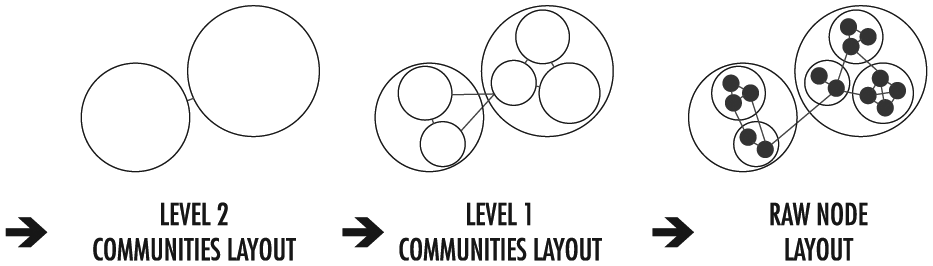
The community hierarchy informs the graph layout, which positions communities and nodes to convey relatedness spatially. The layout algorithm is applied hierarchically within the constraints of the parent community.
To improve layout results and performance times generated by the original Fruchterman–Reingold model, we instituted a number of changes with our approach. During each iteration of our algorithm, community overlap is inhibited by accounting for community radii during the force calculations, a method we adapted from the ForceAtlas2 algorithm presented by Jacomy et al. 19 Once the whole layout converges, the final layout for each community is scaled appropriately to ensure it fits within the bounding area of its parent community. While this could theoretically disrupt the relationship between displayed and actual cluster size, in practice, only modest differences are achieved. In a real-world graph with 2M nodes and 10M edges, the scale factor varies standard deviations from 0.7% to 7% of the mean. This does not affect a significant perceptual difference; the conveyed information, already coarse, does not become coarser. While slight variation appears between zoom levels, different levels are visually incomparable, as they are never on screen at the same time. Because the display scale changes when switching between zoom levels, the difference in cluster scale is imperceptible. Also at this stage, an anti-collision check is performed to adjust the location of any nodes or communities that overlap. To ensure optimal performance times, we approximate calculation of the repellent forces in an efficient manner by using quadtree decomposition. 17 We also employ a scheme similar to the Hu 18 method to adaptively “cool” or “reheat” the force-directed algorithm at each iteration depending on the amount of node movement. This technique mitigates the tendency of the layout to become stuck in a local minima state and more accurately detects when an ideal equilibrium is achieved, thus preventing unnecessary iterations.
Our algorithm also supports several optional features to fine tune the layout of the graph. For example, the location of the node with the highest centrality score (e.g. the highest degree or PageRank 27 ) in each community can be fixed in the center of the layout space of that community. This makes labeling more apparent and facilitates quick access to the most well-connected communities and nodes. In addition, link attraction forces can be scaled by weights to encode strength of node relationships. Finally, a gravitational force can be used to attract communities to the center of the layout and prevent them from straying far outside the bounding circle coordinates of their parent communities providing better space-filling properties of the layout.
Any communities with a degree less than a specified threshold (i.e. disconnected or very sparsely connected communities) are laid out in a fixed outer spiral pattern separate from the inter-connected structure at the center of the graph. This technique, inspired by the Donut layout scheme proposed by Chaturvedi et al., 13 effectively excludes these communities from the force-directed calculations to yield faster, more stable results while also visually separating isolated nodes from the main graph.
Our algorithm saves separate statistics for the layouts on each hierarchical level, including the number of nodes and links and the minimum and maximum radii for the communities. Community cardinality is proportional to geometric size, and therefore indicates directly at which zoom levels each community is reasonably visible.
Applying a recursive force-directed layout to community hierarchies helps to prevent hairballs by increasing visual separation and distinguishing communities and the relationships between them. On each level, the resulting proximity reflects strength of relationship.
Graph tile generation
Once the source graph data are clustered and a global layout is computed, the positioned nodes and links are passed to the tile generation component to create pyramids of data tiles that summarize the graph at multiple resolutions. Tiling data instead of graphics enables users to perform interactive operations on the data while viewing in the browser. For example, color scales may be adjusted to better highlight variations in one part of the graph, or links below a certain weight may be filtered out.
Each level in the tile set pyramid represents a hierarchical view of the entire force-directed layout of the graph (Figure 6). Individual tiles on each level correspond to specific subsets of the graph and are further subdivided into bins (typically 256 × 256) that store the aggregated node or link information and optional metadata for that bin. At the highest level in the hierarchy (level 0), a single tile summarizes the whole graph. On each subsequent level, there are 4 z tiles, where z represents the “zoom” level. Massive graph tile pyramids are saved to an HDFS-based key-value store to enable distributed file storage, as particularly deep hierarchies (>10 levels) can result in millions of individual tiles. For example, a pyramid with 14 zoom levels will have 268M tiles.
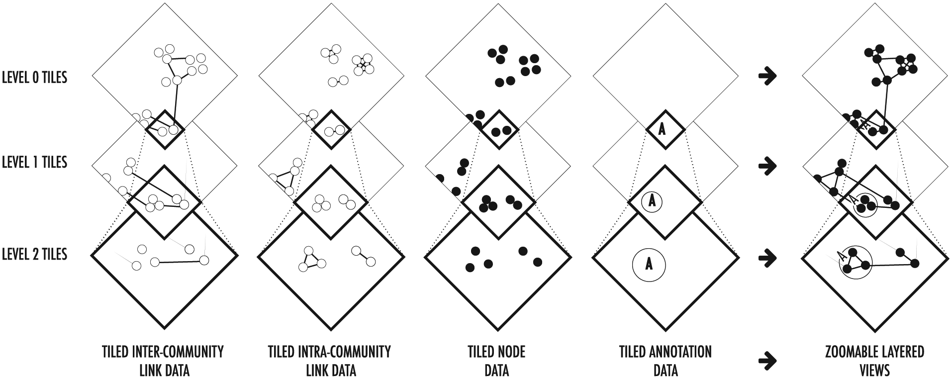
Separate tile pyramids are generated for each of the graph elements, which users can dynamically combine to create custom layered views of the data. Drilling down on each level reveals increasingly detailed aggregate views until finally reaching a plot of all the raw data points.
Nodes and links are written to different tile sets so that they appear as separate, filterable layers in the graph visualization. Separate tile sets can also be created for inter- and intra-community links. In each case, the raw data are passed through a pipeline that filters for the appropriate data type (node, inter-community link, or intra-community link) and translates individual data into bins based on the location determined by the layout algorithm and the hierarchy level. All the values written to a bin (typically the link weights or the count of nodes or links) are then aggregated together to create a final value for use by the visualization pipeline. Each of the parsing, binning, and aggregation of node/link values stages run on a cluster using Apache Spark for efficient parallel execution. The resulting bins are aggregated per tile and stored in an HDFS-based key-value store.
Custom analytics can be added to the generated tiles using the same pipelines, but with different aggregation functions. These custom graph analytics can then be used by client-side components to display node labels or incorporate interactive features that reveal other metadata such as community summaries.
The tile hierarchies created during this stage enable smart decisions about the level of detail of nodes and links in the user interface, which can increase rendering efficiency. At each zoom level, links that are too difficult to discern (e.g. links to off-screen nodes, to lower levels of the community hierarchy, or between two very close endpoints) can be omitted from the display. Moreover, only the data necessary to render the current view need to be delivered to the browser, making it possible to explore billions of linked entities at interactive speeds similar to those obtained by mapping programs such as Google Maps.
TBVA elements for graphs
When the graph tiling process is complete, the tile pyramid is served to the web client, for interactive analysis. Each visual element type is displayed as a separate layer that can be independently filtered or hidden, resulting in an interactive graph that can scale to a trillion or more “pixels” of resolution.
Nodes
The nodes (Figure 7(a)) are aggregated by bin and plotted across each of the increasingly detailed levels of the tile pyramid until the bottom level, where the raw nodes are displayed. This heatmap approach to plotting nodes highlights distribution and density in a level-of-detail and scale-appropriate manner. Node weight may be optionally indicated through color. At each zoom level, nodes are consistently sized relative to the screen pixel size to ensure clarity. Controls allow users to alter node diameter at any time in order to adjust emphasis as needed.
Graph elements are layered to build a view of the relationships in a massive network: (a) nodes, (b) intra-community links, (c) inter-community links, and (d) communities and labels.
Links
Intra-community (Figure 7(b)) and inter-community (Figure 7(c)) links are rendered as separate layers, allowing end users to tailor relative emphasis to support analytic interest. Links can be weighted to represent the strength of relationships between the nodes they connect and are visualized as a heatmap to depict strength, distribution, and density of clusters of links. To avoid visual clutter that can otherwise interfere with visibility of local connections, links leading to distant off-screen nodes can be attenuated using opacity fall off. An optional scaling factor can also be applied to accentuate links within the user interface.
Communities
Communities (Figure 7(d)) visible in the current viewport and zoom level are treated as virtual nodes. They are denoted by interactive circular boundaries around community members and reveal additional metadata when selected. Each community is sized according to the number of child nodes that it contains. Zooming in on a community reveals its children, a group of closely connected subcommunities and nodes.
Community layout reflects centrality and importance in the network as a whole. Fringe communities are plotted spirally outside the centrally connected nodes to illustrate separation from the rest of the network.
Labels
To add semantics to the display, community labels are derived hierarchically from the underlying child node with highest weighted degree centrality (i.e. sum of weights of incident links for a given node). Because the highest degree remains consistent across levels, this node labeling serves as a “landmark” on each zoom level. Additional metadata for a community (e.g. a distribution of its member attributes) can also be presented.
Tile-based analytics
To express the character of communities, additional tile-based analytics can be overlaid on top of the graph. Each analytic summarizes key attributes about the nodes or links underlying the corresponding tile. These overlays summarize aspects with which to characterize visible communities, such as common topics of conversation shown as a word cloud, overviews of internal nodes and degrees, or community coordinates and radii.
Experimental analysis
To gauge the effectiveness and speed of our visualization pipeline for massive graph data, we performed experiments on several undirected synthetic graph data sets and one real-world data set.
Experimental data sets
For a real-world graph, we chose a Stanford-compiled Amazon Product Affinity data set, 28 which is compiled from 9 years of e-commerce activity. The Product Affinity data set includes product metadata and review information from which reviewer nodes and review links were induced 29 to complement the top five co-purchase product links (i.e. “customers who bought this also bought …”). Nodes in the Amazon graph represent products and anonymized customers, while the links indicate weighted customer reviews and co-purchases.
To generate synthetic small-world graph data sets, we used the Watts–Strogatz model, 30 which puts N nodes into a K-wide lattice for a total of K × N links (we used K = 6). The model then randomly decides whether to rewire each of them. To generate small- and medium-sized synthetic scale-free graph data sets, we used the Barabási–Albert model, 31 which adds nodes one at a time to an existing graph, adjoins a fixed number of links for each new node, and preferentially biases those links toward nodes that have a higher degree. Both these models share properties of real-world networks.
Experimental findings
Table 1 summarizes the computation times needed to complete each phase of our TBVA pipeline for our experimental data sets. All times are listed in seconds. In the timing measurements, we intentionally ignore client visualization times, as regardless of the size of the source data set or the resulting tiled output, the frame rates and tile fetch rates remain fixed across every level of detail.
Summary of computation times in seconds.
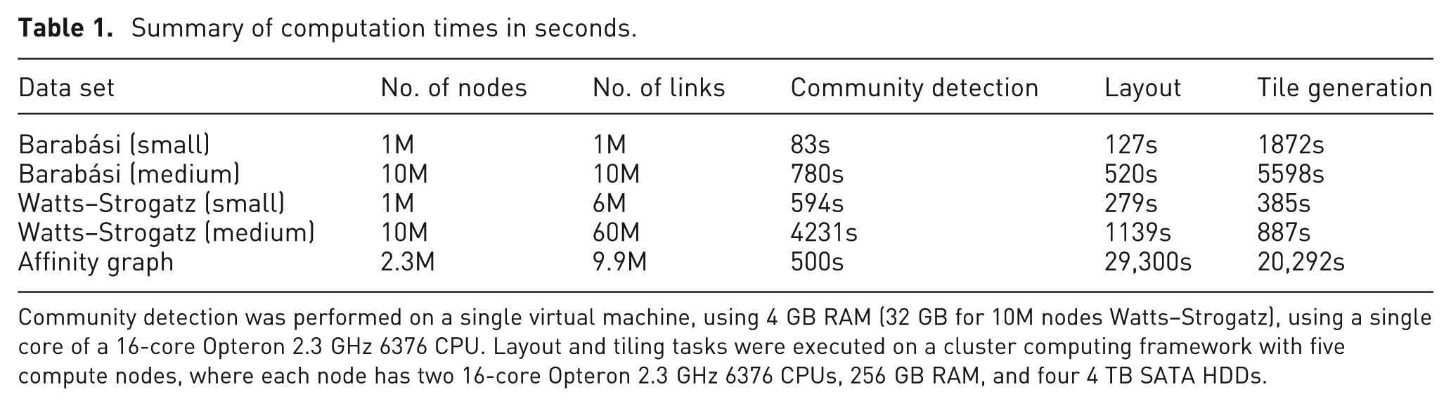
Community detection was performed on a single virtual machine, using 4 GB RAM (32 GB for 10M nodes Watts–Strogatz), using a single core of a 16-core Opteron 2.3 GHz 6376 CPU. Layout and tiling tasks were executed on a cluster computing framework with five compute nodes, where each node has two 16-core Opteron 2.3 GHz 6376 CPUs, 256 GB RAM, and four 4 TB SATA HDDs.
Running the community detection and layout algorithms on our experimental data sets revealed a significant discrepancy—two orders of magnitude—in layout times for similarly sized artificial and real-world graphs (5–10 min vs. 8 h on 2M nodes). Our algorithm processes communities in parallel, but processes each community as a separate task. We identified a single task processing a single low-level community with hundreds of thousands of nodes as the culprit. This large community was caused by a small number of high-degree nodes.
A close examination of the Affinity graph data reveals several nodes with degree greater than 10,000. Two nodes are very prolific reviewers: one mostly reviews books and has 17,666 links, while another mostly reviews music and has 69,007 links. The node with the highest degree has 237,489 links and seems to represent the entire marketplace of items in the United States sold by companies other than Amazon. These nodes are not useless as indicators of category, but the information they seem to convey would be useful higher in a community hierarchy, not lower. We theorize that this could be extrapolated to node size in general: the higher the degree of a node, the more general the information it likely conveys. Yet, modularity maximization causes these nodes to instigate massive low-level communities.
Huge communities cause “hairballs” that can impede analysis in most graph visualization tools, resulting in information overload. To aid visual analysis, hierarchical community detection should increase comprehensibility by partitioning graphs into interpretable subnetworks. The experiments by Miller 32 indicate that human perception is capable of distinguishing roughly 25 categories in a two-dimensional spatial layout. Given that human comprehension is one goal of hierarchical clustering, we hypothesize that communities ideally should not contain more than 25 subcommunities to remain interpretable. While we did not impose this as a hard limit, we looked at two alternate methods for biasing clustering toward this goal, and we introduced a new measure—variance from ideal size—to gauge how close we come.
Alternate methods
In an attempt to correct the large community problems we found, we examined two methods to modify the Louvain algorithm presented by Blondel et al. The first method added a constraint strictly limiting the number of sub-clusters of resultant communities. However, this constraint does not prevent communities with a large number of child nodes from forming, and limiting the number of nodes that could be joined to these communities per level can result in more iterations before convergence—up to 35–40 times as many in the case we were testing.
Instead of limiting community size, our second method ignored nodes with degrees larger than 10N (or, more generally, BN, for some B) until community hierarchy level N. This modification to the baseline Louvain algorithm decreased our layout time by over 90% (from over 8 h to under 30 min) and approximately doubled community detection time (from around 8 min to around 16 min). Like our first modification, it also produced significantly sized clusters, with the largest clusters having around 40,000–50,000 elements, down from around 250,000 for the unmodified algorithm. This change also lowered the modularity of the resulting community hierarchy. For the Affinity graph, the baseline Louvain clustering algorithm achieved a modularity of 0.617, while our version with the node degree modification reached 0.598, a drop of roughly 3%.
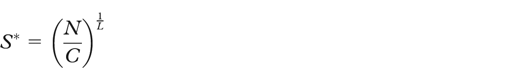
The smallest maximum number of child nodes for communities in a connected subgraph is achieved if every community at every level has the same number of child communities and if bottom-level communities have the equivalent number of nodes. This “even” breakdown is optimal for two reasons. First, it provides an effective level of visual summary for user cognition of structure and relation. Second, because we process each community separately and (potentially) in parallel, our algorithm is linear in the number of communities. Force-directed layout of individual communities, however, is quadratic in the number of child nodes. Therefore, our layout algorithm’s efficiency is increased by evening the clustering until the community size (S) approaches an ideal (S*). Both the decrease in layout time and the lessening of information overload of an evenly clustered graph point out the importance of examining how even a community hierarchy is. Given a clustering of N items (at the lowest level) into C communities (at the highest level) over L clustering levels, the most even distribution for hierarchy level h (where h = 0 is the raw data, h = 1 is the first, least aggregated clustering level, and h = L is the last, most aggregated clustering level) is given by

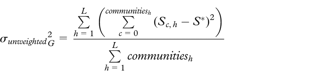
Within a level, the lower the standard deviation of community sizes, the better. This could, in general, measure a variance from the ideal analogous to statistical variance
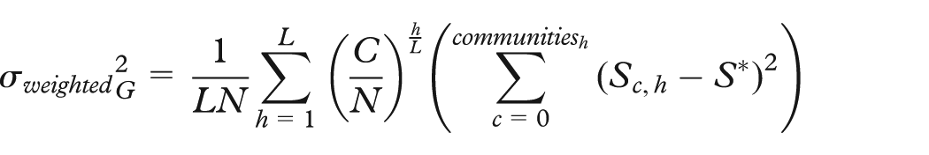
This might top-weight the variation, pushing any excess into the top level, where there are fewer clusters to affect the overall variance. To counteract this, level weights could be applied
Neither version is trivial to calculate, as neither L nor C is known a priori. However, both values can be estimated based on previous iterations.
This does not appear to be a measure that should replace modularity entirely. Taking the case of a collection of completely disjointed, completely connected subgraphs of differing sizes, clustering into the completely connected subgraphs scores poorly because of their varying sizes, whereas a random clustering with the given community size scores perfectly. But given two different clusterings with identical modularity and different variances from evenness, the most preferable results would tend to be the more even of the two. We propose this variance from ideal as a secondary measure to augment modularity, so as to increase human comprehension and computational speed on community detection results (Table 2).
Changes in community hierarchies for the Amazon Product Affinity graph resulting from our modifications to the Louvain clustering algorithm.
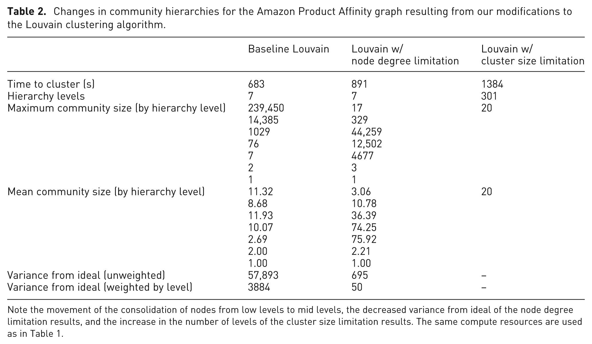
Note the movement of the consolidation of nodes from low levels to mid levels, the decreased variance from ideal of the node degree limitation results, and the increase in the number of levels of the cluster size limitation results. The same compute resources are used as in Table 1.
Proof-of-concept applications
Our tile-based approach to enabling analysis of large-scale graphs was developed empirically over time using a variety of real-world applications. Here, we present two examples that examine large data sets and offer qualitative results of how our visualization pipeline illustrates and informs community structures. Chelsea FC Fan Communities explores social media influence among individuals and organizations using the Twitter social network. Amazon Product Affinity uses the same real-world data set from our experimental analysis to map clusters of products that interest the same people.
Chelsea FC fan communities
The Chelsea FC Fan Communities application highlights communities within the sphere of Twitter users who used Chelsea Football Club keywords in tweets during 2014. In total, the data set contains 248,747,072 tweets with 554,430 unique account nodes (users). The application contains 100,700 relationships (links) between users who have mentioned each other in tweets.
Our first investigation of communities was location based. Chelsea FC data were mapped by geo-location (Figure 8). Directed, clockwise arcs between tweet locations indicate user mentions, while arc color indicates tweet density (dark blue for low density and white for high density).
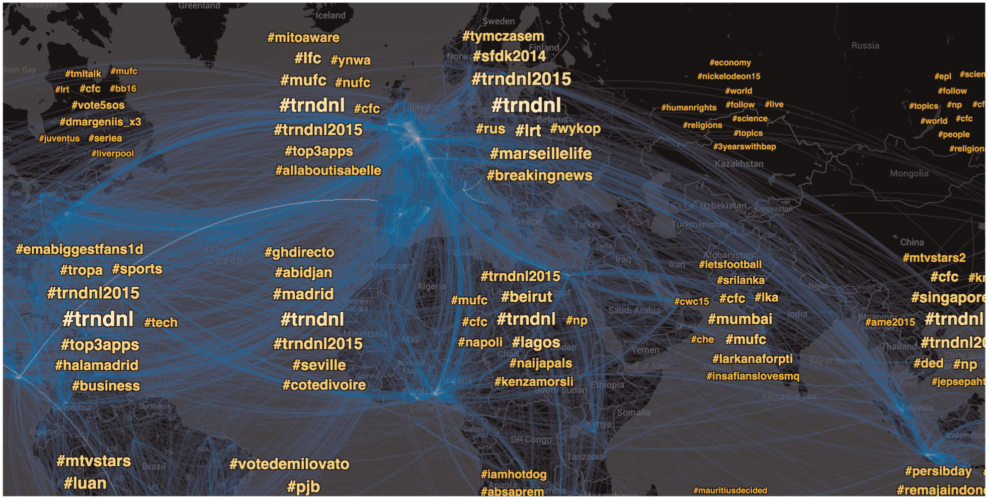
Geospatial mapping of Chelsea FC Twitter reveals connections between large communities in geographically diverse locations, such as England and West Africa. Word cloud overlays allow quick cross referencing of trending topics both globally and regionally.
Geospatial layouts of social media are limited in that they require location data, a considerable problem considering only 2%–3% of Twitter messages are geocoded. 33 Graph layouts, however, can work on any data. These layouts of the Chelsea FC graph are determined by the structure of intercommunicating users, where intensity of directional arc links and the proximity of communities indicate the strength of the relationship between them.
The graph layout of the Chelsea FC Twitter data reveals several details that the geospatial layout obscures. For example, a multitude of disconnected groups exists outside the core Twitter activity, indicating that they do not interact with the community at large (Figure 9(a)).
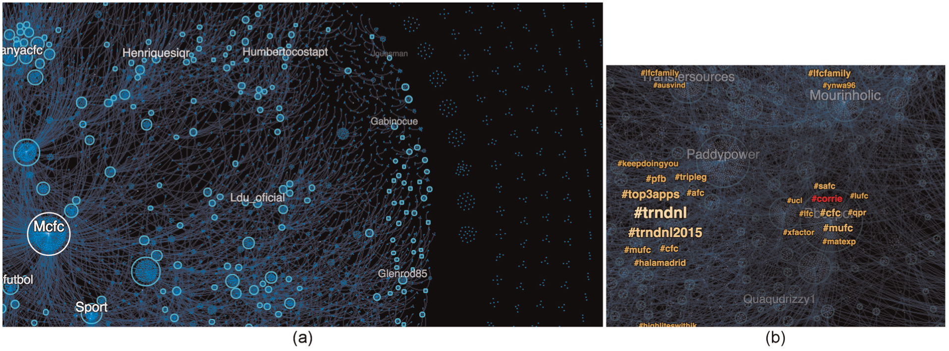
Graphing Chelsea FC fan tweets reveals (a) strong core and fringe communities and (b) characteristic cross interests.
Each circle in the graph is a community of nodes with high modularity. Reviewing community labels can reveal unexpected correlations; for example, the most central community in the Chelsea application appears to be defined by its users’ shared interest in a rival football club, Manchester City FC.
The graph layout supports multiple tile analytic overlays that reveal community characteristics. In Figure 9(b), a community appears to correlate with use of the hashtags #corrie and #xfactor, references to popular British television shows. We can use these analytics to infer community identity—in this case, a cluster of mainstream TV series fans.
Amazon Product Affinity
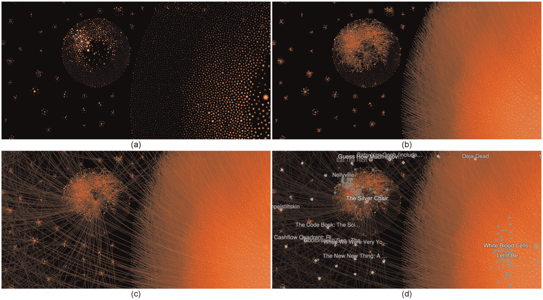
The Product Affinity application is based the same real-world data set described in our section “Experimental analysis.” The application attempts to represent spheres of interest among Amazon customers. While the Amazon Product Affinity data set (with 2,372,409 nodes and 9,909,551 links) is an order of magnitude larger than the Chelsea FC Fan Communities data set, the speed and interactivity of the application remain unchanged.
The layout of the Amazon data set suggests product affinity. The proximity of individual products and communities in the graph indicates that they appeal to the same consumers. Reviewing the hierarchical communities or related products can reveal social demographic data about customers.
For example, zooming in on a community (Figure 10) reveals clusters of products marketed primarily at young adults: rap and alternative music such as Good Charlotte, fantasy novels such as Eragon and The Silver Chair, and edgy animated shows such as South Park. However, further analysis reveals unexpected affinities with products nearby: a cluster of pregnancy books and interactive Baby Einstein products (which itself contains surprising products: Spanish for Health Professionals and a KISS—Immortals DVD). Visualizing nuanced correlations in customer appeal suggests demographic patterns, such as families of a certain size and age.
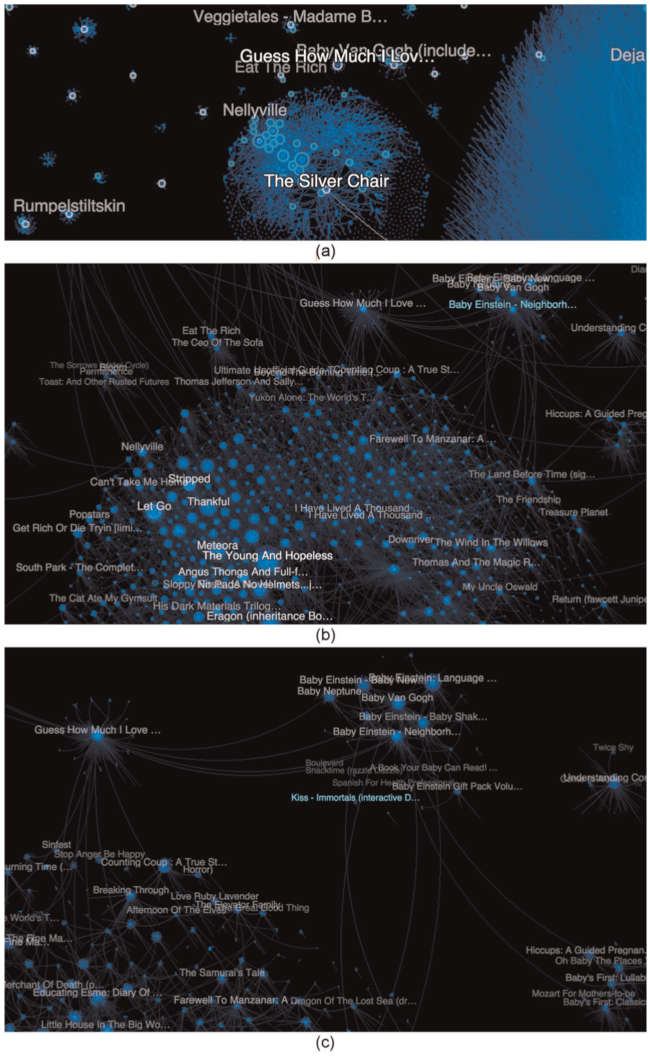
Analyzing the Amazon Product Affinity graph through increasingly detailed zoom levels reveals unexpected associations: (a) a large cluster centered on a children’s fantasy novel; (b) two levels down, more young adult media; and (c) one more level down, nearby products for unpredictably associated interests, such as baby toys and 70s glam rock.
Drilling down into any of these large-scale Amazon product communities reveals constellations of smaller communities, illustrating how TBVA can introduce structure to massive market data.
Future work
During the course of our research on large-scale graph visual analytics, we have identified several areas for further investigation. Our modified Louvain clustering algorithm explores constraints to mitigate large communities for improved visual sensemaking and to reduce computation times during our distributed layout algorithm. We will investigate other constraints and apply them to the parallelized algorithm proposed by Wickramaarachchi et al. to improve scalability of the community detection stage of the pipeline. We recognize, however, that as constraints on community detection slow down convergence of the algorithm, the findings of Wickramaarachchi et al. for only one round of parallel clustering may no longer hold. Finally, with regard to community detection, determining the relative importance of modularity and evenness of community size seems to be an important problem to investigate.
Further experiments, including user studies, will be conducted to evaluate the ease of interaction with and visual interpretation of results produced by our hierarchical community detection and graph layout methods. Additionally, we will investigate integrating a runtime graph analytics engine for interactive analytic queries, such as “path finding” capabilities that allow users to discover the connection between any two nodes. Visual analytic overlays will present analytic results in context. Finally, we plan to explore richer visual expressions of community summary statistics to aid in sensemaking.
Conclusion
TBVA offers a scalable solution to the challenges of creating massive graph visualizations by parallelizing and distributing the generation process. They also offer a user experience that enables investigation of any subset of big data graph through efficient delivery of scale and context-appropriate data to the user interface. The community-based force-directed layouts, multi-resolution views, and interactive labeling in our approach address problems that persist in traditional hairball renderings of graph data. This combination of computational analytics with highly expressive interactive visualization provides the opportunity for deeper understanding and trust.
Footnotes
Acknowledgements
A preliminary version of this article was presented at the Exploring Graphs at Scale (EGAS) 2015 Big Graph Visual Analytics Challenges and Opportunities Workshop as part of IEEE VIS 2015 in Chicago, IL, on 26 October 2015.
Funding
This work was supported, in part, by the Defense Advanced Research Projects Agency (DARPA) (contract number XDATA (FA8750-12-C-0317)). The views, opinions, and findings contained in this report are those of the authors and should not be construed as an official Department of Defense position, policy, or decision.