






Abstract
Documentary narrative visualization is a data visualization approach using the features of documentary film. Researchers in the field of visualization are searching for better methods of constructing narratives from data sets. In this article, we explore the structure and techniques of documentary film and how they apply to the practice of constructing narrative visualization with video. We review the structural aspects of documentary film with examples relevant for narrative visualization. Using six of the highest quality video-based narrative visualizations, we conducted a study of user preferences for three pairs of videos. The video pairs were specifically matched to highlight unique features available in documentary film. Using the preferences expressed by our participants, we performed an empirical study to examine the documentary features most valued by our participants. Our results provide implications about the style and features of documentary film that are most useful in the construction of narrative visualization. Overall, this work provides a clear starting point for the construction of documentary narrative visualization providing content creators with specific techniques that will improve engagement of their content.
Introduction
NARRATIVE visualization refers to a style of information presentation that constructs data visualization–based stories using storytelling. Much of the extant research in this area has explored various aspects of narrative visualization including author/user-driven construction, rhetorical framing, story sequence, and metaphor.1–6 The majority of this work has been an analysis of frame-based techniques in storytelling. This article explores the possibility of constructing narrative visualization with narrative techniques based on film. Emerging technologies are opening up a new range of possibilities for deeper and richer visual representation of data-driven phenomena using film techniques. For instance, YouTube, the popular video sharing service, attracted more than one billion monthly active users by 2013, with monthly active users exceeding two billion by 2020.7,8 YouTube is joined by Facebook, Snapchat, and Periscope in the provision of dedicated video applications. 9 YouTube, as an exclusively video-based platform, continues to be the most widely used online platform. 10 While all of these monthly active users are not necessarily attributable to the presentation of data visualization, they do speak to a very strong trend of increasing content consumption using video-based user interactions.
Previously, the presentation video has generally been regarded as a supplemental activity for engaging audiences in a data-driven experience. In this article, we examine the capabilities of documentary film in transforming videos into primary vehicles for communicating insights derived from a complex data set.
At its core, documentary filmmaking is the combination of evidence and rhetoric presented in a cinematic medium. 11 This places documentary in a unique and perhaps solitary classification of film genre most closely aligned with the fact-based persuasive principles of narrative visualization. The importance of fact-based presentation of the truth is rising to the surface as one of the most important conversations in narrative visualization. We recognize the ideals of accurately representing evidence as a noble and moral activity. 12 Yet the process of visually encoding information includes making judgments about how to represent the data. The facts can remain the facts, as measurements of science, but once we begin to interpret and visually encode the facts, they become arguments, subject to our personal bias. 13 Narrative visualization finds itself in a similar position with documentary on the narrative spectrum, positioning somewhere between objective news and emotionally inspired drama. 14 In order to be effective, narrative visualization must combine elements of both.
Given these challenges, the principles used in the construction of documentary film can serve as a guide for narrative visualization. The emerging study of truth and deception in narrative visualization parallels some of the earliest definitions of documentary film from Dziga Vertov’s “kinopravda” (film truth), to Jean Rouch and Edgar Morin’s “cinema verite”(truthful cinema). 15 The objective of these early film pioneers was to capture the most truthful and accurate representation of various phenomena. In a discussion on the methods of Sergei Eisenstein and Vertov, documentary scholar Bill Nichols explains that “Eisenstein’s theory of montage and Vertov’s ideas about editing insisted on the necessity for the filmmaker to juxtapose images, or shots, in many ways that jarred the viewer into achieving new insights. 11 ” This analysis mirroring the holy grail of narrative visualization as a set of techniques organized for the purpose of identifying and communicating new insights.
Jessica Hullman and others have written extensively about the use of information design elements as classes of visualization rhetoric imposing strategic influence or persuasion on characteristics of the visualization interaction, end user’s knowledge, and the socio-cultural context.3,16 In similar fashion, the use of rhetorical proofs completes the definition of documentary film through the deployment of ethical, emotional, and demonstrative arguments that engage the feelings, human conditions, values, and logic of an audience.
Documentary narrative visualization is the presentation of a data visualization experience using the techniques of documentary film. Film making and narrative visualization share a common architecture with the two varying in a small degree of form. This small difference is fading with several examples of complex data visualizations being represented in short documentary videos. Researchers in data visualization have also turned an eye toward the potential of data visualization in film.17–19
This article is intended to instigate discourse on the disruptive impact of documentary film as a medium of narrative visualization. To this end we provide an overview of the literature on the uses of data visualization in documentary film. We examine these issues with an empirical study of documentary narrative visualization. The study captures the preferences users express for various features of documentary film. We then highlight the features most relevant for the construction of narrative visualization. Specifically, we explore two main research questions:
Q1. Do audiences identify the documentary film genre more closely with factual analysis than other film genres?
Q2. Do audiences place value on the traditional features of documentary film?
Documentary film
From the earliest examples, documentary film has been organized to present evidence using dramatic and persuasive methods. Definitions of documentary film vary widely as do a number of subgenres within documentary. Bill Nichols describes the documentary tradition of filmmaking as one that includes varying degrees of indexical evidence, poetic experimentation (voice), narrative storytelling, and rhetorical oratory.
11
In comparing documentary film to autobiographical narrative, Michael Renov adds the indexicality of the camera arts bears with it a far greater claim on the real than that associated with the Montaignian essay or a Rembrandt self portrait … the building blocks of a filmic life construction can be not words or brushstrokes but indexical signs bearing the stamp of the real.
14
Documentaries are stories that use models as representations of factual events. The production of documentary film has always included the tension of creating artistic images that an audience will find appealing with the presentation of knowledge about the real world. 20 What is common in all of these descriptions of documentary is a culture for presenting evidence with artistic images using rhetorical techniques. Documentary film and narrative visualization share this common approach.
Modes of documentary
Scholars of documentary film have defined and debated various forms of documentary. Notably Bill Nichols has defined a historical progression of the varying forms of documentary into distinct modes with their own characteristics. These modes include the poetic, expository, observational, participatory, reflexive, and performative modes. 11 In this article, we compare three modes of documentary film that are applicable to the field of narrative visualization. The expository, observational, and participatory modes of documentary will compose the focus of our analysis.
Indexical evidence
Indexical documentation of evidence is one of the most prominent components of documentary filmmaking. Indexical representation is the presentation of evidence that may include documents, archival footage, interviews, animations, photographs, models, physical evidence, fingerprints, DNA, and other forms of evidence. Documentaries share this component with scientific, informational, instructional, and safety films. All of these non-fiction genres of film have the ability to present factual evidence that is often undisputed. Only documentaries are designed to structurally deal with persuasive and polarizing concepts. The distinct difference is in the application of rhetoric to activate the social consciousness of the audience. Consider the use of data visualization representing the genetic family tree of orcas in the documentary film Blackfish. 23 The documentary film presents evidence that the orca Tilikum exhibits homicidal tendencies that result from a lifetime in constrained captivity. Using the data visualization in Figure 1, the genetic relationships of all the orcas owned by Sea World are illustrated to be genetically emanating from Tilikum. 24 Using data visualization as an index, the documentary presents evidence that the homicidal problem at Sea World is systemic and cannot be solved by simply removing Tilikum from one of the theme parks.

Indexical family tree of orcas owned by Seaworld.
Voice in documentary
The voice in documentary film is the auditory development of a direction or a particular point of view. Voice is a particular perspective that suggests an intimate understanding of the human experience. The authoritative voice directs the audience toward evidence that should be reviewed using rhetorical techniques. Documentaries have an authoritative voice sometimes referred to as the

Albert Gore Jr. speaking on climate change.
In contrast with documentary film, how-to videos, scientific films, and instructional videos are very strong in indexical evidence but often lack the perspective of an authoritative voice.
Narrative storytelling
Narrative storytelling is a process of constructing a series of events linked by cause and effect occurring in time and space. 26 This series of events is commonly regarded as a plot. Plot was first defined, on the most formal level, as an integrating dynamism that draws a unified and complete story from a variety of incidents, in other words, that transforms this variety into a unified and complete story. 27 The most basic of these structures sequences a beginning, middle, and an ending that evolved from the Aristotelian tradition. The beginning creating a frame of reference for the audience, the middle introducing a change or issue for resolution, and the ending summarizing or resolving the actions from the middle. Slightly more elaborate is Freytag’s Pyramid sequencing Setup, Rising Action, Climax, Falling Action, and Resolution. 28 The rising action, climax, and falling action provide more intricate treatments of the subject. Bruce Block defines the three major components of creating the visual story as the visual exposition, visual conflict and climax, and visual resolution. 29 Visual exposition sets the stage with characters, the situation, the location, and the time period. Visual conflict and climax dramatically increases the intensity of the images. Visual resolution reduces the intensity of images in harmony with the original opening representation.
Recent advancements in the definition of visual narrative structure have defined viewing frame-based sequential images as a process similar to seeing events. 30 In terms of documentary film, the development of these sequential images is equivalent to scripting various scenes on a storyboard prior to filming. The frame-based approach to visual narrative sequence works well in the definition of the expository and participatory documentary modes where the story is driven by the filmmaker, but poses some challenges regarding the observational documentary mode. In observational documentary mode, the filmmaker is simply recording events as they naturally unfold. Predefinition of visual elements may be difficult or unnecessary if the narrative story is not scripted or driven by the filmmaker. Still left to be explored are the competing notions of frame-based visual narrative structure and observational documentary film that might be composed of a single enduring camera shot. The movement within the camera shot might tell a story without a sequence of visual narrative frames.
Rhetorical presentation of evidence
One of the unique characteristics of the documentary genre is the presentation of evidence using rhetorical persuasion. In documentary film, there is clear and explicit intent to use the three original forms of rhetoric described as ethos(ethics), pathos(emotion), and logos(logic). 31 The Thin Blue Line documentary film by Errol Morris uses the presentation of evidence to highlight the ethical issues of wrongly convicting Randall Dale Adams for the murder of a Dallas police officer. 32 Alternatively, the documentary film The Bridge engages high emotion to explore the Golden Gate Bridge in San Francisco as the most popular site for committing suicide in the western hemisphere. 33 And the logical argument is found in the documentary film Super Size Me, conducting a human experiment on an adult male who eats fast food every day for 30 calendar days in a row. 34
Documentary narrative visualization
To effectively evaluate the contribution of documentary film on the practice of narrative visualization, we set out to research short documentary videos posted on the Internet using data visualization for content.
Design of study
We gathered a set of narrative visualization videos that contained features or narrative structure of documentary film. Each of the documentary film features and narrative structure tested in our study have been established historically in the literature on documentary film as important. Our study was designed to validate the utility of these features when they are used in documentary narrative visualization. Specifically, the literature on documentary film establishes at least six different modes including poetic, expository, observational, participatory, reflexive, and performative. Our study examined the following three modes: expository, observational, and participatory. These modes were selected because they contain a narrative structure that could be effectively structured in documentary narrative visualizations. Thus, in our experiential design, participants were randomly assigned to view one of three different pairs of videos and select the one that they preferred.
The videos were all sourced from reputable publications known for producing the highest quality narrative visualizations. Our sources for the documentary narrative visualizations included ESPN, Gapminder, Nature, and The New York Times. Six narrative visualization videos were selected representing a pair of videos for each of the expository, observational, and participatory modes of documentary film. These three modes of documentary are the most consistent and useful for presenting evidence. A qualitative review of the data narrative videos was performed to catalog the unique documentary features in each. The videos were then paired to create three experimental conditions presented in Table 1, each highlighting a unique feature of documentary film.
Documentary visualization tests.
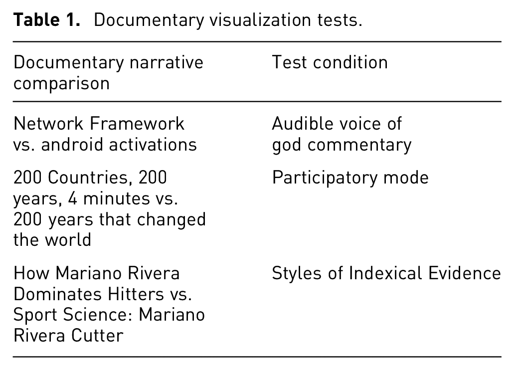
The first test condition used similar videos to measure audience preference for audible narrative. In the second test condition, we measured the preference for the participatory mode of documentary versus the observational mode. In the last test condition, we compared methods of indexical evidence presentation within the expository mode of documentary video.
All videos used in the study shared a common look and feel for navigation controls using a play button, pause button, with left to right temporal flow of the video. The presentation order for each of the two videos was varied to control for order effects.
Across the study, participants were randomly assigned to view one of the three video conditions (described in Table 1) and subsequently indicate their preferred video.
We then applied a quantitative approach to examine the significance of the documentary technique identified in the video choice of the participants. Similar quantitative approaches have been used in the classification of movies based on audience preferences; video mining; and the general application of data science to the humanities.35–37
Genre of facts
One of the primary research questions we set out to answer pertains to the suitability of documentary narrative visualization as a communication medium for delivering factual content. Specifically, we wanted to examine whether a general audience would select documentary as the start of a search for factual information on a topic. To assess this, our survey asked participants: “If you wanted to learn more about a particular subject, which of the following film genres would you watch?” Five of the most popular genres of film including comedy, documentary, action, drama, and romantic were the choices provided to participants. These genres were selected based on their role as traditional primary film genres. These five genres were also consistent with the standard classifications of film used by Netflix and Amazon Prime Video to classify movies selected by general audiences.38,39 A second survey question asked: “If you were selecting a documentary video to watch, How would you select the title?” Participants selected from the following response options: “Find a subject I am interested in?,”“Top 10 List,” and “Based on awards (Oscar, Cannes, Sundance, Telluride, etc …).” Participant responses to this question were used to validate whether or not a general audience understood documentary to be a unique genre that would be selected on factual content versus popularity. The answers to these survey questions establish the foundation of the genre as a suitable structure for deeper exploration of its capabilities in delivering factual information to a general audience.
Voice-of-god narration
Voice is the perspective or point of view in documentary combined with the literal audio sound of a human voice narrating the presentation of evidence. In our first experimental condition, we wanted to determine how much value the audience placed uniquely on narrated commentary. We compared two videos with a similar style of data visualization.
The first of these two videos, A Network Framework of Cultural History is a documentary narrative visualization that plots the birth and death locations of famous people throughout history.40,41 A blue dot flash is highlighted on a geographic map at the precise location a famous person is born. A red dot flash defines the location the famous person died. An arc of direction is then traced from the birth location to the death location of the famous person’s life. The dot flash locations iterate over time.
Global Android Activations, Oct ‘08—Jan ‘11 uses a similar geographic map with colored flashes of stacked bar charts defining the activation of smart phones containing the Google Android Operating System. 42 The stacked bar charts are animated to iterate a new activation count for each location for every calendar day.
The two videos differ slightly in the visual background used in the maps. A Network Framework of Cultural History uses a standard light map background and Global Android Activations uses a standard dark map background. Researchers have found biases in interpreting map symbols with different backgrounds. The conditions necessary for these biases to emerge were not present in these representative video background and highlight combinations.43,44
The pair of videos use global geographic maps with drill down transitions into the regions of the Americas, Europe, and Asia. In the production version of these videos, A Network Framework of Cultural History includes female

Voice-of-god narration test.
Participatory mode versus observational mode
In a similar way, we compared the participatory mode of documentary with the observational mode with the desire of gaining insight into the preference an audience might have for the filmmaker being a part of a documentary narrative visualization. We defined the participatory test condition illustrated in Figure 4 by comparing the Hans Rosling participatory video 200 Countries, 200 years, 4 minutes with the Hans Rosling observational video 200 years that changed the world. 46

Participatory mode of documentary test.
The 200 Countries, 200 years, 4 minutes provided by the Gapminder website engages Hans Rosling in a dynamic discussion with an animated bubble chart data visualization superimposed on the video. As defined in the participatory mode of documentary film, Hans Rosling as creator/filmaker is the central character in the narrative visualization video.
The 200 years that changed the world video was selected for comparison, as it uses the exact same content, data visualization, and voice for narration. 47 The original video contains a small square image of Hans Rosling in the top-left corner. This image of Hans Rosling was removed from the video leaving the data visualization only. The edited video is consistent with the definition standards of the observational mode of documentary, with a camera turned on capturing events as they unfold. As required for clear contrast with the participatory variable, the creator/filmmaker does not participate as an actor in the video. There is a small amount of blurring of the observational mode definition with Hans Rosling providing the narration. However, the use of Hans Rosling as the narrator is a constant between the two videos, controlling bias that would be introduced with an alternative voice for narration. If any bias of the observational mode definition is introduced, it would skew in the direction of muting the significance of the participatory mode variable.
The comparison of the two Hans Rosling videos provides significant control over the look, feel, sound, and content, leaving only the difference in adding the creator/filmmaker as an actor in one of the videos. Participants were asked to “Watch the two videos and choose their preference.”
Evidence presentation in the expository documentary mode
Specific modes of documentary film have the opportunity to provide practitioners of narrative visualization with an overall style guide for presentation of evidence or advancing an argument. How Mariano Rivera Dominates Hitters video, produced by the New York Times, is one of the most complete examples of documentary narrative visualization videos constructed in the expository mode including each essential element of voice, indexical evidence, narrative storytelling, and rhetoric. 48
The video begins with voice of god commentary making a rhetorically persuasive assertion that “Mariano Rivera is one of the most dominant closers in history.” The pitcher’s skill in throwing one specific pitch known as a “cutter” is offered as the central piece of evidence for the claim. A series of animations containing indexical evidence is then presented. An animation of the “cutter” pitch is used to present a visualization diagram of the lateral movement of the pitch keeping it off the sweet spot of the opponent’s bat. Another animated diagram is used to illustrate how the revolution of Mariano Rivera’s cutter pitch looks more like a fastball to the opponent, versus the resemblance of most pitcher’s cutter pitches that looks more like a slider that can be easily identified from a spinning red dot. Another visualization is presented highlighting the choice between a fastball and a cutter that a batter must make when facing Rivera. The batter’s choice visualization presents all of the pitches that Mariano Rivera threw in 2009 as a set circled at the progression of a pitch where a batter must make a swing decision. Almost all of the pitches are in a tight cluster that does not reveal anything about what type of pitch each represents. The visualization then advances to show that the tight grouping of pitches at the point of decision evolves into outcomes that are dispersed all over the strike zone in front of home plate. A visual heat map of fastball and cutter pitches is then presented as a chart of outcomes. Some final rhetorical interview commentary is presented illustrating the cutter pitch hotspot crossing the plate inside on a left-handed batter with the verbal suggestion that “I think he could hit that spot with his eyes closed.” The video closes with voice of god commentary re-stating the original persuasive statement.
A similar video produced by ESPN called Sport Science: Mariano Rivera’s Cutter is also constructed in the expository mode of documentary film. 49 The video contains examples of animated data visualization as well as evidence presentation with visualization diagrams overlaying on moving video footage. Voice-of-god narration provided by John Brenkus is interlaced with loud musical effects in a style consistent with an ESPN SportsCenter newscast. A third-person interview with pitching coach Tom House is used for narration of the first visualization diagram. The video then switches back to the voice of god narrator for the remainder of the video. The second visualization diagram creates a radial axis, overlaying Mariano Rivera’s arm in a pitch, to illustrate the minor amount of variability from different types of pitches. At the 54-s mark, the video changes to evidence presentation using animated data visualization. Animated visualizations are used to highlight the linear speed, rotational speed, and hand grip of the pitcher. The second animated data visualization discusses a phenomenon called the magnus effect, where the rotational speed creates pressure differentials as the ball moves through the air. A third animated data visualization compares the cutter and fastball pitches with two colored lines that cross home plate. The video closes with in person John Brenkus commentary about the importance of experience when hitters are facing a Mariano Rivera pitch.
The two expository videos from the New York Times and ESPN are alternative examples of the expository mode of documentary. Both videos share the same topic, presenting evidence arguments about the mechanics of Mariano Rivera’s pitching. They each use a third-person interview for the presentation of evidence. The videos are consistent in the application of voice-of-god narrative in a story structure, presenting rhetorical proofs to persuade the audience about the exceptionalism of Mariano Rivera’s signature “cutter” pitch. This comparison allowed us to exclusively test the various styles of visualization as an indexical model of evidence.
Figure 5 presents the various styles of indexical evidence presented in the two expository mode videos. Letters a-e present visualization models from How Mariano Rivera Dominates Hitters. The visualization in (a) is an animated comparison of the fastball and cutter pitches as they cross home plate. The visualization in (b) is an animated comparison of the spinning motion of a baseball a batter would see across three different types of pitches. The visualization in (c) is a three-dimensional (3D) representation of the entire collection of Mariano Rivera pitches from 2009 in proportional location to the strike zone and home plate. The visualization in (d) is a two-dimensional (2D) heat map of the entire collection of Mariano Rivera pitches from 2009 in proportional location to the strike zone. The visualization in (e) is a 2D heat map of the entire collection of Mariano Rivera pitches from 2009 in proportional location to the strike zone and home plate. Letters f-h present indexical models from Sport Science: Mariano Rivera’s Cutter. The visualization in (f) is a radial diagram, overlaying Mariano Rivera’s arm in a pitch, to illustrate the minor amount of variability from different types of pitches. The visualization in (g) is an animated data visualization comparing Mariano Rivera’s cutter and fastball pitches with two colored lines that cross home plate.

Styles of indexical evidence presented in the expository mode of documentary data narratives. Frames a to e are from how Mariano Rivera dominates Hitters. Frames f to h are from Sport Science: Mariano Rivera’s Cutter.
The visualization in (h) is an animated data visualization that represents a phenomenon called the magnus effect, where the rotational speed creates pressure differentials as the ball moves through the air. All of these data visualization frames were presented to subjects reviewing the expository video combinations, asking them which provided the best model of a Mariano Rivera pitch. The results of this comparison and the follow-up question on indexical evidence might provide a sense of the preferences audiences have for certain types models. Participants were asked to “Watch the two videos and choose their preference.”
Method
We conducted an empirical study on the impact of the design and structure of documentary narrative visualization on audience preferences. This empirical study was informed and refined by two previous pilot studies. Participant preferences regarding film genre, voice over narration, mode of documentary film, and indexical evidence presentation were assessed. All studies were deployed using Amazon Turk in accordance with the recommendations of the Guidelines for Academic Requesters Project, avoiding the errors presented in The Pitfall of Experimenting on the Web. 50
Participants and procedure
In the study, a group of 514 adult participants (228 male, 276 female, 10 unspecified) from the United States were recruited using Amazon Turk and paid $0.50 for their participation. Their Mean age was 39.16 (SD = 13.06) and they ranged in age from 18 to 77. Participants were well educated with 11.7% completing high school, 25.2% completing some college, 9.9% attaining a 2-year college degree, 39.1% attaining a 4-year college degree, 7.9% attaining a masters degree, and 5.2% for doctoral/professional degree classifications. The occupational categories of Sales, Education, Administration, Computer/Mathematical, Arts/Design and Management make up 53.2% of the respondents, with each of the six occupational categories accounting for more than 7%, respectively. More than 60% of the participants were drawn from the industries of Healthcare, Educational services, Other services, Information, Professional scientific or technical, Arts/entertainment, and Retail trade. In annual personal income, 65.9% reported between $25,000 and $100,000, 10.5% above $100,000, and 23.6% below $25,000. Responses for 10 participants that chose not to identify a particular gender or demographics were included in the analysis of video preferences.
Participants clicked on a link for the survey and affirmed their informed consent. Participants then answered two multiple-choice questions. In the first, participants were asked to indicate which of five popular film genres including comedy, documentary, action, drama, and romantic they would select if they wanted to learn more about a subject. Participants were then asked to determine their preference for the core subjects in the documentary videos including Technology, World Affairs, and Sports.
Participants were randomly assigned to view one of three different pairs of videos and select the video that they preferred. To control for order effects, we included two sets of each video pair and varied the order that they were presented. Video playback controls were programmed to ensure that both videos played once in a series with the mute and pause controls disabled. Participants were prevented from advancing to the next question in the survey until the video play was concluded. Our analysis indicated that the order of the videos did not affect the participant’s preferences in the study.
A follow-up question was exclusively posed for participants reviewing the expository video pair. The follow-up question asked about indexical evidence to better understand which style of data visualization they thought provided the best model.
A follow-up question was asked of all participants to determine if the subjects believed the content in the videos was fact or fiction. Participants were then instructed to provide an open-ended text reason for their video preference.
The survey concluded with a short set of demographic questions asked regarding standard indicators of age, gender, income, industry, level of education, and occupation.
Results of the study
Participants identified the documentary film genre as the logical choice for obtaining more information about a particular subject. Almost all of the participants recognized the presentation of factual evidence in the documentary narrative visualizations they were asked to review. Generally, participants affirmed documentary to be the preferred genre for the presentation of factual evidence.
Participants preferred having a strong voice narrating the presentation of evidence regardless of topic or video presentation. The female voice of Kerri Smith narrating the Network Framework of Cultural History was preferred to a significant degree when compared to the muted Global Android Activations, Oct ‘08—Jan ‘11 documentary narrative video. With the narration of Kerri Smith applied to Global Android Activations, Oct ‘08—Jan ‘11 and the narration muted for A Network Framework of Cultural History, the voiceover video was consistently preferred to a significant degree.
Participants also exhibited a significant preference for the filmmaker/creator as an actor in the documentary narrative visualization 200 Countries, 200 years, 4 minutes when compared to 200 years that changed the world with the character of Hans Rosling removed.
Participants did not have a significant preference for one Mariano Rivera expository video versus the other. We were able to determine some interesting results suggesting that evidence models using the familiar contexts of a batting box, or a pitcher’s mound, outperformed those without the familiar context.
Documentary narrative visualization tests
The results of the three comparisons of documentary narrative visualizations revealed significant differences in participant preferences in two of our three major test conditions.
Audible voice of god commentary when applied to the Network Framework of Cultural History and Global Android Activations, Oct ‘08—Jan ‘11 was found to be a significant variable outperforming the alternative video without voiceover narrative. Participants preferred the observational videos with voice-of-god narrative 66.84% (113/169) over the second observational video without voice-of-god narrative 33.14% (56/169), X2 (df = 1, N = 169) = 19.225, p < .001.
In the second narrative visualization test, we found the importance of including the creator/filmmaker as an actor in the video. Participants preferred the participatory mode of documentary video 80.47% (136/169) versus the observational mode of documentary 19.53% (33/169), X2 (df = 1, N = 169) = 62.775, p < .001.
In the third test of narrative visualization, we were exploring differences in the presentation of indexical evidence using the expository mode of documentary video. We did not find a significant difference in the preferences of participants for presentation of evidence using How Mariano Rivera Dominates Hitters versus Sport Science: Mariano Rivera’s Cutter. Participants marginally preferred Sport Science: Mariano Rivera’s Cutter 55.11% (97/176) as compared to How Mariano Rivera Dominates Hitters 44.89% (79/176), X2 (df = 1, N = 176) = 1.84, p = .175.
The use of indexical evidence in a documentary is the presentation of a model as a representation of a phenomenon. Paul Fishwick defines a model as “something we use in lieu of the real thing in order to understand something of that thing.” 51 White and Ingalls further define a model as “an entity that is used to represent some other entity for some defined purpose.” 52 In this context, a model is defined as a representative example of another real thing, for a defined purpose. To better understand the use of indexical evidence in documentary data narrative, specific frames of data visualization from each video were assessed. Participants were asked to select the style of data visualization that provides the best model of Mariano Rivera pitches. This follow-up question on the various styles of indexical evidence in the two videos revealed the strongest preference for the visualization presented in Figure 5(a): 22.67% (39/172). Figure 5(a) presents an animated comparison of the fastball and cutter pitches, with their complete path, eventually passing through the batter’s box. Some of the explanation for this preference might include preference for a visual scene that is familiar in context to a real-world scenario of the model of a pitch. Participants have a frame of reference of the pitcher, batter’s box, and home plate creating a visual context most similar to a visual scenario a batter would experience. Figure 5(a) uses a simple representation of the two pitches. The visualizations in 5(c) and 5(e) also uses the same context of the batter’s box but have lower preference scores that may be based on the more complicated representation of all the pitches from 2009 presented in three dimensions or a heat map. General audiences may be less familiar with these styles of data visualization. Figure 5(f) was the second most preferred style, with 18.02% (31/172) of participants selecting it. Figure 5(f) benefits from the familiar context of using actual footage from a baseball game with a simple data visualization overlaid on top of the footage. For the remaining six data visualizations, participants reported their preferences as follows; 5(b) 9.88%, 5(c) 6.40%, 5(d) 13.37%, 5(e) 12.79%, 5(g) 10.47%, and 5(h) 6.40%.
Genre of facts
All participants responded to three survey questions assessing the appropriateness of documentary storytelling in data visualization. These survey questions asked participants which film genre they would choose to learn from, how they would select a documentary film, and whether they considered documentary narrative visualization videos to be factual or fictional.
When asked where they go to learn more about a particular topic, the vast majority (74.7% (384/514)) of participants selected documentary, while 13.8% (71/514) selected comedy, 4.5% (23/514) selected romantic, 4.1% (21/514) selected action, and 2.9% (15/514) selected drama. Statistical significance was found in the selection of the documentary film genre, X2 (df = 4, N = 514) = 981.06, p < .001. By establishing that participants were significantly more likely to select documentary, these results help to validate the prominent role of documentary as a genre that is useful in delivering factual information.
Next, in response to our questions assessing how each participant would select a documentary film, results revealed that most participants (80.4% (413/514)) indicated that they would find a subject of interest. The less common responses were as follows: selecting from Top 10 Lists 12.5% (64/514), or Based on Awards (Oscars, Cannes, Sundance, and Telluride) 7.2% (37/514). These results speak to the concept of epistephilia recognized as a driving force in audience selection of documentary films. As defined by Bill Nichols, epistephelia is the desire to know more about a particular subject. 11
Previous studies have concluded that augmenting exploratory data visualization with initial narrative visualization and storytelling does not help to engage users in exploration. 53 These studies were conducted with appropriate random sampling of participants consistent with a general audience. The concept of epistephelia in general, combined with empirical results validating the concept of documentary film selection based on topical interest, versus popularity or awards (expert ratings) begs a new research question. Would exploration of data visualization increase within the context of narrative visualization, when tested with participants that had a significant interest in the subject? Future studies of narrative visualization may benefit from the comparison of participant groups that self-selected subjects of interest, versus groups with average degrees of interest.
We then followed up on the film genre and epistephila assessments with a question asking if participants identified the Documentary Narrative Visualizations they viewed as factual or fictional. This revealed that 96.1% (489/509) of participants identified the content of the documentary narrative visualizations they viewed as factual, with 3.9% (20/509) identifying them as fictional, X2 (df = 1, N = 509) = 432.14, p < .001.
Taken together, the results given by participants in response to these three questions indicates that documentary is a familiar, high-potential genre for audiences seeking to expand their understanding of subjects with fact-driven visual presentation. The selection of which may be a trigger for deeper exploration of data visualization.
Qualitative validation
In order to gain a deeper understanding of the reason why participants selected one video versus another, participants completed a follow-up question in which they describe the reason in their own words. In the first documentary visualization test, “narration” was the most popular reason provided for video selection, with 67% of participants in the Android documentary condition and 48% of participants in the Charting Culture documentary condition citing the voice over narrative technique.
In the second documentary visualization test, 48% (65/136) affirmed that Hans Rosling as a participatory character was the reason for their selection. Twenty-nine percent (39/136) attributed their preference to the method of presentation for the graphics.
In the third comparison of Mariano Rivera pitching videos, we found a nearly even split with respect to the validation of style of evidence presentation. Forty percent (38/97) of participants that selected the Sport Science: Mariano Rivera’s Cutter provided answers suggesting the more “entertaining” style of ESPN was preferable, while 38% (30/79) of participants that selected How Mariano Rivera Dominates Hitters from the New York Times identified “better production quality” as the difference maker. Participant responses often displayed black and white reasoning, in which a preference of “entertainment” in one video also suggested “boring” in the other, as well as “better production quality” in one video also meant “loud and obnoxious” in the other. The two groups were equally split and committed to their preference. The second most popular response included “education” or an aspect of learning provided by the videos, with the New York Times video earning 42% (33/79) of its adherents for that quality, with 27% suggesting the same for the ESPN Sport Science video.
Conclusion
Our work sought to explore the effectiveness of documentary structure and its features when engaged with documentary video as the primary form of user interaction. Emerging trends in the consumption of videos compared with more traditional forms of text narratives motivated us to study various aspects of documentary film. Anecdotally, narrative visualization seemed to have strong connections with the presentation of factual evidence found in documentary film.
These results support our expectation that the structure of documentary narrative visualization, using the modes and techniques of documentary film, is well suited for the presentation of factual information in narrative visualization. The participants in our study affirmed documentary to be the genre of first selection when it comes to the identification of factual information and learning. Thus, the results of this research indicated that the answer to our first research question is yes—people do associate documentary films with factual content more so than other genres.
The second research question asked whether audiences place value on the traditional features of documentary film. Our results provide support for this second research question as well. In two of our three test conditions, using pairs of narrative visualizations, participants preferred videos using the unique features of documentary film, including voice of god narrative and the participatory mode of documentary involving the filmmaker as an actor. Specifically, the comparison of A Network Framework of Cultural History with Global Android Activations, Oct ‘08—Jan ‘11 provided a direct comparison of two documentary narrative visualizations constructed in the observational mode, with very similar geomap data visualizations. When voice-of-god narration was applied to either video, and it was compared to the companion video without narration, audiences preferred the video including the voice-of-god narrative feature. This finding is likely generalizable to many documentary narrative visualizations that will accommodate communication with a voice-over narrative. However, future research should definitely explore this implication of our results.
The comparison of the participatory mode with the observational mode of documentary narrative visualization, established a clear audience preference for having the filmmaker as a character in their own video. In 200 Countries, 200 years, 4 minutes, Hans Rosling acts as the driving force of data visualization. He is the voiceover, storyteller, and performance artist of the video. 200 years that changed the world shares the exact same message, data visualization and voiceover found in 200 Countries, 200 years, 4 minutes, yet it underperforms the participatory version. Researchers have speculated about what made 200 Countries, 200 years, 4 minutes so impressive. Our results suggest the answer is the filmic engagement of Hans Rosling as creator of the narrative visualization. Many speculate that Hans Rosling’s dynamic speaking in 200 Countries, 200 years, 4 minutes is responsible for the popularity of this data narrative video. Indeed, few would argue that Hans Rosling is not a dynamic speaker. Our study controls the dynamic speaker capability through a comparison of dynamic Hans Rosling with participatory presence in a video to dynamic Hans Rosling without physical presence in a video. This isolation of physical presence of the creator in the documentary data narrative video suggests that the creator presence feature from documentary film is the specific element that is preferred. Our findings could likely be generalized to similar documentary data narrative video comparisons using a different creator/speaker, with and without physical presence. Future research should also examine these issues.
Our study was not immune from some disappointing results. From a technical standpoint, the Mariano Rivera videos presented in the Expository mode of documentary film, are two of the most complete examples of documentary narrative visualization available. Each video contains all four major features of the expository mode of documentary film including indexical evidence, voice-of-god commentary, narrative storytelling, and rhetorical proofs. Yet, with all of this technical construction, neither of these styles of documentary narrative visualization outperformed the other. On the contrary, we can take away the knowledge that indexical evidence presented in a familiar context for the audience worked better in our study than visual models presented without a familiar context.
The results of our research suggest there is a need for more research in documentary narrative visualization. Future studies on documentary narrative visualization may provide the ability to isolate various features of indexical evidence. Furthermore, additional research is needed to examine various strategies of evidence presentation and narrative structure that have been used successfully in documentary film. Finally, future work could also assess people’s ability to recall quantitative metrics presented in various styles of data narrative to ascertain which type of data narratives result in the best recall of information. 54 A great deal of narrative visual interaction remains to be studied. However, the results of this study establish the importance of documentaries for conveying information and suggest that future studies continue to explore the ways in which the features of documentaries can play a positive role in shaping our understanding of the factors that enhance narrative visualization.
