
Abstract
Comparisons are central in multi-criteria decision-making, where alternatives must be evaluated across multiple, often conflicting goals. This process becomes especially complex when alternatives are grouped into sets. Based on formative research with domain experts, we first characterize set comparisons in trade-off analysis. In two design workshops, we identify potential visualization solutions to support them. Finally, we conduct a user study with lay participants and collect expert feedback to evaluate the two most promising visualizations that encode trade-offs, alongside a baseline that conveys this information numerically. Our findings show that visual encodings are preferred. The decoupled visual encoding, which separates different trade-off metrics, is favored by the domain expert. For non-experts, this decoupled visualization leads to higher perceived mental load and lower confidence although it may support more varied decision strategies. In contrast, the coupled visualization that integrates these metrics, results in higher confidence but may promote strategies that min-max only the top priorities. Supplementary material are available at https://osf.io/xnbm2/overview?view_only=4b5b940dce0f4ced8b933d9eaceaf3f5.
Keywords
Introduction
Comparing alternative options across multiple criteria is a fundamental task in decision-making and information visualization, requiring the assessment of similarities, differences, and the inherent trade-offs each option entails.1–3 Within multi-criteria decision-making (MCDM), trade-off analysis focuses on how gains in one criterion often come at the expense of others, with the goal of identifying solutions that balance competing objectives when no single alternative is optimal across all dimensions.4,5 This type of reasoning underpins decisions across diverse domains, for instance, agronomists weigh wheat yield against cost and environmental impact, while car buyers consider performance, fuel efficiency and price.
In many real-world contexts, however, alternatives are not considered in isolation, but are grouped into meaningful sets, such as experimental conditions, product categories, or simulation parameter ranges. Experts in biology, engineering, and other fields commonly cluster candidates into distinct sets based on attribute ranges or categorical variables, to manage variability inherent in complex systems and explore different plausible trade-off solutions.5,6 This grouping aligns with the properties of many trade-off datasets, where measurement variability renders value ranges more informative than fixed thresholds, and categorical attributes naturally define clusters. For example, when analyzing wheat fertilization strategies or wine fermentation recipes, experts tend to compare groups (or sets) like early fertilization methods or wines with specific aromatic profiles, rather than individual data points. This approach enables a more comprehensive understanding of trade-offs across the solution space.
Comparing sets across multiple criteria is inherently difficult,7,8 as it requires reasoning about complex, multidimensional relationships where improvement in one dimension may cause deterioration in others. Decision-makers must balance these competing objectives, account for uncertainty and variability, and contextualize results relative to ideal or benchmark solutions. 9 Designing visualizations that clearly reveal these trade-offs, while supporting exploration and preserving faithfulness to the data, is therefore a key challenge, especially as reasoning shifts from single alternatives to comparing sets. 10 In these cases, trade-off relationships can be non-uniform across data points within each alternative set, and this variability further complicates comparisons to benchmarks.
Traditional MCDM techniques, even for single point alternative comparisons, often rely on numerical aggregation or summary metrics, such as means or weighted sums, to capture trade-offs. 11 While computationally efficient, these approaches can obscure the nuanced compromises between criteria, potentially diminishing decision-makers’ confidence. In contrast, visualization offers a means to externally represent trade-offs, enabling users to explore alternative prioritizations and evaluate proximity to benchmark solutions.12,13 Milutinović et al. 14 found that interactive visualization positively impacts decision-making in geospatial contexts, improving coherency and consistency in trade-offs.
Further advances in set visualization and multi-attribute comparison also underscore the value of visual representations and interactions for analyzing attribute distributions and assessing pairwise similarities using defined measures for sets.7,8 A wide range of multi-attribute analysis tools support tasks such as identifying groups, extracting subsets, and comparing them across multiple criteria.15–20 Within this context, Gleicher et al. 3 conceptualize comparative visualization designs as being composed of three fundamental building blocks: juxtaposition, superposition, and explicit encoding of relationships. Explicit encoding approaches compute relationships between items and represent them visually (e.g. LineUp 15 and WeightLifter 12 ), whereas juxtaposition and superposition techniques rely more heavily on human perception and memory to support comparison (e.g. Domino 16 and UpSet 19 ).
However, there is still limited understanding of how specific visualization design choices, such as the type of comparative design or the choice of the explicit encoding, shape users’ reasoning strategies in multi-criteria comparison tasks. While a few empirical studies have examined the effects of general visualization design on multi-criteria decision quality, 21 none, to our knowledge, have investigated specifically how numerically versus visually represented trade-offs, or how coupled versus decoupled representations of trade-off information, influence decision-making outcomes. To fill this gap, we investigate how visualization design affects reasoning, confidence, preference and perceived cognitive load in set-based trade-off analysis.
Our approach computes trade-off metrics, such as means, weighted means, and distances to an ideal reference, while emphasizing the external representation of trade-offs (“seeing the trade-offs”) rather than leaving viewers to cognitively construct these relationships from raw data or item rankings. Building upon established trade-off quantification methods 11 and comparative visualization strategies, 10 we extend these frameworks to examine how external representations of trade-offs shape decision strategies in complex, multi-criteria comparisons.
Our work follows a five-stage user-centered design methodology (Figure 1): (1) Formative research involved analyzing expert trade-off analysis videos and interviewing domain specialists to identify how groups are compared, yielding key requirements (R1–R5); (2) Design and ideation workshops produced 51 sketches, whose thematic analysis informed 8 design considerations (DC1–DC8); (3) A tabular prototype incorporated these directions, establishing a focused testbed for multi-criteria set comparison; (4) A controlled study with 18 participants compared two trade-off visualizations (coupled and decoupled) against a baseline that presents trade-off information numerically only, evaluating decision strategies, explanation quality, confidence, preference, and perceived cognitive load; and (5) A feedback session with one domain expert added insights on real-world applicability. This multi-step process grounded our design in expert needs while empirically assessing different trade-off visualization strategies, contributing new insights for both visualization research and MCDM practice.
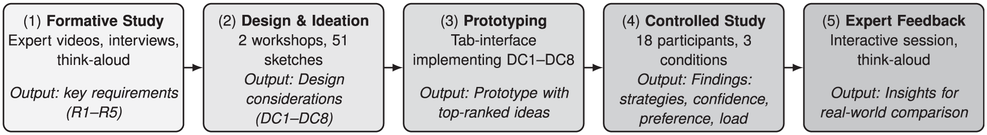
Five-stage research methodology with key outputs.
Our main contributions are: (i) High-level requirements for set comparison in trade-off scenarios, combining domain and visualization expert insights; (ii) Empirical evidence suggesting that even basic encodings can shape trade-off reasoning. Numeric tables with simple histograms can offer comparable confidence and more contrastive explanations than visual encodings, though visuals are generally preferred. Coupled visual encodings are advantageous when confidence and possibly min-maxing judgments are prioritized, whereas separable channels (decoupled) may be preferable when detailed analysis and compensatory reasoning are required, especially for expert users; and (iii) Design recommendations for supporting comparison in trade-off analysis tools.
Background and related work
This section situates our work at the intersection of multi-criteria decision-making (MCDM), trade-off analysis, and multi-attribute comparative visualization. We clarify key terms, review strategies for trade-off analysis, and outline multi-criteria comparison tasks and visual strategies, concluding with an overview of approaches to visualize trade-offs of items in multi-attribute visual analytics systems. We then highlight how our contribution extends and complements this body of work.
Key concepts
We define key terms with reference to established literature in MCDM,22,23 trade-off analysis,11,24 and multi-attribute and set visualization.7,8 These working definitions are tailored to our study, particularly for terms like multi-criteria comparison and ideal point.
In this work, we focus on externally represented trade-offs and examine how different forms of presentation affect decision making, particularly with respect to reasoning, confidence, preference and perceived cognitive load.
Trade-off analysis strategies
Trade-off analysis strategies span from formal quantitative models to participatory and qualitative approaches, supporting decision-making under multiple competing objectives. This includes deliberative and participatory approaches that help surface trade-offs through dialog and collective sense-making, especially when preferences are ambiguous or criteria are difficult to quantify. 26 Scenario-based exploration uses what-if narratives to frame decision contexts and expose potential trade-offs providing a foundation for more formalized analyses. 27
At the quantitative end, Daniels et al. outline core strategies such as multi-attribute scoring (normalizing and weighting criteria), utility functions for capturing nonlinear preferences, and goal-programming for assessing closeness to target goals, complemented by sensitivity analysis and Pareto frontiers to highlight non-dominated options. 11 Building on this, the multi-criteria decision analysis literature offers more nuanced methods such as outranking approaches that handle partial preferences rather than strict rankings, 28 and TOPSIS that ranks alternatives by their distance to ideal and nadir solutions. 9 While these approaches make stakeholders’ preferences explicit, they often present results as aggregated scores or static trade-off sets, leaving interpretation to the analyst.
More recent visual analytics systems integrate these quantification strategies with interactive visual representations. Our work builds on this intersection: rather than introducing new quantification methods, we evaluate visualization designs that surface comparisons between alternative sets and ideal points, aiming to make trade-offs more cognitively accessible and actionable.
Comparative visualization
Building on trade-off analysis methods that quantify and make preferences explicit, comparative visualization focuses on how these quantified alternatives are represented and compared in practice.
Visual strategies to support comparison
Gleicher 10 provides a useful taxonomy for structuring comparative visualization, highlighting three primary strategies: juxtaposition, placing datasets side-by-side for direct comparison; superposition, overlaying them within a shared space for immediate contrast; and explicit encoding, representing relationships or differences as distinct visual elements. Javed and Elmqvist 29 further explore this space by investigating composite visualizations, which combine multiple visualization techniques to represent complex multivariate data, offering richer cues to support comparison tasks. Gleicher 10 also discusses designs incorporating a comparative reference, aligning all items relative to a chosen baseline, 13 sometimes allowing user-selected references 30 or even multiple references for richer insights. 13 These strategies balance the need for comparative clarity with flexibility in defining the “anchor” for reasoning.
Revealing trade-offs in multi-attribute visual analytics
Visual analytics tools have operationalized comparative strategies in different ways, offering users means to compare items or groups and reason about trade-offs. These strategies vary in how trade-off information is made available, ranging from cognitively constructed trade-offs that require users to mentally integrate relationships, to externally represented trade-offs, where gains, losses, or distances are computed and represented in order to support interpretation.
Cognitively constructed approaches often embed trade-off reasoning in composite visualizations or interactive exploration. Podium 17 models subjective user preferences for mixed-initiative ranking, showing differences in how weights get adjusted across different rankings; nonetheless, trade-offs themselves are not directly presented but must be inferred through mental integration of the displayed information. ParetoLens 31 guides users through multi-objective solution sets, providing interactive views to interpret Pareto frontiers, but without explicit multi-group comparison, nor externally represented trade-offs. Other systems support comparisons at the group or subset level: Domino 16 and UpSet 19 visualize set relationships and intersections, while SmartExplore 32 emphasizes aggregated cluster exploration in high-dimensional spaces, and TACO 20 tracks changes in tabular data over time. Across these systems, multi-criteria (and sometimes trade-off) reasoning emerges from interaction and juxtaposition, but without external representation of gains or losses.
Approaches that rely on externally represented trade-offs surface interpretable measures of trade-offs, such as gains, losses, or distances to reference points, in the form of numeric or visual presentations. LineUp 15 supports the exploration of multiple ranking configurations based on weighted attribute combinations, shown as numeric values and bars for each item. It also includes integrated tables and slope graphs to make trade-off cues, such as rank gains or losses, more apparent. WeightLifter 12 enables visual exploration of weight spaces, helping users assess how solutions perform across different preference configurations by exposing cost functions and providing a framework to explore how individual solutions rank under varying weightings. Weighted scores are expressed as ranked bars. These tools use either numeric or visual encodings of trade-off metrics, but their focus remains on single solutions within a larger collection of alternatives rather than comparative group-to-group trade-offs.
When it comes to group comparisons, MetricsVis 33 integrates quantitative and qualitative metrics through stacked radar charts, glyphs, and reweighting, enabling users to evaluate individual and group performance while clearly seeing how prioritization influences outcomes. Comparisons are aided by dandelion glyphs presented side by side. SkyLens 18 enables users to identify and analyze non-dominated (Pareto-optimal) solutions through projection, tabular, and comparison views that highlight loss or gain compared to a reference group or item, using bars and colors. These visualizations aim to reduce the cognitive burden of mentally integrating relationships and enhance the interpretability of trade-offs. Both were evaluated through use-cases and expert feedback sessions without comparative evaluations.
More generally, to our knowledge, this body of prior work that externally surfaces trade-offs, both for single items and groups, has not compared possible design alternatives. Thus further user studies are needed to evaluate their effectiveness in reducing cognitive load and supporting decision-making.
Prior work has mostly focused on comparing trade-offs between individual alternatives, rather than between sets of alternatives. When group comparisons are addressed, the utility of such approaches is typically demonstrated through case studies. 33 To our knowledge, no prior user study has formally investigated how visualization designs and trade-off metrics influence the comparison between groups of alternatives. The most closely related study is by Dy et al., 21 which examined how different visualization types (e.g. scatterplot matrices, parallel coordinates, radar charts) and data complexity affect decision time and accuracy when users select a single “optimal” alternative. They measured accuracy as consistency with users’ self-reported preferences, following the methodology of Dimara et al. 34 Their findings showed that accuracy remained stable across visualization types but improved as the number of options and criteria decreased. In contrast to their study, our work shifts focus from selecting a single item to comparing multiple groups. Furthermore, we adopt a multi-faceted evaluation that includes explanation quality, user confidence, preference and perceived cognitive load. This broader perspective aims to deepen understanding of users’ decision rationales and strategies when faced with competing sets of alternatives.
Formative study
To ground our design in real-world practice, we began by examining how domain experts conduct trade-off analysis and comparisons in their natural settings. This formative study involved revisiting past expert exploration sessions and conducting a new workshop to gain deeper insights into their decision-making processes. Participants’ background are summarized in Table 1 (formative stage).
Participant information: study stage (formative, design, user study), age, gender, degree (obtained), field, and experience (years in domain for formative and design stages; data analysis experience for the user study on a 1–7 Likert scale, 7 = most experienced).
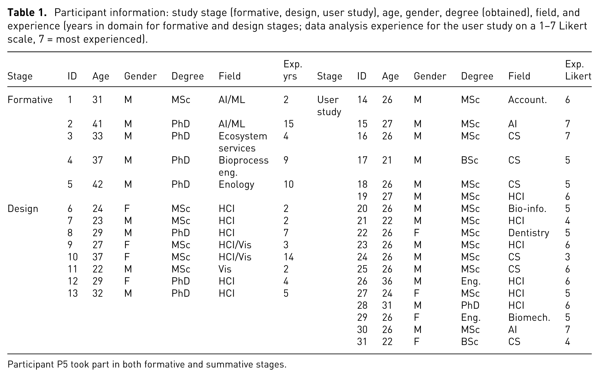
Participant P5 took part in both formative and summative stages.
Videos of expert exploration
We first analyzed
One author conducted a thematic analysis 35 of the videos, identifying six explicit comparison instances, while acknowledging many more likely occurred implicitly without verbalization (see supplemental material for details). These comparisons focused on analyzing groups of data points representing alternative solutions to multi-criteria problems. Across all sessions, experts treated such groups as single units (group alternatives). For example, ecosystem services experts identified groups of farms reflecting specific regional farming practices; wine experts referred to clusters of recipes linked to distinct wine fermentation strategies; and ML experts grouped data points by model type.
Although infrequent, these comparisons were crucial, often informing key decisions such as which costly biological experiments to pursue in the lab or field. Comparisons focused on groups of data points, typically few in number (2–6 per comparison). Group size varied by domain: small in wine (4–5 points) and ecosystem services (8–43), but much larger in ML (17–1090), likely reflecting the size of the dataset and how groups were defined within each context.
Overall, experts sought to rank these alternative groups to identify the most promising option to implement or explore further. Experts compared groups based on value ranges, overlaps, and relative positions in the data (e.g. whether a group’s centroid was near a maximum or minimum). They also considered group size and examined internal patterns, such as trends or correlations.
Semi-structured expert interview
To clarify the nuances of these comparisons, we invited back the 2 ML experts (P1,P2) from the previous video analysis as they had the more diverse group sizes, in a 90-min workshop. We welcomed participants and explained the interview’s goal: understanding their comparison needs. To ground the discussion, we presented comparison instances from their exploration video and invited them to elaborate. We ended with a debrief.
The experts reported that they usually compare groups of points such as subsets and clusters, confirming our video analysis. One explained: “we try to compare groups inside the same [benchmark] dataset. So maybe clusters, maybe classes, stuff like that … In the last few works, we were mainly looking at specific trade-offs for the models’ accuracy and complexity” (P2). When asked about their focus during these comparisons, they reported examining the relative positions of the groups, by: “assessing whether the two groups overlap for one [ML] metric or another, for one dimension over another, or how much they overlap” (P1). This is supported by our video observations showing all experts working with ranges and noting their overlaps.
When asked how they compare groups, they described various methods such as identifying outliers, focusing on top-ranked points, examining group ranges, or checking whether values exceed certain thresholds (e.g. minimum, maximum, or ideal values): “In some cases we might be interested in looking at which one is best, relative best. In other cases, we might want to have stuff under a certain threshold” (P2). They also compared group means and variances.
Summary of comparisons by experts
Our video analysis and workshop with ML experts reveal that while the specifics of “what” is being compared and “how” is problem-dependent, recurring elements emerge. Experts often compare groups of points, examining aspects such as the number of points, the ranges of the groups, and the best and worst points in relation to the trade-off criteria. While means and variances of groups are considered in the comparison, experts also examine individual points: they rank points within a group and look at specific points, such as outliers or best/worst values in the group, and they evaluate group points in relation to a reference point. We distil a summary of these needs into the following set of expert requirements for trade-off comparisons between groups:
Design & ideation workshops
After we confirmed the importance of comparing groups of points (
Participants, scenarios & data
We conducted two 2-h design workshops, with 3 and 5 participants respectively. Participants were researchers or practitioners in HCI and visualization (4.8 mean years of experience, min:2–max:14, see Table 1, Design Stage). The authors of this work also participated in the generation of designs. To provide participants with a realistic design task that did not require domain expertise, we used a hypothetical scenario.
Participants were asked to create designs to compare multiple groups of second-hand vehicles from different manufacturers, to choose one group for a new car-on-demand taxi service. The dataset we used is composed of 60 used cars created by merging two real-life car datasets36,37 and optimizing four objective dimensions (Miles per Gallon MPG, horsepower, price, and odometer readings) to generate a Pareto Front (PF). 38 Sixty cars were randomly selected from this front and grouped into 10 manufacturer-based categories.
Design task and procedure
We began the workshops with an introduction to trade-off analysis to ensure that participants understood the concepts, especially the need to balance competing criteria. We then introduced the design tasks and the criteria involved: to minimize cost and odometer while maximizing MPG and horsepower. Informed by past work on multi-dimensional visualization, 34 we provided inspirational materials in the form of different static visualizations for showing the 10 groups. To avoid biasing participants toward any particular design, we included three different data representations: radar graphs, parallel coordinates, and tabular visualizations.
We asked participants to perform two main sketching tasks, all involving comparison of groups. In the first, they had to sketch a visualization to compare the 10 groups, and in the second to consider additional constraints (brands from a specific country).
Analysis and results
The workshops produced 51 sketches (35 were created by participants and the remaining 16 by the authors). The 3 authors jointly performed a thematic analysis 35 of the first workshop sketches, identifying stand-alone ideas or systems, based on designers’ groupings and insights from the round-table discussion. From these sketches, we identified themes related to comparison (detailed next). One author then coded the second workshop’s sketches using a mixed method combining closed and open coding. Closed coding followed taxonomies for comparison layouts 10 and graph types, 39 while open coding captured the displayed data and its subject, as well as the visual encodings, refined iteratively over three cycles. Coding was conducted in Obsidian note-taking tool.
Our thematic analysis of the 51 sketches yielded 498 coded elements, revealing 6 key themes, organized into 2 broad categories and expressed as design considerations (DC; see Table 2). The first category includes themes that directly align with the five expert requirements (R1–R5) outlined in the previous section: Displayed Data, Subject, and Interactions. The second category, Visual Encoding, Comparison Layout, and Type of Graph, captures design patterns that emerged independently from expert input, shaped instead by participants’ visual thinking.
Summary of frequent design elements and design considerations from stage 2 design workshops, with corresponding expert needs from stage 1.
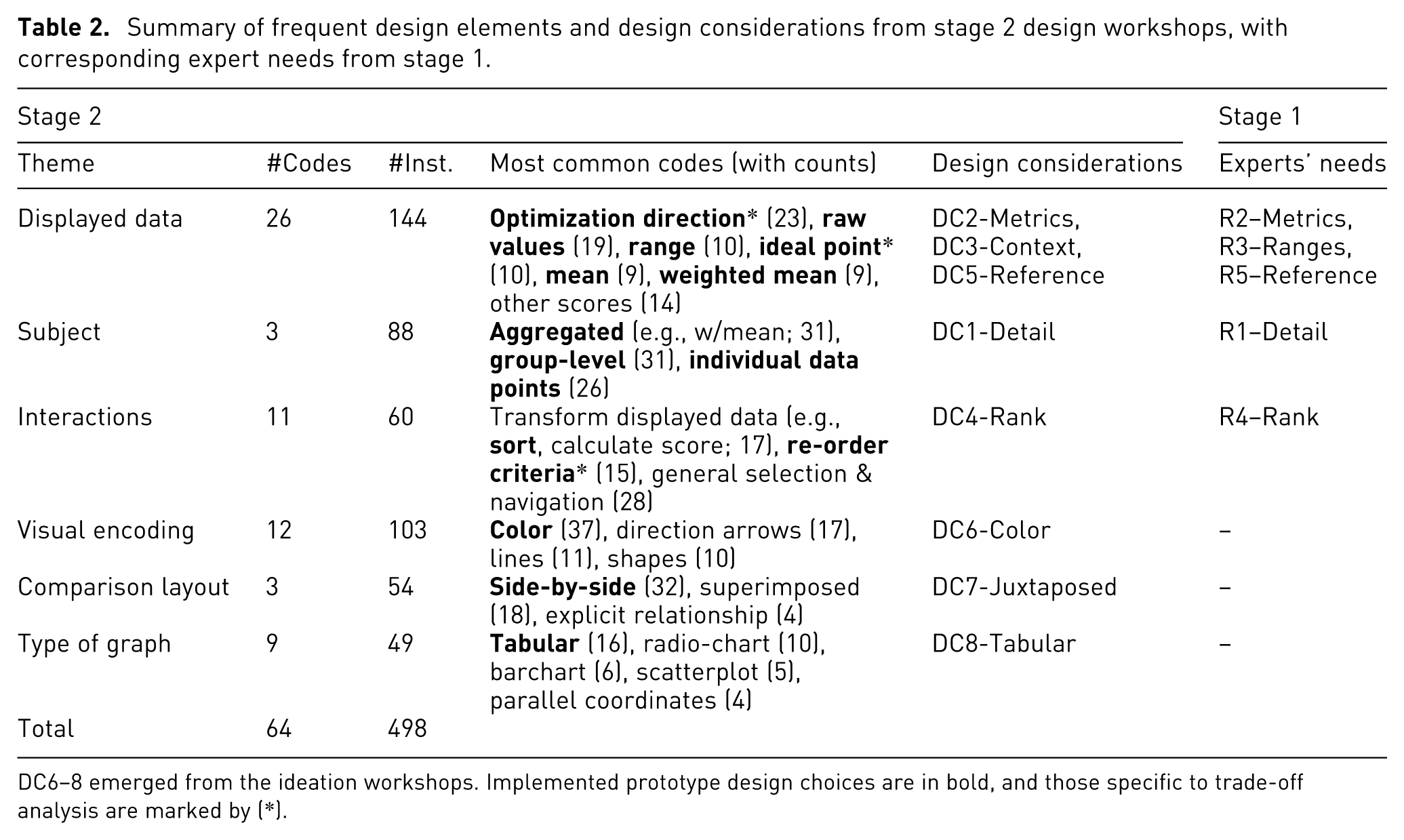
DC6–8 emerged from the ideation workshops. Implemented prototype design choices are in bold, and those specific to trade-off analysis are marked by (*).
In contrast, three themes did not directly correspond to expert needs but emerged repeatedly in the sketches:
Taken together, these implemented design choices
Prototype for multi-criteria set comparison
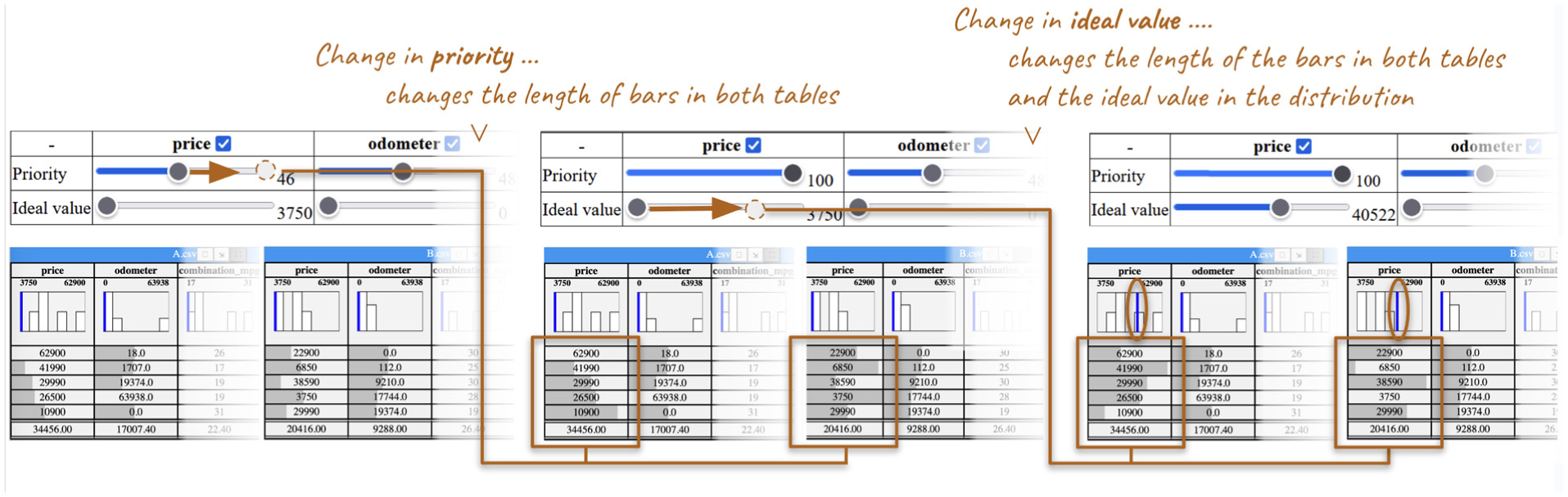
Based on workshop outcomes and expert needs, we developed a group trade-off comparison prototype (Figure 2) using HTML, JavaScript and CSS. The goal was not to create a full trade-off analysis system, but a test-bed tool for a controlled study on supporting group comparison. Below, we detail our design choices.
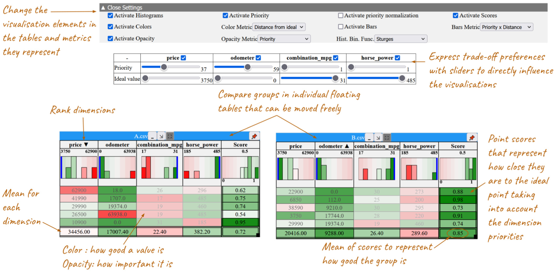
Prototype for trade-off comparisons between groups (or sets) of points, each represented as a table.
Visualizations and comparison layout
We opted for a tabular visualization as the basis of our prototype, since it was the most popular in our design workshop (
Expressing trade-off metrics
Participants in our expert interview and design workshops expressed trade-off information in various ways. We integrated two key concepts: weight or priority for calculating a weighted mean or score (
Displayed data & its subject Most of the generated designs provided aggregated views (
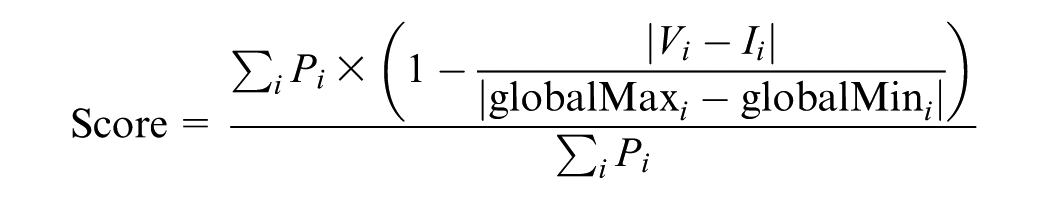
Where:
Conversely, some tools such as LineUp, encode multiple measures simultaneously, for instance, dimension priority and data point value, within a single visual representation like bar length. This
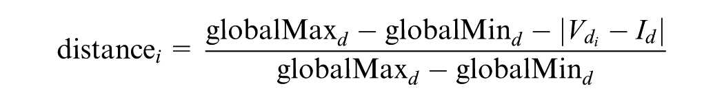
Where:

where the distance and priority are the same as in the decoupled case, with a maximum priority value of 100 for each dimension.
In our prototype we allow analysts to choose what metrics to map on the Colors or Bar lengths of our cells. As this design choice is not obvious, in our user study (next section) we consider the impact of coupling/decoupling the priority and ideal value distance metrics.
Bringing it all together: Options & user interactions
To communicate the position of the groups within the bigger context of all available data (
Analysts can sort data by clicking on the column headers (descending, ascending and back to initial order), as this was deemed important (
Interaction sequence using the prototype.
User study
We conducted a user study to understand the impact of our design choices and the use of visualization in comparing trade-offs across groups, focusing on two research questions:
Participants & data
We recruited 18 participants aged 21–36 (mean 26.1), all with normal or corrected-to-normal vision and no color blindness (Table 1, Stage: User Study). The study lasted about 2 h per participant. Participants used a 27 in screen (3840 × 2160 resolution) split into two windows: the comparison prototype on the right and a form with instructions and answer fields on the left. Sessions were audio recorded and screen captured.
We started with the 4D-PF dataset from the design workshops. To ensure consistent task difficulty, the generated datasets had the same number of dimensions, data points, and weighted mean, with comparable levels of trade-off, measured using the trade-off index from Unal et al. 43 The choice of comparable levels of trade-offs resembles real-world problems, where there is no “correct” choice. In total, we created nine datasets: three for training and six for tasks (two per task). Training datasets had three data points (cars), and task datasets had seven. We limited group sizes to seven data points, as pilot tests showed this size was manageable for visual scanning without being overwhelming, especially in the baseline condition. This size also aligned with the groups that some of our experts compared.
Visualization conditions
Guided by our two research questions (RQ1, RQ2), as well as findings from the design workshops and related work, weselected three conditions with externally represented trade-offs for evaluation (Figure 4): a Baseline condition with
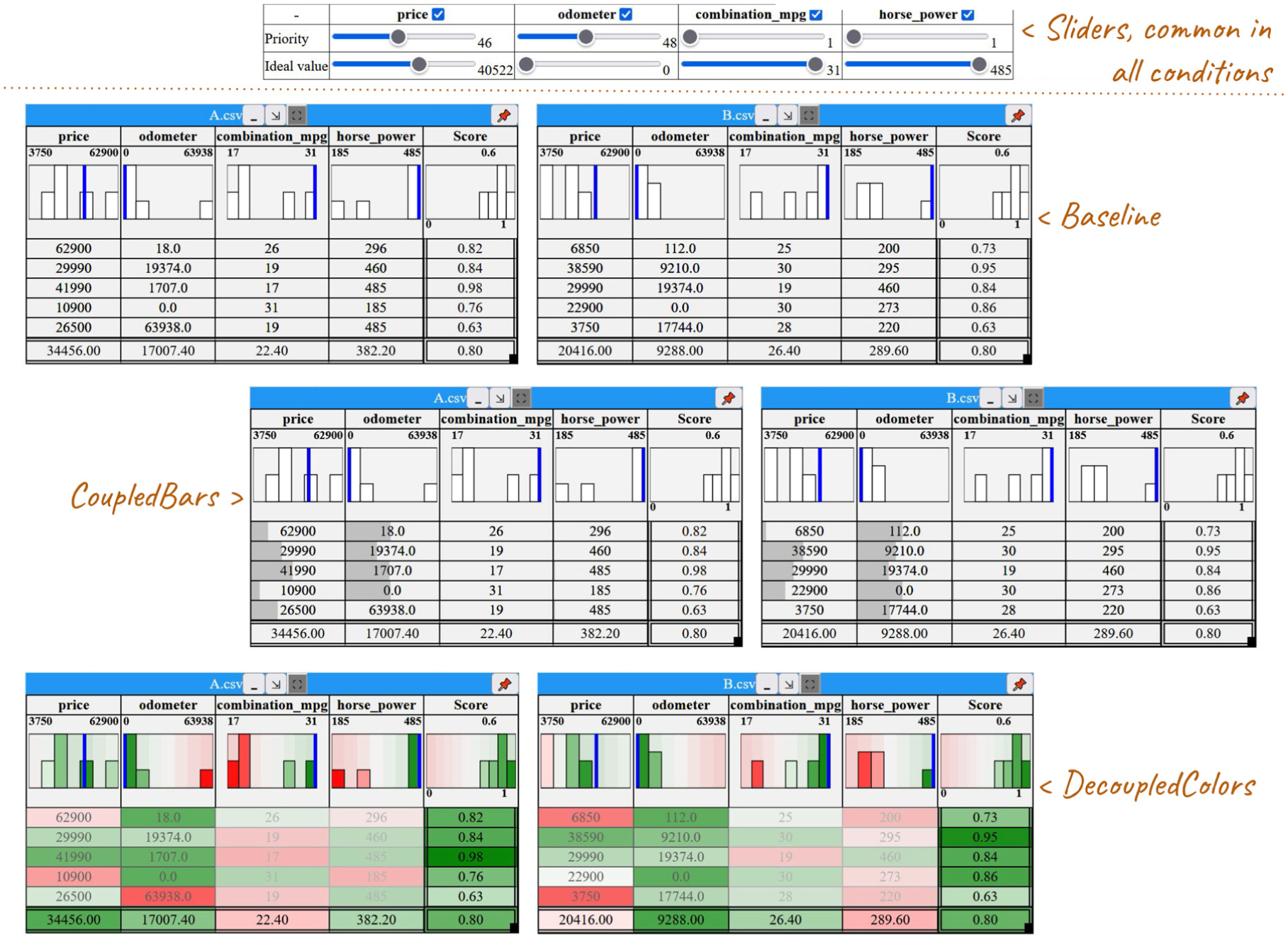
The three tabular visualization setups in our study: baseline with simple histograms, CoupledBars with added bars, and DecoupledColors with a color gradient, all linked to a table of sliders for adjusting priorities and ideal values.
Participants could not switch visual encodings and metrics during the experiment. But they could manipulate weights (expressing priorities) and ideal values, and see the mean for dimensions and the weighted mean (score) for data points, reflecting the most common choice in our sketches.
Finally, we opted for including histograms and ideal values in all conditions (including the baseline) to ensure a realistic and fair comparison, reflecting established practices (e.g. LineUp, WeightLifter). Even though they can be considered as simple trade-off indicators, excluding them from the baseline would not only have made the comparison unfair, but also weakened ecological validity. In the domain context we worked with (agronomy, biology, AI), such contextual notions are often implicitly present in users’ reasoning (Formative Study, R2-Metrics).
Hypothesis
To address our main research question on how different visualizations impact group comparison in trade-off analysis, we formulated two hypotheses. These are based on the assumption that visual representations will likely communicate more directly the trade-offs, thus reducing mental load and increasing confidence, but it is unclear how they will influence the use of information in the decision rationale. Moreover, as decoupled visualizations surface more information (two measures), we suspect they will lead to an increase in the information used and higher confidence, but will require more effort.
Tasks
We designed three trade-off comparison tasks (T1–3), each assigned to one of three visualization techniques (BASELINE, DECOUPLEDCOLORS, COUPLEDBARS) counterbalanced across participants. Each task involved evaluating two groups of used cars and selecting the most suitable group for a hypothetical taxi company’s fleet, based on four conflicting criteria: minimizing price and odometer readings while maximizing MPG and horsepower. Priorities and ideal values were provided by the company’s boss. At the end of the analysis, participants were asked to recommend a car group for purchase, justifying their choice in writing by discussing how each group aligned with the boss’s priorities and evaluating their strengths and weaknesses.
Each task used a different pair of datasets, consisting of the four dimensions (odometer, price, MPG, horsepower) and seven points, but with varying priorities. The task simulated expert decision-making (e.g. selecting wine recipes), without requiring domain knowledge. Participants were asked to provide data-driven justifications, helping us capture the evidence they valued in their analysis. The task datasets were designed to ensure non-trivial decisions, without a single correct answer, mirroring real-world trade-off analysis decision-making.
The visualization prototype, described in the previous section, presented data in side-by-side tables. Participants could adjust sliders to explore scenarios, but their final decision had to align with the boss’s initial priorities and ideal values.
Procedure
Each participant completed a 15-min training session to familiarize themselves with the prototype’s functions. After training, they spent 15 min evaluating two groups of data (car bundles) using the visualization prototype, a task similar to those in the design workshops. Throughout the experiment, participants had a reference sheet with key task information, goals, and prototype features (see supplemental material). They were required to justify their choices in writing, detailing each group’s strengths and weaknesses, referencing the data and visualizations. To capture reasoning, participants used a think-aloud protocol, with their comments audio-recorded for clarification. After each task, participants completed the NASA Task Load Questionnaire. 44
Study measures
We designed four study measures aligned with our hypotheses:
We asked participants to justify their decision choices, and we analyzed the data they report in their explanations. We adapted the Co-12 explanation quality properties from the AI domain 45 to assess participants’ explanations. In particular, the contrastivity property, captures the extent to which explanations support comparisons between alternatives. As our tasks do not have a single correct or more accurate choice, we view these properties of explanation quality as a possible proxy for the quality of comparisons and reasoning during trade-off analysis, assuming that better explanations reflect the extraction of more numerous and diverse information, leading to more informed decisions.
Results
We report next on (1) the qualitative analysis of participants’ open ended responses (decision justification) as a means to shed light on the data they considered for their comparisons, the quality of their reasoning as reflected in their explanations, their self-reported confidence of the decisions they made using the different visualizations, and their decision strategies; (2) the perceived load associated with using each of the visualizations; and (3) the reported overall visualization preference.
Statistical analysis for mean comparison was conducted using interval estimation. 46 Sample means of 95% confidence intervals (CIs) are constructed using BCa bootstrapping (10,000 bootstrap iterations). When interpreting results, a CI of a mean difference that does not overlap with 0 provides evidence of a difference, corresponding to statistically significant results in traditional p-value tests. Here we only report on evidence of a difference (but not the detailed CI values). Analysis scripts, and detailed CIs can be found in supplemental material. For the qualitative analysis, all quotations were translated into English, except those from two participants (P14, P26) who used English throughout the study.
Decision justifications
We analyzed the open-ended responses that participants provided to justify their decisions, in order to characterize their explanations across visualization techniques. Specifically, we identified (i) what
We used a reflexive thematic analysis (TA) approach 35 to analyze the qualitative data in three steps. First, one author assigned labels to text segments related to group comparisons, initially using a closed list of codes from related taxonomies,2,3 followed by open coding. In the second pass, coders categorized snippets as referring to information or decision strategies and grouped codes into higher-level categories (Information Considered and Decision Strategy). Finally, all authors examined how the codes relate to quality of explanation metrics (Justification Quality). Details of the coding are available in the supplemental material.
Information considered in comparisons
We coded types of data-related information participants reported analyzing during comparisons or using in their justifications (248 instances in total: BASELINE: 65, DECOUPLEDCOLORS: 82, COUPLEDBARS: 101). See Figure 5 for all instances by condition. A more detailed analysis of code frequency is provided in supplemental material.
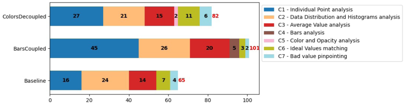
Number of times a type of data-related information was considered (C1–C7) across all participants.
We report next how many participants used specific types of information at least once to justify their choices. Most participants justified their choices by reference to group values and distribution characteristics, or to individual data points and their values.
For BASELINE, most participants used group-level analysis at least once, making references to C3: AverageValues (14/18  participants) and C2: DataDistribution&Histogram (13/18
  ) analysis, with some referencing analysis on specific data points like C1: IndividualPoints (11/18
  ). There were also references to how closely the data aligns with the priorities of the task, that is, how close or far they are from or to C6: IdealValues (7/18
  ).
).
Similarly, for COUPLEDBARS, most participants used group-level C2: DataDistribution&Histogram analysis (11/18  ) and C3: AverageValues (12/18
  ) at least once, with fewer referencing C1: IndividualPoints (8/18
  ) and C6: IdealValues (2/18
  ). References to visualization elements were rarer: they were explicitly mentioned as justifications by few participants for C4: BarsAnalysis (5/18
  ).
).
For DECOUPLEDCOLORS, most participants also referred to C2: DataDistribution&Histograms at least once (14/18  ), followed by C1: IndividualPoints (12/18
  ), C3: AverageValues (10/18
  ), and C6: IdealValues (7/18
  ). Again, there were rare references to visualization elements C5: ColorAnalysis (2/18
  participants).
References to C7: BadValues were pinpointed by few participants in all conditions (2–4/18  ).
).
Justification quality
We adapted five Co-12 explanation quality properties, 45 originally developed for AI explanations, to evaluate participants’ trade-off justifications: Correctness (factual errors in reasoning), Completeness (variety of types of information used), Compactness (amount of information used), and Contrastivity and Confidence discussed next. With the exception of Confidence, these properties were calculated in a second and third iteration of the codes in our thematic analysis. We report only on Contrastivity and Confidence, as they yielded significant results. Details of how the five properties were coded, as well as detailed results about the other properties, are in supplemental material.
Decision strategy
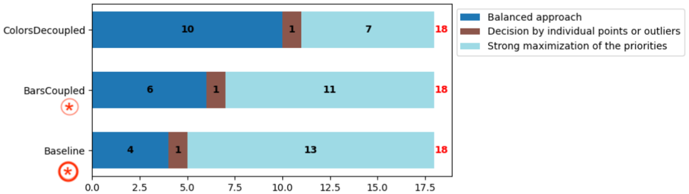
We additionally coded the participants’ decision-making strategies in the group comparison task (Figure 6). Most used one strategy, though a few considered two.
Decision strategy across visualizations.
 and in COUPLEDBARS by 11/18 participants (
 ). But was less common in DECOUPLEDCOLORS, used only by 7/18 participants (
 ). We note that one participant in BASELINE and two in COUPLEDBARS considered a balanced approach (see next) but ultimately made a decision that strongly maximized 1–2 top priorities.
 ), followed by COUPLEDBARS with 6/18 participants (
 ) and BASELINE with 4/18 participants (
 ).
).
 ). For example, P30 declared in DECOUPLEDCOLORS: “The taxi that penalizes the mpg in group A already has a high odometer and may need to be replaced, which will improve the average mpg. In group B, replacing taxis with a high odometer will penalize the average mpg making it less attractive. In the long term, group A will, therefore, be better on all criteria.”
Perceived load - NASA TLX
We report only significant NASA TLX results on task demand across the three visualizations, using 21-point Likert scales (see Figure 7 and supplemental material for additional details.
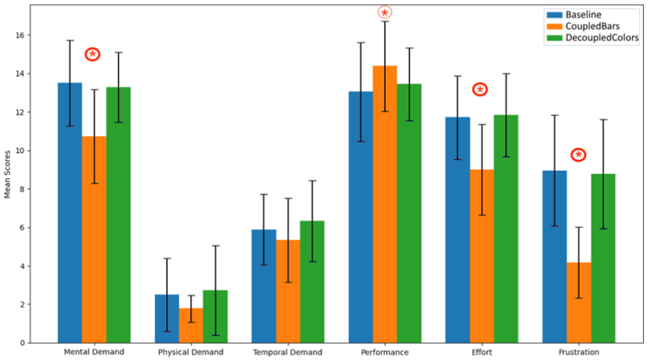
Mean values for the different categories of the NASA TLX questionnaires.
Participants’ ranking of the visualizations.
Mental demand
COUPLEDBARS has the lowest mean (10.72), and there is strong evidence that it was perceived as less mentally demanding compared to both BASELINE (13.5) and DECOUPLEDCOLORS (13.28);
Performance
There is possibly a trend for mean performance in COUPLEDBARS (14.39) to be higher than BASELINE (13.06) but no other evidence of a difference. The mean for DECOUPLEDCOLORS (13.44) was between the two.
Effort
The COUPLEDBARS has the lowest mean (9), and there is strong evidence that participants felt it required less effort compared to both BASELINE (11.72) and DECOUPLEDCOLORS (11.83).
Frustration
COUPLEDBARS shows the lowest mean (4.17), and there is strong evidence that it caused less frustration compared to both DECOUPLEDCOLORS (8.78) and BASELINE (8.94).
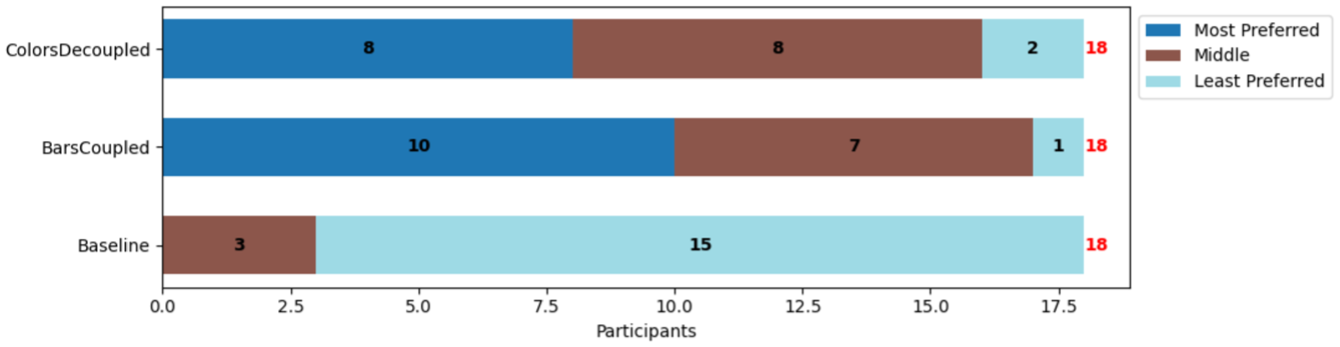
Preferences and qualitative feedback
After the tasks, we asked the participants to rank the three visualizations based on preference and explain their ranking (see Figure 8). COUPLEDBARS was the most preferred visualization, ranked first by 10 participants ( ). DECOUPLEDCOLORS came a close second, with eight participants ranking it as their most preferred choice (
 ). BASELINE was by far the least preferred visualization, with 0 participants ranking it as their most preferred choice (
 ).
).
These results show that participants clearly prefer the visual representations of trade-off metrics compared to the BASELINE that only includes numerical data (and histograms). As P20 mentioned for BASELINE: “Much more difficult to make a decision here [Baseline], having to go through all the data in text.” And P30 adds that: “The choice in Baseline was made more on the whole using averages,” highlighting a tendency to simplify the decision-making process due to the limitations of the visualization.
Slightly more participants preferred the coupled COUPLEDBARS (10/18  ) over the decoupled DECOUPLEDCOLORS. The participants who preferred COUPLEDBARS generally found them easier to read. As P24 explained: “The color representation greatly overloaded the reading of the data. The fact of having two distinct variables (color and opacity) to represent the priority and the ideal value did not facilitate handling. The representation of the relationship between priority and ideal value in the form of a single variable (the gray bar) was easy to use for me.”
Nevertheless, there were several participants who preferred DECOUPLEDCOLORS (8/18 ( ). They felt it made outliers and discrepancies with their goal stand out. For example, P23 mentioned “The DecoupledColors is ideal for me with the colors that greatly facilitate comparison and allow you to see the big differences directly…” Another (P14) commented on the intuitiveness of the representation: “I found the color and opacity combination very helpful in the analysis –the green to red scale is very intuitive, as is the scale from very solid color to nearly transparent. That aligned well with how I was already interpreting the decisions.” Some of these participants commented on how (compared to colors) with COUPLEDBARS they had “difficulty assessing what the maximum of the bars corresponds to” (P22).
Expert feedback
To illustrate how the prototype works, particularly its integration of trade-off metrics and visualizations for group comparison, we conducted a feedback session with an enology expert (Table 1, P5). The expert was tasked with comparing two groups of wine recipes, choosing one to implement in a lab experiment, and justifying their choice. The wine recipe groups, identified in a previous analysis, reflect two distinct temperature management strategies. Each group includes 22 recipes, characterized by eight criteria: three desirable aromas (A1-3), two undesirable compounds (C1-2), energy consumption (E), maximum cooling power (P), and fermentation time (T).
The feedback session was conducted remotely via Zoom, and lasted
Our expert started their exploration by immediately setting priorities, giving maximum weights to two aromas (A2-3), energy (E) and power (P). They explained that the other aroma and the compounds were correlated and weighted them mid-range. They left the weight for time (T) low as they were not as much concerned about fermentation duration. They then set their ideal values, noting that for some aromas (A1) and for (T) they are looking for mid-range values, while attempting to maximize (A2-3) and minimize (C1-2,E,P). Figure 9 shows the participant’s preferred condition (DECOUPLEDCOLORS), and the final priorities and ideal values used to make their choice.
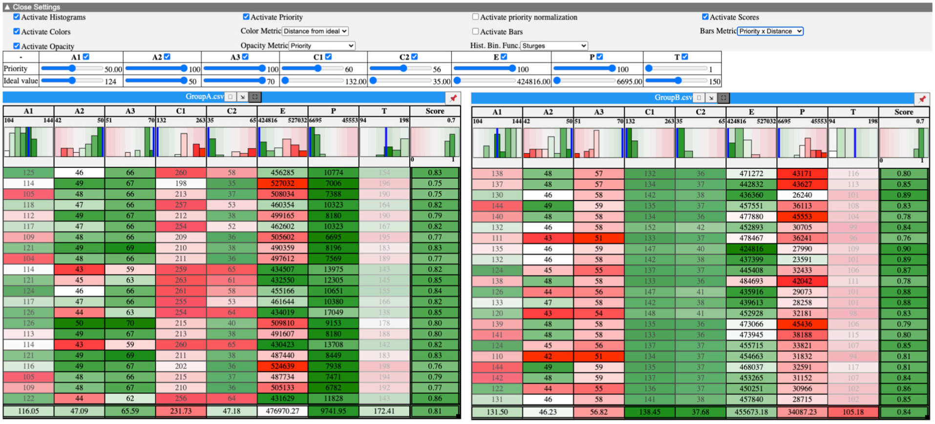
Screenshot of the wine expert’s preferred setup (DECOUPLEDCOLORS) showing participant’s priorities and ideal values.
Their reaction to BASELINE was underwhelming and in the training they considered only the weighted score per group and stated, “I have trouble choosing [ …] they are very similar. I don’t know, I would say group A, because the score seems better.” When their own dataset was loaded, they decided immediately to move to one of the two visual encodings. They started with COUPLEDBARS and used this view to set up their preferences and priorities in the sliders, but once those were set, they quickly moved to colors, “Does it [COUPLEDBARS] make sense to me ? […] I’ll activate the colors to see what it looks like.” Their reaction to DECOUPLEDCOLORS was enthusiastic, “Colors, I like them […], I find it immediately easier to grasp in terms of visualization. Here, spontaneously, I see that my wine B meets its criteria on the alcohol criteria [C1-2], but on the aroma criteria [A1-3] that interest me, it’s less good […] I see that there are still quite a few green things [highlighting several dimensions]. The fermentation time [T] doesn’t necessarily have huge importance. It’s in [low] opacity.” As they explained, “With the color, it helps me make a choice. It’s obvious. It’s much easier than the other ones.” They added, “I find it [BASELINE] less readable. It’s a bit harder to grasp. Because there are only the scores […] Later [after using DECOUPLEDCOLORS], it [COUPLEDBARS] was clearer. But maybe that’s because I don’t have enough experience with the tool. But it’s true that with the color and opacity, it’s nice […] We are trained in the lab to read heatmaps, for example. It [ DECOUPLEDCOLORS] looks like a heatmap.” When asked to justify their final decision, they again made references to the colors to indicate trade-offs in the different criteria. They stated high confidence about their choice, “The approach I set in the priorities, when I started adjusting my sliders, I can see it reflected in the colors, in the table, and in the underlying results [data].” When we indicated that their choice (group A) actually had an overall weighted score that was worse than Group B, they stated “I did it by color. Really, I didn’t look at the scores.”
With regards to adjusting ideal values, the expert expressed keen interest, “There’s something I didn’t do, that I would have enjoyed. But that’s once I initially made my recipe by setting my sliders. I would have liked to play afterward and say: I’m a bit less ambitious.” Finally, when asked whether they adopted a maximization strategy, a more balanced approach, one driven by individual points, or another strategy, they replied that it was “rather a maximization strategy,” albeit with a greater number of key priorities (four criteria all set to 100, Figure 9).
Discussion, future work & limitations
Our work extends prior research on comparative visualization and decision making, evaluating the comparisons of groups of points for trade-off analysis. It (i) underscores the need to add trade-off contextual facets in the comparison process, represented by the user’s goals and expressed as criteria, priorities and the direction of their optimization; and (ii) highlights how concrete representations of these facets contribute to the comparison of and reasoning with groups of points over a multidimensional space.
Understanding what elements constitute the contextual facets that support group comparison is a contribution of our work. In our video analysis and workshop with experts, we were first able to identify, captured as key requirements, high-level trade-off context in the form of: metrics (priorities, ideal values), access to different levels of data detail (raw datapoints, weighted scores of datapoints/dimensions/groups), use of data ranges and ranking. We explored how to visualize these contextual facets in two design workshops. Our subsequent user study examined how concrete representations of these elements are used in trade-off analysis, discussed next. The feedback session with the domain expert further illustrated how these approaches apply to real-world tasks, revealing a clear preference for the decoupled, visual representation, contrary to our findings with lay participants, and showing that it helped them quickly grasp trade-offs and make confident decisions based on visual patterns rather than exact scores.
We revisit next our research questions, highlighting key takeaways (in italics), and associated research implications and future work. We finish with a set of limitations.
Should we visualize trade-off metrics (RQ1)?
Based on our design workshops and related work, we hypothesized (
Surprisingly, baseline tables provided high contrastivity and confidence, suggesting that when users are comfortable with raw data, simple tables can rival complex visualizations, though scalability and further testing remain important. We note, however, that all study participants, and the domain expert, preferred one of the two visual trade-off conditions, even though the decoupled visualization seemed complex for some. We should thus consider designing for a continuum in the external representation of trade-offs, ranging from purely numerical representations to visually enriched ones that support different levels of perceptual comparison and cognitive effort.
Should we use a coupled or a decoupled visualization of trade-off metrics (RQ2)?
We hypothesized (
The increased perceived cognitive load in decoupled colors was expected, consistent with the split attention effect, 47 but the reduced confidence was not. Some participants likely noticed subtler trade-offs, realizing no option was clearly “best,” which reduced confidence. Individual differences in sensitivity to cognitive load may also have contributed as well, reflected in the varied scores, and underscore the need for further studies on visual MCDM tasks.
Understanding, supporting and shaping decision strategies
The justifications for our participants’ final decision show differences in the types of strategies the visualizations support. We see that in the baseline tabular visualization, and to a lesser extent the coupled bars, most participants adopt decision strategies that optimize one or two criteria only, what we refer to as strong maximization of priorities. This aligns with decision-making strategies relying on non-compensatory heuristics such as lexicographic rules 48 and the take-the-best heuristic. 49 Whereas in the decoupled colors, we observe more varied strategies from the same participants, with some balancing optimizations across all criteria, consistent with compensatory decision-making models. 23 Our results suggest that baseline visualizations, and possibly coupled bars, support strategies that adopt strong maximization of few (highest) priorities; if balanced decision strategies that consider multiple priorities are important, then decoupled color representation could be more appropriate.
An important question that emerges from these results is whether specific visualizations support the strategies participants want to adopt, or if they actively influence decision strategies. Our results hint that we could use simple encodings to influence trade-off decision strategies. Coupled encodings (e.g. simple weighted means or bars) tend to promote prioritization of top-weighted criteria, while decoupled encodings (e.g. hue and opacity) could encourage more balanced, multi-criteria reasoning. As visualization designers, we could choose based on desired decision behavior, but this raises ethical considerations regarding “nudging” users and biasing their decision strategies.
Our findings support prior practices in multi-attribute visual analytics, such as LineUp 15 or WeightLifter, 12 confirming that external trade-off representations that are visual are preferred by users. However, our comparative evaluation is more nuanced, indicating that the form of representation matters. Our findings reveal a possible fundamental tension in MCDM visualizations: representations that enhance contrastive (baseline) or confident decisions (coupled bars) do not necessarily support transparency and balanced decision strategies (e.g. decoupled colors). Visual encoding may also shape comparison strategies via ensemble perception, where summary features of groups, rather than individual values, guide attention. 50 Future work should investigate how visual complexity, perceptual and cognitive load, ensemble effects, and decision effort each influence different stages of decision making. In contrast, cognitively constructed approaches,16,19,31 avoid the possible trade-off between transparency and visual complexity altogether, by leaving the integration to the user. But given that the comparison is performed across groups, this integration is likely more challenging than for individual points, leading to a different type of mental (integration) effort - the impact of this integration and how it compares to external representations needs to be confirmed.
Integrating comparisons in VA workflows
We must consider how to integrate comparison into broader MCMD workflows. We studied contexts where criteria are defined a-priori, both when it comes to our experts and in our user-study. There are, nonetheless, cases where criteria may be defined progressively, or a-posteriori 12 as users start exploring their data. Our work on comparison becomes relevant when loosely defined criteria solidify into clear objectives and well-formed groups or subsets to compare.
To arrive at this stage, analysts may need to first go through VA analysis using exploration and set-theoretic relationships such as intersections, unions, and subsets (like LineUp, Taco, Domino, Upset, and SmartExplore, etc.). Our approach can serve as a dedicated comparison aid embedded within such broader decision-support systems, activated when analysts want to zoom into the similarities and differences between alternative candidate sets.
For practical reasons, we tested a small number of groups, each containing a small number of items (<10), reflecting the datasets sizes encountered in some of our expert interactions. In real-world decision-making, users often face more sets, items, and dimensions. It is unclear how increasing the number of sets affects the ability to maintain holistic, priority-driven judgments; how larger numbers of items influence ensemble perception and the detection of anomalies; and how higher-dimensional tables affect the balance between ensemble perception and transparency of individual components. For larger datasets or groups, participants may adopt comparison strategies that rely more on averages or aggregation. Understanding these limits will be critical for designing scalable table visualizations that support more effective trade-off analysis.
Based on our workshops, we focused on variations of trade-off metrics with respect to criteria and comparisons relative to a best or ideal point. In addition, we need to investigate if results could differ when considering other metrics, such as comparisons relative to a nadir or multiple reference points as suggested in the literature. 13 Our study highlights the importance of normative baselines (e.g. the ideal point) as anchors for group comparison. However, because participants often negotiated the norm by adjusting priorities and ideal values, such anchors should be user-controlled. Exploring how to visualize multiple anchors and the impact of combining multiple interactive anchors on the trade-off analysis process remains future work.
Limitations
Our experts work with complex datasets derived froiological models, but simpler trade-off tasks with fewer criteria or data points also exist. In our design workshops, we carefully constructed datasets and tasks to reflect expert practices, though these choices and the inspirational material may have shaped our prototype designs. Still, the alignment between design requirements and expert feedback gives us confidence in identifying what visualizations must provide.
Our resulting prototype, informed by workshops with visualization and HCI experts, takes a tabular form. In contrast to state-of-the-art multi-dimensional visualizations, this is a simple representation. Nevertheless, we note that tables have been found in prior work to be particularly effective in decision-making 34 and preferred by many data experts. 51
Our visualization prototype supports various combinations of trade-off metrics and visual encodings. To keep the study manageable ≈2h), we tested three variations: one based on frequent designs from our workshop (decoupled colors), one from the state of the art (coupled bars), and one that we consider a usable baseline. This resulted in a limitation of our user study: we compared a mix of metric coupling and visualizations (bars with coupled metrics and colors with decoupled). We are thus not able to study in isolation the effect of coupling. It is possible some of our results, for example, higher perceived mental load in decoupled colors, are more due to the visual encoding than the metric coupling. Clarifying this question remains future work, and would benefit from findings in vision sciences on the coupling of or interference between different visual channels.
We considered several properties for justification quality. While these highlight differences in participants’ reasoning (in contrastivity and confidence), as our decision tasks do not have a ground truth or an objectively “correct” choice, it is unclear if they are a reliable proxy for decision-making quality.
Finally, in the summative feedback session we only had one domain expert who had also participated in the formative stage, which may have been influenced by their prior involvement, potentially introducing positive bias. This feedback aimed to highlight domain-specific value rather than to generalize results and complements the study with 18 non-expert participants.
Conclusion
Comparison is an important task in multi-criteria decision-making. Although prior work has considered the comparison of individual points, studying how to compare groups of points remains an open challenge. We contribute empirical results on the evaluation of group comparisons for trade-off analysis. To better identify user needs for comparisons of groups, we conducted a workshop with experts that provided valuable insights into how trade-off comparisons are conducted, and what support visualizations need to provide. Two design workshops in-turn inspired the implementation of a prototype to support group comparisons. As we had to consider several design decisions about how to present trade-off metrics, we evaluated two trade-off metric visualizations against a baseline that uses a purely numerical approach.
Our results identify factors involved in such comparisons and emphasize the need to incorporate trade-off contextual facets beyond raw data, value ranges, and optimization direction, including broader user needs and user goals expressed as criteria, priorities and reference values. They highlight that visual representations of these trade-off facets are preferred, but that decoupling their visual representation increases perceived mental load for non-domain experts. These findings, along with expert feedback that on the contrary favored the decoupled representation, raise questions about how visualizations can support, or even promote, different trade-off decision strategies, and how preferences may vary with domain expertise, they highlight the need for comparative studies that move beyond individual components to consider groups of items. Such studies can clarify how visualization design shapes not just data understanding but also reasoning, decision strategy and confidence.
Footnotes
Acknowledgements
We thank our domain experts, as well as all workshop and user study participants, for their valuable contributions to this work. We also thank the anonymous reviewers for their insightful feedback, which greatly improved this work.
Ethical considerations
Approved by the Ethics Committee of Université Paris-Saclay.
Funding
The authors disclosed receipt of the following financial support for the research, authorship, and/or publication of this article: Ecoles doctorales (Universit/è Paris-Saclay); Agence Nationale de la Recherche (France) ANR projects: ANR-24-CE10-4479 and ANR-24-CE33-4303.
Declaration of conflicting interests
The authors declared no potential conflicts of interest with respect to the research, authorship, and/or publication of this article.