
Abstract
Structural Bioinformatics is a subfield of Bioinformatics dedicated to studying biological mechanisms through the three-dimensional structures of biomolecules, particularly proteins. In this context, Molecular Dynamics is a technique that enables the computational simulation of molecular systems based on their chemical structures. However, this technique faces challenges related to high data dimensionality, high computational costs, and the significant storage requirements for the resulting data. Consequently, it is necessary to develop computational methods that facilitate the analysis, integration, and visualization of data derived from these simulations. Currently, a wide range of approaches exists to analyze such data, including metrics based on system energy or atomic displacement, such as Principal Component Analysis (PCA), Root Mean Square Deviation (RMSD), and Root Mean Square Fluctuation (RMSF). To identify informative patterns within these complex systems, a common analytical method is the Dynamic Cross Correlation Map (DCCM). DCCM analyzes the average correlation of Cartesian displacement vectors for all-versus-all amino acid residues, accounting for the various conformations adopted during the simulation. However, the average correlation done in DCCM can occlude specific transition correlations during the simulation. The DCCM can be interpreted as an adjacency matrix, as defined in Graph Theory. By incorporating the time dimension and simulation states, this matrix becomes dynamic, providing the data structure necessary to construct a dynamic network. Thus, the objective of this work is to explore the transformation, representation, and analysis of structural data from a computational perspective, aiming to bridge the gap between Data Visualization and Structural Bioinformatics. The results include the development of a tool that provides an alternative visualization of the DCCM method by incorporating time segmentation.
Introduction
Molecular Dynamics (MD) is a technique within Structural Bioinformatics used to simulate molecular complexes and extract insights regarding their biological context. This method integrates computational algorithms with concepts from various disciplines, particularly Physics and Chemistry. 1 Fundamentally, MD simulation employs Newton’s laws of motion to model atomic and molecular trajectories over time, providing a detailed temporal resolution of complex biological systems. MD is applied across a wide range of fields, including protein folding studies, drug discovery, and the investigation of disease-related biological processes. The primary output of these simulations consists of the Cartesian coordinates for each atom at every time step. Currently, several methods are employed to analyze these data, such as Principal Component Analysis (PCA), Root Mean Square Deviation (RMSD), Root Mean Square Fluctuation (RMSF), and Dynamic Cross-Correlation Maps (DCCM). While there are various approaches to representing simulation data, 2 this work utilizes dynamic graphs 3 to identify interactions between components within molecular systems. Specifically, we focus on visualization strategies to enhance the interpretation and analysis of DCCMs derived from MD simulations.
To employ a new approach to DCCM analysis on MD, our solution transforms the input, specifically the time-series Cartesian coordinates, into a symmetric square matrix representing the correlations of atomic displacements between variables. This transformation and modeling are fundamental to develop visualization approaches, as they ensure data is manipulated into the required format. To visualize this data, we structure it as an adjacency matrix, 3 interpreting the system as a dynamic network graph. This application of graph theory provides a theoretical foundation for our method. Furthermore, representing the data as adjacency matrices enables the use of the visualization technique proposed by Bach. 4 These authors introduce an interactive three-dimensional space (the Matrix Cube) to analyze correlations by juxtaposing temporal components, thereby facilitating the visual analysis of dynamic data. 5
The aim of this research is to demonstrate correlations considering time using the aforementioned technique, focusing on those that might be overlooked by the averaging process of the method usually used by Structural Bioinformatics researchers.6–12
The current research explores the Matrix Cube data visualization technique applied to MD simulation data, investigating the utility of this general-purpose method within a specific scientific domain. By examining data from a perspective distinct from standard approaches, this study evaluates the technique’s potential to facilitate the analysis of interactions across various simulated systems. Ultimately, this work leverages domain-specific biological data to advance the field of visual analysis from a computer science perspective. The specific objectives are as follows: (a) To develop an algorithm capable of processing MD trajectories and applying DCCM in a time-segmented manner, aiming to detect linear correlations that may be masked by the averaging process of standard methods; (b) To develop a visualization tool specifically designed to represent the results of MD simulation analyses; (c) To explore the applicability of a generic visualization technique within the specific knowledge domain of MD; (d) To validate the proposed visual approach by comparing it with traditional DCCM analysis, demonstrating the tool’s capability to reveal transient and dynamic correlations within the system.
The remainder of this paper is structured as follows. The Preliminaries section presents a brief explanation of essential concepts. The Literature Review establishes the theoretical foundation, reviewing data visualization for dynamic networks and the application of DCCM in Structural Bioinformatics. Materials and Methods details the dataset, the development of the trajectory slicing algorithm, and the implementation of the web-based visualization tool. Results and Discussion provides a comparative analysis between the proposed time-sliced approach and traditional methods, while also addressing the limitations of this work. Finally, the Conclusion summarizes the contributions regarding the tool’s development and validation, and outlines directions for future research.
Preliminaries
Dynamic cross correlation maps as dynamic networks
In MD simulations, DCCM analysis is typically restricted to the Alpha Carbons (
The spatial arrangement of these vectors complicates interpretation compared to two-dimensional environments, as the third dimension introduces additional complexity to the linear correlations.7,13 However, normalizing the data by the product of the root-mean-square fluctuations ensures that the final method captures the essential covariances.
9
This normalization bounds the coefficients between
The mathematical formulation of the method is derived from the variance (equation (2)) and covariance (equation (1)) of atomic displacements. The complete Dynamic Cross-Correlation Map function is presented in equation (3). In this context, covariance quantifies the joint variability between two three-dimensional vectors, while variance measures the fluctuation of a single vector. In these equations, the angle brackets 〈…〉 denote the ensemble average (or time average) over the simulation trajectory.


It is important to note that, although this statistical method reveals linear correlations and anti-correlations, the interpretation of this information in a biological context is the Structural Bioinformatics researcher’s responsibility. Here, we explore the possibilities of visualizing these correlations in terms of time. While Bach 14 employed correlation networks for visualization with Matrix Cubes in the context of different tasks, including correlation between signal connectivity related to brain functions, in the present study we chose Structural Bioinformatics as the applied knowledge field.
Graph Theory offers a robust framework to improve the understanding of complex biological phenomena, 3 particularly in the interpretation of three-dimensional conformational dynamics. This information can be represented as a dynamic network, where atoms are defined as nodes and their interactions constitute the edges. 3 Graph-theoretic metrics, such as connectivity, modularity, and centrality, are crucial for characterizing the behavior of these molecular complexes. Despite their potential, these visualization strategies remain underutilized in current structural bioinformatics research.
A fundamental representation of network topology is the adjacency matrix, 15 where rows and columns correspond to the network’s nodes. In this structure, diagonal elements represent self-loops. Each matrix entry indicates the existence of an edge between the corresponding nodes, with the numerical value representing the associated weight. Specifically, this study employs an undirected weighted graph model, which inherently results in a symmetric adjacency matrix.
Literature review
The use of data visualization within dynamic networks
The taxonomy proposed by Bach et al. (2017) 16 outlines the main data visualization classes for space-time cubes: extraction, flattening, geometry transformation, and content transformation. The authors discuss the advantages and limitations of this technique, facilitating the description, critical assessment of visualization challenges, and comparison of different tasks applied to temporal data. Regarding extraction operations, point and plane extraction from the volume are performed via orthogonal slicing. Within geometry transformation operations, time translation is addressed. Finally, the content transformation class employs labeling and data filtering techniques. By employing these operations in a composite manner, 16 it is possible to construct an interactive environment that enables users to explore data efficiently. This approach aligns with the methodology developed by Hong et al., 17 which emphasizes user interaction within the application.
The work proposed by Hong et al. 17 seeks to clarify the integration of information across visualizations of varying dimensionality, for instance, enabling the integration of 3D and 2D environments. It maps the usage of distinct visual data representation methods that utilize techniques analogous to those developed by Bach. 4 This recent mapping guides the deployment of data visualization techniques, highlighting the design patterns applied in this research.
The literature presents robust techniques for visualizing dynamic networks through the aggregation of time slices in three-dimensional environments. Gohnert et al. 18 propose 3D DynNetVis, a web-based tool (built with Three.js) that stacks graph layouts along a third temporal dimension, facilitating the inspection of network evolution in accordance with Shneiderman’s “mantra”. 19 Similarly, Bach et al. 20 introduce MultiPiles, which utilizes the stacking of adjacency matrices. While focusing on dense and weighted networks, such as those observed in brain activity, the authors group similar time slices to reduce redundancy and visual clutter, validating the use of dense time-series weighted networks in complex scientific domains.
Beyond the temporal structure, data comprehension depends on interaction techniques and the identification of topological patterns. MatrixExplorer 21 established the importance of coupling matrix and graph (node-link) visualizations in a synchronized manner, allowing for reordering to reveal clusters and connectivities. Recent advances focus on the exploration of changes and explainability: Wen et al. 22 developed DiffSeer, which visually highlights weight differences between adjacent time slices, while Shu et al. 23 propose interactive approaches to assist users in identifying and interpreting complex visual patterns in matrices, demonstrating superiority over static learning methods. The development of such tools must consider usability barriers and the various stages of exploration. Alkadi et al. 24 define an eight-step framework for Network Information Visualization, encompassing every step from data formatting and import to the final interpretation of network concepts. This methodological workflow facilitates the identification of limitations and informs design decisions, ensuring that the transition from data modeling to visual exploration, whether via matrices or diagrams, meets the researcher’s cognitive needs.
Application of dynamic cross correlation maps in structural bioinformatics
The literature widely employs DCCM as a comparative tool to elucidate functional alterations in biological systems by contrasting distinct molecular states. Wang et al. 11 and Dash et al. 8 apply this method to compare native structures (wild-type) with mutant variants, demonstrating how point mutations propagate dynamic effects throughout the structure and may induce anti-correlated motions that are functionally relevant. Extending the analysis to molecular interactions, Parida et al. 10 employ the technique to assess the impact of ligands, enabling the identification of molecules that stabilize the protein or induce perturbations within its internal motion network.
Beyond static comparisons, more recent and foundational approaches emphasize the temporal dimension and methodological robustness. Okamoto and Ando 9 propose Time-Dependent Dynamic Cross-Correlation (TDDCC) to track signal propagation, addressing the need for tools that account for the temporal evolution of data. This perspective is complemented by Kasahara et al., 7 who discuss the limitations of standard DCCM in capturing transient states, as well as by the influential work of Hünenberger et al. 6 The latter highlights the slow convergence of correlation maps, underscoring the necessity for extended simulations and suggesting that visual tools can facilitate the monitoring of pattern stabilization.
The work by Cavatão et al. 12 investigates the Melanocortin-1 Receptor (MC1R) through DCCM analysis across six distinct systems, comprising the native protein and mutants in both the presence and absence of ligands. The authors identify how specific mutations alter the transition dynamics between active and inactive states, thereby explaining the loss of molecular function.
Material and methods
The core concept of the tool proposed herein is to employ three-dimensional data visualization to explore the temporal dimension within MD simulations analysis, specifically extending the standard DCCM method.6–12 The tool’s design adheres to the Visual Information-Seeking Mantra proposed by Shneiderman
19
:
“Overview first, zoom and filter, then details-on-demand.” Shneiderman
19
This mantra guides the development of visualization tools by defining the foundational principles of visual information exploration and analysis. First, an overview of the data is provided, followed by interactive operations such as zooming and filtering, and finally, the retrieval of details on demand. This approach establishes a critical framework for the development of data visualization interfaces, as supported by recent research. 25
The development of our analysis tool follows a decoupled architecture, in which one component is responsible for computing the algorithm that processes trajectory data and calculates the method, while a separate component handles data visualization. The proposed visualization technique draws inspiration from complementary approaches that support its rationale. In this work, we apply the Matrix Cube visualization4,16 to a specific scientific domain. Modeling this problem involves integrating techniques from both Structural Bioinformatics and Computer Science. Structural Bioinformatics addresses the exploration of molecular complexes through DCCM trajectory analysis,6–12 while Computer Science contributes the framework for dynamic network representation using graphs and adjacency matrices, 26 as well as three-dimensional data visualization techniques.17,19,26–29
The application architecture is divided into two primary modules: data processing and visualization rendering. The processing component is implemented in Python utilizing the MDTraj library, 30 while the rendering engine is developed in JavaScript using Three.js. 31 Communication between these components is mediated by a binary file, which stores the correlation matrices data alongside a header containing essential visualization metadata. This approach facilitates compact and efficient data transfer between the modules.
Dataset
The dataset used in this research is derived from the study by Cavatao et al., 12 which investigates the effects of distinct mutations on the mechanism of action of the Melanocortin-1 Receptor (MC1R). It is important to note that the detailed biological investigation of this mechanism is outside the scope of the present work.
The dataset comprises three molecular complexes: the wild-type (WT) and two mutant variants. Each system was simulated under two conditions: the protein structure in isolation (apo state) and the protein bound to a specific ligand (holo state). For each condition, five independent simulation replicas were performed, each spanning 1
In the work by Cavatão et al., 12 DCCM analysis was performed using GROMACS 32 through a procedure consisting of the following steps: gmx trjcat was used to concatenate system replicas; gmx trjconv generated a reference file with initial coordinates; and gmx covar calculated the covariance matrix. Subsequently, MDAnalysis33,34 was employed to normalize the matrix by the product of data variances. The final result is a DCCM derived from the concatenation of all replicas for a single molecular system.
Preprocessing
Data preprocessing is required to prepare the inputs for the visualization tool. This process involves removing solvent molecules and retaining only Alpha Carbon (
Computation of sliced dynamic cross correlation maps
The Python-based component processes the simulation data, utilizing the MDTraj library to parse the input files generated during preprocessing. These data comprise topological information regarding the macromolecular structure; specifically, one file stores trajectory coordinates, while the other contains essential system attributes.
The raw data utilized in this work are available at https://linkly.link/2Rkqo. The algorithm automatically detects the number of systems and replicas within a target directory, loading them into memory via the processTrajectory function. This function leverages the MDTraj package, 30 a Python library optimized for the manipulation of MD simulation data. Additionally, the slice size parameter used for segmentation is defined within this routine.
Coordinates corresponding to each simulation frame are extracted using MDTraj and stored in a list. A global alignment of the entire trajectory to a reference structure (the initial frame) is performed using the library’s superpose function. This procedure eliminates global rotational and translational motions by minimizing the RMSD, ensuring that the calculated correlations reflect solely the protein’s internal dynamics. Subsequently, the algorithm partitions the aligned trajectory and computes the standard DCCM for each segment. This calculation is implemented in Python, leveraging the NumPy library 35 for efficient matrix operations.
Time segmentation is performed to capture the temporal evolution inherent in MD trajectories; therefore, the system is modeled by partitioning the simulation into discrete time windows. This approach generates a sequence of graph states, effectively representing the DCCM as a dynamic graph. 18 Such dynamic network representations provide a robust foundation for advanced data visualization. 36
For each selected trajectory segment, the standard DCCM method is applied. Initially, the mean position of each atom across the segment’s conformations is determined. Subsequently, fluctuation vectors for each atom in every conformation are calculated by subtracting the mean position from the instantaneous positions. The core step involves calculating the covariance matrix (using NumPy’s np.einsum) to measure the coordination of atomic movements. The notation ‘tij,tkj->ik’ defines the tensor contraction rule, instructing the algorithm to multiply the fluctuations of atom (
The application of DCCM analysis to discrete time windows of the trajectory may lead to noisy results. Short windows yield calculations that are not truly significant correlations between atoms, impacting the correct interpretation of the results. In this work, we do not evaluate the significance of the correlation obtained using the selected time windows. Selecting the most accurate trajectory size is relative to each biological focus and is a responsibility of the researcher. Although we assume time-dependent noise, our aim in this work is to provide a method that separates an MD trajectory into discrete time windows and computes DCCM for each slice. More detailed information on Section Constraints on Temporal Granularity, Statistical Robustness, and Method Linearity.
Data storage
Subsequently, the generated data is stored in an optimized format to minimize storage overhead by exploiting the symmetry of the matrix to eliminate redundancy. This optimization facilitates efficient data transfer between the processing module and the visualization interface. The dataset generated for the visualization examples is available at https://linkly.link/2Rljq.
Given the symmetric nature of correlation matrices (where
Visualization
To incorporate and visualize DCCM information, the framework adopted in this study adheres to the elementary taxonomy of space-time cube operations proposed by Bach et al. 5 We implemented this technique as a web application, leveraging graph theory and data visualization concepts to explore data derived from MD simulations. Figure 1 illustrates this approach utilizing space-time cubes. Specifically, the operations selected from Bach et al., 16 as described earlier, guided the functional development of the tool.
Matrix cube visualization.
The visualization interface is implemented in JavaScript utilizing the Three.js library. 31 This library facilitates the construction of a 3D environment for rendering scenes derived from the processed data. The software architecture employs a modular design (using functions and classes) to isolate the visual component logic. This approach not only streamlines development and dynamic scene reconstruction but also ensures efficient memory usage on the client device. Functionally, the application retrieves binary data from the server, while the computational burden of rendering is offloaded to the client-side hardware. This architecture effectively mitigates processing overhead on the hosting server.
Binary file reading
The DccmFunctions class, defined in DccmFunctions.js, includes methods responsible for data processing and binary file parsing. Specifically, the asynchronous function loadBinaryDCCM handles the extraction of all data required for the projection construction. Data is read sequentially from the binary file in the following order: the number of segments, the number of protein atoms, the residue names corresponding to the
After parsing the binary file, the asynchronous function returns the number of generated slices, the total number of atoms, an ordered list of residue names, and the correlation matrices for each residue pair. In addition to this data, the function returns two closures, getDCCMValue and getSliceAsMatrix, which facilitate data access and are utilized throughout the visualization code. The getDCCMValue closure retrieves the correlation value between two atoms in a specific slice based on their indices. Meanwhile, getSliceAsMatrix exports a slice in a matrix format optimized for the rendering process.
Tool development
The software is built upon a modular architecture, where a main function defined in SceneManager.js controls the entire scene. Scene subjects are organized in a separate directory and are instantiated on demand by the main function. The SceneManager acts as an application controller, applying configuration changes and updates to the system being visualized.
The application design is inspired by the “Visual Information Seeking Mantra” proposed by Shneiderman. 19 This principle advocates a specific workflow for constructing data visualizations: overview first, zoom and filter, and then details-on-demand. This paradigm serves as a reference for various data visualization tools4,18,25,38 as it establishes a foundational taxonomy for the field of Information Visualization.
The update function, defined in main.js, is primarily responsible for executing the rendering cycle. At the conclusion of each cycle, it invokes the renderer.render(scene, camera) method. This method instructs the Three.js WebGLRenderer to draw the current state of the scene to the screen from the camera’s perspective. This operation effectively presents the updated frame to the user.
The scene is initialized with a uniform gray background via the buildScene function. Subsequently, the remaining components, which are managed by the SceneManager, are added. These components include ambient lighting and a color-coded axis indicator. This indicator consists of line segments representing the x, y, and z axes, which intersect at the origin (0,0,0).
The user can manipulate the camera’s rotation and translation via cursor interaction. This functionality is enabled by the Three.js OrbitControls class, instantiated in the buildControls function, which facilitates scene navigation. The camera itself, initialized in the buildCamera function, is an instance of the THREE.PerspectiveCamera class. This class renders the visualization using a perspective projection that updates dynamically in response to user interaction.
A contextual background is added to the visualization. This structure takes the form of a parallelepiped that encapsulates the Matrix Cube, 5 maintaining a buffer distance to prevent overlap with the data. This geometric shape is dynamic; its dimensions scale to match the visualization, specifically adjusting its depth based on the number of slices selected for rendering. To ensure the observer’s view is not obstructed during navigation, the planes composing this background are rendered such that only their interior-facing surfaces are visible. Additionally, a subtle black border, defined via custom shader programming, outlines these planes to enhance the spatial perception of the visualization volume.
A configuration panel is created to handle parameter manipulation. This interface is managed by the GUI class and is instantiated within the createPanel function. The panel provides users with control over the visualization through the following ordered elements:
Following the binary file parsing, the data flow is managed by the SceneManager. This manager utilizes the closures defined in loadBinaryDCCM alongside the DccmSlice class. The DccmSlice constructor is critical for the scene’s display; once the raw data is loaded, it is responsible for generating the point cloud. To achieve this, the getSliceAsMatrix closure is invoked to convert the correlation data into attribute buffers formatted for WebGL. These buffers are encapsulated within a Three.js THREE.BufferGeometry object and subsequently instantiated in the scene as a THREE.Points object, establishing the initial visualization.
The updateFromSettings function, triggered by GUI events, orchestrates the dynamic reconfiguration of the visualization. When the user modifies parameters, such as correlation thresholds, the underlying filtering logic is re-executed to recalculate point attributes, including color and visibility. Subsequently, the BufferGeometry attributes are updated in place and flagged for the renderer (setting needsUpdate to true). This efficient approach ensures the next render call displays the filtered points without the performance overhead of destroying and re-instantiating the THREE.Points object.
These rendered points represent the values derived from the symmetric correlation matrices. Their color is assigned by the function gradientColorForCorrelationForParticles, which implements a scalar-to-RGB mapping using piecewise linear interpolation. The visualization employs a diverging color scheme defined by three control points: blue, white, and red. The interpolation is applied in two distinct segments: negative values are interpolated between blue and white, while positive values are interpolated between white and red. This function is executed for each point in the visualization, determining its color based on the correlation value of the specific
Reproducibility and availability
To ensure the software can be reproduced, modified, and audited across different contexts, it is developed as an open-source tool. Consequently, the source code is published on GitHub and released under the GNU General Public License (GPL). This licensing framework promotes broad distribution and guarantees the continued availability and development of the tool as free software.
To further ensure the tool’s reproducibility, the Frontend component employs Docker containerization. This approach encapsulates the application within a self-contained environment, automating the build process and strictly managing the dependency versions required for consistent rendering across different systems.
In contrast, the Backend is designed to operate on pre-processed data, specifically supporting trajectories that contain exclusively the
Results and discussion
Effective interactive visualization relies on an appropriate data representation. Bridging the gap between Data Visualization and Structural Bioinformatics presents a unique challenge, requiring careful methodological design. In this context, MD trajectories are conceptualized as dynamic networks. 3 This study adopts this network-based perspective to model the data, thereby enabling the application of the Matrix Cube visualization technique proposed by Bach et al. 5
The primary contribution of this work is the development of an approach that overcomes the temporal limitations of traditional DCCM analysis, which typically relies on averaging the entire trajectory and aggregating data across simulated replicas. Rather than conducting an exhaustive biological study, this analysis serves as a proof of concept. It demonstrates that time-sliced DCCM visualization can reveal dynamics and structural variabilities that are consistently obscured by the global averaging inherent in standard methods.
As detailed in the methodology section, standard DCCM analysis is typically performed manually using GROMACS commands, as seen in Cavatão et al. 12 The technique developed here not only discriminates covariances over shorter trajectory intervals but also automates this workflow. Achieving the same result through the conventional method would require extensive manual data processing. For instance, to calculate DCCM for specific time slices, a researcher would need to execute gmx trjconv on every replica of every system, followed by the standard GROMACS procedure for each extracted slice. Furthermore, comparing these slices using standard 2D visualizations is inherently difficult. Thus, this tool significantly streamlines the research process by automating these tasks and overcoming the bottlenecks of manual processing in this case study.
Overview of the data
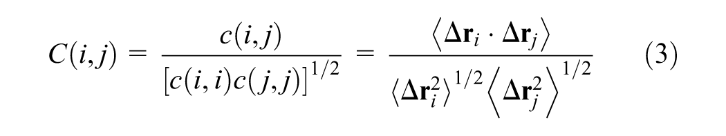
To establish the initial data overview, the camera is automatically positioned to frame the visualization centrally within the viewport. This arrangement provides a comprehensive global view of the dataset, as illustrated in Figure 2. Furthermore, this stage supports immediate interaction, allowing the user to explore the visualization using mouse-based navigation controls.
Overview of the matrix cube visualization applied to sliced DCCM.
Interactive operations
To facilitate data exploration, the tool provides interactive operations aligned with the principles proposed by Shneiderman. 19 These operations enable the user to manipulate the camera attributes described previously, specifically by allowing rotation, translation, and zooming around a point initially located at the center of the visualization volume.
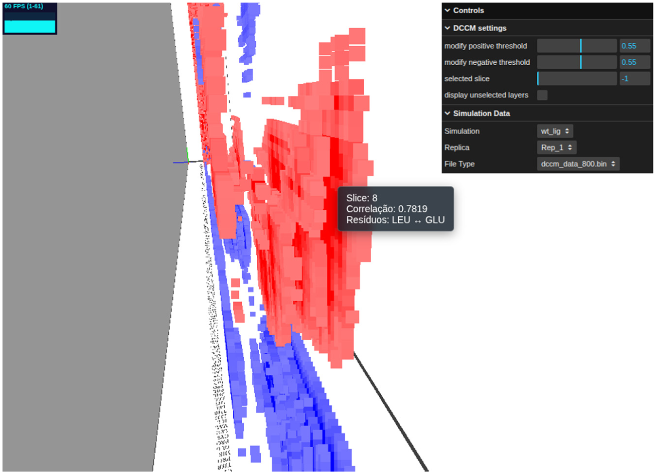
Data filtering is implemented through two distinct mechanisms. The first is temporal filtering, 16 which allows the user to isolate and view specific time slices. By utilizing a slider interface, the user can seamlessly traverse the timeline, selecting distinct slices for detailed analysis as exemplified in Figure 3. Crucially, this interaction is optimized to ensure high-performance rendering. Even for systems with a relative large number of residues and slices, the transition occurs without perceptible lag, creating a practical environment for real-time data exploration.
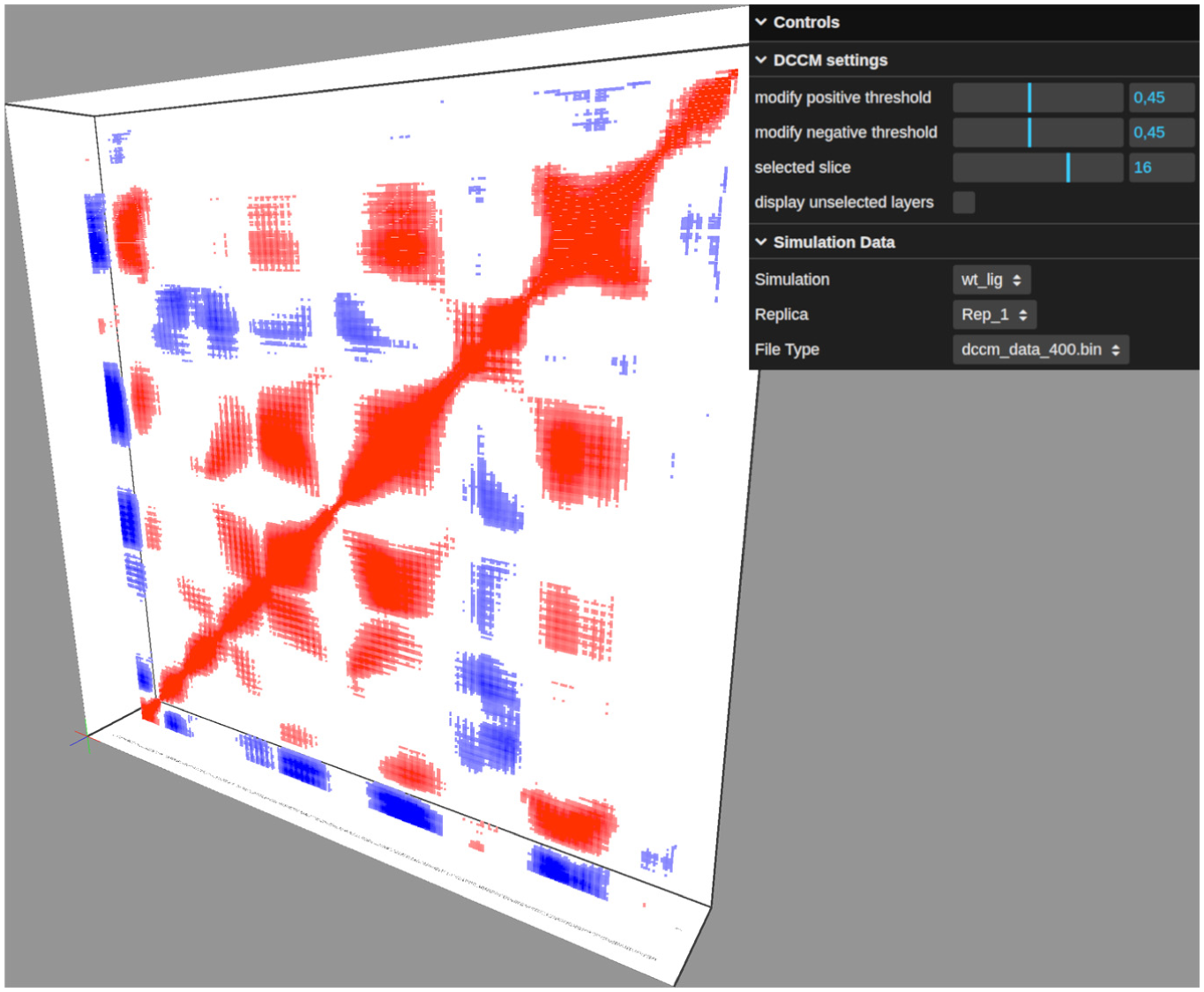
Visualization of a specific time slice selected from the composite representation, with additional point filtering applied based on normalized correlation thresholds.
The second filtering mechanism is based on correlation magnitude. Implemented within the control panel, this function allows the user to set a threshold using a slider ranging from 0 to 1. This threshold applies to the absolute value of the correlation; any data point with a correlation magnitude below this limit is excluded from the rendering pipeline. This effectively declutters the visualization, isolating and highlighting only those residue pairs with strong correlations. This filtering capability is demonstrated in Figure 3.
Detailed information
To provide details-on-demand, the system employs tooltips, contextual labels that appear when the cursor hovers over a specific data point. The selection mechanism utilizes the THREE.Raycaster class, which projects a ray from the camera through the mouse position to detect intersections with the 3D point cloud. Upon selection, the tooltip displays precise metadata: the correlation coefficient, the identifiers of the interacting residue pair, and the corresponding time slice index, as shown in Figure 4.
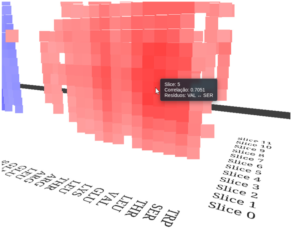
Detail view showing the interactive tooltip mechanism.
To enhance interpretability, residue identifiers are arranged along the base axes of the visualization, aligned with their corresponding columns as shown in Figure 4. Additionally, the display includes a label indicating the specific time window (segmentation) currently being viewed. This label provides essential temporal context, identifying the precise simulation interval during which the observed correlations occurred.
Case study
In the following examples, we explore the application of the proposed method, using traditional DCCM analysis as a baseline for comparison. To enhance visual clarity, a correlation magnitude threshold of 0.5 was applied. This filtering strategy reduces visual clutter, ensuring that only the strongest and most significant correlations are highlighted.
Regarding temporal segmentation, window sizes of 800 and 200 frames were adopted for Figures 6 and 7, respectively. These window sizes directly dictate the visualization’s depth along the time axis; specifically, a smaller frame count per segment results in a larger number of slices representing the data. These values were selected to demonstrate the tool’s flexibility in handling varying levels of temporal granularity and to illustrate the inherent trade-off regarding statistical noise 6 :
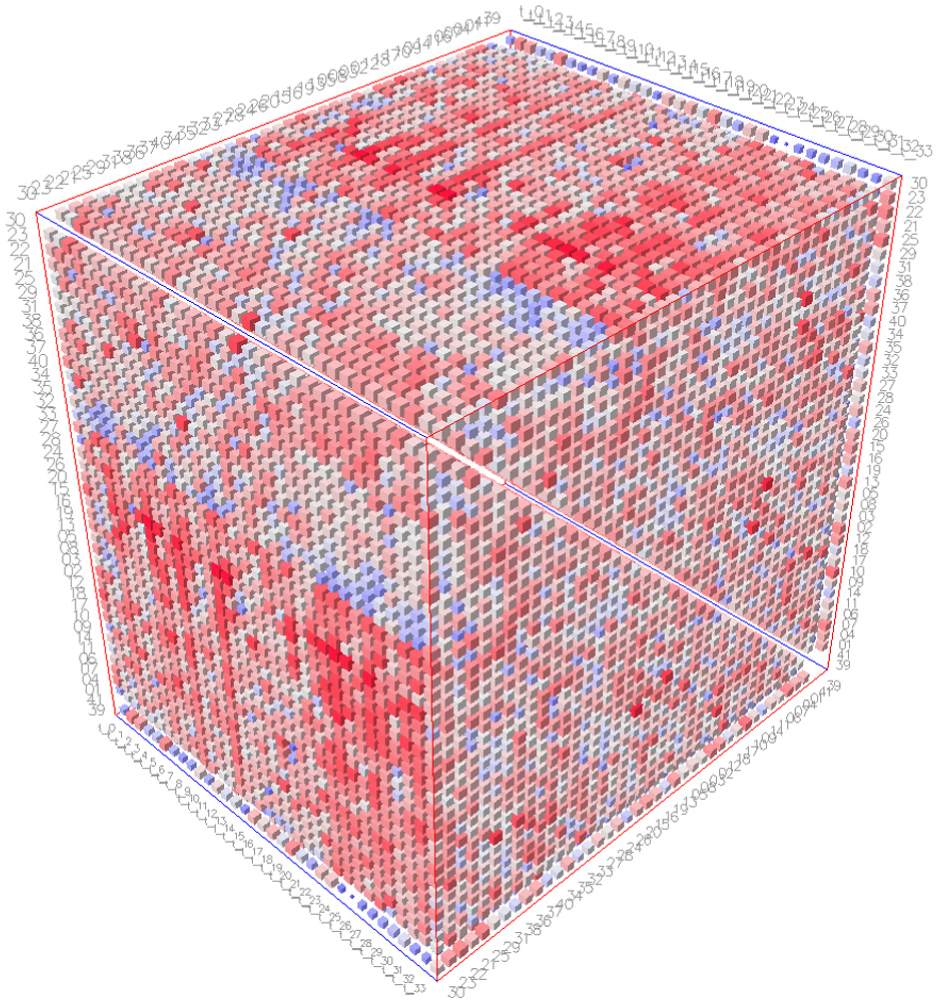
The standard DCCM analysis employed in the MC1R study by Cavatão et al. 12 is presented in Figure 5. Crucially, the three-dimensional visualizations developed in the present research are generated from this identical dataset. This shared data foundation allows for a direct comparison between the two methods. Consequently, it becomes possible to identify distinct characteristics that emerge in the proposed visualization, thereby reinforcing the hypothesis that time-resolved analysis reveals correlations typically obscured by standard averaging methods.
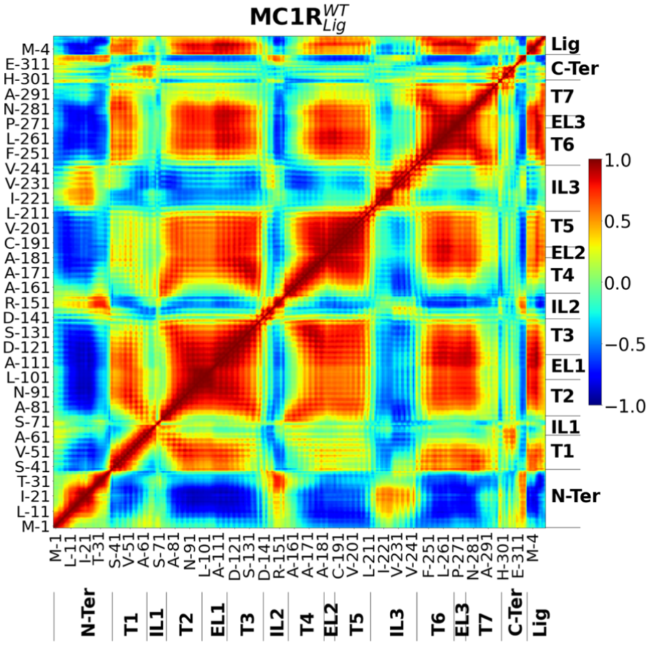
DCCM analysis of the wild-type (WT) protein-ligand complex.
MC1R is a transmembrane protein, and the coordinated movement of its transmembrane (Ts) components and N-terminal (N-Ter) region is associated with the protein’s activation and deactivation. Cavatão et al. 12 describe this coordination of movements by employing a standard DCCM analysis (Figure 5). Standard DCCM analysis could identify which regions of MC1R are associated with an active state (red and blue points in Figure 5). Comparing the standard DCCM with the sliced approach proposed in this work reveals consistent data patterns, corroborating our results (red and blue points in the same positions (Figure 2). However, while the visualization by Cavatão et al. 12 presents the data as a static 2D plane, effectively flattening the temporal dimension, the proposed method expands this view into three dimensions. This volumetric approach facilitates the identification of gradients where correlations transition from low to high magnitude, represented as solid volumes formed by temporally contiguous points (Figure 6). Consequently, it becomes possible to observe correlations and anti-correlations coexisting within specific time windows, thereby characterizing complex dynamic behaviors that are often obscured in planar representations.
Details of the time-resolved DCCM visualization, contrasting with the standard static analysis shown in Figure 5.
Furthermore, a time-based description of the trajectory enables a more specific characterization of protein movements. For instance, Figures 6 and 7 show that T1 and T5 have a gain in correlated movements in the middle of the trajectory. It enables a time-detailed description of the MC1R activation process, which is not accessible in a standard DCCM analysis. Moreover, this approach allows the investigator to characterize related motions not only structurally distant but also temporally distant. As we observed in Figures 6 and 7, anti-correlation movements in the N-Ter region (blue region on base of both figures) start on the first slices, whereas the T5-T1 correlation (red region at center of both figures) starts only on the middle slices. It aggregates insights into MC1R’s time-dependent motion functionality, dependent on further analysis.
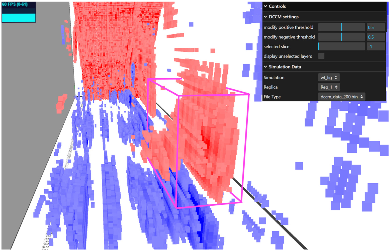
Transition from an uncorrelated state to a period of significant correlation, highlighted by the pink bounding box.
Figure 6 highlights the volumetric clusters formed by the spatial neighborhood of contiguous points—a structural detail revealed only after applying the developed filters. To interpret these structures, the tooltip mechanism is essential, aiding in the precise identification of the constituent residues within a region of interest. Furthermore, the system’s interactive nature provides unconstrained navigational freedom, allowing the investigator to rigorously inspect these regions from multiple angles according to specific research needs.
By employing a higher temporal resolution (more slices) and filtering out weak signals, it is possible to observe distinct transitions between uncorrelated and correlated regions, as shown in Figure 7. This observation holds true for anti-correlations as well. In this specific case study, a 10,000-frame trajectory was segmented into 200-frame windows, yielding 50 discrete slices. Notably, a growing correlation emerges in the region spanning slices 25–36, highlighted by the pink bounding box. This distinct increase in correlation intensity may indicate a significant structural coupling event, such as a conformational change in a specific domain or the propagation of a dynamic effect following ligand accommodation. It is important to note that the same correlation and anti-correlation regions appear in both window-sizes, 800-frames and 200-frames (Figures 6 and 7). It suggests a stability correlation on those regions, once that the bigger statistical convergence in 800-frames found the same pattern in 200-frames window-size.
It is important to highlight that this visualization also aids in the identification of simulation artifacts-errors that may arise during the preparation of the molecular system 1 or at other stages of the Structural Bioinformatics workflow. These artifacts can compromise the integrity of the research; therefore, their early detection is crucial for producing robust scientific work. In this context, an artifact often manifests as an abrupt, non-fluid transition in the observed correlations within the molecular complex. Ultimately, it is the investigator’s role to interpret these anomalies, determining their biological, physical, or chemical significance versus their nature as methodological errors.
These examples demonstrate that the proposed method enables a more detailed characterization of system dynamics. This capability allows the investigator to pinpoint the specific moments when conformational state transitions occur. Crucially, connecting these dynamic events to protein movements provides deeper insights into the system’s specific biological function.
More dataset exploration
We also applied our approach to a different dataset produced by Pinto et al. 40 This dataset is an MD of PET30, an enzyme capable of plastic degradation. The original paper reported five trajectories of PET30 bound to a PET ligand, each describing a different interaction pattern between PET30 and the ligand. These different replica characteristics impact correlation patterns accessed by DCCM. The standard DCCM analysis yields mask correlations among most residues due to replica divergence in the trajectories (Supplemental Figure 1), as described in the original paper. 40 However, when we split the first replica (10,000 frames) into 6 slices, we observe high correlation values forming in the last slice (Figures 8 and 9). These correlations inform the movement of residues not necessarily structure-related to the binding pocket. This information may indicate to investigators which interactions are involved in the protein-binding process and why they occur primarily in the final frames. As described by Pinto et al., 40 this first replica demonstrates the PET ligand moving outside of the interaction pocket and then returning. Together with our results, this may indicate that the final slice pattern is related to PET30 adjustments for ligand interaction, although further analysis is required. Furthermore, 3D visualization using slice selection helps investigators overcome occlusion and enables a clear view of correlation transitions.
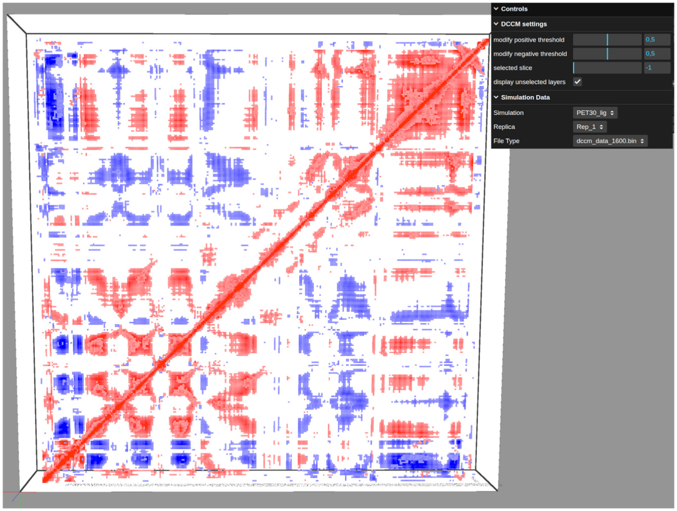
General sliced PET30 DCCM overview.
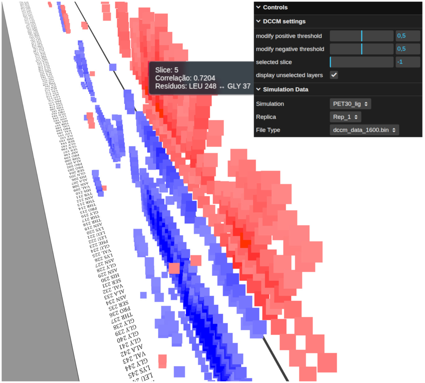
Time-sliced PET30 DCCM view.
Performance and scalability
A critical factor in the development of web-based visualization tools for bioinformatics is scalability with respect to the molecular system size. In the proposed approach, each point rendered in the three-dimensional scene corresponds to a single cell of the correlation matrix. Consequently, the total number of points (
For the MC1R system analyzed in this work Case Study section, it consists of 317 residues, each time slice generates a correlation matrix of
Simple performance metrics are shown in the Supplemental material, these were extracted from visualizations that ran in the following hardware specifications: Intel(R) Core(™) i5-9400F CPU @ 2.90 GHz, 24.0 GB of RAM and an NVIDIA GeForce GTX 1050 TI 4 GB . Supplemental Figure 2 shows the impact of threshold interaction on the number of points that are shown in the visualization disaggregated by the number of slices. For each system, a significant number of points are visible even when using a high threshold for correlation between atoms, due to the normalization of those values. The lower number of visible points at higher threshold reduces the computational cost, compared to rendering a larger number of points in the scene.
The augmentation of the time needed to render the scene regarding the augmentation of the number of visible points is given by Supplemental Figure 3, where the points form groups of the same slice size denoted by color, demonstrating that a high number of points takes a considerable time to render. So, for significantly larger molecular complexes, the
Frames Per Second (FPS) performance is affected by the threshold in this specific MD simulation. The boxplots (Supplemental Figure 4) show that a reasonable FPS value is observed in the visualizations with fewer than 100 slices, across different thresholds. While visualizations with more slices and smaller thresholds compromise FPS, this is important to grasp the idea of how many slices would be the limit for this specific simulation, giving a simple demonstration of when the application might fail. Disaggregating the data by threshold also shows a similar pattern in the boxplots, indicating that as the threshold decreases, the average FPS per slice decreases (i.e. more visible points).
Constraints on temporal granularity, statistical robustness, and method linearity
While the proposed tool facilitates the visual identification of dynamic patterns, it is critical to acknowledge the statistical limitations of calculating correlation matrices over short time windows. Specifically, reduced sampling periods may impede the statistical convergence of the covariance data. Consequently, what appears to be a dynamic correlation event could, in some cases, be an artifact of insufficient sampling rather than a genuine physical coupling.
The validity of the Pearson correlation, which forms the basis of the DCCM method, relies on adequate conformational sampling to ensure that the covariance between atomic displacements is statistically significant, a constraint highlighted by Hünenberger et al. 6 By segmenting the trajectory into slices of high granularity (such as 25-frame windows), the analysis incurs the risk that the recorded atomic motions are not representative of the global ensemble. Consequently, this insufficient sampling can introduce noise and generate spurious correlations.
The present work did not apply quantitative validation methods to independently verify the statistical significance of each individual slice. Consequently, the interpretation of the observed “transition correlations” requires caution, and the visualization should be regarded primarily as an exploratory instrument. In this context, the window size serves as a critical hyperparameter; the investigator must carefully adjust this value to strike an optimal balance between the desired temporal resolution and the statistical reliability of the data.
Crucially, while the proposed visualization enhances the temporal perception of the data, it remains subject to the inherent mathematical constraints of the standard DCCM method. Since the underlying algorithm relies on the Pearson correlation coefficient, the analysis is strictly limited to capturing linear relationships between atomic fluctuation vectors. Consequently, non-linear correlated motions remain undetectable by this approach, regardless of the quality of the three-dimensional representation or the granularity of the temporal slicing. Thus, the tool serves to optimize the visual interpretability of linear data.
2D and 3D view
Our 3D visualization, achieved by superimposing slices and changing the camera angle, provides an overall view of temporal slices and reveals general changes in correlation patterns. Furthermore, zoom and slice selection devices enable high-resolution imaging while maintaining detail and overcoming slice occlusion. All these features contribute to a clear understanding of the analysis and to user-directed manipulation. 2D visualizations can also overcome temporal occlusion. However, a side-by-side view of each segment introduces a limitation in the resolution and detail of the data. For instance, Hünenberger et al. 6 performed DCCM, separating the MD trajectory into four 200-ps slices and placing them side by side. However, longer MD trajectories would make it difficult to visualize detailed information in several 2D plots or to characterize collective patterns. SmallMultipile overcomes this limitation by stacking slices and enables user manipulation for slice visualization. 20 However, this approach still makes it difficult for users to view individual slices’ contributions to the overall pattern. Although they have limitations, 2D or 3D methods positively contribute to data visualization. The application of those methods will depend on the area and the investigator’s interest.
Conclusion
The analysis of the proposed method highlights clear pathways for its application in future research. Developed within a robust conceptual framework, 16 this work explore the visualization of previously unexplored temporal dimensions in DCCM data. By addressing this gap, the tool expands the analytical horizons of Structural Bioinformatics, specifically enhancing the study of dynamic behavior in simulated molecular systems through time-resolved Cross-Correlation Maps.
Therefore, the first objective was successfully achieved through the development of a Python algorithm leveraging the MDTraj library 30 to segment MD trajectories into discrete time windows. For each resulting slice, the DCCM was computed using optimized matrix operations via NumPy/CuPy. This methodological approach served as the foundation of the entire study, generating the essential data structure: a time series of correlation matrices. Crucially, this structure enables the capture of transient linear correlations that are inherently obscured by the global averaging of the standard DCCM method.
The visualization tool was implemented as an interactive web application built with JavaScript and Three.js, specifically designed to parse and render the output of the slicing algorithm. The architecture proved effective in translating multiple correlation matrices into a coherent three-dimensional environment. Crucially, the design successfully operationalizes Shneiderman’s mantra, 19 Overview first, zoom and filter, then details-on-demand, through the integration of intuitive camera controls, dynamic GUI filters, and interactive tooltips. Furthermore, the tool is released as open-source software, ensuring accessibility and fostering future community-driven enhancements.
This research explored the application of a generic visualization technique within a specialized domain. Specifically, we adapted the taxonomy and ‘Matrix Cube’ technique proposed by Bach et al. 5 to the field of Structural Bioinformatics. By modeling DCCM slices as a dynamic network and stacking them along a temporal axis as adjacency matrices, this work bridges the existing methodological gap. The results demonstrate that this visual abstraction offers a viable and intuitive means to represent the temporal evolution of correlations inherent in molecular simulations.
Finally, the validity of the visual approach was substantiated through a direct comparison between the traditional DCCM (a 2D average heatmap) and the proposed time-sliced 3D visualization, using the MC1R system as a case study. This comparison highlighted the tool’s primary contribution: whereas standard analysis yields a single, static average frame, the proposed approach exposes the variability and temporal evolution of correlations. The tool successfully demonstrated its capacity to visualize fluctuating correlation volumes and transient dynamic patterns. These insights, which are often obscured in traditional analyses, validate the central hypothesis of this work.
Supplemental Material
sj-pdf-1-ivi-10.1177_14738716261459476 – Supplemental material for Exploring data visualization techniques in molecular dynamics: Analysis of dynamic cross-correlation maps as dynamic networks
Supplemental material, sj-pdf-1-ivi-10.1177_14738716261459476 for Exploring data visualization techniques in molecular dynamics: Analysis of dynamic cross-correlation maps as dynamic networks by Guilherme Rafael Graeff, Arthur Tonietto Mangini and Marcio Dorn in Information Visualization
Footnotes
Author contributions
Funding
The authors disclosed receipt of the following financial support for the research, authorship, and/or publication of this article: This work was supported by grants from the Fundação de Amparo à Pesquisa do Estado do Rio Grande do Sul –FAPERGS (24/2551-0001392-0 and 23/2551-0001894-2), Conselho Nacional de Desenvolvimento Científico e Tecnológico –CNPq (314082/2021-2, 408154/2022-5, 440279/2022-4, and 404319/2024-6), and the Coordenação de Aperfeiçoamento de Pessoal de Nível Superior - CAPES.
Declaration of conflicting interests
The authors declared no potential conflicts of interest with respect to the research, authorship, and/or publication of this article.
Data availability statement
Supplemental material
Supplemental material for this article is available online.
References
Supplementary Material
Please find the following supplemental material available below.
For Open Access articles published under a Creative Commons License, all supplemental material carries the same license as the article it is associated with.
For non-Open Access articles published, all supplemental material carries a non-exclusive license, and permission requests for re-use of supplemental material or any part of supplemental material shall be sent directly to the copyright owner as specified in the copyright notice associated with the article.