
Abstract
Visual discomfort occurs when the statistics of the retinal image depart from those of natural scenes, particularly in respect of an excess energy at spatial frequencies close to 3 cycles/degree. Computer models suggest that uncomfortable stimuli are processed with a larger and less sparse neural response. Uncomfortable stimuli usually evoke a relatively large oxygenation of the visual cortex of the brain, consistent with inefficient neural encoding. The discomfort may be homeostatic. The neural computation that sustains sight is therefore likely to be more complex when the visual scene is spatially periodic, when the colour contrast is high or when saccadic suppression is impaired by flicker that is too rapid to be seen.
1. Introduction
This paper will demonstrate that visual discomfort can be caused by images in which the spatial, chromatic or temporal features depart from those usually found in nature.
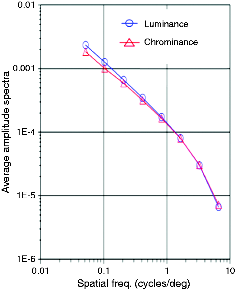
Natural scenes have a particular spatial structure – the complexity of the image remains the same across spatial scale. The Fourier spectrum decreases in amplitude with increasing spatial frequency. In many natural images, this decrease in amplitude is approximately proportional to the reciprocal of spatial frequency (1/f). A plot of amplitude against spatial frequency on log-log coordinates therefore has a slope close to −1,1–5 (Figure 1). The chromatic structure of images of nature is constrained and colour contrasts are modest.
6
The temporal variation in brightness is largely circadian.
7
Each of these natural attributes will be examined in turn.
1/f amplitude spectra for luminance and chrominance for the 29 scenes measured by Parraga et al.
4
2. Spatial structure of images
2.1. Neural computation
Given that the visual system has adapted to process natural images, one might expect that images with the spatial structure exemplified in Figure 1 would be computationally easy for the visual system to process. This expectation is borne out in several ways.
Visual processing is more efficient when images have a 1/f amplitude spectrum. 2 The human contrast sensitivity function is optimised for encoding images with this structure. 8 Also, the receptive fields of neurons in the primary visual cortex are such that images with 1/f structure produce a sparse cortical response. 9 The defining characteristic of this sparse response is that few neurons are active while many are inactive, thereby reducing metabolic demand. Hibbard and O’Hare 10 have used a computational model of visual area V1 to show that uncomfortable stimuli such as striped patterns, which are rare in nature and do not conform to a 1/f structure, result in an excess of ‘neural activity’ and a non-sparse distribution of ‘neural’ firing. Penacchio et al. 11 have extended this finding using a more elaborate model that includes the excitatory and inhibitory connections between neurons. They show that the sparseness of the distribution of neural firing correlates negatively with discomfort.
2.2. Visual discomfort and 1/f
The above theoretical work therefore suggests that images are processed inefficiently by the brain if they do not possess a 1/f structure. Images of this kind are usually uncomfortable to look at. Juricevic et al.
12
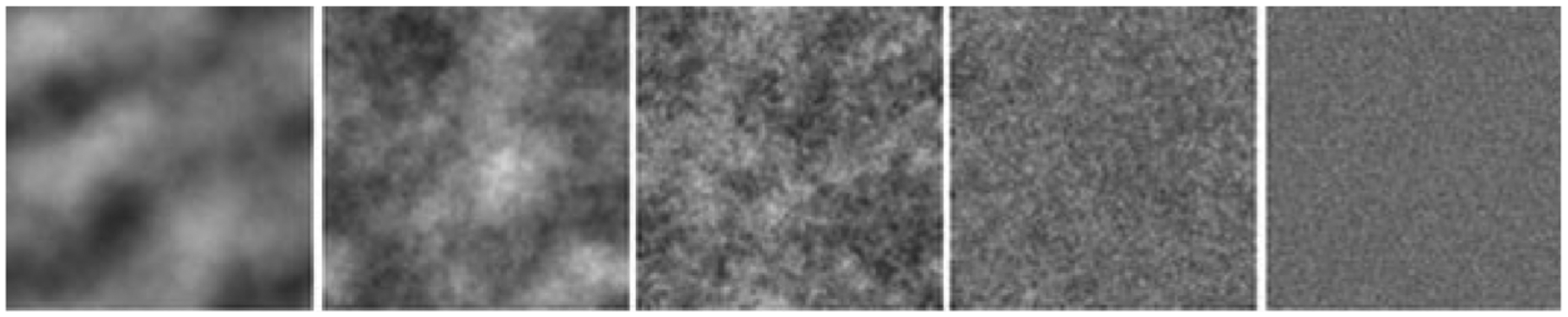
asked observers to rate the discomfort from meaningless images composed of filtered noise or randomly disposed randomly sized rectangles. For both categories of image, the discomfort was minimal with a 1/f Fourier amplitude spectrum, i.e. when the slope was −1 on log–log coordinates; the central pattern in Figure 2 has a slope of −1. The discomfort increased when the slope was greater or less than −1, as in the flanking patterns.
Examples of meaningless patterns of filtered random dots. The slopes of the amplitude spectra (left-right) are −2, −1.5, −1, −0.5 and 0 (from Juricevic et al.
12
).
Fernandez and Wilkins 13 showed that it is not simply the slope of the amplitude spectrum that is critical in determining discomfort. A variety of observers viewed images of non-representational modern art. Again, images with a 1/f spectrum were rated as comfortable to look at. In this experiment, however, the uncomfortable images had a spectrum that departed from 1/f in terms of the shape, not the slope, of the Fourier amplitude spectrum. The uncomfortable art had a curvilinear spectrum with an excess (relative to 1/f) of contrast energy at mid-range spatial frequencies. The human visual system is generally most sensitive to mid-range spatial frequencies, those within an octave of three cycles per degree. 14
Using artificial images made by filtering random noise, Fernandez and Wilkins 13 confirmed that departures from 1/f were responsible for discomfort if the spatial frequency was close to three cycles per degree. By exchanging the phase and amplitude of comfortable and uncomfortable images, they showed that the discomfort was determined by the amplitude rather than the phase information.
O'Hare and Hibbard 15 used images constructed from filtered noise and controlled for the apparent contrast of the stimuli. They also found that an excess of energy at mid-spatial frequencies determined discomfort ratings, although with a spatial frequency tuning that was slightly lower than that obtained by Fernandez and Wilkins. 13
The Fourier amplitude spectrum is two-dimensional – it reflects the periodicity of the images at all orientations (vertical, horizontal and all orientations in between). The studies described above measured the Fourier amplitude spectrum by averaging over all orientations, as in Figure 1. Averaging over orientations loses the distinction between periodicity in one orientation and that in another. Wilkins et al.
16
showed that checkerboards (which have contrast energy in several orientations) are less uncomfortable than stripes in which the energy varies only in one orientation. Penacchio and Wilkins
17
therefore measured the Fourier amplitude in two dimensions. Instead of averaging over all orientations and fitting a straight line on log–log coordinates, as had previously been done, they fitted a cone with slope of −1 to the two-dimensional log amplitude spectrum. The residual error in the fit provided a useful index that could reliably predict how uncomfortable the image was. The residual error increased as the structure of the image departed from that expected for a natural image. Penacchio and Wilkins
17
used seven sets of images: photographs of everyday scenes, of buildings, of animals, images of randomly generated polka dots and non-representational art. All the images were rated for discomfort. Despite the large range of images, the index explained 17% of the variance in judgments of discomfort. The prediction was improved when the residuals were weighted to take account of the greater sensitivity to mid-range spatial frequencies, as reflected in a published estimate of the contrast sensitivity function.
18
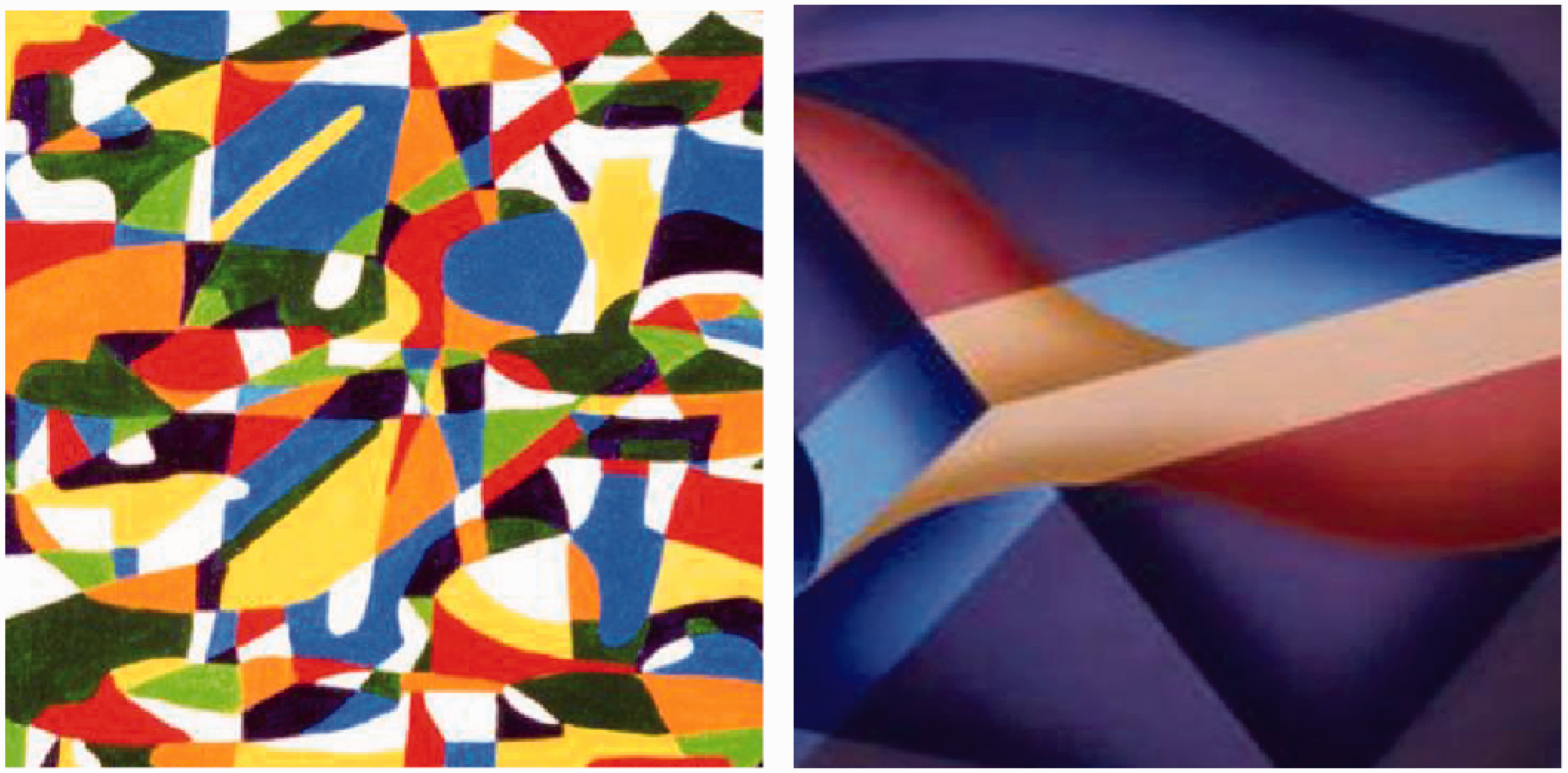
From these two principles gleaned from the literature (without fitting any parameters), they were able to explain an average of 27% of the variance in judgments of discomfort of a wide range of images. This is surprising given the variation between people. Figure 3 shows an example of an image that is recognized by the algorithm as uncomfortable and one that is comfortable.
Examples of artwork by Debbie Ayles that is recognized as uncomfortable (left) and comfortable (right) by the algorithm of Penacchio and Wilkins.
17
In summary, two related factors were found to predict judgments of discomfort: (1) departure from the statistics of natural images and (2) excess energy at the spatial frequencies to which the human visual system is generally most sensitive, i.e. about three cycles per degree.
Using grating patterns with this spatial frequency, Wilkins et al. 16 showed that the discomfort increased linearly with the spatial extent of the visual cortex to which the pattern projected. The discomfort is therefore determined not only by the spatial frequency but by the size of the pattern.
3. Hypermetabolism and discomfort
It has been shown that images with Fourier amplitude spectra that depart from 1/f are not efficiently processed and are uncomfortable to look at. In theory, at least, they involve a less sparse coding and a greater neural response overall. As will now be shown, the theory is supported by physiological evidence that the neural response to these uncomfortable images is indeed greater than to images that are comfortable.
When a visual stimulus is observed, there is a change in the oxygenation of the blood reaching the visual cortex – the cortical haemodynamic response. The cortical haemodynamic response to visual stimuli reflects the activity of large numbers of neurons and their local collective demand for oxygenated blood. The relationship between the amplitude of the haemodynamic response and the size of the neuronal response is complex and indirect. It is affected by many factors such as blood flow and glial cell activity, but generally broadly reflects local field potentials. 19 The response can be measured using functional magnetic resonance imaging (fMRI) and near infrared spectroscopy (NIRS). As will now be shown, both techniques demonstrate that the oxygenation is greater when the visual stimulus is uncomfortable.
Haigh et al. 20 used NIRS of the visual cortex and found that coloured patterns gave a larger oxyhaemoglobin response if they had large differences in their component colours and were therefore uncomfortable to view. Huang et al., 21 measured the blood-oxygen-level dependent (BOLD) response to achromatic gratings with a range of spatial frequencies and showed that those with mid-spatial frequency (which are uncomfortable) gave the largest response.
It is also quite generally the case that individuals who are susceptible to discomfort show a larger BOLD response than those who are not. Huang et al. 21 showed that patients with migraine who reported high levels of discomfort from patterns gave a BOLD response with relatively high amplitude. Martín et al. 22 compared 19 patients with migraine and 19 controls. Patients with migraine had a larger number of activated occipital voxels than controls. Cucchiara et al. 23 found that in migraine patients who experienced aura, the number of symptoms of discomfort they reported by questionnaire correlated with the amplitude of the BOLD response to visual stimulation.
Although the studies reviewed in the above paragraph concerned patients with migraine, the relationship between discomfort and the size of the haemodynamic response occurs independently of this diagnosis. Thus, Alvarez-Linera Prado et al. 24 compared 20 photophobic patients with 20 controls who viewed a light source at various intensities. There was a direct relationship between stimulus intensity and the size of the BOLD response, and the response was higher in the photophobic patients, particularly at low and medium light intensities. Chouinard et al. 25 reported a case study of an individual with visual stress. The BOLD response was measured when lists of words were read, and an elevated activity was found in a variety of visual and somatosensory areas. Bargary et al. 26 compared normal participants with high and low discomfort glare thresholds, while they identified the orientation of a Landolt C surrounded by peripheral sources of glare. The group that was sensitive to discomfort glare had an increased BOLD response localized at three discrete bilateral cortical locations: in the cunei, the lingual gyri and in the superior parietal lobules.
There is therefore a relationship between discomfort and the magnitude of the haemodynamic response in the visual cortex both in terms of the stimuli that evoke discomfort, which generally induce a large response, and in terms of the individuals who are susceptible to discomfort, in whom the response is larger than in others. It is possible that the discomfort is homeostatic. As with any other pain, it encourages withdrawal and thereby acts to reduce the use of energy by the brain. The brain constitutes 2% of body weight but consumes 20% of the body’s energy. Only a small fraction, perhaps 1%, of the cerebral cortex can be supplied with energy and be active at any given time,27,28 so conservation of metabolic energy is an important requirement.
4. Colour contrasts and light source chromaticity
So far, consideration has been limited to patterns of luminance, but we now consider differences in colour. Haigh et al.
20
measured the discomfort from gratings with bars that alternated between two colours. They showed that discomfort from these patterns was predicted from the separation of the chromaticities in the CIE 1976 UCS diagram: the larger the separation, the greater the discomfort and the larger the haemodynamic response evoked. This was the case in many studies and for a large gamut of colours, some with different luminance. Juricevic et al.
12
also showed that discomfort was greater for images with a large colour difference. They used images comprising random dots or randomly disposed rectangles and measured the colour difference in terms of the L – M and S – LM chromatic plane. Large colour contrasts are rare in the natural world,6,12 so once again, in both the studies by Haigh et al.
20
and Juricevic et al.,
12
discomfort was associated with images that are rare in nature. Large colour contrasts are not necessarily rare in the modern urban environment, as Figure 4 shows. It is not yet known whether large colour contrasts in day-to-day settings can give rise to discomfort, but a comparison of the left and right images in Figure 4 suggests that they might.
(left) Strong colour contrasts in a primary school (Courtesy of EME Furniture, reproduced with permission); (right) same figure with contrasts reduced (available in colour in the online version)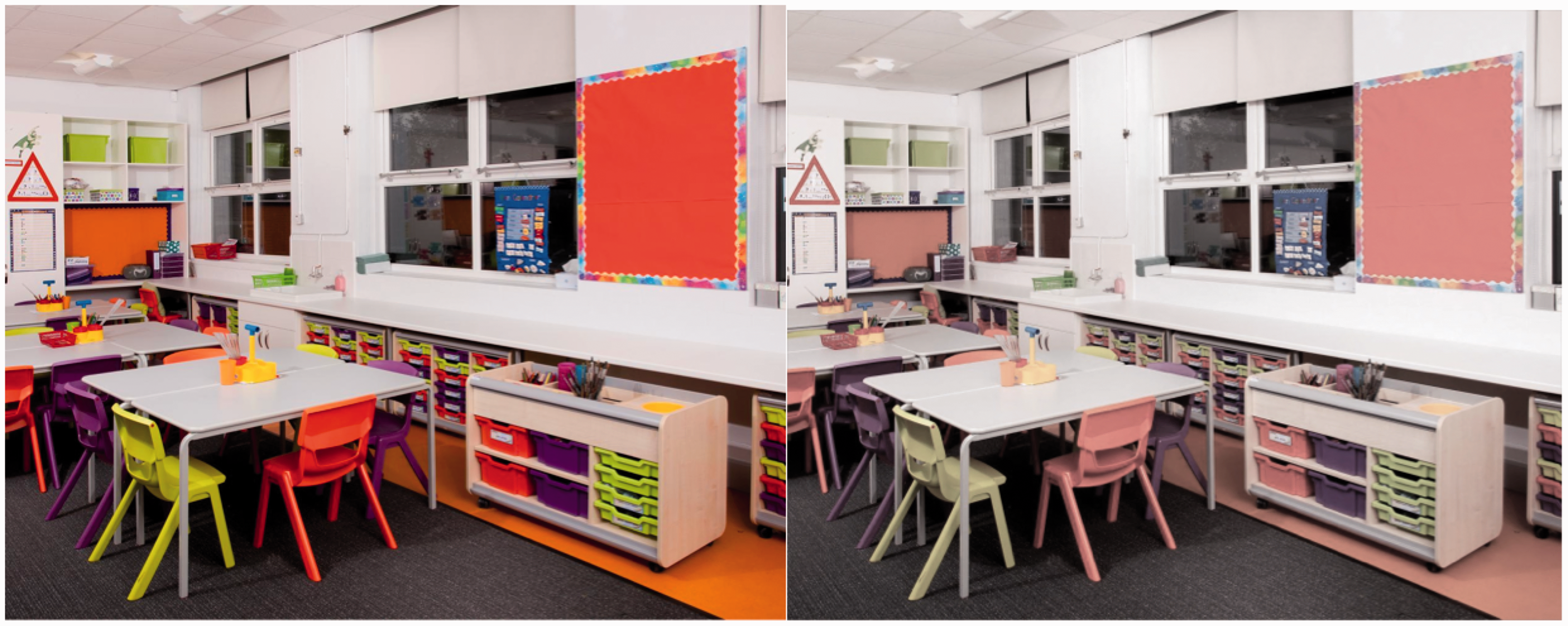
Such colour contrasts are, of course, affected by the spectral power distribution of the lighting, and this in itself can be responsible for discomfort. There are large individual differences in people’s preference for the colour of lighting, and these individual differences have a neurological basis. Huang et al. 29 asked patients with migraine to observe text in an apparatus that permitted the separate control of the hue, saturation and luminance of the illuminating light. They selected a chromaticity that optimised the visual comfort of the page. Wearing coloured filters, they later observed patterns of stripes. Three filters were compared; one provided the chosen chromaticity, one provided a chromaticity that differed by about 6 JND’s and one simply reduced the luminance by an amount equivalent to the reduction afforded by the other two filters. When a stressful (3 cycles/degree) pattern was observed, the BOLD response was selectively reduced with the filter that provided the chosen chromaticity. The other filters had no such effect. The BOLD response to the filters did not differ when a non-stressful pattern (spatial frequency 0.5 cycles/degree) was observed. In migraine patients, the BOLD response is usually abnormally large when stressful patterns are observed,21,29 so the reduction in the haemodynamic response with a coloured filter suggests a possible therapy for migraine, and helps to explain the strong aversion to colour schemes that people sometimes express.
5. Temporal characteristics
Variation in brightness over time, when it is rapid, is usually called flicker. Flicker is perceptible at low frequencies. It is not only uncomfortable, but can cause seizures. 16 As frequency is increased there comes a point at which a flickering light appears steady, the so-called critical flicker fusion threshold (CFF). Even though the light may appear steady when its frequency is above the CFF, the flicker may nevertheless have perceptible effects on the appearance of a moving target (stroboscopic effect), and movements of the eyes may give rise to a perceptible array of multiple images (phantom array). These perceptible effects are spatial, and are the combined effect of the temporal variation in brightness and target displacement on the retina. Because the eyes move at up to 700 degrees per second during a saccade (rapid jerk of the eye), the spatial effects of flicker can be perceived at frequencies in the kilohertz range. 30
When our eyes make a saccade, we are usually unaware of the motion of the image across the retina. This is partly because of active neural mechanisms of suppression, 31 partly because of masking by the images before and after the saccade, 32 but also partly because the motion of the image on the retina is continuous and its velocity is outside the range that occurs during fixation, to which the neurons are most sensitive. 33 Under flickering illumination, the image on the retina is not continuous but a series of discrete images; the normal mechanisms of saccadic suppression then break down, and the intrasaccadic images can sometimes be perceived. This is particularly noticeable at night when automobile rearlights use LEDs that are lit periodically. A trail of lights is visible with each saccade. This is a distraction. The normal processes of computation that sustain perception are rendered more complex. Such interference with saccadic suppression may be one reason why supra-CFF flicker has been shown to interfere with eye movements34,35 and to induce headaches. Wilkins et al. 36 studied the daily incidence of headaches and eye-strain in office workers over a five-month period. Halfway through this period, the circuitry controlling the fluorescent lighting in the offices was changed from low frequency wire-wound ballast to high-frequency solid-state ballast and vice versa. The change occurred without the awareness of the office occupants, half of whom received the low-frequency lighting first and half second. The low-frequency ballast gave light that varied at 100 Hz by about 35% of maximum. The high-frequency ballast had little variation at 100 Hz. The incidence of headaches was halved under the high-frequency ballast. The reduction was due largely to the few occupants who suffered frequent headaches.
6. Application to lighting design
6.1. Spatial configuration
Visual images from nature are processed efficiently and comfortably. When the spatial characteristics of an image are unnatural, the neural processing is inefficient, metabolic demand increases and discomfort ensues. The discomfort increases with the spatial extent of the visual cortex to which the stimulus projects, larger patterns being more uncomfortable. A simple algorithm described by Penacchio and Wilkins
17
predicts discomfort from images on the basis of departures from 1/f structure, particularly those that involve excess contrast energy at mid-spatial frequencies. The algorithm should be helpful in avoiding discomfort from lighting design, as, for example, in the spatial arrangement of luminaires. Striped patterns such as shown in Figure 5(a) have Fourier amplitude spectra that depart maximally from 1/f. Similar considerations apply to arrays of point sources on ceilings, and LED lamps on cars (Figure 5(b)), although the latter are small in area and therefore less uncomfortable. The discomfort depends both on the spatial frequency of the array and the retinal subtense (extent of the visual cortex to which the pattern projects) according to functions published by Wilkins et al.
16
Uncomfortable configurations of luminaires and lamps (a) supermarket (b) daytime running light.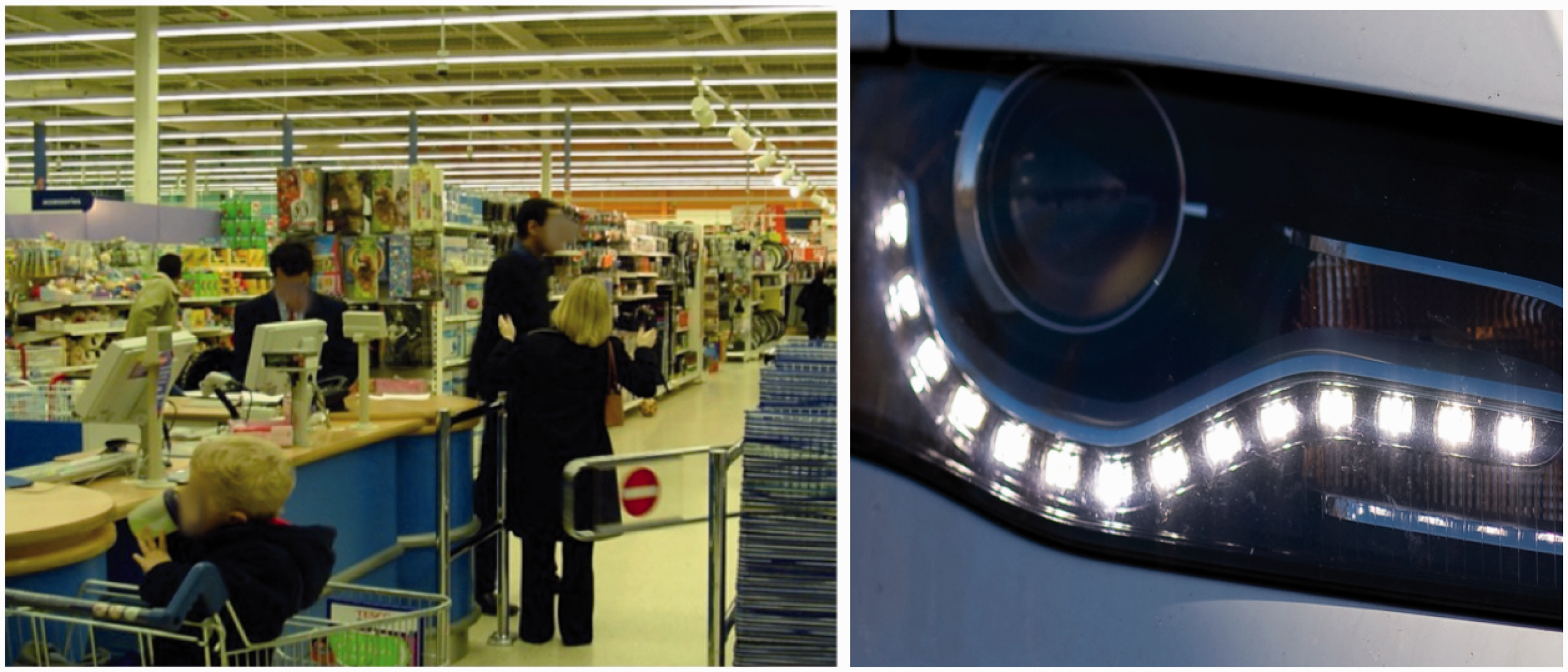
6.2. Colour
Both the light source chromaticity and colour contrasts within a living space affect comfort, but they do so individually, with large variations between people. Light sources and large surface areas with strongly saturated colour (particularly red) can induce headache. 37 Note that colour contrast is affected not only by the surface colours but also the gamut of the illuminating light.
6.3. Flicker
Flicker in the range 4–60 Hz can induce seizures in a small proportion of the population with photosensitive epilepsy. It can also induce headaches. Seizures and headaches are most likely when the flicker is between 15 and 20 Hz. 38 Flicker in this frequency range is sometimes produced when 50 Hz compact fluorescent lamps ignite (author’s measurements). If these lamps are used in public places with occupancy sensors, they ignite automatically without warning and constitute an unacceptable hazard.
Flicker from fluorescent lighting is rarely visible as such. Nevertheless, observers with high CFF are more likely to complain of fluorescent lighting. 39 Flicker can be appreciated at frequencies in the kilohertz range, well above the CFF. This is due to the patterns formed during rapid eye movements.
Although fluorescent lighting with the more efficient high-frequency electronic ballast has now largely replaced the low frequency circuitry, the legacy of inefficient unhealthy lighting is still with us. In a survey of schools in Britain in 2009, 80% of classrooms were found to be lit with low-frequency circuitry. 40
The contemporary challenge is to prevent the flicker from LED lighting – both flicker that is below the CFF and flicker that is above the CFF and therefore usually imperceptible but not necessarily innocuous. A recent survey of LED lamps available on the market has found that many flicker, and for some the variation is greater than for fluorescent lamps.
41
Under these circumstances, it seems likely that the introduction of LED lighting will be met with complaints and resistance similar to those that accompanied the introduction of compact fluorescent lighting (which also often flickered). IEEE has published guidance on the acceptable limits for flicker broadly similar to those in Figure 6(b). It is to be hoped that this guidance will help prevent the various negative health impacts that result from supra-CFF flicker, which have been summarized by Wilkins et al.
42
Note that Paplowski and Miller
41
express the variation in terms of the flicker index, which takes some account of the atypical waveforms from LED lamps, whereas Lehman and Wilkins
43
express the variation in terms of the simpler percent modulation. It is possible that in due course both expressions can be subsumed in a formulation that applies appropriate weights to the Fourier series derived from the waveform by which the light varies over time. In unpublished work, Drury and Wilkins have found that the visibility of intrasaccadic flicker is greater at 300 Hz than at 100 Hz, presumably because the pattern formed on the retina during the flight of the eye has spatial characteristics that are closer to the peak of the spatial contrast sensitivity function.
14
This finding suggests that the recommendations of IEEE 178943 are not conservative.
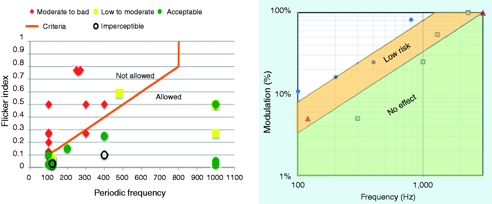
Paplowski and Miller 41 summarised the conditions that contribute to a higher risk of adverse responses to flicker as follows: long exposure, large area of retina receiving stimulation and high luminance. In all these respects, exposure to lighting is of high risk and the exposure cannot be avoided.
7. Conclusion
The human visual system evolved to process images from nature. In the modern urban environment the visual images it is required to process make the neural computation involved in sight more complex than it needs to be, with consequences for discomfort, cortical metabolism and, more generally, for health. The beneficial effects of exercise in natural surroundings (‘green exercise’) 44 may perhaps be explained in these terms, as perhaps can other examples that support the so-called ‘biophylia hypothesis’. 45
The spatial configuration of lamps and luminaires is often such as to induce discomfort. The use of large areas of highly saturated colours can also cause discomfort for some individuals. It is a mistake to assume that a lamp is ‘flicker free’ simply because the flicker cannot be seen. It is essential that the lighting industry does not repeat the mistakes of the past. Imperceptible flicker from lighting has adversely affected the lives of many, if not most individuals who suffer migraine 45 and future generations should not have to bear this burden.
Footnotes
Acknowledgements
I thank Dr Peter Boyce for perspicacious comments on an earlier draft.
Declaration of conflicting interests
The author(s) declared no potential conflicts of interest with respect to the research, authorship, and/or publication of this article.
Funding
The author(s) received no financial support for the research, authorship, and/or publication of this article.