
Abstract
Traditional Jun porcelain constitutes a significant cultural heritage, yet how lighting conditions affect its aesthetic perception remains underexplored. This study investigated the influence of correlated colour temperature (CCT) on multi-dimensional perception of Jun porcelain and examined the moderating role of gender. Using a THOUSLITE LED Cube lighting system, standardized Jun porcelain specimens with Lilac Purple glaze were illuminated under eight CCT conditions (2700 K to 6000 K) at constant 150 lx illumination, with spectral characteristics verified using a THOUSLITE FS spectroradiometer. Thirty participants (15 males and 15 females) evaluated five perceptual dimensions (glossiness, translucency, roughness, temperature and relief perception) of the specimens. Results revealed significant linear relationships between CCT and four dimensions, with higher CCTs enhancing perceived glossiness and translucency while reducing perceived roughness and temperature. Relief perception exhibited negligible sensitivity to CCT. Gender significantly modulated these relationships, with females showing greater sensitivity to CCT variations in perceiving glossiness, translucency and temperature, while males demonstrated stronger responses in roughness evaluation. These findings demonstrate predictable, linear CCT effects on Jun porcelain aesthetic qualities with dimension-specific and gender-based perceptual differences. This study advances understanding of lighting-material perception interactions and provides targeted lighting strategies for culturally authentic ceramic exhibition design.
1. Introduction
Effective lighting is paramount in shaping the perception and appreciation of material artifacts, particularly within cultural heritage contexts such as museums and galleries.1,2 Beyond merely ensuring visibility, museum lighting serves dual objectives: preserving artifact integrity while facilitating meaningful visual engagement.3,4 Accordingly, museum lighting research has progressively evolved from a primary concern with visual adequacy towards integrated strategies that simultaneously address conservation constraints and perceptual quality. Early investigations established foundational principles for balancing light exposure with conservation requirements, 5 proposing strategies to minimize cumulative light damage without compromising visitor experience. 6 Subsequent studies systematically examined how light source characteristics – particularly spectral composition – affect the colour rendering and visual appearance of artworks. These efforts include empirical evaluations of illuminant optimization for aesthetic preference and colour fidelity,7,8 feasibility assessments of white-light LED systems for art display, 9 and spectral optimization approaches aimed at reducing light absorbed by sensitive materials. 10 More recent work has extended this inquiry to material-specific contexts, demonstrating that lighting parameters critically shape perceived colour quality in Chinese bronzeware, 11 colour naturalness and preference in traditional paintings,12–14 and perceived gamut and tint under low illuminance conditions. 15
Among lighting parameters, correlated colour temperature (CCT) has received particular attention. However, its role in perceptual research requires careful conceptual clarification. CCT, quantified in kelvin (K), is a metric describing the chromaticity of a light source by reference to the colour appearance of a blackbody radiator at a given temperature. 10 Crucially, CCT characterizes the light source itself rather than the objects it illuminates. Nevertheless, systematic variations in source CCT inevitably alter the spectral composition of reflected light, thereby influencing the perceived appearance of illuminated surfaces. 10 While CCT has been widely adopted in lighting design and research, its limitations are well documented and warrant explicit acknowledgment. Specifically, (1) light sources with identical CCT values can exhibit substantially different spectral power distributions (SPDs), resulting in divergent colour rendering behaviour 16 ; (2) CCT provides no information about spectral content beyond chromaticity 17 ; and (3) the classical Kruithof curve linking CCT and illuminance to visual comfort has been challenged by empirical evidence. 18 These critiques underscore that CCT should not be treated as a comprehensive predictor of perceptual outcomes but rather as a constrained descriptive parameter whose effects must be examined under carefully controlled conditions.
Within these acknowledged limitations, CCT remains a practically relevant parameter for investigating how systematic variations in light source chromaticity influence perceptual responses. One particularly robust phenomenon associated with CCT is the hue–heat hypothesis, which posits that warmer CCTs (lower values, characterized by increased long-wavelength content) evoke psychological associations with physical warmth, whereas cooler CCTs (higher Kelvin values) elicit perceptions of coolness. 19 Empirical studies have consistently demonstrated that CCT modulates thermal sensation, comfort and related affective responses in built environments, with warmer lighting (typically 2700 K to 3000 K) increasing perceived warmth and cooler lighting inducing cooler sensations.20,21 Recent systematic reviews and meta-analyses further confirm that, although modest in magnitude, these effects are robust across experimental settings and populations. 22
Beyond thermal perception, CCT-induced spectral shifts may also influence material appearance through both psychophysical and cognitive mechanisms. Warmer illumination enhances long-wavelength reflectance, potentially amplifying perceived redness, visual warmth and surface softness, whereas cooler illumination accentuates short-wavelength reflectance, which may enhance perceived translucency, sharpness or gloss – particularly in materials exhibiting subsurface scattering. However, the nature of these relationships remains insufficiently characterized for complex materials. Human perceptual responses to variations in visual stimuli, including spectral composition, are known to exhibit non-linear patterns depending on the perceptual attribute under evaluation and the range of variation. 23 More recent research has further suggested that perceptual sensitivity to spectral changes is not uniform across the CCT spectrum,24,25 highlighting the need for attribute-specific and material-sensitive investigations.
Despite substantial advances in museum lighting research, most empirical studies have focused on paintings and textiles or on general visual performance metrics,26,27 rather than systematically examining how CCT variations influence the multiple, distinct perceptual dimensions of artefacts with highly complex surface and optical properties. Some findings indicate that intermediate CCT levels (e.g. around 4000 K) may provide a balance between colour rendering quality and visibility for objects with intricate surface characteristics, yet these optima appear to be strongly material dependent. 2 Current museum lighting standards 28 are therefore largely derived from studies on planar, pigment-based artworks, leaving a critical gap in guidance for three-dimensional, glaze-based ceramic artefacts.
Jun porcelain, one of China’s five famous traditional ceramic wares dating back to the Song Dynasty (960 to 1279 CE), presents a unique case for addressing this gap. Distinguished by its remarkable yao-bian (kiln-transmutation) glazes that exhibit flowing colour variations, Jun porcelain embodies high aesthetic and cultural significance. 29 At the material level, its glaze is characterized by complex crystalline structures that produce variable translucency, localized colour pooling and distinctive crack patterns, resulting in optical behaviours that are highly sensitive to illumination conditions.30,31 Inadequate or poorly calibrated lighting may therefore distort critical visual cues essential for accurate cultural interpretation and aesthetic appreciation, potentially leading to misrepresentation of their historical and artistic value.
The perceptual evaluation of ceramic materials necessitates a multi-dimensional approach. Fleming et al. established that material perception encompasses multiple interacting attributes rather than a single unified judgement. 32 For traditional Chinese ceramics, professional assessment emphasizes both visual and tactile dimensions, with particular attention to glaze depth, texture, translucency and surface irregularities.33,34 Recent studies further highlight the importance of translucency in ceramic appreciation, 35 texture visibility for accurate ceramic identification, 36 and the role of environmental lighting in shaping the aesthetic experience of textured surfaces. 13 Given that these diverse attributes arise from distinct optical and cognitive mechanisms, it is plausible that they exhibit differential sensitivity to changes in illumination spectrum, including CCT.
Separate from lighting parameters, observer characteristics – particularly gender – represent another important dimension in material perception. Gender-related differences have been documented across perceptual domains directly relevant to ceramic evaluation. Cohen and Levy reported that females generally demonstrate greater sensitivity to fine textural information. 37 Bonnardel et al. further identified systematic gender differences in colour preferences, with females showing greater sensitivity to subtle variations in reddish-purple hues – colours particularly relevant to Jun porcelain glazes. 38 In museum contexts, Bartlett and Camba reported different viewing patterns and preferences between male and female visitors examining ceramic collections. 39 These findings suggest that gender may act as a moderating factor in the relationship between lighting conditions and material perception. If females exhibit enhanced sensitivity to subtle chromatic and textural cues, they may respond more strongly to CCT-induced spectral variations. Conversely, gender effects may emerge selectively for certain perceptual dimensions but not others. Clarifying these potential moderation effects is essential for developing inclusive and perceptually informed exhibition lighting strategies.
Despite the growing body of research on lighting and material perception, critical gaps persist in the context of Jun porcelain. First, while non-linear perceptual responses to CCT have been noted for attributes like colour preference, 40 it remains unknown whether similar non-linear patterns govern the perception of other key ceramic material properties. Second, although it is theorized that distinct material properties may exhibit varying sensitivity to environmental factors, 41 systematic comparisons examining how multiple perceptual dimensions of a single, complex artefact respond to identical CCT variations are notably lacking. Third, despite well-established gender differences in visual and aesthetic processing,42,43 the extent to which gender moderates the influence of CCT on ceramic material perception has not been empirically investigated.
Addressing these gaps is essential for developing evidence-based museum lighting practice. By elucidating whether CCT effects on ceramic perception are linear or non-linear, attribute specific or uniform, and moderated by observer gender, lighting strategies can be more precisely tailored to both material characteristics and audience diversity. Against this background, the present study aimed to provide a comprehensive empirical investigation into the effects of CCT on the perception of Jun porcelain. Specifically, the research objectives were (1) to assess the nature (linear or non-linear) of CCT’s influence on Jun porcelain perception; (2) to determine whether different perceptual dimensions of Jun porcelain exhibit differential sensitivity to CCT variations and (3) to examine whether gender moderates the relationship between CCT and ceramic material perception dimensions.
2. Method
2.1 Experimental design
We employed a mixed factorial design with gender (male, female) as a between-subjects factor and CCT at eight levels between 2700 K and 6000 K as a within-subjects factor. The eight CCT levels were strategically chosen within a range commonly encountered in museum and exhibition lighting applications.28,44
The selected CCTs were 2700 K, 3000 K, 3500 K, 4000 K, 4500 K, 5000 K, 5500 K and 6000 K. Lower CCTs in the range of 2700 K to 3000 K are characteristic of traditional museum and gallery lighting, particularly in exhibitions emphasizing material authenticity, surface texture and damage mitigation.5,6,9 Mid-range CCTs (3500 K to 4000 K) correspond to neutral white lighting commonly recommended in contemporary museum guidelines to balance visual clarity, colour fidelity and conservation concerns.11,28 Higher CCTs (5000 K to 6000 K) are more frequently applied in commercial exhibition spaces, temporary installations and modern gallery environments where enhanced brightness perception and visual vividness are prioritized.7,13 The spacing between adjacent CCT levels was determined based on two considerations. First, the step size aligns with reported just-noticeable differences in CCT perception under controlled viewing conditions. 45 Second, the use of relatively fine-grained intervals allows for the detection of potential non-linear or threshold effects across the CCT continuum, which have been reported in previous studies on visual comfort and colour appearance. 40
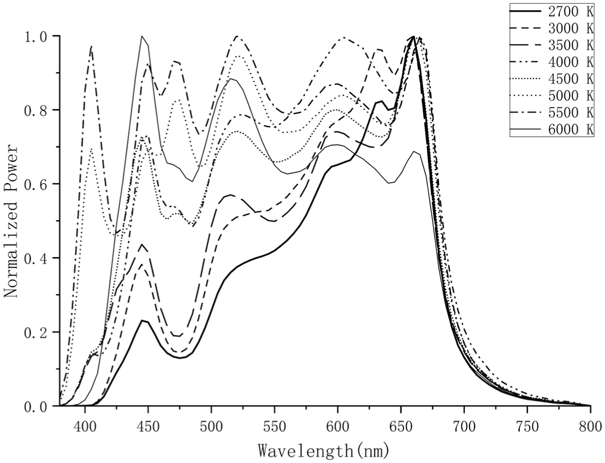
Throughout all experimental conditions, illuminance was maintained at a constant 150 lx, a level consistent with recommendations for illuminating ceramic artifacts in museums. 28 Crucially, light sources for all CCT conditions were carefully calibrated to ensure high colour fidelity and consistent colour rendering properties (see Table 1), thereby controlling for other light quality parameters that could influence material appearance independent of CCT. 46
Light source spectral parameters across different CCT conditions
All lighting conditions were generated using a THOUSLITE LED Cube spectral tunable lighting system and verified with a spectroradiometer. Constant illuminance of 150 lx was maintained across all CCT conditions while optimizing for high colour rendering properties.
Our dependent variables included the subjective ratings of five distinct material perception dimensions: glossiness, translucency, roughness, temperature and relief perception. These dimensions were selected because they represent key visual attributes through which ceramic materials, particularly those with complex glazes like Jun porcelain, are visually evaluated. They encompass properties related to surface reflection (glossiness), subsurface scattering (translucency), fine surface texture (roughness), three-dimensional form (relief perception) and the subjective thermal impression evoked by the material’s appearance under illumination (temperature).32,47–49
2.2 Materials
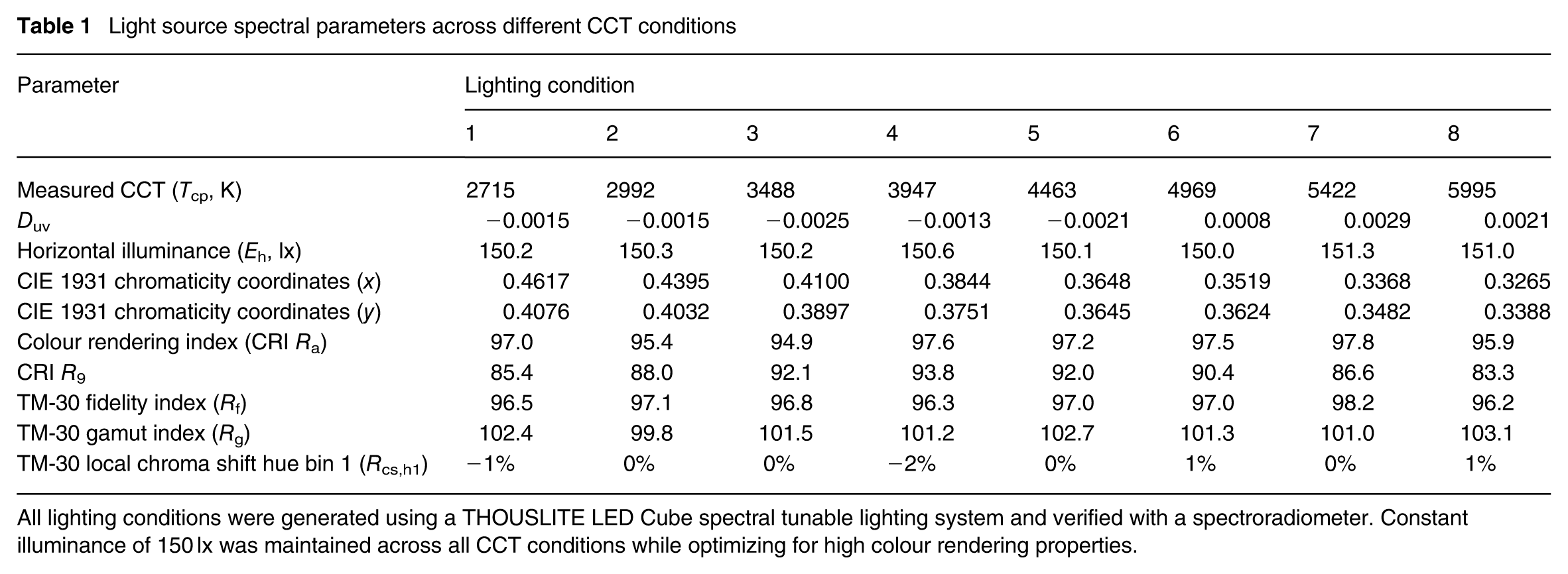
The study used standardized Jun porcelain specimens as experimental stimuli (see Figure 1). A single glaze colour, Lilac Purple, representative of the distinctive purple-red glaze group characteristic of Jun ware, was selected. Each specimen had a standardized diameter of 120 mm and a thickness of 8 mm. These specimens were chosen for their renowned ‘yao-bian’ effect, resulting from complex high-temperature interactions between iron and copper elements. 29
The standardized Jun porcelain specimen
To ensure material consistency across trials and participants, all specimens were sourced from a single supplier using identical production methods. 30 Furthermore, a standardized flat plate form was selected for all specimens. This circular, planar geometry was chosen to minimize the influence of complex three-dimensional form variations on the perception of surface and glaze properties, allowing a more focused examination of CCT effects on the intrinsic material attributes.
2.3 Participants
Thirty participants (15 males and 15 females) were recruited from Huaqiao University. While no formal a priori power analysis was conducted due to the exploratory nature of this investigation, a post hoc power analysis was performed to evaluate sample adequacy and is reported in Section 2.6. Participants’ ages ranged from 19 years to 22 years, with a median age of 20 y. Inclusion criteria required participants to have normal or corrected-to-normal vision, confirmed through Ishihara colour vision tests administered prior to participation. 50 They possessed basic ceramic knowledge but no strong pre-existing colour preferences towards the tested glaze colour that might bias evaluations. These selection criteria were consistent with best practices in material perception research to ensure reliable and unbiased subjective assessments. 32 All participants provided written informed consent, and the study adhered to the ethical guidelines of Huaqiao University.
2.4 Equipment and environment
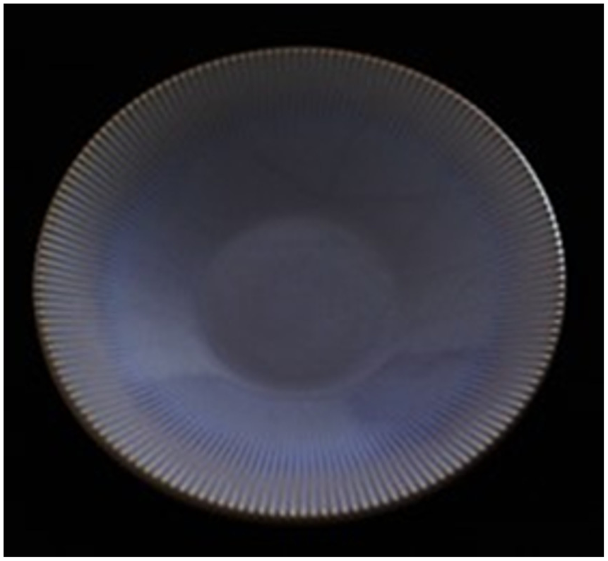
The experiment was conducted in a controlled optical laboratory environment, specifically designed for lighting-perception studies (see Figure 2). The laboratory was equipped with blackout curtains and featured a matte black background to minimize extraneous light reflections and ensure a dark, surround-adapted state between trials. Environmental conditions were maintained at a constant temperature of 22 ± 1°C and a relative humidity of 50 ± 5% RH to ensure environmental stability.
The controlled optical laboratory settings
The primary illumination source was the THOUSLITE LED Cube spectral tunable lighting system. This system, measuring 1020 × 740 × 860 mm3, utilizes 14 discrete LED channels covering the spectral range of 380 nm to 780 nm. Controlled via LED Navigator software (Version 6.3.70606), this system is capable of precisely generating desired SPD and CCTs. For this study, it was used to generate the eight target CCTs while maintaining a constant illuminance of 150 lx and ensuring controlled light quality metrics (|Duv| ≤ 0.002, CRI Ra ≥ 94, TM-30 Rf ≥ 96 and controlled gamut) as described in Table 1. Illuminance was fixed at 150 lx, consistent with Chinese national standards for light-stable artefacts 51 and international conservation guidelines.28,52 This value represents a mid-range setting commonly used in Chinese museum exhibitions for ceramic collections, enabling isolation of chromatic CCT effects without luminance confounds.
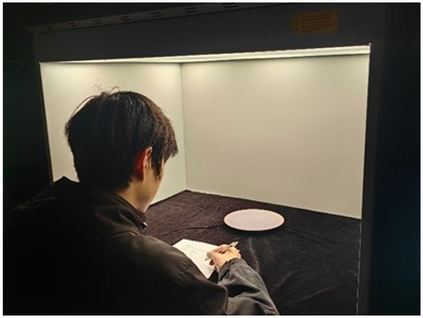
Spectral characteristics of all light sources, including SPD (see Figure 3), CCT, CIE 1931 chromaticity coordinates (x, y), Duv, colour rendering index (CRI), special CRI for red samples (R9), and IES TM-30-18 fidelity index (Rf) and gamut index (Rg), were measured using a THOUSLITE FS spectroradiometer (Thousand Lights Lighting (Changzhou) Limited, Changzhou, China) with a wavelength range of 380 nm to 780 nm. The spectroradiometer was positioned at the participant’s viewing location (550 mm from the sample surface) to accurately characterize the actual lighting conditions experienced during the experiment. All measurements were conducted after dark-field calibration to ensure measurement accuracy. The specimen was positioned on a 360° rotating turntable with light-absorbing fabric. The turntable’s rotation could be paused by the participant.
The SPD of eight lighting conditions
2.5 Procedure
Participants first received comprehensive standardized instructions on the experimental procedure and the use of the semantic rating scales. Prior to the experiment, participants underwent a 600 s training session using calibration samples representing the full range of each perceptual dimension to minimize stimulus range effects. Following the provision of informed consent, they were seated at a fixed viewing distance of 550 mm and a visual angle of about 30° relative to the specimen plane. The experimental environment was controlled with neutral grey surroundings (N7) and ambient light shielding to prevent extraneous visual cues. The experiment began with a familiarization period, during which participants were exposed to each of the eight CCT conditions in a randomized order for approximately 3 s each to allow adaptation to the range of lighting variations. For each subsequent experimental trial, participants were instructed to observe the rotating specimen for 60 s. After the observation period, they rated the specimen on the five perceptual dimensions using 7-point semantic differential scales. The poles of the scales were clearly defined: Glossiness (1 = Very Matte, 7 = Very Glossy), Translucency (1 = Very opaque, 7 = Very translucent), Roughness (1 = Very smooth, 7 = Very rough), Temperature (1 = Very cold, 7 = Very warm) and Relief Perception (1 = Very flat, 7 = Very relief). To prevent scale compression effects, participants were explicitly instructed to utilize the full range of the scale when appropriate. Participants recorded their ratings using paper questionnaires with a pencil.
The CCT presentation order across the main trials was counterbalanced using a Latin square design across participants to minimize potential order effects. A 20 s dark adaptation period was enforced between the presentation of each CCT condition. Additionally, a standardized reference specimen under neutral illumination (4000 K) was presented at the beginning of each session and after every three trials to recalibrate participants’ internal scales and prevent drift effects. Each experimental session lasted about 720 s per participant. To assess intra-participant reliability, each participant repeated one randomly selected CCT condition at the end of the experimental session.
2.6 Statistical analysis
Prior to the main analyses, we assessed the reliability of participants’ perceptual ratings to ensure data quality. Intra-participant reliability was quantified using Pearson’s correlation coefficient between the original and repeated measurements across the five perceptual dimensions, which was calculated using Equation (1).
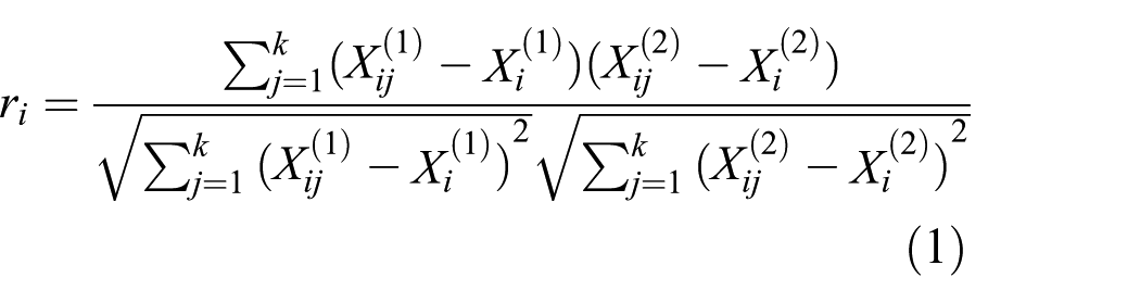
where
Following established guidelines, 53 all participants with reliability coefficients r ≥ 0.50 were included in all subsequent analyses to ensure adequate within-subject measurement consistency. Inter-participant reliability was evaluated using Equation (2) to calculate the degree of agreement across participants.
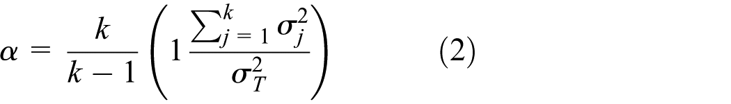
where k is the number of dimensions,
Summary of reliability analyses
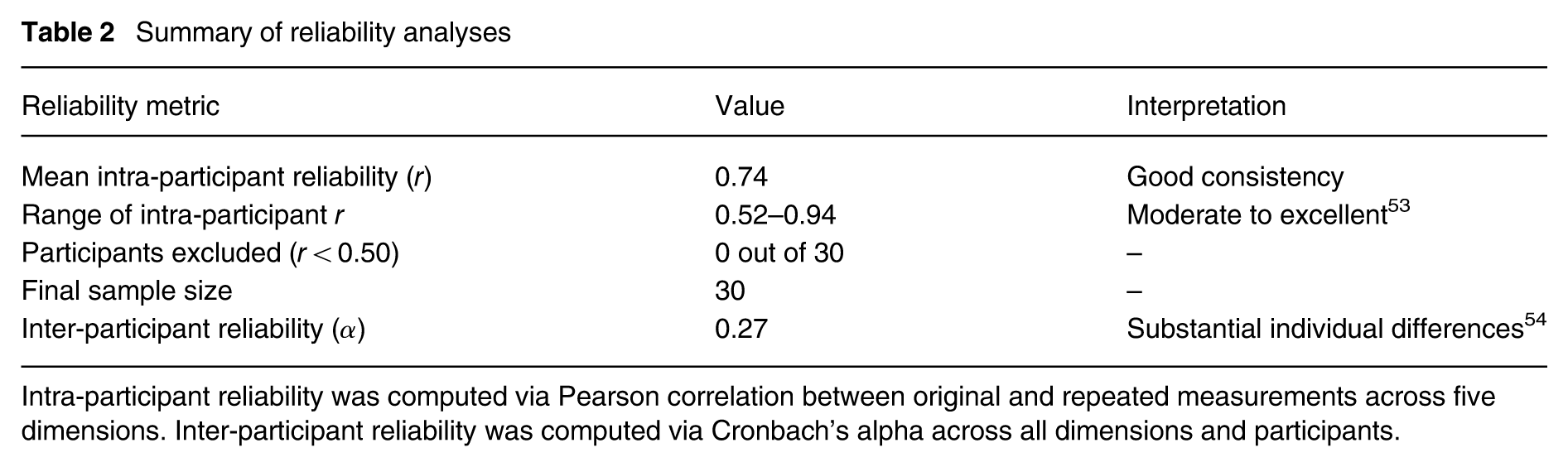
Intra-participant reliability was computed via Pearson correlation between original and repeated measurements across five dimensions. Inter-participant reliability was computed via Cronbach's alpha across all dimensions and participants.
Subjective ratings for the five perceptual dimensions under each experimental condition and participant demographics were digitized using a double-entry verification process to minimize input errors. Data were screened for outliers using Mahalanobis distance (p < 0.001), and normality of distributions was assessed using Shapiro-Wilk tests. Descriptive statistics were calculated for each perceptual dimension across all experimental conditions and participant groups.
To evaluate the adequacy of our sample size, we conducted a post hoc power analysis using G*Power 3.1, 55 Based on the main effect of CCT on translucency (partial η2 = 0.148, F(7, 203) = 4.863, p < 0.001), we calculated Cohen’s f = 0.417. For a repeated-measures analysis of variance (ANOVA) with eight measurement occasions, 30 participants, α = 0.05, and assuming a conservative correlation among repeated measures of r = 0.5, the achieved power was 0.95, substantially exceeding the conventional 0.80 threshold. 56 This high power confirms that our sample size was adequate to detect the effects observed in this study.
The primary analysis used mixed-design ANOVA with CCT as the within-subjects factor and gender as the between-subjects factor. Mauchly’s test of sphericity was conducted, and Greenhouse-Geisser corrections were applied to the degrees of freedom when the assumption of sphericity was violated. Significant interaction effects were analysed using simple main effects analyses. Bonferroni adjustments controlled family-wise error rates. Effect sizes were calculated using partial eta squared.
To specifically assess the nature (linear or non-linear) of CCT’s influence on the five perceptual dimensions of Jun porcelain, repeated-measures ANOVA with polynomial contrasts was conducted. All analyses were conducted using SPSS version 26.0 (IBM Corp., Armonk, NY, USA).
3. Results
3.1 Descriptive statistical analysis
Descriptive statistics revealed systematic variations in perceptual response across CCT levels (Figure 4). As CCT increased from 2700 K to 6000 K, participants reported higher levels of translucency (mean scores ranging from 3.2 to 4.5), glossiness (4.1 to 5.0) and roughness (3.9 to 5.0). Conversely, temperature perception showed a pronounced decrease with increasing CCT (dropping from 5.4 to 2.1), reflecting the well-established association between lower CCTs and warmer perceptions. Relief perception remained relatively stable across CCT conditions (ranging from 3.2 to 3.8), suggesting this dimension may be less influenced by lighting temperature.
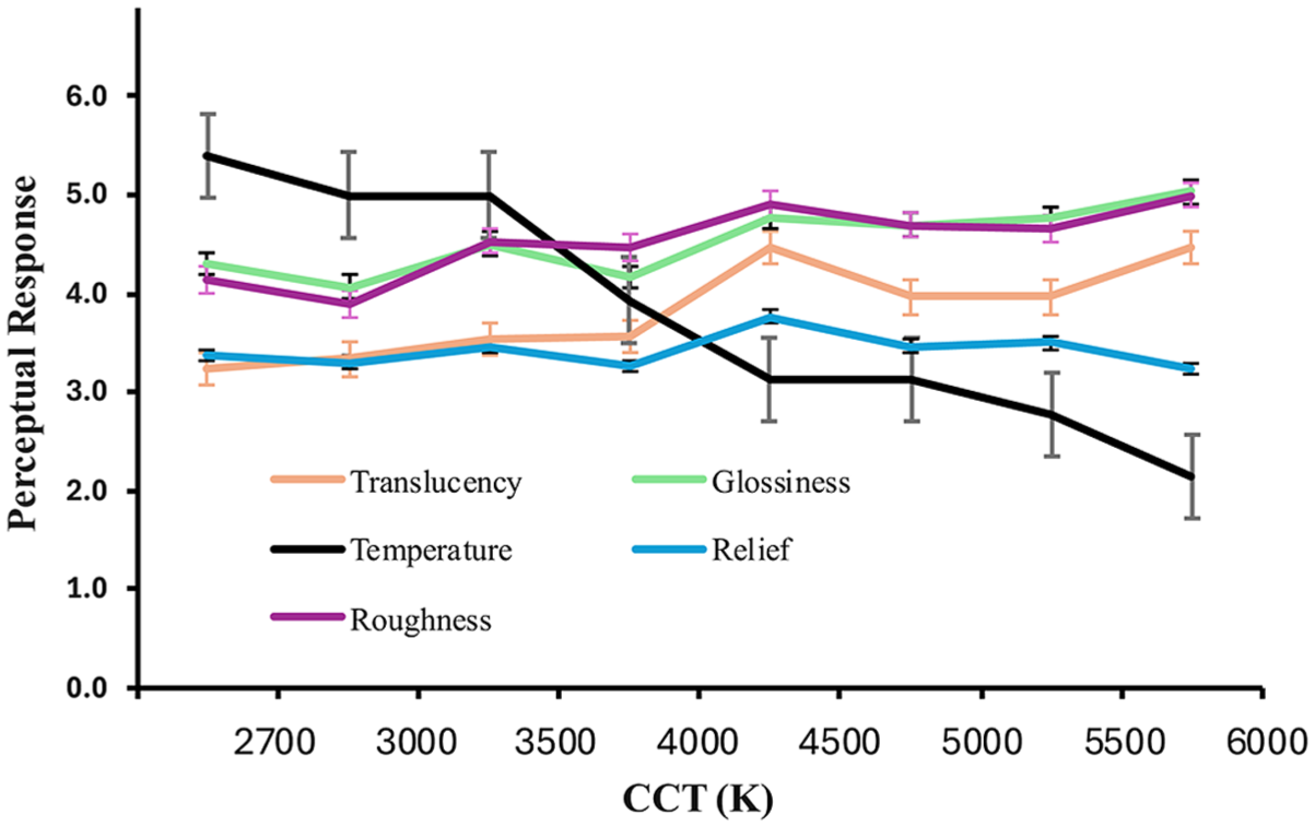
Mean subjective responses for five perceptual attributes of the ceramic specimens under varying CCT. Error bars represent the standard error of the mean
3.2 Effects of CCT, gender and their interaction on perceptual dimensions
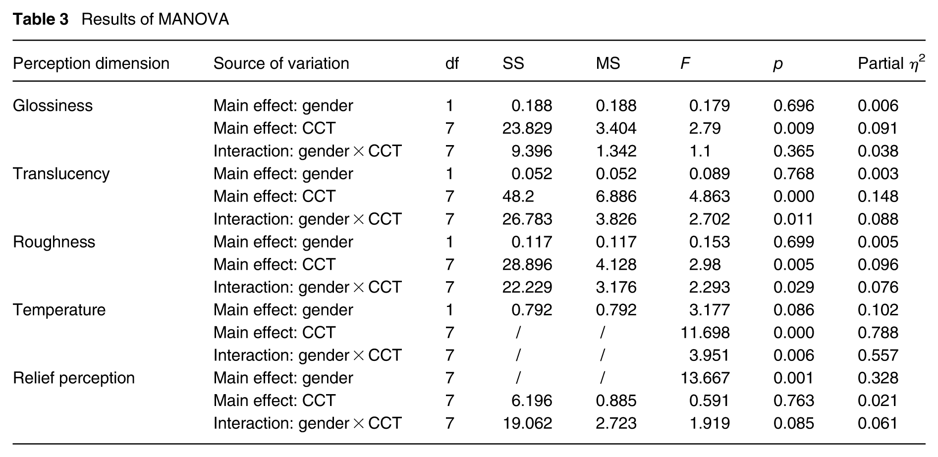
A multivariate analysis of variance (MANOVA) was conducted to examine the effects of CCT, gender and their interaction on various perception dimensions (see Table 3).
Results of MANOVA
3.2.1 Glossiness
There was a significant main effect of CCT on glossiness, F(7, 196) = 2.79, p = 0.009, partial η2 = 0.091. Neither the main effect of gender, F(1, 28) = 0.179, p = 0.696, nor the interaction between gender and CCT, F(7, 196) = 1.10, p = 0.365, reached statistical significance.
3.2.2 Translucency
The main effect of CCT was significant, F(7, 196) = 4.86, p < 0.001, with a moderate effect size (partial η2 = 0.148). A significant interaction between gender and CCT was observed, F(7, 196) = 2.70, p = 0.011; partial η2 = 0.088, indicating that the effect of CCT on translucency differed between males and females. No significant main effect of gender was found, F(1, 28) = 0.089, p = 0.768.
3.2.3 Roughness
CCT significantly affected perceived roughness, F(7, 196) = 2.98, p = 0.005, partial η2 = 0.096. Furthermore, the gender-by-CCT interaction was significant, F(7, 196) = 2.29, p = 0.029, partial η2 = 0.076, indicating differential effects between male and female participants. The main effect of gender alone was not significant, F(1, 28) = 0.153, p = 0.699.
3.2.4 Temperature
The main effect of CCT on temperature perception was highly significant, F(7, 196) = 11.70, p < 0.001, with a large effect size (partial η2 = 0.788). In addition, the interaction between gender and CCT was statistically significant, F(7, 196) = 3.95, p = 0.006, partial η2 = 0.557, suggesting that gender moderates the effect of CCT on temperature perception. The main effect of gender was marginal but not statistically significant, F(1, 28) = 3.177, p = 0.086.
3.2.5 Relief perception
A significant main effect of gender on relief perception was found, F(7, 196) = 13.667, p = 0.001, partial η2 = 0.328. Neither the main effect of CCT, F(7, 196) = 0.591, p = 0.763, nor the gender by CCT interaction, F(7, 196) = 1.919, p = 0.085, reached significance.
The results indicate that CCT has a consistent and statistically significant effect on glossiness, translucency, roughness and temperature, with the strongest influence observed on temperature as indicated by a very large effect size (partial η2 = 0.788). Significant interactions between gender and CCT on translucency, roughness and temperature perception suggest that the perception of these dimensions varies by gender under different CCT conditions. Gender alone significantly influenced relief perception, but not other perception dimensions.
3.3 Trends in perceptual responses across CCT levels
The analysis revealed that among the five perceptual dimensions assessed, four showed significant linear trends with increasing CCT: temperature, translucency, roughness and glossiness (all F(1, 28) ≥ 12.93, p ≤ 0.001). The effect sizes for these linear trends varied, with temperature showing the strongest linear relationship (partial η2 = 0.78), followed by translucency (partial η2 = 0.32), roughness (partial η2 = 0.35) and glossiness (partial η2 = 0.41). The plots in Figure 4 visually represent these trends, illustrating a general increase or decrease in perceptual ratings as CCT increases. Conversely, the analysis showed that relief perception exhibited neither a significant linear nor a significant non-linear trend across the CCT levels tested (p > 0.05), indicating its relative stability to changes in spectral composition within the range of 2700 K to 6000 K. Collectively, these findings suggest that the influence of CCT on the perception of most Jun porcelain properties is predominantly linear within the tested range, with relief perception being largely unaffected. This linearity indicates that perceptual changes occur in a predictable and proportional manner in response to CCT adjustments.
4. Discussion
This study investigated the effects of CCT on multiple perceptual dimensions of Jun porcelain, examining possible relationships, differential sensitivity across dimensions and gender moderation effects. Our findings reveal several important insights into the complex interplay between lighting conditions and ceramic material perception, with significant implications for both theory development and practical applications.
4.1 Linear effects of CCT on multiple dimensions of Jun porcelain perception
Contrary to our initial hypothesis regarding non-linear effects, our results demonstrate predominantly linear relationships between systematically varied CCT levels (2700 K to 6000 K) and four of the five perceptual dimensions examined. Glossiness, translucency, roughness and temperature perception all exhibited significant linear trends as CCT increased. This strong linearity was particularly evident in temperature perception (partial η2 = 0.788), indicating that the thermal qualities of Jun porcelain are perceived in direct proportion to CCT variations within this range.
The observed linearity for dimensions like temperature can be mechanistically explained by the direct correlation between CCT and the SPD of the illuminant, particularly in the red-yellow versus blue regions of the spectrum. Lower CCTs are richer in longer wavelengths (red/yellow), which are perceptually associated with warmth, while higher CCTs are richer in shorter wavelengths (blue), associated with coolness. 57 The human visual system, particularly the koniocellular layers of the lateral geniculate nucleus and downstream cortical areas, is highly sensitive to changes in the blue-yellow axis.58,59 This fundamental neural processing pathway likely underpins the robust and linear change in temperature as CCT shifts. Similarly, other dimensions like glossiness and translucency, which rely partly on the interaction of light with the material surface and subsurface, are influenced by the spectral composition of the incident light. Higher CCTs, with their increased blue light component, can enhance the perception of translucency by interacting more readily with scattering centres within the ceramic body. 60 The linear trends observed for these dimensions suggest that within the CCT range studied, the visual system integrates these spectral cues in a relatively consistent, dose-dependent manner.
However, our results stand in contrast to studies reporting non-linear perceptual responses to CCT in other material domains, such as the textile perception work by Fairchild and Johnson. 61 This discrepancy underscores the critical role of material structure and composition in mediating lighting-perception relationships. 3 Jun porcelain, characterized by its unique thick glaze and often subtle internal structures (like worm tracks or jigger marks), interacts with light differently than fibrous or woven materials. The glaze’s properties – its spectral reflectance, refractive index and opacity – govern how the incident light’s SPD translates into the light reflected and scattered towards the observer’s eye. For materials like textiles, complex surface microstructures and scattering properties can lead to more complex, potentially non-linear, perceptual responses to changes in illumination direction or spectral composition. 62 Our findings suggest that the optical properties of Jun porcelain glaze and body promote a more direct, linear translation of CCT variations into changes in perceived glossiness, translucency, roughness and particularly temperature.
Conversely, relief perception showed no significant linear or non-linear trend across the tested CCT range (p > 0.05). This lack of sensitivity is likely because the perception of three-dimensional form and relief, such as the undulating surface texture of Jun ware, primarily relies on geometric cues derived from shading, cast shadows, binocular disparity and motion parallax rather than spectral information. 63 While changes in CCT alter the colour of the light, they do not fundamentally change the distribution of light and shadow across the object’s surface in a way that significantly impacts the perception of its relief structure. This highlights the domain-specificity of lighting effects on material perception and sets the stage for understanding differential sensitivity across dimensions.
For lighting design in museums and galleries, these findings imply that while CCT adjustments are highly effective for modulating the perceived warmth, translucency and subtle surface characteristics (like glossiness and roughness) of Jun porcelain, they are not a primary tool for emphasizing its three-dimensional sculptural qualities. To enhance relief perception, lighting strategies should instead focus on manipulating the directionality and spatial distribution of light to create strong modelling and shadows. 27 The predictable linear effects on other dimensions mean that precise CCT specification can be used as a reliable method to systematically shift specific perceptual qualities of Jun porcelain. For instance, lower CCT values (2700 K to 3500 K) were statistically associated with higher perceived warmth, while higher CCT values (4000 K to 5000 K) were associated with greater perceived translucency. These relationships offer curators an evidence-based basis for CCT selection when specific perceptual outcomes are desired.
The linearity in these relationships has important implications for both theoretical understanding and practical applications. As Xiao et al. noted, linear relationships between lighting parameters and perception facilitate more straightforward predictive frameworks and planning approaches for display and exhibition settings. 64 Our findings extend this understanding specifically to traditional Chinese ceramics, which have rarely been studied in controlled lighting conditions. The linear relationship we observed allows lighting designers to anticipate how adjustments in CCT will influence specific perceptual dimensions of Jun porcelain. Museums and galleries can implement straightforward CCT adjustment protocols to emphasize specific perceptual dimensions. For exhibition spaces seeking to highlight the traditional warm aesthetic of Jun porcelain, lower CCT values (2700 K to 3500 K) are recommended, aligning with Cuttle’s conservation-sensitive lighting recommendations that balance visibility with material preservation. 1 For educational displays focusing on technical properties, higher CCT values (4000 K to 5000 K) would optimize translucency perception while maintaining acceptable colour rendering (Ra > 90), as suggested by Schanda et al.’s museum lighting framework. 2
4.2 Differential sensitivity across material properties to CCT
Our findings demonstrated a distinct hierarchy in perceptual sensitivity to CCT variations, perfectly aligning with Nishida’s modular theory of material perception. 41 Rather than being arbitrary, this pattern reflects how different visual features are encoded by the human visual system and interact uniquely with the illuminant’s spectral composition. The dominant sensitivity of temperature perception underscores the prominence of the direct neural pathways processing blue-yellow spectral shifts, meaning even subtle CCT adjustments can dramatically alter the perceived thermal quality of the porcelain.
By contrast, attributes relying on complex light-matter interactions at the surface and subsurface – namely translucency, roughness and glossiness – demonstrated only moderate sensitivity. As shorter wavelengths (prevalent at higher CCTs) scatter more readily within a translucent medium, 65 CCT modulates the perception of depth and internal structure. Similarly, the incident SPD interacts with the glaze’s reflectance properties to subtly shift the colour of specular highlights and diffuse reflections. 3 However, their sensitivity is moderate rather than extreme because these dimensions are simultaneously constrained by the physical geometry of the specimen (e.g. the shape of specular highlights).
Most notably, the perception of macroscopic relief proved entirely robust against spectral variations. Because the visual system constructs three-dimensional form primarily through geometric cues – such as shading gradients, cast shadows and binocular disparity 66 – changes in CCT do not fundamentally alter the necessary spatial luminance distributions. Consequently, underlying geometric cues remain largely invariant across different CCT levels, confirming that shape-from-shading mechanisms are decoupled from chromatic variations. 62 This mechanistic divergence clearly dictates the boundary of CCT’s utility in exhibition lighting.
The differential sensitivities observed across dimensions also produce predictable patterns in how these dimensions co-vary under changing lighting conditions. Dimensions showing similar directional responses to CCT increases (e.g. translucency and glossiness both increasing, while perceived temperature decreases) will naturally show consistent patterns across experimental conditions, reflecting their shared responsiveness to spectral variations rather than intrinsic perceptual interdependencies. Conversely, relief perception’s independence from CCT effects means it remains decoupled from the other dimensions under spectral lighting changes, reinforcing its reliance on geometric rather than chromatic visual cues.
For lighting designers and museum professionals, these findings offer practical guidance for emphasizing specific material qualities through selective lighting manipulation. Curators seeking to highlight the translucent qualities of Jun porcelain – a historically significant aesthetic dimension of this ceramic tradition 67 – should prioritize CCT adjustments, as this dimension shows moderate sensitivity to spectral changes. Conversely, exhibition designers aiming to emphasize the three-dimensional surface relief of Jun ware are advised to prioritise adjustments in lighting directionality rather than CCT, as relief perception was found to be statistically insensitive to CCT variations in this study. 58 Additionally, retail environments selling fine ceramics could strategically employ higher CCT values (5000 K to 6000 K) to enhance perceived translucency while using focused directional lighting to accentuate three-dimensional surface qualities.
4.3 Gender moderation effects
Our third key finding revealed significant gender-by-CCT interactions for the perception of translucency, roughness and temperature perception of Jun porcelain. These interactions signify that the impact of spectral variations (as modulated by CCT) on the perception of these specific material properties differs between male and female observers. Furthermore, a significant main effect of gender was observed on relief perception (partial η2 = 0.328), independent of CCT variations.
The pronounced gender difference in how CCT influences temperature (the largest interaction effect observed) aligns with the literature indicating gender-based differences in processing spectral stimuli. 68 Potential explanations include neurobiological differences in visual pathways or differences in learned associations.68,69 For the temperature of a material, this might manifest as different weighting or sensitivity to the blue-yellow opponent signal, which is directly affected by CCT. Females have sometimes shown greater sensitivity to chromatic differences in certain parts of the spectrum, 43 which could contribute to differential responses to CCT shifts when evaluating the thermal qualities of a surface.
The significant gender-by-CCT interactions observed for translucency and roughness perception are more complex and suggest gender differences in how spectral cues are integrated with other visual information (e.g. luminance gradients, specular reflections) to form these complex material percepts. Translucency perception relies heavily on how light scatters within the material subsurface, a process that is spectrally dependent. 65 Roughness perception from vision is influenced by the microstructure of the surface and how it interacts with light reflection, which can also have a spectral component. It is plausible that males and females exhibit differential attentional biases towards spectral versus geometric cues when judging these properties, or they may weight these cues differently during perceptual integration. 3 For example, if one gender relies relatively more on spectral cues (affected by CCT) and the other more on geometric cues (less affected by CCT) for judging translucency or roughness, this would result in a gender-dependent response to CCT variations. While research directly linking gender to spectral cue weighting in material perception is limited, studies on gender and object recognition or texture perception have noted differences in feature processing strategies. 70
The significant main effect of gender on relief perception, independent of CCT, reinforces that certain visual abilities are differentially distributed between genders. As discussed in relation to spatial cognition, 71 processing three-dimensional form and spatial relationships can show gender-based variability. In lighting design practice, these gender moderation effects highlight the importance of considering visitor demographics when illuminating ceramic displays. Since temperature shows the strongest interaction, specifying CCT in public spaces should account for potential differential experiences. For exhibitions aiming for universal appeal, selecting moderate CCT values (e.g. 3500 K to 4500 K) might minimize the range of temperature variation between genders compared to the extremes of 2700 K or 6000 K. For properties like translucency and roughness, understanding that CCT’s effect is gender-dependent suggests that a multi-parameter approach involving strategic directional and intensity variations, in addition to CCT, might be necessary to achieve consistent perceptual effects across all visitors. Ultimately, the presence of gender-specific CCT sensitivities in some material properties underscores the potential benefit of tunable lighting systems in museum and gallery environments, enabling flexible adjustments that could potentially optimize the viewing experience for diverse audiences or specific exhibition goals.
These gender effects have substantial implications for inclusive design practices in exhibition spaces. Given the well-documented sex differences in the human visual system 43 and gender-related variations in colour preference,38,68 gender-based perceptual differences necessitate more nuanced approaches to lighting design for public art and historical artifact display. Museum curators might consider implementing adjustable or zone-based lighting systems that accommodate diverse perceptual tendencies, particularly for exhibitions focusing on ceramic traditions where translucency and thermal qualities feature prominently in aesthetic appreciation. Commercial environments might similarly benefit from lighting solutions that appeal to diverse perceptual tendencies, potentially increasing engagement across demographic segments.
4.4 Limitations
While this study provides valuable insights, several limitations warrant consideration. First, the present study examined CCT levels of 2700 K, 3000 K, 3500 K, 4000 K and 5000 K, while 6500 K was deliberately excluded. This decision was motivated by practical considerations of museum lighting practice. Nonetheless, the omission of 6500 K constrains the completeness of the CCT spectrum investigated and may limit the generalizability of the dose–response relationships reported here. Future studies should extend the CCT range to include 6500 K – and potentially beyond – to establish a more comprehensive understanding of CCT effects on the perceived material qualities of ceramics across the full range of commercially available light sources.
Second, our study manipulated CCT without explicitly holding colour rendition constant across conditions. Although we report comprehensive photometric and colourimetric characterization for all eight lighting conditions, variation in colour rendition properties (e.g. fidelity, gamut or hue-specific rendering) across CCT levels could potentially contribute to observed perceptual differences.72,73 Future work would enable independent manipulation of CCT and specific colour rendition dimensions (e.g.
Third, our focus on Jun porcelain, while providing deep insights into this ceramic tradition, limits generalizability to other ceramic types. Future research should encompass diverse ceramic traditions with varying glaze compositions (e.g. celadon, famille rose), firing techniques and surface characteristics to build a more comprehensive model of lighting-ceramic interactions.
Fourth, our participant sample was culturally homogeneous, which may limit broader applicability. Cross-cultural research has demonstrated perceptual differences between Eastern and Western observers, 74 suggesting cultural factors may moderate the observed effects. Additionally, participants’ prior experience with art, design, museum visiting or ceramic appraisal was not formally quantified or controlled. Domain expertise may influence sensitivity to subtle glaze-related cues (e.g. yao-bian colour transitions, crystalline textures) and evaluative criteria.75,76 Future studies should systematically measure viewer expertise (e.g. using validated scales for art/design experience) and test whether expertise level moderates CCT effects on material perception, alongside gender and other individual-difference variables.
Finally, real-world validation through longitudinal studies in exhibition contexts would strengthen these laboratory findings. Such studies should assess visitor engagement and aesthetic preference under different lighting conditions to provide ecological validity for museum applications.
5. Conclusion
This study establishes that CCT exerts predominantly linear effects on four key perceptual dimensions of Jun porcelain – temperature, translucency, glossiness and roughness – while revealing significant gender-based variations in sensitivity patterns. Importantly, we identified differential sensitivity across these dimensions, with temperature perception showing the strongest response to CCT changes and gender-based moderation effects.
These findings make both theoretical and practical contributions. Theoretically, they advance understanding of visual material perception by demonstrating the domain specificity of lighting–perception relationships for culturally significant ceramics, extending prior work on generic materials to heritage objects with complex optical properties. The observed gender differences highlight the importance of considering observer characteristics in perceptual models. Practically, the identified relationships provide immediately applicable, evidence-based guidelines for museum and gallery lighting design. These insights enable curators to strategically modulate perceptual experiences to align with exhibition narratives and conservation requirements.
By bridging perceptual science and cultural heritage practice, this research offers a replicable framework for investigating lighting effects on diverse material categories, supporting the optimization of illumination strategies that enhance aesthetic appreciation while respecting the integrity of ceramic artefacts.
Footnotes
Acknowledgements
The authors would like to give great thanks to Professor Yan Li at the School of Fine Arts, Nanjing Normal University and Professor Daqing Zhu at the College of Information Science and Engineering, Huaqiao University for their contributions to experimental design.
Declaration of conflicting interests
The authors declared no potential conflicts of interest with respect to the research, authorship, and/or publication of this article.
Funding
The authors disclosed receipt of the following financial support for the research, authorship, and/or publication of this article: This research was funded by the Project of Fujian Provincial Social Science Fund (No. FJ2025B238), Xiamen Natural Science Foundation Project (No. 3502Z202573039), Xiamen Natural Science Foundation Project (No. 3502Z202473049) and the Humanities and Social Sciences Research Project of the Ministry of Education (No. 24YJA760065).
Ethics statement
This study was approved by the Ethics Review Committee of the College of Mechanical Engineering and Automation, Huaqiao University (approval date: 5 October 2024). All participants provided written informed consent before participation.
Declaration of generative AI and AI-assisted technologies in the writing process
During the preparation of this work, the authors used Sider to assist with generating ideas, enhancing clarity and improving the overall structure of the writing. After using this tool, the authors reviewed and edited the content as needed and took full responsibility for the content and references of the publication.