
Abstract
Background and Aims:
Continuous glucose monitoring (CGM) devices provide real-time actionable data on blood glucose levels, making them essential tools for effective glucose management. Integrating blood glucose data with food log data is crucial for understanding how dietary choices impact glucose levels. Despite their utility, many CGM applications lack integration with other external services, such as food trackers, and do not generate useful glycemic variability (GV) metrics or advanced visualizations. Existing solutions vary in functionality: some are proprietary, many require additional user programming or custom preprocessing to meet diverse research needs, and few have created solutions to connect CGM data with external services. Recent reviews highlight gaps such as insufficient postprandial analytics, absence of composite indices, and inadequate tools for nontechnical users.
Methods:
Glucose360 and commonly used alternative CGM applications and tools were compared by calculating GV metrics on 60 participant datasets and by contrasting their general applications for research workflows.
Results:
To address limitations, we developed Glucose360, featuring (1) an open-source python framework for event-based CGM data integration and analysis; (2) automated calculation of glucose metrics specific for meals and exercise events and other short-interval events; and (3) a user-friendly web application, designed for users with minimal programming experience and accessible at vurhd2.shinyapps.io/glucose360/.
Discussion:
Overall, Glucose360 provides a holistic analysis pipeline that is useful for both individuals and researchers to track and analyze CGM data. The source code for Glucose360 can be found at github.com/vurhd2/Glucose360.
Keywords
Introduction
Continuous glucose monitoring (CGM) devices have emerged as a valuable novel technology for helping people with diabetes, health care professionals, and researchers manage most forms of diabetes due to their ability to accurately monitor one’s blood glucose levels in real time. 1 CGM devices not only track glucose levels but also have the potential to facilitate behavior change2–4 and personalize nutrition. 5 Professionals and researchers generally convert CGM data into glycemic variability (GV) metrics and visual reports to better analyze participants’ diabetes-related medications, health, and lifestyle. Additionally, CGM devices enable individuals to share relevant data with professionals and to be more aware of hypo- or hyperglycemia events. 6 CGM devices have also been useful in identifying glycemic irregularities in participants from normoglycemic and prediabetic populations,7–9 who frequently utilize CGM in combination with external applications not intrinsic to their CGM devices (such as meal logging app Cronometer) to learn more about their glucose responses and manage them better through lifestyle factors. However, open-source facile pipelines to overlay, generate, and deliver valuable insights from synchronized external and CGM data to various stakeholders such as users, researchers, and health care professionals without necessitating prior experience in data analytics or programming have not been developed.10,11
Recent comprehensive reviews have identified several limitations of existing CGM software packages, including lack of integration with external applications, limited user-friendly interfaces, and gaps in available glucose variability metrics and visualization capabilities.10,11 Despite the availability of tools such as Microsoft Excel workbook EasyGV, 12 International Diabetes Center’s (IDC) Ambulatory Glucose Profile (AGP) Report,13,14 Tidepool, 15 R packages CGMAnalyzer, 16 cgmanalysis, 17 iglu, 18 MATLAB package/toolbox AGATA, 19 and Python package cgmquantify 20 (see Supplementary Table S1 and Supplementary Table S2), these limitations persist. Although useful, many applications and websites for CGM devices do not directly integrate with other relevant devices or applications (e.g., Cronometer), hampering the ability to compare the CGM data side by side with meal data for users with lesser technical experiences, for example.
Additionally, most CGM portals from device manufacturers often do not support plots other than time-series and AGP13,21,22 or calculate GV metrics such as the mean amplitude of glycemic excursions (MAGEs). In addition, the Python programming language is increasingly integral to machine learning and artificial intelligence purposes and is commonly used among those research communities. 23 However, there are currently no open-source CGM tools in Python that support all clinician consensus-recommended glucose metrics.10,11,21,24 Also, a graphical user interface would be most helpful for users with minimal prior programming experience to integrate event data such as meals with CGM data. 11
More generally, these existing tools are built primarily for people with diabetes that are insulin dependent (typically type 1 or type 2 diabetes) and for those who manage their glucose levels through medications. This results in most available features summarizing key metrics using solely all of the CGM data and thus does not provide functionality to analyze glucose levels around specific meal or exercise times that would allow people from all populations to engage in lifestyle and preventative therapy.10,11 This functionality would be particularly useful for people from normo-glycemic and prediabetic populations who maintain their health through lifestyle factors instead of medication. With CGMs now increasingly becoming available, including over the counter, it is even more crucial that users of all backgrounds have access to these features, particularly in the form of a free, open-source, and easy-to-use tool.
Built with capabilities for connecting with data from external services and applications, we introduce Glucose360 to fill the gap of an open-source Python CGM package designed to enable extensive glucose data analysis for both researchers and casual users from all glycemic backgrounds. Glucose360 is completely free and open-source, with source code and a beginner guide hosted online at GitHub (github.com/vurhd2/Glucose360), package installation available on the Python Packaging Index (pypi.org/project/glucose360), and a free wrapper web application hosted online at vurhd2.shinyapps.io/glucose360/.
Methods
Reading and preprocessing data
Glucose360 currently supports importing CGM data that follow the Dexcom CGM manufacturer and FreeStyle Libre’s CSV file formats, which generally include two columns for time stamps (in a DateTime format) and glucose values (in milligrams per deciliter); thus, data from Dexcom and FreeStyle Libre CGM devices are instantly compatible with the package, although files from other manufacturers would have to be reformatted to follow Dexcom and FreeStyle Libre guidelines or otherwise be manually imported as per Glucose360 guidelines. Glucose360 employs two main Python libraries for efficient computation and data manipulation, NumPy 25 and Pandas, 26 respectively.
When passed a file path to a CSV file or a directory/zip file containing properly formatted CSV files with CGM data, the preprocessing pipeline will resample the data within the given CSV files, interpolate possible missing values within the data, parse the appropriate identifications for each dataset, and output a single Pandas DataFrame containing the id’s, time stamps, and glucose values for all participants in the directory (see Fig. 1a). Within the resampling process, time stamps are generated in evenly spaced user-specified intervals (5 min by default) starting from the time stamp of the very first data point in the dataset. The glucose values for each of these time stamps are then linearly interpolated using the closest existing glucose values, essentially estimating what the participant’s blood glucose levels would have been at this exact time stamp. In order to prevent extrapolation, however, only points within inner gaps that have a duration less than the user-specified maximum length (30 min by default) will be interpolated. Thus, all missing values at the start and end of the dataset are dropped, and, if the maximum gap is set to 30 min, for example, no values within gaps longer than 30 min would be interpolated. Also, all “Low”s and “High”s within the glucose column are converted to 40 mg/dL and 400 mg/dL, respectively, and columns chunking each data point into sleeping/waking hours and weekday/weekend are added to help users subset their data.
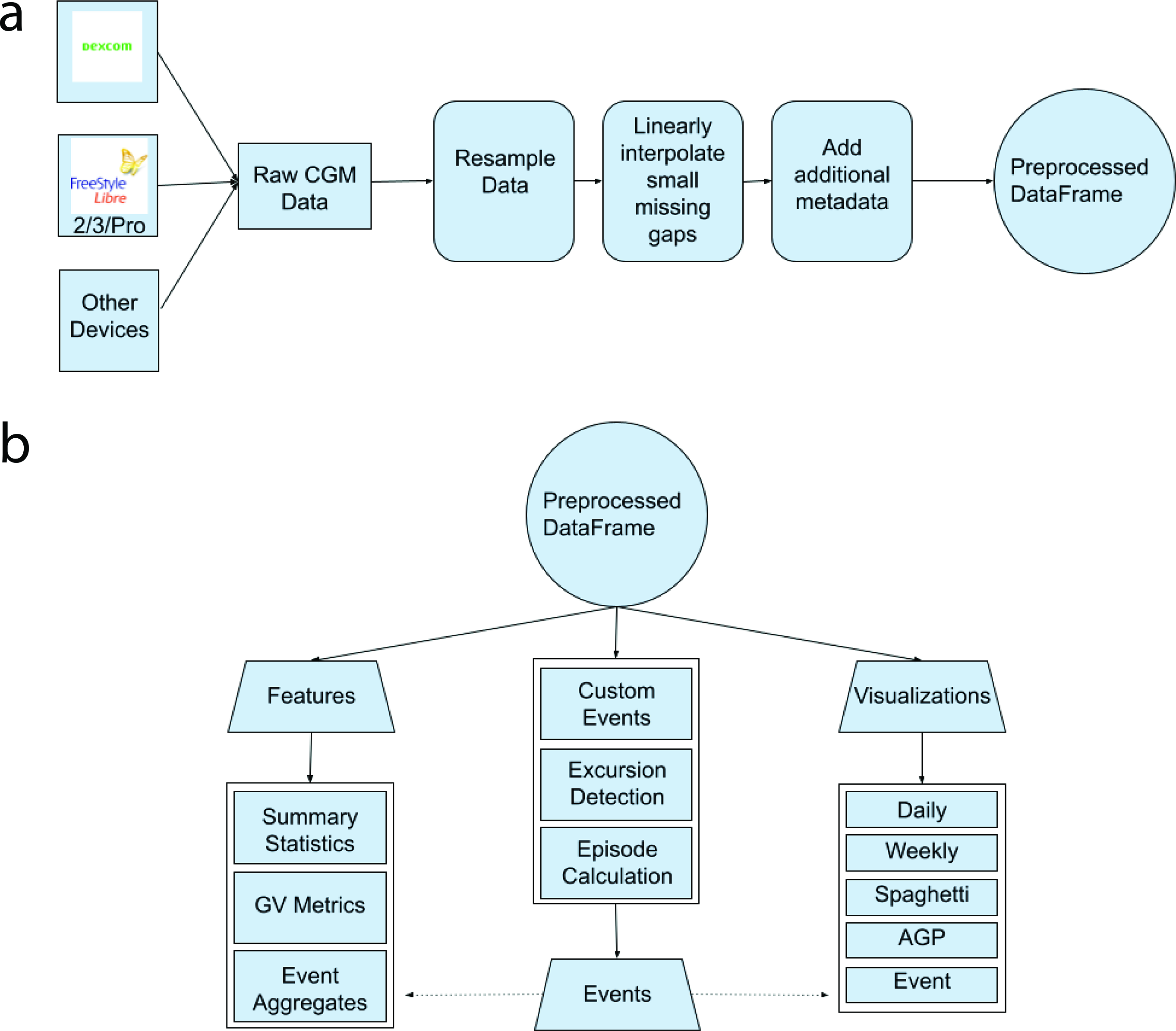
Workflow of package.
At the end of this process, each dataset is assigned an identification (id) to properly differentiate each participant’s data within the single returned DataFrame and also to help connect the preprocessed datasets with other imported data types (such as events indicating Cronometer meals). By default, the id is a concatenation of the first and last name given within each CSV file; however, users can pass in text indicating a different way of combining the first and last name or even pass a regular expression dictating how to parse the CSV file names to retrieve the intended id. With this in mind, the returned Pandas DataFrame is multi-indexed: it contains the relevant columns and preprocessed information for all of the participants in the directory, although users can also specifically index into only one participant’s data using their respective id. Also, due to all the data being stored within the standard Pandas DataFrame class, all NumPy and Pandas methods will work seamlessly on this data structure. Note that other CGM data analysis packages implement their own preprocessing pipelines, without consensus on the best method.17–19,27
Event-based framework
All events share the same structure: an exact time stamp of when the event occurred, the number of minutes before and after this time stamp to be observed, the “type” of event it is, and a description containing any further relevant details about this event. Through this format, different events such as meals and exercise are standardized and can be used through many of the same functions (as mentioned below). With this in mind, users can manually create events through Pandas or bulk import them by passing in CSV files (see Fig. 1b). As an example use case, users can export data from Cronometer into CSV files and then directly import those into events within the package.
Glucose360 provides multiple functions that act on events. With a DataFrame containing CGM data and another containing relevant events, the retrieve_event_data() function will return a filtered DataFrame that contains only the CGM data points that occurred during the supplied events. Also, the event_metrics() function will return metrics such as area under the curve (AUC), baseline, peak, and slope for a given event, whereas the create_event_features() function will return aggregate metrics such as average AUC for multiple given events. Finally, events can also be passed to provided daily and event plots in order to render them visually (see the “Visualizations” section).
Features
Users have access to around 66 functions and 84 functionalities, including various summary statistics and measures of GV (see Table 1). To calculate any of the metrics, users have two main options: the create_features() and create_event_features() functions will return a Pandas DataFrame with each participant in the directory corresponding to one row, and each column corresponding to one metric. In essence, the returned DataFrame will contain all available metric computations for all available participants. Alternatively, if the user decides to calculate only one (nonevent) metric for one participant, they can opt to index into a specific participant’s data and then run one of the individual metric functions (see Table 1).
List of Provided Functionality Within Glucose360
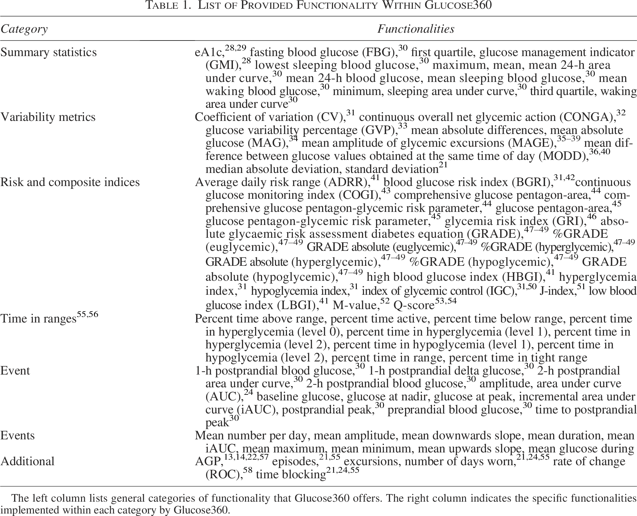
The left column lists general categories of functionality that Glucose360 offers. The right column indicates the specific functionalities implemented within each category by Glucose360.
Many of the 61 nonevent features have already been implemented in other studies and other CGM tools.17–19,27 Glucose360 uses the uniquely implemented MAGE algorithm from iglu.18,35–39,59 The 13 features designed to summarize a single event (of any type) are baseline glucose (milligrams per deciliter), peak/maximum glucose (milligrams per deciliter), nadir/minimum glucose (milligrams per deciliter), amplitude (difference between baseline and extrema in milligrams per deciliter), AUC (milligrams per deciliter min), incremental AUC/iAUC (milligrams per deciliter per minute), preprandial blood glucose, 1-h postprandial blood glucose, 2-h postprandial blood glucose, 1-h postprandial delta glucose, postprandial peak, time to postprandial peak, and 2-h postprandial AUC. The nine aggregate features for events of the same type include mean duration (min), mean glucose (milligrams per deciliter) during this type of event, mean upward slope (milligrams per deciliter per minute), mean downward slope (milligrams per deciliter per minute), mean minimum glucose (milligrams per deciliter), mean maximum glucose (milligrams per deciliter), mean amplitude (milligrams per deciliter), mean iAUC (milligrams per deciliter per minute), and mean number of this type of event per day (see Fig. 2b).
Visualizations
Glucose360 currently provides five main types of plots, all built with the help of the Plotly Python library:
60
Daily time-series plot (see Fig. 2a), which displays glucose levels with respect to time for each day in the participant’s CGM trace. Event plot (see Fig. 2b), which displays the participant’s glucose levels during a zoomed-in subset of their CGM trace. Weekly time-series plot (see Fig. 4), which displays glucose levels with respect to time for each week in the participant’s CGM trace. Spaghetti plot (see Fig. 3a), which overlaps the participant’s glucose levels for each day with respect to time stamps. AGP report style plot
61
(see Fig. 4), which displays the 5th, 25th, 50th, 75th, and 95th percentiles for the participant’s aggregate glucose levels.
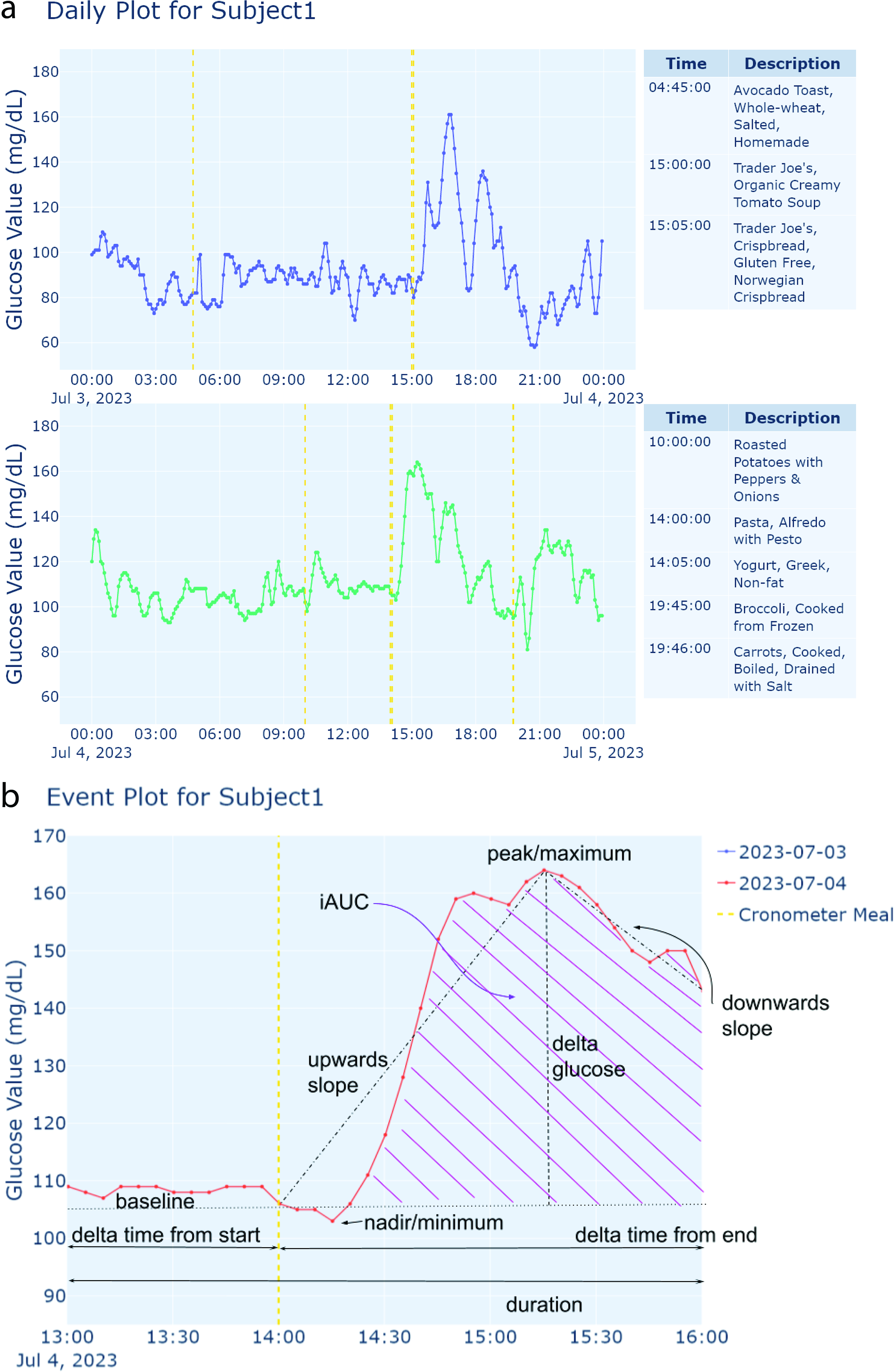
Examples of generated time-series plots.
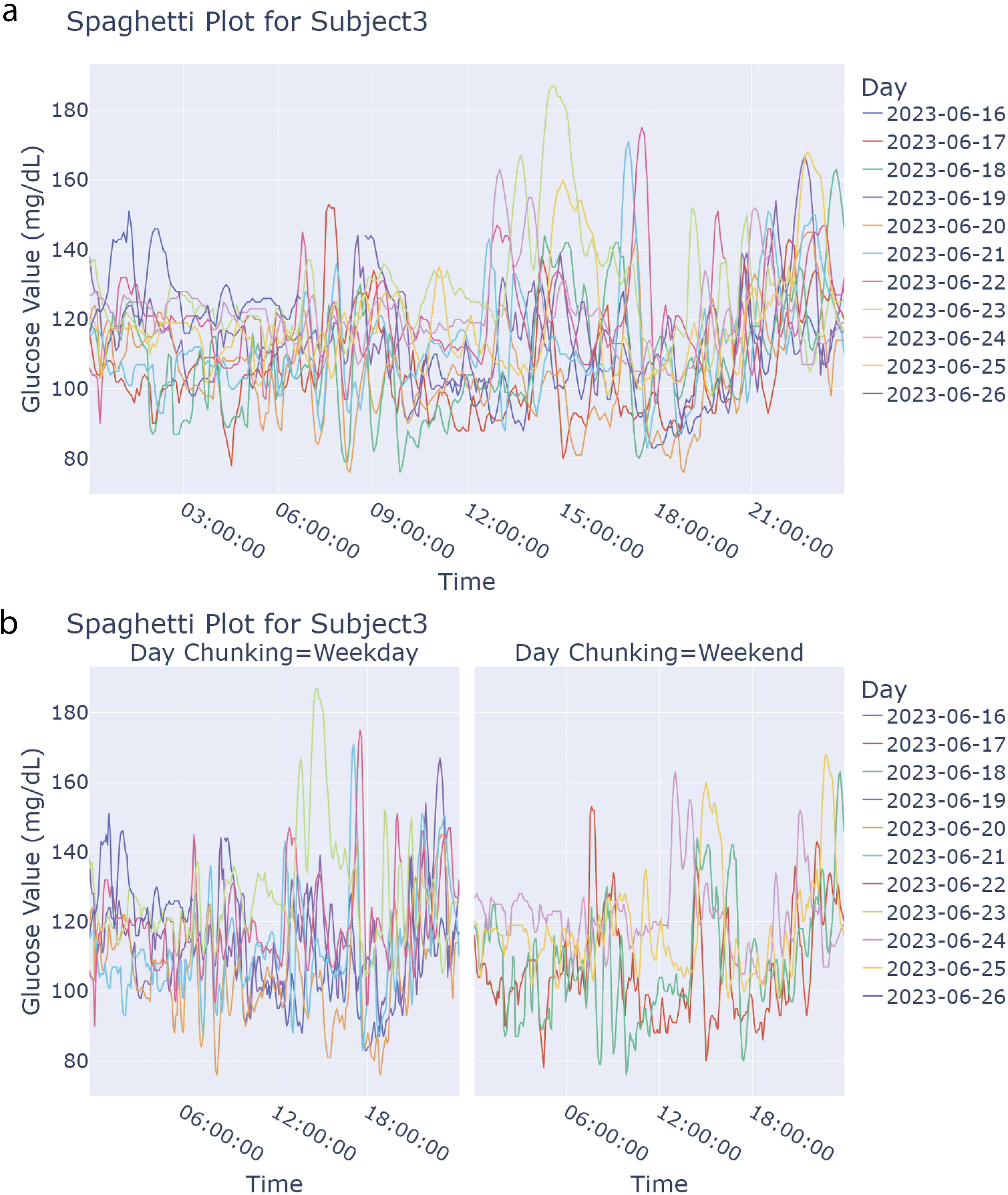
Examples of generated spaghetti (combined) plots.
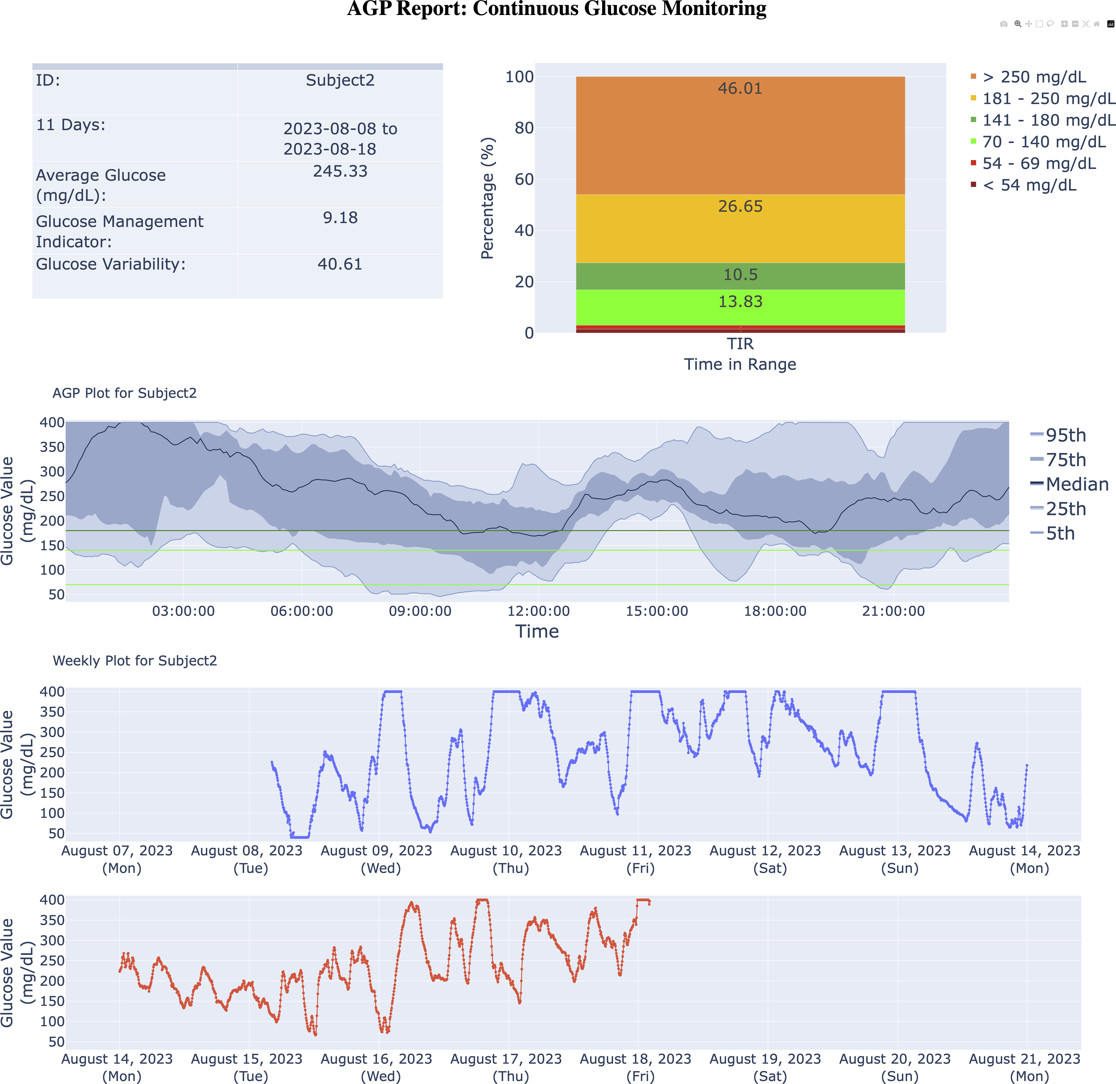
Example AGP-report generated. Direct copy of Glucose360 output from when the Subject2 dataset is passed into the AGP_report() function (with a maximum linear interpolation gap of 45 min and all remaining missing values dropped). Top left contains a time in range stacked bar chart with six ranges for the given participant: <54 mg/dL, between 54 and 69 mg/dL (inclusive), between 70 and 140 mg/dL (inclusive), between 141 and 180 mg/dL (inclusive), between 181 and 250 mg/dL (inclusive), and >250 mg/dL. Table in top right contains five summary notes and statistics regarding the given participant’s CGM trace: identification of the given participant, dates during which the given trace has CGM values, average glucose (in milligrams per deciliter), GMI, 28 and glucose variability or CV. 31 Center represents an AGP plot, where, from top to bottom, the blue lines represent the 95th, 75th, 50th, 25th, and 5th percentiles for the Subject2 dataset’s glucose values (milligrams per deciliter) per time stamp. The horizontal light green lines denote 80 and 140 mg/dL, and the horizontal dark green line marks 180 mg/dL. Thus, the range between the light green lines indicates ideal glucose values, with the range between the green lines in general indicating typical glucose values. The space outside these bounds represent risky to problematic glucose values. Bottom of the report represents a weekly plot for the given example CGM trace, where each subplot (within the weekly plot) indicates a time span of one week (starting on Mondays), with the colored lines representing the magnitude of the glucose values (in milligrams per deciliter) for each week within the example data. AGP, Ambulatory Glucose Profile; CV, coefficient of variation; GMI, glucose management indicator.
Additionally, Glucose360 offers some variations for the daily (time series) and spaghetti plots. For the daily time-series plot, the user can also pass an event Pandas DataFrame (see the “Event-based framework” section), for which the plot will add in vertical lines denoting where the “events” took place (see Fig. 2a). For the spaghetti plot, there is also an option to chunk by weekday/weekend, splitting the plot into two (see Fig. 3b). All plots can be exported into a PNG, PDF, or HTML format.
Results
Design of workflow
The Glucose360 package comprises four main components: (1) importing and preprocessing CGM data, (2) features such as glucose management indicator (GMI) and MAGE, (3) the event-based framework, and (4) visualizations. The package is compatible with data from Dexcom and select FreeStyle Libre devices, with minor restructuring for data from other sensors. After the preprocessing pipeline, which consists of resampling and interpolation of missing values, all of the imported data are then stored together within a single multi-indexed Pandas DataFrame (see Fig. 1a). Utilizing a Pandas DataFrame allows not only for a standardized table with columns for both time stamp and glucose values but also allows users to index a specific participant’s data, easily utilize most NumPy and Pandas functions on the DataFrame (such as efficient splicing or general computation), and employ the DataFrame in various Python pipelines already compatible with Pandas. Users can then employ this preprocessed DataFrame to calculate features, graph plots, or retrieve events (see Fig. 1b).
Event-based framework
A key capability within Glucose360 is the event-based framework, designed to help users analyze specific intervals within their CGM data and capture the diversity of their routine glycemic patterns. Broadly speaking, we define an “event” as any time stamp and surrounding interval that either we or the user deem important (e.g., meals or exercise). All events can be utilized in tandem with certain features and plots.
Glucose360 also provides two “curated” types of events: “episodes” and “excursions.” We define episodes as periods of time where a participant’s glucose values are in literature-defined ranges that indicate hypo- or hyperglycemia, modeled primarily on the guidelines presented by Battelino et al. 55 Additionally, we also include a “level 0 hyperglycemic episode” defined by glucose values exceeding 140 mg/dL for people with prediabetes or those with normoglycemia who are looking to optimize their control. Note that this is a parameter that the user can set to different thresholds. We define excursions as periods of time where a participant’s glucose values are in ranges that indicate irregular values or trends for the individual participant (much more personalized), by default calculated by observing data points outside two standard deviations from the mean for each participant. Simply put, episodes and excursions may overlap for certain participants, but episodes generally indicate intervals where participants experienced literature-defined and population-based hypo- or hyperglycemia, whereas excursions describe periods where glucose levels deviate from a participant’s typical range.
As part of Glucose360’s event-based framework, users can also import and add their own custom events, such as food logs from Cronometer. For example, a user might import their own Cronometer meal logs to better understand how each of their meals corresponds to their glucose levels and overall CGM trace. Within Glucose360’s daily time-series plot (see Fig. 2a), these imported Cronometer meal logs would be displayed as vertical lines over the participant’s blood glucose levels, allowing the user to visually understand their glucose responses after each specific meal. Calculating event-specific metrics such as amplitude and duration (see the “Features” section) for these meals also provides insights into which foods appear to spike the participant’s blood glucose levels the most drastically and for the longest duration.
Features
Glucose360 supports 84 various features (see Table 1). Metrics can all be calculated for only one participant or simultaneously for all participants in a given preprocessed DataFrame.
Fifty of these features are implemented in other CGM tools (see Supplementary Table S2) and can generally be grouped into the following categories: summary statistics for the overall glucose levels (e.g., mean glucose, eA1C, GMI, etc.), percentage of time within a given range (e.g., time in tight range), composite and risk indexes (e.g., J-Index, average daily risk range, absolute and %GRADE, low blood glucose index, high blood glucose index, continuous glucose monitoring index), and types of variation in glucose levels during specific time ranges (e.g., MAGE, glucose variability percentage [GVP], mean difference between glucose values obtained at the same time of day [MODD], continuous overall net glycemic action).
Many of the other features within Glucose360 are designed to analyze specific time points of interest, such as meal consumption or exercise, as part of the event-based framework (see the “Event-based framework” section) and thus are unique to this package.10,11 These event-based features include metrics for quantifying individual events (e.g., AUC, baseline glucose, peak glucose) as well as event aggregates, which indicate overall trends within the CGM trace during the observation windows of specific types of events (e.g., mean glucose during “meals,” mean duration of “meals”; see Table 1).
Visualizations
With regard to visualization, Glucose360 provides five main types of plots. The daily (time-series) plot allows users to more closely examine each day within a CGM trace (see Fig. 2a). Events can also be utilized within certain plots: within a daily (time-series) plot, vertical lines mark the time stamps of all events and side-by-side tables listing all the events that occur during each day are generated (see Fig. 2a), whereas event plots allow users to zoom in on blood glucose levels during a given event (see Fig. 2b). Similarly, the weekly (time series) plot provides an in-depth look into each week within a CGM trace, helpful for comparing and contrasting the blood glucose levels during certain days of the week. For more comparisons, the spaghetti (combined) plot superimposes each day’s CGM trace, helping users compare blood glucose levels during specific times within the day and as well as during specific days of the week (see Fig. 3a, b), whereas the AGP report provides aggregates and overall trends about a particular participant’s blood glucose levels (see Fig. 4). 62
Comparison of CGM tools
We determined which metrics were implemented by each package by sourcing the packages’ codebases and also published manuscripts (see Supplementary Table S2 for a detailed comparison). For the event-based metrics, Glucose360 implements 100%, CGMQuantify 0%, AGATA 8.70%, iglu 8.70%, and cgmanalysis 0%, IDC’s AGP 0%, and Tidepool 0%. Glucose360 complements other CGM analysis tools by uniquely providing a set of event-based metrics for analyzing within the CGM trace.
We validated our metric calculations against IDC’s AGP-report and Tidepool, as both are frequently used in clinical practice. Additionally, we also validated against iglu because of its extensive overlap in available metrics. For testing, we imported three example datasets (“Subject1,” “Subject2,” and “Subject3”) as well as the CGM data for the 57 participants from the Hall et al. study into each software. We then individually ran each glucose metric algorithm, ensuring parameter consistency (e.g., using a limit of 140 mg/dL when calculating hyperindex and resampling the data to evenly spaced 5-min intervals). 9 All overlapping metrics between Glucose360 and IDC’s AGP report and Tidepool showed correlations >0.99. Similarly, all overlapping metrics with iglu showed correlations >0.99, except for GVP, M-value (default 100), MAG, and MODD.
Overall, the calculations from Glucose360 align with those from iglu, although we believe all significant differences can be explained by our differing preprocessing pipelines and algorithms for calculating these metrics. Primarily, iglu does not always replace blood glucose values of “Low” and “High” with the same constants as we do; rather, these rows are dropped altogether. 18 Moreover, instead of starting at the first data point’s time stamp when generating the time stamps of the resampled data (see the “Methods—Reading and preprocessing data” section), iglu starts at midnight of the very first day present within the data, often resulting in most of the data points being interpolated slightly. Another notable difference between Glucose360’s processing stage and iglu is how gaps are handled. With this in mind, both Glucose360’s and iglu’s preprocessing pipeline result in near identical data frames for datasets without missing values nor “Low”s and “High”s, which then results in identical calculations across Glucose360 and iglu for most metrics.
In terms of Glucose360’s plots, we note that our time-series plot (see Fig. 2a) and AGP-style plot (see Fig. 4) appear nearly identical to those generated with IDC’s AGP, Tidepool, and iglu, with slight differences due to the difference in preprocessing pipelines and styling.
Discussion
Here, we present Glucose360, which has a variety of useful features, including an effective preprocessing pipeline that supports numerous CGM sensors, algorithms for the accurate calculations of most utilized GV metrics, interactive visualizations of trends within CGM traces, and a novel event framework to help users integrate lifestyle data from other sources to improve personalized nutrition or behavior and better isolate and manage anomalies within their overall glucose levels.
However, Glucose360 does have various limitations. First, Glucose360 primarily imports Dexcom and FreeStyle Libre sensor data by default; data from other CGM sensors can also be imported, but they would have to be restructured to adhere to Dexcom or FreeStyle Libre guidelines or manually imported into a data frame as per our package guidelines. Moreover, it currently supports five main plotting types, and the majority of the GV metrics Glucose360 currently calculates were not introduced or validated recently, so future endeavors could include adding other visualizations or newer measures of GV into the package. Additionally, no other packages offer functionality for events, so the validity of our algorithms for these metrics has only been checked empirically through our own testing. Finally, the majority of our algorithm testing and comparison for plotting and metric calculations was based on 60 participants’ data (the CGM data from the Hall et al. study 9 and the three example datasets “Subject1,” “Subject2,” and “Subject3”). To guarantee our algorithms’ accuracy, testing with more datasets should also be done. Nonetheless, in spite of these limitations we believe the Glucose360 will be a valuable platform for many different types of stakeholders. Future extensions of this package could include extending Glucose360’s event framework to include expert recommended reports that standardize CGM and connected insulin pens joint metrics.57,63–65
We ask that Glucose360 users cite the original sources for each functionality they utilize in Table 1.
Conclusions
Glucose360 is a new open-source Python package for CGM analysis, providing multiple clinician-recommended and event-based metrics, multiple interactive graphs, and an easily modifiable codebase. The software is available on PyPi and GitHub, with a companion web interface for use without programming. Metric calculations were validated against IDC’s AGP report, Tidepool, and iglu, confirming concordant results. Glucose360 is a flexible platform for researchers seeking deeper lifestyle-driven insight into glucose dynamics.
Authors’ Contributions
B.E.: Conceptualization, data curation, formal analysis, methodology, software, visualization, and writing—original draft. D.A.: Data curation, formal analysis, methodology, software, visualization, and writing—original draft. D.P.: Software, validation, and writing—review and editing. Y.W.: Software, validation, and writing—review and editing. M.P.S.: Conceptualization, funding acquisition, resources, supervision, and writing—review and editing.
Footnotes
Acknowledgment
The authors would like to thank the CGM and fiber team for their helpful comments.
Author Disclosure Statement
M.P.S. is a cofounder and scientific advisor of Crosshair Therapeutics, Exposomics, Filtricine, Fodsel, iollo, InVu Health, January AI, Marble Therapeutics, Mirvie, Next Thought AI, Orange Street Ventures, Personalis, Protos Biologics, Qbio, RTHM, and SensOmics. M.P.S. is a scientific advisor of Abbratech, Applied Cognition, Enovone, Jupiter Therapeutics, M3 Helium, Mitrix, Neuvivo, Onza, Sigil Biosciences, TranscribeGlass, WndrHLTH, and Yuvan Research. M.P.S. is a cofounder of NiMo Therapeutics. M.P.S. is an investor and scientific advisor of R42 and Swaza. M.P.S. is an investor in Repair Biotechnologies. The other authors have no disclosures.
Funding Information
This work was supported by National Library of Medicine (2T15LM007033). Y.W. was supported by American Diabetes Association Grant 11-23-PDF-76. This work was also supported by Nutrition for Precision Health’s AIMINGS Pilot Project Program. This work was also supported by the National Institutes of Health under Grant No. R01 DK110186.
Data and Code Availability
Fake example data are available at ![]() . Other data can be found at https://journals.plos.org/plosbiology/article?id=10.1371/journal.pbio.2005143. Code is available here: github.com/vurhd2/Glucose360.
. Other data can be found at https://journals.plos.org/plosbiology/article?id=10.1371/journal.pbio.2005143. Code is available here: github.com/vurhd2/Glucose360.
Supplemental Material
References
Supplementary Material
Please find the following supplemental material available below.
For Open Access articles published under a Creative Commons License, all supplemental material carries the same license as the article it is associated with.
For non-Open Access articles published, all supplemental material carries a non-exclusive license, and permission requests for re-use of supplemental material or any part of supplemental material shall be sent directly to the copyright owner as specified in the copyright notice associated with the article.