
Abstract
We introduce a method in which instant data visualization facilitates real-time data integration and involves participants in data interpretation. The results of quantitative research (e.g., electronic card sorting) are represented visually (e.g., in a dendrogram) and fed back to research participants in follow-up focus group conversations. The visualized quantitative results are reviewed and discussed by participants. The visual display of the quantitative results is annotated with qualitative feedback generated by participants that explains, enriches, or challenges the quantitative results. We apply our method in a card sorting study of Fédération Internationale de Football Association’s (FIFA) stakeholders. An approach that facilitates real-time data integration that is participant driven and visually supported is the unique contribution of this article to mixed methods research.
Background and Methodological Purpose
In mixed methods research, researchers combine elements of qualitative and quantitative approaches (e.g., qualitative and quantitative viewpoints, data collection, analysis, and inference techniques) to gain breadth and depth in understanding and corroboration (Johnson et al., 2007). According to a recent definition, mixed methods include “any research that involves multiple sources and types of data and/or multiple approaches to analysis of those data, in which integration of data and analyses occurs prior to drawing final conclusions about the topic of the investigation” (Bazeley, 2018, p. 7). Notably, “meaningful integration of qualitative and quantitative data remains elusive and needs further development” (Guetterman, Fetters, et al., 2015, p. 554). Researchers employing mixed methods often experience difficulty in integrating the analysis and interpretation of the quantitative and the qualitative data and writing a narrative that links the analyses and interpretations (Bryman, 2007).
Hence, there is a need to find ways to facilitate meaningful integration of quantitative and qualitative data. Our attention turned specifically to “development of descriptive and narrative accounts from quantitative (statistical) data” (Bazeley, 2018, p. 223). Such accounts result whenever researchers describe, interpret, or discuss their findings in prose. As integration of this kind is not often used as a deliberate analysis strategy in mixed methods projects, it may offer “untapped potential” (Bazeley, 2018, p. 223). In this article, we unleash this potential by offering a visual approach to elicitation of qualitative participant interpretations of visualized quantitative data in a real-time data integration. The methodological purpose of our article is to provide a method that facilitates real-time integration that is participant driven and visually supported.
Our work is structured as follows. We begin with a review of the literature on the use of visual representations in mixed methods research and on participant involvement in data interpretation. We then provide a summary of our method, including a description of its constitutive phases and their outcomes, as well as a description of an illustrative study in which the method was employed. Finally, we evaluate the method and discuss it with reference to its contribution and limitations. The following section aims to clarify what types of visual representations exist and to contextualize their role in mixed methods research.
Literature Review
Use of Visual Representations in Mixed Methods Research
Building on recent efforts to systematize the use of visual representations in mixed methods research (Archibald, 2018; Balomenou & Garrod, 2015; D’Angelo et al., 2016; Guetterman, Fetters, et al., 2015; Onwuegbuzie & Dickinson, 2008; Shannon-Baker & Edwards, 2018), it is possible to identify three main (often overlapping) purposes of use. Visual representations are used in mixed methods research for data elicitation, data integration and interpretation, and data communication.
First, mixed methods researchers use visual representations to elicit that which is difficult to verbalize or observe. Visual representations (e.g., diagrams, drawings) are produced by researchers or by the research participants. Visual representations that are produced by researchers are used as stimuli in the study to elicit responses from research participants. For example, Tubaro et al. (2016) asked participants to fill in the blanks on a diagrammatic representation of concentric circles and Alexander et al. (2015) asked participants to fill in the blanks on a metaphoric representation of a funnel. Visual representations that are produced by the research participants express feelings or illustrate situations introspectively and reflectively. For example, the participants in the studies of Brechet et al. (2009), O’Connell (2013), and Shannon-Baker (2015) produced self-portraits, drawings, and photos to express feelings and illustrate situations.
Second, mixed methods researchers use visual representations to integrate and interpret quantitative and qualitative data in order to derive new insights beyond the information gained from the separate quantitative and qualitative results (Fetters et al., 2013) and hence to enhance their understanding of the phenomena under analysis (Onwuegbuzie & Dickinson, 2008). For example, mixed methods researchers use joint displays (Guetterman, Fetters, & Creswell, 2015) to integrate quantitative and qualitative data by bringing them together with the purpose of direct comparison.
Third, mixed methods researchers use visual representations to communicate research results to the readers. For example, crossover graphical displays (Onwuegbuzie & Dickinson, 2008) summarize integrated quantitative and qualitative results in (interactive) line charts, georeferencing plots, bubble plots, scatterplots, pictograms, maps, and (decision) trees. The title “crossover” (Onwuegbuzie & Combs, 2010) comes from using techniques from one tradition (e.g., quantitative) to analyze data associated with the other tradition (qualitative).
Visually supported mixed methods studies can be conceptualized as involving different levels of visual representations. In his seminal work, Tufte (2001) identified five levels of visual representations: text (Level 1); tables (Level 2), which show exact numerical values; text-tables (Level 3), which summarize and arrange numeric data by type (i.e., demographics, source, time, group membership, scale, level) to facilitate comparison; supertables (Level 4), which provide organized, sequential detail, and reference-like quality and may contain pictures; and graphics (Level 5), which combine words, numbers, and pictures.
The visual representation used in Nicca et al. (2012) can be categorized as a text-table—corresponding to Tufte’s third level of representations (Table 1). For the purposes of data integration/interpretation and data communication in a multiphase mixed methods study, this table summarizes and arranges numeric data by “symptoms” according to a questionnaire, “appraisal of symptoms” according to contrasting groups of participants in narratives elicited after the questionnaire, and the results of testing hypotheses regarding differences in the participants’ narratives.
An Example Visual Representation Used in Mixed Methods Research Corresponding to Tufte’s Third Level.
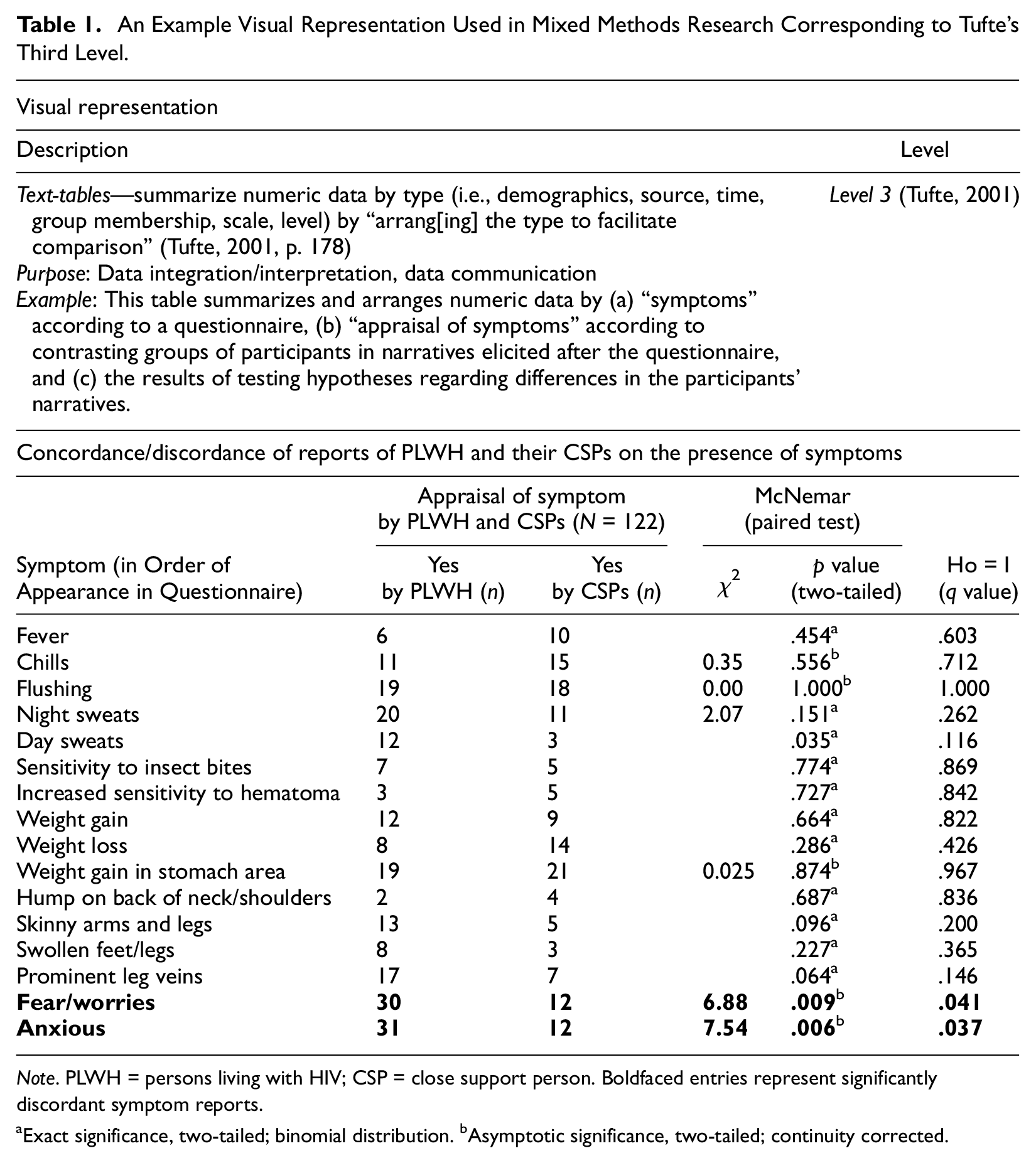
Note. PLWH = persons living with HIV; CSP = close support person. Boldfaced entries represent significantly discordant symptom reports.
Exact significance, two-tailed; binomial distribution. bAsymptotic significance, two-tailed; continuity corrected.
Source. Nicca et al. (2012, p. 229), reprinted with permission from the authors and the publisher.
The elaborate table used at the data interpretation stage for Alexander et al. (2015) can be categorized as a supertable—corresponding to Tufte’s fourth level of representations (Table 2). This supertable contains numeric, textual, and visual data (i.e., the experimental conditions are visually represented). The supertable allows comparisons between the shared and withdrawn thoughts regarding project experiences. The horizontal rules divide the data into group-related paragraphs; the rows are ordered so as to tell an ordered story about the experimental groups and the individual members of the experimental groups (based on integrated thoughts). Further examples of elaborate tables may be found in Peroff et al. (2020) and Flowers et al. (2015).
An Example Visual Representation Used in Mixed Methods Research Corresponding to Tufte’s Fourth Level.
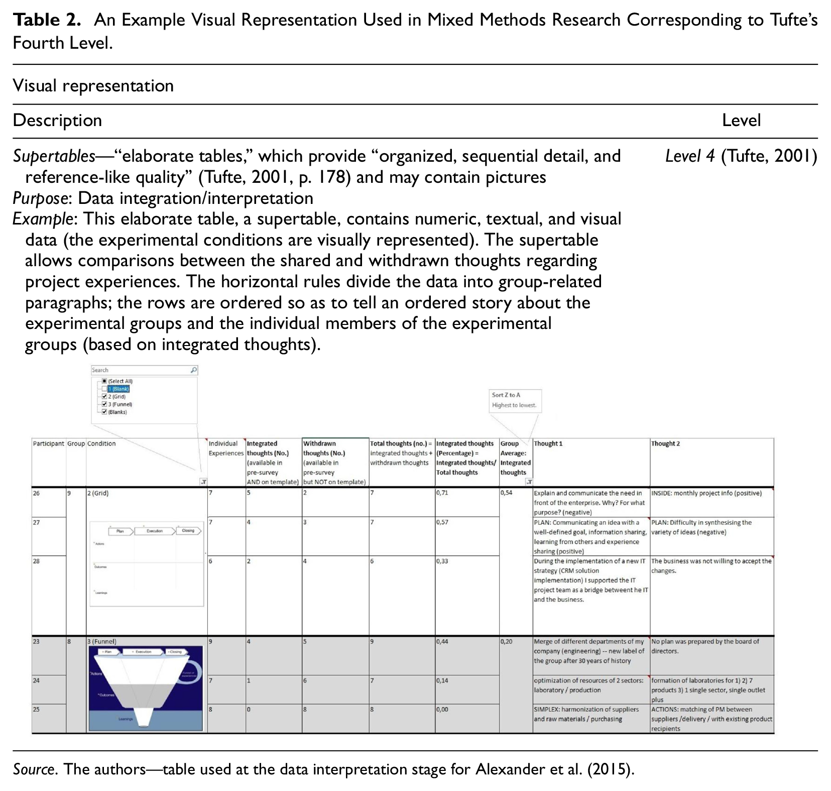
Source. The authors—table used at the data interpretation stage for Alexander et al. (2015).
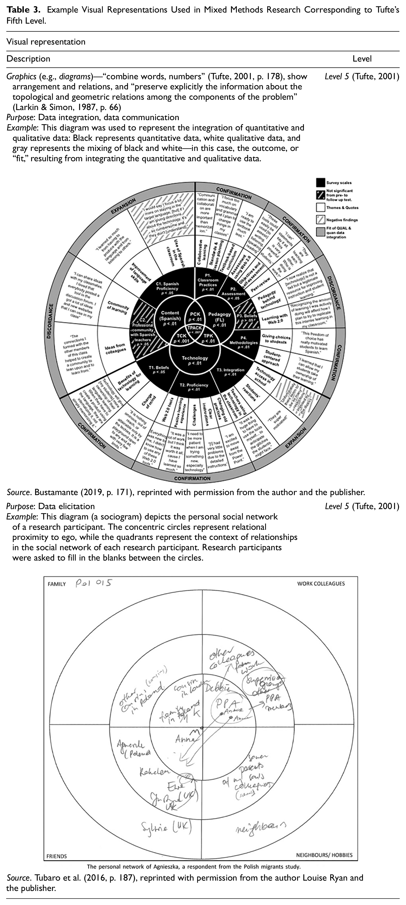
The diagram used in Bustamante (2019, Table 3) can be categorized as corresponding to Tufte’s fifth level of representations. This diagram was used to represent the integration of quantitative and qualitative data: Black represents quantitative data, white qualitative data, and gray represents the mixing of black and white—in this case, the outcome, or “fit,” resulting from integrating the quantitative and qualitative data. The diagram used in Tubaro et al. (2016) also corresponds to Tufte’s fifth level of representations but has been used for the purpose of data elicitation. The personal social network of each research participant (Table 3) contains concentric circles that represent relational proximity to ego, while the quadrants represent the context of relationships in the social network. Research participants were asked to fill in the blanks between the circles. Similarly, Alexander et al. (2015) used a diagrammatic representation (a funnel metaphor) for the purpose of data elicitation. The research participants were asked to fill in the blanks on the funnel in order to share their project-related experiences. The types of Level 5 visual representations used in mixed methods include arts-based graphics. For example, Brechet et al. (2009), O’Connell (2013), and Shannon-Baker (2015) collected self-portraits, drawings, and photos produced by participants and analyzed them in mixed methods studies.
Example Visual Representations Used in Mixed Methods Research Corresponding to Tufte’s Fifth Level.
Visual representations have the potential to add to the inference-drawing capacity of researchers but not necessarily to the integration of data. Bazeley (2018) points out that visual displays generated by “software are helpful to varying degrees in revealing and displaying patterns in data—sometimes more for the researcher [italics added] during the analysis process than for the reader of a report” (p. 297). But what about for participants, who are increasingly being drawn into the process of data analysis and interpretation?
Involving Participants in Data Interpretation
The idea of involving research participants in data interpretation stems from early concerns about the provisional nature of knowledge and the limits of objectivity (Popper, 1959). Participant involvement has been motivated by early concerns regarding interpretation biases (MacCoun, 1998) as well as by more recent concerns that inferences drawn “should make sense to those who contributed the data” (Bazeley, 2018, p. 55). So-called reflexive (or participatory) research methods describe a partnership between researchers and research participants in order to use the knowledge and abilities of each (Van de Ven, 2007). Participatory methods have been used in attempts to involve participants in data interpretation (as e.g., “coresearchers”). Such methods are frequently used in fields like postmodern ethnography (e.g., Presnell, 1994), anthropology (e.g., Feighery, 2006), applied communication research (e.g., Deetz, 2008), action research (e.g., Heron & Reason, 2006; Reason & Bradbury, 2008), and less frequently used in management and organization studies (Bartunek, 2007; Van Aken, 2004; Van de Ven, 2007). In mixed methods, participatory research is “one expression of a pragmatist position” (Garner, 2015, p. 179). For example, community-based participatory research (Israel et al., 2013) combined with mixed methods research (Dejonckheere et al., 2018) engage research participants in the design and implementation of research that may benefit society (Molina-Azorin & Fetters, 2019). Ivankova (2014) first discussed intersecting mixed methods with action and participatory research approaches.
It has been suggested that researchers and participants collectively negotiate the meaning of results to help complement otherwise “incomplete” research (Alvesson et al., 2008, p. 483). Another proposal for involving participants is to open up research texts to “multiple readings” by participants and audiences (Alvesson et al., 2008; King & Learmonth, 2015; Lukka & Modell, 2010). These multiple readings may take place (a) during “data collection and initial analysis” (through events such as meetings and workshops), (b) during “interpretation” (through joint interpretive forums), (c) during “dissemination” (through coauthorship of research reports), or (d) during “implementation” (through guidance and advice on implementation) (Knight & Pettigrew, 2007, pp. 7-9). Joint interpretive forums have been suggested by Mohrman et al. (2001) and Rynes et al. (2001) as events (like workshops or conversations) where researchers and practitioners work together to interpret results. However, both Mohrman et al. (2001) and Rynes et al. (2001) are conceptual epistemological articles that suggest (but do not apply) “joint interpretive forums” as a concept.
Kieser and Leiner (2009) noted that the overwhelming majority of articles resulting from collaborative research [with participants] are of an epistemological kind. Kieser and Leiner also indicated that they did not know of any publications that contain jointly produced research output describing research results rather than processes and the difficulties of collaboration between researchers and research participants. Hence there is a recognized need to find ways to facilitate joint researcher–participant interpretation of research results.
According to Howe and Eisenhart (1990), Bazeley (2018), and Kuckartz (2018), all scientific analysis involves acts of interpretation by researchers [italics added]. The role of the researcher remains paramount in deciding issues relating to . . . the meaning of codes, the interpretation of the data tables and displays produced using the computer. (Bazeley, 2010, pp. 418-419)
Interpretation conducted by researchers is influenced by their research purposes, their subjective awareness and sensitivity, the context in which the data were obtained, the underlying conceptual framework, and the choice of methodology. Interpretation of data still remains largely the prerogative of scholars, even though participants commit substantial time and resources to the studies and numerous approaches have set out to involve them in the process. With this work, therefore, we aim to contribute by offering a visual approach to involve participants—by using visual representations to elicit qualitative participant interpretations of visualized quantitative data in a real-time data integration.
In this section, we have (a) reviewed the visual representations used in mixed methods research and (b) shown that there is a recognized need to find ways to facilitate joint researcher–participant interpretation of research results. On the basis of these methodological needs, we now introduce an innovative method enabling research participants to review quantitative results through visual displays shortly after the research participants have provided the quantitative data.
The Method and an Illustrative Example
The method for data integration we introduce in this article consists of seven phases: data collection, formation of focus groups, data analysis (quantitative), data visualization (quantitative), data collection (qualitative), data analysis (qualitative), and critical interpretation. Table 4 introduces the phases of our method, along with detailed information on associated procedures and products. We have compiled this table in accordance with guidance for visual modeling of mixed methods design procedures provided in Ivankova et al. (2006). The mixed methods design used is explanatory sequential (as defined by Creswell et al., 2011) because it is intended to explain initial quantitative results using a qualitative follow-up component.
An Overview of the Method and Its Application in Our Study (Italics).

To showcase application of our method, we conducted a study in which we explored sensemaking of stakeholder groups by managers. The purpose of our study was to understand the reasoning managers apply when grouping stakeholders and when designing strategies for dealing with each group of stakeholders. Our research question was the following: How do managers make sense of stakeholder groups?
Sensemaking has been defined as “the ongoing retrospective development of plausible images that rationalize what people are doing” (Weick et al., 2005, p. 409). This is an important yet underresearched aspect of stakeholder management (Davis, 2014; Turner, 2014; Turner & Müller, 2006; Turner & Zolin, 2012). The participants’ task in our study consisted of identifying groups among Fédération Internationale de Football Association’s (FIFA) stakeholders. FIFA is a suitable case for exploring managers’ sensemaking of stakeholder groups; it is beholden to a number of stakeholders who require different information about its performance (Schenk, 2011) and demand different strategic approaches. As revealed by recent scandals documented in the press (Poddar, 2014), FIFA seems to eschew formal mechanisms of accountability to its stakeholders (Pielke, 2013). Making the organization more accountable would require, among other things, making sense of FIFA’s stakeholder groups and designing a strategy for dealing with each of them.
Our study participants were 50 managers enrolled in a part-time executive MBA program in Switzerland. Our sample was appropriate for uncovering how managers make sense of stakeholder groups. The participants were collectively experienced managers (with an average work experience of 8 years), cross-functional (coming from different functional areas), and international (coming from 17 different countries). No prior knowledge of FIFA was necessary. All participants were informed that their participation was voluntary, anonymous, and would not be graded.
Phase 1: Data Collection
In this study, we collected quantitative data through electronic card sorting. To convey the card sorting instructions, we created a website (https://sites.google.com/site/cardsortingstakeholders) in which we uploaded information about FIFA and explained the task that participants were invited to complete. Each participant was given 10 minutes to read the background information (https://drive.google.com/file/d/1L1crREVbzFZfmIotZA8-84K-SLZRfR5c/view) and the task instructions (https://drive.google.com/file/d/1zaVF2PxxEkfwXnATGb8VcInn_VpWEaIh/view). The background information covered essentials about FIFA’s stakeholders and the problems associated with managing them. The individual task that each participant had to complete was formulated as follows: TASK: You are a strategy consultant working for FIFA’s president. The president is facing the challenges of stakeholder diversity and stakeholder pressure. Your task is to give him an overview of his stakeholder groups in order to help him better understand them. You will have to sort the stakeholder cards online (https://www.simplecardsort.com/sort.php?s=JLX122XD&p=454
1
). Each card will have the name of a FIFA stakeholder written on it.
Each participant was then given 20 minutes to complete the individual electronic card sort for this first phase of our study (as outlined in Table 4). We designed the electronic card sorting task with the help of the simplecardsort.com online platform. The task was devised as an “open card sort,” following the procedure documented in Rugg and McGeorge (2005). We provided no presupplied stakeholder groups, and thus aimed “to elicit criteria and categories” from the participants (p. 97). We used the 20 most significant stakeholders of FIFA, as listed at fifa.com. Figure 1 contains a list of the 20 cards, each bearing the name of one of FIFA’s 20 stakeholders. Each of these cards had to be dragged to the right and grouped with other cards.
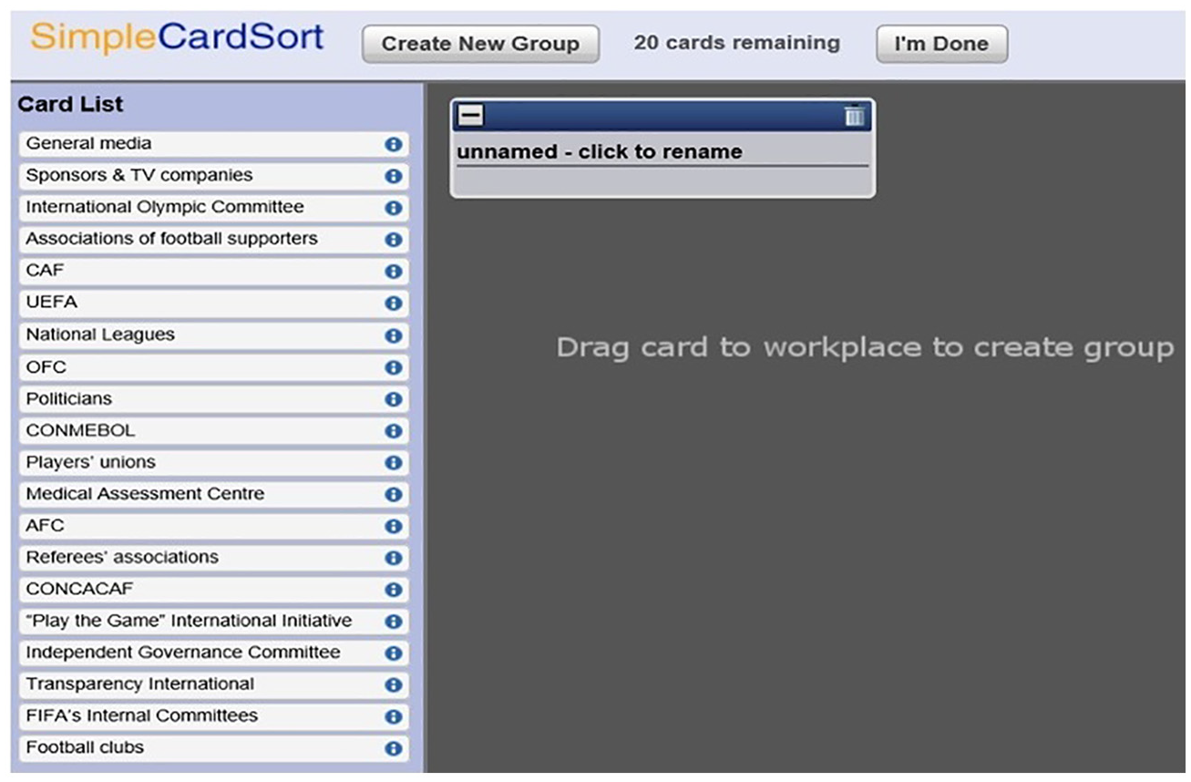
The individual card sorting workplace.
All participants were assembled in a big plenary room and accessed simplecardsort.com through their laptops or mobile phones. The participants finished their card sorting task within 20 minutes. Fifty individual card sorts were stored online at the end of the task. Figure 2 shows an example of an individual card sort. Each individual card sort shows how each manager distinguishes and labels FIFA’s stakeholder groups.
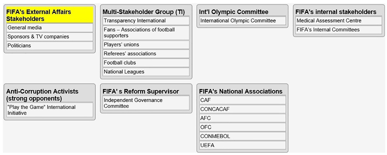
Example of an individual card sort.
Phase 2: Formation of Focus Groups
We assigned all participants to six focus groups (3 groups of 9 people and 3 of 8). Eight to 10 people is the optimal group size recommended by focus group researchers (Krueger & Casey, 2014). Each participant was randomly given a focus group number (from 1 to 6) written on a piece of paper together with the number for the room to which they should return after a break. We explained that participation in the focus groups was designed to help us understand the card sorting data. All participants then left the big plenary room for a break. Random allocation of focus group participants was designed to ensure a nonbiased interpretation of the aggregate quantitative results.
Phase 3: Data Analysis (Quantitative)
Simplecardsort.com produced and stored numeric data that contained all individual card sorts. We then ran a cluster analysis using all these card sorts through the simplecardsort.com platform. The cluster analysis files, available for download at https://drive.google.com/file/d/1jOAyaRLefYLU2TZYHk1ZP3Dwi-cSWxm1/view?usp=sharing, include a card summary, a group summary, a groups-by-card summary, a maximum group agreement solution, a participant summary, participant-card raw data, and a similarity matrix.
Phase 4: Data Visualization (Quantitative)
Simplecardsort.com was used to produce a dendrogram representing the aggregate cluster analysis results. A dendrogram is a tree diagram used to illustrate arrangement of the clusters produced by hierarchical clustering. The percentages of agreement for each cluster popped up when the mouse rolled over a cluster in this electronic dendrogram (Figure 3).
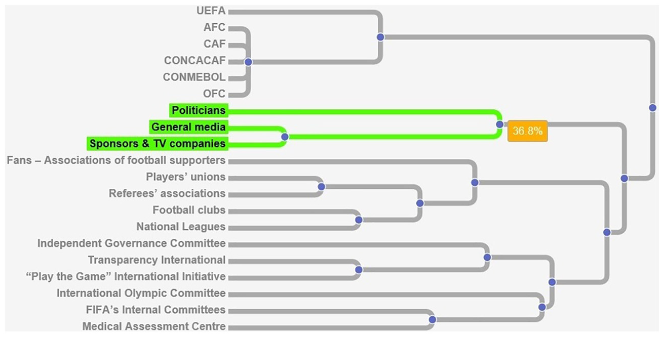
An interactive electronic dendrogram representing the aggregate cluster analysis results for all 50 individual card sorts. (The percentage represents the level of agreement for a particular cluster.)
Phase 5: Data Collection (Qualitative)
The participants entered the six separate focus group rooms after a 20-minute break. The same interactive dendrogram (see Figure 3) was shown on a large screen in each focus group room. We facilitated the focus groups by asking questions aimed at interpreting the cluster analysis results displayed in the dendrogram. The same questions were used in all groups. Table 5 shows the questions and examples of visual outputs (i.e., how the dendrogram was annotated based on the answers to the questions).
Questions Asked, Examples of Answers, and Visual Outputs.
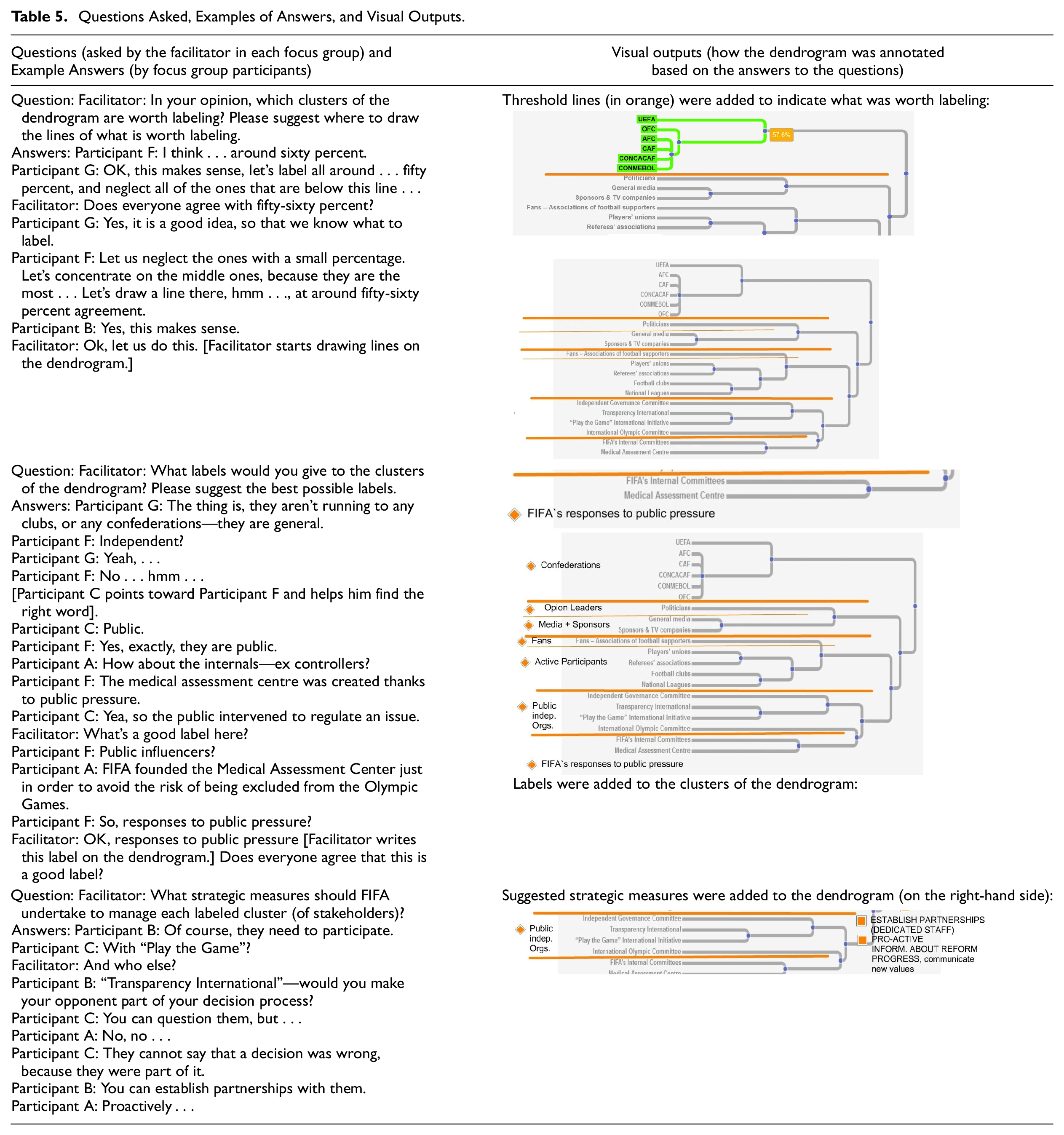
The participants answered our questions, but they were also free to add further and unprompted interpretations. We annotated the dendrogram according to participant input while the group conversation unfolded. The group decided what was to be annotated and how. The annotated dendrogram in Table 6 represents a final version of the dendrogram with the annotations produced in one of the focus groups.
A Joint Display of Dendrogram Annotations From the Focus Groups and Verbatim Quotations From the Transcripts of the Focus Group Conversations.
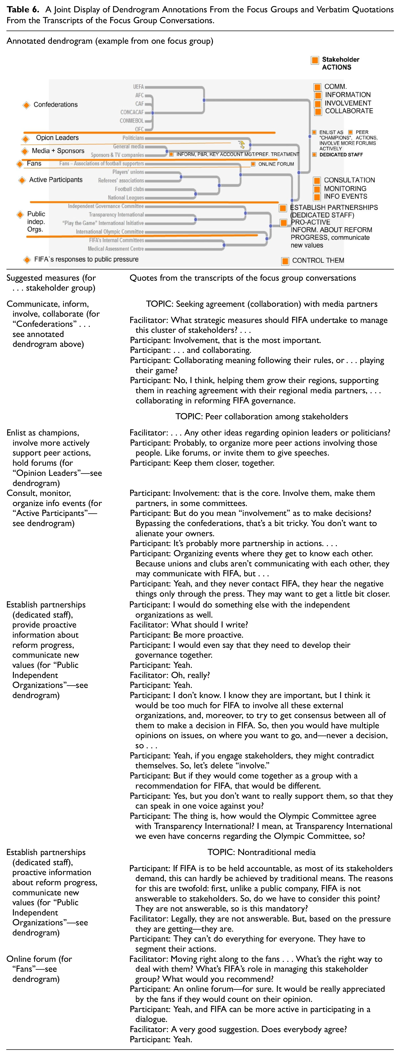
The annotated dendrogram shows that the focus group agreed on the following labels for the clusters of the dendrogram—“confederations,”“opinion leaders,”“active participants,”“FIFA’s responses to public pressure,” and so on. We compared these with the labels provided in the individual card sorts and found that the focus group labels were more detailed and exhaustive. In 25% of the cases, the individual participants had labeled their groups of cards either “internal stakeholder,”“external stakeholder,” or a variation containing the word “internal” or “external” (see “group summary” folder in the cluster analysis files; see also “max group agreement solution” in the cluster analysis files, where the “internal stakeholders” group label received the highest agreement).
Once the clusters were labeled, the focus group participants were asked to suggest strategic measures that FIFA should undertake to manage each labeled cluster (i.e., group of stakeholders). These suggested strategic measures were also added to the dendrogram. We obtained two products from our focus groups: (a) six annotated versions of the (same) dendrogram (archived as jpg. files) and (b) six audio recordings of the focus group conversations.
Phase 6: Data Analysis (Qualitative)
We transcribed and thematically coded the audio recordings from the focus groups (following the procedure described in Gläser & Laudel, 2010; Krueger & Casey, 2014). We performed three coding cycles—we used peer debriefings to discuss codes and assess if the conclusions that were reached were plausible. We reformulated our codes during the process. The following themes emerged as main topics: “seeking agreement (collaboration) with media partners,”“peer collaboration among stakeholders,”“nontraditional media,” and “involvement” (see Table 6 and Meta-Inference 2). The transcripts of the audio recordings also showed that the participants often changed their minds about what is worth labeling and how the stakeholders should be grouped and labeled accordingly. For example, a 56% agreement threshold was agreed on in the beginning of most focus group conversations but modified later on (see Meta-Inference 1).
Phase 7: Critical Interpretation
We compared the dendrogram displaying the results of the cluster analysis (quantitative) with the transcripts of the focus group conversations as well as the textual annotations on the dendrogram (qualitative). We depicted this comparison on a joint visual display, an excerpt of which is presented in Table 6. At the top of Table 6 is an example of a dendrogram with the annotations added during a focus group conversation. The right-hand column in Table 6 contains verbatim quotations from the transcript of this focus group conversation. These quotations reveal the reasoning behind the strategic measures suggested for each stakeholder group. For example, according to the thinking behind the measures suggested for “public independent organizations,” traditional means of communication do not work because FIFA is not formally accountable to this stakeholder group. Nontraditional channels should therefore be used in conveying new values, proactively providing information about progress made by FIFA in reform, and establishing partnerships. Accordingly, the following strategic measures were suggested: “establishing partnerships (dedicated staff), providing proactive information about reform, and communicating new values.”
Comparing the coded transcripts with the annotations on the dendrogram, as well as with the dendrogram itself (which was an aggregate visual representation of the quantitative results), allowed us to derive the following meta-inferences, which provided answers to our research question, that is, “how do managers make sense of stakeholder groups?”
Meta-Inference 1: In making sense of stakeholder groups, managers dynamically redefine the boundaries of those groups.
As can be seen from the annotated dendrogram (Table 6), the orange lines (added during the focus group conversation) set labeling thresholds that do not follow the dendrogram’s clusters blindly. One example is the Union of European Football Associations (UEFA), which is included under the general “confederations” label, although UEFA is displayed in a separate cluster on the dendrogram (a cluster with 57% agreement). This was explained by our focus group participants by the necessity to treat all confederations equally, although some, like UEFA, exhibited unique courses of action, including engagement in public campaigns against FIFA’s president. This challenged the quantitative results.
It is also apparent from the dendrogram that the orange lines do not always follow the 56% agreement threshold that were tentatively agreed on in the beginning of the focus group conversation (see Table 6). For example, politicians were included under a separate “opinion leaders” label, although the level of agreement corresponding to this dendrogram cluster was only 20% to 30%. This was explained as follows—politicians are a special group that has to be approached separately, as a group of potential opinion “champions” (see annotated dendrogram in Table 6). “Fans” were also labeled as a separate group. This also challenged the quantitative results, that is, approximately 50% of all individual card sorts (as depicted by the respective cluster in the dendrogram) agreed that fans should be placed in the same group as the unions, associations, clubs, and leagues. Our focus group participants disagreed, arguing that “the fans are, in fact, a unique group, which deserves unique treatment” and should be strategically approached through an online forum created especially for them.
Meta-Inference 2: Managers make sense of stakeholder groups by primarily trying to figure out which level of involvement is appropriate for each stakeholder group.
Involvement was recommended as an essential strategic measure (“Involvement: that is the core. Involve them, make them partners . . .” and “Involvement, that is the most important”). Involvement was intended in a broad sense—from consultation to taking part in FIFA’s decision making. Although involvement was recommended for most stakeholder groups (e.g., so that “. . . they cannot say that a decision was wrong, because they were part of it”), our participants were notably careful about which stakeholder groups should actually be involved. For example, they did not recommend active involvement of fans. Had the quantitative results (i.e., the dendrogram) been merely replicated, the fans would probably have received the same label and consequently the same recommendation for active involvement as the “active participants.” As indicated by a high-voltage sign in the annotated dendrogram in Table 6, participants perceived conflict between the “opinion leaders” and the “media and sponsors.” Hence active pursuit of consensus between the latter two stakeholder groups would need to be encouraged by organizing peer events. The media representatives could be involved only on the condition that they had settled their conflict with the politicians beforehand. This revelation would not have been possible based solely on the quantitative results, that is, the qualitative input extended the quantitative results.
In a third case, in which involvement was not recommended for the stakeholder group labeled “FIFA’s responses to public pressure,” the qualitative input explained the quantitative results. Had we relied solely on the quantitative results, it would have remained unclear why FIFA’s internal committees had been clustered in one group together with the medical assessment center. The “internal committees” label, which had been produced quantitatively, would not have helped in clarifying the grouping for these two stakeholders. The label produced during the focus group conversation, namely, “FIFA’s responses to public pressure,” was more effective in explaining the recommendation for controlling these two groups of stakeholders. The following explanation was provided by our participants: Stakeholders like FIFA’s internal committees, which had been created solely in response to public pressure, should be controlled because of their damaged reputation and their historically evidenced inability to act credibly.
Discussion
Our method produced meta-inferences challenging and extending the quantitative results. The dendrogram annotations challenged the quantitative clustering. As the focus group conversations unfolded, participants shifted the threshold lines for some stakeholder groups and contradicted the dendrogram by dynamically redefining the boundaries of those groups. Neither was labeling in complete agreement with the dendrogram. Compared with the quantitative labels, the cluster labels that were added to the dendrogram during the focus group conversations were more detailed and exhaustive.
Exploring disagreement with the quantitative results, therefore, led to expanded understanding. According to Fetters et al. (2013), expansion occurs when the findings from the two sources of data diverge and expand insights of the phenomenon of interest . . . For example, quantitative data may speak to the strength of associations while qualitative data may speak to the nature of those associations. (p. 2143)
In our study, the cluster analysis results spoke to the strength of association with the clusters of the dendrogram. Conversely, the qualitative focus group interpretations spoke to the nature of those associations. The final product of the focus groups—the interpretative annotations added to the Table 6 dendrogram (as labels or “strategic measure” proposals)—were an integrative reflection of quantitative explicitness merged with nuances of qualitative thoughtfulness.
Contribution to the Field of Mixed Methods
A widely discussed challenge to mixed methods is the need to make the process of data integration legitimate in the sense of being meaningful and seamless (Bustamante, 2019; Guetterman, Fetters, & Creswell, 2015; Ivankova, 2013; Leech et al., 2010; Wall et al., 2013). The unique contribution of this article to the field of mixed methods research is an approach that facilitates participant-driven, visually supported, and real-time data integration.
First, the method employs the potential of data visualization to facilitate participant-driven data integration. Using interactive and annotatable visual representations, researchers and participants work together to integrate quantitative and qualitative data. Spontaneous interpretations of results by the participants—in the form of qualitative responses—are inserted as annotations in the quantitative data visualizations. Hence integration of quantitative and qualitative data becomes seamless and authentic. The focus is placed “on involving the voices of the targeted population in the research” (Fetters et al., 2013, p. 2139).
Second, the method facilitates visually supported data integration. The interactive data visualizations are diagrams (see Table 3), that is, computer-generated drawings that display information about the geometric and topological relations among the components of the research problem and express it explicitly. For example, the geometric and topological relations among the clusters in our study explicitly represented the aggregate results from the card sorting task. By so doing, these diagrams serve as a guide (Gibson, 1978; Silver, 2008; Suthers & Hundhausen, 2003) during the follow-up group conversations (in our study, the percentages of agreement that popped up when the mouse rolled over a cluster within the dendrogram guided sensemaking).
Third, the method facilitates real-time data integration. “Rapid research feedback” (Wenger-Trayner et al., 2017, p. 333) is obtained from research participants by conducting focus groups shortly after the initial quantitative phase. Our research participants join the focus group conversations with fresh memories of the quantitative phase. By so doing, they are able to provide credible and meaningful interpretations of the visualized quantitative results. “Time-to-audience” (Dyllick & Tomczak, 2009, p. 7) of the quantitative research results is reduced from months (or years) to 20 minutes.
Scope of Application
The method has a broad scope of application. It is useful whenever initial quantitative results need to be explained or enriched by using a qualitative follow-up component (e.g., in an explanatory sequential mixed methods design). The latter can be applied provided that the initial quantitative results can be aggregated in a visual representation (like a bar chart, a dendrogram, or another computer-supported visual representation). Examples include results of surveys, experiments, and card sorting, with the latter having been illustrated in our study.
The application of this method is especially suitable for situations in which participant-driven, visually supported, and real-time data integration is needed. For example, participant-driven integration is needed in the field of management, where the voices of the targeted population have to be heard to understand the context. The voices of the targeted population may help researchers understand constituencies affected by wicked problems (see Mertens, 2015). When practitioners become involved in interpretation of research results, they are better able to base their subsequent practice on those results—so that mixed methods research can help in “building a better world” (Molina-Azorin & Fetters, 2019).
Visually supported integration is particularly helpful within heterogeneous or multidisciplinary groups or teams. In this case the fact that “different constituencies and stakeholders do not all value the same kind of information” (Molina-Azorin & Fetters, 2019, p. 280) becomes especially relevant. Here, the universal nature of the visual language can mitigate linguistic, disciplinary, or knowledge barriers and provide integrated mixed methods findings that are compelling for all stakeholders. Real-time data integration would be useful in any managerial or research situation in which time is a factor.
Limitations
To ensure a broad scope of application for our method, a few basic considerations should be taken into account in designing the quantitative visual representation (Bresciani & Eppler, 2015). Generally, a visual representation depicts information less precisely than a number or a table (Few, 2006; Kosslyn, 2006). Researchers need to apply a visual representation that is adequate for the information to be represented. Some visual representations based on predefined forms or (technology-driven) templates do not meet this standard (Few, 2006; Tufte, 2001). For example, if a visual representation is designed to place a focus on some items (Lurie & Mason, 2007), this might channel thinking in a set direction (Mengis, 2007). The large screens needed to display the visual representation (e.g., the dendrogram) in the center of each focus group room for our study are another limitation on our method. If large screens prove unfeasible, white walls for data projection or smaller (e.g., laptop or tablet) shared screens can be used instead. In any case, screens shared via the Internet will be necessary in remote settings. A further limitation of our method is connected with the risks of ineffective focus group facilitation. To allow participants to express their genuine thoughts and feelings associated with the quantitative results displayed in a visual representation, facilitators must refrain from “explaining” the representation.
Conclusion
In this article, we discussed the theoretical underpinnings and proposed application of a method in which instant data visualization facilitates real-time data integration and involves participants in data interpretation. We have proposed an application of this method within the context of mixed method research, whenever initial quantitative results need to be interpreted, explained, or enriched by using a qualitative follow-up component—quantitative data can be comprehended, questioned, modified, and augmented by research participants. We illustrated our arguments with an examination of an example study (in an explanatory sequential mixed methods design), hence providing a discussion of the advantages of our method.
According to Ketokivi and Mantere (2010), reasoning is “incomplete” (p. 315) if it fails to amplify our knowledge; in other words, the conclusion should be more than a restatement of the premises. The method introduced in this article potentially amplifies quantitative knowledge; the collaborative interpretations of visualized quantitative data offer a “1 + 1 = 3” integration formula (Fetters & Freshwater, 2015, p. 116). They permit challenging and extending of the quantitative results in a manner that would not have been possible otherwise. This is a value-adding research outcome of data integration, whereby “analytic density” (Fielding, 2012, p. 127) is achieved by involving the research participants as co-interpreters.
The implications of the method include its possible application whenever (a) the voices of the targeted population have to be heard (participant-driven integration), (b) linguistic or knowledge barriers have to be mitigated (visually supported integration), or (c) time is a factor (real-time integration). The method has the potential to help practitioners better understand research results, become involved in a real-time interpretation of the collected data, and base their practices on those results—so that research can have impact in the real world.
Footnotes
The author(s) declared no potential conflicts of interest with respect to the research, authorship, and/or publication of this article.
The author(s) disclosed receipt of the following financial support for the research, authorship, and/or publication of this article: This research is supported by the Swiss National Science Foundation (Grant No. 100018_169373).