
Abstract
Populist radical right (PRR) parties tend to stress their differences from other parties. Yet at the same time, PRR parties have increasingly sought to integrate into party systems across the globe. In seeking to understand the way that PRR parties negotiate this paradoxical situation, the literature tends to focus on their policy offerings or discourse. We, on the contrary, investigate an underestimated aspect of their political communication: their visuals. Namely, we focus on the question of if and how PRR parties communicate their similarities or differences from other parties via the color profiles of their logos, given that color is a key way that political parties can signal (a) their ideological commitments (via hue) and (b) their approach to “valence” considerations (via saturation). We expect PRR parties’ attempts to signal their integration into party systems to be mainly sought via saturation, as a proxy for valence perceptions related to parties’ seriousness and competence, while we expect them to signal their difference from other parties via hue, given the incentive for PRR parties to communicate their ideological distance from non-populist parties as a marker of distinctiveness in the political market. We test our research questions by analyzing parties’ logos across 35 democracies in recent elections. Results largely confirm our expectations, demonstrating the utility of focusing on the visual aspects of PRR parties’ political communication. Interestingly, the results do not replicate if we focus on populist parties beyond the PRR party family.
Introduction
In recent years, populist radical right (PRR) parties have increasingly sought to integrate into party systems in many countries across the world. At the same time, PRR parties have tended to stress their difference from other parties, thus putting distance between themselves and the so-called “mainstream.” The literature has explored various aspects of how PRR parties have managed to negotiate this somewhat paradoxical situation by examining their policies, organization or discourse (see, e.g., Akkerman et al. 2016). However, previous research has paid scant attention to a key aspect of PRR parties’ communication in this regard: namely, their visuals. This is surprising because, as Moffitt underlines (2022: 557–8) “visuals matter to politics [. . .] This is arguably only intensifying, given that media technologies now used around the world tend to privilege the image above other forms of communication.”
Visual political communication points to a multitude of forms, for instance, posters, advertisements, and websites (Aiello and Parry 2019; Veneti et al. 2019). Nevertheless, when it comes to the visual communication of political parties there is one form, due to its importance in everyday political life, that clearly stands out: the party logo. Indeed, for political parties—as for organizations more broadly—logos symbolize their identity (Skaggs 2019) and represent an immediate way to connect the former with voters by building upon cognitive shortcuts (MacInnis et al. 1999). Party logos are both pervasive and prominent in politics and the media more generally, and are central in both internal (i.e., for activists and representatives) and external (i.e., voters, competitors and the press) flows of information.
In this article, we provide the first systematic and comparative analysis of how PRR parties attempt to visually communicate both their integration into party systems (i.e., demonstrate their “normality” and credibility) as well as maintain difference (i.e., stress that they are not like other parties) through their logos. In doing so, we investigate a core element of party logos: their chromatic features. Specifically, we focus on hue and saturation, two key dimensions of what is generally referred to as “color.” Drawing on several strands of literature, we argue that these components respond to two different competitive needs for political parties. We suggest that hue is relevant for positional competition as it represents a way to signal the ideological commitments of a party (e.g., using blue to signal a party’s right-wing position, or red for its left-wing position). Saturation, meanwhile, pertains more to non-positional competition, given that it might evoke, as we will discuss, valence considerations such as competence, professionalism, and seriousness.
We expect that the incorporation of the PRR into party systems entails seeking a balance between these two different, but complementary, needs. On the one hand, even though the PRR party family is very much on the march toward the mainstream in many countries, the integration of such parties more broadly typically follows a “negative” pattern (Zulianello 2020), meaning that despite their increased acceptance and legitimation they remain different to more traditional, established, competitors (see also Akkerman et al. 2016; Albertazzi and McDonnell 2005). In this respect, there are good reasons to expect that PRR parties will focus on emphasizing their ideological distinctiveness from other parties through hue, especially as a way of signaling they have not “sold out” their core principles and goals. On the other hand, PRR parties increasingly also have an incentive to portray themselves as credible and dependable political actors by focusing on valence considerations (and as we suggest, this can be communicated via use of low saturation).
The empirical results we derive by investigating the chromatic features of logos of 375 parties from 35 countries are coherent with our expectations. Our findings in fact suggest that the chromatic choices of the PRR parties, as shown by the difference of the hue and saturation of their logos in comparison to other parties, point to a Janus-faced situation when it comes to their visual communication: on the one hand, they are keen to stress their ideological distance from other parties but, on the other, they also emphasize their valence qualities. Interestingly, while this duality characterizes the PRR, we do not find the same results for other populist party subtypes.
This article is structured as follows. First, we briefly review the literature on how PRR parties balance the demands of integration and maintaining difference. We then outline why chromatic choices can be interpreted as potential communicative signals of the aforementioned balance, set out our research questions, and explain our focus on party logos. Subsequently, after presenting the data and methods employed in the paper, we carry out the empirical analysis. Finally, we provide some concluding remarks, suggesting avenues for future research and highlighting the relevance of our findings not only for the analysis of PRR parties, but also the visual dimensions of contemporary politics more broadly.
The PRR: Between Integration and Difference?
At this point in time, PRR parties need little introduction. Combining nativism, authoritarianism, and populism (Mudde 2007), the PRR are not only “the most successful new European party family since the end of the Second World War” (Mudde 2013: 4), they are also arguably the most-studied European party family as well (Mudde 2013: 2). Beyond this, they are no longer “just” a European phenomenon, with PRR parties increasingly successful in many parts of the world, from Asia to Oceania to North and South America (De la Torre 2019). Indeed, while PRR parties were once treated as something of a novelty, many of them are now decades old (e.g., Betz 1994; Mudde 2007), and several countries previously believed to be “immune” to PRR success have experienced their breakthrough in recent times (e.g., Heyne and Manucci 2021). It is clear that PRR parties are now a mainstay of contemporary global politics: they have either won government or become junior coalition partners in several countries, have become the dominant party on the right in some places, and have proven surprisingly resilient and long-lasting in numerous cases (Akkerman and de Lange 2012; Akkerman et al. 2016; Albertazzi and McDonnell 2015). In a nutshell, most contemporary PRR parties are now integrated into national party politics (at least to some degree) in many liberal democracies.
In this process of integration, these parties have been faced with something of a paradoxical challenge. On one hand, the appeal of PRR parties has long relied on them demonstrating their difference from other parties. Indeed, a significant part of PRR parties’ messaging and positioning involves them proving that they are not like other parties, particularly more traditional “mainstream” parties, who are seen to be corrupt or in thrall of “the elite,” and are often construed as being soft on crime and weak on issues such as immigration or national identity. This distancing can take the form of the ideological platform PRR parties put forward (particularly around their core ideological value of nativism) (Mudde 2007), or the performative, communicative, and discursive tactics they utilize, which may involve acting on the “political low” (Ostiguy 2017) or using the populist “style” to distinguish themselves from “mainstream” political actors (Moffitt 2016).
On the other hand, many PRR parties are increasingly in the position of integrating into (or attempting to integrate into) party systems across the globe. To do so, PRR parties have been forced to present themselves as credible, legitimate, and at least somewhat “normal” parties. This is not only to communicate to voters that that they are trustworthy and worth voting for (thus potentially increasing their voter share), but also to other parties, given that PRR’s attractiveness as potential coalition partners has increasingly played a key role in determining whether they access positions of power or not (Zulianello 2020). PRR parties’ attempts to position themselves in this way have included expanding their policy agendas beyond their “usual” topics of immigration and law-and-order (Paxton and Peace 2021); making organizational changes to appear more professional (Jungar 2016); or adapting their discourse or political communication strategy (Curran 2004; Wodak 2020). It is the latter indicator that we are interested in here: however, we focus on a particularly underanalyzed area of PRR parties’ political communication, their visuals. Indeed, even though “populism is mostly reflected in the oral, written, and visual communication of individual politicians, parties [and] social movements” (Reinemann et al. 2016: 13), we still know comparatively little about the latter form when it comes to the PRR.
While there is a growing literature on the visual dimensions of PRR communication—for an overview, see Moffitt (2022)—only a few works in this space particularly focus on the question of how this affects such parties’ integration or maintenance of difference. Albertazzi and Bonansinga (2023), Bast (2021) and Farkas et al. (2022), for example, examine how PRR parties’ visual communication on social networks affect their “mainstreaming,” while Szebeni and Salojärvi (2022) and Sayan-Cengiz and Tekin (2022) have examined how visual communication via social media or campaign posters can help solidify the PRR’s nativist and authoritarian credentials. However, while this work engages in depth with how populist tropes are visually represented, as well as analysing visual dimensions such as gesture, framing, fashion, and symbols, they tend to ignore one of the most important visual genres that political parties use—logos—as well as overlooking one of the most basic elements of visual communication—color. We turn to both of these aspects now, explaining why they matter and how we study them in this article.
Chromatic Choices in Populist Radical Right Parties’ Logos as Signals of Integration and Difference
Why should we care about PRR parties’ logos? The central reason is that logos are the clearest and most prominent form of visual communication produced by political parties. They are used across many different formats—in advertisements, on posters, on party publications, and on lecterns at speeches and rallies amongst others. They are even usually present at arguably the most important moment in electoral democracies: on the ballot sheet, when citizens vote. As such, they are a core part of a party’s visual branding. This reflects the perception of logos more generally in both the semiotics literatures, where they are viewed as “a graphic device that acts as the primary symbol of identity” (Skaggs 2019: 279) for an organization, brand or firm; or in the marketing literature, where they are seen as a way of building a corporate visual identity as well as a way of enabling consumers’ processing fluency (Kim and Lim 2019). In other words, logos allow consumers a relatively simple heuristic with which they can identify a party, differentiate it from other parties (MacInnis et al. 1999), and in the process, contribute to the building of a strong brand in terms of the different dimensions of what marketers call “brand equity,” which encompasses brand loyalty, awareness, perceptions of quality, and the kinds of associations that are linked to the brand (Aaker 1996; Abratt and Kleyn 2012). Beyond this, evidence from experimental research has shown that exposure to party logos can influence public behavior in terms of social learning and sustaining partisanship (Guilbeault et al. 2018). Despite this, study of political party logos remains significantly lacking. We seek to bridge this gap by contributing to this very small literature on the topic (Avina 2023; Casiraghi et al. 2023; Guilbeault et al. 2018; Marland and Flanagan 2013), and more specifically, providing (to our knowledge) the first comparative analysis of PRR party logos versus other party logos.
We focus on one particular—and unexplored—aspect of PRR parties’ logos: their chromatic features, or to put it more simply, the colors that are used. We argue that colors in a party logo can tell us two important things about how a political party seeks to represent itself: the first to do with its ideological position and the second with valence aspects (in particular, perceptions of competence). In other words, we argue that colors, and their properties, are able to capture and reflect the two main dimensions along which political competition can unfold—ideological and valence issues (Adams et al. 2020). Both aspects, we argue, have important implications regarding how PRR parties position themselves vis-à-vis other political parties. As we shall explain, these factors respectively relate to two of the core parameters around how humans perceive color: namely, hue and saturation. 1
In the first case, there is a long history of particular colors being associated with certain ideologies, social movements, and political party types. For example, red has long been associated with revolution, communism, socialism or social democracy, being able to be traced back to the red liberty caps worn in the French revolution (Navickas 2010: 542); blue with conservatism, initially linked with the expensive blue pigments of the French Estates General (Navickas 2010: 551); green with ecological movements; and black with anarchism and fascism (for a historical overview of these associations, see Sawer 2007) amongst others. 2 These associations have been built over centuries, with these learning processes not only occurring from the “top-down,” whereby parties started to copy one another and use similar colors in their visual profiles; it also occurred from the “bottom-up,” whereby citizens started to associate such colors with particular ideologies, and adopted and developed different color profiles in social movements (Sawer 2007).
When we use these terms, however, what we are really talking about is hue. As Labrecque (2020: 857) notes, “hue is what most people think of when using the term “color” (e.g., red, orange, yellow, green, blue, violet). Hue is the spectral wavelength composition of a color,” with violet having the shortest wavelength, and red having the longest. The link between hues and ideology is not just historical, as noted above, but has recently been empirically proven by Casiraghi et al. (2023), who found clear evidence of what they term “chromatic isomorphism”—that is, parties of a similar ideological standing utilizing very similar colors in their logos—across a wide variety of countries (see also Marini 2017; Tourangeau et al. 2007). Specifically, in line with what we have laid out, they found that left-wing party logos generally displayed red hues, while right-wing party logos generally displayed blue hues at a statistically significant level.
But does this also hold for PRR parties? While using similar hues may be a way that many (or even most) parties seek to signal their ideological commitments (Casiraghi et al. 2023), PRR parties may not behave in precisely the same way as other parties. As such, our first research question is: do populist radical right parties use different hues compared to other parties? We expect that they will: given that much of PRR parties’ appeal and messaging relies on the appearance of not being like other parties, we expect that this may go as far as their visual communication (Moffitt, 2022), and particularly the hues they use in their logos. In this case, they may choose different hues to represent themselves, stressing their difference and distance from other parties.
Another chromatic indicator of how PRR parties position themselves is saturation. Saturation can be understood as “the degree of intensity, richness, strength, or purity of a color” (Labrecque 2020: 857)—the higher the saturation, the more intense and vivid a color’s appearance; the lower the saturation, the more washed out or pale a color appears. Although hue (having been used synonymously with color) has received some attention in the party politics literature, there is no work in this space, to our knowledge, that has examined the role of saturation—whether on PRR parties or parties in general. This is problematic, as the color research literature has shown that saturation plays “an important, or even more important role than hue for predicting emotions and perceptions” (Labrecque and Milne 2012: 717).
Given this gap in the literature, we rely on insights from the color research and sensory marketing literatures—particularly evidence from the latter’s experimental studies—for indications about the effects and associations of different levels of saturation. We then discuss how these effects and associations might be used by political parties to inform their chromatic choices for party logos. Consumer research shows that lower saturation levels are associated with qualities of sophistication, “classiness,” attractiveness, and being refined, while higher saturation levels are associated with qualities of dominance and toughness (Labrecque and Milne 2012; Pichierro and Pino 2023). Moreover, higher levels of saturation are better at capturing attention (Camgöz et al. 2004) and evoking excitement and arousal (Gorn et al. 1997) in viewers and/or consumers. We can contextualize these associations and sensory reactions by drawing on the experimental literature on saturation use in consumer packaging: while highly saturated colors are often used to market children’s toys and products, lower saturated colors (such as pastels) are often marketed to adults—the former capturing attention, and being associated with novelty and fun, but not necessarily quality or durability, whereas the latter is perceived as more mature, high-quality and long-lasting (Scott and Vargas 2007; Labrecque et al. 2013). There is also evidence of similar associations when it comes to food packaging: higher levels of saturation are associated with junk/snack food, and thus perceived as unhealthy and of lower quality, whereas lower saturation packaging is perceived as healthy and of higher quality (Mead and Richerson 2018; Tijssen et al. 2017).
How can this be interpreted in terms of the chromatic choices that political parties make in their logos? If parties wish to be seen as competent, professional, and credible, we assume that they will make the requisite choices around (lower) amounts of saturation in their logos. Perceptions of trustworthiness, maturity, and of being “high quality,” we argue, are not ideological, but are rather what can be thought of as “valence” considerations. As originally highlighted by Stokes (1963), in contrast to positional policy issues, which involve a clear conflict of interest among groups of electors depending on their ideologies (e.g., being in favor of or against the welfare state), when it comes to valence issues, voters prefer more to less or less to more, depending on the issue. Among the issues that Stokes advances in this regard are honesty, dedication to public service, integrity, and leadership ability. Note that valence issues are therefore judged positively by the entire electorate, irrespective of any possible ideological divide characterizing the voters (Adams et al. 2020; Curini 2018).
This leads to our second research question: do populist radical right parties use lower saturation compared to other parties? We expect that they will: if PRR parties wish to communicate their credibility when it comes to these valence issues, thus proving their trustworthiness and “normality” to some extent, we assume they will utilize lower levels of saturation in their logos given the associations and effects proven in the color research and color marketing literatures noted above. Such a strategy would allow them to balance their ideological difference from other parties (through hue) while strengthening their valence appeal to voters (through saturation).
Data, Case Selection, and Classification
To explore the chromatic choices behind party logos, in the following sections we analyze if there are any systematic differences in this regard between PRR parties and other parties. To test the robustness of our findings, as we discuss below, we will also explore if our results also apply to other populist parties (i.e., populist parties of other ideological persuasions). To do so, we employ the dataset of party logos introduced and already validated in Casiraghi et al. (2023), which covers 375 parties from 35 democracies across the world. Encompassing contexts that are not generally included in the same study—including European countries (both from Western and Eastern Europe as well as EU-members and EU non-member states), Australia, Canada, Israel, Japan and New Zealand—our analysis responds to recent calls by scholars to understand populism, and the PRR more particularly, as a global phenomenon (Ammassari et al. 2023; Moffitt 2016; Norris 2020; Rovira Kaltwasser and Zanotti 2023; Tanscheit 2023). Specifically, the dataset includes all the main parties running in the latest election held in each of these countries in the period from January 2016 to March 2020.
We follow the ideational approach to populism, which defines populism as a set of ideas that views society as divided into two hostile groups: the “pure people” and the “corrupt elite” and holds that politics should embody the “general will” of “the people” (Mudde 2004). Right-wing populist parties are characterized by an exclusionary notion of “the people”: these actors combine populism with ideologies such as nationalism or neoliberalism (Betz 1994). Falling under the broad group of right-wing populist parties is the sub-category of PRR parties (Mudde 2007), the focus of our article. Left-wing populism, instead, emphasizes inclusivity and equal treatment, rather than the exclusionary focus of right-wing populism (March 2011). Finally, while both right-wing and left-wing populism present a clear positional character, a third variety of populism is constituted by valence populist parties (Zulianello and Larsen 2021, 2023), which are essentially “non-positional” as they focus on issues widely shared by the electorate (for instance, anti-corruption appeals).
To distinguish between PRR parties, other populist parties and non-populist parties within this dataset, we rely on two different sets of sources. For Europe, we relied on the lists of populist parties compiled by Zulianello (2020) and Zulianello and Larsen (2021). Compared to other classificatory efforts found in the literature (e.g., Rooduijn et al. 2019); these lists present an important advantage in that they move beyond a simple populist right/populist left binary by separating out populist right parties that do not fall into the PRR category (e.g., by their lack of adoption of nativism or authoritarianism), as well as acknowledging the aforementioned existence of “valence” populist parties. For the classification of smaller parties and non-European cases, we complemented the analysis with a range of secondary sources (see the Supplemental Appendix A). Overall, we identified 41 PRR parties (see Supplemental Table A.1). This leaves 303 non-populist parties and 31 populist parties of other varieties in the dataset: 10 parties belong to other sub-types of right-wing populism, 11 left-wing populist parties, and 10 valence populist parties (for details, see Supplemental Table A.2).
Beyond distinguishing between PRR parties, other populist parties and non-populist parties, we also stored all parties’ left-right ideological placement, their vote-share during the elections noted above, their government experience (i.e., we distinguish between parties that have been in government at least once in their history (1) or not (0)) and their age. This latter variable allows us in particular to identify “new” parties (in our case: those parties formed after 2010 3 ). It can in fact be argued that what we find about PRR parties could also apply, with some distinctions, to new parties more generally as they try to find and visually communicate their position in the ideological continuum and signal proficiency to the electorate. Given that, on average, PRR parties are “younger” than other parties (i.e., the average age of a PRR party in our database is 22.0 versus 33.9 years for the other parties; a difference that is statistically significant at 95%), omitting this variable in our analysis would risk running into a severe omission bias problem. All parties’ information in this regard are extracted from the ParlGov Dataset.
The dataset we employ allows us also to get access to the average hue of each logo, which is measured by employing a k-means analysis to extract the three main colors in each party’s logo (excluding white, which is often the background color of logos). Averaging the value of these hues for each logo, weighted by their relative presence on the surface of the logo (thus underweighting colors that only appear in a tiny part of the logo), permits us to recover a single hue value for each logo. The hue value is a radial number between 0° and 360° that describes the color dominant wavelength, wherein 0° corresponds to red and 240° to blue. In the dataset we draw upon, the hue value was rescaled between 0 and 10, wherein 0 corresponds to red and 10 to blue to allow the comparison of the hue and the left-right ideological placement of a party along the same scale. We adopt the same approach.
To extract the overall saturation of each logo, we followed a procedure similar to the one employed to recover the hue. By taking advantage of the ColToHsv function presented in the R-package DescTools, we first identified the saturation of the three main colors of each party logo. We then took their weighted average and label this variable Saturation. Saturation is a number between 0 and 1 that indicates the brilliance and intensity of the color: the higher the number, the higher the saturation. In our dataset, the average value of Saturation is .672 (s.d. .230), implying that on average, party logos present a high level of saturation, with some exceptions. 4
Methods and Analysis
Our first research question requires that we compare the hue of PRR parties’ logos with the hue of other parties’ logos. As long as the ideological position of a party is traditionally correlated with a color (i.e., left parties with red, right parties with blue), however, it is not possible to directly contrast the hue-values of PRR parties versus other parties without also taking the ideological position of such parties into account. Otherwise, we would be contrasting apples with pears, when on the contrary, we should aim to contrast apples with apples: that is, left-wing parties with other left-wing parties, right-wing parties with other right-wing parties (including the PRR ones), and so forth.
In this respect, we therefore adopted the following procedure. First: for each party included in our dataset, we computed an ideological “window” centered on its left-right score (as per ParlGov) of size .5 on either side. As an illustrative example, let’s take the Sweden Democrats, a PRR party, whose left-right position is 8.8. The ideological “window” for this party would be between 8.3 and 9.3. Second: we compute the average hue of all the parties falling within this ideological window in our dataset (i.e., to have a basket of only “apples” to compare with—a decision supported by the previously mentioned fact that the ideological associations attached to colors, like red and blue in liberal democracies’ party logos, appear remarkably consistent across regional contexts). Third: we compute the absolute difference between this value and the hue recorded for the Sweden Democrats’ logo (i.e., the focal party). We label this variable HUE_ABS_Difference. The procedure just illustrated has been applied to all the parties in our dataset. A larger value of HUE_ABS_Difference implies therefore that the hue of a party’s logo is dissimilar to the hue of other parties within its ideological window, whereas a lower value implies that it is similar in hue. 5 The average value of HUE_ABS_Difference in our database is 2.86 (st.dev.: 1.54), pointing therefore at a non-negligible difference in the hue of parties’ logos, also when considering parties in a similar ideological window.
According to our expectations, we would presume a larger difference for PRR parties if they want to stress their difference to other parties. The results are reported in Table 1, where we also controlled for country-fixed effects, to account for the possibility that observations might be correlated within each national election. 6 As can be seen (see Model 1), being a PRR party significantly (and substantially: +.653) increases HUE_ABS_Difference with respect to other parties. Interestingly the inclusion of the dummy for being a New Party (see Model 2) does not change this outcome, notwithstanding the fact that this latter variable is also positively and significantly related to HUE_ABS_Difference. In other words, it seems that the impact of being a PRR party on our dependent variable is not due to the fact that a PRR party is on average younger than other parties. Regarding the other control variables, having Government experience also positively affects the HUE_ABS_Difference. 7
Explaining HUE_ABS_Difference.
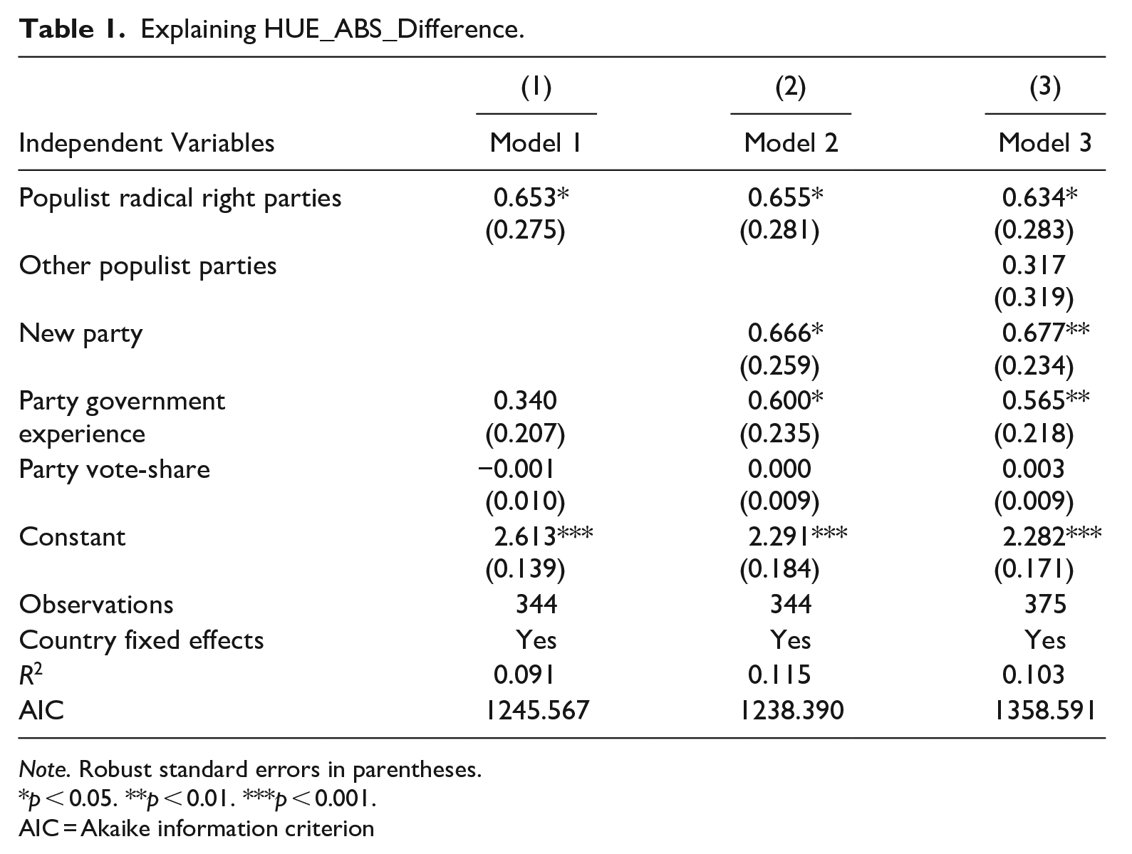
Note. Robust standard errors in parentheses.
p < 0.05. **p < 0.01. ***p < 0.001.
AIC = Akaike information criterion
Finally, note that if we also control in the analysis for the presence of other populist parties (see Model 3), the dummy variable identifying them fails to reach a conventionally significant level from a statistical point of view, while the coefficient for PRR party remains largely unaffected by this inclusion, clearly pointing to the “specificity” of the PRR set of populist parties. This latter result still holds intact if we separate the other populist parties set according to their subtypes (such as left-wing, valence populist, and other right-wing populist parties—that is, non-PRR: see Supplemental Table B.1).
The previous analysis does not allow us, however, to understand the sign of the difference in the hue between PRR parties and the other parties in its ideological window. Is it because the hue of the former is higher (i.e., more blue) or lower (i.e., more red) with respect to the average hue of the latter parties? In this respect, Figure 1 plots, for the PRR subset of parties only, the relationship between their ideological position along the left-right dimension and the difference (rather than the absolute difference—as with HUE_ABS_Difference above) between their hue and the average hue of their ideologically proximate parties. As it clearly shows, the more a PRR party assumes a rightist position, the more the difference in the hue increases. In particular, one-point movement along the left-right ideological axis, implies an increase in the difference of the hue of 1.84 toward the blue-pole. 8
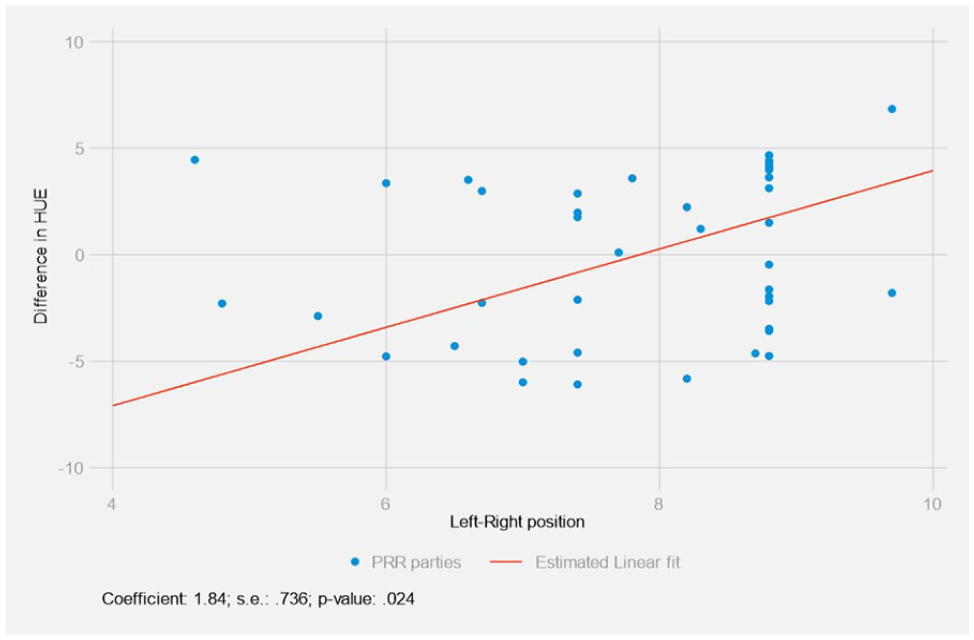
The relationship between ideological position of populist radical right parties along the left-right dimension and the difference between their hue and the average hue of their ideologically proximate parties.
Given that the highest values of hue are those related to the “blue” hue, our finding implies that, on average, those PRR parties closer to the rightist pole of the left-right scale are actually “bluer” than the corresponding parties in the ideological window we considered. In other words, PRR parties not only want to appear “different” than the other parties by using a different hue. Overall, they want to do that in one particular “colored” direction, that is, by using a bluer hue (i.e., the typical color of “mainstream” conservative and/or center-right parties) to demonstrate their ideological bona fides.
To make this clear, in Figure 2 we report the overall hue of the PRR parties with a strongly rightist ideological position (i.e., left-right score ≥ 8) on the left panel, and contrast it with the overall hue of the non-PRR parties within their 0.5 “ideological window” (i.e., left-right score ≥ 7.5). As can be seen, the prevalence of the blue color is larger in the first rather than in the second set of parties.
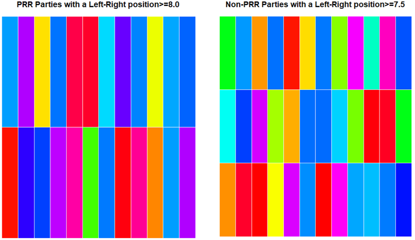
Overall hue of populist radical right parties versus non-populist radical right parties in the same “ideological window.”
Our second research question is related to a second property of the colors of a party’s logo, that is, its Saturation level. Table 2 reports the result of a set of regression models. Such results clearly replicate the ones we found with respect to hue: PRR parties present a lower level of saturation in their logos. In this case the impact is once again not only significant, but also substantial (see Model 1 of Table 2): being a PRR party decreases on average Saturation by around .17. Secondly, and coherently with Table 1, the inclusion of the other populist parties does not substantially affect the coefficient for PRR parties, while the dummy identifying this subset of populist parties fails once again to reach any statistically significant level (see Model 2 of Table 2).
Explaining Saturation.
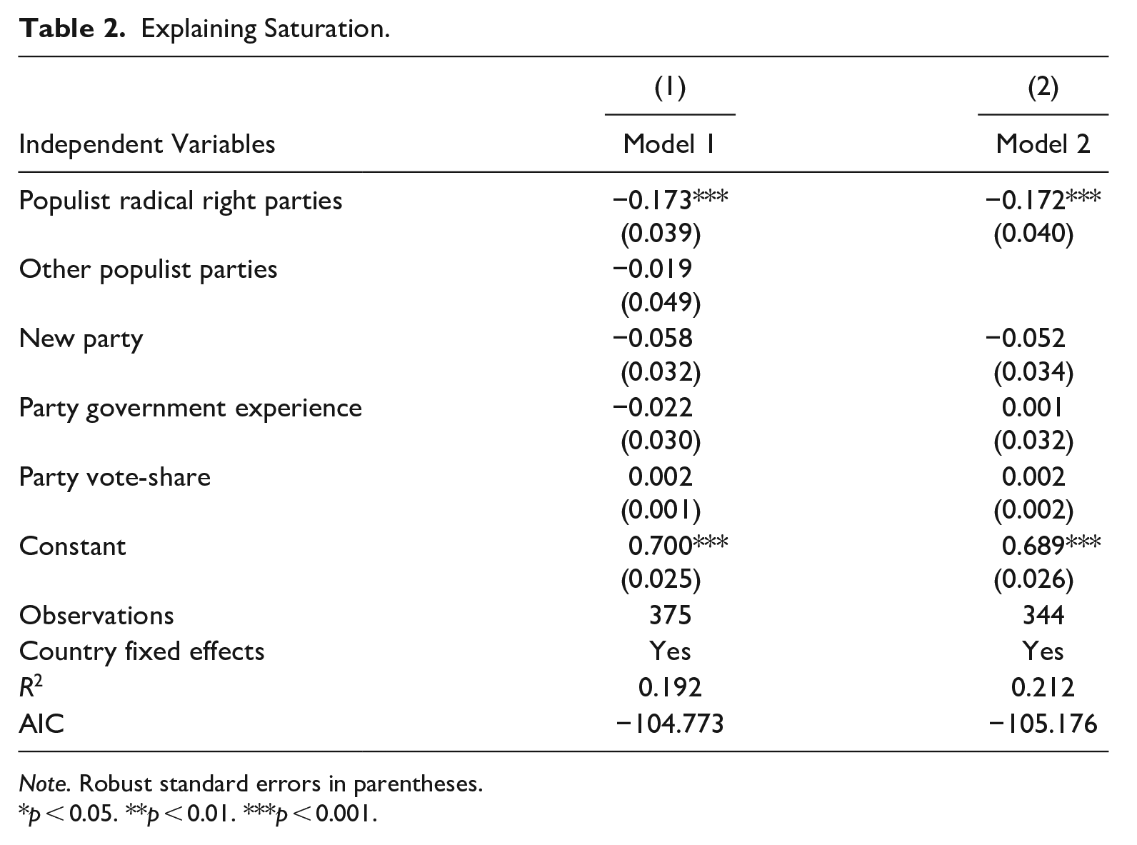
Note. Robust standard errors in parentheses.
p < 0.05. **p < 0.01. ***p < 0.001.
Figure 3 below gives a visual representation of the results reported in Table 2. In this graph the different intensity of the green colors identifies the four-quartiles of Saturation presented in our database (with cut-offs of .53, .70, .86 respectively), where a more pronounced darker green refers to a higher Saturation value compared to a lighter green. On the left panel we have reported the distribution of Saturation for the PRR parties. On the right panel we have reported the Saturation values for a random sample of non-PRR parties’ logos (given that they are much more common than PRR parties) to allow a direct comparison between the two panels of Figure 3. As clearly stands out, the Saturation value of parties’ logos appear lower in the left versus the right panel of Figure 3. 9
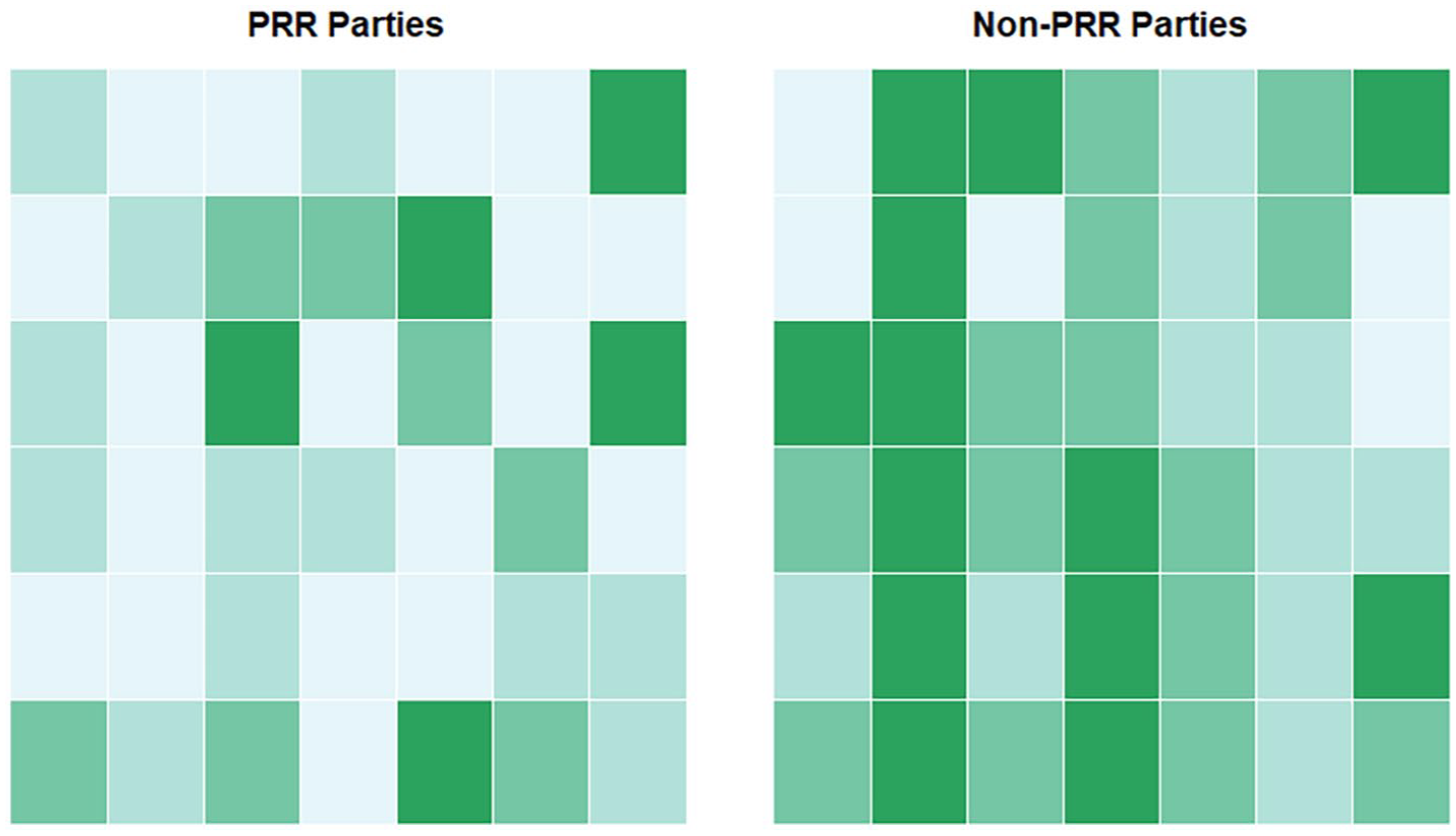
Populist radical right versus non-populist radical right parties in terms of the overall Saturation of their logos (darker green: higher Saturation).
At this point, it is useful to briefly show some real-world examples illustrating our key findings. Figures 4 and 5 show, respectively, the ten PRR party logos with the highest hue compared to the average hue of ideologically proximate parties (Figure 4); and the ten with the lowest saturation (Figure 5).
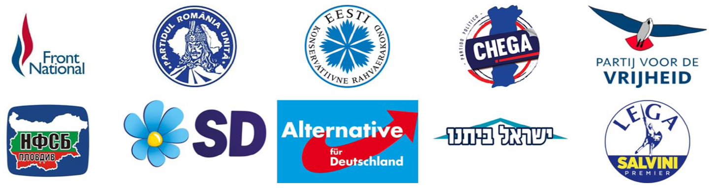
The ten populist radical right party logos with the highest hue compared to the average hue of non-populist radical right parties falling within their ideological window (decreasing order).
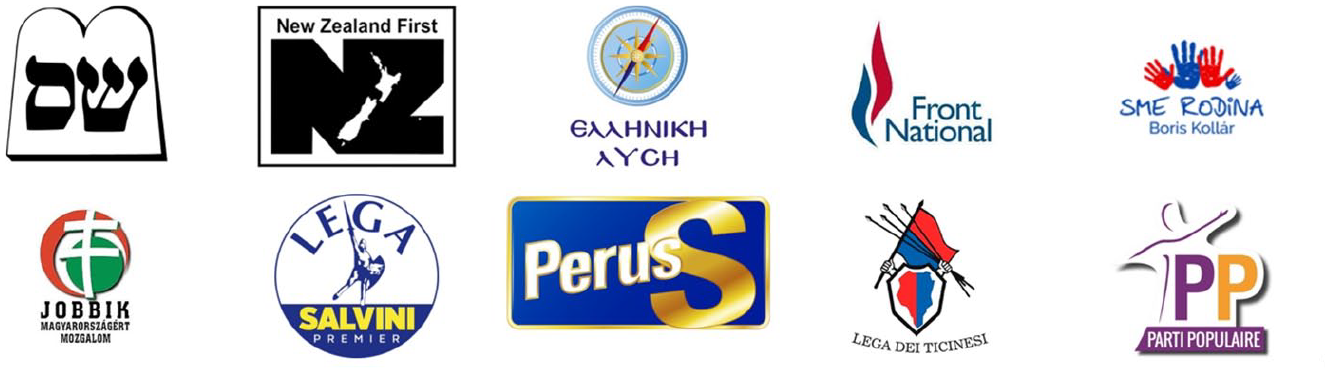
The ten populist radical right party logos with the lowest saturation (increasing order).
It is noticeable that the parties in these figures are from very different national contexts, and differ in terms of government experience, age, and level of electoral success. Most notably, Figures 4 and 5 suggests that the strategic use of hue and saturation we have described in this article are not only limited to parties that have already become “acceptable” players at the time our dataset refers to, such as the Conservative People’s Party of Estonia, the Italian League, Shas in Israel or New Zealand First, but are also used by those that were isolated in the party system and tried to (slowly) mitigate the perception of stigmatization at the public level, as suggested by prominent cases like the French Front National, the Dutch Party for Freedom, the Sweden Democrats, and the Alternative for Germany (for details on the classification, see Zulianello 2020; see also Wondreys 2023). Finally, it is worth adding that the only two parties that made into the top ten in both Figures 4 and 5 are the French Front National and the League. In both cases, the logo included in our dataset is interestingly the first new one adopted by the parties after major competitive changes. In the case of the Front National, the adoption of a stylized tricolor flame to replace the traditional tricolor flame that characterized much of its history can be seen as one of the most evident steps of the strategy of dédiabolisation that culminated in its renaming into Rassemblement National in 2018. Instead, the new League’s logo was adopted to contest the 2018 general elections, the first it contested after its transformation into a state-wide party and the abandonment of Northern regionalism.
Conclusion
PRR parties increasingly have one foot in and one foot out in party systems worldwide (Zulianello 2020). As they have gained success in many democracies, they have been forced to work out ways in which they can communicate their radical right ideological bona fides, while at the same time seeking to demonstrate that they are no longer “just” upstart challenger parties, but rather credible parties who want to be taken seriously. While there is an existing literature on how PRR parties attempt to communicate this through their policy platforms, organizational changes or their discourse (see Akkerman et al. 2016), there is a much smaller literature on the role of their visual communication (e.g., Albertazzi and Bonansinga 2023; Bast 2021; Farkas et al. 2022; Sayan-Cengiz and Tekin 2022; Szebeni and Salojärvi 2022), and, to our knowledge, nothing on the role of their use of color in this regard. This article has sought to address this.
We have undertaken the first comparative analysis of the chromatic choices of PRR parties versus other parties, specifically looking at the use of hue and saturation in their logos, across 35 democracies worldwide. We have argued that hue can offer an insight into parties’ ideological profiles, while saturation can shed light on how a party wants to position itself in terms of valence considerations such as professionalism, trustworthiness, and “seriousness.” In examining the PRR’s chromatic choices in these regards, we argue that such parties are attempting to balance maintaining their difference with also attempting to be seen as credible and “normal.”
When it comes to hue, while overall PRR parties use different hues to other parties, this was particularly pronounced in the case of PRR parties that are closer to the rightist pole of the left-right dimension, who tended to have a higher (i.e., bluer) hue than ideologically nearby parties—to our minds, communicatively stressing that they had a “purer” and more genuine ideological mooring than these other parties. The findings around saturation were more uniform: PRR parties unambiguously used lower saturation in their logos than other parties, suggesting that they are seeking to appear as professional, acceptable, and trustworthy in their visual identity (as these valence qualities are associated with low saturation in the color marketing literature). Indeed, the fact that their logos are less saturated overall than other parties suggests almost an “overcorrection” in this regard—they are not only trying to appear as professional as other parties; they are potentially trying to appear as more professional than those other parties through their chromatic choices. Finally, it is important to note that our findings only held for PRR parties, but not other populist party sub-types, suggesting something unique is occurring for the former party family in terms of its attempts at integration: this is particularly of interest given that the PRR is arguably the most successful of the populist party subtypes in actively seeking to shed its stigma and make electoral gains.
The analysis we have undertaken in this article opens several avenues for future research. First, while we have focused on political party logos in this article, the methods we have used for measuring hue and saturation could be applied to any number of objects of political visual communication, such as party websites, posters or social network pages (such as Instagram profiles). It would be interesting to compare results across these forms of visual communication, and to consider how they might play different roles in terms of building a visual brand for PRR parties. For example, are colors used consistently across different visual objects—and if not, why might this be? Second, it would be useful to undertake a longitudinal analysis of the use of color in PRR parties’ logos, particularly in the context of the literature on the process of “mainstreaming” PRR parties (Akkerman et al. 2016; Ben-Shitrit et al. 2022; Brown and Mondon 2021; Brown et al. 2023): where such parties have changed logos over time, how has use of hue and saturation changed, and what might this indicate regarding their “mainstreaming”? Moreover, it would be particularly useful to measure when such changes occur: are they associated with periods in which PRR parties move (or prepare to move) into government, thus shunning their “challenger party” status (De Vries and Hobolt 2020)? In such a case, we might be able to speak of a “visual mainstreaming” of PRR party logos. Third, there is clearly more to political party logos than their hue and saturation, and there are also limits to large-N studies of the type we have undertaken here in terms of grasping the detail and contextual information that underlie PRR visual communication. As such, the work we have done here can and should be supplemented with a more in-depth qualitative study of the kinds of iconography, fonts, shapes, and symbols that are used in political party logos (see, e.g., Bible et al. 2016; Spierings 2021): this would open up a better understanding of the reasons why such parties use such logos and colors, as well as give us insight into whether there are recurring trends across PRR party logos versus other party logos. Fourth, decisions about the kinds of hue and saturation that political parties use in their visual branding do not simply come out of nowhere: professionals such as party advisors, communication specialists, and graphic designers make these choices, and interviews with these decision makers would be of great help in making sense of the reasoning behind these decisions (see, e.g., Marland and Flanagan 2013; Doerr 2017). Finally, it is worth noting that the use of color and logos is obviously not just a PRR issue: the argument we have made has ramifications for understanding how political actors more broadly use color and their logos to build a visual identity that reflects professionalism and trustworthiness, and the methods and analytical approach we have set out here can thus be applied to a wide range not only of objects as argued above, but also of subjects.
Overall, this article shows that chromatic choices matter. Colors are not just something trivial that can be ignored because political science is not comfortable or used to dealing with measuring or analyzing them. As we have shown, chromatic choices can provide insight into how a party positions itself in terms of both its ideology and valence concerns, and in the case of PRR parties, shows the way that this party family is seeking to communicate its balance between integration and maintaining difference. As PRR parties likely become more integrated in party systems worldwide over the coming years, it will be fascinating to see how these chromatic choices continue to develop, and whether such parties are showing their “true colors.”
Supplemental Material
sj-docx-1-hij-10.1177_19401612241229216 – Supplemental material for The Colors of the Populist Radical Right: The Strategic Use of Hue and Saturation in Party Logos
Supplemental material, sj-docx-1-hij-10.1177_19401612241229216 for The Colors of the Populist Radical Right: The Strategic Use of Hue and Saturation in Party Logos by Luigi Curini, Benjamin Moffitt and Mattia Zulianello in The International Journal of Press/Politics
Footnotes
Declaration of Conflicting Interests
The author(s) declared no potential conflicts of interest with respect to the research, authorship, and/or publication of this article.
Funding
The author(s) disclosed receipt of the following financial support for the research, authorship, and/or publication of this article: Benjamin Moffitt gratefully acknowledges that his research was funded by the Australian Government through the Australian Research Council’s Discovery Early Career Researcher Award funding scheme [DE190101127]. Luigi Curini and Mattia Zulianello acknowledge that their research was funded by the European Union - Next Generation EU, with the support of the Italian Ministry of University and Research under the PRIN 2022 Project “The Visual Politics of Populism” (Project code: 20222ERHBA, Principal Investigator; Mattia Zulianello).
Supplemental Material
Supplemental material for this article is available online.
Notes
Author Biographies
References
Supplementary Material
Please find the following supplemental material available below.
For Open Access articles published under a Creative Commons License, all supplemental material carries the same license as the article it is associated with.
For non-Open Access articles published, all supplemental material carries a non-exclusive license, and permission requests for re-use of supplemental material or any part of supplemental material shall be sent directly to the copyright owner as specified in the copyright notice associated with the article.