
Abstract
We demonstrate that dynamic illumination color variations can trigger surprising changes in perceptual qualities for printed imagery. We explored different types of printed stimuli, including existing illusions with color patterns, contrast phenomena, colored materials and objects, and art. Stimuli were presented under color-changing illumination, and naive observers were asked to report whether they saw any qualitative changes, and if so, of what type they were. Observers reported a wide variety of effects, ranging from glowing, deforming, wiggling, rotating, and flowing, to changes in depth or material. These results show how varying lighting color can modulate not only color appearance and contrast per se, but can also induce more general changes of object appearance in still images.
How to Cite this Article
Doerschner, K., & Pont, S. (2026). To appear in a new light: Varying illumination colors induce dynamic transformations of perceptual qualities in still images. i-Perception, 17(3), 1–16. https://doi.org/10.1177/20416695261459972
Introduction
The light in natural environments tends to be rather broadband and stable (Figure 1, left, e.g., Foster, 2021; Morimoto et al., 2022; Panorgias et al., 2012; Spitschan et al., 2016; Yu et al., 2023, 2024, 2025). Temporal changes of the illumination spectrum in natural environments occur in the range of hours (of course, there are exceptions, e.g., clouds passing), and usually happen so slowly that the change becomes imperceptible for us (Hurlbert & Yu, 2025; Pastilha & Hurlbert, 2022). Under these conditions, the human visual system has evolved. Therefore, it is unsurprising that traditionally, the perception of color and other material qualities has also been mostly studied under naturalistic, broadband and temporally stable illumination (i.e., no fast chromaticity or intensity changes; e.g., Brainard, 1998; Foster, 2011; Maloney, 1999). Under such conditions, it has been shown that the visual system discounts the effects of the illumination and exhibits, for example, color constancy, which refers to the idea that an object's surface color appearance is perceived as rather stable despite changes in the illumination and consequently the resulting changes in the spectral composition of the light reflected from the object's surface.
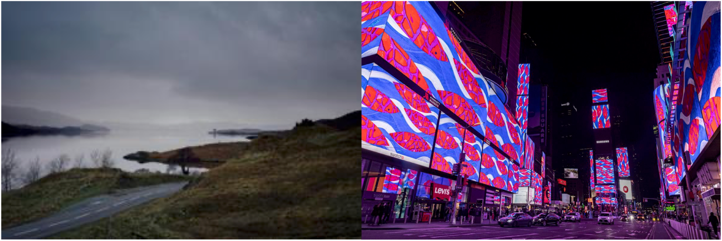
Stable natural illumination (natural landscape) versus dynamic artificial lighting (times square).
When we enter the realm of artificial lighting, there are no limits on the speed and spectral changes a given illumination could go through (see Figure 1, right). Spectral tuning has, for example, been used to specifically tune color appearance towards (or against) preferences (e.g., Cebioglu et al., 2025). It is applied widely in industry, for example, in (high-end) supermarkets, the “white” lights on meat/fish/cheese are tuned to make them look more red/blue/yellow and fresh; in fashion retail, to make white shirts look crispy white and colored ones more saturated and colorful; and in museums to render paintings’ color palettes well. When light spectra become too artificial, for example, narrowband, color constancy, and contrast preservation break down (e.g., Lucassen & Walraven, 1996), and if such narrowband illuminations also vary temporally, surprising perceptual effects, beyond an apparent surface color change, can arise.
For example, surfaces, alternately illuminated by two metameric spectra at a rate of 1 Hz, will appear to dynamically and dramatically change their color (unless they have a flat reflectance spectrum, see the “magical metamers light show” in Aston et al., 2020). We recently showed that dynamic spectral changes in narrow-band illuminations can induce a powerful rotation effect in multi-colored, printed patterns (Pont & Doerschner, 2025). This effect could, for the largest part, be explained by changes in the effective luminance contrast, being the result of the illumination spectrum multiplied by the paper reflectance spectra, weighted by human sensitivities (Pont & Doerschner, 2025).
Here we extend our investigation of dynamic illumination color-triggered perceptual changes of complex printed imagery. The temporal changes of the illumination spectrum in our experiments are much more dynamic than those occurring in natural environments. Moreover, the illumination changes in our experiment do not preserve (the signs of) luminance contrasts in the imagery. The novelty of this contribution is the finding that illumination color variations can trigger not just hue, saturation, and brightness changes in the displays but also powerful dynamic changes in perceptual qualities of the Gestalt such as form, depth, movement, and material properties.
Methods
Stimuli
Stimuli were 20 printed (on A4, InaCard 25 300g [double coated, semigloss], laser printed on a Konica Minolta C4080 with a CMYK toner) examples of colorful imagery that represented contrast, movement, shape, depth, materials, and other qualities (Figure 2). They were selected from two existing sets, one used for an installation at the Delft Highlight Festival 2024 (https://www.highlightdelft.nl/program/in2024/chromatically-controlled-hallucinations/), and one used for a demonstration at the Vision Sciences Society conference 2024 (https://www.visionsciences.org/previous-programs/).
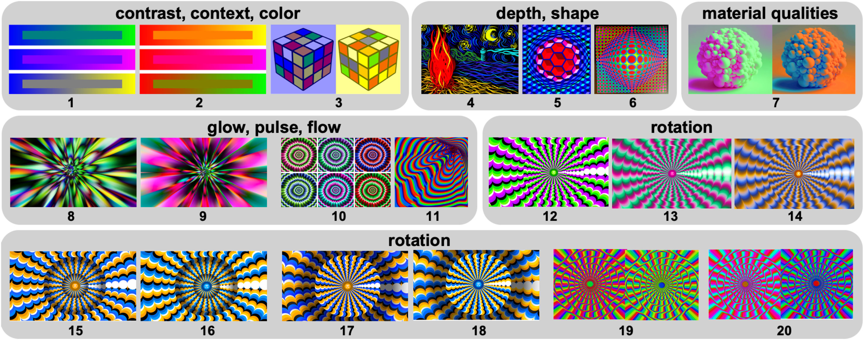
A stimuli, grouped by type of appearance change under changing illumination. 1. Simultaneous color contrast. The stripes in the center are the same color throughout (top: teal, center: purple, bottom: gray). However, we perceive them to have color gradients (e.g., top, from green to blue); 2. Simultaneous color contrast. Like 1, with different colors; 3. After Purves and Lotto (Purves, 2011), demonstrating color constancy. The central square tiles on the top surfaces of the left and right cubes have the same physical pixel values. Yet they appear quite different in color; the left appears yellow, and the right appears blue; 4. Homage to starry night (Van Gogh, 1889), created by Yuguang Zhao, TU Delft; 5. Victor Vasarely (“Chet-Pyr,” 1970/71, copyright VG Bild-Kunst); 6. Viktor Vaserely (“Vega 200,” 1968, VG Bild-Kunst. Note that the works represented by VG Bild-Kunst are excluded from release under a CC license.); 7. Bubbly shape, generated with ChatGPT4 prompt (OpenAI, 2024) and postprocessing in GIMP (The GIMP Development Team, 2019); 8–10. Concentric structures; 11. Op-Art pattern ID 94442160, downloaded from dreamstime.com, postprocessing in GIMP; 12–18. Variants of the rotating snake stimulus (Kitaoka, 2003; Kitaoka & Ashida, 2003) created by author SP; 19. and 20. Chromatic versions of the concentric circle illusion (e.g., Orbison, 1939). See text for detailed descriptions of the effects under color changes.
Designs were developed by us through several rounds of trial and error to maximize visual effects, with basic inspiration from existing illusions and intuitions about basic perceptual mechanisms (e.g., related to material, shape, and depth perception) and how illumination-induced dynamic changes in contrast will affect the appearance—especially contrast reversals within images. Some designs were chosen to demonstrate effects of simple color contrasts under dynamically changing light (Stimuli 1–3). Other designs started out as variations of contrast-induced motion effects (e.g., as in Pont & Doerschner, 2025 Stimuli 8–20). Each author developed her own “recipe” for creating color gradients that yielded different flow and morph patterns under illumination change. For example, one author modified Op-Art patterns (Stimuli 11, 19, 20). Building some intuition about the interactions of printed color contrasts and dynamically changing illumination, we started to explore other types of stimuli, for example, shape from shading patterns, as those in the works of Victor Vasarely (Stimuli 5–6), or as in the bubbly shape that we created using AI tools (Stimulus 7). The final selection of stimuli to include in this study was made by the two authors on the basis of how strong the appearance changes under illumination change (also using the feedback at the installations in Delft and at VSS), with the aim of yielding a large range of types of effects. A common factor in all designs is the use of highly saturated colors covering a wide range in the hue circle, which, in combination with RGB lighting variations, result in large changes and frequent reversals in the effective contrast.
The prints were mounted on a white wall in a dark, windowless hallway in which only very little daylight entered, and were illuminated by two 60 W RGB LEDs (Ouside, see Figure 3 for LED spectra and illuminance ranges), each set to crossfade between red, green, and blue channels at a speed of 5 s per color. Crossfading essentially reduces a given LED RGB channel intensity to near zero, and then ramps up to the max intensity of the next channel. In practice, the two lamps rapidly de-synchronized after onset, and their contribution of light to each stimulus also varied with their position on the wall, in part going through mixing colors like yellow, magenta, cyan, etc. As a consequence, the illumination of the stimuli was effectively an arbitrary weighted mixture of the separate spectra and was also continuously varying. This lighting configuration was similar to that used at the two installations (Delft, VSS), which had proven most effective for demonstrating the various visual effects described below.
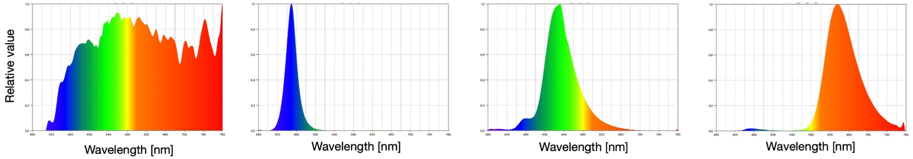
Measured LED RGB Spectra. Illuminance (relative value) as a function of wavelength (nm). Illuminance values measured at the wall were 1.8 lux (LED off, daylight), 43–661 lux (blue LED), 401–6080 lux (green LED), 78–1130 lux (red LED). The higher values of the LED illuminance values indicate their values for measurements at the print positions closest to the lamps, the lower values at the prints furthest away from the lamps. Measurements were done with a spectral illuminance meter (Sekonic C-7000 spectrometer). Please note that in the experiment, the actual lighting on the prints was a mixture of daylight and two de-synchronized color-varying lamps, so arbitrary weighted mixtures of the basic spectra.
A Simple Model of Illumination-Induced Appearance Changes
In previous work, we have developed a simple quantitative model describing effects of contrast-based motion effects in printed stimuli under dynamically changing light (Pont & Doerschner, 2025). The model uses a very coarse-grained spectral approach, assuming perfect separation between red, green, and blue spectra (which is reasonable for current RGB LEDs, see Figure 3), and that cyan, magenta, and yellow are simple superpositions of red, green, and blue so following a simple additive light scheme with C = G + B, M = R + B, Y = G + B, see Figure 4A. We also assume such spectral separation and saturation for RGBCMY print colors (and have designed our stimuli accordingly), so that relative values of the “course-grained spectra” for both lighting and prints can be simplified describing the energy in “spectral coordinates” R (0,0,1), G (0,1,0), B (1,0,0), C (1,1,0), M (1,0,1), Y (0,0,1). The effective, reflected energy's spectral coordinates were then determined by a binary filtering operation of print and light spectral coordinates (see Figure 4A) where we further assumed the luminance to be weighted as L = 0.3R + 0.6G + 0.1B (Figure 4D and F). The effective relative contrast between color pairs in the rotation stimuli was computed as

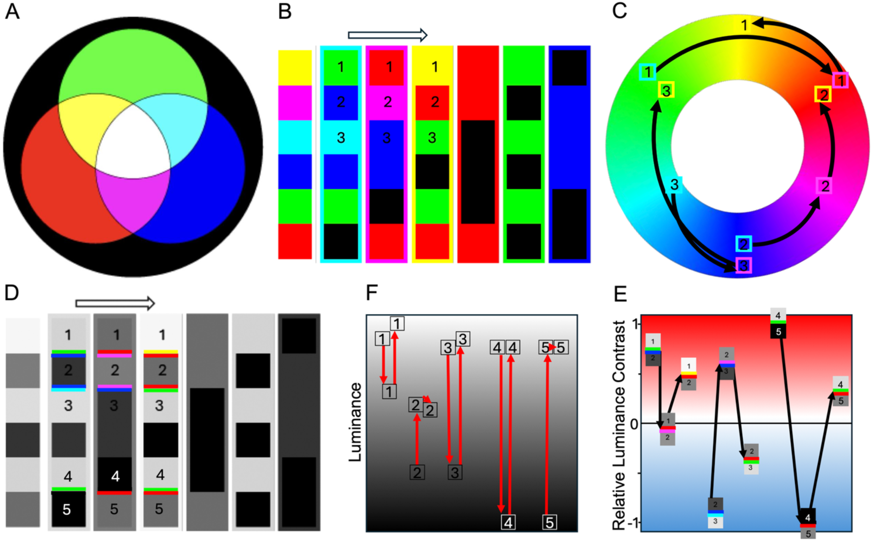
A simple additive light scheme and its effects. A. Illustrates additive light mixing of red, green, and blue beams. B. The left-most column shows a color swatch of RGBCMY print colors. The remaining columns show simulations of those swatches under CMYRGB lights, sequentially. The arrow shows the direction of illumination change, for example, from cyan to magenta to yellow. Also see https://zenodo.org/records/18743342 for analogous computer-rendered simulations for the stimuli used in this study. C. “Hue walk”: Illustrates the non-linear changes in hue produced by illumination color changes (from cyan to magenta to yellow) for patches 1, 2, and 3. Depending on the initial reflectance of the surface patch, we see leaps around the hue circle in different directions and for different amounts. This, along with non-linear luminance contrast changes, is likely the basis of the complex appearance changes observed in this study. D. Shows the luminance-converted version of the simulated patches in B. Colored borders are added to remind the reader of the actual color appearance. F. “Luminance walk”: Illustrates the non-linear changes in luminance across patches 1, 2, 3, 4, and 5 produced by illumination color changes. E. “Contrast walk”: Illustrates the complex changes and reversals of luminance contrast across pairs of patches, for example, patches 1-2, 2-3, and 4-5. Relative luminance contrast was computed according to the model in Pont and Doerschner (2025, please refer to their Table 2). Colored borders are added to remind the reader of the actual color appearance of both patches.
When switching the light from one color to another, this effective contrast might change, see for instance, the contrast reversal for the red-green color pair under cyan and under magenta light in Figure 4B, D, and E. We found that data agreed well with the predictions of this model, with decreasing (increasing) contrast predicting anti-clockwise (clockwise) rotations and larger effective contrast changes causing more powerful rotations (Pont & Doerschner, 2025).
Appearance Changes Noticed by the Authors
We next briefly describe the types of appearance changes that we noticed to be brought on by transitions in illumination color. The underlying basis of these phenomena is that the reflectance spectra of the different ink hues in each print lead to a multitude of simultaneous color and contrast changes when they are illuminated by different-colored lights. The changes dynamically modulate the overall appearance of the depicted objects. In Figure 5, we provide some snapshots of how dramatically stimuli might change with the spectral properties of a simulated single illumination; however, to experience the whole gamut of effects—including rotations, glowing, shape changes, etc.—one has to view them under dynamically changing lights, either in a video (see Supplemental Materials and https://zenodo.org/records/18743342) or in a real demo.

Simulation of stimuli 1, 3, 4, 5, 7, 9, 18, 20 under mixed lights (combinations GB, RB, RG, in other words C, M, Y, plus 5% white). These images serve to illustrate that the color and contrast effects are strong. Note that the above-described illusory effects can only be observed if dynamics are added, for example, by cross-fading the images, in videos (see Supplemental Materials for demo videos that were taken in the lab under a RGB LED building lamp using a fading mode), or by using prints and dynamic LED lighting (which can also be simulated with a bright computer screen and cross-fading color slides).
Changes in Contrast, Context, and Color
The perceived color of a surface is, of course, not just the direct result of a localized physical light-surface interaction (and the corresponding activation of retinal photoreceptors) but also depends on the spatio-temporal context in which it is viewed. Stimuli 1 and 2 in Figure 2 are displays of simultaneous color contrast. The stripes in the center of each configuration are of constant physical reflectances throughout (having the color of the center of the gradient around it). However, we perceive them to have color gradients, with the color changing from left to right. Illuminated by a cyan light, the center stripe in the middle of stimulus 2 appears to blend with its immediate surrounding, and the top and bottom center stripes have a similar appearance. When the light changes, for example, from cyan to magenta, the same center stripe in stimulus 2 is now clearly distinguishable from its surroundings, and top and bottom center stripes now look different. In general, the strength of the simultaneous contrast of the center stripe with its surroundings varies with the illumination spectrum.
Stimulus 3 has been created after Purves and Lotto (Purves, 2011). The central square tile on the top of the left cube has the same physical pixel values as the central square top tile on the right cube. The color appearance of the (actually grey) center tile is determined by the respective chromatic context, that is, the tiles surrounding it. Since this context is different for each tile, their color appearance is quite different: the left appears yellow, and the right appears blue. Depending on the illumination color, the apparent difference between the two patches dynamically increases or decreases.
Changes in Depth and Shape
Stimulus 4 was inspired by van Gogh and created by Yuguang Zhao, a member of the perceptual intelligence lab at the TU Delft, Netherlands. It contains pictorial elements of quite primary colors on a black background. Depending on the color of the illumination, different elements in the image become visible or change contrast. As a consequence, objects appear to recede from the foreground to the back, for example, those whose contrast decreases with respect to the background, or, conversely, emerge from the background as their apparent brightness increases. The pictorial depth perception is therefore modulated by illumination color.
Stimuli 5 and 6 are artworks by Victor Vasarely (1906–1997), depicting abstract geometries composed of numerous different-colored elements. The complex, colorful, and engaging patterns convey complex three-dimensional structures at different scales, for example, small cube-like shapes that together form a large convex shape. As the illumination varies, each colored element will be affected differentially, changing appearance and contrast. As a result, the perceived structure of the shape changes at multiple scales simultaneously, sometimes even alternating between convexity and concavity.
Changes in Material Properties
Stimulus 7 was created by author KD and depicts a bumpy sphere. The original image was AI-generated as a matte bumpy sphere illuminated with colored light from the right and a colored ambient light of a different color. Next, the color channels in the image were modulated in GIMP (The GIMP Development Team, 2019), to produce two different versions of the stimulus, one approximately appearing to be illuminated by a magenta diffuse ambient light and directed greenish lighting from the right (left panel), and one appearing to be illuminated by a blue diffuse ambient light and an orange directed light from the right (right panel). The depicted objects seem to change material qualities (e.g., from matte to silky or pearlescent) when the illumination changes color and, at some instances, seem to glow.
Changes in Glow, Pulse, Flow
Stimuli 8, 9, 10 were created by author SP, and depict abstract radial patterns with multiple colors that, overall, show hue variations from their centers to the edge. The patterns were inspired by pulsating illusions, and the pulsating effect was even present under regular (i.e., stable) illumination. Under color-varying illumination, however, individual colors change contrast dramatically, even appearing to glow for a moment, which leads to a strong boosting of the pulsating pattern. This boosting effect is different for each of the six sub-images in stimulus 10.
Stimulus 11 was made by author KD. Starting with a freely available black-and-white Op-art image, several colored versions of the art were superimposed and shifted to create colorful gradients. Individual parts of the pattern were cut out, the color gradients for these parts inverted (with respect to the rest of the pattern), and blended in on the edges, to compose the stimulus. The resulting still image looks like an abstract flowy shape, and under color-varying illumination seems to flow, in part in opposing directions.
Rotations
Stimuli 12–20 appear to rotate under changing illuminations. This effect is mainly due to changes in effective contrast of the illuminated color patches (Pont & Doerschner, 2025). Stimuli 12–18 were created by author SP inspired by Kitaoka's snake illusion (Kitaoka, 2003), with rings modulated by color order (all), blur (13, 14), and shading (15–18). Stimuli 19–20 were made by author KD starting with a black-and-white pattern (concentric circle illusion) and subsequently shifting copies of different color versions of the pattern in GIMP to create the colored gradients.
Participants, Apparatus, Procedure, and Analysis
The study was conducted in accordance with ethical standards put forward in the Declaration of Helsinki. Twenty-two volunteer participants gave consent to participate. They provided descriptions of their perceptions as part of an open-house tour and demo at Giessen University. Participants looked at the prints from an approximate distance of 1.5 m, and were asked to note down whether they saw any qualitative changes in the appearance (per image, YES/NO response), and if so, write up a few keywords, for example, moving, rotating, deforming, that described the change and leave any other comments they might have on a prepared sheet (see Appendix A). They could take as much time as they needed to write their answers. We analyzed the percentage that said yes (“I saw a qualitative change”) as well as the frequency of words occurring in the participants’ descriptions—across all stimuli.
Results
First, we checked whether illumination color changes triggered any qualitative change in the images at all. Figure 6 shows that, on average, participants perceived changes in the images 93.6% of the cases. The average of “yes” responses varied between 81% and 100% across stimuli.
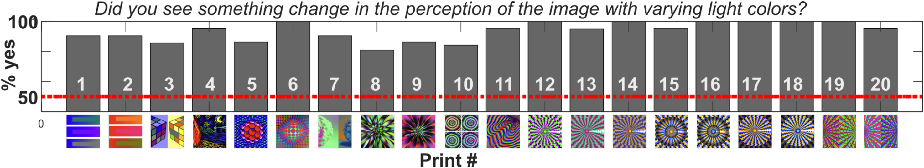
Yes/No responses—shows the % of saying “yes I perceived a change” as a function of stimulus. Red dotted line denotes the chance level. Stimulus numbers are inset in white font, and are printed as thumbnails below the corresponding bar. Also see Figure 2.
Having established that participants did observe changes in appearance, we next pre-processed the open-ended verbal responses, for example, homogenizing responses, “wiggled,” was changed to “wiggling,” or “colored” changed to “color,” and excluding words that occurred less than 10% for a given stimulus, and those that were not related to appearance changes, for example, “and,” “one,” or “circle.” We excluded the term “color,” because color changes occurred with all stimuli, as well as the words “clockwise” and “anticlockwise,” because they always co-occurred with the term “rotation.” The remaining responses were counted per stimulus (total number of responses per stimulus ranged between 19 and 34, also see Figure 7), and the three most frequent ones were plotted as pie charts. Sometimes less than three terms survived the pre-processing (e.g., only “wiggling” for stimulus 10, or only “moving” and “rotating” for prints 12–18). In Figure 7, the color of the segment denotes the most frequently used adjective/word for describing a given stimulus. From the pie charts, it becomes apparent that the quality of appearance change differed across the stimulus set, for example, some stimuli were perceived to rotate (12–20) under illumination changes, others to glow (3, 4, 6, 7, 9), flash (6), deform (1, 2, 5), wiggle (10, 11), or change material properties (7).
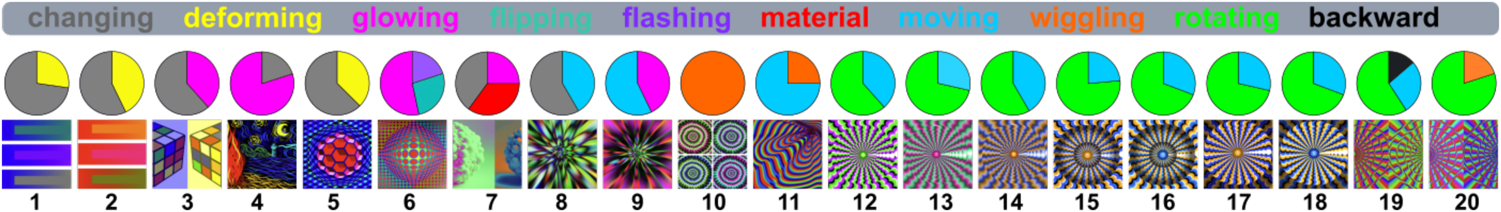
The responses remaining after cleaning up the verbal responses, counted per stimulus, and the most frequent answers are plotted here as pie charts above each stimulus. At the top, the color coding is shown. The total number of responses were 29, 25, 29, 31, 33, 25, 34, 27, 22, 22, 29, 23, 24, 20, 27, 21, 22, 19, 29, 31 for stimulus 1–20, respectively.
We also created word clouds to more comprehensively illustrate the qualitative changes associated with illumination color changes. No words or phrases were excluded. Preprocessing included homogenizing responses and splitting up action and direction words, for example, “rotating clockwise” into “rotating” and “clockwise.” A subset of word clouds for four example stimuli are shown in Figure 8, and all word clouds can be found in Appendix B. The size of a word corresponds to its frequency of occurrence; the coloring of action words corresponds to that in Figure 7. Figure 8 illustrates that color-varying illumination triggered a wide variety of qualitative changes in the perception of the images, including changes in material, shape deformations, depth “flips,” wiggling or forward motion.
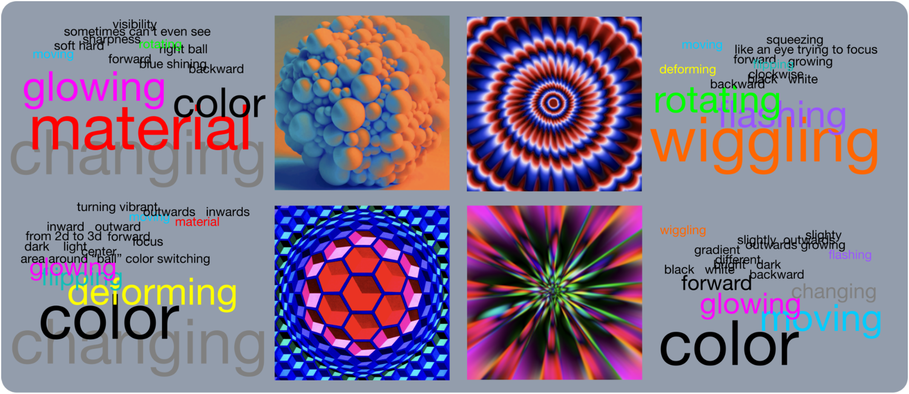
Subset of wordclouds with qualitatively different effects under color-varying illumination. The colors of the words follow the same scheme as in Figure 7.
Discussion
We showed that color-varying illumination can induce a range of visual phenomena and dynamic changes in object appearance—beyond color. The printed stimuli appeared to rotate, wiggle, and pulse, or change visual qualities like material and form. Possible explanations of these effects start, of course, with the modulation of the effective contrast patterns in each stimulus by changing the spectral properties of the illumination. The stimuli were carefully selected/designed to contain cues for depth/shape/material perception, or to have a chromatic-spatial pattern (gradients) that already, as a still image, would trigger some illusory movement. However, the effects reported here are not observable under stable illumination conditions. Current RGB LEDs are rather narrow-band, and these new technologies can trigger large spectral shifts as they change color. Moreover, when two such LEDs are changing color with a temporal delay, combinations of hues can occur that are quite far apart in hue space. As a consequence, as printed imagery is illuminated by such color-varying LEDs, the effective luminance and color contrasts in our stimuli may change non-linearly, even showing many contrast reversals and re-orderings (see Figure 4A–F for an illustration). This caused quite dramatic changes in our stimuli, as shown by the results, creating an extra layer of dynamically changing qualities to the viewing experience of still images.
Experimental paradigms in perception research often involve comparing the perceived color of a (depicted) surface, shape, or material under stable illumination A versus stable illumination B. However, comparing two static states of the same object seems to be of a different nature than witnessing objects change under dynamically varying illumination. Here the visual object morphs into a different state, which some observers experience as “trippy,” “hallucinatory,” or “illusory.” The temporo-spectral properties of the illumination in our study were obviously non-ecological and quite intensive, but we believe that experiments like these can teach a lot about general perceptual mechanisms subserving motion, material, and shape perception—besides being fun.
The perceptual experiences that were triggered by our stimuli must concern a wide diversity of underlying mechanisms, for example:
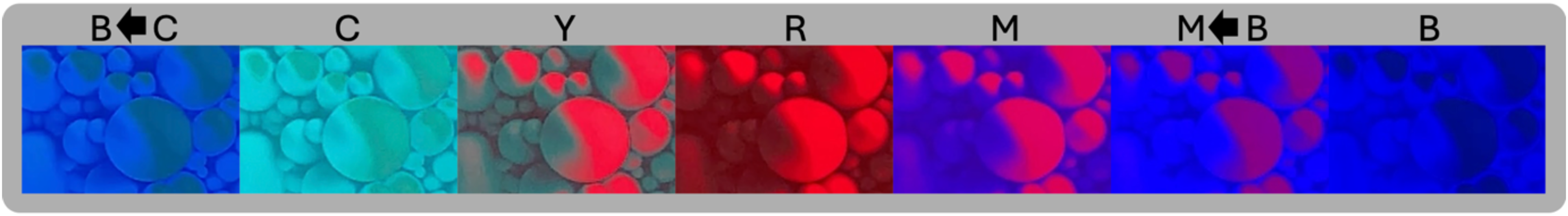
Illustration of the differences in shading patterns under color-varying illumination. Shown is a cropped region of stimulus 7 (right) under different illumination colors; lettering stands for illumination color, for example, R: red, C: cyan etc. An arrow denotes that the light was transitioning between two illumination colors, for example, between cyan and blue, or between blue and magenta. The luminance flow patterns change dramatically and even reverse (e.g., under red and blue light). Along with this, the perceived material properties also tend to be perceived as dynamically changing.
In previous work, we developed a quantitative model using a coarse spectral RGB approach that takes into account RGB reflectance, illumination, luminance sensitivity, and contrast to explain contrast-based 2D rotation effects of printed patterns under illumination changes (Pont and Doerschner, 2025, see a brief description of the model above). This approach might also partly explain the phenomena described here, that is, the part that depends on directional reversals of the effective luminance contrast: the rotating stimuli (depend on the directions of the effective contrast of the color pair elements in them), the simultaneous contrast stimuli (depend on the effective gradients and contrasts), but also the ones showing material, shape and depth perceptions that are related to shad(ow)ing and luminosity, which depend on spatial gradients and luminance flow patterns, which deform and sometimes reverse (e.g., Figure 9). In addition, the colors and color contrast most probably drive a variety of additional mechanisms, for example, chromostereopsis, illusory effects coupled to lighting cognitions, and dynamic changes per se, for example, as in the perception of glow (Harvey et al., 2019).
We used 2D printed patterns in this study; however, varying the illumination in a 3D scene would have different effects in many regards. The effects of color-varying illumination on natural 3D scenes or objects with complex shapes and combined materials, however, are complicated and far from linear, due to effects of reflections, interreflections, scattering, vignetting, and so forth—even if one uses a coarse spectral RGB approach. Clear demonstrations of such differences have been provided, for instance, in the realm of computer graphics (Dam et al., 2010), showing the difference between a scene rendered with and without interreflections, and in perception, for example, by Gilchrist showing the (noticeable) difference between a red room illuminated by white light and a white room illuminated by red light (Gilchrist & Ramachandran, 1992). Given this complexity, it is not clear whether the visual phenomena observed here will be as dramatic for 3D scenes and objects. Some evidence suggests that despite (or due to) optical interactions in 3D scenes, visual perception of object properties, such as color, may be more robust than in 2D (Hedrich et al., 2009).
To conclude, we found dramatic effects of color-changing illumination on the perceived properties of depicted imagery, that is, not just perceived color changes (like in “conventional” spectral tuning), but also qualitative dynamic changes in shape, depth, material, or movement. Future work should investigate how form, speed, and color variations of the illumination ramps modulate the changes we observed in this study.
Supplemental Material
Supplemental Material
Supplemental Material
Footnotes
Acknowledgments
We thank Yuguang Zhao for creating stimulus 4.
Ethical Approval and Informed Consent
The study was conducted in accordance with ethical standards put forward in the Declaration of Helsinki. Twenty-two volunteer participants gave consent to participate.
Author Contribution(s)
Funding
The authors disclosed receipt of the following financial support for the research, authorship, and/or publication of this article: This work was supported by the Deutsche Forschungsgemeinschaft (DFG, German Research Foundation)—project number 222641018—SFB/TRR 135, Project B8 (KD) and by the Hessisches Ministerium für Wissenschaft und Kunst (HMWK; project “The Adaptive Mind”) (KD), by the Excellencecluster EXC3066, and by the HORIZON 2020 framework MSCA doctoral network “Perception of materials, objects and spaces through active EXPLORAtion,” EXPLORA (101229608).
Declaration of Conflicting Interests
The authors declared no potential conflicts of interest with respect to the research, authorship, and/or publication of this article.
Data Availability Statement
Data underlying the results presented in this paper are not publicly available at this time but may be obtained from the authors upon reasonable request.
Any Other Identifying Information That Might Compromise Anonymity
Because it is highly relevant, we refer to very recent related work (Pont & Doerschner, 2025) in this manuscript, which might compromise anonymity.
Supplemental Material
Supplemental material for this article is available online.
Appendix A: Answering sheet
Appendix B: Word clouds for all stimuli
References
Supplementary Material
Please find the following supplemental material available below.
For Open Access articles published under a Creative Commons License, all supplemental material carries the same license as the article it is associated with.
For non-Open Access articles published, all supplemental material carries a non-exclusive license, and permission requests for re-use of supplemental material or any part of supplemental material shall be sent directly to the copyright owner as specified in the copyright notice associated with the article.