
Abstract
While a wide range of software applications allow users to manipulate time-based data, or time series, they all work with user interfaces designed with specific affordances related to time. This article investigates how interfaces help users capture, manipulate, and understand time series data. By exploring how user interface elements of time-based software applications address seven User Time Needs, the authors propose a set of nine different interface design patterns called timeline navigators that generalize across applications. While existing research evaluates specific time-based interface elements, the authors have not seen a framework for considering time-based interface elements and users’ corresponding underlying needs more generally across software domains. The analysis provided is intended to help designers become aware of the major practices and conventions found in timeline navigators as well as the user needs that they support.
Introduction
A wide range of audiences use software involving time. When a child streams a movie, a commuter checks how soon the bus is coming, or a stockbroker examines data over time, they all work with user interfaces designed with specific affordances related to managing time-based data, or time series. This article investigates how interfaces help users capture, manipulate, and understand time-based data, with the research question of whether a common pattern language can be created that describes generalizable concepts in users’ mental models of time as well as the common practices of time-based interfaces across domains.
In particular, this research attempts to categorize users’ needs regarding time and then explores the specific user interface elements of seven time-based software applications. Based on commonalities among their affordances, the authors describe a set of nine different interface design patterns called
Concepts of Time and Previous Work
The Greek philosopher Aristotle described the basics of time (Aristotle, 2000), that is, concepts of before, now, and after, and ideas of the time flowing by vs. motion through time which much later were labeled by Clark (1973) as “moving time” and “moving ego” (or “moving observer” per Lakoff and Johnson (1999). Bull (1960) and Traugott (1978) further classified human usage of word “time” into four categories: the physics time that flows by or through which we flow, the time we perceive (impatiently or patiently), the time as marked by calendars and other measuring devices, and linguistic reference points to time (then, now, before yesterday, etc.). Clark (1973) added old vs. young and old vs. new to the linguistic reference points.
Bull (1960) also elaborated on the logistics of handling time-based events. He noted that when considering sequence, or ordering of events, events can happen end-to-end (e.g., spring followed by summer) or with intervals between them (e.g., clicks of a metronome). He also noted that humans tend to categorize events by intervals or durations, such as, “What happened today?” or “What happened last summer?” Finally, he stressed the importance of simultaneity, or synchronization, when two events happen at the same time. This concept is related to keeping time with music.
These concepts guided the authors’ formulation of the user needs in Table 1, phrased as foundational questions that a user might want to answer about time series data. UI components in software involving time should ideally feature affordances that enable users to answer these questions.
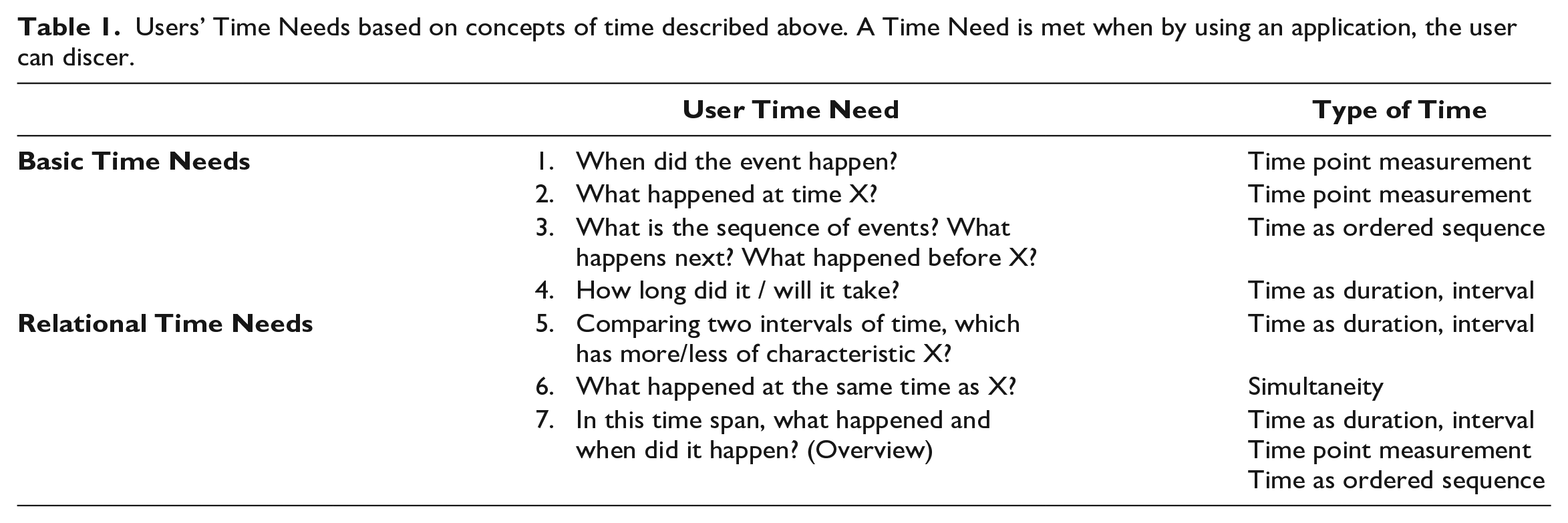
Users’ Time Needs based on concepts of time described above. A Time Need is met when by using an application, the user can discer.
While there has been extensive research in the linguistics community on words related to time and time metaphors, for example Boroditsky (2001) exploring whether users conceptualize time as flowing horizontally (English) vs. vertically (Mandarin), and Jackoff and Johnson describing time as spatial, as a substance that flows, as a resource, and as money, there have been fewer publications about time focusing on UI design.
Human factors research related to time has focused largely on four areas: users’ wait time while using software, the usability of time series data visualizations, long-term user experience analysis, and natural language processing of texts involving time for the purpose of text mining. Waiting for technology, related to Time Need 4 (How long will it take?), has been characterized as System Response Time (SRT), along with the subjective experience of that time (SXT). Liikkanen & Gomez (2013) offer six guidelines for system design to minimize SXT. Conn (1995) characterized the UI elements that offer information about system wait time, duration, and progress as “time affordances,” a close cousin of the timeline navigators described in this paper.
The topic of how to best visualize time series data and support visual analytics has led to hundreds of research papers, e.g., comparisons of linear vs. round visualizations (Brehmer et al., 2019), how to best support interaction with these time series visualizations (Adnan et al., 2016), and how to present multiple “zoom levels” simultaneously (e.g., a duration of 5 minutes and a duration of 3 days) (Javed & Elmqvist, 2010). These efforts focus largely on Time Needs 5 and 7, e.g., “Which of these two years had the hotter summer?” (5) and “In 1968, what hit songs appeared in the UK, when did they appear, and how long did each last?” (7).
A third area of time-related research is long-term user experience. Rather than the momentary usability of a “walk up and use” system (Bennett, 1986), long-term user experience focuses on how users’ experience with a system changes over time. While this field does not explicitly explore users’ interactions with time-based user interfaces, many of its different methodologies gather users’ behaviors and feelings over time, frequently requiring users to use time concepts as they reflect on their system usage. For example, the UX Curve method (Kujala et al., 2011) asks users to draw their experiences on graph over time, sequencing various events along it. Diary studies, used as early as the 1950s in sociology but adopted in HCI in more recent decades (e.g., Brown et al., 2000), ask users to document behaviors using a calendar. These efforts focus mostly on Time Needs 2, 3, and 7, e.g., “What happened today?” (2), “Tell me about each time you used the system yesterday” (3), and “What happened as you used it over the past month?” (7).
A fourth area of research related to time addresses the challenge of making computational sense of time-based language, e.g., creating software that could analyze a news story and create an accurate table of the sequence of events that occurred. Computer science text mining researchers meet annually at the TIME International Symposium on Temporal Representation and Reasoning and have produced software such as TimeML (Pustejovsky et al., 2003) and SUTime (Chang & Manning, 2012), markup languages for temporal language. Their work usually focuses on Time Needs 1, 2, and 3, trying to establish events of a body of text, when those events happened, and in what sequence.
Finally, there is additional research on time in the broader human factors context focused on the way users perceive and experience time, and how those perceptions might be affected by technology, e.g., Pschetz’s suggestion that we consider multiple temporalities (2015). Also, there are cross-cultural considerations. Taylor et al.’s discussion of the “right” time being at times situational (2017), based on system co-design with an Australian Aboriginal community, points to a need for a broader analysis of users’ time needs than the seven needs described above.
While each of the above research areas focuses on time, the present research attempts to address the question of whether there is a generalizable mapping between the Time Needs and corresponding UI elements that address them, interface idioms per Tidwell (2010), or even a pattern language (Alexander et al., 1977; Borchers, 2008) that could be used by software designers.
Methods
Because the goal of this research is to explore whether features of time-based user interfaces can be generalized with an appropriate level of abstraction to form a pattern language, the research method is exploratory (Corbin & Strauss, 2015), using observations of existing software in the world.
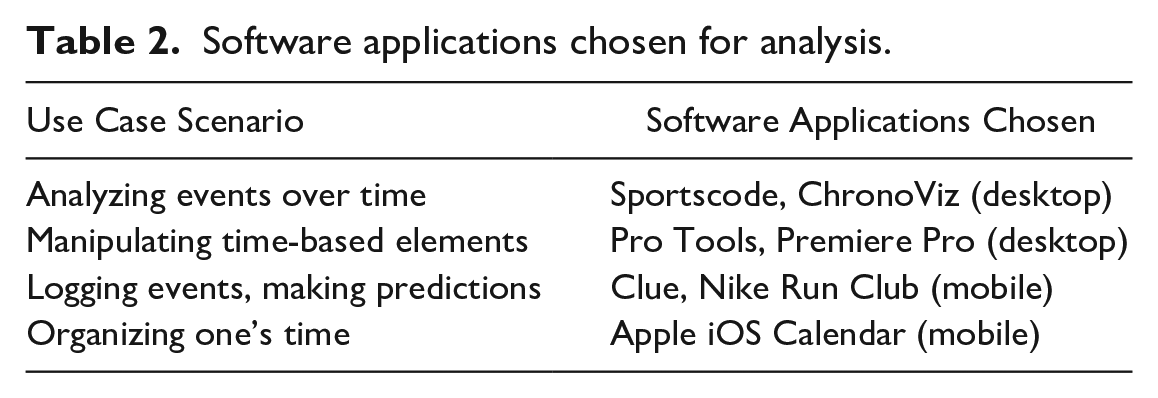
Specifically, the authors examined seven time-based software applications (Table 2), chosen to span the range of the seven Time Needs and to address each of four use case scenarios specified in Table 2. Because of the growing trend in personal data logging (Rapp & Cena, 2016), mobile apps were chosen for the third and fourth scenarios. looking for user interface features that may or may not have a common visual appearance or similar set of buttons (surface level of analysis) but that fulfilled a common user goal by affording the user analogous actions across domains.
Software applications chosen for analysis.
Results
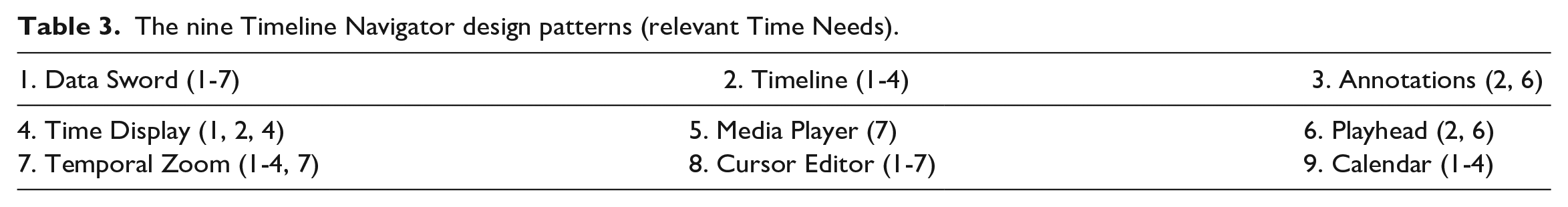
The software applications and their online documen-tation were analyzed with two overall questions in mind: 1) Are there commonalities between the time-related UI components included in each application? and 2) How do each of these applications address the seven Time Needs? Results from this analysis yielded nine different time-based user interface components shared across the applications, aka the timeline navigator design patterns (Table 3). The authors describe each timeline navigator briefly below. Additional details and examples for some patterns can be found in author Rubio’s master’s thesis (2014).
The nine Timeline Navigator design patterns (relevant Time Needs).
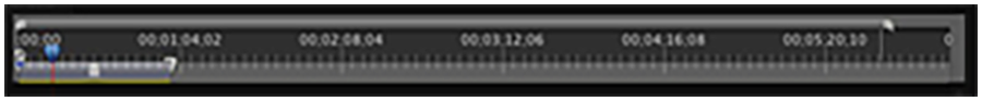
Data Sword
This pattern is the most essential tool in affording interactions with the time-series data. The data sword often appears as a horizontal timeline, with a “handle” attached to the time-series data that characterizes the data sword. The handle is often a heading or button group which can be used to manipulate the data sword’s particular time-series data source. The data sword allows users to adjust the temporal positioning of a segment of time-series data, dragging and dropping time intervals or events along the timeline. Users may also use this pattern to view annotations about intervals or events.
The data sword allows users to meet all four basic Time Needs (1-4). When multiple data swords are stacked, users can meet Need 5, comparing time spans, and Need 6, simultaneity. Finally, the data sword is ideal for offering an overview of a complex sequence of events, Need 7. See example in Figure 1.
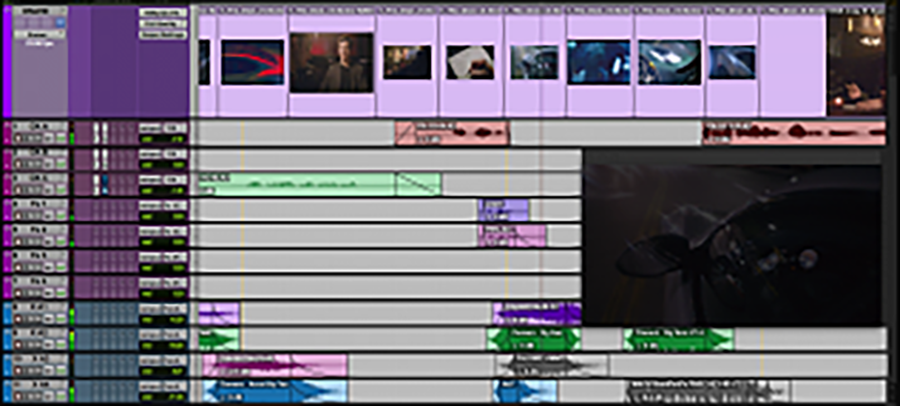
Data swords in PRO TOOLS®, an audio editing suite, used with permission of Avid Technology, Inc. © 2020.
Timeline
The timeline acts as a temporal ruler for the project in the timeline navigator. It visualizes a consistent range of time users can use to judge the position of a playhead or segments of time-series data. Use the timeline design pattern when users need a quick and efficient visualization of their data source’s time-stamp. This pattern is also effective at helping users visualize the temporal positions of other items on the interface like annotations or the playhead.
By leveraging spatial perception, the timeline allows users to immediately recognize a data set’s position in time (Need 1). In some cases, like a ruler, a timeline is precise, e.g., to a millisecond, while, in other cases, the timeline is less precise, e.g., providing resolution by week. Because the timeline can aid in marking a clear starting point, end point, and range, the timeline design pattern can enable users to judge their position and duration of events relatively (Needs 2, 3, and 4). At a macro-level of temporal resolution, users can judge the entire dataset’s relative length. At the micro-level of temporal resolution, users can focus on smaller units of time. See example in Figure 2 from Premier Pro.
Timeline in Adobe Premiere Pro, a video editing suite. Reprinted with permission from Adobe.
Annotations
Annotations come in many shapes and sizes, but they often populate the timeline and/or data swords as colored markings. These markings often signify important events within the time-series data, allowing a user to make notes that address Need 2 (What happened at time X?) and Need 6 (What happened at the same time as X?).
Annotations assist the user with working memory by making important events and their timestamps visually more memorable. Some annotation systems allow the user to enter custom content as well, assigning new tags to specific keystrokes or color codes, or leaving free response comments within an annotation. Finally, as shown below, some systems create annotations automatically on behalf of the user, to assist in data analysis. See examples in Figure 3 from Clue, a menstrual cycle tracking app and ChronoViz, an app for combining multimodel time-series data.

Annotations in Clue (left), used with permission by Clue. Annnotations in ChronoViz (right), used with permission by Fouse.

Time Display in Clue (left), used with permission by Clue, and in PRO TOOLS®, used with permission of Avid Technology, Inc. © 2020.
Time Display
The time display is typically rendered similarly to a digital clock and represents the playhead’s temporal position as a numeric value. Counts of larger time intervals typically precede counts of smaller time intervals, moving left to right. Time-values other than “now” can be displayed if the user selects other time points or items on the interface, e.g., anno-tations or specific events. In some contexts, an event with duration can be selected and the time display shows the duration. The time display enables users to know the absolute position in time of an event (Need 1), the exact current time (related to Need 2), or the duration of an event (Need 4).
Media Player
The media player is the controller interface for the playhead. The media player alters the playhead’s direction, speed, and behavior for playback purposes. Time-series data like video can be represented in static form using small multiples of different frames. Audio can be represented statically as waves. These static representations, however, do not fully represent the nature of the time-series data because they exclude the experience of the temporal dimension, which users can experience by using the media player. This real-time experience of the time-series data over time stems from Need 7, needing to grasp an overview of events within an interval.
Interactions with the media player are typically afforded as a button group, with button graphics modeled after older tape-based recording systems. One button typically toggles between a play and pause function. Depending on the context of usage, the media player may include more elaborate features. See example in Figure 5.
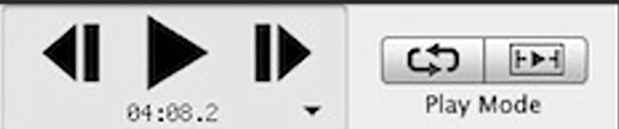
Media Player in ChronoViz, used with permission by Fouse.
Playhead
The playhead pattern marks a position in time within the time-series data during playback. It can be dragged along the timeline to different temporal positions. During playback, this timeline navigator moves according to the controls set by the media player. With single video or audio playback, e.g., in YouTube or Vimeo, the standard playhead is typically represented by a circle on the timeline, indicating that what the user is seeing or hearing currently is at the playhead’s timepoint (Need 2). However, in the software that allows analysis of multiple time series simultaneously, the basic circle is supplanted by a line extending across all the time-series data representations, yielding a solution to Need 6, discerning which events happened at the same time.
While the role of the playhead appears simple, users glean more from its dynamic behavior than might be expected. Two forms of visual motion can occur between the playhead and the timeline when the time-series data extends beyond the current view of the timeline: either the timeline remains still and the playhead moves left to right above it on screen, or, when the data continues off screen at right, the playhead remains still near the center or towards the right side of the screen while the timeline moves right to left beneath it. Just as Western vs. Eastern comic strip motion lines differ (McCloud, 1993), both approaches can work effectively; the foreground (playhead) or the background (timeline) can move. As a result, the playhead’s position offers additional cues: a playhead near the left suggests that current playback moment is near the beginning of the currently played excerpt, while a playhead near the far right indicates that playback is almost complete. The speed of the playhead’s movement gives an indication of the current level of temporal zoom relatively to the size of the project. See examples in Figure 6.

Playhead in Clue (left), used with permission by Clue and in PRO TOOLS® (right) used with permission of Avid Technology, Inc. © 2020.
Temporal Zoom
In time-series software, the temporal zoom pattern alters the temporal resolution of the time-series data presented in the application. This pattern enables users to view the entire project’s range of time data on a small space of the screen, such as hours or days, or to zoom in on minutes or seconds. This pattern typically includes two buttons (zoom in, zoom out) with a range of resolutions in between. This timeline navigator addresses the four basic time needs (Needs 1-4), enabling users to focus the timing and sequence of events, as well as Need 7, the overview of everything that has happened. See Figure 7 from Sportscode, software designed for sports analysts to explore patterns within game videos.

Temporal zoom in Sportscode. Used with permission. Source: Hudl.
Cursor Editor
The cursor editor pattern is one of the most specialized patterns included in this analysis; it depends strongly on the application of the time series software. However, several characteristics of time make the cursor editor a timeline navigator design pattern that applies across application domains. The cursor editor is a button group (often accompanied by keyboard shortcuts) that allows the user to change the function of the cursor.
The cursor, often controlled by mouse or trackpad in desktop software or controlled by the finger on a mobile app, is often used for selection of a specific time-based event (Needs 1-2) for the purposes of moving it temporally or annotating it. The cursor can also be used to select time intervals (Needs 3-7). The user’s goal for that selected interval could vary based on goal: create a new event of that duration, to designate that interval to be a new chapter, to zoom into that time interval, or to define that duration as the start and end of a loop. These very different resulting actions from selecting a time interval typically require a cursor editor or a modifier key to change the role of the cursor appropriately. See a complex example in Figure 8.
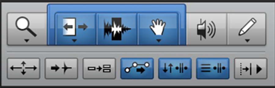
Cursor Editor in PRO TOOLS® used with permission of Avid Technology, Inc. © 2020.
Calendar
The Calendar design pattern consists of displaying a portion of the traditional Gregorian calendar within software, most often a monthly view organized in seven columns for the days of the week or simply a weekly view. Users encounter this timeline navigator many places outside of time-series software, such as making hotel or flight reservations, but within scope of applications that manage time-series data, the most common examples are calendaring applications themselves, followed perhaps by task management (aka “to-do list”) applications. This design pattern typically addresses the Time Need 1 (when did the event happen) and Need 2 (what happened at time X). In some views, such as a day or week view, it may also address Needs 3 and 4 (in what order will events occur and how long they will take).
Because most users approach a calendaring application with a strong internal mental model of the Gregorian calendar (e.g., years contain months, which contains weeks, which contain days), software applications can succeed with less explicit labelling than might be required for unfamiliar domains. See example in Figure 9.
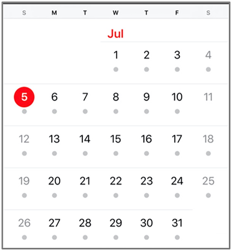
Calendar within Apple iOS Calendar. Source: Apple, Inc.
Conclusion
This research examined the way users’ Time Needs intersect with several application domains and produced nine timeline navigator design patterns that span multiple software applications. While this research by no means addresses the full richness of time within HCI, this work – grounded in the underlying concepts of time as implemented in popular user interfaces – may provide a useful vocabulary and framework for other researchers and UI designers. Future work could explore time UI components in other further software applications to further validate these patterns. Ideally, the usage of these timeline navigator design patterns as standards would make both desktop and mobile applications that handle time-series data easier to “walk up and use” (Bennett, 1986) with increased long-term usability as well for experienced professionals.