






Abstract
In the Single Usability Metric benchmarking method, the calculation of completion rates creates a bias for completion rates by ignoring the z-score transform that is conducted for satisfaction and time-on-task measures. This artificially inflates all ‘good’ scores and marks some ‘poor’ scores as ‘good’. This paper discusses two methods to augment the SUM so that it will accurately calculate completion rates into the final SUM score.
Usability benchmarking is a methodology that allows researchers to measure the quality of a product or design (Sauro, 2018). This has grown in popularity over the past decades and emerged as a critical area of concern in the field of user experience (Barnum, 2010).
This method can be done retrospectively (typically via surveys) or behaviorally (by viewing how users actually perform in a task). The single usability metric (SUM) has emerged as a common choice to tackle usability benchmarking, as it combines both retrospective and behavioral information (Sauro & Kindlund, 2005a). Further, the SUM has be been shown to be valuable in measuring design variants within a product (de Leon, et al., 2020) and across competitive products (Suaro & Kindlund, 2005c). These capabilities allow for the assessment of whether or not a product performs well or poorly on usability assessments.
The focus of this paper is how the original calculation for the SUM biases the data to be overly positive, based on the way completion rates are calculated. The bias is explored using a set of example data and R statistical programming language for reproducibility (R Core Team, 2023) (see appendix item 1).
How the Sum Works
The SUM uses time-on-task, satisfaction, error rates, and completion rates to form an overall usability measurement (Sauro & Kindlund, 2005a).
This paper focuses on an augmented version of the SUM that excludes error rates. Sauro and Kindlund note the possibility of excluding error rates due to theoretical reasons in their original paper. Additionally, other recent work using the SUM has moved away from including error rates due to the high time requirement to calculate this sub-score and imprecision on how to define the score components (Van Waardhuizen, et al., 2019).
Score Standardization
Each metric in the SUM has to be taken in its raw form and turned into a standard score so that all disparate sub-measures can be mathematically combined into an average for a task-level SUM score.
For example, in the satisfaction survey on task 1, let’s say the mean response is 3.5/5. The mean time-on-task for task 1 is 60 seconds. With raw scores, we cannot directly compare or combine 60 seconds and 3.5/5. However, it’s possible to standardize each score separately into a standard score, or z-score. These standard scores can then be averaged together to get a task-level SUM score (Figure 1).
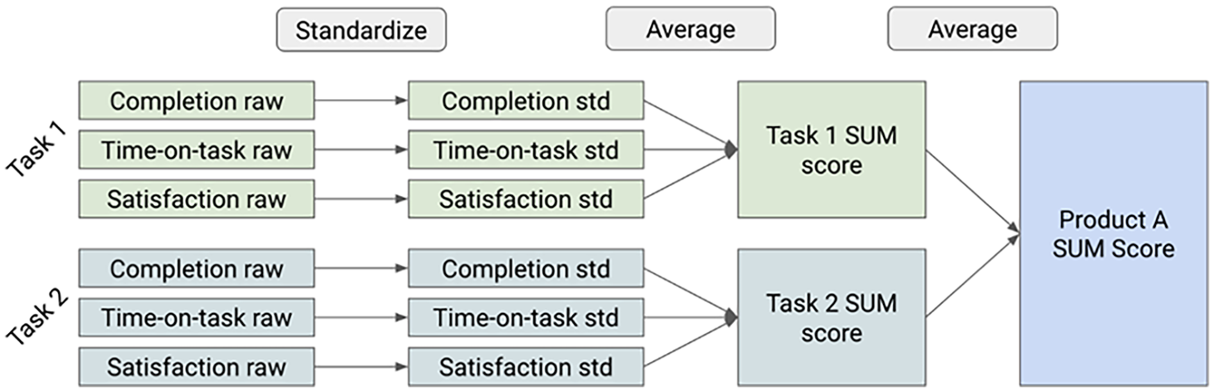
SUM score overview.
The standardization process involves subtracting the mean from a specification limit and dividing that value by the standard deviation. The challenging part can be finding out what the specification limit should be.
The mean is x, x-bar is the specification value, and S is the standard deviation (Figure 2). Figure 3 shows how this can be completed in R.
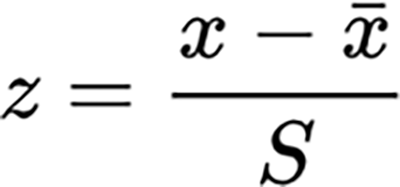
Z-score formula.

Z-score calculation in R.
The standard score is represented as a z-value. This can be confusing for stakeholders who are not familiar with statistical concepts, so the original SUM authors recommend converting this z-value to a percentage format. It can be done simply in R (Figure 4).

Percent conversion in R.
Using this calculation, when a metric’s value is below the specification, it is below optimal and should be below a 50% in its standard SUM score. This lets researchers and stakeholders quickly make value judgements for individual metrics, task-level scores, and product-level scores: above 50% is good, below 50% is poor.
How to standardize each metric
For illustration purposes, we will rely on a simulated dataset, as seen in table 1.
Simulated dataset for Task 1.
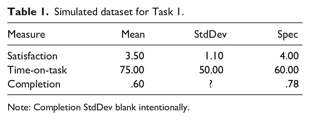
Note: Completion StdDev blank intentionally.
For satisfaction, we use a benchmark spec of 4/5 on a likert scale for mark what a ‘good’ value is based on the research the SUM authors cite (Nielsen & Levy, 1994). Therefore, we want to assign all scores at or above 4 a relatively positive value and scores below 4 a relatively negative value.
Our satisfaction SUM value for task 1 is 32%. That is below 50% so it is a poor score. This aligns with our specification idea that anything below 4 should be represented as relatively poor, as our satisfaction mean of 3.5 is (Figure 5).
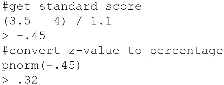
Satisfaction standard score.
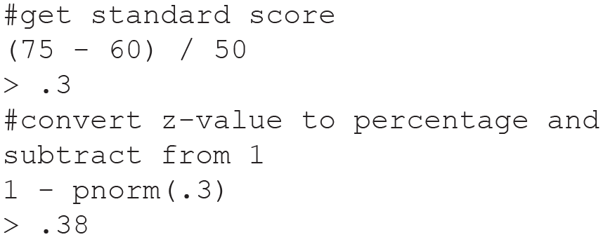
For time-on-task,we have to choose a bespoke specification time for each task (Suaro & Kindlund, 2005b). We will use 60 seconds as our simulated data specification limit (Figure 6). To calculate the standard score, we use the same approach as for satisfaction but inverting the final percentage (because smaller is better for time measurements).
Time-on-task standard score.
Our time-on-task SUM value for task 1 is 38%. This is also below 50% so it is a poor score. Because we want users to take 60 seconds but they took 75 seconds, this poor score makes sense.
For completion rates, our specification limit could be 78%, based on industry research (Sauro, 2011). However, original authors propose that we ignore the completion rate specification because the mean of a completion rate is already a proportion. We use the direct proportion (mean) that we have based on successes compared to all attempts collected participant trials.
Our completion SUM value is 60%. This is above 50% so it is a good SUM score. But, this is below our specification of 78% so we should have a poor SUM score. The original completion rate calculation misspecified our completion rate score. This is what amounts to a positive bias for completion rates, most critically in the range of 50% to 78%.
Resolving Bias
This positive bias could be a detriment to product teams who may be led to believe their product is performing well, when it may in fact require improvement to reach an optimal state of usability.
This positivity bias can be reduced by implementing the 78% completion rate specification in two different ways.
Using Bernoulli variance
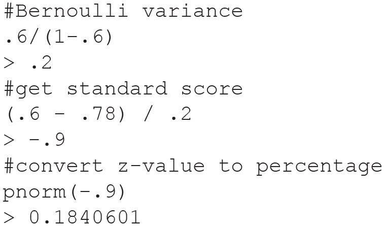
To incorporate the specification of 78%, we can use the variance from a Bernoulli distribution as the variance (S) in our z-score transform of the completion rate (Figures 7 and 8). The Bernoulli distribution is used for binary variables like completion rates. (We also investigated using binomial variance, but this performed exceptionally poorly, see appendix #2.)

Bernoulli variance.
Bernoulli variance R code.
Applying this variance to the standardization process for completion rates allows us to reduce the completion rate bias:
Our completion SUM value is now 18% instead of 60%. This is below 50% so it is a poor SUM score. This makes sense: our completion rate is below the specification value of 78% so the SUM value should be poor and is with this approach. We can extend this over other possible completion rates.
Using a dataset that contains all completion rates values at a sequence from 0%-100% over 1% intervals,we can see how using different methods yields more or less accurate completion rates.
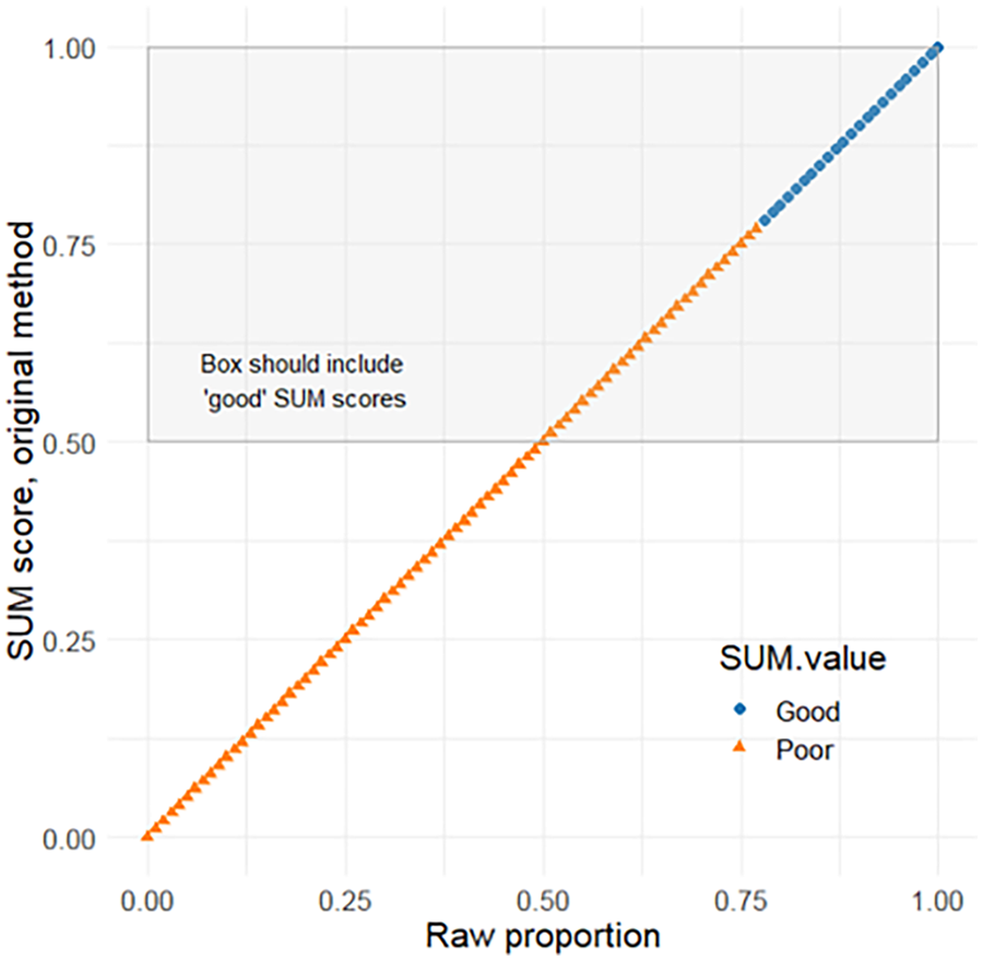
Blue dots are good SUM scores and orange dots are poor SUM scores. An accurate SUM value would have all and only good/blue values in the gray box (SUM >= .5). In the original SUM formulation, we can see all values between .5 and .78 are poor/orange but still in the box that should only contain good/blue (figure 9). This shows the bias that the original method contains. Any completion rate between .5 and .78 will contribute an artificially positive value to the task level SUM scores. Values near and above .78 will also be artificially high.
No transform plot.
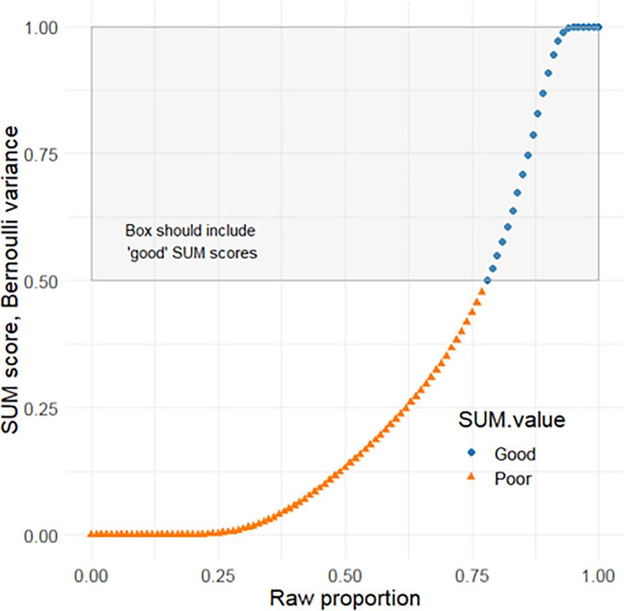
In the Bernoulli variance approach, all good/blue values are in the box and all poor/orange values are outside of the box (figure 10). In this way, the Bernoulli approach is accurate to the specification that .78 is a good completion rate.There is still some error in the model: this approach flattens out the low and high extreme values into a light-tailed distribution — this makes our model less discriminating at extreme proportions.
Bernoulli variance plot.
Using polynomial interpolation
We could also use polynomial interpolation as an indicator variable, rather than finding a variance term to add to our z-score transformation (Figure 11). The benefit to this method is that there is no light-tailed distribution. This method simply spreads out the raw proportions between 0 and .78 to fit between 0 and .5. Then for raw proportions between .78 and 1,we fit them between .5 and 1.
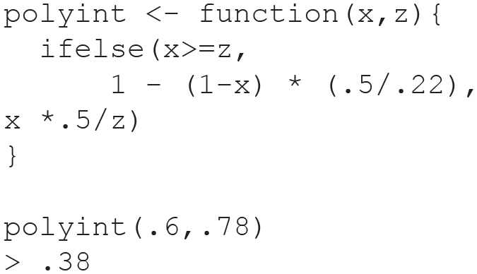
Polynomial interpolation R code.
Our completion SUM value is 38%. This is below 50% so it is a poor SUM score, in alignment with .6 being below the completion specification level of .78.
The polynomial interpolation method is another way to ensure all good/blue completion rate proportions have SUM scores above .5 and all poor/orange completion rate proportions have SUM scores below .5 (figure 12).
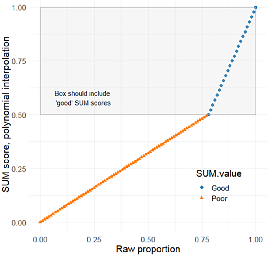
Polynomial interpolation plot.
This approach avoids the inaccuracy of the original SUM approach and the light-tailed nature of the Bernoulli approach. As made clear by the graph, this method is crude and will likely introduce some more error in certain situations based on using interpolation over regression. However, the trade off may be worth it to properly specify good and poor completion rates.
Conclusion
The SUM is a robust and useful method in the toolkit of a usability practitioner. The completion rate bias detracts from the impact a SUM score can provide by quickly and accurately assigning a quality judgment to a usability study metric. The two methods outlined have downsides but improve upon the original SUM formulation.
The Bernoulli variance approach uses the same z-score standardization method for completion rates as time-on-task and satisfaction. It improves upon the original method by not reporting poor scores falsely as good, in exchange for weaker differentiation on extremely negative or positive completion rates.
The polynomial interpolation approach does not use the typical z-score transformation to standardize, but relies on two simple algebraic functions to transform the values above and below the specification value. This method also improves upon the original method by not reporting poor scores falsely as good, and also does not compress variance in extreme completion rate proportions.
Beyond reducing bias in the SUM formulation in the current state of usability benchmarking, the proposed methods increase the flexibility of the model. For example, with advanced product analytics becoming more easily available to usability practitioners, there are situations where the 78% completion rate specification may no longer hold, such as the use of naturalistic log data to collect completion rates. Our proposed methods allow for the SUM to be more reliably implemented outside of traditional usability study designs.
Ultimately, usability benchmarking is a widespread methodology from general consumer spaces to safety critical domains like robotics and e-health (Chacón, Ponsa, & Angulo, 2021 ;Broekhuis, van Velsen, & Hermens, 2019). It’s critical that benchmarking results are clearly and accurately reported to stakeholders. As usability benchmarking methods are adopted more broadly, this update to the Single Usability Metric calculation can ensure practitioners have properly specified conclusions from their investigations.
Footnotes
Appendix
1. Link to reproducible script with data and calculations: https://github.com/carljpearson/SUM-completion-rates/blob/main/HFES_submission
2. Binomial variance is npq, rather than Bernoulli variance as p(1-p). When used as the specification variance, it yielded an unusably heavy-tailed distribution.
