
Abstract
This article delineates the development of an integrated assessment tool to understand inequality in the provision of urban services among neighbourhoods in Khulna city, Bangladesh. The study considers eight key indicators to evaluate basic urban services related to the physical environment of the city. We use primary and secondary sources of information as well as geographic information system (GIS) to summarise the results in a scientific fashion. Additionally, we adopt the analytic hierarchy process (AHP) technique to distribute weights among the considered indicators and categorise the neighbourhoods as ‘good’, ‘average’ or ‘poor’ in terms of service availability. Results from the study demonstrate that a majority of the neighbourhoods lack basic urban services. Only 10 per cent of the neighbourhoods are equipped with basic urban services, whereas 74 per cent face difficulties with ‘average’ quality of services and nearly 16 per cent of neighbourhoods fail to provide basic services to city dwellers. Our study may be useful to development authorities, city corporations and local governments to visualise the neighbourhoods struggling for basic urban services and bring them under immediate attention to deliver the required resources. Further, the study provides an assessment model to understand urban service inequality in cities with similar characteristics in other parts of the world.
Introduction
Measuring spatial inequality in cities requires analytical tools to assess the coverage of existing urban policies, identify areas of under-provision and allocate public resources efficiently (Dadashpoor et al., 2016; Faka et al., 2021; Nijman & Wei, 2020; Rahman et al., 2022; Sminkey & Le Doux, 2016). As the global population increases, so does urbanisation, leading to limited available resources to be distributed among urban centres. Cities, while being hubs of knowledge and innovation, socio-economic growth and development, political power, and dynamic governance (Fernández & Wu, 2018; Hussaini et al., 2022; Marques & Saraiva, 2017; Wei & Ewing, 2018), are also always at the centre of environmental problems, economic and social inequalities, and political instabilities (Hussaini et al., 2022; Liu et al., 2015; Nijman & Wei, 2020; Rahman et al., 2022). The recent crisis of economic downturn (i.e., declining economy of the city) has intensified debates about inequality, with ‘reduced inequalities’ becoming a top priority for the United Nations (UN) under Sustainable Development Goal (SDG) 10 (Al Rifat & Liu, 2019; Nijman & Wei, 2020; Wei & Ewing, 2018). Urban inhabitants all over the world are facing numerous challenges regarding access to necessary urban services (Nijman & Wei, 2020). Urban services can be defined by two dimensions: utility services such as the provision of water, electricity and infrastructure, and advanced services to enhance socio-economic structures, enable sustainability of neighbourhoods, address increasing density in the downtown core, integrate communities to engender a sense of togetherness and establish a stable political system (Castán Broto & Neves Alves, 2018; Dadashpoor et al., 2016; Galster, 2001; LeGates et al., 2009; Shirazi et al., 2022). A growing number of studies have found that residents in densely populated areas with mixed land use do not have sufficient access to necessary services (Neckerman et al., 2009). Several social, economic and political factors, combined with a lack of information, are responsible for this inequality (Castán Broto & Neves Alves, 2018; Singh et al., 2015). In fact, many developed countries also exhibit inequality in urban service distribution. For instance, a group of researchers found significant differences in the accessibility of services among the poor and non-poor neighbourhoods of New York City in the United States (Neckerman et al., 2009). In Asia, researchers from academic institutions, government and non-government organisations (NGOs) have brought to light scientific evidence on issues related to urban services and inequalities through social, economic and built environment perspectives (Galster, 2001; Hill, 2002; Linn, 1982; Madlener & Sunak, 2011; Marques & Saraiva, 2017; Sminkey & Le Doux, 2016; Wong et al., 2016). However, these studies have provided subjective evaluation based on qualitative information.
Contemporary literature has emphasised several issues to address urban inequality worldwide. Various frameworks have been proposed to evaluate inequality in a scientific fashion by using appropriate research methods. Below is a summary of the issues and relevant tools used to address inequality.
Inadequate access to urban green spaces: Studies have been conducted to understand the need for urban green spaces for the well-being of city dwellers at the neighbourhood scale (De La Barrera et al., 2016; Neckerman et al., 2009; Pineo et al., 2018; Williams et al., 2020). In these studies, researchers used a combined proximity approach of existing green spaces to explain the relation between the urban environment and equality for residents. As an input data set for generating the outcome models, they employed data sets emphasising urban blocks, existing green spaces and path networks to access the facilities. A geographic information system (GIS) model builder application was used to highlight the areas characterised by unequal development.
Unequal access to transportation systems: Many studies have suggested that people living in urban areas do not have equal access to transportation systems based on factors such as time, comfort, convenience, resources and service availability (Chang et al., 2019; Pereira et al., 2023; Tiznado-Aitken et al., 2022; Vitrano & Mellquist, 2022). The methods employed in these studies highlighted the spatio-temporal differences in accessing public transit systems in neighbourhoods of different socio-economic and cultural characteristics. Moreover, walkability remains an important mode of mobility in urban geography to measure inequality among different age groups, who consider mobility for diverse reasons (Parida et al., 2022). In assessing transportation access and inequality at the neighbourhood level, these studies used both qualitative and quantitative methods to summarise outcomes. Among these methods, interview surveys and census data (on socio-economic conditions, population density, income groups, etc.) were the key tools used.
Unequal access to healthcare facilities: Several studies have looked at the inadequate access of poor and non-poor areas (determined by annual household income) to healthcare facilities in cities (Flacke et al., 2016; Neckerman et al., 2009; Pineo et al., 2018; Ramirez-Rubio et al., 2019; Roux, 2001). In these aforementioned studies, authors have considered population density, number of healthcare centres in nearby neighbourhoods, distance between residence and road/transport networks (e.g., bus stops and subway stops), land use, and ratio of retail building floor area to retail land area.
Inequality in delivery of utility services: Local governments across the world are considering providing a consistent supply of basic urban utilities (e.g., water, energy, waste management, sewerage pipelines, etc.) to their residents at a broader ecology. Several studies have demonstrated that community capacity within a city’s jurisdiction may be different depending on socio-economic conditions and service quality attributes (e.g., supply and demand; Abubakar, 2016; Deslatte et al., 2017; Robinson et al., 2018). These studies have considered both qualitative and quantitative methods to understand access to basic utility services at the household level in several neighbourhoods in China, Nigeria and the United States.
Climate change and environmental justice: The UN Framework Convention on Climate Change (UNFCCC) has overarching global importance in addressing equity and equality issues under the SDGs. Several research articles have pointed out the social, environmental and economic inequality of natural and built environments in the face of climate change (Bai et al., 2018; Reckien et al., 2017; Singer, 2018; Watts, 2017). These studies use qualitative and quantitative data in order to demonstrate climate-induced natural events and estimate exposures to hazards, mostly in the cities. Additionally, these studies have noted that while several cities are vulnerable to climate change, they do not all equally contribute to carbon emissions, thus highlighting the need for climate justice (Watts, 2017).
Unequal access to social infrastructure: Several studies have revealed that social amenities and infrastructure are not widely distributed in cities, thus making them difficult to access for residents (Green, 2015; Karas, 2015; Pan & Shallcross, 2016; Singh et al., 2018; Tonkiss, 2015). Researchers used secondary sources of information obtained from institutions such as schools, hospitals and energy authorities to identify neighbourhoods and areas with minimal services. They also took into account income and cultural differences that may exacerbate inequality.
Geospatial techniques to visualise urban inequality: Lately, GIS and remote sensing techniques have been popular for visualising and analysing disparity in urban centres at the neighbourhood scale (Kolosna & Spurlock, 2019; Mudede et al., 2020; Pallathadka et al., 2022; Xiao et al., 2019; Zheng et al., 2017). Such studies were conducted using satellite-borne remote sensing data to identify ghost towns that are struggling economically. They also consider the decline of urban green spaces and monitor urban environmental quality (in terms of pollution, air quality, urban heat islands, etc.) to demonstrate unequal development (Leya et al., 2022).
Multicriteria analysis (MCA) techniques to understand urban inequality: MCA has been used in several studies to evaluate the inequality of urban services, access to healthcare, quality of education at the community level, economic environment, regional disparity, housing prices, solid waste management, urban green space and recreation, and urban safety index (Cabrera-Barona et al., 2015; Coco et al., 2020; D’Alpaos & Andreolli, 2020; Ghasemi et al., 2018; Kaklauskas et al., 2018). Among these methods, analytic hierarchy process (AHP) is a popular technique to generate alternative options of choosing particular criteria in managing sustainability (Ha-Mim et al., 2024).
The methods discussed here, employed in various geographical locations, do not take into account specific criteria that may be useful to evaluate inequality among neighbourhoods in a typical city of a developing country. We find that it is critical to introduce geospatial techniques and integrate the MCA approach to generate inequality maps at the neighbourhood scale in Bangladesh. Few studies have emphasised poverty-related issues to demonstrate urban inequality considering social, ecological and infrastructural systems in urban settings (Clark et al., 2022; Swiader et al., 2017). Thus, an integrated approach is necessary to determine which neighbourhood is demonstrating better normalised scores while comparing several of them in Khulna city. We use primary data obtained from the field and integrate this information on a GIS platform to make connections between diverse data sets (such as qualitative data, quantitative data, census data, etc.) to depict them on inequality maps of the neighbourhood. We also consider the physical environment (e.g., built environment, landscapes, green spaces, infrastructures and transportation routes) of urban areas at the neighbourhood level to evaluate inequalities. We then assigned appropriate weights to critical indicators in our assessment tool to visually represent the different neighbourhoods. Such a comprehensive evaluation method of assessing inequalities at the neighbourhood scale in an urban setting in Bangladesh is in demand to delineate different zones with special needs. Khulna, one of the largest cities in the country, is susceptible to severe impacts of climate change. It is critical to understand the needs of such cities and their neighbourhoods to allocate the required resources on time. This study aims to integrate several criteria and develop a comprehensive method to assess inequalities based on physical attributes and people’s perceptions in the complex urban neighbourhoods of Khulna in Bangladesh. In doing so, this article lays out the spatial accessibility of different neighbourhoods to different urban services and highlights the areas that are in urgent need of planning and intervention.
Study Area
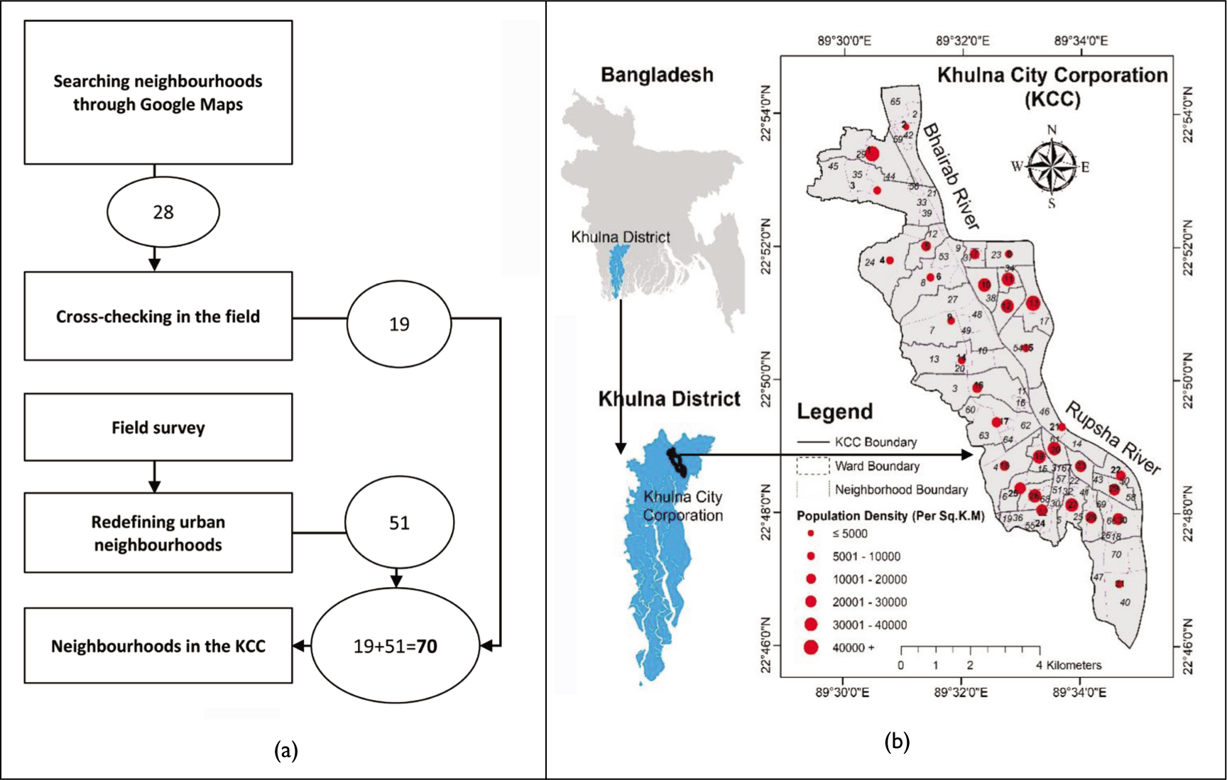
We chose Khulna city in Bangladesh (i.e., Khulna City Corporation [KCC]) as our study area. Khulna, with an area of 45.65 sq. km, is the third largest city of Bangladesh. It has a population of 1.5 million and density of approximately 67,994 persons/sq. km (Rafew & Rafizul, 2021). The metropolitan jurisdiction of the KCC, located at 22o49’ N and 89o34’ E, comprises 31 local wards (i.e., local administrative unit; Rahman et al., 2017). The city originated as a linear-shaped town along the banks of the rivers Rupsha and Bhairab (Figure 1). As the city developed, people from the surrounding districts moved to Khulna in search of jobs and income-generation activities (Banks et al., 2011; Ewaz et al., 2014; Roth et al., 2019). As a result, the city has been growing very fast, with an ever-increasing number of neighbourhoods to accommodate the influx of population. The built-up area in Khulna has increased from 39.03 per cent in 1998 to 49.60 per cent in 2018 (Marufuzzaman, 2019). Due to rapid urbanisation in recent decades, neighbourhoods suffer from uneven development coupled with environmental degradation, including water pollution, air pollution and traffic congestion (Abdullah et al., 2019; Ayeb-Karlsson et al., 2016; BRTC-BUET, 2015; Chen & Mueller, 2018).
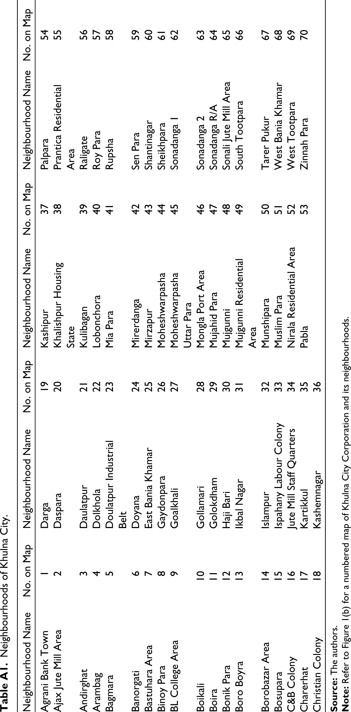
Remarkably, neighbourhood boundaries in Khulna are not demarcated officially by the Khulna Development Authority (KDA) or the KCC. Thus, we demarcated 70 distinct neighbourhoods within the 31 wards as per the local names of areas and with assistance from Google Maps (Figure 1). We have considered all 70 neighbourhoods in our study to demonstrate the inequality of urban services by using both quantitative and qualitative data sets. See Figure 1(b) for a numbered map of the neighbourhoods. The corresponding names of the neighbourhoods are provided in Table A.1 in the Appendix.
Methods
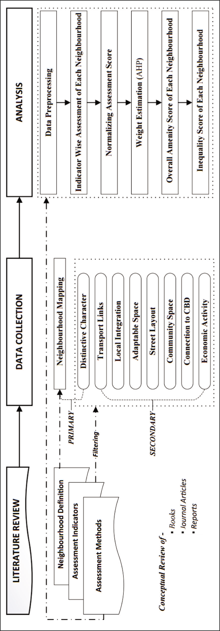
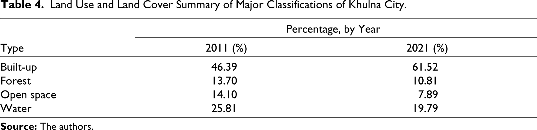
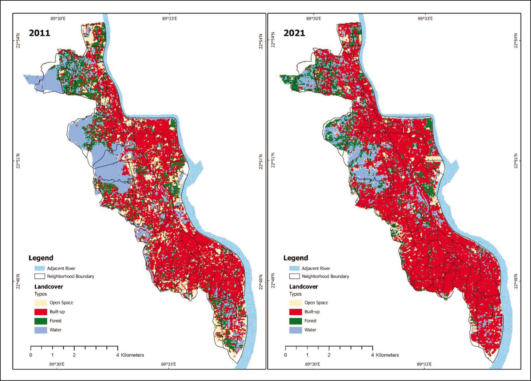
We adopted a comprehensive approach to evaluate the physical environment of an urban area based on eight indicators. In doing so, we undertook the study in three parts: (a) reviewing literature to understand contemporary methods and approaches to delineate inequality in an urban physical environment; (b) collecting appropriate data as per the selected indicators for evaluation and (c) analysing and summarising data while adopting geospatial techniques to prepare urban inequality maps. We also generated land use land cover (LULC) maps based on satellite imagery to showcase major changes in the study area in two consecutive census years (2011 and 2021). See Figure 2 for a detailed schematic diagram of the study.
Reviewing Literature to Understand Contemporary Methods and Approaches to Delineate Inequality in an Urban Physical Environment
As the first step, we reviewed scientific literature and delineated the neighbourhood boundaries of our study area based on contemporary evidence. Based on the literature, we selected appropriate indicators aligned with the socio-economic, political and built environment in our study area (Al Rifat & Liu, 2019; Arcaya et al., 2015; Dehimi, 2021; Dixon & Woodcraft, 2013; Fernández & Wu, 2018; Flacke et al., 2016; Hill, 2002; Hussaini et al., 2022; Kremer et al., 2016; Neckerman et al., 2009; Pereira et al., 2023; Shirazi et al., 2022; Vitrano & Mellquist, 2022). Once the indicators were finalised, we selected a suitable research method to capture data and analyse and summarise it using geospatial techniques. Note that we first identified 28 neighbourhoods using Google Maps (Figure 1(a)) and then digitised them on the GIS platform. Consequently, we physically checked these 28 neighbourhoods in the field to determine the boundaries. Among these 28 neighbourhoods, we found that 19 had boundaries similar to those shown on Google Maps. Further, we conducted a field survey using participatory GIS mapping by asking residents about the names and boundaries of their neighbourhoods. We provided them with a base map upon which participants were asked to draw the boundaries of their neighbourhoods. In this way, we reconfirmed the boundaries of the remaining 9 neighbourhoods and added 51 more neighbourhoods according to the opinions of the participants. Once the number of neighbourhoods was confirmed, we moved to finalise the evaluation criteria (i.e., indicators). Based on the literature review, urban planning documents and newspaper articles focusing on our study area, we selected the following eight indicators to be assessed: local integration, adaptable space, distinctive character, street layout, transport links, community space, connection to central business district (CBD) and economic activities of the neighbourhoods.
Collecting Appropriate Data in Evaluating the Selected Indicators
Both physical (e.g., access to roads and integrated transportation networks, land use and recreational facilities) and non-physical (e.g., attractions of a particular neighbourhood) features of data were used to assess inequalities among the 70 identified neighbourhoods in the study area. Physical features and data sets were collected from secondary sources and through reliable government sources of information (e.g., road networks, land use, transportation routes, bus stops, etc., from KDA and KCC). However, non-physical features of data were identified through participatory GIS and a structured questionnaire survey with the residents. The sample size was determined using the following equation where the precision level was taken as 0.09 (Daniel, 2005).
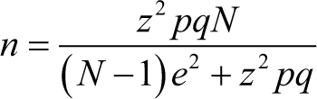
Here, n is the sample size, N is the population size, Z denotes standard normal distribution (set at 1.96 corresponding to a confidence level of 95 per cent), p denotes the probability of success (0.5), q denotes the probability of failure (0.5) and e refers to the precision level (0.09).
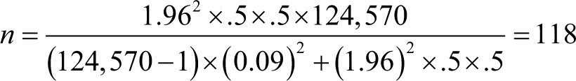
We conducted 118 structured interviews with residents of different neighbourhoods. The interview questions were mostly focused on obtaining qualitative responses on major attractions of specific neighbourhoods, associated reasons and alternative options if provided to stay in the same neighbourhood. Additionally, we collected GIS data sets of road land use maps, utility serviced areas, population density and ridership of buses in the city from relevant organisations.
Analysing and Summarising Data using Geospatial Techniques to Prepare Urban Inequality Maps
To analyse inequality among the neighbourhoods in our study area, we first processed the data collected using ArcGIS Pro and MS Office Suite. In doing so, we obtained a consistent score for the selected indicators so that the evaluation scale could be retained intact. Then, an overall amenity score for individual neighbourhoods was computed upon considering the total score of the eight indicators. Finally, disparity scores for all the neighbourhoods were summarised and visualised through mapping. We used advanced approaches in GIS (ArcGIS Pro version 2.93), Statistical Package for Social Science (SPSS) and Microsoft Excel to generate the targeted scores for all neighbourhoods. Network data sets were created using the Network Analyst extension tool in ArcGIS Pro for calculating the distances of specific locations from major road networks in different neighbourhoods.
To assess the accessibility and spatial distribution of urban services regarding the above-mentioned indicators, GIS-based tools and techniques (such as Spatial Analyst and Network Analyst) were used. The distinctive character of a neighbourhood was assessed through the frequency of people’s interest in staying in or moving to the neighbourhood. A larger number represents stronger distinctive character of a neighbourhood with several pull factors for people to live there.
To assess the transport links, the average distance (D) of houses from the public transport route (Equation 1) and the percentage of the footpath length (PFL) with respect to the total road length (Equation 2) within a neighbourhood area were calculated. These two factors were weighted using AHP and combined to get the score for transport links.
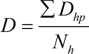
Here, Dhp and Nh are the distance of a house (h) from the public transport route (p) and the total number of residential houses in a neighbourhood, respectively.
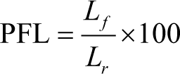
Here, Lf and Lr refer to the total length of footpath (f) and total length of roads (r) in a neighbourhood, respectively.
Local integration (LI i ) was assessed by calculating the average road network distances from a particular neighbourhood to all other neighbourhoods (Equation 3). A higher number indicates the neighbourhood is highly connected with the whole city.
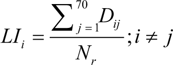
Here, Dij is the road network distance from the reference neighbourhood (i) to another neighbourhood (j). Nr is the number of routes from the reference neighbourhood (i) to all other neighbourhoods.
The score for adaptable space (AS) was assessed by calculating the percentage of total area of relevant space with respect to the area of the neighbourhood (Equation 4).
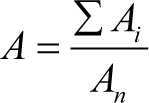
Here, Ai is the area of each parcel of chatal (crop drying yard), Eidgah (designated outdoor space for communal prayers during the Eid festival), bazaar, playground or open space, and An is the area of the reference neighbourhood.
Street layout (SL) was assessed through two factors, road area density and length density (per sq. km). Road area density (RAD) was calculated by dividing the total area of the roads by the area of the neighbourhood (Equation 5). Road length density (RLD) was calculated by dividing the total length of the roads by the area of the neighbourhood (Equation 6). AHP was used to weigh these factors and finally combined to get the score for street layout.
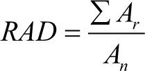
Here, Ar and An are the area of a road segment and the area of the reference neighbourhood, respectively.
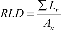
Here, Lr and An are the length of a road segment and the area of the reference neighbourhood, respectively.
The assessment of community space (CS) was conducted by delineating its service area (500 m) along the adjacent road network and calculating the percentage of residential houses that fell within the service area in a neighbourhood (Equation 7).
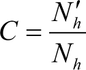
Here, Nh' and Nh are the number of residential houses in the service area and the total number of residential houses in the neighbourhood, respectively.
Connection to the CBD was assessed for each of the neighbourhoods by calculating the shortest network distance from a particular neighbourhood to the CBD area.
Finally, economic activity (EA) was assessed by calculating the non-residential economic space per unit of residential space (Equation 8).
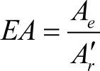
Here, Ae and Ar' are the total area of non-residential economic space and the total area of residential space, respectively.
To eliminate the effect of factor dimension and magnitude of the scores assessed from the indicators and belonging factors, normalisation method (Al Rifat & Liu, 2019) was applied to the scores of all indicators, making the range of scores from 0 to 1, using Equation 9.
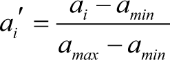
Here, ai' is the normalised value calculated for the ith cell of variable x, ai is the value of ith cell of the same variable, and amin and amax are the minimum and maximum values of the same variable, respectively. If the indicator’s higher scores represent higher accessibility, then ai' has been used. On the other hand, if the lower scores represent higher accessibility, then 1 – ai' has been calculated.
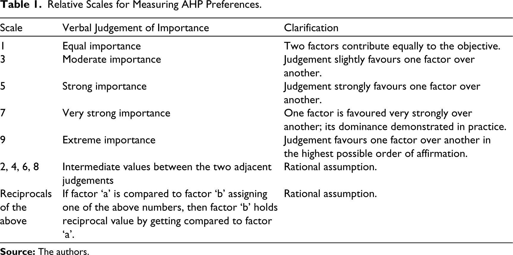
AHP was used to calculate weights for the indicators and belonging factors. AHP is a multi-criteria decision-making procedure that was introduced by Saaty (1990) to simplify intricate decisions into a series of pairwise comparisons and consider both subjective and objective aspects of the decision. It has the capability to reduce bias by checking the constancy of the decision-maker’s evaluations. AHP can be applied with some consecutive steps. The vector (pairwise comparison matrix) is developed based on expert opinion using a scale of 1–9, with 1 implying that two factors are equally important and 9 implying that one factor is much more important than another (Table 1). Also, scale with fraction can be used for factors that are very near to each other considering relative importance (Saaty, 1990). However, the mean of the expert opinions is calculated to construct the matrix.
Relative Scales for Measuring AHP Preferences.
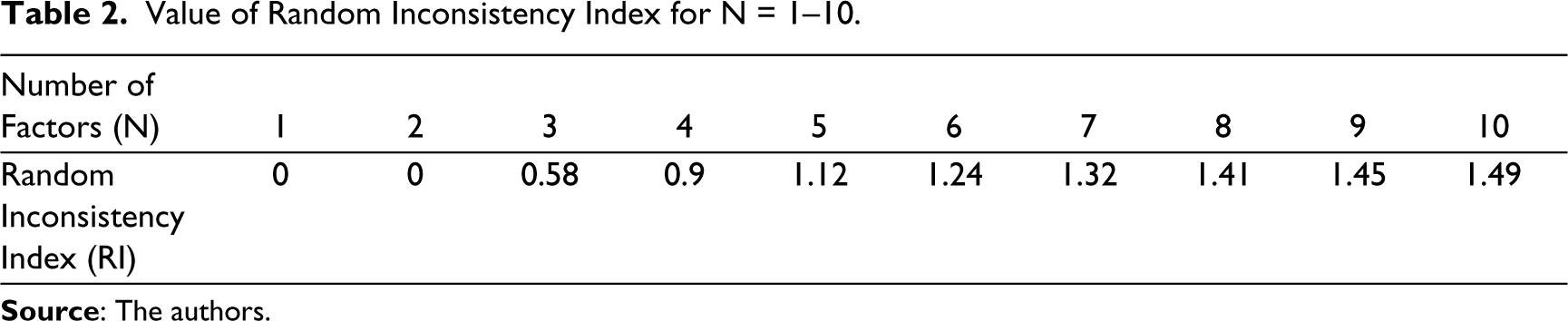
The weight is determined through some step-by-step calculations solving an Eigenvalue problem. It is common to face some inconsistencies when performing many pairwise comparisons. AHP has an effective method to check the consistency of evaluations made by decision-makers when constructing the matrix for pairwise comparisons. A consistency index (CI) was calculated and a random inconsistency index (RI) was used, depending on the number of factors (N), to determine the consistency ratio (CR). If the consistency ratio is greater than 0.1, the matrix becomes inconsistent and pairwise comparison must be re-performed. The variations of RI value for different number of factors (N) are shown in Table 2.
Value of Random Inconsistency Index for N = 1–10.
Then, the overall amenity score (S) of each of the neighbourhoods was calculated using Equation 10.

Finally, the disparity score (SD) of a neighbourhood was calculated using the neighbourhood’s overall amenity score according to the proximity to the lower average (Equation 11).

Here, Si is the overall amenity score of the neighbourhood i, S' is the overall amenity score lower than Si and X is the number of neighbourhoods satisfying S' < Si.
Based on the disparity score (SD), we identified and categorised the neighbourhoods in the study area into three types, ‘good’, ‘average’ and ‘poor’, based on the inequalities existing among them. ‘Good’ neighbourhoods are those that have a value more than or equal to 0.40; ‘average’ neighbourhoods have values between 0.26 and 0.39; and ‘poor’ neighbourhoods have values less than or equal to 0.25.
Results
Khulna is the third largest city of Bangladesh with an approximate population of 1.5 million. The city has a high literacy rate at 73.6 per cent (Bangladesh Bureau of Statistics [BBS], 2020). In our study, we found that several districts (i.e., wards) have a high concentration of literate people (85%–100%), mostly living near the CBD area. However, in some districts in the north and south, the literacy rate is between 40 per cent and 50 per cent (Figure 3).
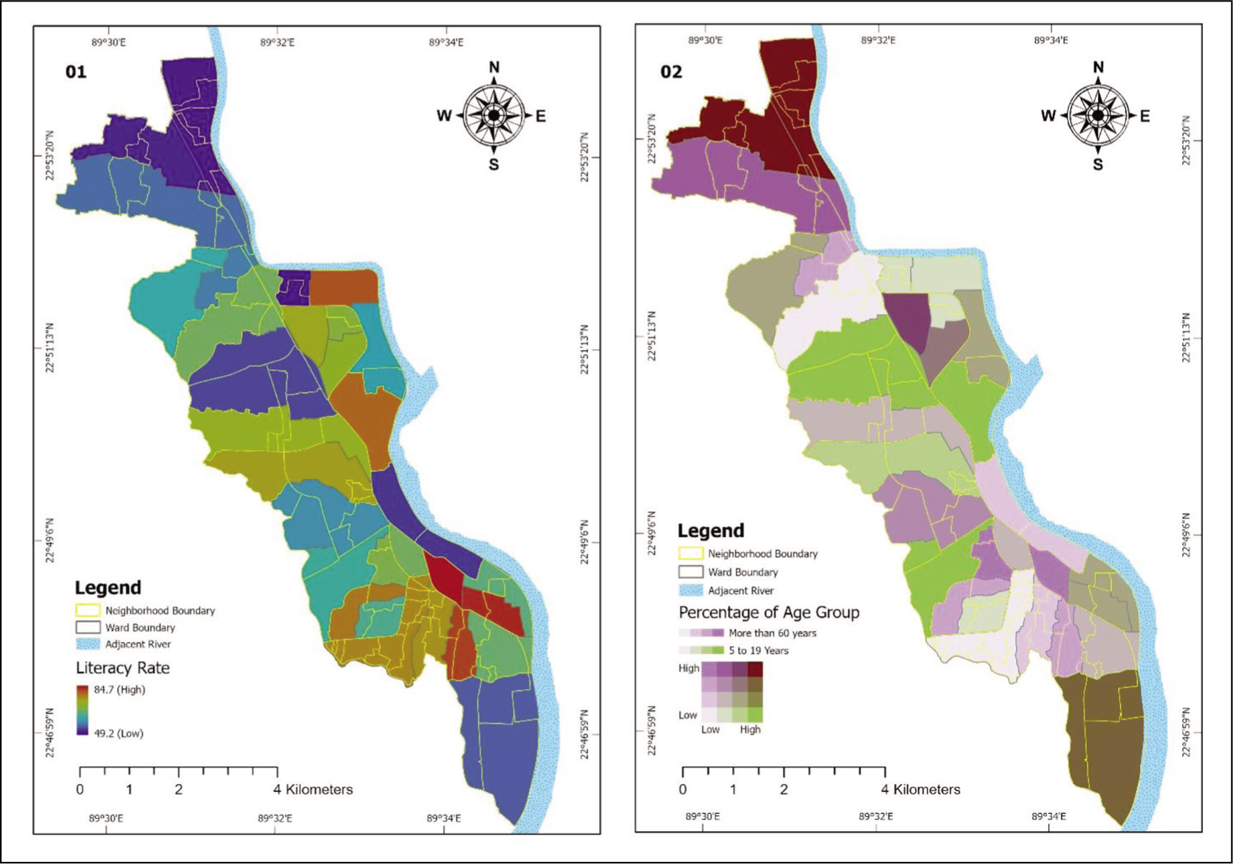
Interestingly, people from districts with a lower literacy rate exhibit a strong desire to move to the CBD and nearby areas due to its proximity to better schools, universities and post-secondary education opportunities for the younger generation. Additionally, while considering the different age groups of the population, we found that a high concentration of the older population resides in the northern part of the city, which comprises quiet and calm neighbourhoods conducive to a traditional lifestyle. Meanwhile; the youth were found to be spread across the city, with pockets of concentrated population in districts that house educational institutions (e.g., Khulna University of Engineering and Technology, Khulna University, Khulna Medical College, Khulna Agricultural University, BL College, etc.)
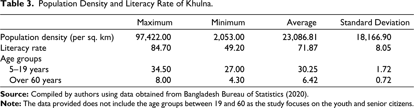
Table 3 shows the summary of maximum and minimum population density, rate of literacy and different age groups of people in Khulna city. The maximum density of population is around 97,422 people per sq. km, mostly in the CBD and nearby districts. The percentage of senior citizens is 8 per cent maximum and 4.30 per cent minimum, distributed across the city.
Population Density and Literacy Rate of Khulna.
Land Use and Land Cover Summary of Major Classifications of Khulna City.
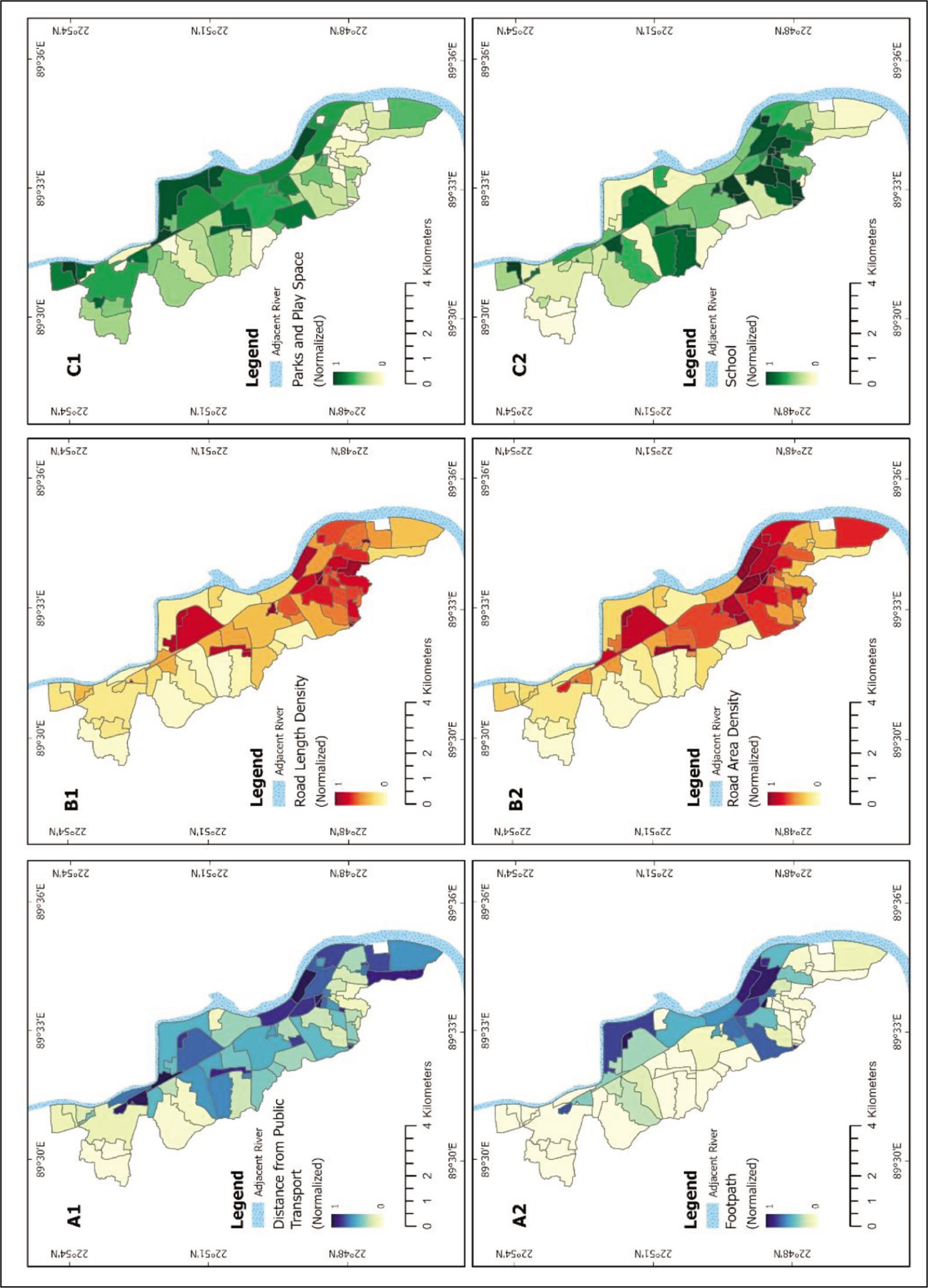
In this study, we have considered several criteria to evaluate the level of services available at the neighbourhood level (i.e., ward and/or district) in Khulna city. Figure 4 shows the normalised values of these services at a scale of 0–1, with 1 meaning the best service available while 0 depicts almost no service available. It is seen from this figure that access to public transportation systems is available in most of the districts; whereas, the density of access road networks is widely available near the CBD and institutional districts (i.e., those with universities, medical colleges, post-secondary colleges, etc.). The density of footpaths is also higher in areas close to the CBD, as is the density of schools (elementary, secondary and post-secondary). The density of schools depends on access to roads and public transportation systems within the city limits. On the other hand, districts located close to the CBD area lack parks and playgrounds.
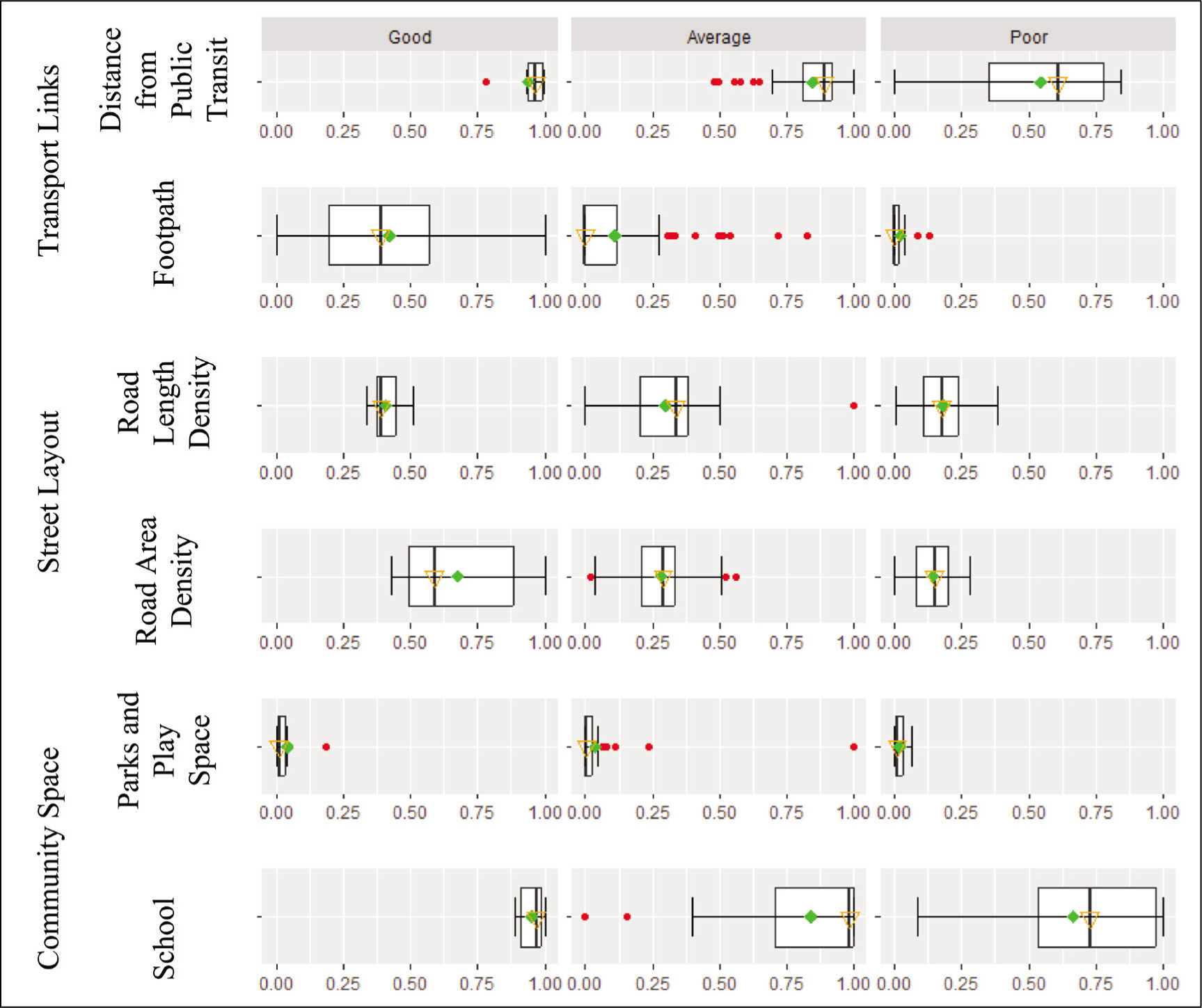
It has been found that the distance and density of public transport services in each neighbourhood has higher influence, obtaining better evaluation while comparing the scores among all the neighbourhoods. The good neighbourhoods hold consistent scores and the spread (i.e., the interquartile range) of this variable’s distribution progressively increases from good neighbourhoods towards poor neighbourhoods. Here, higher scores represent shorter distances from public transit services. Interestingly, sidewalks demonstrate almost the opposite scenario from the distance from public transit in terms of spread, showing some outliers and skewness in the average and poor neighbourhoods (Figure 5). Considering the upper and lower whiskers, median, and mean points, the better the evaluation of a neighbourhood, the higher the score of the footpath. Additionally, density of road network (i.e., length of paved roads) is higher in neighbourhoods with a higher evaluation score. Parks and playgrounds (e.g., open spaces) show almost similar patterns in all three categories of neighbourhoods, although the outlier indicates the highest score in the average neighbourhood category. The median scores of schools increase progressively from poor neighbourhoods towards good neighbourhoods. Here, the spread follows the completely opposite pattern.
We mapped the eight indicators to demonstrate the level of services available at the neighbourhood level in Khulna city. Figure 6 shows the normalised values of these services at a scale of 0–1 (with 1 meaning the best service available and 0 meaning the least service available). Interestingly it has been observed from this figure that a significant spatial pattern is hard to find in most of the maps (01, 02, 04, 05, 06 and 08) except 03 and 07 due to the location. Map 09 has been prepared based on the eight indicators and divided into three categories (good, average and poor). All good neighbourhoods are close to the core of the city and the poor neighbourhoods are close to the border of the city.
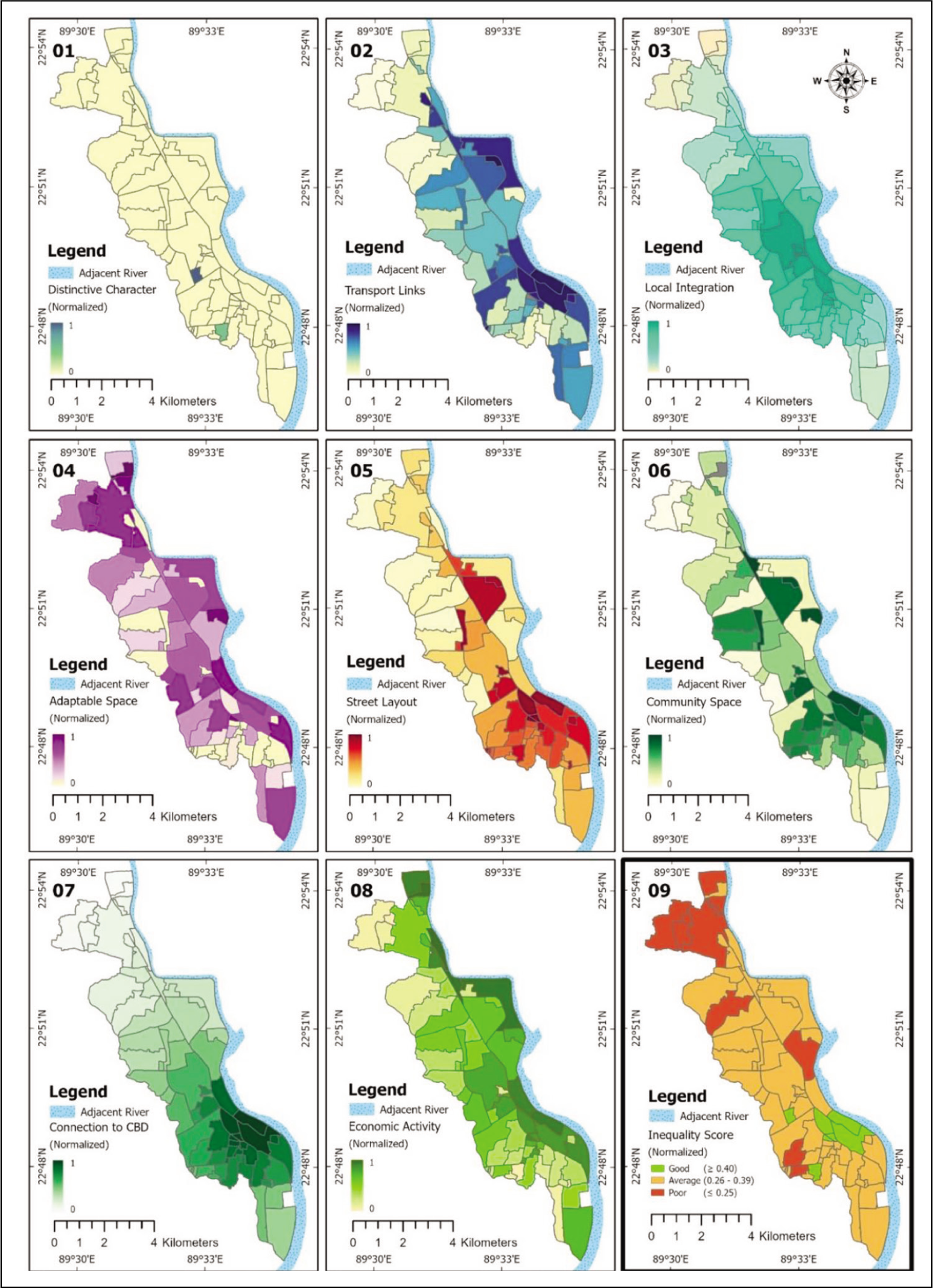
Interestingly, Figure 7 shows that the score of distinctive character is the highest in good neighbourhoods (e.g., majority of considered characteristics are somewhat present). Transport link is higher in good neighbourhoods than average neighbourhoods, followed by poor neighbourhoods. Consequently, the poor neighbourhoods’ spatial distribution (interquartile range) is highest where the number of neighbourhoods in this category is comparatively lower. Figure 8 represents the four major classes of LULC derived from Landsat 8 and Landsat 5 satellite images for the years 2011 and 2021 (i.e., the census years). We observed from this analysis that built-up areas have approximately increased from 46 per cent to 62 per cent.
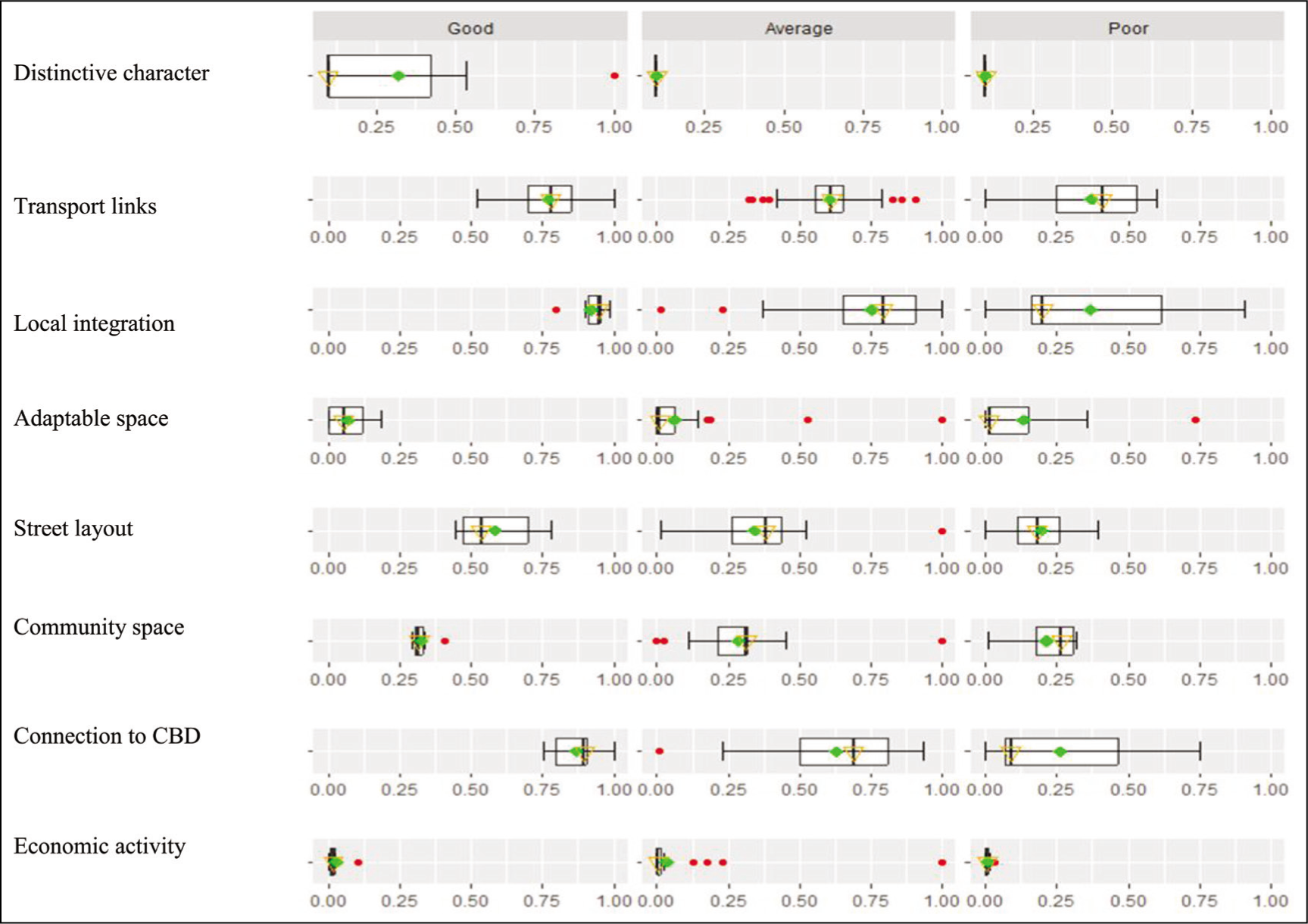
Local integration scores of all categories show progressively higher and more similar characteristics (lower spread in interquartile range) starting from poor to good neighbourhoods. The mean and median of the poor neighbourhoods show significant variation with skewness. Additionally, adaptable space is higher in good neighbourhoods than both average and poor neighbourhoods. Considering the median point, the average and poor neighbourhoods have almost similar characteristics, though the spread is higher in the poor neighbourhoods. Note that the median of street layout is higher in good neighbourhoods than in average neighbourhoods, which outshines poor neighbourhoods. The spread of this variable’s distribution progressively decreases from good neighbourhoods to poor neighbourhoods. Furthermore, community space demonstrates similar traits, considering the median points for all categories of neighbourhoods, although the spread is different. The share of good neighbourhoods depicts almost similar distribution, where the average category is very dispersed. Both average and poor neighbourhoods show skewness. Also, connection to CBD shows the same distribution as local integration. However, the mean and median of the poor neighbourhoods show significant variation with skewness. Moreover, economic activity is depicting comparatively the same cohort in all categories considering the mean, median and interquartile range. The outliers give some insights, for example, the average category has the highest score and the good category has a higher score compared to the poor category.
Discussion
Based on the results obtained from our study, we identified some interesting discussion points about urban services at the neighbourhood scale in our study area.
The CBD is characterised by diverse economic activities and land use: We identified the CBD in Khulna to be situated in Neighbourhood 14 (see Figure 1). Popularly known as Boro Bazar, it connects almost all the neighbourhoods by public transit services. This neighbourhood is highly dominated by commercial activities (e.g., stores, banks, markets, wholesale bazaar, transit hub, restaurants, hospital, school, cinema hall, court and on-street markets) and was categorised as a good neighbourhood based on our evaluation. Additionally, it has areas dedicated to residential use, a stadium and a central open space (i.e., Hadis Park). Boro Bazar attracts commercial investments and people from other neighbourhoods looking for employment. A small port and ferry terminal provide access to the rural hinterlands on the other side of the river from where produce such as vegetables, fish, poultry and livestock come to the market. However, residents of other neighbourhoods do not consider relocating to this area.
Some residents want to relocate to another neighbourhood: Our study revealed that Sonadanga (Neighbourhood 64) and Nirala (Neighbourhood 52) are considered ideal for living and raising a family in Khulna, and they were evaluated as good neighbourhoods. We found that residents from other neighbourhoods were willing to relocate to these two neighbourhoods as they are safe, well planned and designed with attractive housing units and recreational facilities. Other factors include easy access to education (in terms of the number of pre-schools, elementary schools, English-medium schools and high schools), availability of private healthcare centres, access to regional transportation terminals and shopping facilities. Additionally, we discovered that people felt proud to live in these two neighbourhoods as they were considered to be modern and high-income residential areas of the city.
There are push factors to move out of some neighbourhoods: We found that a few neighbourhoods are pushing people to leave as there are not enough job opportunities in the area, and thus a lack of adequate support to raise children. These include Labonchora (Neighbourhood 40), Mirer Danga (Neighbourhood 42), Maheshwarpasa (Neighbourhood 45), Mujahidpara (Neighbourhood 47), Sen Para (Neighbourhood 59), Sonali Jute Mills area (Neighbourhood 65) and Jinnah Para (Neighbourhood 70). These neighbourhoods received an average rating in our evaluation. These areas do not have options for better housing units and have less access to other urban centres, especially for trade and commerce. Residents also complained about the living environment, citing difficulties related to access to piped water supply, sewerage facilities, electricity services and access to public transit.
Migrants from other districts are concentrated in specific neighbourhoods: Our study showed that certain neighbourhoods tend to attract newcomers arriving from nearby districts. Areas such as Boyra (Neighbourhood 11), East Baniakhamar (Neighbourhood 25), Khalishpur (Neighbourhood 38), Mujgunni (Neighbourhood 48) and Nirala (Neighbourhood 52) have different choices and supplies of rental housing units, catering to those from low- to very high-income groups and offer a quick integration system into the community socially. Moreover, new migrants arrive in these neighbourhoods with the purpose of educating their children in better schools.
Industrial neighbourhoods are decaying: Our study revealed that some industrial areas, such as Ajax Jute Mills area (Neighbourhood 2), Chorer Hat (Neighbourhood 17), Daulatpur (Neighbourhood 21), Mirer Danga (Neighbourhood 42) and Sonali Jute Mills area (Neighbourhood 65) have been decaying for the last 20 years and people are moving out from these neighbourhoods for better urban services. Khulna is one of the largest industrial cities of the country, having approximately 21 jute mills, one newsprint paper mill, a hardboard mill, a cable industry and an industrial belt for small and medium entrepreneurs (Jodder et al., 2023). However, due to lack of raw materials and less demand for jute products, these industries have been declining since the early 2000s. This has emerged as a critical problem for city planners and decision-makers to utilise the lands upon which these mills stand by updating existing by-laws and amending land use regulations. While some of these neighbourhoods received poor and average ratings, there is potential to revive these areas if appropriate measures are taken by jurisdictional authorities.
Natural hazards and calamities are forcing residents to relocate: Khulna suffers through cyclones, floods and waterlogging—and consequently, outbreaks of water-borne diseases such as cholera and diarrhoea—due to its geographical proximity to the Bay of Bengal. However, two areas, Labonchora (Neighbourhood 40) and Rupsha (Neighbourhood 58), are especially vulnerable to waterlogging and water-borne diseases due to poor drainage facilities. These areas also face river erosion and local flooding due to their proximity to the Rupsha River.
New growth centres developing near higher educational institutions: In Bangladesh, new growth centres usually develop close to urban centres for commercial and economic activities (Hassan, 2017). However, in Khulna, we noticed that some growth centres are located close to educational institutions like Khulna University, Khulna Medical College, Khulna University of Engineering and Technology, Khulna Polytechnic Institute, BL College, Khulna Agriculture University and several other private institutions distributed throughout the city. As a result, the areas of Boyra (Neighbourhood 11), Khalishpur (Neighbourhood 38), Nirala (Neighbourhood 52) and Sonadanga (Neighbourhood 62) have witnessed rapid growth in commercial and business services, in addition to the coming up of new housing units to accommodate people. Further, new road networks are being constructed in these neighbourhoods to support residents in institutional, commercial and economic activities. These circumstances usually increased the land value in these neighbourhoods.
Concluding Remarks
Historically, Khulna as a city has been significant for its industrial infrastructure and economic activities, which led to the rapid urbanisation of Bangladesh. After the independence of Bangladesh in 1971, Khulna became one of the country’s major industrial hubs, attracting people from other regions. Since then, the city’s neighbourhoods have been expanding to accommodate the influx of population. Presently, Khulna has approximately 70 neighbourhoods in the city corporation area. Many of the neighbourhoods are unable to provide basic urban services to their residents, and these demands have been increasing over the last three decades from 1991 to 2020. As a result, we found it necessary to investigate the state of existing urban services at the neighbourhood level to understand the shortcomings and future requirements. This study has considered eight key indicators, selected based on contemporary literature and availability of required data, to evaluate the available services. We employed both qualitative and quantitative techniques to evaluate these neighbourhoods. Our results show that approximately 10 per cent of these neighbourhoods provide good quality of urban services to their residents, 74 per cent provide average quality of services, and 16 per cent were rated poor in providing services. We used AHP tools, geospatial technology and quantitative methods to prepare maps of Khulna, showing the neighbourhoods evaluated as good, average and poor. A combination of these three techniques is rarely adopted in studying geographical settings such as Bangladesh. This study enhances the ability of scholars to quantify basic urban services at the neighbourhood scale in a growing city in a developing country like Bangladesh. We also generated a neighbourhood mapping tool through this research project to assist urban planners, decision-makers, politicians, residents and other stakeholders to evaluate each neighbourhood and gauge the probable requirements for enhancing the urban environment through an equity lens. While conducting research, we encountered challenges in identifying specific information and potential sources to develop the evaluation criteria. Thus, we recommend that researchers identify the required data and ascertain the reliability of their sources before they employ our model in other geographic locations. Future scope of this study may include utilisation for land use planning and mapping, climate adaptation processes, enhancing urban services, evaluating urban environments, understanding the flow of population density and community planning. Finally, we recommend that future urban policies place special emphasis on urban service delivery, engage with multiple stakeholders to collaborate on development initiatives, take a scientific approach to collecting diversified data and summarising them for stakeholders, strive for transparency in urban land management in the face of climate change and garner greater attention from politicians, practitioners and the public.
Footnotes
Declaration of Conflicting Interests
The authors declared no potential conflicts of interest with respect to the research, authorship and/or publication of this article.
Funding
The authors received no financial support for the research, authorship and/or publication of this article.
Appendix
Neighbourhoods of Khulna City.
| Neighbourhood Name | No. on Map | Neighbourhood Name | No. on Map | Neighbourhood Name | No. on Map | Neighbourhood Name | No. on Map |
| Agrani Bank Town | 1 | Darga | 19 | Kashipur | 37 | Palpara | 54 |
| Ajax Jute Mill Area | 2 | Daspara | 20 | Khalishpur Housing State | 38 | Prantica Residential Area | 55 |
| Andirghat | 3 | Daulatpur | 21 | Kulibagan | 39 | Raligate | 56 |
| Arambag | 4 | Dolkhola | 22 | Lobonchora | 40 | Roy Para | 57 |
| Bagmara | 5 | Doulatpur Industrial Belt | 23 | Mia Para | 41 | Rupsha | 58 |
| Banorgati | 6 | Doyana | 24 | Mirerdanga | 42 | Sen Para | 59 |
| Bastuhara Area | 7 | East Bania Khamar | 25 | Mirzapur | 43 | Shantinagar | 60 |
| Binoy Para | 8 | Gaydonpara | 26 | Moheshwarpasha | 44 | Sheikhpara | 61 |
| BL College Area | 9 | Goalkhali | 27 | Moheshwarpasha Uttar Para | 45 | Sonadanga 1 | 62 |
| Boikali | 10 | Gollamari | 28 | Mongla Port Area | 46 | Sonadanga 2 | 63 |
| Boira | 11 | Golokdham | 29 | Mujahid Para | 47 | Sonadanga R/A | 64 |
| Bonik Para | 12 | Haji Bari | 30 | Mujgunni | 48 | Sonali Jute Mill Area | 65 |
| Boro Boyra | 13 | Ikbal Nagar | 31 | Mujgunni Residential Area | 49 | South Tootpara | 66 |
| Borobazar Area | 14 | Islampur | 32 | Munshipara | 50 | Tarer Pukur | 67 |
| Bosupara | 15 | Ispahany Labour Colony | 33 | Muslim Para | 51 | West Bania Khamar | 68 |
| C&B Colony | 16 | Jute Mill Staff Quarters | 34 | Nirala Residential Area | 52 | West Tootpara | 69 |
| Charerhat | 17 | Kartikkul | 35 | Pabla | 53 | Zinnah Para | 70 |
| Christian Colony | 18 | Kashemnagar | 36 |