
Abstract
On the one hand, the development of printing technologies has greatly facilitated the dissemination of text written with Chinese characters. This is to be compared with ancient manuscript scrolls of text. On the other hand, printing has forced Chinese characters to be enclosed into a fixed 1:1 shape. This is the case for computer systems as well: although modern systems might tolerate aspect ratio flexibility to a certain extent, document processing by means of computers has pushed for Chinese character font design to, even approximately, retain the fixed 1:1 aspect ratio. When comparing the documents produced by our modern systems and ancient ones, it is clear that a significant part of the art of calligraphy has been lost, or is at least at a great risk of extinction. In this article, we aim to address this cultural heritage issue by conducting an ontological discussion focused on the aspect and balance of Chinese characters, whence we then derive solution hints for our modern computer systems to tentatively support greater flexibility with respect to the aspect ratio of characters.
Introduction
The objective of this research work is to clarify the notions of aspect and balance with respect to Chinese characters, and subsequently support their drawing, including their rendering by means of computers. This study is in continuation of a wider project to propose a scientific approach to Chinese characters, as largely discussed previously (Bossard 2018, 2022, 2024). It is recalled that, amongst other advantages, such a scientific approach to Chinese characters allows for facilitated or improved processing by computer systems. It also has important implications for the study (learning), notably memorisation, of these characters, which is a challenging issue especially for non-native speakers (Shen, 2005; Sung, 2012). There, it has become clear that technology has an important role to play (Lu et al., 2013; Yang et al., 2019; Zhan and Cheng, 2014).
Returning to the processing of Chinese characters by computers, it is first interesting to note that whereas character calligraphy has since immemorial times allowed flexibility regarding the aspect (i.e. dimensions) of characters (cf. dictionaries, and texts in general that predate the printing era), printing and computer system requirements, and possibly other circumstances, have forcibly enclosed those characters to the 1:1 aspect ratio: it is – or, perhaps more correctly, initially was – indeed a requirement for document typesetting, and in general to ensure maximised readability on early systems, including typewriters (Mukai, 2018). Although technical evolutions have rendered these requirements partly obsolete (the number of available dots to output characters, character alignment issues, etc.), Chinese character typesetting remains largely bound by those legacy conditions. As a result, the balance, or more precisely the aspect, property of Chinese characters, and initial (historical) flexibility thereof, are clearly at risk of disappearing from the corresponding writing systems. This work can thus be seen as an attempt at saving this cultural heritage by considering the related scientific and computational issues, and providing hints at corresponding solutions.
On a side note, it can be noticed that the aspect ratio of Chinese characters is vertically shrunk for newspaper printing (e.g. enforcing a 1:0.8 aspect ratio for every character), at least for Japanese newspapers (Lunde, 2009). This allows condensation of more text on one newspaper page while minimally impacting readability.
This article applies to Chinese characters in general: it does not depend on a particular writing system such as traditional Chinese, Japanese or Korean. For the sake of conciseness, we have only given character readings when needed and for the considered writing system. The rest of this article is organised as follows: the foundations of this work – definitions and properties – are laid in the next section. Then, the weight distribution of character elements is discussed. These allow us to next address, in further sections, the aspect ratio and balance of Chinese characters, the impact of character simplification reforms on these issues, and to hint at computational solutions for these issues. Conclusions are discussed in the final section.
Foundations: Definitions and properties
We start by recalling the following definitions regarding the basic structure of characters (additional details can be found in the referred works).
For example, the character 因 consists in the composition of the two elements 大 and 囗.
For example, the topmost composition of the character 雫 is the vertical combination of the two elements 雨 and 下.
We then approach the notion of weight with respect to Chinese characters, a notion that is induced indirectly by the weight of a character's composition elements. Although it is difficult to derive general principles for that matter, the following definition suffices for the rest of this article.
For example, given the character 試, its semantic element – its radical – is 言 and its phonetic element is 式. By Definition 3, the latter is thus the heavier of the two.
It is here essential to note that Definition 3 does not define the weight of a character, but instead the weight of character elements. (In this article, we do not address the notion of character weight, only that of element weight, and weight distribution amongst character elements.) Furthermore, it is important to clarify that Definition 3 defines the weight of character elements relatively, that is, not in an absolute manner: the established weight of an element is meaningful solely with respect to other elements, that is, it has no meaning in itself. From there, we shall derive the two concepts of theoretical weight distribution and graphical weight distribution.
On the contrary, and for comparison, most if not all previous works define the weight of a character (or character element) absolutely; here are some examples: based on stroke width (Liu et al., 2016), based on visual significance (Liu et al., 2016), based on stroke features (Luo et al., 2025) and based on the number of strokes (Huang and Hsu, 2025).
Definition 3 next needs to be justified. We believe that of the element bearing the semantic information and that bearing the phonetic information, the latter is responsible for the identification of the character by the reader: contextual information indeed makes the character semantic clear once the character pronunciation has been established, rendering the semantic element more or less superfluous (e.g. the author remembers Japanese students regularly confusing 購 and 講, both of phonetic element 冓 kō in Japanese, but the distinct meaning of words such as 購読 and 講読 remaining clear, unambiguous). And that even when the number of strokes, area and so on of the semantic element are superior to those of the phonetic element (e.g. the character 馳: the radical 馬 is its semantic element and 也 the phonetic one, the former having a greater stroke number than the latter). Indirect confirmation of this point can be found in experimental results obtained in related works (Zhang and Reilly, 2020).
It is next interesting to consider the relationship between character element weight and visual significance, relationship from which we can exhibit a trend (counterexamples are not infrequent, as shown below): globally, radicals – the semantic element – are ‘thin’ (i.e. visually minor: few strokes, comparatively small area), which incidentally reflects the character element weight considerations previously established (cf. Definition 3). This is especially the case when considering the number of characters and not that of radicals: a majority of characters have a thin radical, even if there exist ‘thick’ radicals (i.e. visually not minor: a ‘thick’ radical is not necessarily visually major). In order to confirm this property, we have enumerated at least 1645 characters with a thin radical out of the total 2136 jōyō characters of Japanese (i.e. the frequently used Chinese characters of the Japanese writing system), that is, as shown in Figure 1, approximately 77%, thus a vast majority even if tolerating some error margin in this count. For example, the semantic element of the character 倫 is its radical 亻, clearly visually minor (i.e. a thin radical). On the contrary, the semantic element of the character 状 is its radical 犬, clearly visually not minor. It is important to note that, once again, this relationship is a trend and does not impact previous definitions, especially Definition 3: the heaviest character element remains the one that holds phonetic information.
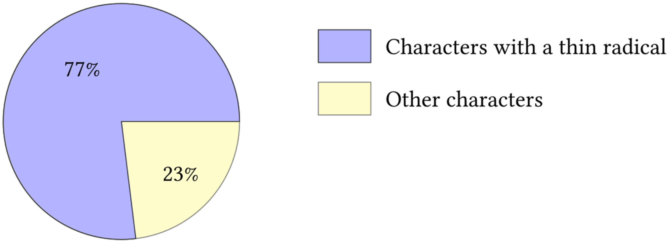
The amount of Chinese characters featuring a thin radical out of the total 2136 jōyō characters of Japanese (i.e. the frequently used Chinese characters of the Japanese writing system).
Although this discussion might seem to only concern characters that are phono-semantic compounds (形聲), this is not the case. For instance, compound ideographs (會意), which by essence result from the composition of several elements, still satisfy Definition 3 in that the character element that holds the semantic information is not the heaviest as the other elements – although not holding the phonetic information in this case any more – are prioritised for identification, as explained above. There can nevertheless be exceptional cases where the element holding the semantic information is as heavy as the other elements, thus resulting in the balance of weights (see next section); this is typically the case of characters consisting in the duplication of the radical, like 森. Regarding characters that are pictograms (象形), they are prime characters (i.e. not induced by composition of several elements) and thus obviously include one single element, hence the heaviest.
Finally, one may wonder whether considering solely the topmost composition operation suffices. That is, whether also considering the second in line composition operation is desirable. We do not think so, since once the semantic element (radical) has been excluded as part of the topmost composition operation, it would then become difficult, not to say arbitrary, to establish the weight of the parts making the other character elements (e.g. the element holding phonetic information in the case of a phono-semantic compound).
Weight distribution amongst character elements
Considering Definition 2 regarding elements composition of a character and Definition 3 regarding the heaviest element of a character, weight distribution amongst the elements making a character depends on the character morphology, that is, on its topmost composition operation, as well as on the location of the heaviest element with respect to the character morphology.
For example, considering horizontal character composition as the topmost composition operation, when the semantic element is on the left, the weight distribution diagram is with the larger disc representing the heavier element (or heaviest when there are at least three elements). This weight distribution diagram applies for instance to the character 配.
It is recalled that most composition operations are binary, thus involving two elements. The detailed repartition of the character composition arities is shown in Figure 2, which is based on previous work (Bossard, 2018): we have counted that 12 out of 17 are binary, four are ternary and one, the identity operation, is unary. As a result, most weight distribution diagrams represent two character elements.
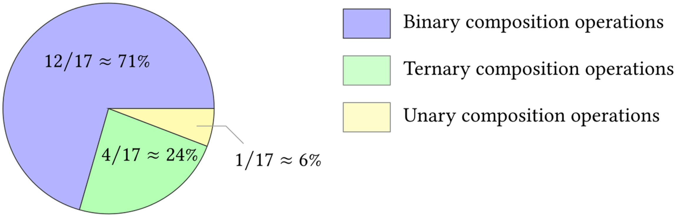
Repartition of the character composition operation arities.
This first approach to weight distribution amongst character elements is what we call the theoretical weight distribution of a character: it is based on the element weight relationship induced by Definition 3. We can then extend this discussion to the graphical weight distribution of a character: this is the visual importance (roughly the graphical size) of an element with respect to the other character elements.
It can be noted that since, as confirmed earlier, the vast majority of semantic elements are visually minor, the theoretical weight distribution will match the graphical weight distribution, in other words, inducing an unbalanced graphical weight distribution. For other cases, that is when the semantic element is visually not minor, the graphical weight distribution tends towards balance. (This is especially visible in the case of character elements with a large number of strokes or area.)
For characters that are pictograms, as explained previously, both the theoretical and graphical weight distributions are trivially . For the particular cases of compound ideographs consisting in the duplication of the radical, both the theoretical and graphical weight distributions are balanced: in the case of two elements (e.g. 林), in the case of three elements (e.g. 森), and so on.
Finally, although, as mentioned at the end of the earlier section ‘Foundations: Definitions and properties’, considering composition operations that succeed the topmost one is not an option when it comes to ordering the weights of character elements, it is sound to assume that the parts composing the character elements (i.e. informally, elements of elements) induced by the topmost composition operation are theoretically balanced, that is, have the same theoretical weight. This is important when considering the character drawing issue as addressed below in the ‘Towards applications’ section.
Aspect ratio of characters
The previous discussion on weight distribution amongst character elements allows us to approach the character aspect ratio issue. In the rest of this article, the aspect ratio of a character is written as width:height. We begin with the following non-trivial remark.
An example is given in Figure 3: a sample character drawn with approximately a 1:2 ratio (i.e. twice higher than wide), as found in the Jikyōshū manuscript (字鏡集, by Sugawara Tamenaga (1158–1246), thus predating the printing era as explained in introduction), features the same graphical weight distribution as the same character drawn more conventionally with a 1:1 ratio. In other words, the character elements are evenly impacted, or nearly so, when enforcing a 1:1 ratio.
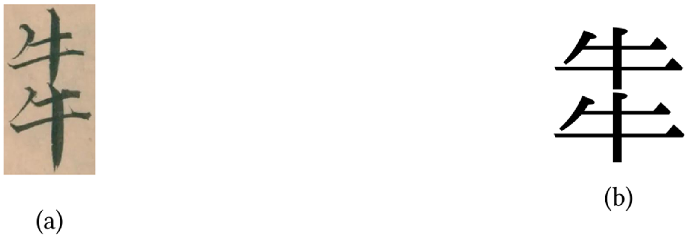
The sample character 𤘧 drawn with (a) approximately a 1:2 ratio, and (b) a 1:1 more conventional ratio. (The image of the former has been extracted from the Jikyōshū manuscript (vol.3, no.10) available in the digital depository of the National Diet Library (NDL) of Japan – info:ndljp/pid/2592434.).
Furthermore, instead of considering the graphical weight distribution, which, as explained, corresponds in most cases (i.e. when the semantic element is visually minor) to the theoretical weight distribution, it may be more relevant, and interesting, to focus on the aspect ratio of a character.
A conventional, fixed 1:1 ratio for a character necessarily (mathematically) induces deformation of the aspect of its elements, since those are generally balanced with a 1:1 aspect ratio. This is especially the case when the semantic element is visually not minor. Two sample characters are shown in Figure 4: the topmost composition operation is horizontal composition for one and vertical composition for the other. They are both drawn with the 1:1 conventional aspect ratio. Moreover, the semantic element of both (i.e. 鳥 for one and 雨 for the other) is visually not minor: deformation of character elements is thus clearly visible. Elements are indeed significantly narrowed or widened, depending on the topmost composition operation.
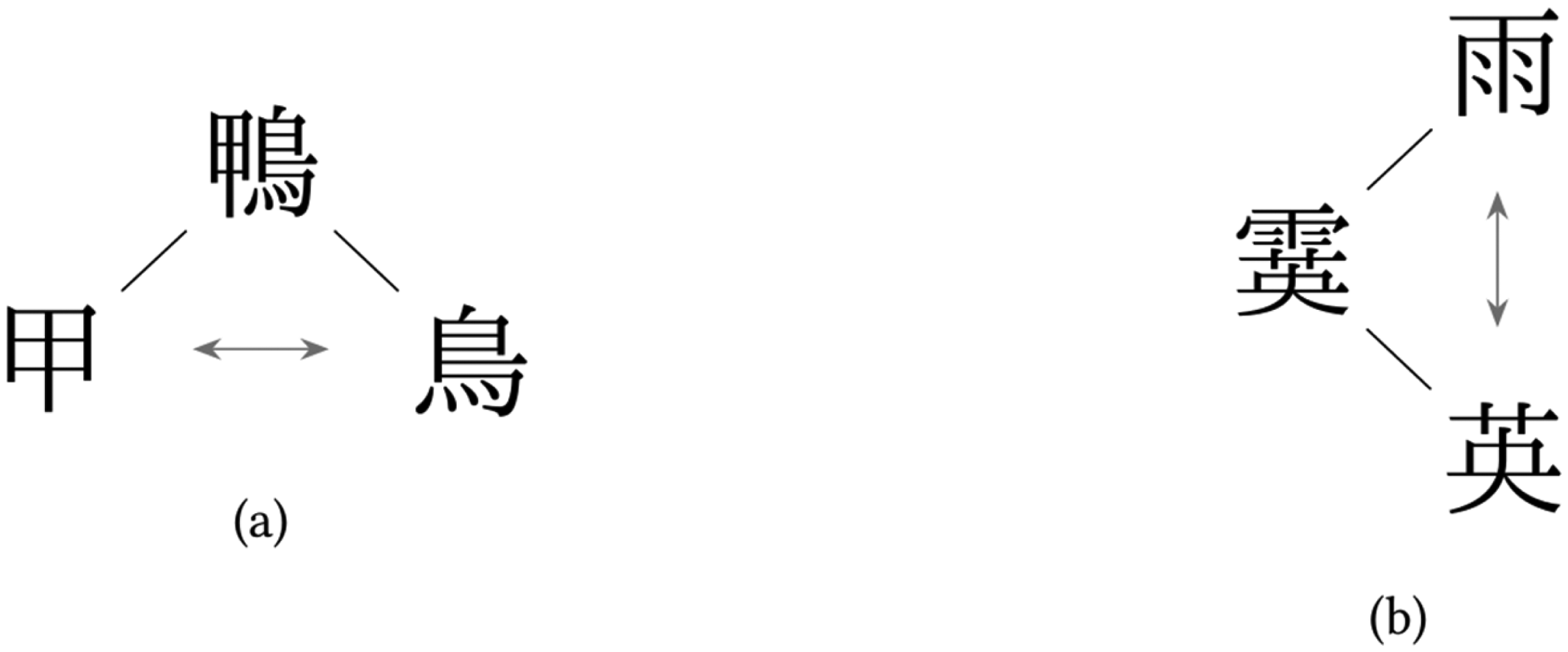
An illustration of the deformation of a character's elements, especially visible when the semantic element is visually not minor, as in these sample characters: (a) horizontal composition, (b) vertical composition.
On the contrary, tolerating some flexibility for the aspect ratio of the character allows to maintain a natural aspect of its elements: these are not, or at least are significantly less, shrunk. This is indeed a matter of tolerance since the aspect ratio of prime characters (i.e. characters that result not from the composition of several elements) is 1:1. (Even ‘thin’ characters, which do not visually exhibit a 1:1 ratio, such as 一 and 丿, are treated as having a 1:1 aspect ratio when appearing in text between other characters.) Such aspect ratio flexibility does not impact the distribution of graphical weights, and that for the same reason that enforcing a 1:1 ratio impacts all the characters elements evenly, or nearly so.
Therefore, such aspect ratio tolerance enables to a certain extent to restore the visibility of the elements of a character, and especially of its heaviest element, by showing them in a more natural, less deformed manner. Examples are given in Figure 5 where such visibility improvements are rather clear.
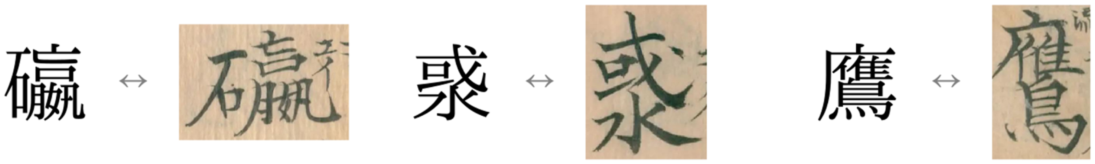
Sample characters demonstrating that aspect ratio tolerance enables to a certain extent restoration of the visibility of the character elements. (Images extracted from the Jikyōshū manuscript of the NDL, vol.1, no.47, no.98, info:ndljp/pid/2592432, vol.3, no.33, info:ndljp/pid/2592434.).
On the impact of character simplification on character element theoretical weight
Within the writing systems based on Chinese characters, some, Chinese and Japanese mainly, have undergone character simplification – we consider here only official character simplification reforms and not demotic character variants, the latter being another, insightful subject (Bossard, 2018).
First, it (almost) goes without saying that simplified characters retained their original readings: this is obviously critical to maintain cognition of the language. Second, it is however interesting to note that in Chinese, characters have been simplified by retaining phonetic information of the phonetic, and thus heaviest element.
We give two examples for the case of Chinese below (transliterations given in pinyin): ➓ The character 磯 jī of phonetic element 幾 jī has been simplified as 矶 jī of phonetic element 几 jī. ➓ The character 濱 bīn of phonetic element 賓 bīn has been simplified as 滨 bīn of phonetic element 宾 bīn.
So, the heaviest element has changed (i.e. it has been simplified), but it has been replaced by an element of same phonetic information. Besides, semantic information remains intact since the character radical is untouched.
The situation in Japanese interestingly differs. We again take two examples (regarding the character readings, we abide by the authoritative Daikanwa dictionary (Morohashi et al., 2000)): ➓ The character 驛 (eki, yaku) has been simplified as 駅 (eki). That is, the phonetic element 睪 (eki, jaku, jō, taku, tsu, to, nyō, yaku) has been replaced by the phonetic element 尺 (shaku, seki). It is very interesting to note here that unlike Chinese as seen above, Japanese has, at least in some cases, simplified the character at the cost of losing phonetic coherence (尺 does not include eki, yaku as phonetic reading). Furthermore, one can note that this loss is partial: the readings of 尺 remain close (shaku, seki) to the original ones (eki, yaku). Obviously, as mentioned earlier for Chinese, the simplified character retains the same reading. ➓ The character 濱 (hin) has been simplified to 浜 (hyō, hin, hō). That is, the phonetic element 賓 (hin) has been replaced by the phonetic element 兵 (hyō, hei). This is yet another example of simplification at the cost of losing phonetic coherence (兵 does not include hin as phonetic reading). Furthermore, one can note that this loss is partial: the readings of 兵 remain close (hyō, hei) to the original one (hin).
On a side note, it is worth mentioning that the respective meanings of the phonetic elements before and after character simplification (i.e. of 尺 and 睪, and of 兵 and 賓) are unrelated: semantic information is not shared.
Therefore, from the point of view of character element (theoretical) weight, it can be noted that although theoretical weight distribution amongst character elements is not impacted by character simplification (i.e. the phonetic element remains the heaviest), Chinese keeps the phonetic information of the phonetic element identical before and after simplification, which is in our opinion positive from a logical standpoint. On the contrary, Japanese does, or tends to, lose coherency during simplification: the phonetic information of the phonetic (heaviest) element may not remain the same before and after simplification, which is in our opinion a disturbing side effect thereof. As ‘mitigating circumstances’ for the case of Japanese, this peculiar phonetic situation may be rooted in the fact that Japanese readings are far more complex than Chinese ones as they do not satisfy the one character, one reading principle, unlike Chinese (Bossard, 2018).
Finally, we would like to mention that by the considered examples, we have exhibited at least a trend: counterexamples might be found, especially in Japanese where the situation with respect to character readings is complex.
Towards applications: Hinting at computational solutions
We here provide hints regarding implementation and application of the previously discussed character weight distribution and aspect ratio issues.
Memorisation support systems for learners
The previous discussion on the heaviest element of a character can subsequently serve as a basis for the design of memorisation support software systems for learners of a language whose writing system relies on Chinese characters. As recalled in the introduction, such computer systems are numerous, especially since the advent of mobile devices like smartphones and tablets.
Concretely, character drawing (handwriting) practice software, for instance by means of a tablet and a digital pen, can emphasise the heaviest element of a character, for instance with colour information – this is Figure 6(a): the user draws only the heavier element, here dashed – or different element scaling factors – this is Figure 6(b): the user draws over both elements, one scaled down compared with the other as just explained.
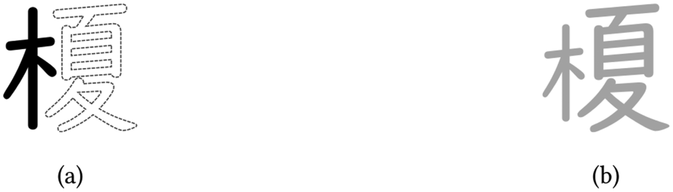
Character drawing practice software can emphasise the heaviest element of a character, for instance with colour information (a) or different element scaling factors (b).
Text rendering by software
Allowing character aspect ratio flexibility on computer systems is a challenging issue, and font generation must be one essential step to this end. Due to the numerous glyphs involved, automatisation of such process is highly desirable (Tanaka et al., 1995). We here give hints regarding solutions to achieve this objective.
In order to restore a more natural aspect ratio for the glyphs of a CJK font, spacing is key: solely resizing by either shrinking or expansion of character elements, even uniform resizing of character elements separately, would surely produce poor results, especially due to uneven brush widths for strokes after element resizing. Instead, starting for each of the elements from the corresponding character glyph and then adjusting space between its parts is recommended, which could then be followed by slight resizing for optimal output. To this end, space adjustment and light resizing of the parts of a character element reflect their weight balance, that is, their uniform weight distribution, as explained previously.
An illustration of this process is shown in Figure 7: from simple CJK glyph composition (here, horizontal composition of the two characters 石 and 嬴) to space adjustment between the parts of the character elements (here, only the parts of the element 嬴 are suitable for space adjustment) and finally slight resizing (shrinking and expansion) of the character elements and parts. Several character heights for the same character are given in order to facilitate readability comparison.
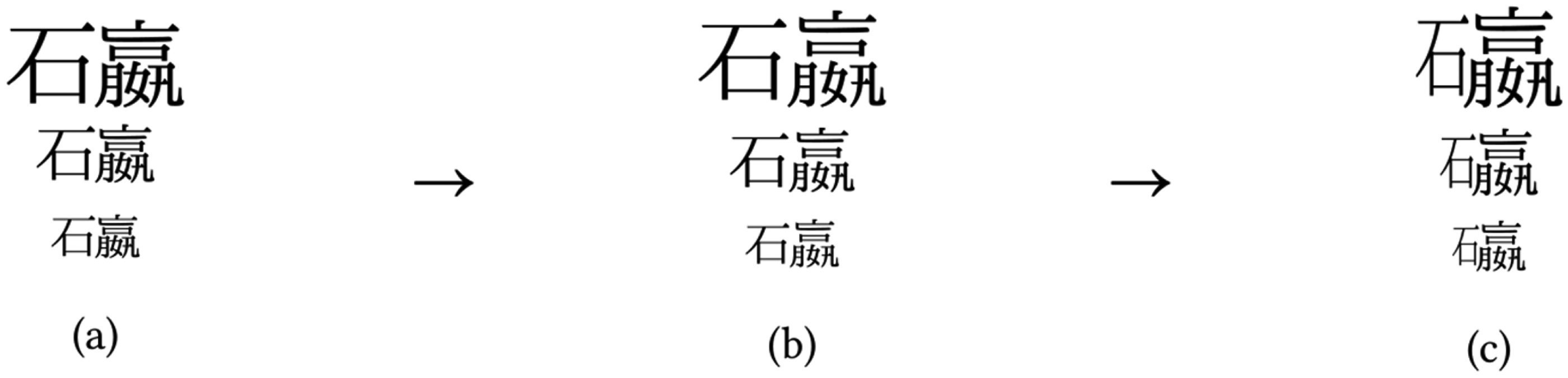
From simple CJK glyph composition (a) to space adjustment between the parts of the character elements (b) and finally slight resizing (shrinking and expansion) of the character elements (c). Several character heights are given for readability comparison.
It can be observed that flexibility in the aspect ratio of the character enables an arguably enhanced readability while avoiding automated font generation artefacts such as flagrantly uneven stroke widths and ill-placed elements and parts.
We have then conducted a preliminary experiment involving three subjects so as to assess the proposed typographic rendering. The experimental conditions were as follows: the three subjects were native Japanese speakers of diverse backgrounds and ages, and the same experimentation was repeated for every subject. At the beginning of the experiment, it was explained to every subject that he was about to be shown one single Chinese character and asked questions about it.
Precisely, the three different renderings of Figure 7 were shown to each subject, and the subjects were asked the following three questions successively, each time waiting for the subject's answer to move on to the next question. ➓ Question 1: Which of the three renderings makes it clear that this is one single character? Sort in descending order of understandability thereof. ➓ Question 2: Sort in descending order of readability (the higher the readability, the more easily the character parts are distinguished). ➓ Question 3: Sort in descending order of visual quality, that is, calligraphic elegance.
The obtained answers were in the form ‘a’, ‘b’ or ‘c’, respectively, corresponding to Figure 7(a), 7(b) and 7(c), and given in a sequence, for example ‘b, c, a’, meaning here first ‘b’, then ‘c’ and lastly ‘a’. The results are detailed in Table 1.
Experimental results: answers (i.e. sequences) given by the subjects to the three questions.
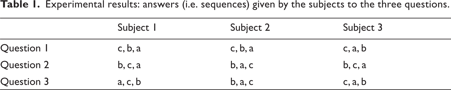
The obtained results are next discussed. Regarding Question 1, rendering ‘c’ (i.e. that of Figure 7(c)) is clearly the one showing that this is one single character; this is a positive indicator of the proposed character rendering method: reader confusion is avoided. Regarding Question 2, it is clear that our rendering approach to adjust the space between character parts is valid: most answers favour renderings ‘b’ (i.e. that of Figure 7(b)) and ‘c’ (i.e. that of Figure 7(c)). Finally, regarding Question 3, there was no significant difference regarding visual quality (calligraphic elegance), which is not surprising given that all three renderings are based on the same font (a same character design).
Conclusions
The advent of printing, not only through a computer, has significantly impacted CJK text typesetting: the usage of a fixed 1:1 aspect ratio for characters has nowadays rendered almost invisible the aspect flexibility of Chinese characters when drawn by hand. So as to tentatively save this cultural heritage, in this article, we have first investigated and clarified what the heaviest element of a character is, which is an important indication when it comes to character drawing. Then, we have more precisely introduced the notion of weight for the elements of a character, relying on two types of weight: the theoretical weight and the graphical weight. This discussion has enabled us to clarify the notion of weight distribution amongst the elements of a character. Next, we have considered the aspect ratio issue of characters, an issue that is directly related to weight distribution of the character elements. Aspect ratio flexibility has been addressed. In addition, the influence of character simplification reforms on weight distribution amongst character elements has been discussed. Finally, applications of these issues, both character element weight and weight distribution amongst elements, have been discussed from a computational point of view.
Throughout this study, it has become clear that more than weight distribution, be it theoretical or graphical, of the elements of a character, its aspect (proportions) is at risk. That is, aspect ratio flexibility. It notably has important implications for character drawing and readability.
Regarding future works, we would like to further propose solutions to enable aspect ratio flexibility for CJK characters on computer systems. In addition, it may be interesting to distinguish the various CJK writing systems (e.g. Chinese, Japanese) when discussing this balance and aspect matter.
Footnotes
Acknowledgements
The author is deeply appreciative towards the reviewers for their insightful comments and suggestions.
Funding
The author received no financial support for the research, authorship, and/or publication of this article.
Declaration of conflicting interests
The author declared no potential conflicts of interest with respect to the research, authorship, and/or publication of this article.