
Abstract
Big data has emerged as a critical instrument for urban planning and development decision-making. However, the reliability and representativeness of big data constrain its utility. Availability of big data varies significantly across different space, time and socio-demographic groups, particularly in the Global South. This leads to the existence of digitally invisible groups – those who cannot contribute to and benefit from digital data-informed decisions – resulting in the deepening of existing inequalities and further marginalising those already excluded populations. This study presents an example application using land use classification with data from different sources in a developing country context, to explore how certain community groups may be systematically underrepresented or overlooked in specific data and applications. We combine traditional geospatial data (satellite imagery, nighttime light imagery, building footprints) with large-scale, digitally generated data sources (geotagged Twitter posts, street view imagery), and apply a stepwise data integration approach using a random forest classifier. We focus on class-specific changes in performance to infer patterns of uneven data representation. By comparing model outputs across different data combinations, we assess how the inclusion or exclusion of specific datasets influences classification performance. Results indicate that informal settlement areas are underrepresented in geotagged Twitter data, and inaccessible neighbourhoods are poorly captured by street view imagery. Our findings show that reliance on a single data source can reinforce biases, while integrating complementary datasets can partially mitigate these gaps when guided by systematic evaluation. We recommend targeted primary data collection and participatory mapping to address persistent blind spots and improve the inclusiveness of data-informed urban decision-making.
Keywords
Introduction
The challenge of involuntary digital exclusion and resulting digital invisibility is one of the most important limitations of using digital data for public policy. In this context, digital data refers to the extensive and rapidly growing datasets generated by various sensors integrated into devices such as smartphones, satellites and other Internet of Things (IoT) devices. These sensors capture a wide array of data, including physical environments, social sentiments and human mobility patterns (Guo et al., 2019; Li et al., 2022). Characterised by its large volume, high velocity and diverse sources, big data provides rich, real-time insights into complex systems. As a result, an increasing number of administrative bodies are leveraging this data to inform and enhance evidence-based policymaking (Gao et al., 2024). European governments have been endeavouring to establish open data platforms for data-driven decision-making in smart cities (Bokolo, 2023; Mureddu, Schmeling and Kanellou, 2020). At the national level, as of 2020, 77% of decisions in the US were data-driven (Taylor, 2022). Reports indicate that national leaders often utilise data to gain a better understanding of policy issues and to design or inform specific implementation strategies (Felzer, 2018). Many countries have utilised mobile phone data to track human movements for epidemic disease prevention; such applications noticeably increased during the COVID-19 pandemic (Arai et al., 2021), especially in the Global North countries such as the US, UK and Spain (Chen et al., 2021; Frias-Martinez and Frias-Martinez, 2014; Yin et al., 2021). Applications in these regions have demonstrated that combining remote sensing data (e.g., satellite imagery and nighttime light imagery) with social sensing data (e.g., Twitter data, street view imagery) can enhance the accuracy and performance of land use classification (Tu et al., 2021). Ideally, such data sources and research methods could be transferred and applied globally, including to the Global South.
The World Development Report (World Bank Group, 2021) suggested that the infrastructure required for data generation is not yet widespread across all parts of the world, and it is essential to ensure equitable data access for low-income groups and countries. Millions of people are not included in existing data collection and are therefore excluded from decision-making and policy development (UN DESA, 2022). Under-sampling of the urban poor is a long-recognised issue: census data in informal settlements often carries high uncertainty (Desgroppes and Taupin, 2011). Yet as urban living arrangements become more complex (and sometimes transient) (Thomson et al., 2021) and decision-making increasingly depends on big data to capture details like mobility, this challenge is taking a new form – digital invisibility. It is estimated that 37% of the global population has restricted or no access to the internet, many of whom are in the Global South (International Telecommunication Union Development Sector, 2022). Among all regions, Africa has the lowest internet access, with only 40% of individuals having connectivity, in contrast to 88% in Europe (International Telecommunication Union Development Sector, 2022). Those populations with no access to smart devices or the internet are called ‘digitally invisible groups’ since they have less opportunity to generate data that could influence policy or benefit from data-informed decisions (Longo et al., 2017). While data and digital services bring new potential to society, the collection and access of data from the digitally invisible groups become a critical issue that may intensify social-spatial inequalities. When directly applying research from the Global North to countries in the Global South, the methods used in these studies may create barriers that exclude digitally invisible groups from data-driven decision-making.
Several studies have sought to address the challenges of digital invisibility faced by countries in the Global South. These studies mainly adopt social science methods focusing on detailed data collection for smaller areas, which can be costly and subjective (Nasr et al., 2023; Thomson et al., 2022). Furthermore, there is a lack of systematic approaches to assess which population groups are digitally invisible and how that impacts urban decision-making using digital data sources. To address this knowledge gap, this research introduces a machine learning workflow for inferring digitally invisible groups and quantifying the impact of their exclusion on modelled urban indicators. To demonstrate the feasibility of the workflow, we apply it to a land use classification study using multi-source data in Nairobi, Kenya, since land use categories correspond to distinct activity groups. Our investigation is guided by three research questions: 1) Can a machine learning–based workflow be designed to infer digitally invisible groups using multi-source geospatial and social data? 2) How does the inclusion or exclusion of different data sources influence the representation and classification of activity-associated population groups in land-use classification? 3) Which land use categories and corresponding activity-based population groups are underrepresented in individual data sources?
The rest of the paper is organised as follows. Following this introduction, the next section presents a review of the existing literature on digitally invisible groups. The following section introduces the general workflow and provides an overview of the landscape in our case study city. The results of applying the workflow are then presented, followed by a discussion on how both the workflow and its findings may be relevant to a broader audience. Finally, we conclude the paper by summarising the key findings of the research.
Literature review
Definition of digitally invisible groups
Data not being representative of the entire population is known as ‘data bias’ or the ‘digital divide’ (Doshi and Garschagen, 2023). Those individuals who are overlooked in digital data generation, collection and analysis processes are referred to as the ‘digitally invisible’ group (Taylor, 2017). Making extrapolations or assumptions about an entire population from datasets that under-sample digitally invisible groups can result in unjust policies and exacerbate social inequality. While some people actively opt for being digitally invisible due to privacy concerns, others find themselves in this position due to a lack of access to necessary infrastructure. The latter is the primary concern of this research and is labelled as unintentional non-participation (Lutz and Hoffmann, 2017), a situation where individuals are inadvertently excluded from data collection processes, and the issue has garnered attention from scholars studying digital inequality (Micheli et al., 2018). Although Doshi and Garschagen (2023) argued that other parties, including individuals, NGOs and civil society organisations in India, often step in to voice the concerns and experiences on behalf of digitally invisible groups, the challenge remains that no systematic research has been conducted to understand the extent to which these groups have been ignored and how this would affect data-driven decisions.
In the context of the Global South, the issue of digital invisibility is likely to be further exacerbated by the typical characteristics of inequality in developing cities. Digitally invisible groups, including lower-income, marginalised, and vulnerable populations, are systematically underrepresented in datasets due to limited access to technology, low smartphone usage, inconsistent internet connectivity and barriers like language, culture and privacy concerns (Taylor, 2017). For instance, people living in informal settlements are inherently more vulnerable than their counterparts in formal urban areas (Dodman et al., 2017), and are less likely to participate in sensor technology initiatives due to factors such as limited access to the internet and IT equipment or a lack of relevant knowledge (Wyche, 2015), which further exacerbates the digital invisibility issue (Yeboah et al., 2021). However, this group is projected to reach up to three billion worldwide by 2050 (Samper and Liao, 2023). The omission of such vulnerable groups reinforces inequalities, as the needs and experiences of these groups are less likely to be reflected in data-driven decisions.
Three dimensions of digital invisibility
In this study, we distinguish between digital invisibility as a condition of underrepresentation in digital data, and digitally invisible groups as the population segments affected by this condition. While data gaps have been widely discussed in geographical research, we emphasise that these gaps are not random but are often systematically associated with specific socio-demographic groups, such as low-income populations, informal settlement residents, or digitally disconnected users. Despite discussions across various sectors, such as digital media and data analysis, there remains a lack of systematic understanding of the issue of digitally invisible groups. By reviewing the existing literature, we categorise the concept of digital invisibility broadly into three dimensions of invisibility, namely spatially invisible, temporally invisible and demographically invisible, as elaborated below.
Spatially invisible: Spatial representativeness has been a persistent challenge in both traditional and big data. Thomson et al., (2022) found that grid-based population datasets for slums in Nigeria and Kenya underestimated slum populations significantly, predicting only 39% of residents, highlighting gaps in spatial coverage due to issues such as under-sampling of new areas due to use of old census data for sampling strategies and sometimes complex/transient living arrangements in slums. Spatial representativeness is crucial for big data. For instance, smartphone and Wi-Fi accessibility affect users’ contributions to spatially referenced mobile app and social media data, with significant regional disparities. Africa, for example, has 48% less internet access compared to Europe (International Telecommunication Union Development Sector, 2022). On a more localised scale, Crawford (2013) analysed Twitter activity to understand public responses following Hurricane Sandy hit the north-eastern US. This study revealed a data skewness with most tweets from Manhattan, but limited data from the hardest-hit areas of Breezy Point, Coney Island and Rockaway due to extended power blackouts and lower smartphone ownership and Twitter usage (Xu and Qiang, 2021). Similarly, Biljecki and Ito (2021) highlighted that, despite the cross-country collection of Google Street View imagery, no imagery is available in about half of the countries. Furthermore, most street view imagery is clustered in urban areas rather than rural regions (Li et al., 2022), so refining the spatial coverage of these visuals remains an ongoing challenge.
Temporally invisible: The duration and frequency of updates are additional factors to consider. Given their recent emergence, existing big data only spans a short time. For instance, Meta (formerly Facebook), one of the earliest platforms, was launched in 2004, making it only 21 years old at the time of writing. Much big data from the past was not preserved and is therefore untraceable, leading to considerable gaps in historical big data. The temporal irregularity of street view imagery has been criticised due to infrequent and inconsistent updates, variations in image acquisition timing (e.g., time of day, season, weather) and disparities in temporal distribution across locations (Li et al., 2022), leading to challenges in conducting accurate and consistent analyses of the built environment. Similarly, mobile phone app data is heavily influenced by users’ preferred usage time of afternoon (Guo et al., 2019; Sarker et al., 2021), which can result in the underrepresentation of specific activities such as commuting during peak hours.
Socio-demographically invisible: The demographic profile of digitally invisible groups is a focal point for researchers. Existing literature on content creation highlights that age plays a significant role in the generation of digital data, with younger users being the primary content producers (Leonelli et al., 2021; Micheli, Lutz and Büchi, 2018; Wang and Ye, 2018). Moreover, contributors of mobile phone data are often individuals from more affluent and better-educated backgrounds (Golder and Macy, 2014). However, some studies suggest that social media use is more inclusive than previously assumed, noting that different age groups tend to concentrate on different platforms. Some platforms attract predominantly younger audiences, while others have a more mature user groups (Blank, 2013; Micheli, 2015). Different social media platforms reflect distinct aspects of people’s activities. For example, Facebook data can effectively capture users’ social relationships, which can be used to infer social status, whereas Yelp data more accurately reflects users’ preferences for restaurants (Ariyasriwatana and Quiroga, 2016; Lie-Panis et al., 2024).
It is important to underscore that these dimensions are interrelated. For instance, one’s residential location often correlates with their socio-economic status (Luo et al., 2021). Understanding these categories helps in tailoring interventions that address unique challenges faced by each group. These dimensions of digital invisibility therefore provide a framework for linking data coverage gaps to specific population groups, which is essential for interpreting patterns of underrepresentation in data-driven applications.
Lack of standardised methods to infer digitally invisible groups
Existing research on digital data bias has largely been developed in the context of the Global North, where data availability is relatively high and digital infrastructure is more evenly distributed (Özkula and Reilly, 2024). In these settings, studies often focus on identifying and correcting biases within datasets, such as sampling bias or measurement error, assuming that most population groups are at least partially represented. In contrast, in the Global South, the challenge is more fundamental: large segments of the population may be entirely absent from digital datasets due to limited access to technology and infrastructure (Raihan et al., 2024). As a result, digital invisibility is not only a matter of bias within data, but also of complete exclusion from data generation processes (Arora et al., 2023). Despite this critical difference, relatively few studies explicitly compare how these challenges manifest across contexts or develop methods to systematically identify who remains digitally invisible.
Previous relevant work presents a critical gap in methodology design. We found no standardised methods to reveal the presence of digitally invisible groups or to assess how data biases affect indices derived from significant data sources. Although some studies address data biases and representativeness issues within big data, they often lack systematic ways to infer who is excluded and why. For example, Poledna et al. (2018) analysed biases in two mobile-phone-derived datasets, finding that they largely mirror telecom market share and subscription patterns rather than population coverage (i.e., who has a chance to be observed by the data). Moreover, for privacy reasons, this method was designed not to map exact locations of individuals but to make general estimates about movement patterns and locations visited. Similarly, Jürgens et al. (2019) looked at biases in data collected through self-reporting by comparing it to data gathered automatically from mobile devices. They found that self-reported information and automatically collected data produced different results, with mobile device tracking reducing some measurement errors. This study underscores that different methods capture different types of information. Neffendorf et al. (2018) applied a similar comparison in the UK, examining location data from 254 mobile phone users against their self-reported travel records. They found that while work locations were accurately identified, home locations were somewhat reliable, though some devices were inactive during travel times, leading to gaps. Conversely, Embury (2023) used mobile app data and travel surveys to detect biases in synthetic population models, which have the potential to harm marginalised individuals and groups. This work further highlights the variability in methods and the need for standardised approaches to address who remains ‘digitally invisible’.
To address the knowledge gap on digital invisibility in urban settings, we propose a scalable and transferable methodology that identifies digitally invisible groups through stepwise integration of multi-source data. We apply this workflow to land use classification in Nairobi, demonstrating its effectiveness in inferring digitally invisible groups. This approach enhances the inclusiveness of urban mapping by integrating diverse datasets that capture unique aspects of human activity and the physical environment.
Data and methods
Study area setting
Kenya, located in East Africa, is a hub of African economic, political and digital development (Ngui Muchai and Kimuyu, 2017; Ren et al., 2020) (Figure 1). From 2021 to 2022, the number of internet users in Kenya grew by 1.6 million, a 7.4% increase (Kemp, 2022). The country has also launched the Kenya National Spatial Data Infrastructure to promote spatial data usage (Mwungu et al., 2017) and support land use planning (Ministry of Lands and Physical Planning, 2017). Nairobi, Kenya’s capital and economic hub, is recognised globally for its innovation, ranking among the top 100 cities in the 2019 Global Innovation Index (Ren et al., 2020; Ministry of ICT Innovation and Youth Affairs, 2022). The city increasingly leverages data sciences and technology for development monitoring (Nairobi City County, 2023).
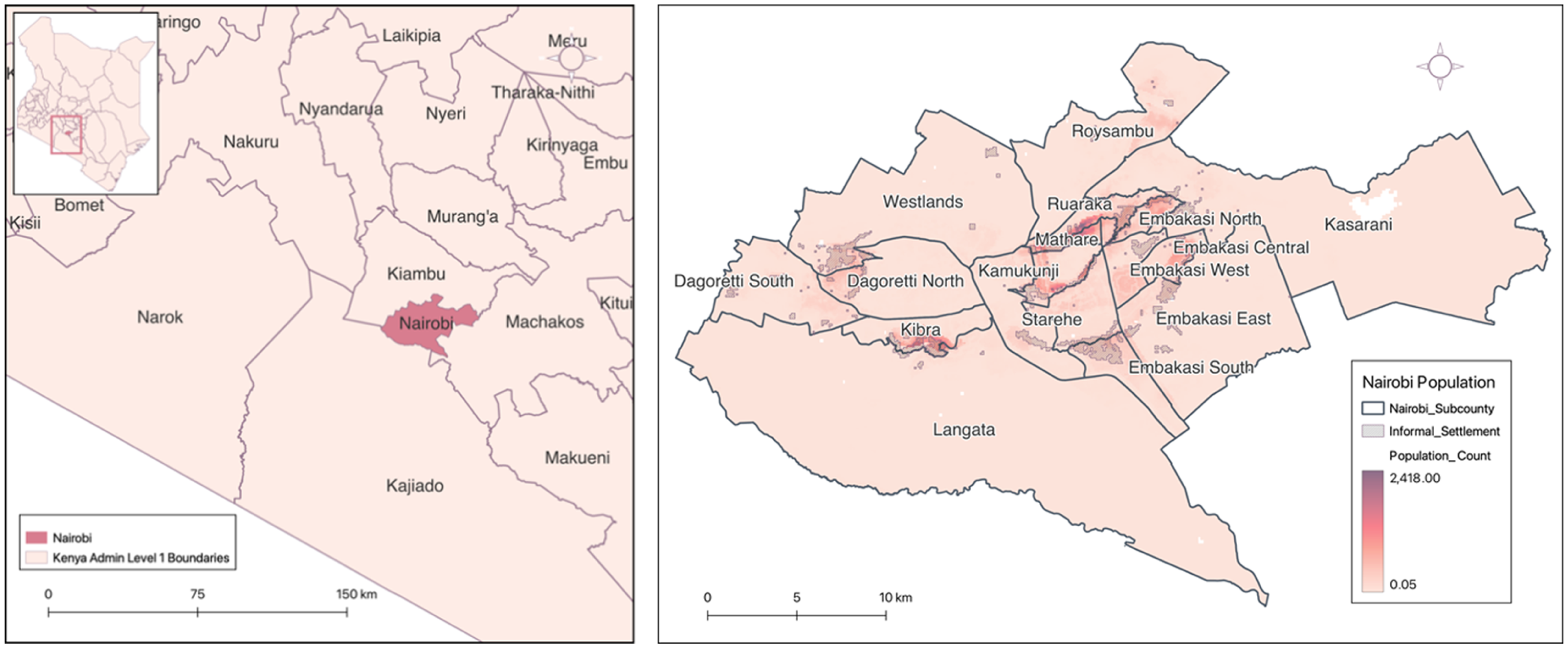
Location of Nairobi and population count distribution across 100 m × 100 m grid cells. Data sources: Administrative boundaries from GADM; population count data per 100 m grid from WorldPop (2020).
Nairobi offers significant potential for data-driven applications, supported by robust infrastructure and a population willing to engage in digital initiatives. According to Kiburi et al. (2022), phone access among individuals was estimated to be 77.2%, and among them, 59.7% used smartphones. Nearly all households had access to some form of phone communication. Safaricom, Kenya’s leading mobile network, provides the most comprehensive mobile data coverage, making it a valuable resource for spatially referenced analyses of human behaviour. However, accessing mobile phone data poses challenges due to privacy concerns. Social media data, while more readily available due to voluntary participation, remain limited in representativeness in Kenya. Social media platforms collectively reach approximately 23.5% of the total population, whereas Twitter reaches only 3.4% (Kemp, 2024). This disparity underscores the restricted penetration of platform-based data, with many excluded users residing in informal settlements due to persistent technical and infrastructural barriers. With strong government support for digital initiatives and relatively high levels of data availability, Nairobi stands out as one of the most digitally advanced cities in the Global South. It is positioned at the forefront of urban digital transformation, facing challenges that many other cities in the region are likely to encounter as they progress through similar data-driven development pathways.
Nairobi faces rapid population growth, especially in informal settlements. According to Georganos et al. (2021), informal settlements occupy less than 5% of the city’s residential land but home more than 60% of the population, as shown in Figure 1. Although there has been some progress in expanding digital access in larger informal settlements, such as Kibera, such effort is limited to a local scale, leaving many communities disconnected (Williams et al., 2020).
Workflow: Reveal digitally invisible groups via land use classification
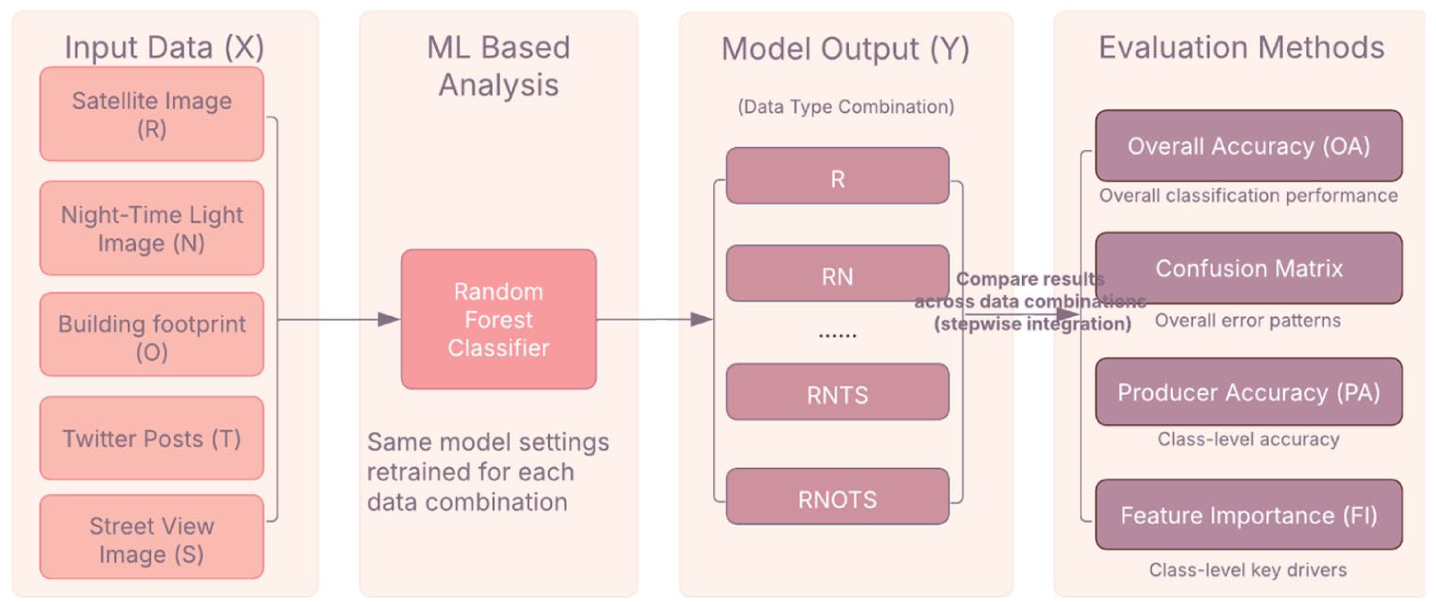
There is no standard method or reliable ground truth for identifying digitally invisible groups. We address this by comparing modelled outcomes from a single data source with outcomes produced after stepwise integration of additional sources. Digitally invisible groups are conceptualised as systematic misclassification across different combinations of data inputs. We demonstrate this idea with land-use classification, using a simple diagnostic: hold the modelling framework constant and compare outputs from a single data source with outputs after adding other sources step by step.
To implement this, we adopt a
We choose land-use classification because it is a well-established task with benchmarks (Pan et al., 2013; Soliman et al., 2017; Talukdar et al., 2020) and because land-use classes correspond to human activities (Toole et al., 2012), allowing us to see where some groups are likely to be missed by particular sources (e.g., building footprints, Twitter, street view imagery). More specifically, when a data source is introduced or excluded, certain land-use types, and the associated activity patterns, may be systematically under- or over-classified because the data disproportionately omit or capture these activities.
Because there is no reliable ground truth for digitally invisible groups, these output comparisons are more informative than raw coverage checks and represent our attempt to address this gap. The workflow has four steps as shown below and in Figure 2. A full explanation of the workflow can be found in Appendix 8.1
Input data preparation: We assemble five data sources (Figure 1): satellite imagery (R), nighttime light imagery (N), building footprints (O), Twitter posts (T) and street view imagery (S). Details of data sources and processing appear under ‘Data processing and random forest classifier’.
Machine learning (ML)-based modelling: We train a pixel-based random forest classifier (Breiman, 2001) as a transparent benchmark commonly used in land-use mapping and robust to heterogeneous features (Talukdar et al., 2020), following practice for small/medium samples Ching et al., (2018). The same modelling setting is used across all experiments (i.e., identical algorithm, hyperparameters and training procedure), while the model is retrained from scratch for each data combination.
Data source integration for results: We implement a stepwise data integration approach, training models using incremental combinations of input data sources (e.g., R, RN, RNO, . . ., RNOTS). For each combination, the model is retrained under this consistent setting to ensure comparability across experiments. All combinations are shown in Figure 4.
Results comparison and evaluation: We compare results from each combination in two stages. First, we use global metrics (overall accuracy and the confusion matrix) to check whether adding sources improves performance and to characterise how errors redistribute across classes. In addition, we use SHapley Additive exPlanations (SHAP) as a model-agnostic interpretability method to analyse global feature contributions and complement impurity-based feature importance. Second, we focus on three equity relevant land use categories: commercial, industrial and informal settlements. These categories correspond to distinct activity groups including international and business users, informal vendors, industrial workers and low-income residents who are often at risk of digital underrepresentation. For these categories, we report per-class metrics, i.e. producer’s accuracy and feature importance to attribute any gains to specific inputs. Partial Dependence Plots (PDP) are further used to examine non-linear relationships between key variables and predicted probability of selected land use classes. Full explanations and formulas of the evaluation methods are provided in Appendix 8.2 and Appendix Table S1.
Workflow via land use classification.
In this study, digital invisibility is operationalised as systematic differences in classification performance across data source combinations. Rather than directly observing socio-demographic groups, we infer potential underrepresentation by analysing class-specific changes (e.g., producer’s accuracy and misclassification patterns) when particular data sources are included or excluded. Population groups are therefore represented indirectly through land-use categories, which act as proxies for activity-based population segments. We do not directly measure socio-demographic groups; instead, we infer potential underrepresentation through model behaviour across data combinations.
Data
Multi-source data
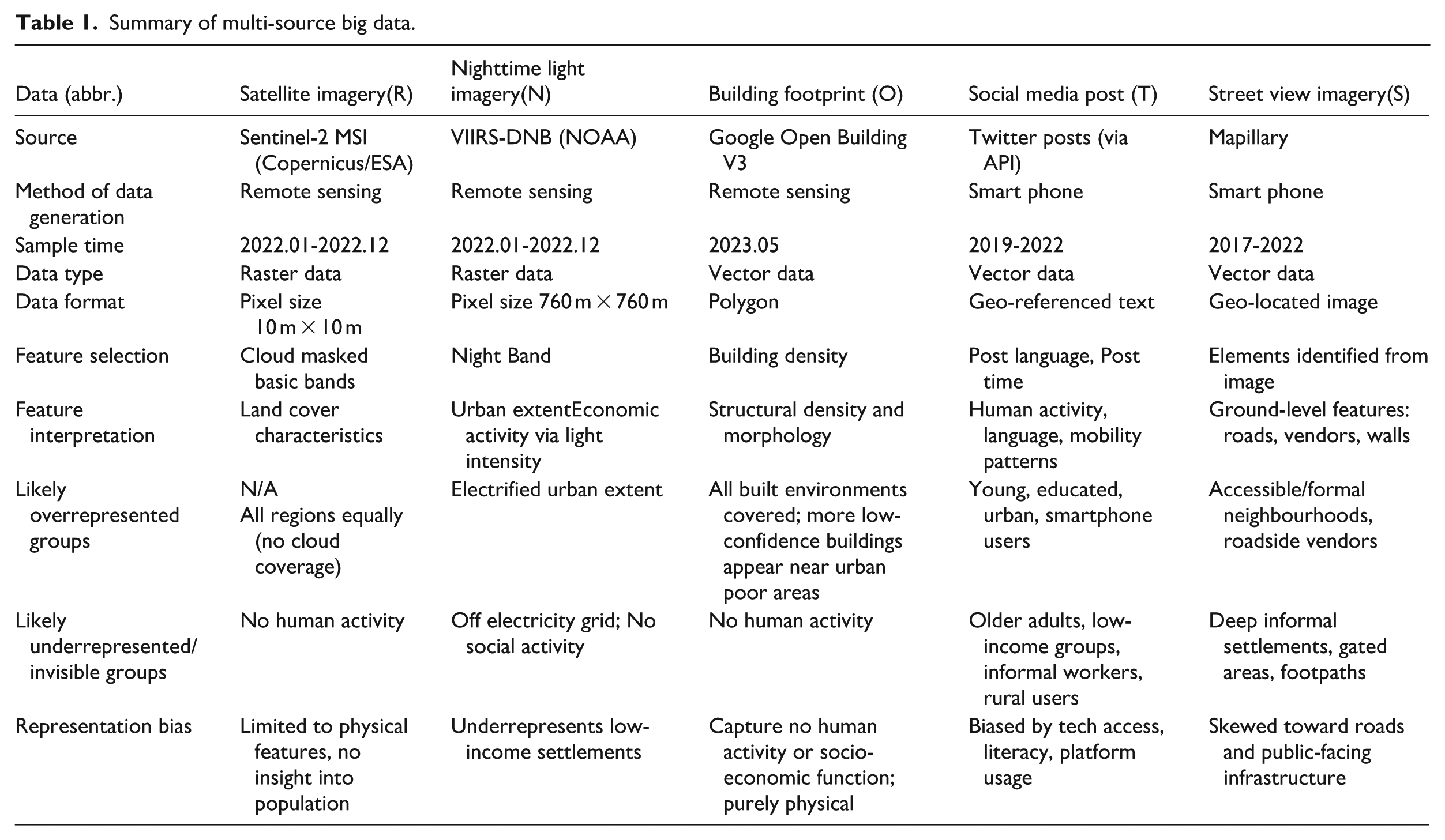
In typical land use classification, remote sensing data, including satellite images (R) and nighttime light imagery (N), usually serve as the base layer for mapping land use. Although nighttime light imagery is derived from satellite sensors, it is treated as a separate data source due to its role as a proxy for human activity. To demonstrate the utility of our workflow in inferring digitally invisible groups, we started by using satellite imagery for land use classification, and then following a stepwise approach to incorporate additional data sources including building footprint (O), social media post (T) and street view imagery (S), as illustrated in Figure 2. Understanding the strengths and limitations of each data source is crucial for interpreting findings on digital invisibility. Table 1 summarises the input data sources and indicates which groups are likely to be over- or underestimated.
Summary of multi-source big data.
Reference land use map
The training and ‘validation’ data are created based on the most updated digital land use map of Nairobi, created by Columbia University’s Centre for Sustainable Urban Development in 2010 (World Bank Data Catalogue, 2010). However, it should be noted that this map was generated by volunteers digitising from a paper map, and is likely to contain errors due to: (1) the volunteer’s various perspectives and skillsets, (2) the mismatch between land use plan and ground truth and (3) urban change since 2010. Therefore, manual modifications and corrections were implemented based on field investigations and comparisons using Google Satellite Map to improve accuracy and consistency. The 2010 land use map encompassed 13 land use types, which were reduced to 8 types in accordance with the Nairobi land use policy (The Nairobi City County Assembly, 2021), i.e. commercial (CM), industrial (ID), residential (RS), informal settlements (IS), vegetation and water (VM), recreational (RC), transportation (TP) and institutional (IT) areas. The modified data has been published on GitHub to ensure transparency and reproducibility (Zhang, 2023).
Data processing and random forest classifier
Building footprint, Twitter posts and street view imagery were pre-processed before being used in the classification model, summarised in Table 2. We used building data from Google Research open data source to calculate building density, providing insights into urban morphology (Sirko et al., 2021).
Features selected from multiple data sources.
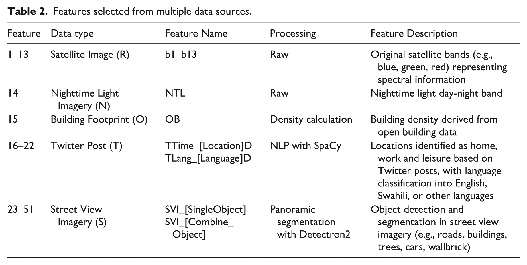
Georeferenced Twitter posts were pre-processed using cleaning procedure proposed by Lansley and Longley (2016). Following this method, we removed tweets that meet the following criteria: a) Repeated tweets from the same user exceeding three instances, and b) Tweets from users who posted more than 3,000 times within a year. The cleaned georeferenced Twitter posts were then categorised into three groups based on the timing of posts: work/school locations, leisure activity locations and home locations. Language detection techniques from spaCy (Montani et al., 2020) were applied to analyse the content of these posts, classifying them into three language groups: English, Swahili and other non-official languages.
Street view imagery was processed through panoramic segmentation using Detectron2 (Wu et al., 2019), a pre-trained image segmentation and object detection algorithm developed by Meta. Detected objects from these images were transformed into features for the classification model. The resulting point dataset was then aggregated into a grid to align with the spatial resolution of the remote sensing data. A summary of the selected features used for inferring and estimating land use types is presented in Table 2.
Input data were resampled to a uniform 10 m resolution to ensure spatial alignment across datasets, although this may introduce smoothing effects and reduce fine-scale variability. Classifications were also tested at coarser scales (30–100 m in 10 m increments) to assess the sensitivity of model performance to spatial resolution.
We randomly sampled 1,000 pixels per land-use class and split them into training and validation sets (70:30). A random forest classifier with 200 trees and a fixed random seed (42) was used to ensure stable and reproducible performance. Missing values resulting from incomplete data coverage (e.g., absence of Twitter or street view observations) were retained and encoded as zero, thereby implicitly representing data absence within the feature space. All models were trained using identical hyperparameter settings across data combinations to ensure comparability.
Results
Overall model performance
Figure 3 illustrates the output land use classification for Nairobi using a combination of all data sources, and Figure 4 illustrates changes in overall accuracy across spatial resolutions as they are introduced step by step into the model. A consistent improvement in overall accuracy is observed across all spatial resolution groups, with the highest OA of 73.57% achieved at a 30-meter resolution when all input datasets were integrated. This improvement reflects the complementary information provided by different datasets, including variations in spatial coverage and the ability to capture distinct aspects of the urban environment. However, these gains should not be interpreted as a direct indication of improved representation of underrepresented population groups. Instead, they reflect aggregate model performance, which may arise from multiple factors unrelated to population visibility. Therefore, in the following sections, we focus on class-specific performance changes to examine how representation varies across data sources.
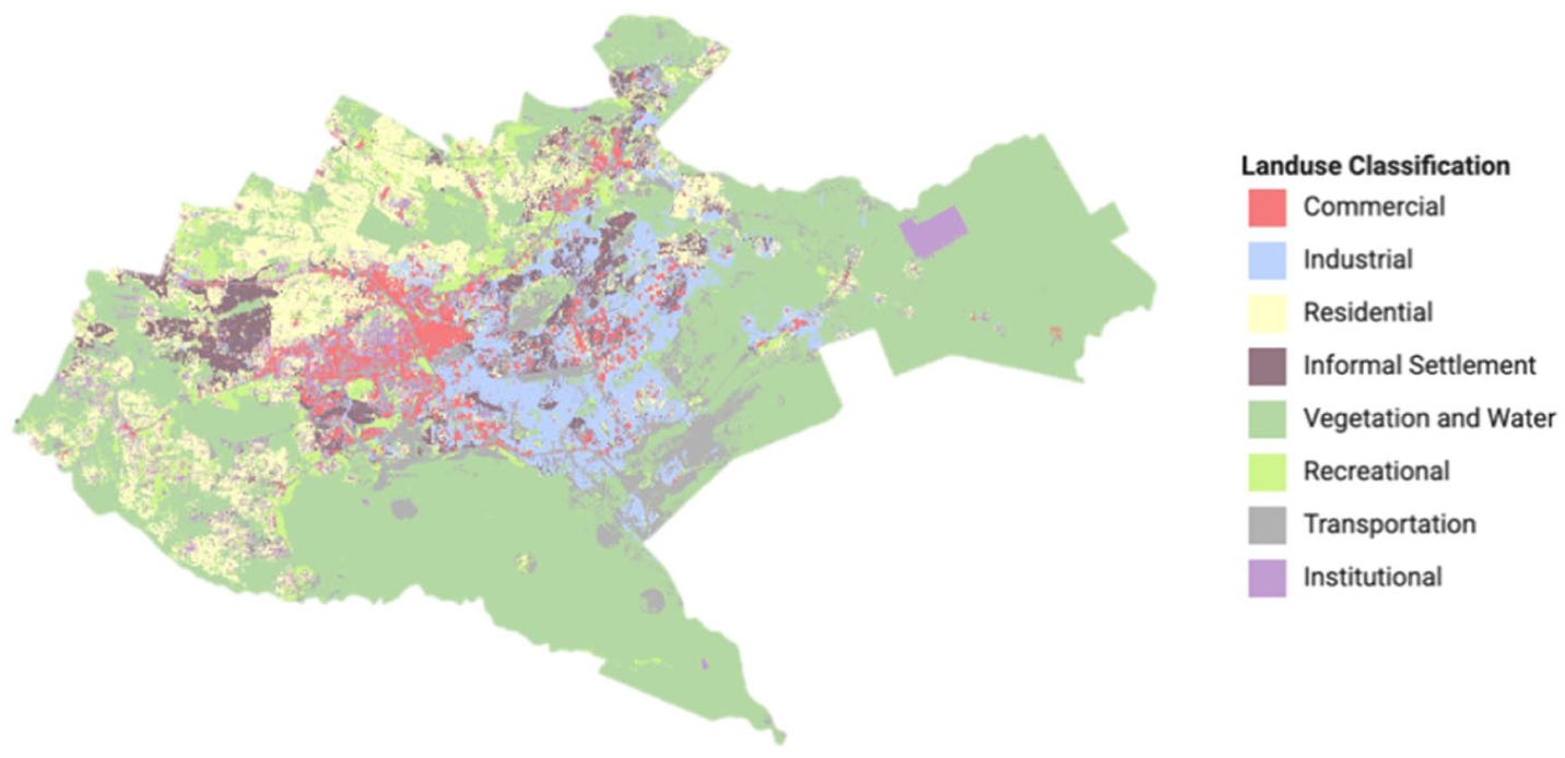
Land use classification of Nairobi at 30-meter spatial resolution with all data.
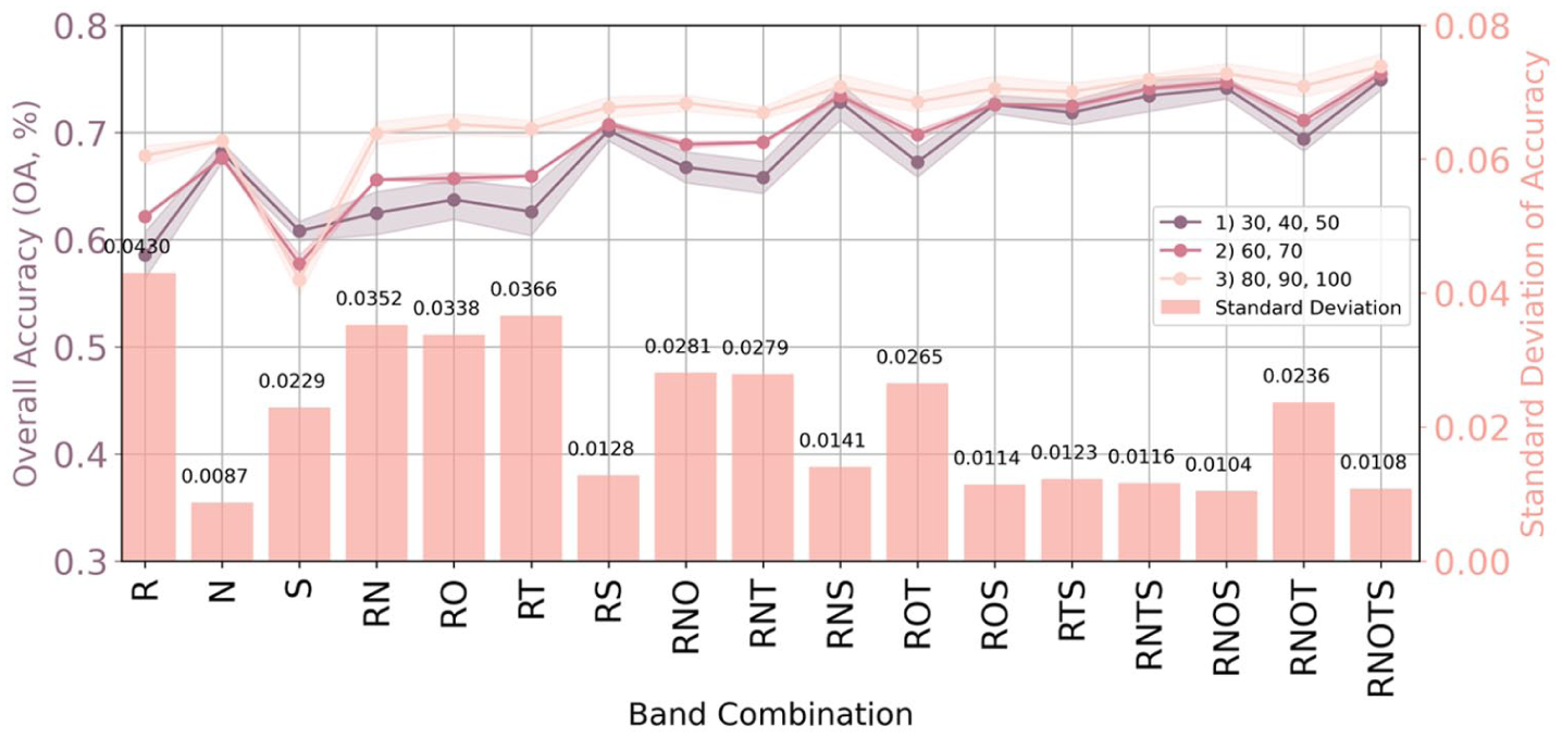
Change of overall accuracy by data type combinations across spatial resolutions and standard deviation: The x-axis highlights different data type combinations (outlined in Table 2), while each colour corresponds to a spatial resolution group. The left y-axis represents overall accuracy (depicted as lines), while the right y-axis corresponds to the standard deviation for mean overall accuracy (represented as bars). This depiction illustrates both the variations in overall accuracy across spatial resolutions and the associated variability.
Error analysis and feature interpretation
This section provides an overview of how classification errors are redistributed across land-use types under different data combinations, based on confusion matrix analysis. Detailed class-specific evaluation is presented under ‘Class-specific evaluation by land use type’. The confusion matrix analysis focuses on false-negative misclassifications resulting from horizontal omission errors (Barsi et al., 2018). Figure 5 shows the baseline datasets: the basic combination of remote sensing and nighttime light imagery (RN, in Figure 5a) and the fully integrated dataset of RNOST (All, in Figure 5h). To assess the individual contribution of building footprint (O), Twitter (T) and street view imagery (S) data sources, we compare RNO, RNT and RNS with RN. We then compare the All with RNOT, RNTS and RNOS to evaluate the additional value of each dataset when introduced at a later stage of integration.
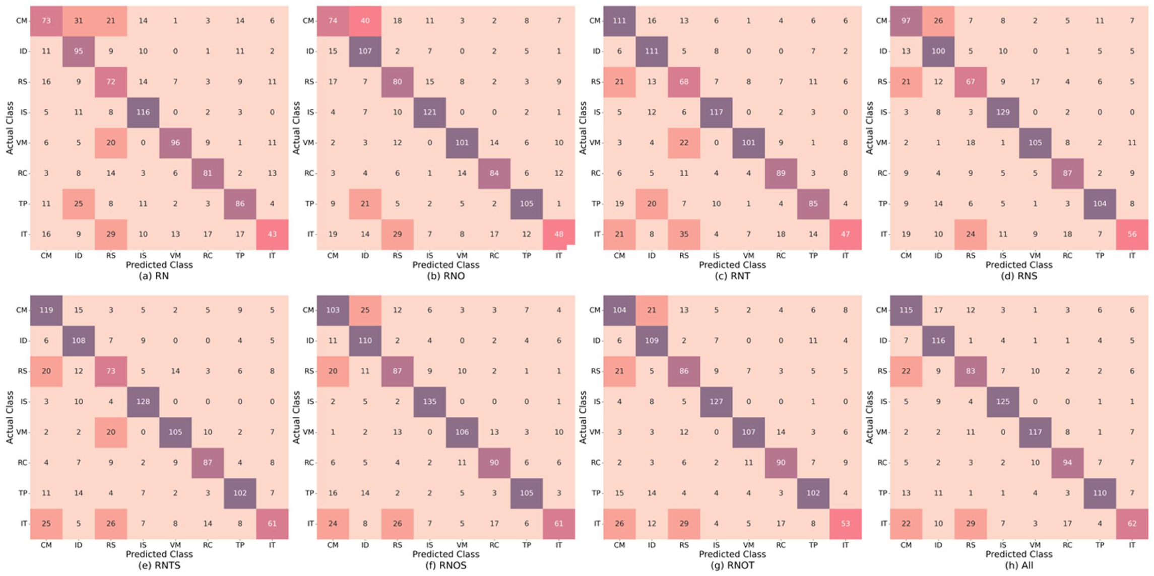
Confusion matrix across different data combinations: The x-axis denotes the predicted classification of pixels, while the y-axis represents the actual reference pixels. Each cell contains the count of pixels, colour coded by value.
By comparing RNO with RN and ALL with RNTS, we observe that incorporating the building footprint led to a consistent improvement in accuracy for residential areas. This change significantly reduced misclassifications of vegetation as residential areas. In addition, in the absence of Twitter and street view imagery, the inclusion of building density also enhanced the identification of industrial areas. However, this improvement overlapped with the contributions from Twitter as shown by comparing RNTS and RNOS with RNS, as well as RNOT with RNT and RNO. Despite a similar level of improvement in revealing industrial areas, building footprint led to an overestimation of industrial areas at the expense of commercial areas, as both share similar morphological features, including larger and more sparsely distributed buildings. These misclassifications suggest that building data alone may not fully capture activity-based distinctions. Thus, although building footprints improve spatial recognition of physical land use, they may fall short in representing the social or economic activities of certain population groups.
Twitter data highlights patterns of underrepresentation of commercial activities at any stage of integration, as seen in the comparison from RN to RNT, RNS to RNTS, RNO to RNOT and RNOS to ALL. However, the trade-off is an overestimation of commercial activities at the expense of residential and institutional activities. This overestimation may arise because many commercial activity patterns overlap with other land uses: for example, individuals working in office buildings may follow similar schedules to those in government institutions, and retail and catering activities often occur outside standard office hours and can overlap with times when people are likely to be at home. As Twitter captures patterns of digitally engaged users during activity-rich periods, these overlaps introduce classification ambiguity.
SVI improved the identification of commercial activities at both early and later stages of data integration (RN to RNS and RNOT to All), indicating that the commercial activities identified from street view imagery represent a different group of commercial activities from those identified through Twitter data. In addition, it also contributed significantly to the accurate classification of informal settlements. This is noteworthy given that many informal settlements are not directly accessible by vehicle and therefore have limited street view imagery coverage. The strong performance of SVI in this context suggests that even partial visibility, particularly along settlement boundaries, can capture distinctive environmental features that differentiate informal settlements from formal areas. These features may include differences in the presence of pavement, fencing, or other physical infrastructure. This result highlights how comparing outputs from different data sources helps reveal how even incomplete street view coverage can capture previously underrepresented activity patterns associated with informal settlements.
While the confusion matrix highlights how classification errors are distributed across land-use types, it does not explain the contribution of individual variables to these outcomes. To complement this analysis, we apply SHapley Additive exPlanations (SHAP) to interpret feature contributions (Figure 6). The results show that OB is the most influential feature across multiple land-use classes, particularly for distinguishing residential and informal settlement areas. NTL and spectral features provide more general contributions, while social media features (e.g., TTime and TLang) have comparatively lower influence, especially for informal settlements. These patterns indicate that different data sources contribute unevenly to the classification process, helping to explain the class-specific patterns observed in the confusion matrix.
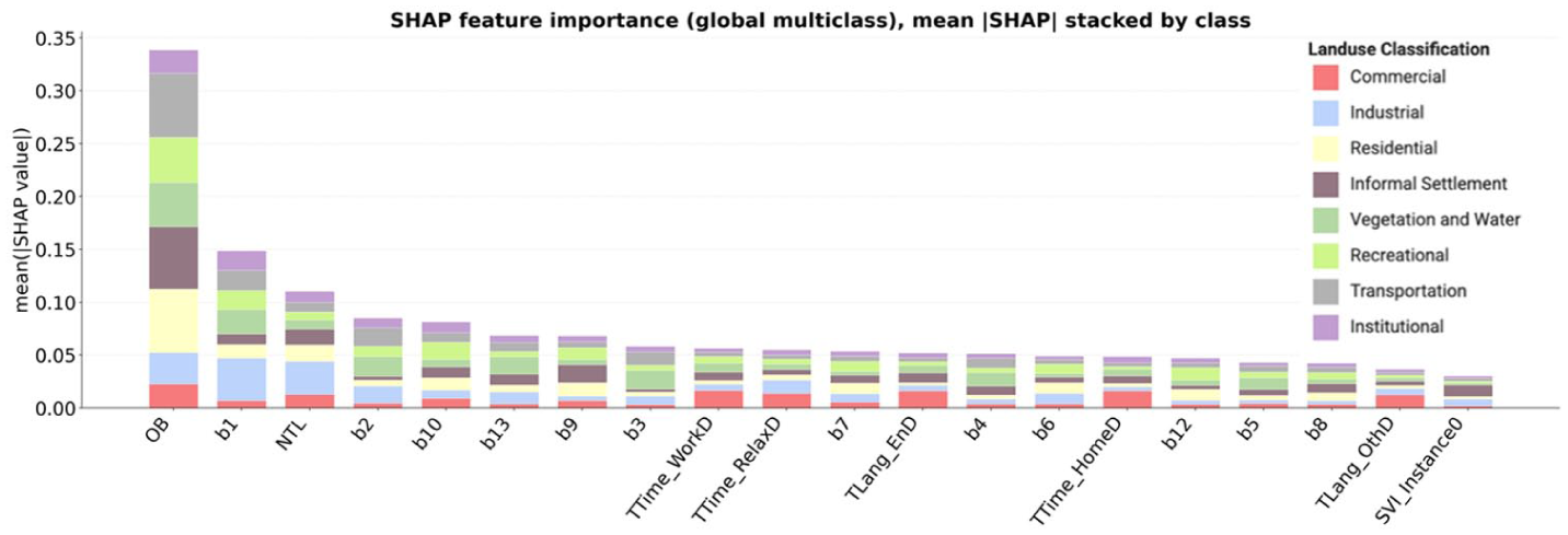
Global SHAP feature importance showing mean absolute SHAP values across all land use classes, with contributions stacked by class. Higher values indicate greater influence on model predictions.
Class-specific evaluation by land use type
We focus on commercial, industrial and informal settlement land use types, as these were most impacted by multi-source data integration. Their differing responses to different data inputs indicate that activity patterns associated with these areas are captured unevenly across datasets, making them particularly relevant for demonstrating our workflow and identifying patterns of underrepresentation across data sources. Within this framework, ‘digitally invisible groups’ refer to population segments approximated through land-use types, where persistent underrepresentation or misclassification is observed when relying on specific data sources. We interpret these patterns as indirect evidence of uneven representation of the activities, and by extension, the populations, associated with these land-use categories. For example, informal settlement areas may be underrepresented in social media data, while certain commercially active areas may be overrepresented.
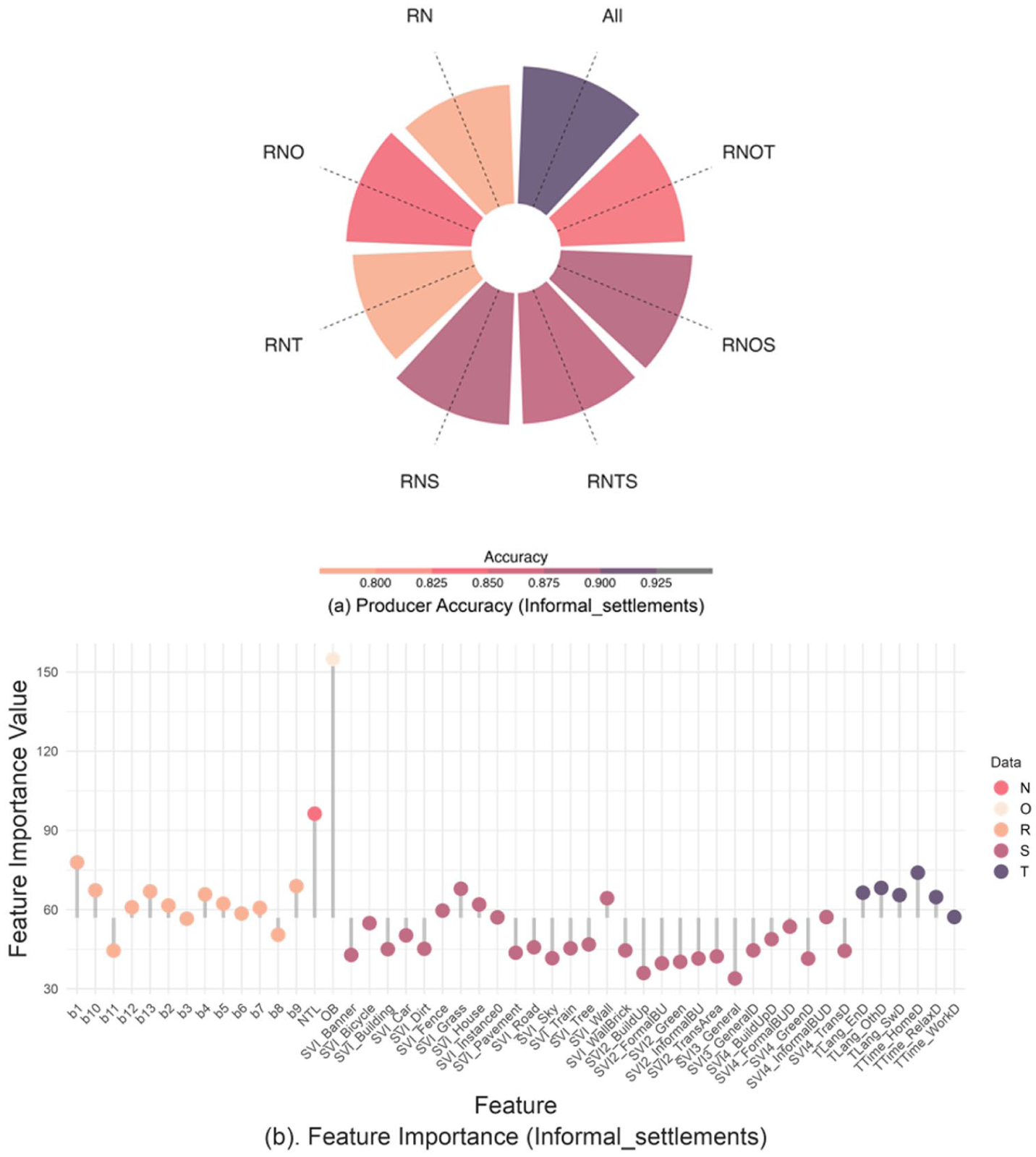
For each selected land use type, we provide the producer accuracy and feature importance plot to further understand the role of different data sources in revealing and mitigating digital invisibility. The producer importance plots depict the accuracy of a land use type under various data combinations, represented by bars and colours. RN is used as the baseline model, and the effects of additional data sources are evaluated relative to this combined reference rather than individual datasets. The subplots should be interpreted in an anticlockwise direction. The feature importance plots list features derived from five input datasets and are used to interpret how specific data sources may influence the representation of activity patterns. The central x-axis in each sub-figure represents the mean feature importance for each type. A lower value below the mean does not indicate an adverse impact; rather, it suggests the feature has less influence. However, multiple low-impact features can collectively affect the results. Full producer accuracy and feature importance results are provided in Figures S2 and S3 in Appendix.
Commercial land use area
Incorporating Twitter and street view imagery significantly improves the classification accuracy of commercial activities, with RNT and RNS improving accuracy by 16.89% and 12.84%, respectively, compared to RN, as shown in Figure 7a. This enhancement demonstrates that both Twitter and SVI effectively capture human commercial activities that traditional RS and building data fail to detect.
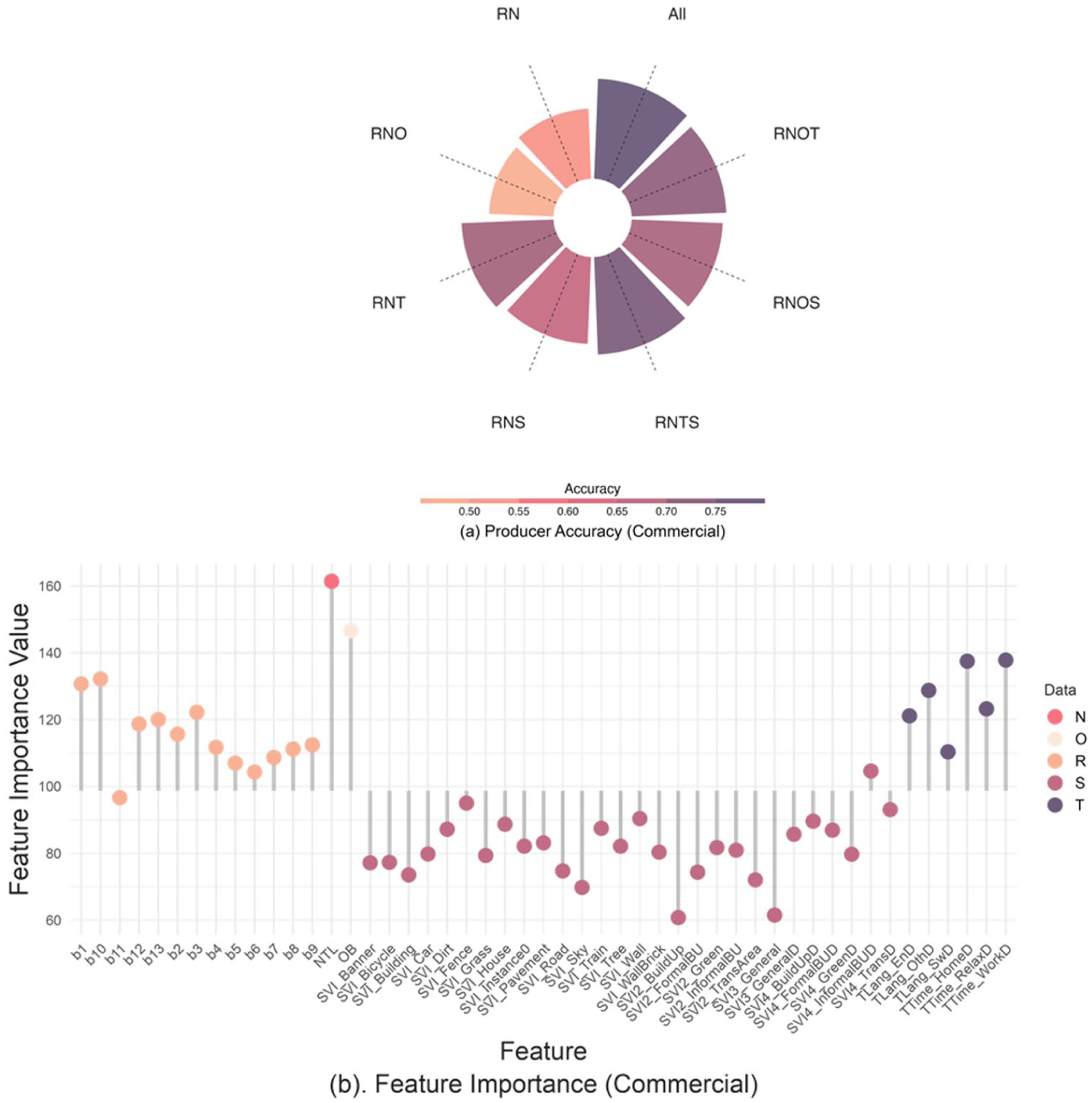
Producer’s accuracy (a) and variable importance (b) of the commercial land use type. (a) Producer’s accuracy: the x-axis corresponds to different data combinations, and the bars indicate the estimated accuracy values. (b) Variable importance: the x-axis is the feature importance value, and the y-axis is the selected feature by input data, from left to right: satellite imagery, nighttime light imagery, building footprint, street view imagery and Twitter.
Figure 7b further explores the groups of people identified and missed by Twitter and SVI. Twitter-derived location features such as work, home and recreational location effectively distinguish between daily leisure activities and home-based activities, potentially reflecting patterns like dining out or entertainment. The notable contribution of TLang_OthD, which is the ‘other’ language, supports the identification of international commercial activities, such as international business and tourism. This finding is intuitive: people often share their travel and dining experiences on social media, and consequently, the tourism and food industries are more inclined to advertise online (Azhar et al., 2023; Rini et al., 2024). Incorporating Twitter data into ALL results in a 6.75% improvement over using RNOS alone, highlighting the irreplaceable ability to infer formal commercial activities.
Among SVI features, SVI4_InformalBUD, which aggregates objects commonly associated with informal settlements (e.g., unpaved roads and umbrellas), exceeds the average feature importance for commercial classification. In particular, the presence of ‘umbrella’ often indicates local commercial activities like street vendors, kiosks and food carts, as shown in Figure 8b. This aligns with findings from the World Bank Group (2016), which reported that 95% of all businesses in Kenya operate within the informal economy.
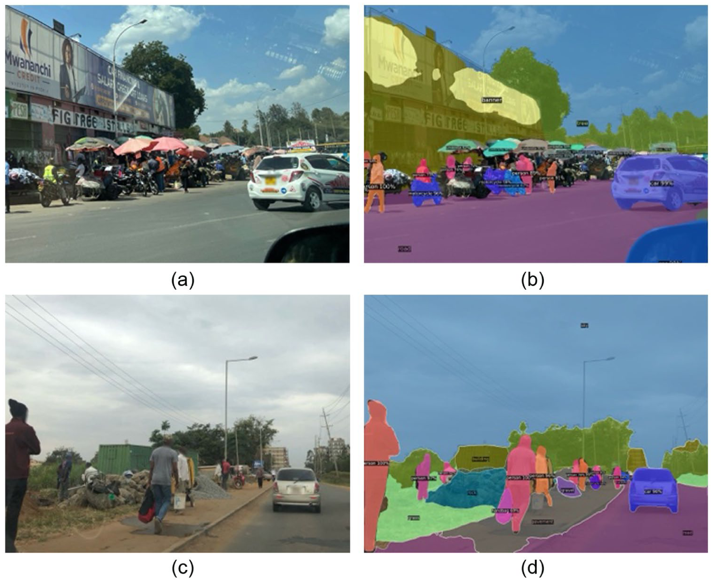
Panoramic segmentation results for street views in commercial and industrial areas: umbrellas are visible in the commercial area (7a and 7b), while pavement and gravel are visible in the industrial area (7c and 7d).
Importantly, the improvements brought by Twitter and SVI are complementary rather than overlapping. This is evidenced by the performance differences between RNT, RNS and RNTS, as well as among RNOS, RNOT and All. These differences indicate that while there is some overlap – such as in locations like the Maasai Market, where local markets attract tourists – each data source also captures distinct groups and spatial patterns of commercial activity. This complementary nature underscores the value of integrating both Twitter and SVI data for a more comprehensive understanding of urban commercial dynamics.
The producer accuracy for commercial land use decreases with the introduction of building footprint data, as seen in the RNO combination. This suggests that building footprints alone, which reflect only physical structures, are not effective in identifying commercial activities. However, when combined with SVI features (RNOS), the accuracy improves by 3.39% over RNS, indicating that building footprints can still contribute to infer a certain group of people when integrated with other data sources. For example, while building data alone may cause confusion between commercial and industrial areas, SVI features like SVI_Pavement help distinguish them: local markets often have goods displayed directly on the ground, while industrial areas typically maintain visible pavement for workers commuting. This demonstrates the synergistic effect of combining datasets to reveal the underrepresentation of certain digitally invisible groups.
Industrial land use area
Figure 9a shows that the inclusion of building footprint data, Twitter and SVI improves the identification of industrial activities, achieving an average improvement of 7.07% over RN. Further gains are observed when multiple datasets are combined in pairs, reaching an average producer accuracy of 81.67%, and achieving the highest producer accuracy of 82.86% when all datasets are integrated. This synergy arises because each dataset captures distinct characteristics of industrial activities.
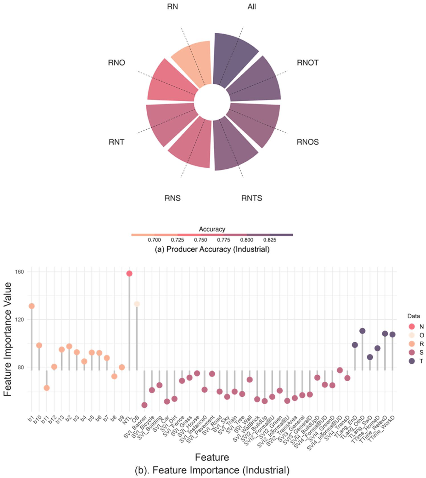
Producer’s accuracy (a) and variable importance (b) of the industrial land use type.
In Figure 9b, nighttime light imagery is widely recognised as a reliable indicator of industrial and economic activity (Cui et al., 2023; Qi et al., 2017). Building footprints highlight areas with larger building sizes and lower density, typical of industrial zones designed for vehicle loading for heavy manufacturing. However, similar patterns are also found in some commercial areas, such as shopping malls, which can introduce confusion between industrial and commercial classifications. The inclusion of SVI features helps mitigate this confusion. For example, SVI4_InformalBUD contributes significantly, possibly due to elements like gravel, as industrial sites often have debris piles. The presence of SVI_Pavement further supports the hypothesis that industrial areas maintain footpaths for daily worker commuting, as shown in Figure 8d. A similar effect is observed for SVI_Wall, which reflects security infrastructure typically associated with more managed environments such as industrial activities.
From Figure 9b, TTime_relaxD and TTime_workD are the main contributors to the identification of the industrial area. This is likely due to the long working hours in Nairobi’s manufacturing plants, factories and warehouses, where the distinction between work and recreation is often blurred (Ongeri Ondimu, 2024). Additionally, Nairobi’s industrial sector employs a diverse workforce, including individuals from various regions of Kenya, other African countries and expatriates from around the world, as indicated by TLang_othD (Castañeda-Ramírez and Martínez-Mares, 2025).
Informal settlement land use area
From Figure 10a, both O and S significantly enhance the classification of informal settlements, improving producer accuracy to 83.95% and 88.27%, respectively, as shown in Figure 10b. O is expectedly the dominant contributor for identifying the high building density characteristic. This is further supported by SHAP analysis (Figure 11), which shows that OB has the strongest contribution to the predicted probability of informal settlement areas, with higher values consistently increasing the likelihood of this class. Partial dependence analysis (Figure. S4 in the Appendix) further confirms the non-linear relationship between OB and the predicted probability of informal settlement areas. This feature is widely used for urban slum mapping in the Global South (Bettencourt and Marchio, 2023; Boo et al., 2022).
Producer’s accuracy (a) and variable importance (b) of the informal settlement land use type.
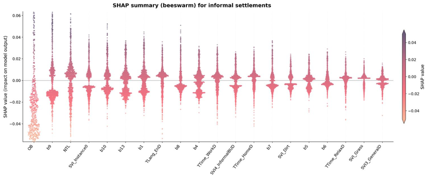
SHAP beeswarm summary for informal settlements. Points represent individual samples, coloured by feature value.
SVI also contributes significantly to the identification of informal settlements. This is counterintuitive, as informal settlements are generally considered inaccessible for SVI collection. However, even without access to the core areas of informal settlements, SVI helps delineate their boundaries, as these settlements are mainly located within urban areas. As shown in Figure 10b, the SVI_Grass and SVI_Wall features stand out despite the overall higher contribution of building footprint. SHAP analysis further supports the contribution of SVI, although the specific features highlighted differ from those identified through impurity-based importance. This reflects that SVI-derived variables capture a range of contextual signals associated with informal settlements, even if their individual contributions vary across methods.
The inclusion of Twitter data from RN does not significantly influence the classification of informal settlement residents. This is also reflected in the SHAP analysis, where Twitter-derived variables exhibit minimal contributions. This pattern is intuitive, given that smartphone ownership and internet penetration within highly informal settlements are still relatively low (Williams et al., 2020; Wyche, 2015).
Identification of digitally invisible groups from multi-source data
Table 3 summarises which groups are well represented or underrepresented across different data sources, revealing patterns of digital invisibility in Nairobi. These patterns are not inferred from data availability alone, but from systematic differences in model performance when specific datasets are included or excluded.
Summary of digitally invisible groups from multi-source data.
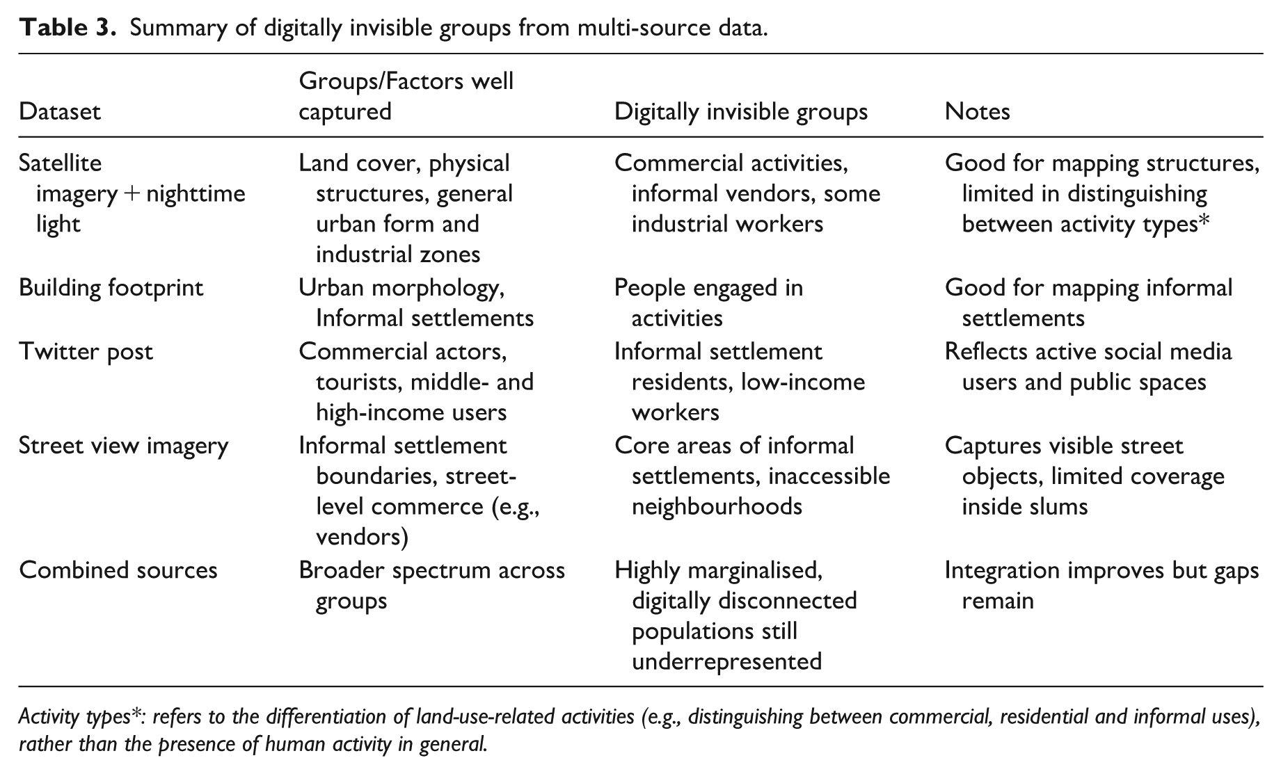
Activity types*: refers to the differentiation of land-use-related activities (e.g., distinguishing between commercial, residential and informal uses), rather than the presence of human activity in general.
Twitter data significantly improves commercial and industrial classification but contributes little to informal settlements. This selective improvement suggests a digital silence from informal settlement residents, likely due to limited internet access or device ownership, making them invisible in social media-derived data. Similarly, while SVI improves classification at settlement boundaries, core areas remain unmapped due to limited vehicle access, reinforcing spatial exclusion. Building footprint data, though valuable in highlighting dense, informal urban fabric, lacks behavioural information and cannot differentiate between land uses shaped by human activity, leaving economically marginalised groups partially obscured in activity-based models.
These disparities reflect not only technical limitations but also social and spatial inequalities in data coverage. Persistent misclassification or only small gains for certain land use types, even after adding new sources, indicate that some populations remain digitally underrepresented. Adding a single dataset does not reliably improve performance and can reinforce errors when that source underrepresents particular groups. Combining complementary sources can reduce blind spots because each captures different people and places, but improvements are class-dependent and should be verified through systematic, per-class evaluation rather than by aggregating everything. In short, digital invisibility is exposed, and partly mitigated, by how performance changes with each data source and urban context.
Discussion
Data-informed urban mapping is essential for understanding and addressing a range of socio-economic challenges in our city environment, including land cover and land use classification, disaster risk management, poverty mapping and policy impact evaluation. The increasing availability of big data presents new opportunities. However, concerns about the representativeness of these data sources are particularly acute in the context of the Global South. It is therefore crucial to examine the inherent biases of datasets, their impacts on estimated indicators, and the exclusion of digitally invisible groups from data-driven decision-making. Our work presents a methodology for revealing the presence of digitally invisible groups by comparing the estimated indicator (i.e. land use classification) at each step of data source integration. The approach alerts practitioners to the risks of relying on a single source and shows where and which groups are missing, motivating small, targeted supplementary data collection when needed. More importantly, the proposed workflow provides a systematic and transferable approach to identifying where and for which population groups data gaps emerge, moving beyond simple data coverage assessments to evaluate their impact on modelled outcomes. We apply this workflow in Nairobi, a representative city of the Global South, to demonstrate its feasibility in addressing key challenges related to urban digitalisation. The proposed approach is designed to be scalable and adaptable to other data-scarce contexts, many of which are likely to face similar issues as digital infrastructures continue to expand.
Our findings indicate that low-income informal settlement residents, local street vendors and certain industrial workers remain underrepresented when any single data source is used. Consequently, integrated multi-source approaches are required to achieve more inclusive urban mapping. This interpretation aligns with socio-demographic invisibility, since certain land uses, such as street vendors, are underrepresented on Twitter due to limited smartphone usage among specific social groups. This is typically related to spatial invisibility, as people doing certain activity are typically clustered around certain places of the city. These findings further illuminate the complex relationship between spatial and demographic invisibility.
To promote more inclusive and representative urban planning and development in the Global South, we recommend adopting targeted mitigation strategies that explicitly account for digitally invisible groups. Policymakers and practitioners should incorporate bias mitigation frameworks, such as the three-level approach proposed by Smith and Rustagi (2020), which emphasises addressing biases at the data collection stage through improved data and algorithmic practices. Building on this, we advocate for the adoption of methodological data fairness principles, including representative sampling and transparent reporting of project scope and limitations, as highlighted by Leonelli et al. (2021). Additionally, leveraging multiple data sources, such as combining big data with targeted primary data collection (e.g., surveys), can help overcome representativeness challenges, as suggested by Jürgens et al. (2019), and increasingly adopted in practice (Thompson et al., 2025) in low-data settings.
These findings are consistent with and extend existing literature on data bias and urban mapping using heterogeneous data sources. For example, the strong contribution of building footprint data to informal settlement classification aligns with prior studies highlighting the effectiveness of morphological indicators for slum mapping in the Global South (Bettencourt and Marchio, 2023; Boo et al., 2022). Similarly, the contribution of nighttime light imagery to industrial classification is consistent with its established role as a proxy for economic activity (Cui et al., 2023; Qi et al., 2017). In contrast, the limited influence of social media data in informal settlements reflects well-documented biases in digitally generated datasets, which tend to overrepresent younger, more affluent and digitally connected populations (Golder and Macy, 2014; Wyche, 2015). Our results further extend this body of work by demonstrating that these biases are not uniform, but vary systematically across land use types and associated population groups. By comparing model outputs across multiple data source combinations, we show that different datasets capture different segments of the population, and that their integration can both reveal and partially mitigate patterns of digital invisibility. This highlights the importance of evaluating data sources in a class-specific and context-dependent manner, rather than assuming uniform improvements from data integration. This also supports recent work suggesting that combining remote sensing and social sensing data can improve land use classification, but only when their inherent biases are explicitly accounted for (Tu et al., 2021; Yin et al., 2021).
Furthermore, participatory data collection initiatives, such as community mapping, should be integrated into urban data strategies. Successful examples from Brazil (Nasr et al., 2023) and Kenya (Abascal et al., 2024) demonstrate that community-driven approaches can enhance inclusivity and ensure that digitally marginalised groups are represented in decision-making processes. Embedding these practices into policy frameworks will be critical for ensuring equitable and socially responsible digitalisation in urban governance. Citizen science data holds significant potential to complement official data sources by capturing hyper-local insights and amplifying community voices in urban planning.
Despite its contributions, this study acknowledges several limitations. First, the random forest classifier was chosen because it is widely used in land use classification, due to its interpretability, robustness to noisy features and computational efficiency. However, this choice may limit the model’s ability to detect more subtle patterns related to digitally invisible groups. More complex models, such as gradient boosting or neural networks, may offer improved classification in edge cases where digital presence is weak or ambiguous. However, these methods often lack transparency, making it more difficult to interpret which data sources are contributing to improved visibility. Future research could explore advanced algorithms and model-agnostic interpretability tools to test whether more complex models surface different or more subtle forms of digital invisibility.
Second, although this study proposes a workflow for revealing digitally invisible groups, it does not explicitly identify their spatial locations or capture spatial heterogeneity. The availability of a comprehensive reference land use map for the entire city would enhance understanding of spatial invisibility, as well as provide insights into spatial land use classification accuracy and spatial feature importance. Such a reference map, however, is time-intensive to produce, a common challenge in urban mapping efforts. More broadly, many urban indicators, such as accessibility or green space availability, lack reliable, citywide ground-truth data. These are often estimated using proxy datasets with limited validation. In addition, land-use categories in this study are used as proxies for activity-based population segments, and this relationship is indirect and not explicitly validated. Future work could incorporate independent socio-demographic data, such as census data, survey data, or participatory mapping, to better assess the correspondence between land-use types and population characteristics. In such cases, comparing outputs across different data source combinations offers a practical way to assess uncertainty and identify representational gaps, especially in data-scarce environments where formal evaluation is not possible.
Third, the study overlooks inherent biases in the datasets used. For instance, street view imagery coverage is inherently uneven and often limited to road-accessible areas, with substantial spatial gaps reported in many regions (Biljecki and Ito, 2021), while social media data often represents younger and wealthier populations (Wang and Ye, 2018). These biases introduce selection effects that impact the accuracy of specific groups or activities. For example, incorporating either Twitter or street view imagery reduced the classification accuracy of residential areas by 5.52%. While the combined use of multi-source data provides a broader understanding of urban populations, these double-edged effects highlight the need to evaluate which groups remain digitally invisible when relying on a single dataset.
In addition, differences in spatial resolution and data quality across datasets may influence model performance. While resampling enables consistent integration of multi-source data, it may introduce smoothing effects and obscure fine-scale spatial patterns. Variations in data quality (e.g., noise in social media data or uneven coverage of street view imagery) may further affect the reliability of certain features.
While the study identifies digitally invisible groups and observes lower algorithmic performance in certain areas, it does not establish a causal relationship between digital invisibility and reduced performance. The current producer accuracy reflects average performance across all cells of the same land use classification type, making it difficult to determine if performance changes are directly attributable to digital invisibility. A potential solution could involve classifying cells into overrepresented, underrepresented and unrepresented categories based on data availability and comparing model performance across these categories. Such an approach could provide deeper insights into how digital invisibility affects land use classification and its associated indicators.
Conclusion
Overcoming digital visibility bias is essential to fully realising the potential of digital data in public policy. While this challenge is global, it is particularly acute in the Global South, where economic inequity drives widespread invisibility. This study proposes an applicable workflow presenting evidence of digitally invisible groups applicable across diverse data contexts. Tested through land use classification in Nairobi, the workflow demonstrates that multi-source data fusion can effectively reveal these groups even in low-data settings, as different datasets capture unique aspects of human activity and the physical environment. The same workflow can be used in hazard settings, for example, to compare flood simulations with mobility-based dynamic population maps, to show that areas of greatest simulated hazard are not always those of greatest human impact. While the workflow does not directly detect the location of individuals or groups, it systematically indicates underrepresented population segments by analysing where models fail or succeed depending on data availability.
We find that relying on a single big-data source does not necessarily improve modelling; source-specific biases can render some populations digitally invisible. Incorporating multiple sources can mitigate these blind spots when the signals are complementary. However, this requires careful evaluation rather than indiscriminate aggregation, and the benefits depend on the indicator of interest. These findings underscore the need for rigorous data quality control and strategic, purpose-built integration to improve both the inclusiveness and accuracy of urban mapping. Beyond accuracy gains, the approach surfaces patterns of digital participation that would otherwise be overlooked, with implications for promoting inclusivity and addressing inequalities.
Serving as an initial step toward systematically tackling digital invisibility in cities of the Global South, the proposed approach is both scalable and transferable, providing a practical tool for other data-scarce urban contexts facing similar challenges. As data-driven decision-making becomes increasingly central to urban governance, recognising and including digitally invisible groups is critical to achieving equitable and inclusive urban development. Future research should focus on mitigation strategies for data bias and incorporate targeted primary data collection to complement big-data sources, enabling more holistic and sustainable urban planning.
Supplemental Material
sj-docx-1-tus-10.1177_27541231261457648 – Supplemental material for Revealing digitally invisible groups through a machine learning approach using multi-source data
Supplemental material, sj-docx-1-tus-10.1177_27541231261457648 for Revealing digitally invisible groups through a machine learning approach using multi-source data by Wenlan Zhang, Chen Zhong, Faith Taylor, Yan Liu and Mark Pelling in Transactions in Urban Data, Science, and Technology
Footnotes
Ethical considerations
All data used in this research is openly accessible and contains no personal information of individuals; therefore, ethical approval was not required.
Funding
The authors disclosed receipt of the following financial support for the research, authorship and/or publication of this article: This research was supported by the European Research Council (ERC) under the European Union’s Horizon 2020 Research and Innovation Programme (Grant agreement No. 949670)
Declaration of conflicting interests
The authors declared no potential conflicts of interest with respect to the research, authorship and/or publication of this article.
Data availability statement
All data used in this research is openly accessible.
Supplemental material
Supplemental material for this article is available online.
Author biographies
References
Supplementary Material
Please find the following supplemental material available below.
For Open Access articles published under a Creative Commons License, all supplemental material carries the same license as the article it is associated with.
For non-Open Access articles published, all supplemental material carries a non-exclusive license, and permission requests for re-use of supplemental material or any part of supplemental material shall be sent directly to the copyright owner as specified in the copyright notice associated with the article.