
Abstract

Introduction
Scientists and engineers often assume that statistics is mainly about numbers. In reality, graphs are a fundamental part of the field. In my teachings on data analysis, I often say that one graph is worth a thousand numbers—a compelling play on the saying that “a picture is worth a thousand words.” In a prior Stats Corner column, (“Improving Your DOE - Analysis with Response Transformations,” Shari L. Kraber, Journal of Plastic Film & Sheeting, Volume 38, Issue 1, 2022, pp. 15–20) my colleague Shari Kraber provided an array of extremely useful graphs for diagnosing response-modeling abnormalities. I will focus on visualization of experimental data prior to fitting the model — in particular for two-level factorials. As food for thought (pun intended), I will do so using a case study on an edible film. (“Optimization of process conditions for the development of pectin and glycerol based edible films: Statistical design of experiments,” Shumyla Mehraj, Yamini Sudha Sistla, Electronic Journal of Biotechnology, Volume 55, 2022, pp. 27–39).
Case study
Select results from a two-level factorial experiment on edible film.
The engineers wanted the edible film to be as transparent as possible for consumers to see the food it packages. Two of them stand out by being far lower (worse) than the others (the higher the better). They align with low pH, but not consistently.
Scatterplots with correlation statistics will tell the story.
Scatterplots of factor effects
I imported Table 1 into Stat-Ease software (Stat-Ease® 360 software, version 25, Stat-Ease, Inc.) to make use of its data visualization tools. I then went to its Custom Graphs feature to assess correlations and view select scatterplots.
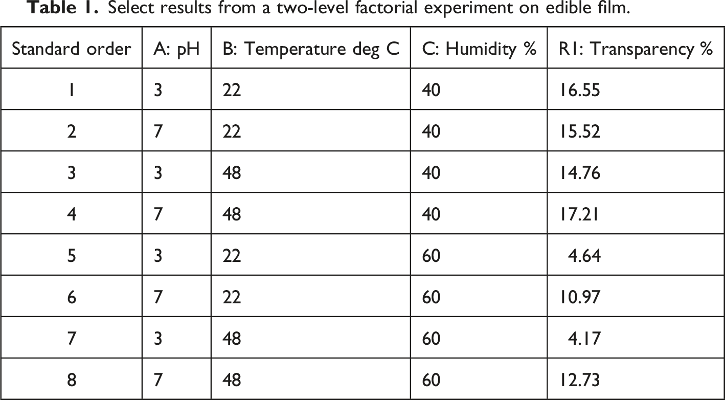
On the color-coded correlation grid—shown by Figure 1, I looked for the most intense color for the correlation of factors with responses (shown at the lower left of the matrix). Whether it be red (positive) or blue (negative) is of no concern just yet—this will be manifested in the scatter plot. Color-coded correlation grid.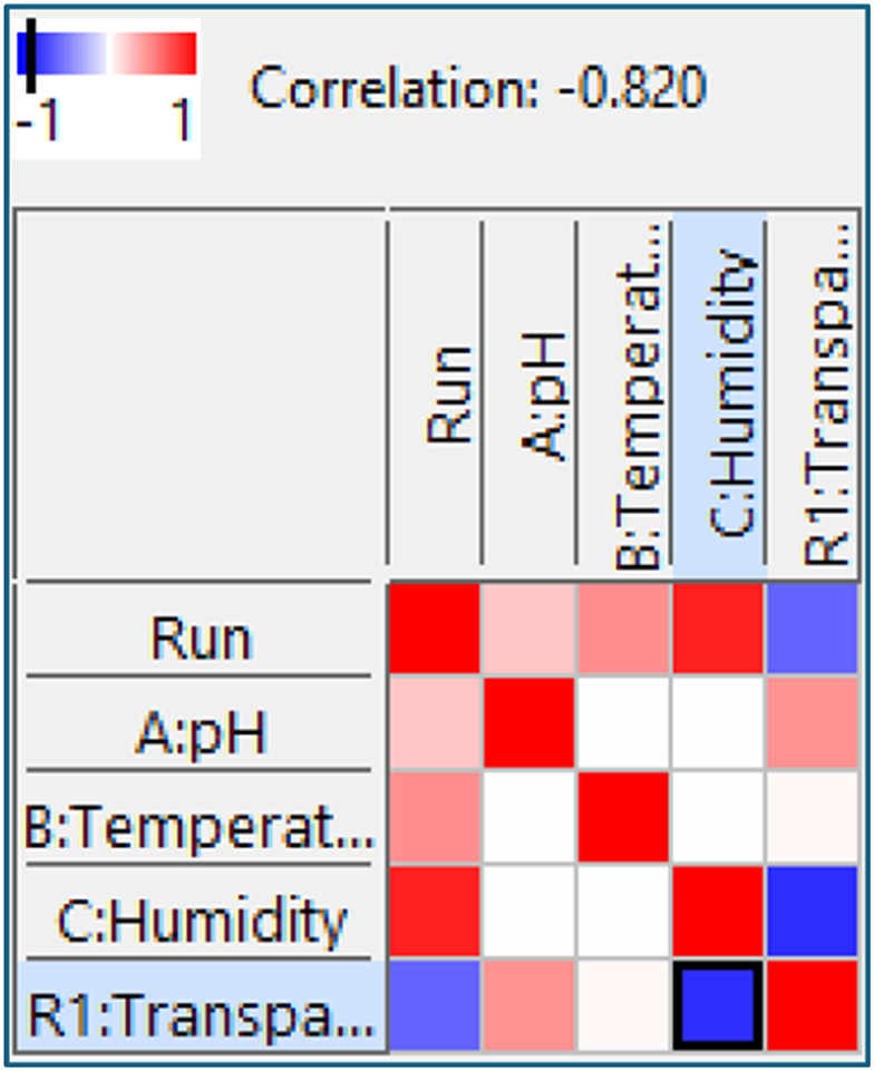
Surprisingly, humidity, not pH, creates the strongest effect—exhibiting an absolute correlation exceeding 0.8 on a scale of 0 to 1. Figure 2 shows the scatterplot. As indicated by the negative sign on the correlation value, the transparency goes down as humidity (factor C) goes up. Scatterplot of transparency versus humidity.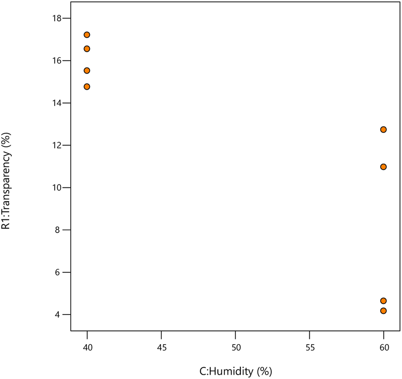
The scatterplot makes it obvious that the engineers should go with the lowest humidity to maximize the transparency of the packaging. But why are two results at high humidity so low?
When a split is seen on one side of a scatterplot, it often indicates an interaction between the factor plotted and one of the others. In this case, it is the pH (factor A) interacting with humidity (this becomes crystal clear later during the effect selection phase of the analysis). To show its impact I colored the points by pH—blue and red for low and high; respectively. See this in Figure 3. Scatterplot of transparency versus humidity colored by pH.
Notice now that at humidity and low pH the film becomes far more opaque (low transparency). However, at low humidity, transparency is not affected by pH. That is the nature of a two-factor interaction—the effect of one factor (humidity) depends on the level of the other (pH). When pH is low (blue points, increasing humidity creates a far worse effect on transparency than when pH is high (red points).
As expected from my graphical pre-analysis, the AC interaction emerged as a significant effect along with its parent terms—the main effects of A (pH) and C (humidity). Based on the fitted predictive model, Figure 4 displays the interaction in a far more compelling fashion than the scatterplot. Interaction plot of humidity and pH.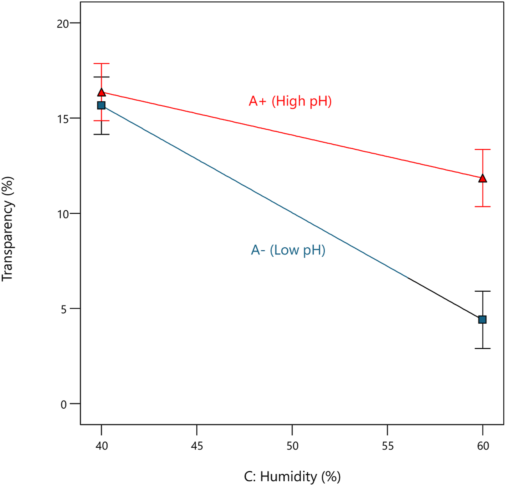
The bars being separated at the right indicate the significant impact (p < 0.05) of pH (factor A) at high humidity.
Conclusion
I recommend that, before getting mired down in the complexities of statistical analysis, experimenters (or miners of existing data) first assess easily interpreted correlations for all factors aided by a color-coded grid. Then view select effects via simple scatterplots aided by graphical tools that can color and/or size and/or symbolize points by levels of other factors, etc. This provides powerfully visual insights at the outset of making the most from every experiment.