





Abstract
Traditional measurement approaches in health care focus on group data, virtually ignoring the individual client. To demonstrate the distinct value of occupational therapy, we need a measurement model that focuses on the person and generates outputs to inform daily practice. Traditional methods of establishing norms and predictive validity do not inform the development of interventions and goal setting. In this Eleanor Clarke Slagle Lecture, I use a person-centered measurement model that focuses on the person, versus the instrument, to demonstrate how person-centered measurement can be immediately used to identify the just-right challenge for the client. Person-centered measurement can be both the basis for designing interventions specific to the client and the foundation for setting empirically appropriate short-term and long-term goals. Occupational therapy practitioners can lead health care by immediately applying person-centered measurement to address the needs of individual clients and, moreover, to reveal the distinct value of occupational therapy.
In this Eleanor Clarke Slagle Lecture, the author uses a person-centered measurement model that focuses on the person, versus the instrument, to demonstrate how person-centered measurement can be immediately used to identify the just-right challenge for the client.
As occupational therapy practitioners, we ask our clients to do the hard work of focusing on extreme challenges they face in their daily lives. We put our clients in the most vulnerable of situations. In this Eleanor Clarke Slagle Lecture, 1 I am asking you, our professionals, to focus on a key change in how we measure and track the progress of our clients to empirically demonstrate the effectiveness of occupational therapy. I believe this change will provide irrefutable quantitative proof of the value of occupational therapy.
Assessment is the core of our profession. Hinojosa and colleagues (2014) defined assessment as “a specific tool, instrument, or systematic interaction . . . used to understand a client’s occupational profile, client factors, performance skills, performance patterns, and contextual and environmental factors, as well as activity demands that influence occupational performance” (pp. 3–4). Assessment results in a multidimensional, qualitative experience.
But assessment is different from measurement. The measures or numbers generated by our assessments result in a unidimensional, mathematical experience. Although we often attribute many things to the numbers generated by our assessments, numbers simply indicate whether the client has more or less of something: more or less movement, range of motion, functional ability. So when we put the qualitative experience resulting from assessment against the mathematical experience resulting from measurement, assessment wins every time.
A critical goal of this presentation is to convince you to adopt a measurement model that does more than just produce numbers—that is, a person-centered measurement model that focuses on the client and provides a picture or pattern of the client’s performance on our instruments.
Barriers to Using Measurement in Practice
There is ample evidence that we have failed to adequately incorporate measurement in practice. Even when we use the numbers generated from our assessments, we typically record those numbers and file them away or enter them into an electronic database. The results are all the same: The numbers go into the abyss—maybe to show up in a quarterly report or, more likely, never to be seen or heard from again. The evidence of our neglect of numbers is overwhelming. For example, in a survey of 300 Australian physiotherapists conducted by Abrams and colleagues (2006), although about 90% agreed that “health professionals should monitor patient progress using reliable and valid tools,” less than 60 percent reported routine use of standardized assessments (p. 48). Kay and colleagues (2001) reported that despite concerted educational efforts to motivate therapists to use published outcome scales, 6 years later only about a third of the therapists had incorporated standardized published scales into practice. Garland et al. (2003), in a study of 50 mental health clinicians, reported that despite mandated standardized assessments, only 8% reported that they used the scores for diagnostic evaluation, treatment planning, or monitoring.
There are excellent reviews of the barriers to clinicians’ using standardized assessments in practice. Many of the statements from Garland and colleagues’ (2003) participants should sound familiar. One clinician said, “As clinicians, we are burdened by more and more paperwork to prove what we do, which takes a big hunk of time away from doing what we do” (p. 400). Another therapist said, “One of the things I’d like to see is for someone to convince us therapists about why we need to do this. What benefit is this to me and what can I get off of this that would really be helpful to me as a therapist?” (p. 401). A third clinician said, “We’re doing a lot of extra work for this, and we’re expected to do it with no questions asked. . . . The rewards are so minimal, which does not feel professionally respectful nor supportive of me or anybody else I know who is doing it” (p. 401).
So, where did we go wrong? We have a bigger problem than just barriers. Essentially, the numbers generated from our standardized assessments have little value to clinicians in daily practice.
Ways to Make Numbers Meaningful
We have tried to make our numbers meaningful. In rehabilitation and the social sciences, we compare our clients’ scores to norms. In pediatrics, comparisons of assessment scores to norms are required for reimbursement. For example, developmental norms indicate that at 2 years, it is expected that a child begins to run; at 4 years, it is expected that a child can hop and stand on one foot. While norms are important, especially for reimbursement in pediatric treatment, are they necessary for measurement? If I needed to repair a leg of a table, would I need to know the norms for the heights of all tables to replace the leg of my table? I guarantee you that we could generate norms for table heights. Most tables are about 30 in. high, high enough to slide a chair underneath. Fewer tables are 20 in. high, the height of a coffee table. Similarly, fewer tables are 40 in. high, the typical height of a standing table. Do the norms for table heights help me in any way in replacing the leg of my table?
Another way we add meaning to assessment numbers is by establishing predictive validity. For example, an instrument my colleagues and I developed, the Worker Role Interview, was designed to predict whether someone will return to work after injury (Velozo et al., 1999). But is prediction necessary for measurement? What happens when we investigate the predictive validity of length, an ideal basic-science measure? How well does length (represented by body height) predict success in the National Basketball Association (NBA)? Actually, physical attributes do not predict NBA success. Moxley and Towne (2015), using an archival database of promising college basketball players, found that the only variables that predicted NBA success were age, college performance, and quality of their college basketball program (see also Kaufman, 2014). If we based the value of length on its predictive validity, we probably would have discarded length as a measure a long time ago.
The traditional approach to evaluating our instruments, called classical test theory, has failed to advance measurement in rehabilitation and habilitation. While reliability and validity are important, the focus is on the instrument—that is, on whether the instrument is reliable and valid. That focus is in the wrong place. We need to focus on what is being measured: the person. The Institute of Medicine (2001) defined patient-centered care as “providing care that is respectful of, and responsive to, individual patient preferences, needs and values, and ensuring that patient values guide all clinical decisions” (p. 40). Related, precision medicine takes into account individual variability in genes, environment, and lifestyle for each person ( The Precision Medicine Initiative, n.d.). If we hope to show the true value of occupational therapy, we need a measurement model that focuses on the person, not the instrument.
Rethinking Measurement in Occupational Therapy
What if measurement in the social sciences and rehabilitation worked like measurement in the basic sciences? If we could find a measurement model that describes how a ruler works, maybe we could apply the model to our clinical measures and get them to work like rulers.
Figure 1 shows a child being measured by a ruler. It is the child versus the ruler: How well does the child do when she competes with the markings of the ruler? In Figure 1, each major mark on the ruler represents 10 in. Against the 10-in. mark, the child wins, because she is taller than the 10-in. mark. Against the 20-in. mark, again the child wins, because she is taller than the 20-in. mark. Against the 30- and 40-in. marks, again the child wins, because she is taller than the 40-in. mark. What happens when the child competes against the markings at the higher end of the ruler? Against the 60-in. mark, the child loses, because she is shorter than the 60-in. mark. Against the 50-in. mark, again the child loses, because she is shorter than the 50-in. mark. But where the marks match the child, maybe we are not sure who wins, the child or the ruler.
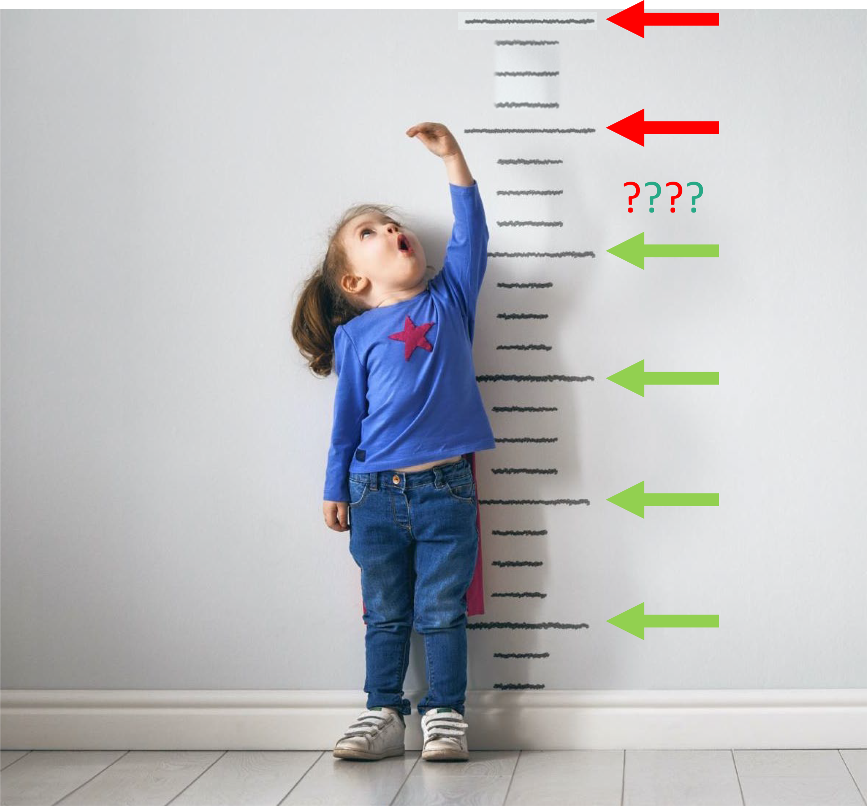
A measurement model to describe height: Child against ruler markings.
Does this measurement model work for measuring other things, such as measuring the ability of an Olympic-level short-distance runner? The probability that an Olympic-level athlete can run a 10-min mile is very, very high. The probability that they can run a 2-minute mile is very, very low. But the probability that they can run a 4-min, 30-s mile is about .50 (the present women’s mile world record is 4 min, 12.33 s; World Athletics Report, 2021). Sometimes they are successful at running a 4-min, 12.33-s mile, and sometimes they are not successful. Does this work for measuring other things, such as measuring my math ability? The probability that I can correctly answer the problem 5 + 5 is very high. The probability that I can correctly calculate, in my head, the square root of 458 is very low. The probability that I can correctly determine the answer to the question 57 minus 22 in my head is about .50. So, in each of these cases, when the challenge matches the person, they have a .50 probability of passing the task.
Defining the Person-Centered Measurement Model
The following formula focuses on the person being measured. This formula represents the dichotomous Rasch measurement model, a subcategory of the item response theory models:
This formula indicates that the natural log of the probability of a person passing an item over the probability of a person failing an item equals person ability minus item difficulty. The important relationship boils down to the person against the item. All testing in occupational therapy investigates the relationship of the person or object to the items of the instrument or measure. It is the client against putting on shoes. It is the client being able to shave himself. It is the child with an upper extremity impairment trying to do a craft with their impaired limb.
We can diagram this relationship, showing graphically the association of person ability versus item difficulty. In Figure 2, the line with arrows at each end represents the continuum of person ability on the thing that we want to measure. This line represents the ideal that we attempt to measure with our assessments (Wright & Stone, 1999). The line can represent, for example, physical ability, cognitive ability, depression, or resilience.
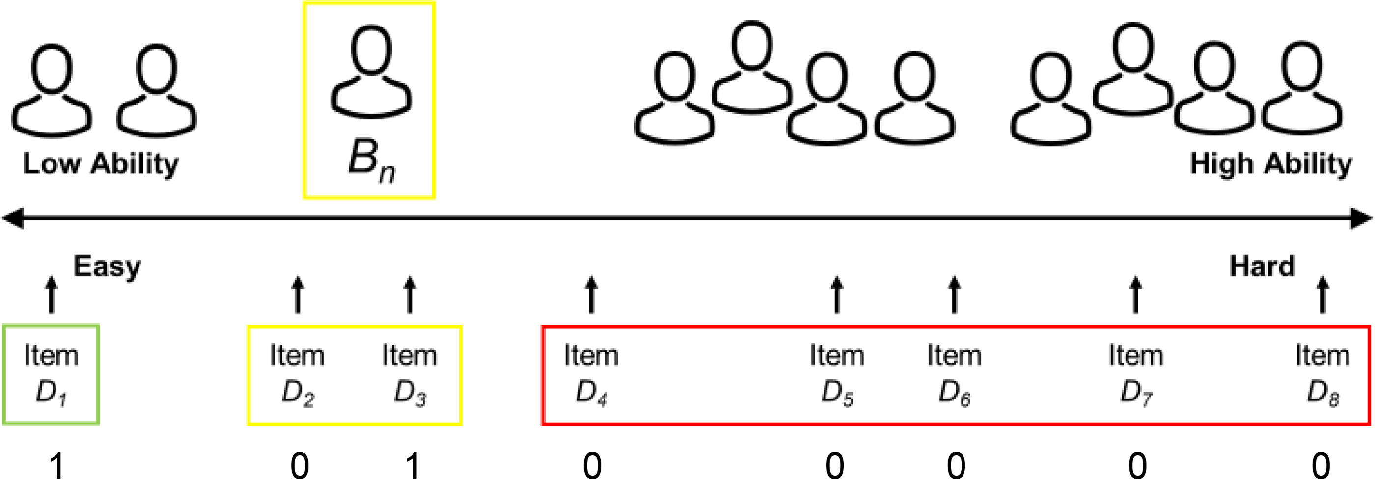
Diagram representing a line (ruler) for any measure in terms of client ability (top) and item difficulty (bottom).
A measure is an abstraction; you cannot really touch it. You cannot touch length, temperature, or weight. Similarly, you cannot touch activities of daily living, depression, or resilience. We can put people with different abilities on the Figure 2 measurement line. To the far left are people of low ability. To the far right are people of high ability. Person Bn is somewhere on this line. We can also put items of different difficulties on this line. To the far left are items that are easy. To the far right are items that are hard. Person Bn is a little below middle ability. When this person takes a patient-reported outcome or self-report measure or is assessed with a clinician-reported measure on an easy item, there is a high probability that they will pass the easy item. When this person is assessed on a hard item, there is a high probability that they will fail the hard item. When they take items at their ability level, sometimes they pass, and sometimes they fail.
Not only does this person-centered measurement model focus on the person, but the responses on items ordered by difficulty provide a pattern or picture of the ability of the client. Person Bn in Figure 2 will receive a 1 for a correct answer and a 0 for an incorrect answer; the results are going to look like this: When the person takes the very easy items, they will get them correct. They get a 1 for each easy item. When the person takes the very hard items, they will get them incorrect. They get a 0 for each hard item. When the person takes items at their ability level, sometimes they get them correct and sometimes they get them incorrect.
How does this pattern look for instruments that occupational therapy practitioners and other rehabilitation therapists typically use? Figure 3 represents a measure of mobility, where Bn represents a person with low mobility ability. We create a self-report measure by generating easy and hard items. Stepping into and out of an elevator and walking within one’s home represent easy items. Jogging 1 mile and running 1 block represent difficult items. The instrument should have items with difficulties across the range of challenge the instrument is intended to measure. The numbers across the bottom of the figure represent the person’s response pattern. When person Bn takes the easy items, they are likely to pass or be successful on the items; they get a 1. When person Bn takes the hard items, they fail or are unsuccessful on the items; they get a 0. When they take items at their ability level, sometimes they pass them and sometimes they fail them.
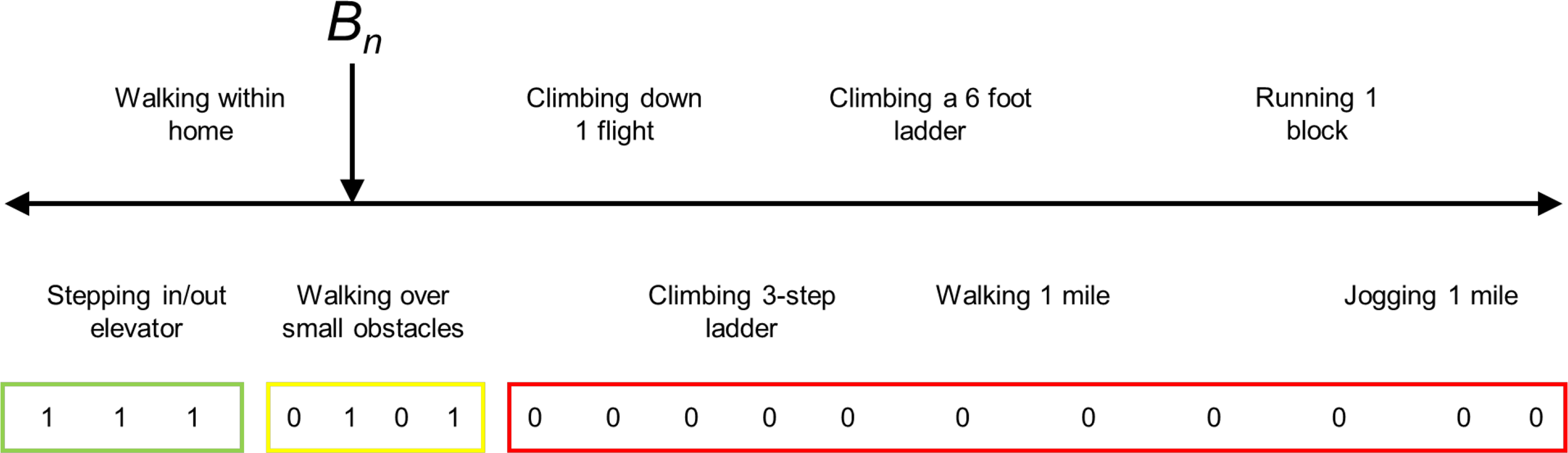
Diagram representing a line (ruler) for a measure of functional mobility.
How about something more difficult to measure, for example, a measure of attention? In Figure 4, Bn represents a person who has high attention. Again, we build a self-report measure that has easy and hard items. Only being able to answer questions about oneself and about locating something in the refrigerator should reflect someone with low attention. Being able to work on multiple things and write messages while talking reflect someone who has good attention. In the case of person Bn, they pass easy items all the way up to “locates items in the grocery store.” But they cannot pass high-attention tasks like “writing messages while talking” and “able to work on multiple things.” For activities like “participates in a 30-minute activity with a break,” sometimes they are successful and sometimes they are not successful.
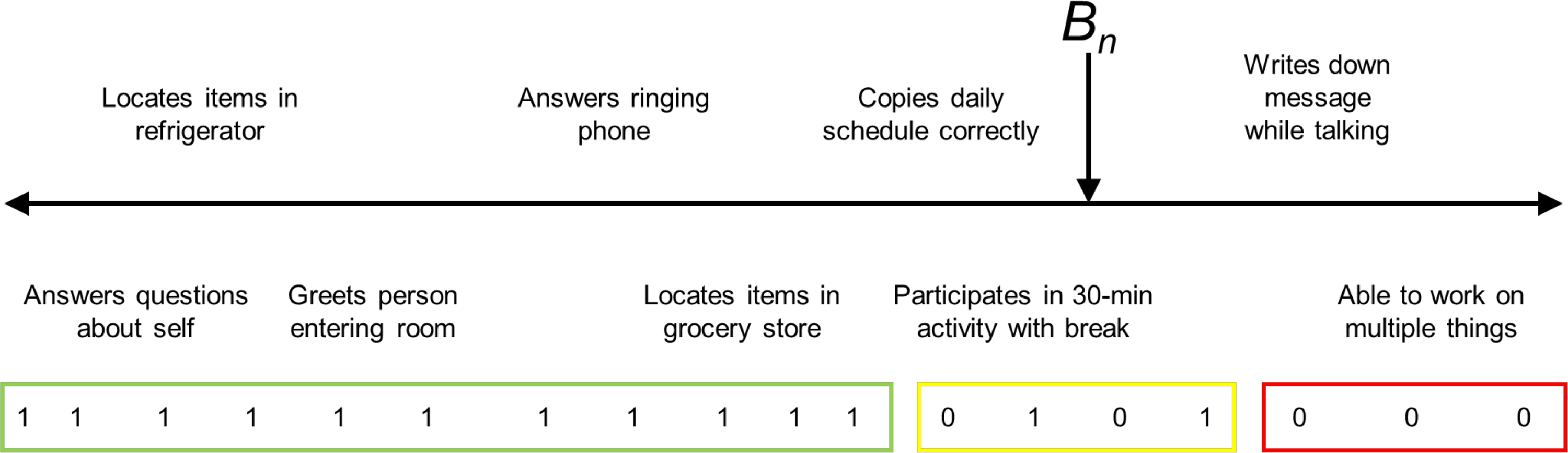
Diagram representing a line (ruler) for a measure of attention.
Person-Centered Measurement and Group Data
What are some of the advantages of focusing on the person and item when interpreting group data? My colleagues and I at the Medical University of South Carolina had the opportunity to work with a database from the Spinal Cord Injury Longitudinal Aging Study, a 40-year project with long-term survivors of spinal cord injury (SCI). What was noticeably missing in this database was a measurement of change in performance of activities of daily living/instrumental activity of daily living (ADL/IADL) over time. Fortunately, the longitudinal database included 11 ADL/IADL items. While these 11 items technically were not an established measure, we analyzed them and found that they showed adequate measurement qualities to serve as an ADL/IADL measure, which we named the Spinal Cord Injury Activities of Daily Living measure (Li et al., 2018).
Figure 5 presents the main findings. This figure is a plot of the average ADL/IADL ability of three categories of SCI survivors at three time points over a 20-yr period from 1993 to 2013. For the analysis, we separated individuals based on their initial SCI. The top line represents people with a thoracic-, lumbar-, or sacral-level SCI. The middle line represents people with a cervical (C) Level 5–8 injury. The bottom line represents people with a cervical Level 1–4 injury. As expected, people with higher level injuries demonstrated lower average ADL/IADL ability at all time points. A finding of particular interest is that people with C1- to C4-level injuries showed the most dramatic drop in ADL ability from 2003 to 2013. This finding was somewhat expected in that people with high-level cervical injuries have lower physiological reserves.
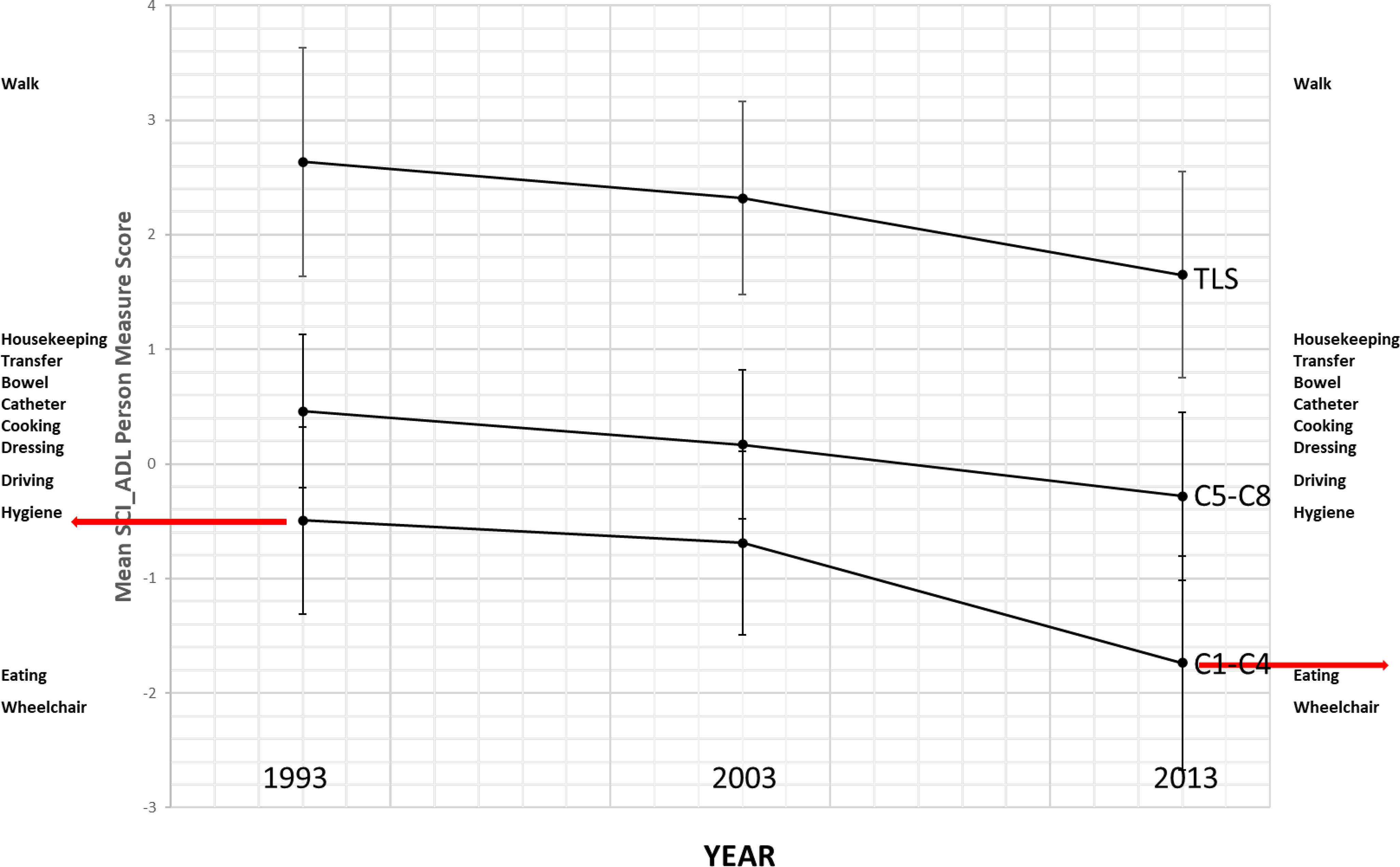
Person ability measure changes over time on the Spinal Cord Injury Activities of Daily Living measure.
But the importance of this drop becomes apparent only when we relate it to the items of the instrument. On the far left and far right of Figure 5 are lists of the ADL/IADL items, with the easiest items on the bottom and the hardest items on the top. Eating and operating a wheelchair are easy items. Doing housekeeping and walking are hard items. Whereas in 2003, on average, people with C1 to C4 SCI could maintain their own hygiene, in 2013 they could only feed themselves and operate their wheelchairs. When data are presented this way, the value of occupational therapy services becomes apparent: Over time, people with high-level cervical injuries are increasingly likely to benefit from occupational therapy interventions.
Another example in which the person–item relationship becomes apparent is in understanding critical measurement values relative to the risk of falling. A clinical instrument commonly used in evaluating balance is the Berg Balance Scale (BBS; Berg et al., 1992). This scale has a well-known criterion score of 45/56 as the cutoff score identifying people likely to fall (Donoghue et al., 2009); those with scores below 45 have a greater chance of falling. This is very important information, but it is only when we connect these people to the items of the instrument that we get important insights into why people with scores below this criterion tend to fall.
Figure 6 is a Wright map (named for Benjamin Wright), which places person ability measures and item difficulty measures on the same line (Kornetti et al., 2004). The Xs to the left of the vertical dashed line represent people with different measures on the BBS. The lowest X represents the person with the lowest measure of balance. The highest Xs represent the two people with the highest measure of balance. There is a normal distribution, with most people in the middle of the scale and fewer people at the ends. The items of the instrument are listed to the right of the vertical dashed line. The easiest items are “sit unsupported,” “stand to sit,” and “stand unsupported.” The hardest item is “tandem stance”—that is, standing with one foot directly in front of the other (see the photo in Figure 6). Other hard items are “alternating foot,” which is placing one foot at a time on a step or low stool, and “standing on one leg.” The critical value of 45/56 is represented by the black horizontal line. What this line indicates is that the people with abilities below this line, who cannot maintain a tandem stance, alternate feet, or stand on one leg, are more likely to fall. Not only does this make sense, it is certainly better than believing that the number 45/56 is somehow magical. This Wright map demonstrates how the Rasch model, which relates item difficulty to person ability, is useful in looking at group data.
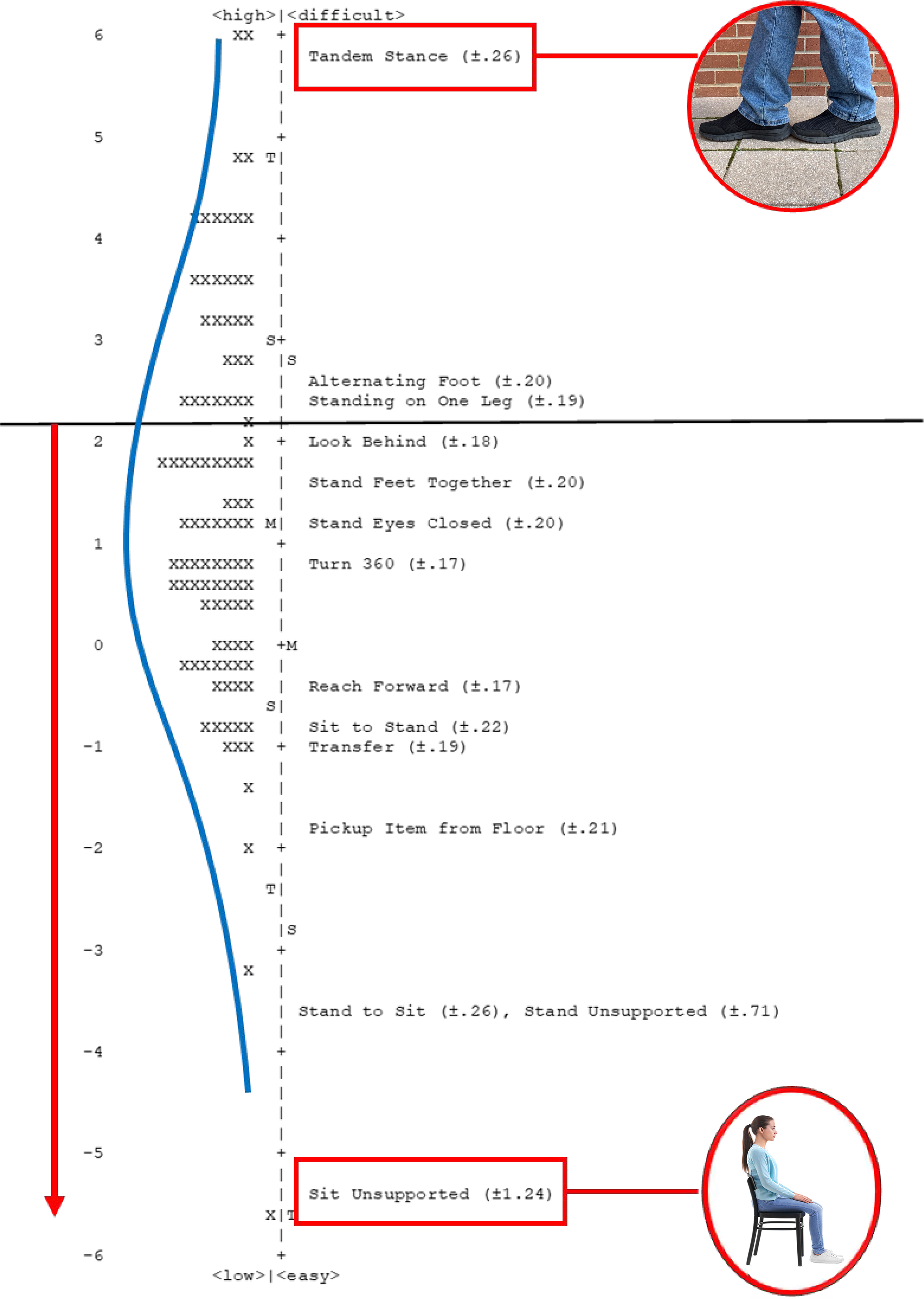
Wright map for community-dwelling veterans referred for balance deficits.
Keyform Recovery Maps: A Tool for Applying Person-Centered Measurement With Clients
The numbers from our instruments are relevant only if they generate information that is useful in practice. What is needed are measures that focus on the person—in particular, measurement outputs that are useful to the therapist when working with the individual client.
Scott Hutchison, an occupational therapist doing research with Michelle Woodbury at the Medical University of South Carolina, designed Excel worksheets that convert client ratings on commonly used assessment instruments from administration order to item difficulty hierarchy order. This display is an adaptation of the “keyform” output from Winsteps Rasch analysis software (Linacre, 2021). The term keyform recovery map was coined by Woodbury et al. (2007). Keyform recovery maps can be generated from the item difficulty calibrations from Rasch or item response theory analysis of an instrument. The Excel keyform recovery map displays items of an instrument in order of difficulty, with easier items toward the bottom and harder items toward the top; client ratings on each item are color coded, green indicates the client is successful, yellow indicates the client is somewhat successful, and red indicates the client is unsuccessful.
Figure 7 shows the Excel worksheets for the University of Illinois at Chicago Fear of Falling Measure (Velozo & Peterson, 2001). There are two worksheets (see the tabs at the bottom of the spreadsheet). The first worksheet, “Items Assessment Order,” is where the client’s therapist entered the client ratings for each item: 1 indicates very worried, 2 indicates moderately worried, and 3 indicates not worried at all. The therapist entered the values from the assessment into this first worksheet, which provides the client’s total score out of the maximum score for the instrument. After entering the data, the therapist clicked on the tab labeled “Item Hierarchy Order.” This worksheet is the keyform recovery map; the easier items (i.e., those causing the client the least worry) are on the bottom, and the harder items (i.e., those causing the client the most worry) are on the top. The right column is color coded according to the client’s worry ratings. “Not worried at all” ratings are in green; these items were easy for the client. “Very worried” ratings are in red; these items were hard for the client. “Moderately worried” ratings are in yellow; these items represent the just-right challenge for the client and can be the focus of treatment interventions.
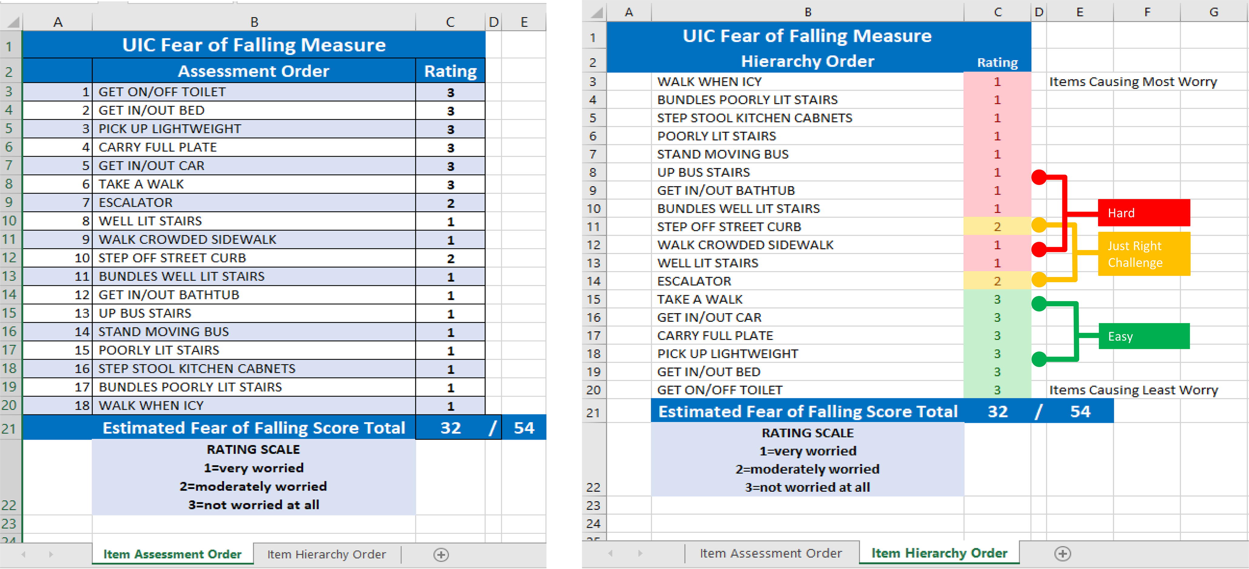
Excel spreadsheet for the University of Illinois at Chicago Fear of Falling Measure, with client results.
Figure 8 shows the keyform recovery map in a little more detail. This client’s high scores (indicating easier, less worrisome activities), in green, are located toward the bottom of the item difficulty hierarchy, and low scores (indicating harder, more worrisome activities), in red, are located toward the top of the item difficulty hierarchy. The item ordering and colors provide an indication of where one can set short-term goals and long-term goals. Where the colors change is an indication of the just-right challenge area for the client. Moving up the hierarchy, where the color changes from green to yellow represents where the therapist can set short-term goals. Items associated with short-term goals for this client are “using escalator,” “going up well-lit stairs,” and “walking on a crowded sidewalk.” Where the color changes from yellow to red represents where the therapist can set long-term goals. Items associated with long-term goals are “stepping off a street curb,” “carrying bundles up well-lit stairs,” and “getting in and out of a bathtub.” The items in this transition zone represent the just-right challenge for the client.
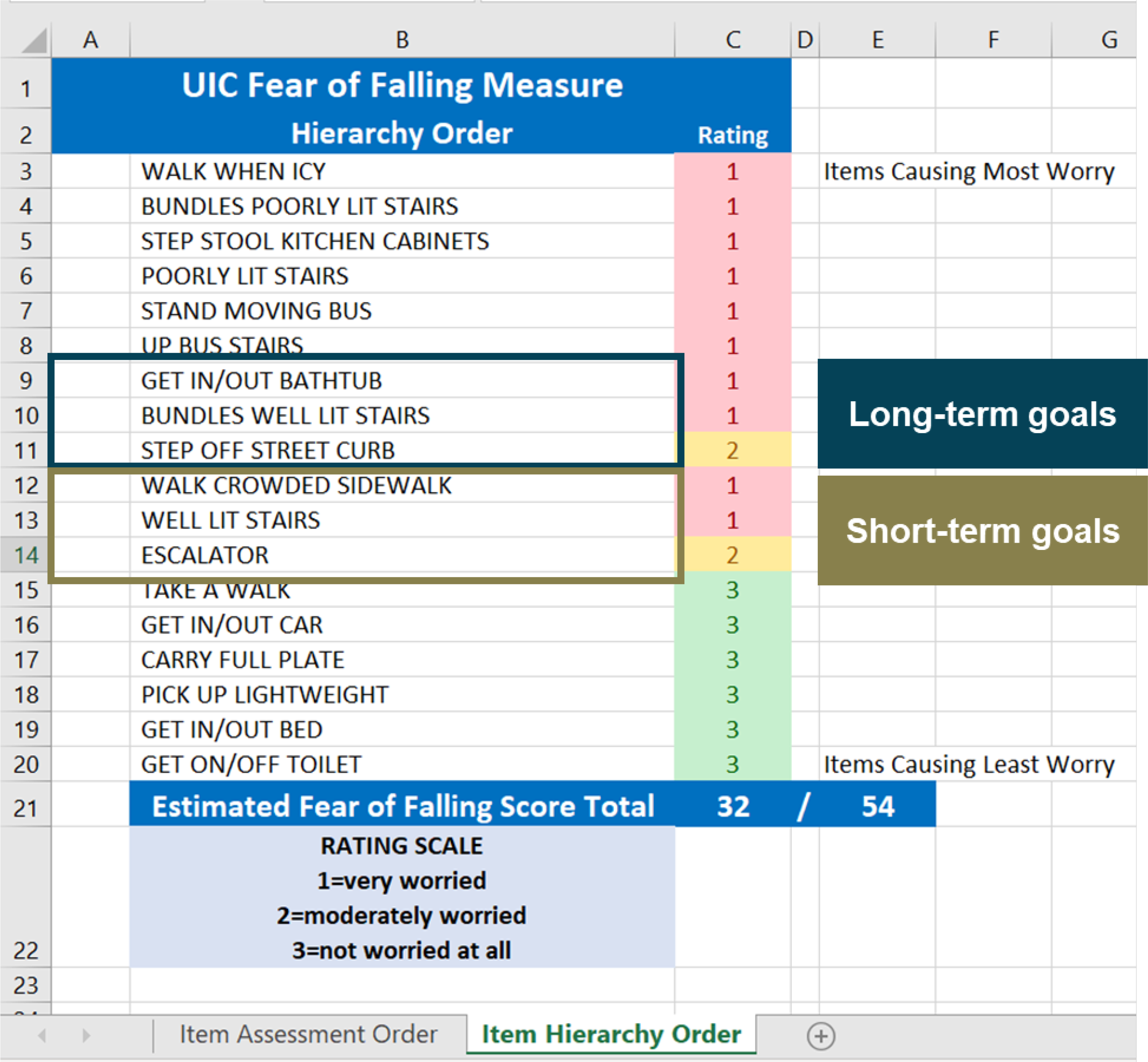
Keyform recovery map from Figure 7 with items identified for short-term goals and long-term goals.
A reflection on the items in the transition zone should provide the therapist with insights into the physiological, cognitive, social, or emotional challenges facing the client. For example, the keyform recovery map may suggest that the client does not have the coordination for making mobility adjustments when stepping off a street curb. The client may be unstable getting in and out of a tub, or visual challenges may be impeding the confidence of the client when walking on a crowded sidewalk or riding an escalator. Multiple graded activities and compensatory methods can likely be implemented to improve the client’s function. For this client, initial education with the keyform recovery map may help increase the client’s awareness of their challenges. Yoga and tai chi or leisure activities specifically designed to present the just-right challenge for the client may be effective in improving strength and coordination. Home modifications and mobility devices may also increase the client’s confidence and decrease the possibility of falling.
Where to Find Keyform Recovery Maps
Keyform recovery maps are available at https://patientprogress.org, a noncommercial website affiliated with the Medical University of South Carolina that has been designed to distribute keyform recovery maps to occupational therapy and other rehabilitation professionals. Clicking on “Keyform Recovery Maps” at the top of the home page will take you to a list of assessments for which our team has developed keyform recovery maps in Microsoft Excel and PDF formats. This is a partial list of instruments; we will continue to develop keyform recovery maps for additional instruments.
The Rasch measurement model is based on the pattern of responses to individual items. Keyform recovery maps provide a pattern or picture of your client that identifies the just-right challenge for the client instead of generating a total score and simply confirming that your client is below the norm or that your client has or has not improved. When the data from your client are presented in a keyform recovery map, you can focus on the specific needs of that client. In addition, this tool provides an empirical basis for setting short-term and long-term goals and delivering optimal treatment interventions.
Conclusion
In summary, measurement will never beat assessment. But if we use a measurement model that focuses on the client, we can use person-centered measurement to produce a picture of the client through the pattern of their responses. This methodology provides a mechanism to demonstrate occupational therapy’s distinct value and empirically reveal the effectiveness of our interventions. We have the scientists to provide the theoretical and analytical support for person-centered measurement. But it is practitioners who will find innovative ways to implement person-centered measurement and effectively demonstrate the value of occupational therapy interventions. Now is the time for occupational therapy to lead health care in implementing person-centered measurement.
Footnotes
1
This article is an adaptation of the Eleanor Clarke Slagle Lecture presented online at the virtual 2020 AOTA Annual Conference.
Acknowledgments
I thank Patty Coker-Bolt, Hazel L. Breland, Nancy E. Carson, Amanda K. Giles, Emily Grattan, Cristina Reyes Smith, Na Jin Seo, Michelle L. Woodbury, Pey-Shan Wen, Leigh Lehman, and Ickpyo Hong for nominating me for the Eleanor Clarke Slagle lectureship. I thank Gary Kielhofner for guiding me as a developing faculty member; Benjamin D. Wright for introducing me to a revolutionary way to look at measurement; the faculty, students, and staff of the Medical University of South Carolina for supporting my preparation of the lectureship; and the many doctoral students who did the hard work necessary to refine my thinking that led to this lectureship.