






Abstract
Keywords
Communicating about the magnitude of risks is an important part of decision support, health promotion, informed consent, and other health communication activities. Perceived risk is a potential motivator of health behavior change and decision making,1–3 and perceived risk has a strong relationship with subsequent behavior. 4 Patients should be able to understand and compare risks when making decisions such as choosing between treatments, 5 understanding insurance alternatives or health care quality indicators, 6 and granting informed consent. 7
Health risks are often presented as percentages, proportions, or rates. However, numeracy skills such as ability to calculate and manipulate percentages vary widely among the public.8–11 In general, the less numerate and less well educated have less understanding of and comfort with probability and percentages.12,13 Printed graphics and frequency formats14–18 can help illustrate these concepts.
Much health-related communication takes place online. Web-based environments and computer games provide creative examples of animated, interactive graphics that involve and engage their viewers. These technologies could easily be adapted for health communication. For instance, a game might convey the meaning of a 10% risk by letting players pilot animated characters through simulations in which characters encounter the disease 10% of the time. Alternately, a player could “test” a group of animated characters to identify the 10% affected by the disease. Several behavioral economics studies have explored the use of real and virtual experience to convey information about the probable payoffs of gambles.19,20 In these studies, participants learned about the probable payoff of a deck of cards by examining samples of cards from the deck rather than by reading a statement such as “a 50% chance of winning $10.”19,20 Like participants in the classical studies involving statistical descriptions of choice options,19,20 the participants judged rare events inaccurately, but strikingly, participants in these experiential studies erred in the opposite direction, underweighting rather than overweighting rare events. 21 In medicine, inaccurate judgment about rare events such as vaccine side effects often takes the form of overreaction. Thus, these findings seemed worth exploring as a possible path toward ways to increase accuracy of risk perception about rare events, if a way could be found to avoid the problem of inducing people to underweight the events.
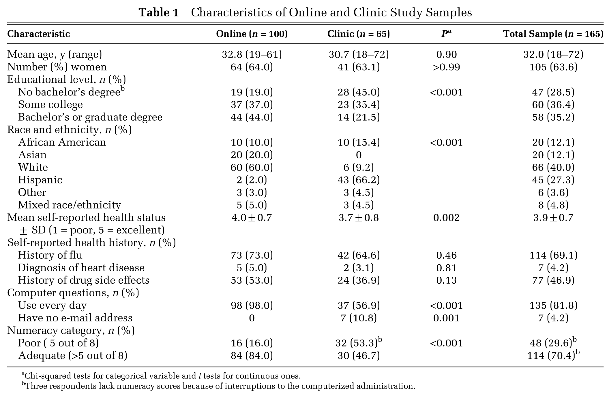
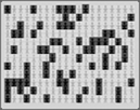
Communicating information about risk through virtual experiences would appear to be promising for several other reasons as well. First, computer games and simulations are fun and popular, especially among younger people, and avatar-based games have been successful in teaching health knowledge and self-management skills.22,23 Second, people interacting actively with information may process it at a deeper cognitive level than those who passively view it. Deep processing, in turn, has been shown to improve comprehension of and satisfaction with risk information 24 and, in persuasive communications, to induce more stable attitude change. 25 As described above, each scenario was illustrated with a graphic. On the basis of our qualitative study, 26 we developed 2 static control graphics. The static random graphic showed dark blue figures (representing those with disease) and yellow ones (representing those without the disease) scattered randomly throughout the grid. The static sequential graphic showed the blue figures sequentially arranged in the bottom rows of the grid. We also developed a minimally interactive switch graphic that allowed participants to toggle back and forth between sequential and random views of the same percentage (working example at www.dbmi.columbia.edu/~jsa7002/Switch.php). The interface was designed in such a way that participants had to switch views at least twice before being able to answer the questions in the questionnaire. The fourth condition, the interactive search graphic (Figure 1; www.dbmi.columbia.edu/~jsa7002/Search.php), showed a grid of orange squares, with instructions to click on any square to see the figure underneath. When a blue figure was found, all the squares turned over to reveal all the figures. The interface was designed so that participants had to find a blue figure before they could answer the questions in the questionnaire. *

Interactive search graphic (working example at www.dbmi.columbia.edu/~jsa7002/Search.php; requires Adobe Flash Player). (A) Viewers first see a grid of squares. (B) Clicking on a square shows the figure under it. (C) Yellow figures are unaffected. (D) Blue figures have the disease. (E) Finding a blue figure triggers a cascade that reveals all the figures (F). Participants could not proceed through the questionnaire until they found a blue figure.
All graphics were developed in Adobe Flash CS Professional Version 9.0, using ActionScript 2.0 (Adobe Systems, Inc., San Jose, CA) and embedded in an html/php questionnaire. All graphics showed a grid of stick figures with yellow indicating no disease and dark blue indicating disease. The grid was 20×12, a large size that was chosen to carry the implication of a large sample because other researchers have found that small stick figure samples are sometimes interpreted as indicating small and therefore unreliable sample sizes. 33 All participants saw the same type of graphic for both scenarios.
Statistical Analysis
The primary outcome measures were the risk perception questions (risk feelings and risk estimates), the intention to take preventive action, and the perceived usefulness of the graphics. For a preliminary test-retest reliability analysis, item correlations were calculated with Pearson’s r for continuous variables, Spearman’s ρ for Likert-style scales, and tetrachoric correlations for binary variables. Our a priori hypotheses treated feelings about risk and estimates of the risk separately, so as described above, we identified 4 questionnaire items that had prior evidence or face validity for measuring these constructs. After data collection, to determine whether these were indeed separate constructs or whether the 4 questions measured the same construct and should be combined, we performed factor analysis (principal components without rotation) on the 4 questions. The number of factors to retain was based on an eigenvalue threshold of 1 and examination of the scree plot; an item was assigned to a factor if its loading had an absolute value of 0.3 or higher. For comparisons across graphic groups, chi-squared tests, Fisher exact tests, and analysis of variance (ANOVA) were used to compare responses of respondents who had read the same scenarios but viewed different graphics. In some cases, skewed data were normalized by square root transformations or tested with nonparametric tests, but results did not differ substantially, so most analyses are presented with nontransformed data and parametric tests. A planned subgroup analysis focused on 1 unique variable within the search graphic group: number of clicks, indicating the extent of the respondent’s interaction with the graphic. Thus, in the search graphic group only, we computed Spearman correlations between the number of clicks and 1) intention to take preventive action and 2) risk perception. Analyses were performed in SAS 9.1 (SAS Institute, Cary, NC) and SPSS 16.0 (SPSS, Inc., an IBM Company, Chicago, IL).
Results
Pilot Testing and Test-Retest Reliability
The computerized questionnaire with embedded interactive graphics was tested for usability with 7 participants recruited to represent a range of education levels and computer familiarity. The pilot testing helped us clarify instructions and improve the layout. Test-retest reliability was assessed by having an additional 9 participants take the questionnaire twice over an interval of 2 to 3.5 weeks (median 18 days). Reliability was good with average item correlations for each subscale ranging from 0.75 to 0.99, with the exception of the intentions questions (=0.66, P < 0.001).
Demographics
The 2 samples were similar in age and sex distributions (Table 1), but the clinic sample had less education, less familiarity with computers, and lower numeracy. Clinic participants had slightly worse current health status but were not more likely to report histories of flu, heart disease, or drug side effects (3 health issues related to the questionnaire scenarios). There were no differences in demographics or dropout rates between the 4 experimental arms (random, sequential, switch, and search).
Characteristics of Online and Clinic Study Samples
Chi-squared tests for categorical variable and t tests for continuous ones.
Three respondents lack numeracy scores because of interruptions to the computerized administration.
Factor Analysis of Perceived Risk Questions
The factor analysis revealed 1 factor accounting for 59.7% of the variance in story 1 and 64.5% of the variance in story 2; this factor was interpreted as the general construct of perceived risk (perceived risk factor). Although only 1 factor was extracted at the eigenvalue threshold of 1, the scree plot showed a strong second factor accounting for an additional 20.7% of the variance in story 1 and 20.4% in story 2, which would have been extracted at an eigenvalue threshold of 0.8. This factor revealed a sharp contrast between the first and last 2 questions and appeared to suggest a distinction between feelings about risk and estimates of risk (feelings/estimates factor). As a result, we summed the reverse-coded “susceptible” and “vulnerable” questions to create a combined risk feelings question for each story but retained the remaining questions as 2 separate items (verbal risk estimates and numeric risk estimates) as this second factor suggested a possible distinction between them.
Primary Outcomes: Risk Feelings, Risk Estimates, and Perceived Usefulness
Our first hypothesis was that interactive graphics would reduce risk feelings for rare risks. However, assignment to different graphics had no main effect on risk feelings for either the low-risk story (means of 3.1, 2.7, 2.7, and 2.9 on the 7-point scale; P = 0.66) or the high-risk one (means of 4.5, 4.2, 4.5, 4.5; P = 0.79). It also had no main effect on verbal risk estimates (all differences between means smaller than 0.3 on the 7-point scale, Ps>0.40). The planned subgroup analysis within the search graphic group showed no meaningful correlations between number of clicks on the graphic and perceptions, estimates, or intentions (all ρ < 0.09).
The graphics had no main effect on mean numeric risk estimates (Ps>0.40). However, our second hypothesis was in part supported by the finding that the graphics affected variability in numeric estimates. For story 2 (the low-risk story), variance in numeric risk estimates was highest for the random graphic (s2 = 630.2), lowest for the sequential graphic (105.9), and in the middle for the switch graphic (409.9) and for the search graphic (243.2). The variances were significantly different (Levene’s test, F = 4.7, P = 0.004). In story 1, the variances followed a similar pattern, but the differences were smaller and not statistically significant.
Our third hypothesis was that interactivity would lead to higher ratings for perceived usefulness of the graphics. The search interactive graphic received the highest ratings on perceived realism and accuracy for story 1 (Table 2); it also received the highest ratings on most of the other perceived usefulness questions listed in Table 2, but these differences were not statistically significant. The search graphic also earned the most “confusing” ratings, although this difference also was not statistically significant. Over all 4 conditions, people with low familiarity with computers were more likely to say that graphics were confusing (31.2% v. 18.3%, P = 0.004). However, the proportion was almost the same in every condition, suggesting that the search and switch graphics were no more likely to be confusing than the static ones to these respondents. People with poorer numeracy tended to consider graphics more helpful for understanding (i.e., over all groups, lower numeracy score correlated with higher perceived helpfulness of graphics; ρ = 0.22, P = 0.002). People with poor numeracy were not more likely to consider graphics confusing (23% v. 19%, P = 0.56).
Perceived Value of the Graphics
 (n = 39)
 (n = 44)
 (n = 39)
 (n = 43)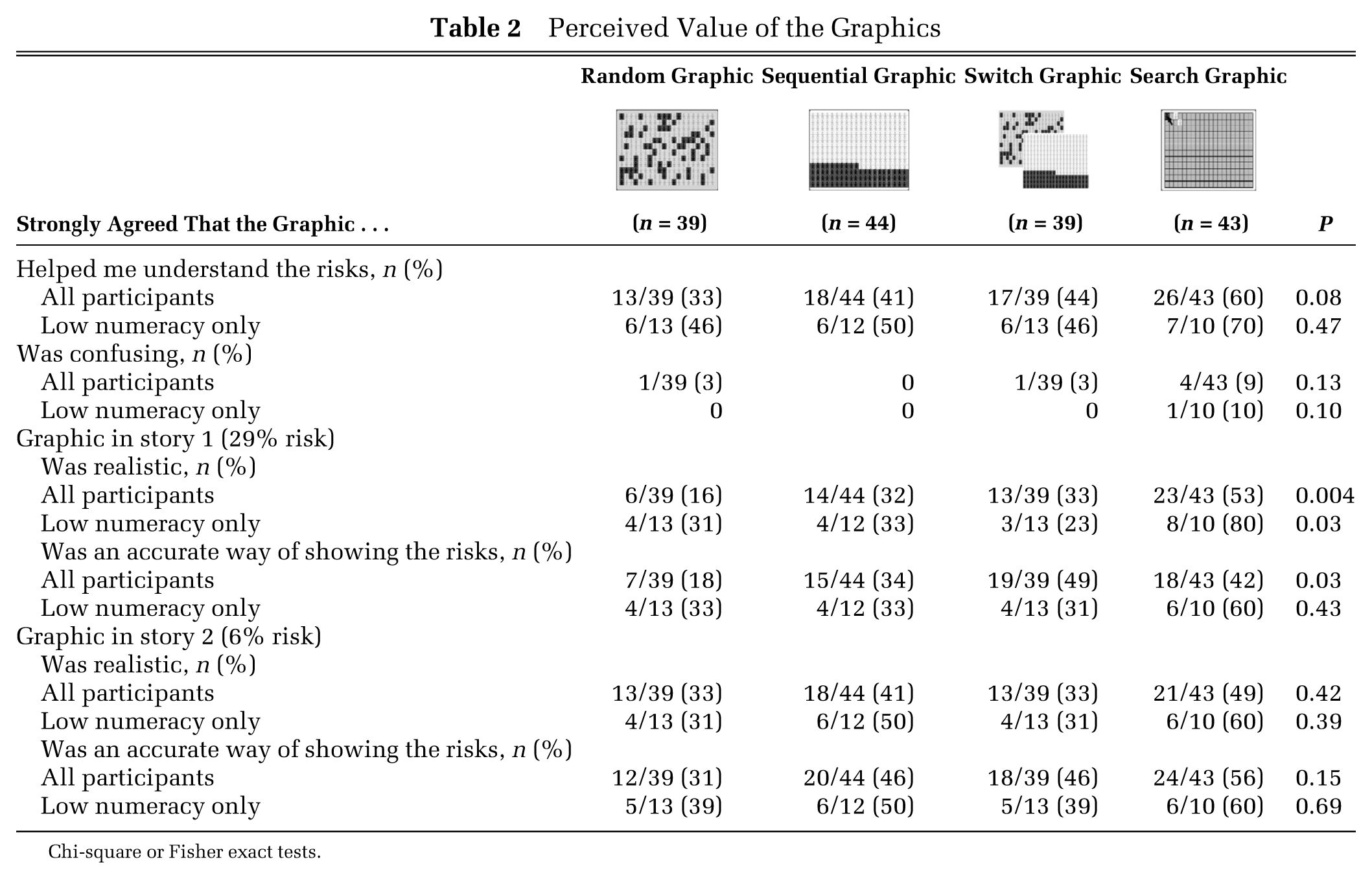
Chi-square or Fisher exact tests.
Our fourth hypothesis was that the interactive graphics would reduce differences between high- and low-numeracy participants in both risk feelings and intentions. In general, our low-numeracy respondents reported higher perceived risks and stronger intention to take the preventive option than high-numeracy respondents did (Table 3). However, these differences between high- and low-numeracy respondents were smallest in the search graphics group (Table 3); they were most exaggerated in the random and switch groups. The low-numeracy groups had small sample sizes, but the confidence intervals in Table 3 are relatively narrow, and most are statistically significantly different from zero.
Mean Risk Perceptions and Intention by Numeracy Level

Boldface indicates significantly different at alpha = 0.05. Risk feelings and verbal risk estimate: 1 = low, 7 = high. Numeric risk estimate: fill in the blank with number from 0% to 100%. Would take preventive action: 1 = strongly agree, 4 = strongly disagree.
For the first 3 measures, lower numbers indicate lower risk, and differences are calculated as (low numeracy – adequate numeracy); for intention, lower numbers indicate stronger intention, so difference is (adequate – low).
Group assignment (graphics) had no appreciable main effect on intention to take the preventive action. Across all 4 conditions, the preventive option was chosen by 62% of respondents in story 1 and 49% of respondents in story 2. All answers about risk feelings, verbal and numeric risk estimates, self-efficacy, response efficacy, and response side effects were correlated with intention to opt for the preventive action, in the expected directions. Clinic respondents were more likely than the online sample to opt for the preventive action (71% v. 56% for story 1, P = 0.056; 60% v. 41% for story 2, P = 0.02). Blacks and Hispanics were more likely to opt for the preventive action than were whites or Asians (story 1: 75%, 78%, 53%, 35%, P = 0.02; story 2: 55%, 64%, 36%, 35%, P = 0.058). Clinic status and self-reported health status partly mediated the race effect (i.e., adding these variables to regression equations reduced the coefficient of the race variable and increased its P value).
Numeracy as a Covariate
Numeracy score was negatively correlated with the perceived risk questions (all ρs from –0.16 to –0.40; Ps < 0.04), indicating that higher numeracy was associated with lower risk feelings and risk estimates. The correlations were stronger among respondents without a college degree (ρs from –0.20 to –0.40; Ps ≤ 0.04) than among respondents with lower education level. Education level was itself negatively correlated with risk feelings and numeric risk estimates.
As described above, all respondents were presented with a scenario in which their risk was described as 29% (story 1) and a scenario in which their risk was described as 6% (story 2). Low-numeracy respondents were less likely than high-numeracy ones to adopt the risk level described in the story as their own numeric risk estimate; 66% of low-numeracy respondents gave a nonscenario risk estimate for both stories, compared to 47% of high-numeracy ones (P = 0.03). Again, the effect was weaker among college-educated respondents.
For the numeric risk estimate, “29%” and “6%” were the most frequent answers, but “50%” was the second most frequent answer (11% of respondents in story 1, and 5% of respondents in story 2 chose 50%). Low-numeracy respondents, even college-educated ones, were much more likely to use 50% than were high-numeracy ones (23% v. 6% in story 1, P = 0.002; 13% v. 1% in story 2, P = 0.003). This led to significant differences in both means and variances of their risk estimates (story 1: means of 42 v. 30, P < 0.001 for significance of difference between means of square root–transformed data, P < 0.001 for significance of differences between variances; story 2: 22 v. 6, P = 0.04 on square root–transformed data, P < 0.001 for significance of differences between variances).
Effect of Question Order
In an unanticipated effect in story 2 (the low-risk story), question order affected intention to take the preventive action but did not affect perceived risk. As shown in Figure 2, in the first order, the questions about perceived risk and opinion about the graphics appeared immediately after the graphic risk display; the question about intention to take the preventive action appeared later. In the second order, questions about disease severity and efficacy appeared first, followed by the intention question, with the perceived risk questions last. Respondents in this (second) order condition were much more likely than those in the first order condition to opt for the preventive action (65% v. 34%; P < 0.001) in story 2.

Order of question blocks.
Within the search graphic condition, question order also influenced the effect of number of clicks on risk perception. For story 2 with the 6% risk, search graphics participants clicked from 2 to 51 squares before finding a blue figure (median 12 squares). When questions about perceived risk appeared immediately after this search experience, respondents who had to click more times before finding a blue (affected) person reported a higher perceived risk (correlation between clicks and verbal risk estimate, ρ = 0.57, P = 0.009; correlation between clicks and risk feeling, ρ = 0.35, P = 0.13). For example, those who clicked fewer than 10 times tended to call the risk almost zero, whereas those who clicked more than 25 times generally called the risk small to moderate. These differences in perceived risk influenced subsequent behavior. In particular, risk perception was positively correlated with intention to take protective action (verbal estimate ρ = 0.44, P = 0.055; risk feeling ρ = 0.74, P<0.001; numeric estimate ρ = 0.45, P = 0.047).
By contrast, in the other question order, when questions about perceived risk came last, number of clicks did not correlate with any of the risk perception ratings (all ρ < 0.12).
In story 1 (with the 29% risk), participants in the search group clicked a median of only 2 times before finding a blue figure (range, 1–16), and there were no correlations between click number and the perceived risk questions in either order (all ρ < 0.08).
Discussion
This questionnaire study focused on risk feelings, quantitative risk estimates, and intentions to take protective action when risks were illustrated with 1 of 2 interactive graphics (switch and search) or 1 of 2 static graphics (random and sequential). A priori, we wanted to focus on feelings of risk because they are strongly associated with subsequent behavior, and in many cases, behavior is more strongly correlated with risk feelings than with quantitative risk estimates. 27 Although risk feelings and estimates were correlated, the postanalysis factor analysis found sufficient difference between them that we did not abandon our a priori intent to examine them separately. The graphics did not have main effects on mean risk feelings, risk estimates, or intentions. However, the variability in quantitative estimates was significantly higher with random graphics, suggesting that individuals tend to be less precise in assessing the proportion represented in these graphics and may not be able to distinguish small differences between such graphics. The sequential arrangement, as well as both types of interactive graphics tested here, reduced the variability, suggesting that such designs would likely be better for helping people estimate risks accurately and recognize relatively small differences between risks. This study found a high prevalence of low numeracy among an outpatient population and confirmed previously reported correlations between low numeracy and higher risk perceptions. Question order affected intention to take preventive action against a threat. Of the graphics explored in this study, only the search graphic had an appreciable effect on risk perceptions and subsequently on behavioral intentions. However, question order attenuated the effect on risk perception.
The search graphics earned good ratings on helpfulness, accuracy, and realism; for one of the stories, the ratings for the search graphics were statistically significantly higher than for the other graphics. Ratings among low-numeracy respondents were particularly high. Also, respondents with low computer familiarity were no more likely to consider the interactive graphics confusing than they were to consider static graphics confusing. These findings suggest that these interactive graphics were viewed positively by the respondents.
Although poorer numeracy was associated with lower educational level, the numeracy effects were not fully explained by education, age, computer literacy, or other factors. Others have also found effects of numeracy independent of education, SAT scores, and other factors.8,34 Low-numeracy respondents systematically gave numeric risk estimates that were higher than the value described in the scenario, as well as higher than the estimates provided by other respondents. Low-numeracy respondents also reported higher risk feelings and higher verbal risk estimates than other respondents. Others have also linked low numeracy with overestimates of personal risk of disease.35,36 In the current study, the effect was in part because low-numeracy respondents were more likely to choose 50% when describing their own risk. This may have been a rhetorical measure to express uncertainty or confusion.36,37 However, this phenomenon did not fully account for the overestimation because average estimates were above the scenario risk even among participants who did not choose 50%. Another reason low-numeracy respondents’ estimates were higher than high-numeracy respondents’ was that in the low-risk scenario, high-numeracy respondents tended to lowball the risk. People with poor numeracy considered graphics more helpful for understanding the risk information, which is consistent with previous findings about subjective (self-perceived) numeracy.38,39
As we had hypothesized, the interactive search graphics narrowed differences between high- and low-numeracy respondents. The explanation may have to do with the approaches high- and low-numeracy respondents use to make decisions about quantitative information. Peters and others 34 have found that the less numerate are not only less able to make optimal decisions about quantitative information but are also less able to make affective judgments about it. For example, when asked how clear a feeling they had about whether a particular option had a good or bad chance of winning, low-numeracy subjects reported less clear feelings. In the current study, high-numeracy respondents may have relied on the percentages and the graphic to determine their feelings about perceived risk and response efficacy. By contrast, low-numeracy ones may not have gotten a clear feeling from the number and instead may have relied on the descriptive text. But the search graphic forced all respondents—both high and low numeracy—to explore the probability through the interaction with the graphic. This effect suggests that graphics such as these could improve communication by reducing differences between the way that numerate health care professionals and less numerate patients perceive risks. Table 3 also suggests that graphics such as these might be particularly effective when the goal is to reduce overreactions to risks among the less numerate. 3
In an unanticipated finding, question order had a strong effect on intention regardless of graphic. When questions about self-efficacy, response efficacy, and disease severity preceded the intention question (reverse-ordered questionnaire), most respondents said they would take protective action. But when questions about perceived risk and perceived value of the graphics themselves preceded the intention question, most said they would not take the protective action. The reverse-ordered questionnaire may have increased intention to adopt the protective behavior by heightening respondents’ perceptions of response efficacy and self-efficacy, both of which were designed to be relatively high (as the recommended response was described as very effective and free). Others have found that emphasizing response efficacy or self-efficacy can increase rates of adoption of disease prevention behavior40–43 and have argued that when consumers respond to fear appeals, they first assess the threat and then immediately appraise the efficacy of the recommended response. 3
We had hypothesized that the search graphic would reduce risk perceptions for rare events because it had some similarities to stimuli used in some gambling experiments,19,20,44 in which subjects learned about the risks of lotteries through the experience of sampling repeatedly from card decks rather than by interpreting symbolic (verbal, numeric, or graphic) statistical descriptions of likelihood. These gambling experiments had found that experiential learning was associated with underestimation of rare events, a phenomenon predicted by associative learning models.20,45 In addition, it seemed that the search graphic might focus attention on the relationship between the numerator and denominator in the rare risk. The idea of drawing attention to the denominator of a ratio has been suggested as a way to combat biases such as overreaction to rare events 46 and ratio bias, 47 the finding that people tend to perceive a chance of 10/1000 as larger than a chance of 1/100.
However, contrary to our expectations, the search graphic did not reduce risk perceptions for rare events on average. Instead, risk perception was correlated with the number of times the respondent clicked on the graphic. The finding may be related to the design of the graphic. Every respondent explored each graphic just once (instead of repeatedly as in the gambling studies described earlier19,20,44), was forced by the design to continue sampling until finding a blue figure, and then stopped. Thus, each respondent had a unique experience of the probability depicted in the graphic, one in which the numerator (number of diseased stick figures) was always 1, but the denominator (number of unaffected stick figures) was unique. The average probability across all respondents was about 6% for the 6% scenario and 29% for the 29% scenario.
In a second unexpected finding, the correlation between number of clicks and perceived risk was in an unanticipated direction: the more the respondent searched before finding a stick figure affected by the disease, the higher the perceived risk. For this finding, several explanations are possible.
Vividness or worry
Participants were told that each square concealed a person who might or might not have the disease. If this instruction led the respondent to imagine the disease at each click, then a long sequence of clicks might lead to a more vivid conception of the hazard, which could translate into higher worry and thus higher perceived risk. Others have found that describing risks in frequencies (e.g., 10 in 100) induces more vivid imagery of the risk than describing risks as percentages.34,48
Emotional arousal
The qualitative study 49 showed that the clicking interaction in the search graphic was associated with more verbal expressions of emotion than any static graphic, which suggests emotional arousal as a potential explanation. In the Columbia Card Task, a game used in psychological experiments on risk taking, players click on virtual cards to see if each carries a monetary gain or a loss. Clicking on the cards is associated with skin conductance responses, which indicate emotional arousal. 50
Gambler’s fallacy
The gambler’s fallacy51,52 is the belief that independent random events are not independent but instead that current outcomes can influence future ones. A person who encounters a short-term deviation from the expected probability of random events becomes convinced that the probability will change in the future to maintain the expected average probability. A long sequence of clicks on “healthy” stick people could lead participants to believe that the probability of disease for future clicks must rise. In the case of truly independent random events such as coin flips, this belief is a fallacy. However, as described above, we designed each graphic to contain a fixed number of diseased figures, and thus, as specified by the hypergeometric distribution, the chance of a diseased figure did in fact rise after a sequence of clicks on nondiseased stick figures. Nevertheless, the probability rose very slowly and, even after 40 yellow clicks, would rise from 6% to only 7%, so the inflation in perceived risk was probably disproportionate to the actual increase in probability.
Implications for Health Communication
Our findings suggest that interactive graphics can affect risk perception in health decisions. With the design that we used, rigging the graphic to require longer periods of interaction would be expected to increase feelings of risk about relatively small risks. Although this would be inappropriate in many medical choice situations, it might have some legitimate applications in health promotion (e.g., by increasing the salience of long-term consequences of poor diet, lack of exercise, or smoking). We also speculate that we might be able to reduce risk feelings about rare risks using a different design in which the user plays with a series of similar graphics, searching each graphic until the affected stick figures were discovered, then moving to the next graphic (perhaps as part of a game). This process might induce the associative learning effect mentioned earlier, which would be expected to lower perceptions of rare risks.20,45
Limitations
This study used only text descriptions of hypothetical health choices. The experiment used 2 stories involving risks of 29% and 6% and thus shed little light on the difficult issues of communicating about extremely small46,53 or large risks. The use of both hospital and online samples broadened the range of education, numeracy, computer literacy, and health status levels represented but also introduced the possibility of confounding from other unmeasured variables that differ between online and urban outpatient populations. Post hoc subset analyses suggest that there was no confounding in the effect of the search graphic on risk perception, as the effect sizes were very similar in the online (ρ = 0.63; P = 0.02) and clinic subgroups (ρ = 0.61; P = 0.14). However, the effect of the reverse question order on intention in story 2 was stronger in the online sample (i.e., it increased the proportion choosing the preventive action by 16% [to 69%] in the clinic respondents and by 42% [to 62%] in the online ones). Such post hoc analyses have limited statistical power but may suggest a ceiling effect in the clinic, where the respondents expressed stronger interest in preventive action in both stories.
Another limitation is that despite the range of educational levels represented, almost all of our respondents tested well in health literacy, limiting generalizability to low health literacy populations. The study was also limited to English-speaking participants with some familiarity with computers. The limited sample size means several interesting subgroups had too few members for subset analyses. For example, we could not analyze the effect of different click numbers within the less numerate because only 10 of the search graphic group had low numeracy. In addition, all participants completed a brief substudy in which they estimated the proportion of blue figures in a series of 6 icon graphics. Although they received no feedback about the accuracy of their guesses, we cannot rule out the possibility that this exercise trained them to use the graphic format or otherwise affected their responses in this study.
Conclusions
The game-like interactive computer graphics in this study had no main effect on risk perceptions but did reduce differences in risk feelings between the numerate and the less numerate without strongly affecting their quantitative risk estimates. Longer periods of interaction with the graphic increased risk feelings, when the risk feelings were measured directly after the interaction. For such game-like interactions, the effect on behavioral intentions is likely to be strongest when these intentions are measured directly after the interaction. Respondents were much more likely to opt for the preventive action when question order encouraged them to consider self-efficacy, response efficacy, and disease severity than when it directed them to attend to perceived risk. Finally, the interactive graphics received good perceived usefulness ratings. Presenting health risk information in game-like graphic forms might be useful in increasing interest in quantitative information and in some situations might affect perceived risk.
Footnotes
Appendix
Instructions: In this section, we will give you 2 imaginary stories about health risks. Then you will see several questions about each story. Try to answer the questions as if the story had happened to you.
Stories:
1. Dr. Smith tells you that there’s a new disease going around. This disease causes a very high fever and painful headaches for at least 1 week. Some people have to go to the hospital, and a few of them will die. Your risk of getting this disease is 29%. He recommends a free vaccine to prevent the disease. It will lower your risk to almost zero. But there’s a 9% chance of a side effect. This side effect is long-term nerve damage, which will make some of your muscles very weak.
2. Dr. Smith said your risk of getting heart disease during your lifetime was 6%. Heart disease can lead to chest pain, heart attacks, and other problems. He recommends a new cholesterol drug to prevent the disease. His clinic will give you the drug for free. If you take the drug, the risk of heart disease will go down to almost zero. But there’s a 2% chance of a side effect. This side effect causes long-term muscle pain and kidney problems.
A portion of these results was presented at the International Shared Decision Making conference, 14–17 June 2009, Fairmont Copley Plaza, Boston, MA.
Dr. Ancker was supported by National Library of Medicine training grant LM-007079. The risk graphics study was supported by AHRQ R03-HS016333. Results from this study were submitted in partial fulfillment of the requirements for Dr. Ancker’s doctoral degree from the Columbia University Department of Biomedical Informatics. The authors thank Jianhua Li for assistance in computer programming.
*
To create a random arrangement, we wrote a permutation algorithm that randomly distributed the blue figures among the yellow ones. To reduce intersubject variability in what different respondents would experience, we used the same random arrangement for all participants. As a consequence of this design, the interaction in the search graphic was an example of sampling without replacement (hypergeometric distribution) rather than sampling with replacement (binomial distribution). In other words, the chance of hitting a blue person was not exactly 6% or 29% on each click. Instead, with each click, the chance varied slightly in accordance with the hypergeometric distribution