
Abstract
Introduction
Prevalence of Hypertension
In the United States alone, over 78 million adults have been diagnosed with hypertension. 1 Uncontrolled hypertension is a significant public health problem because it is a major risk factor for morbidity and mortality, and it contributes to the risk of heart disease, stroke, and chronic kidney disease. However, multiple drugs have been shown to effectively treat hypertension. Despite this advance in clinical care, hypertension remains uncontrolled in 47% of these patients. In the Hypertension Clinical Action Model, Kerr et al. 2 identified 4 factors that predict uncontrolled hypertension: 1) clinical uncertainty, 2) competing demands and prioritization, 3) medication-related factors (e.g., side effects), and 4) organizational factors.
Development of Shared Data Visualization
This research was conducted as part of a larger project to develop and test a shared data visualization tool designed for hypertension to be jointly viewed by the provider and patient during a clinic visit. Data visualization for hypertension is not part of the current standard of care for electronic health records (EHRs); current practice tends to be heterogeneous with respect to how home and clinic blood pressure data are reviewed and discussed. However, given the recent proliferation of home measurement devices for health monitoring, EHRs and primary care providers will likely be inundated with home blood pressure data and will need to find methods for employing their use in clinical practice. This data visualization tool was designed with this future wealth of data in mind, which will likely contribute to the clinical uncertainty associated with hypertension management. This tool is designed to address the issue of clinical uncertainty, that arises when patients’ blood pressure data vary by time (e.g., between and within clinic visits) and location (e.g., clinic, home, acute care setting). The shared data visualization tool will summarize home, clinic, and ambulatory blood pressures with the goal of reducing uncertainty—for both the patient and the clinician—about whether a patient’s hypertension is controlled.
In the process of developing this data visualization tool, we conducted a rapid prototyping process in which candidate visualizations were iteratively refined based upon regular feedback from both patients and physicians. 3 While working on the prototype displays, we also conducted a series of web studies designed to better understand how characteristics of blood pressure data, such as variability and change over time, affect patient judgments about hypertension control. 4 These studies demonstrated that perceived hypertension control is negatively related to variability (i.e., standard deviation [SD]) and outliers in the blood pressure data. This is concerning because outliers and variability are not important predictors of hypertension-related health outcomes (e.g., heart attack and stroke). 5 Rather, the single strongest indictor of heart attack and stroke risk was the average blood pressure. Variability, which is inherent in blood pressure measurement, distracts from detection of the mean blood pressure value and masks the presence of data trends, which are more important clinical indicators.
Present Research
The goal of the present research was to examine whether enhanced data visualization techniques can improve patient judgments about hypertension control by reducing their overreliance on blood pressure variation. In studies 1 and 2, we compared participant judgments about hypertension control when the data were presented using a standard raw data display to judgments made viewing enhanced displays featuring a data smoothing line generated by the locally weighted smoothing (LOWESS) algorithm. 6 This function employs a local regression technique to “smooth” the data by presenting an average value within a given interval size. In study 3, we compared tabular data displays to graphical data displays. Across 3 studies, we examined the effect of visualization type on judgments about hypertension control.
Study 1 Method
Materials and Procedure
An Internet sample of patients with hypertension completed a web survey featuring several brief vignettes. Each vignette described a fictitious patient being treated for hypertension and included a graph of the patient’s blood pressure data over the past 2 years. Study 1 employed a 2 (systolic blood pressure [SBP] mean: 130 or 145 mm Hg) × 2 (SBP standard deviation: 15 or 25) × 3 (data visualization type: raw data, raw + smoothed, or smoothed only) factorial design resulting in 12 unique vignettes. This was a within-subjects design, where participants reviewed all vignettes, with blocks (raw, raw + smoothed, or smoothed only) presented in random order, and provided judgments about the degree of hypertension control for every patient/vignette.
The goal of this study was to examine whether adding the smoothing line to the raw data (raw + smoothed data display) or providing only the smoothing line without the raw data (data display with smoothing line only) would reduce the influence of blood pressure variability on patients’ judgments about hypertension control. See Appendix A (available online) for samples of the 3 types of data visualization displays used in study 1.
The mean SBP values were chosen to represent either controlled (mean of 130) or uncontrolled (mean of 145) cases of hypertension according to the 2014 Evidence-Based Guideline for the Management of High Blood Pressure in Adults from the panel members appointed to the Eighth Joint National Committee (JNC8). 7 The SBP standard deviations were chosen to represent moderate (SD = 15) and large (SD = 25) mean variability according to published SBP values. 5
Outcomes
Primary outcomes were 1) perceived hypertension control, 2) need for medication change, 3) subjective risk of heart attack, and 4) subjective risk of stroke for each vignette. Perceived hypertension control and need for medication change were assessed using agree-disagree Likert-scales (0–100), while subjective likelihood of heart attack and stroke was measured using unlikely-likely Likert scales (1–10); see Table 1 for item wording. In study 1, we also asked participants to report which of the 3 data displays (raw, raw + smoothed, or smoothed only) they found the most useful, helpful, and trustworthy, as well as which display they would be most likely to use and which display they preferred overall.
Study 1: Mean (SD)
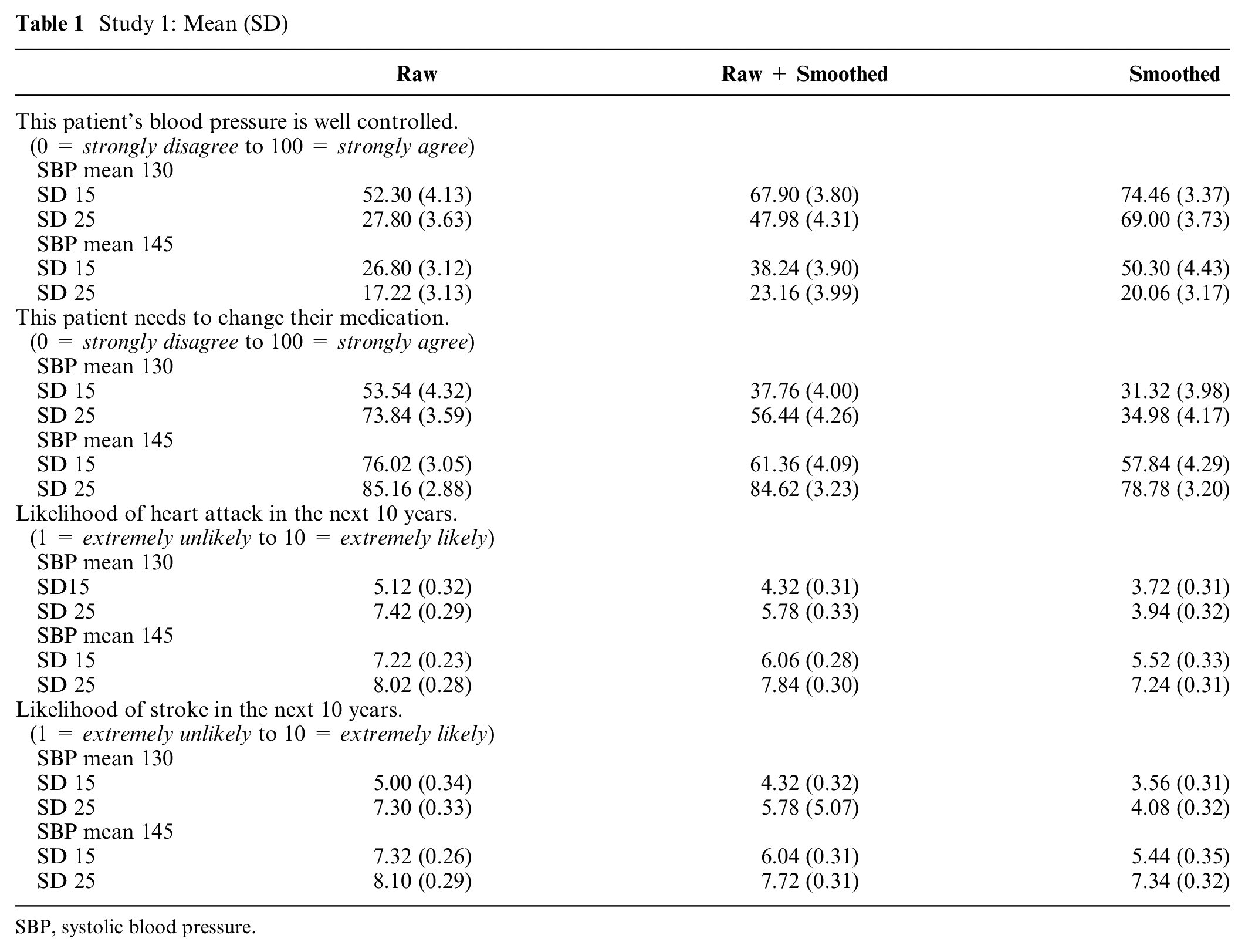
SBP, systolic blood pressure.
After evaluating all vignettes, participants completed the Subjective Numeracy Scale (SNS) 8 and a Single Item Literacy Screener for health literacy (SILS). 9 Participants also provided demographic information (age, sex, race/ethnicity, education, and income) and responded to 2 additional items about how often they monitor and graph their own blood pressure (BP).
Power and Statistical Analyses
We planned to recruit 50 patients with hypertension for study 1. Sample size was determined a priori using G-Power10,11 with the following data characteristics: 80% power to detect a significant medium-sized effect (Cohen’s f = 0.25) at an α level of .05, with a minimum correlation of .50 between repeated measures. All outcomes were treated as continuous variables. We examined the effects of data visualization on our primary outcomes by conducting a series of analysis of variance (ANOVA) tests for repeated measures. Predictors included type of data visualization, mean SBP, and SBP standard deviation. Demographic information, health literacy, and subjective numeracy were not included as predictors in these models because the studies were not powered for their inclusion. All tests were conducted in R version 3.5.312 and were considered statistically significant when P < 0.05.
Study 1 Results
Participants with hypertension (N = 50) were recruited by Qualtrics, a survey company that maintains an opt-in demographically diverse Internet panel of participants, using a single self-reported measure: “Has your doctor ever diagnosed you with hypertension, also known as high blood pressure?” Similar self-report items have been used to identify patients with hypertension in other epidemiologic studies.13,14 See Table 2 for complete participant characteristics.
Participant Characteristics a
BP, blood pressure.
Values are presented as number (%) unless otherwise indicated.
We observed a significant main effect of data visualization type on judgments of hypertension control, F(2, 98) = 33.19, P < 0.001,
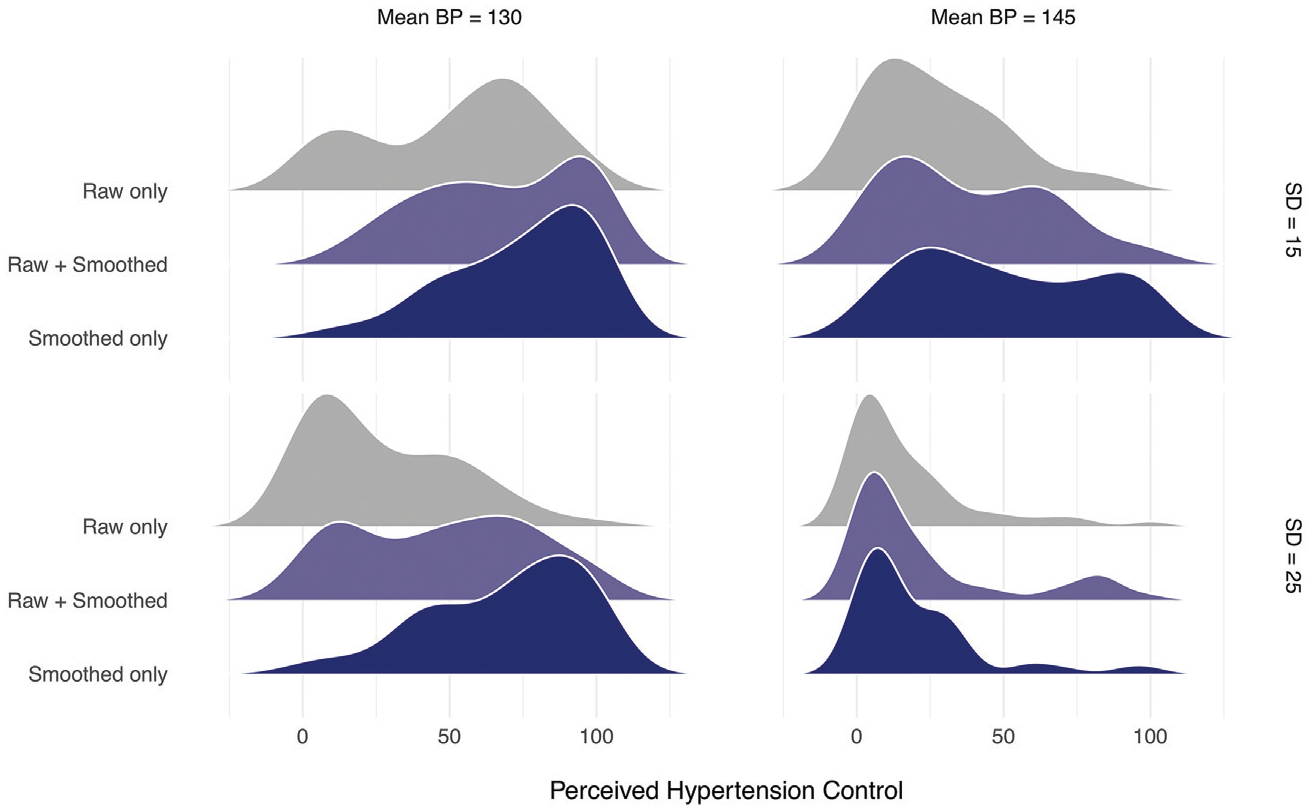
Frequency distributions of perceived hypertension control in study 1. BP, blood pressure.
The same pattern of results exists for the 3 additional outcome measures. There were significant main effects of data visualization type on perceived need for medication change, F(2, 98) = 28.37, P < 0.001,
In addition, we asked about preferences between the 3 data displays. The raw + smoothed data display was chosen as the most preferred graph overall by 54% of participants; it was also rated as most useful (52%), helpful (56%), and trustworthy (60%) by a majority of the participants. Participants also reported being most likely to use the raw + smoothed display (54%).
Study 2 Methods
Study 2 employed the same procedure as study 1. We used a 2 (SBP mean: 130 or 145 mm Hg) × 3 (absolute value of the slope: 0, 0.50, or 1.0) × 2 (data visualization type: raw or smoothed) factorial design, resulting in 12 new vignettes; SBP standard deviation was held constant at 15 mm Hg across all vignettes. Slope refers to the change in blood pressure values over time, where slopes of greater magnitude indicate greater change over time. When SBP mean was 130, the slopes were positive, showing blood pressure measurements increasing over time. When SBP mean was 145, the slopes were negative, showing blood pressure measurements that decreased over time. See Appendix B (available online) for samples of the data displays used in study 2. The purpose of this study was to examine whether providing the smoothing line would allow trends in hypertension over time (either increases or decreases) to become more visible to patients, thereby influencing their judgments about hypertension control. We again used a within-subjects design, and we chose to compare only the raw data with the smoothed data to minimize response burden on participants.
Study 2 used the same primary outcomes as study 1 (perceived hypertension control, need for medication change, perceived heart attack risk, and perceived stroke risk) with the same response scales. After evaluating all vignettes, participants also completed the SNS and the SILS and provided the same demographic information as study 1. Sample size calculations, determined a priori using G-Power,10,11 indicated that a minimum sample size of 50 would yield 80% power to detect a significant effect at a medium effect size (Cohen’s f = 0.25), with a type I error rate of .05, and a minimum correlation of .50 between repeated measures.
To examine the impact of SBP mean, SBP slope, and data visualization on our primary outcomes, we conducted a series of ANOVA tests for repeated measures. All tests were conducted in R version 3.5.312 and were considered statistically significant when P < 0.05.
Study 2 Results
Participants (N = 81) with hypertension were recruited by Qualtrics using the same method as study 1. See Table 2 for complete participant characteristics.
Consistent with study 1, hypertension was perceived to be less controlled when the data were displayed in the raw format compared to when participants viewed the displays with only the smoothing line, F(1, 80) = 45.59, P < 0.001,
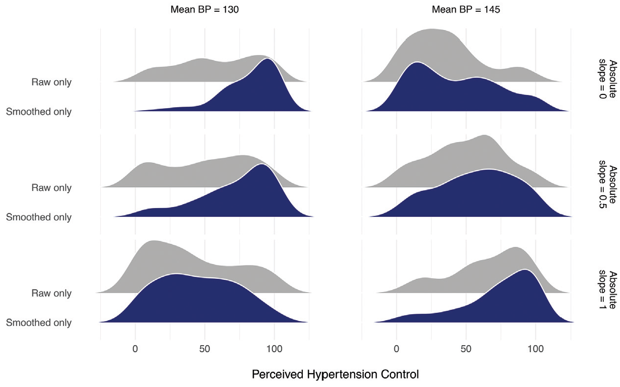
Frequency distributions of perceived hypertension control in study 2. BP, blood pressure.
Perceived hypertension control was also sensitive to change over time (i.e., slope). While there was no main effect of slope, F(2, 160) = 1.55, P = 0.22,
Study 2: Mean (SD)
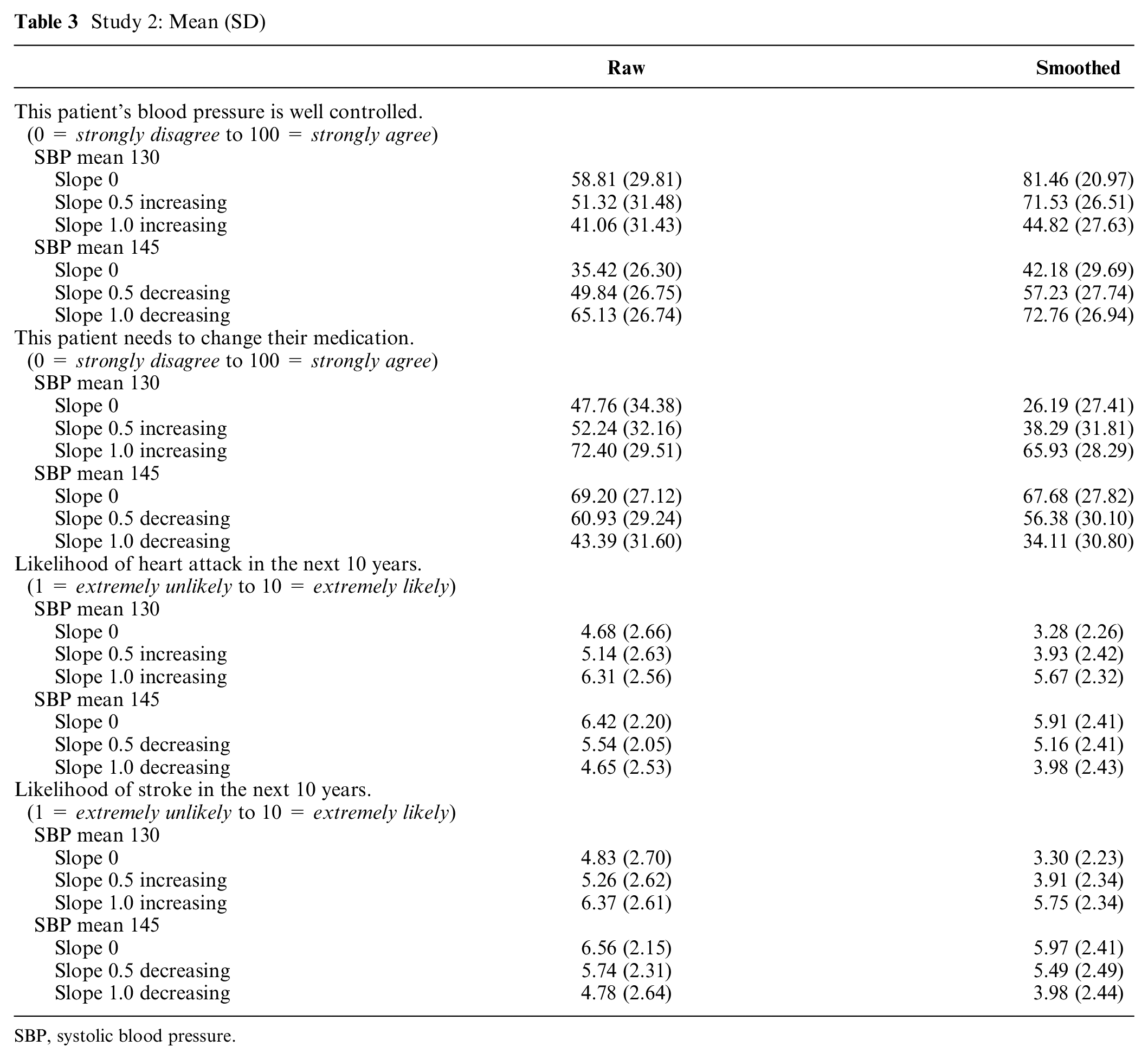
SBP, systolic blood pressure.
The general patterns were the same for the 3 additional outcome measures. There were significant 3-way interactions (SBP mean × absolute slope magnitude × data visualization type) for perceived need for medication change, F(2, 164) = 6.29, P = 0.002,
Study 3 Method
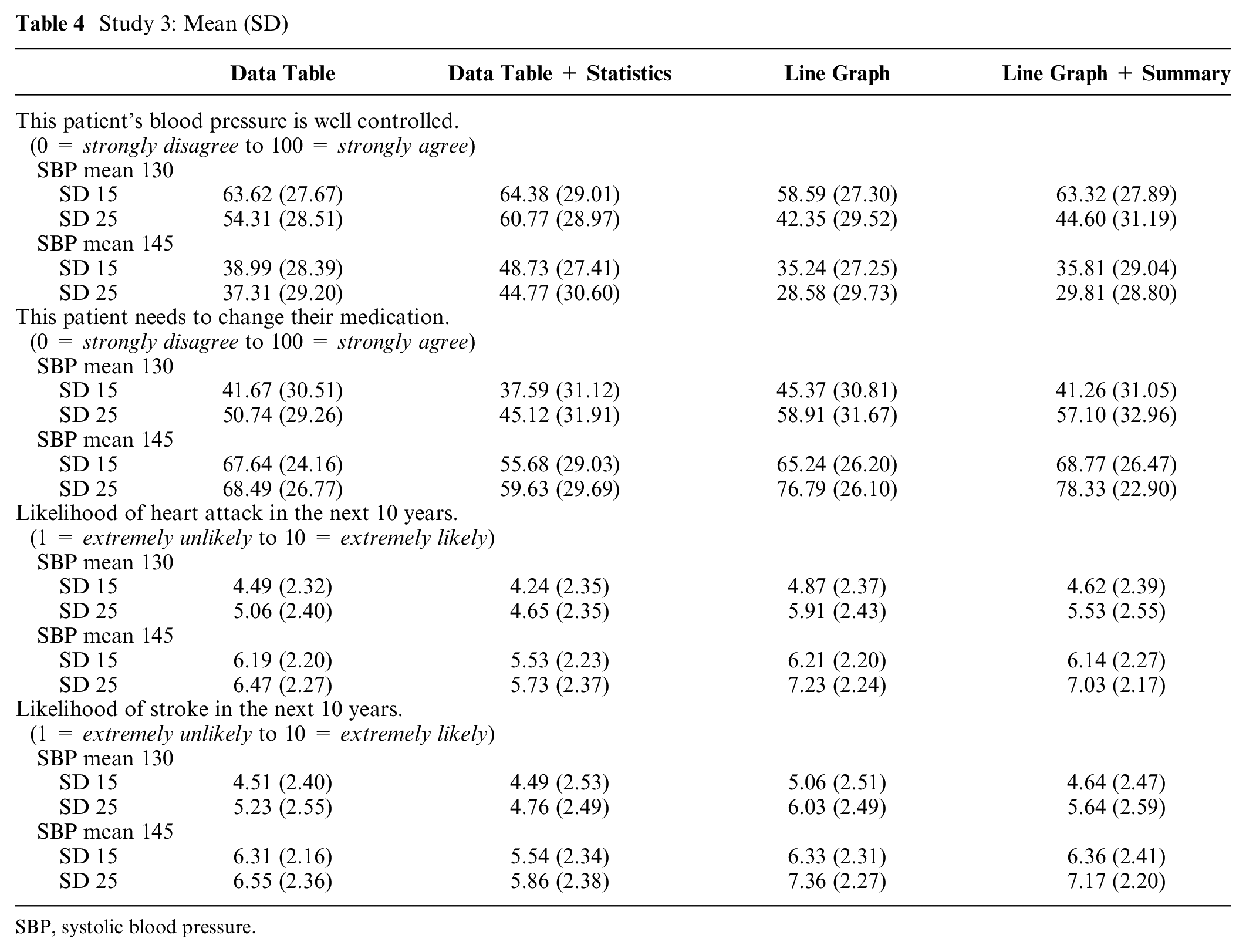
Using the same approach as the 2 prior studies, study 3 employed a 2 (SBP mean: 130 or 145 mm Hg) × 2 (SBP standard deviation: 15 or 25) × 4 (data visualization type: data table, data table with summary statistics, graph depicting raw data and smoothing line, and graph depicting raw data and smoothing line with an additional linguistic summary) factorial design, resulting in 16 new vignettes. See Appendix C (available online) for samples of the data visualization displays used in study 3. In this study, we compared the effects of displaying blood pressure data in tables v. graphs. We tested 2 different types of data tables: 1) a table that displays all of the individual blood pressure measurements and 2) a table that contains all of the individual measurements and includes a summary table with range of values and mean value for the data displayed in the table. These were compared with 2 types of graphs: 1) a line graph showing the raw data and the smoothing line and 2) the same line graph with an additional linguistic summary. The linguistic summary includes a sentence that summarizes the display and a sentence that provides direction to the patient about how to proceed. For example, when the display shows blood pressure measurements that are controlled, the linguistic summary reads, “Overall blood pressure is within the healthy goal range. Continue your current treatment plan.” Alternatively, when hypertension is uncontrolled, the linguistic summary reads, “Overall blood pressure is outside of the healthy goal range. Contact your healthcare team.” This data visualization type examines the effect of the presence of these types of summaries, which can be automatically generated with algorithmic and fuzzy logic computational techniques to provide a text summary of numeric data and trends in that data.
In study 3, we again employed a within-subjects design. To reduce participant response burden, we chose to use only a single data visualization, one that included both the raw data and the smoothing function. Since we opted to use only 1 type of graph (either with or without the linguistic summary), we chose this visualization type because it included both data elements of interest.
Study 3 employed the same primary outcomes using the same response scales. In addition, in study 3, we asked participants to estimate the proportion of SBP values out of range for each vignette (“What percentage of the patient’s systolic blood pressure values [i.e., top number] would you estimate to be out of the goal range?”). After evaluating all vignettes, participants also completed the SNS and the SILS and provided the same demographic information as study 1. Sample size calculations, determined a priori using G-Power,10,11 indicated that a minimum sample size of 50 would yield 80% power to detect a significant effect at a medium effect size (Cohen’s f = 0.25), with a type I error rate of .05 and a minimum correlation of .50 between repeated measures.
To examine the impact of SBP mean, SBP SD, and data visualization on our primary outcomes, we conducted a series of ANOVA tests for repeated measures. All tests were conducted in R version 3.5.312 and were considered statistically significant when P < .05.
Study 3 Results
Replicating study 1 and study 2, perceived hypertension control was lower with higher mean SBP and greater variability. Specifically, in study 3, we observed a main effect of SBP mean on perceived hypertension control, F(1, 77) = 90.28, P < 0.001,
Most importantly, there were also significant differences in perception of hypertension control when viewing the different forms of data visualization. Patients judged the same blood pressure data presented in graphical form as less controlled, F(3, 231) = 14.08, P < 0.001,
Study 3: Mean (SD)
SBP, systolic blood pressure.
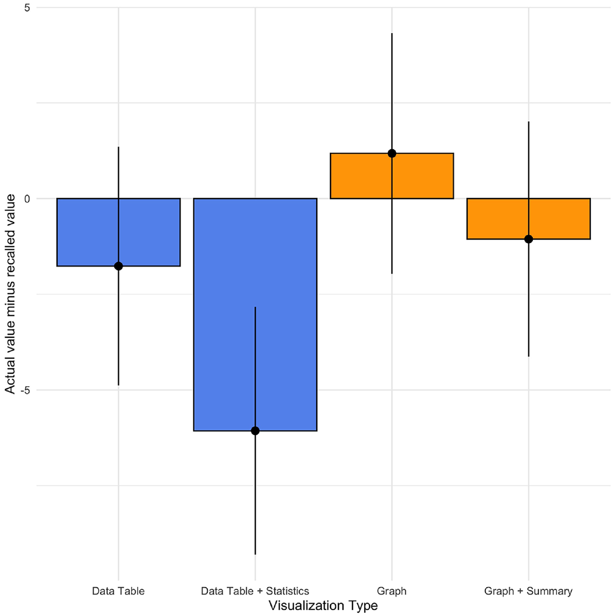
Recall accuracy (actual value – recalled value) by data visualization type, study 3.
Discussion
To examine whether enhanced data visualization techniques can improve patient judgments by reducing their overreliance on blood pressure variation, we compared judgments about hypertension control when the data were presented using a standard raw data display to judgments made viewing enhanced displays. In study 1 and study 2, we compared raw data displays with visualizations that feature a data smoothing line generated by the LOWESS algorithm. In both studies, participants perceived greater hypertension control with displays employing the smoothing function than with raw data displays. The discrepancy between the 2 displays was greatest when the patient’s hypertension was controlled.
It is of great interest to understand not only how different data visualizations change perceptions of hypertension control but also whether this change results in perceptions that are more or less accurate. In general, we considered judgments about hypertension control to be accurate when they align with published guidelines, for example, the 2014 Evidence-Based Guideline for the Management of High Blood Pressure in Adults from the panel members appointed to the Eighth Joint National Committee (JNC8). 7 Based on these guidelines, an SBP mean value of 130 would typically be considered controlled. As seen in Table 1, participants judged hypertension to be uncontrolled for the vignettes with a mean SBP of 130 when viewing the raw data displays. By contrast, when participants view the same data with the smoothing function, they perceive hypertension control to be much greater. These latter perceptions align more closely to the JNC8 guidelines. Therefore, we conclude that the smoothing line produces more “accurate” judgments because participant judgments of hypertension control are more aligned with the judgments made by the clinical experts on our research team and with the JNC8 guidelines.
In addition, in study 2, participants were more sensitive to increases in SBP readings over time when the smoothing function was employed. Given the natural variability inherent in blood pressure measurements, which is due to both measurement error and behavioral factors (e.g., diet, smoking, stress), important increases in blood pressure may not be visible when looking only at the raw data. Therefore, enhanced data visualization with a smoothing function can help reduce focus on variation due to “noise” and make important trends more noticeable.
In study 3, we examined the effect of data visualization type on patient judgments of hypertension control, comparing 2 types of graphs with 2 types of data tables. Results about the superiority of data presentation method were mixed. Patients judged blood pressure data presented in a graphical form as less controlled and at increased heart attack and stroke risk compared to data presented in tabular form. Judgments based on data tables were generally more closely aligned with clinical guidelines in that perceived hypertension control was greater with tables than graphs in the cases where hypertension was in fact controlled (e.g., SBP mean = 130). While studies 1 and 2 did not include a data table condition, the differences in findings may also be due to the fact that study 3 only employed a visualization that included both the raw data and the smoothing function. However, recall for the percentage of SBP values out of target range was more accurate with graphical representations than tabular representations. Therefore, choice of graphical v. tabular display may be dependent upon clinical goals. Future research is needed to understand the contexts in which data tables may be superior to graphical visualizations.
Together, these 3 studies suggest that visualizing blood pressure data via graphical representations with smoothing functions may improve judgments about hypertension control. The smoothing line minimizes the effect of blood pressure variability on judgments of hypertension control, which is in line with clinical research suggesting that mean blood pressure values are the most important predictors of negative health outcomes. 5 Furthermore, these enhanced displays can make important trends more visible. Reducing uncertainty about the state of blood pressure control through graphical representation may help patients and their physicians overcome at least one of the barriers to blood pressure control described in the Hypertension Clinical Action Model. 2
The smoothing line effectively masks extreme variability, which can capture the attention of patients and clinicians without meaningfully improving judgments of hypertension control. Another potential approach to improving correspondence between patient judgments and clinical guidelines would be to simply direct patients to attend to the average blood pressure values and to ignore any extreme values. Although this is a more parsimonious approach than developing sophisticated data visualization tools, there is a rich history of research in judgment and decision making showing that these types of informational correction strategies are fairly ineffective at debiasing.15,16 However, this remains an empirical question in this specific context; therefore, future research should compare the effects of information correction strategies and other patient education efforts with enhanced data visualizations on judgments of hypertension control.
More work is needed to understand when data tables may provide greater benefit than graphical visualizations. In study 3, perceptions of hypertension control were more closely aligned with clinical guidelines (i.e., hypertension control was deemed greater when the SBP mean was within the “normal” range) when participants viewed blood pressure data in tabular form. However, recall for the percentage of values outside the goal range was more accurate with the use of graphs. Tabular presentations may promote more informed judgments, although more research is needed to compare tables to visualizations without raw data. Alternatively, graphical representations—more than tabular displays—may promote a greater willingness to intensify medication by highlighting the number of times that blood pressure measurements exceeded the recommended goal range.
Limitations
There are some limitations to these studies that potentially minimize their ability to inform clinical encounters. The primary limitations are the use of Internet patient samples and vignette-based studies. Patient judgments were made without a physician guiding their interpretation; interactions within a clinic visit may alter patient responses. In addition, participants in this study were asked to make judgments about hypertension control for other patients, not themselves. Given the literature on self-other differences (e.g., Zikmund-Fisher et al. 17 ), these findings may not generalize when patients make judgments about their own data. Furthermore, we focused only on patients in these studies, which represent only half of the dyad. Future research should examine the effect of data visualization on physicians’ judgments about hypertension control, as well as the effect on shared patient-physician decisions. It is likely that physician judgments will be similar to patients because we are examining judgments that stem from common perceptual and cognitive processes.18,19
Conclusions
This work has important implications for the design of data displays in the electronic medical record and patient portal platforms. The format of data visualization significantly affects judgments of hypertension control. The traditional raw data displays may be less effective in communicating about hypertension control to patients. A smoothing function that visually minimizes the inherent variability in blood pressure data can drive more accurate perceptions of hypertension control, which may help to overcome the clinical inertia documented in the management of hypertension. 2 Enhanced data visualization has the potential to improve patient and physician understanding of hypertension control, enhance the shared decision-making process, and encourage intensification of antihypertensive therapy as needed.
Supplemental Material
Appendix_A.rjf_online_supp – Supplemental material for Use of Enhanced Data Visualization to Improve Patient Judgments about Hypertension Control
Supplemental material, Appendix_A.rjf_online_supp for Use of Enhanced Data Visualization to Improve Patient Judgments about Hypertension Control by Victoria A. Shaffer, Pete Wegier, K. D. Valentine, Jeffery L. Belden, Shannon M. Canfield, Mihail Popescu, Linsey M. Steege, Akshay Jain and Richelle J. Koopman in Medical Decision Making
Supplemental Material
Appendix_B.rjf_online_supp – Supplemental material for Use of Enhanced Data Visualization to Improve Patient Judgments about Hypertension Control
Supplemental material, Appendix_B.rjf_online_supp for Use of Enhanced Data Visualization to Improve Patient Judgments about Hypertension Control by Victoria A. Shaffer, Pete Wegier, K. D. Valentine, Jeffery L. Belden, Shannon M. Canfield, Mihail Popescu, Linsey M. Steege, Akshay Jain and Richelle J. Koopman in Medical Decision Making
Supplemental Material
Appendix_C.rjf_online_supp – Supplemental material for Use of Enhanced Data Visualization to Improve Patient Judgments about Hypertension Control
Supplemental material, Appendix_C.rjf_online_supp for Use of Enhanced Data Visualization to Improve Patient Judgments about Hypertension Control by Victoria A. Shaffer, Pete Wegier, K. D. Valentine, Jeffery L. Belden, Shannon M. Canfield, Mihail Popescu, Linsey M. Steege, Akshay Jain and Richelle J. Koopman in Medical Decision Making
Footnotes
This research was presented at the 2017 and 2018 annual meetings of the Society for Medical Decision Making.
The authors declared no potential conflicts of interest with respect to the research, authorship, and/or publication of this article.
The author(s) disclosed receipt of the following financial support for the research, authorship, and/or publication of this article: This project was supported by grant number R01HS023328 from the Agency for Healthcare Research and Quality. The content is solely the responsibility of the authors and does not necessarily represent the official views of the Agency for Healthcare Research and Quality. Financial support for these studies was provided entirely by a grant from the Agency for Health Care Research and Quality. The funding agreement ensured the authors’ independence in designing the study, interpreting the data, writing, and publishing the report.
References
Supplementary Material
Please find the following supplemental material available below.
For Open Access articles published under a Creative Commons License, all supplemental material carries the same license as the article it is associated with.
For non-Open Access articles published, all supplemental material carries a non-exclusive license, and permission requests for re-use of supplemental material or any part of supplemental material shall be sent directly to the copyright owner as specified in the copyright notice associated with the article.